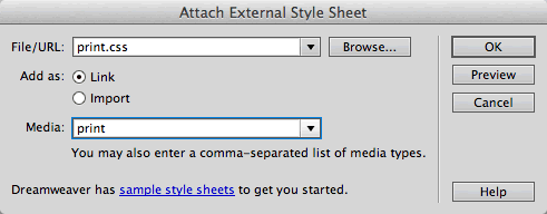
CSS3 media queries detect the width of the user's device, then serve up a phone.css or tablet.css style sheet accordingly. This involves just a few lines of code.
Download the mobile folder from the course downloads area. Unzip it and move it into your dw2projects folder. Open the index.html file.
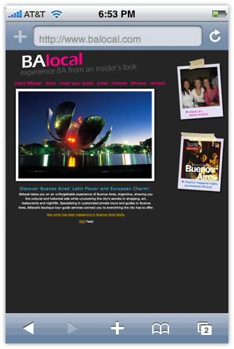
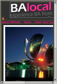
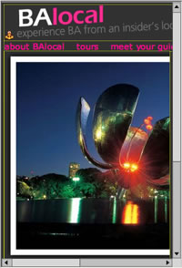
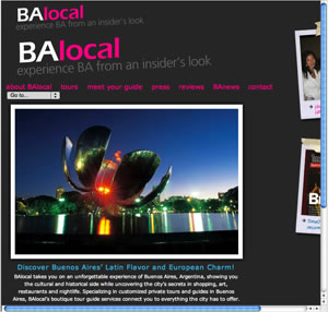
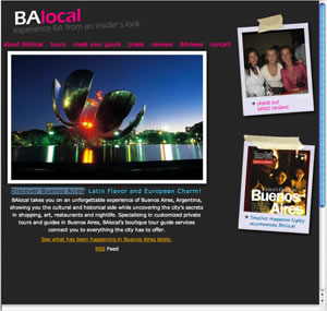
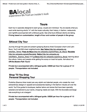
The BAlocal home page displays correctly on an iPhone, but there are some obvious layout problems. The container div is 890 pixels wide in a normal Web browser, but here, it is scaled to just 320 pixels wide. This makes the text too small to read. Also, the tiny links in the top nav bar are hard to click. It is possible to browse this site on a mobile device, but it involves a lot of zooming and scrolling.
Optimize Layout
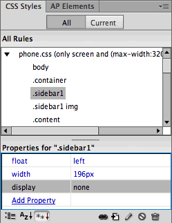
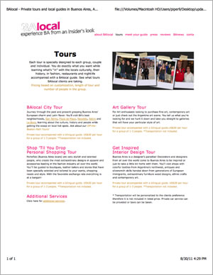
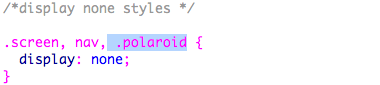
The first order of business is to restructure the layout into a single column. This means getting rid of the polaroid photos in the right sidebar. You could move the polaroids down to the bottom of the page, but since the polaroids are not essential, it will be cleaner to remove them.
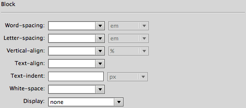
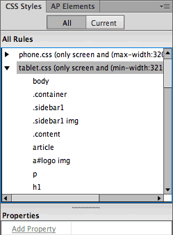
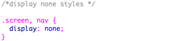
1. Expand the phone.css file in the CSS Styles panel. Edit the .sidebar1 style. In the Block category, set display to "none".
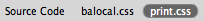
You won't see any changes yet, since Dreamweaver is displaying the regular balocal.css styles. Here's how to preview the phone.css file:
 |
|
 |
|
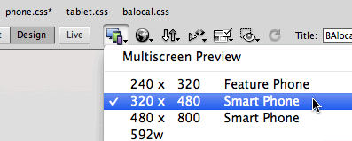
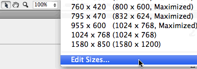
Dreamweaver CS6 users: Click the Multiscreen icon in the Document toolbar and choose "320 x 480 Smart Phone".
 |
| Windows users: If your work area is maximized, the Window resize options may be grayed out. Make the work area window smaller to activate these options. |
Dreamweaver CS5.5 users: Choose "320 x 480 Smart Phone" from the Window Size menu in the bottom-right corner of the Document window.
 |
| Windows users: If your work area is maximized, the Window resize options may be grayed out. Make the work area window smaller to activate these options. |
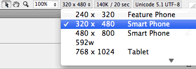
Dreamweaver CS5 users: Choose "Edit Sizes" from the Window Size menu.
 |
| Windows users: If your work area is maximized, the Window resize options may be grayed out. Make the work area window smaller to activate these options. |
Enter a new window size and description,
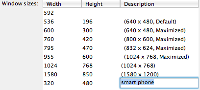
Click OK. Return to the Window Size menu and choose the new smart phone option. |
|
 |
|
 |
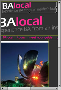
Changing the window size triggers the phone.css file. If you scroll over to the right, you'll notice that the polaroids no longer display in the phone view.
A word of warning: Dreamweaver's Smart Phone preview occasionally locks up. If your screen freezes and won't let you select anything, go to File > Save, close your HTML file, then open it again.
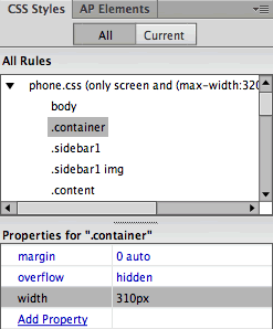
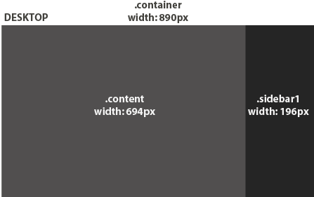
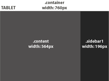
2. The next step is to resize the layout to fit a 320 pixel screen. Edit the .container style (in the phone.css), and set the width to 310px.
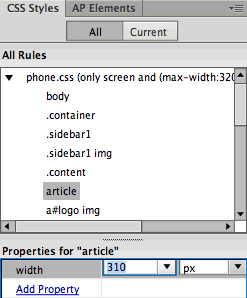
3. Edit the article style (in the phone.css), and change the width to 310px.
4. Next, edit the body style (in the phone.css). Change the margins to 5px.
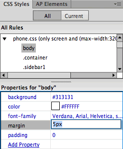
The container div is 310 pixels wide, with 5 pixels of body margin on each side. This adds up to 320 pixels, fitting the 320 x 480 media size.
Optimize Images
Let's insert a smaller version of the logo for mobile devices.
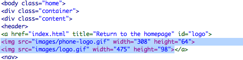
1. Select the logo (be careful to select the logo itself, and not the entire container div—you might need to click the logo, pause, and click again), then press your Left arrow key. You'll see your cursor blinking to the left of the logo.
2. Go to Insert > Image, and browse to insert phone-logo.gif from the images folder in the mobile directory.
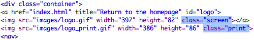
Switch to Code View and toggle to the Source Code. Both logos should be nested inside an <a href> tag, which links to the homepage.
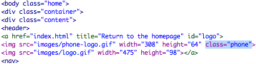
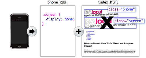
3. Insert your cursor inside the phone-logo.gif image tag, and type class="phone".
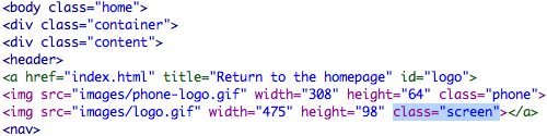
4. Insert your cursor inside the logo.gif image tag, and type class="screen".
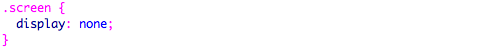
5. Toggle to phone.css, and add this class selector:
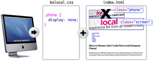
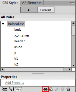
6. Toggle to balocal.css, and add this class selector:
This may seem crisscrossed, but there is an underlying logic.
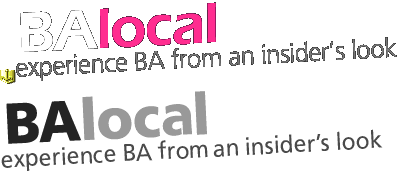
In the source code, the small phone-logo.gif is identified with a class of "phone", while the full-sized logo.gif is identified with a class of "screen".
When the page loads, the CSS3 media query identifies the width of the device and serves up the the corresponding style sheet.
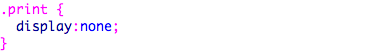
Small screens are formatted with the phone.css file. According to the phone style sheet, any element with a class of "screen" is set to display "none". Presto, this hides the full-sized logo in the phone version.
Large screens are formatted with the balocal.css file. And, accordingly, any element with a class of "phone" is hidden from view. This removes the small logo from the normal desktop version.
Use the Multiscreen menu (or the Window Size menu in Dreamweaver CS5) to toggle between the Full Size and Smart Phone views of the BAlocal homepage. You should see the large logo in the Desktop version, and the small logo in the Smart Phone version. Good so far?
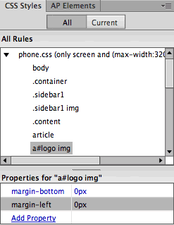
7. Expand the phone.css file. Choose the a#logo img selector, and set the margins to 0.
8. If you see a small yellow anchor to the left of the logo, go to View > Visual Aids > Invisible Elements and unselect this option. The yellow anchor tag won't display in the browser, but it takes up space in Design View.
Optimize Background Images
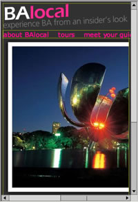
The large photo of metal flower on the BAlocal homepage is actually a background-image. This makes it very easy to swap using CSS.
1. Edit the .home h1 style (in the phone.css). Browse to select the phone-flower.jpg in the images folder. Set the top padding to 205px.
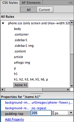
The photo is applied as a background image to the homepage's h1 heading. The top-padding allows space for the image above the heading.

That's all there is to it; no changes to the source code are necessary. Swapping background images is much easier than swapping regular content images, like the logo. Use CSS background images as much as possible, for all decorative images throughout your site. Insert normal content images for graphics that are integral to the content, like logos, product photos, or any image that should print along with the text.
Optimize Navigation: Option 1
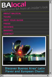
This is looking better, but the top-nav bar is getting cut off. Also, the tiny links are hard to select.
1. Edit the ul.mainnav li (in the phone.css file). In the Block category, delete the display "inline" property. This will transform the list from a horizontal list to a vertical list.
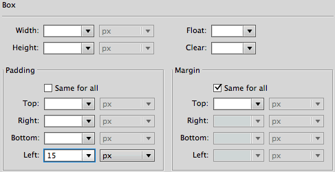
In the Box category, delete the 16px right-padding. Add 15px left-padding.
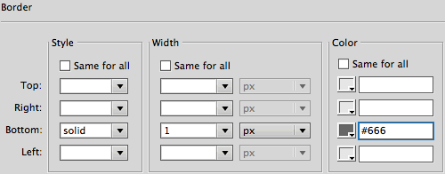
In the Border category, uncheck "same for all" and add a solid, 1 pixel gray bottom border. Click OK.
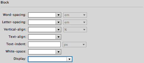
2. Edit the ul.mainnav a, ul.mainnav a:visited (in the phone.css file). In the Type category, set the font size to 12px, the line-height to 20px, and text-transform to "uppercase".
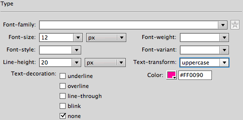
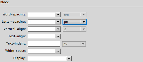
In the Block category, add 1 pixel of letter-spacing. Click OK.
The final nav-bar is certainly more usable. The links take up a lot of screenspace, but it is easy enough to scroll down to the content.
If you would like to compress the navigation, take a look at a second option below.
Optimize Navigation: Option 2
1. Copy the following lines of code:
<script src=

          "http://ajax.googleapis.com/ajax/libs/jquery/1.6.2/jquery.min.js">

          </script>

          <script type="text/javascript" src="js/pagechanger.js"></script>
Switch to Code View. Toggle to the Source Code and paste into the Document head:
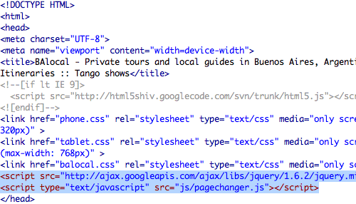
These scripts dynamically create the select menu. The jquery script links to ajax.googleapis.com. The pagechanger.js file is saved locally, inside the js folder in the mobile directory. If you want to use this script in another project, you'll need to copy the js folder into that project's local site folder.
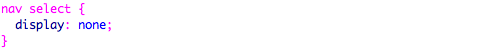
2. Preview in Live View. You'll see both the list menu and the select menu. Let's hide the list menu in the phone version.
Edit the ul.mainnav (in the phone.css file). In the Block category, set display to "none".
Preview again in Live View (the select menu won't appear in Design View). The rest of the pages haven't been created yet, but the select menu does function as a working navigation menu.
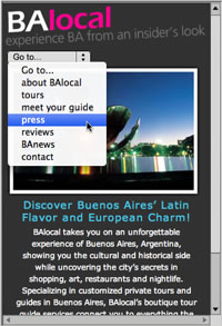
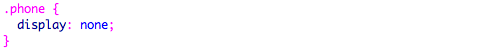
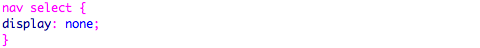
3. To finish up, hide the select menu from the Desktop view. Toggle to the balocal.css file, and add the following style:
Final Refinements
Make these final adjustments to the phone.css file:
1. Edit the p tag selector, and set text-align to "left".
2. Edit the h1 tag selector, and set text-align to "left". Change the font-size to 15px.
3. Edit the h1, h2, h3, h4, h5, h6, p selector, and change the right and left padding to 5px.

That does it! A final word of advice: Keep your phone layouts clean and simple. Data transfer rates can be slow, and screenspace is certainly limited.
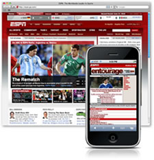
The desktop version of the ESPN Web site goes for full graphic effect, with gradient background images and large photos.
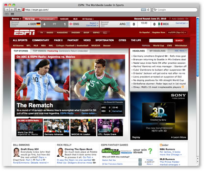 |
| The screen version of the ESPN Web site. |
The mobile version is drastically pared down—small images, no unnecessary graphics—just a clear presentation of the content.
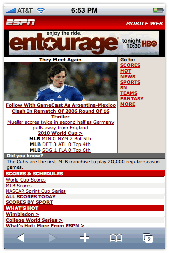 |
| The mobile version of the ESPN Web site as viewed on an iPhone. |
 Write media queries for mobile phones and tablets.