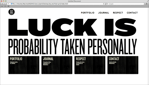
Fluid grid layouts meld to any screen size. Web designer Stephen Caver's portfolio site expands across four columns to fit a large resolution:
Compresses to two columns to fit a tablet:

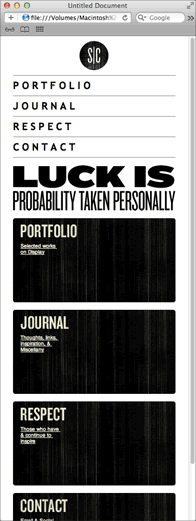
And wraps to a single column to fit a mobile device:

Test Caver's site in your browser, resizing your window and watching as the columns slide into place. The fluid columns are achieved by percentage widths and margins.
The percentage values are quite complicated to calculate, but Dreamweaver CS6's fluid grid layout tool will do the work for you.
Download the fluid-grid folder from the course downloads area. Unzip it and move it into your dw2projects folder. Go to File > New Fluid Grid Layout. For this practice project, you will create a layout based on Stephen Caver's design, so the number of columns should be divisible by 4. Enter "4" columns for Mobile, "8" columns for Tablet, and "12" columns for Desktop.

Click Create, saving the style sheet as "styles.css" inside the fluid-grid folder.
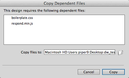
Go to File > Save to save the html file as "index.html". Click Copy to add the dependent files.
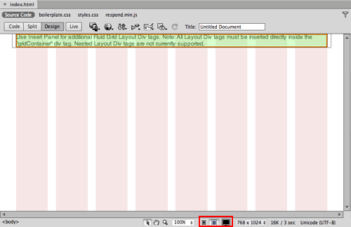
Pale stripes delineate the columns. Click the icons at the bottom of the Document window to toggle between the mobile, tablet, and desktop layouts.
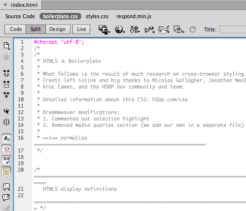
Using the related files toolbar, open the boilerplate.css file. This document contains standard-issue styles which force the layout to render consistently in various browsers. You won't need to edit these styles.
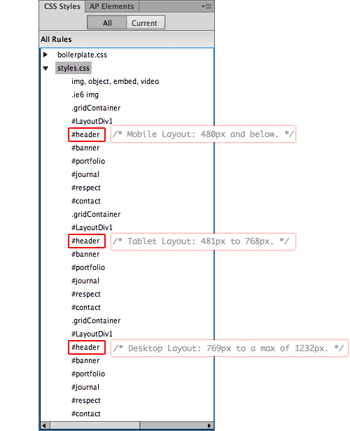
Switch to the styles.css file. When you worked with media queries earlier in Lesson 6, you created three separate external style sheet files for phones, tablets, and desktops. This file is structured differently. All of the styles are saved in the same styles.css file, separated by media queries.

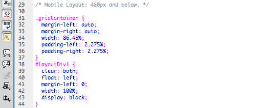
The mobile styles are listed at the top:
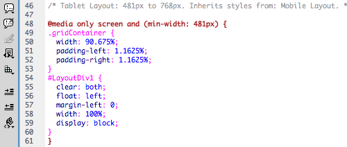
Followed by the tablet styles:
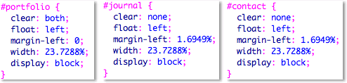
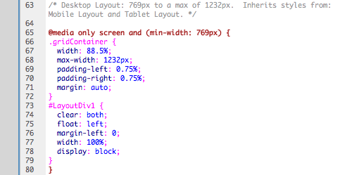
Followed by the desktop styles:
The media queries are grouped together in CSS Styles panel, which can be confusing. Remember that the styles are listed in order: mobile, tablet, desktop.
1. Toggle back to Design View. Click inside the green div, then select #LayoutDiv1 using the Tag selector in the lower-left corner of the Document window. Hit your Delete key.
 |
 |
| Dreamweaver has already inserted a fluid grid layout div inside the container, but it has a generic id of #LayoutDiv1. Delete this div, and insert a #header div in its place. |
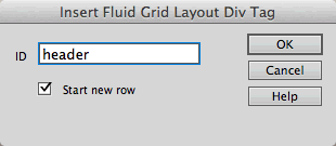
2. Go to Insert > Layout Objects > Fluid Grid Layout Div Tag. Give the div an ID of "header", keeping "Start new row" checked. Click OK.
3. Click the right arrow on your keyboard to move your cursor to the right of the header div. Go to Insert > Layout Objects > Fluid Grid Layout Div Tag again. Give the div an ID of "banner", keeping "Start new row" checked. Click OK.

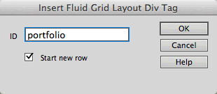
4. Click the right arrow on your keyboard to move your cursor to the right of the banner div. Go to Insert > Layout Objects > Fluid Grid Layout Div Tag. Give the div an ID of "portfolio", keeping "Start new row" checked. Click OK.
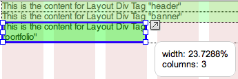
Using the icons at the bottom of the Document window, toggle to the Desktop view (all 12 columns should be visible).

Mouse over the right edge of the portfolio div. When your cursor turns into a double-arrow, grab the div handles and drag to the left, until the div fits 3 columns.
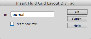
5. Click the right arrow on your keyboard to move your cursor to the right of the portfolio div. Go to Insert > Layout Objects > Fluid Grid Layout Div Tag. Give the div an ID of "journal", but this time, "Start new row" should not be checked. Click OK.
Resize the journal div so it is 3 columns wide. When you release, it will snap into place, beside the portfolio div.

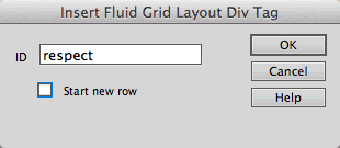
6. Click the right arrow on your keyboard to move your cursor to the right of the journal div. Go to Insert > Layout Objects > Fluid Grid Layout Div Tag. Give the div an ID of "respect". Uncheck "Start new row". Click OK.
Resize the respect div so it is 3 columns wide.

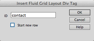
7. One more. Click the right arrow on your keyboard to move your cursor to the right of the respect div. Go to Insert > Layout Objects > Fluid Grid Layout Div Tag. Give the div an ID of "contact". Uncheck "Start new row". Click OK.
Resize the contact div so it is 3 columns wide.

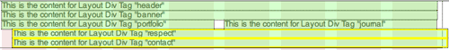
There you have the basic structure for the desktop view: the portfolio, journal, respect and contact divs fit a single row.
8. Using the icons at the bottom of the Document window, toggle to the Tablet view.

Resize the portfolio and journal divs so they are 4 columns wide, sitting side-by-side.
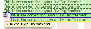
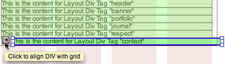
The respect div is indented slightly—it wasn't originally set to start a new row. When you mouse over the respect div, you'll see an arrow to the left. Click the arrow to align the div with the grid.
Resize the respect div so it is 4 columns wide, then resize the contact div so it is also 4 columns wide.

9. Using the icons at the bottom of the Document window, toggle to the mobile view.

All of the divs will span 4 columns in the mobile layout, so this one's easy. Click the arrow to the left of the journal, respect, and contact divs so they align with the grid.
At this point, you've built the mobile, tablet, and desktop layouts. To finish up, add content and style.
10. Expand the fluid-grid folder in the Files panel and open div-content.txt. Copy the content under the /* Insert in "header" div */ heading:
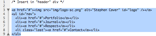
Switch to Code View in your index.html file, toggling to the Source Code. Find the header div. Delete the default content:
Paste the new header content:
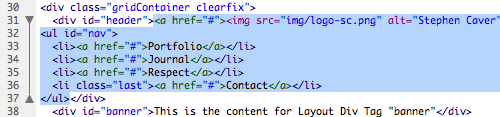
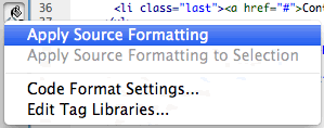
Repeat, copy and pasting the content from div-content.txt into each div. When you're done, click the paint bucket icon in the Code toolbar and choose "Apply Source Formatting" to clean up the code.
Note that none of the images include height or width attributes. The height and width of the images will scale along with the layout.

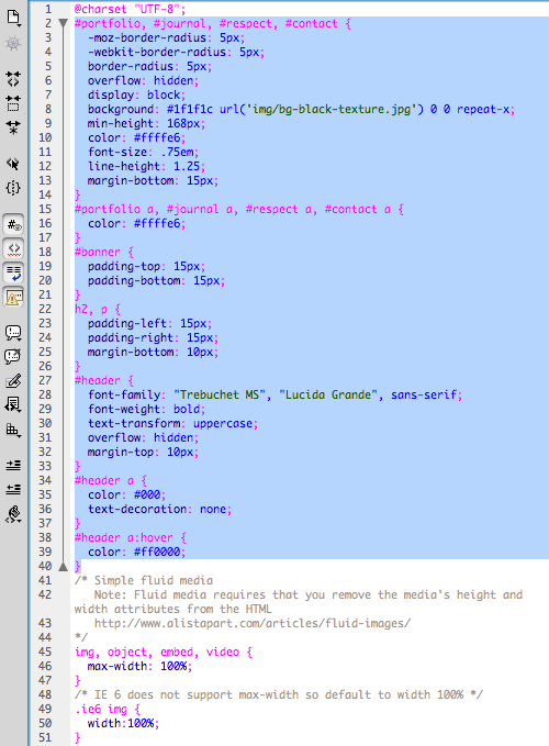
11. Open css-content.css. Copy the styles listed under /* Insert at top of styles.css */, and paste into the styles.css file:
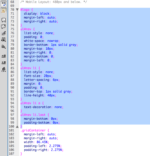
Switch back to css-content.css, and copy the styles listed under /* Insert: Mobile Layout: 480px and below. */. Switch to styles.css, and paste below /* Mobile Layout: 480px and below. */
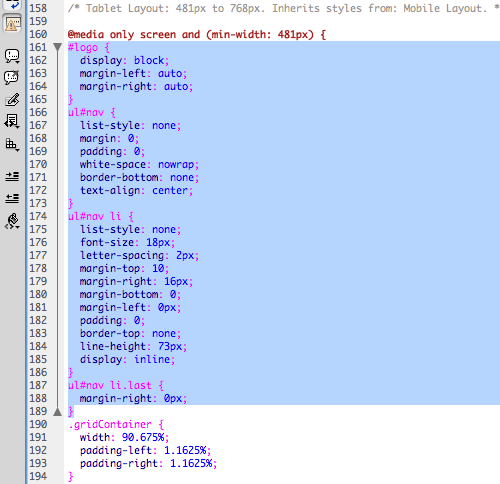
Copy and paste the tablet styles. Be careful to insert your cursor below the tablet media tag:
Copy and paste the desktop styles to finish up. Go to File > Save All, then preview in a browser. The layout contains four columns at a large screen size:
Two columns at a medium screen size:

And one column at a small screen size: