Dreamweaver CS5 users: Choose Help > Updates to make sure you've installed the latest Dreamweaver update. After downloading the update, do the installation, reboot your computer, and relaunch Dreamweaver.
Click the Multiscreen button in the Document toolbar.

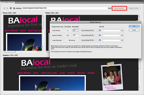
The Multiscreen Preview panel shows how the page will render in three different media devices: phone, tablet, and desktop.
Click the Media Queries button in the top-right corner of the Multiscreen Preview panel.
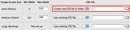
Now, specify which external style sheet should be used for each device. Select the Phone media query, then "Create new CSS file in folder". Browse to select the mobile folder. The link will appear as ./ indicating that the CSS file will be created at the current folder level.
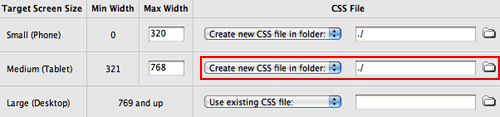
Move down the list to the Tablet media query. Create a new style sheet for tablet users, named tablet.css. Browse to select the mobile folder.
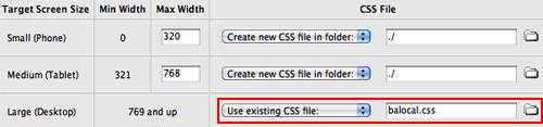
The external style sheet for the Desktop version of the Web site has already been created. Choose "Use existing file" from the CSS file menu, then browse to select the balocal.css file from the mobile folder.
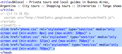
Click OK to exit the Media Queries panel, then close the Multiscreen Preview panel. Switch to Code View to see the new media queries which have been added to the Document head.
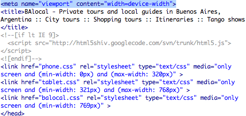
One more line of code is needed in order to force handheld devices to report their actual width. Copy the following meta tag:
<meta name="viewport" content="width=device-width">
And paste it into the Document head, just above the title tag:
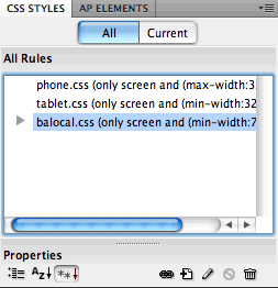
Back in Design View, all three external style sheets will be listed in the CSS Styles Panel.
Using the Document toolbar, toggle to the phone.css file. The file is completely empty now. You could build your phone layout from scratch, but it is usually faster to copy and modify the general desktop styles.
Toggle to the balocal.css file. Go to Edit > Select All to select all the CSS code, then Edit > Copy.

Toggle back to phone.css file. Select the @charset "utf-8"; at the top of the empty CSS file and hit Delete. Then, Edit > Paste.

Toggle to the tablet.css file. Select the @charset "utf-8"; at the top of the empty CSS file and hit Delete. Then, choose Edit > Paste again.

Go to File > Save All. You're ready to optimize the phone and tablet layouts.