Dreamweaver CS6 users: Click the Multiscreen icon in the Document toolbar and choose "Multiscreen Preview from the pulldown menu.
Dreamweaver CS5.5 users: Click the Multiscreen button in the Document toolbar.

Creating Media Queries
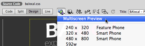
The Multiscreen Preview panel shows how the page will render in three different media devices: phone, tablet, and desktop.
Click the Media Queries button in the top-right corner of the Multiscreen Preview panel.

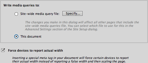
Choose "This document" to embed the media queries in the Document head. Select "Force devices to report actual width".
Click the Default Presets button to load the default set of media queries.

Specify which external style sheet should be used for each device. Select the Phone media query, then "Create new file". Name the new file "phone.css".

Select the Tablet media query. Create a new style sheet for tablet users, named tablet.css.

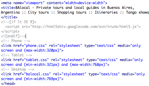
Select the Desktop media query. The external style sheet for the Desktop version of the Web site has already been created. Choose "Use existing file:" from the CSS file menu, then browse to select the balocal.css file in the mobile folder.

Click OK to exit the Media Queries panel, then close the Multiscreen Preview panel. Switch to Code View to see the new media queries and viewport settings in the Document head:

Notice how the balocal.css file is repeated twice? The balocal.css file was already attached to this document before you added the Desktop media type. Select the duplicate "balocal.css" link (without the media tags)…

… and hit your Delete key to remove it.
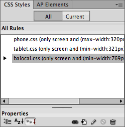
Back in Design View, all three external style sheets will be listed in the CSS Styles Panel.
The phone.css and tablet.css files don't contain any styles yet. To speed up the process of building these alternate layouts, copy the general desktop styles.
Toggle to the balocal.css file. Go to Edit > Select All to select all the CSS code, then Edit > Copy.

Toggle to phone.css. Select the @charset "utf-8"; at the top of the empty CSS file and hit Delete. Then, Edit > Paste.

Toggle to tablet.css. Select the @charset "utf-8"; at the top of the empty CSS file and hit Delete. Then, choose Edit > Paste again.

Go to File > Save All. You're ready to optimize the phone and tablet layouts.