 |
Making documents in InDesign is sort of like putting together a cake. And the more you learn, the more your documents will look as good as Rose Sen's book-shaped cake! (Image credit: sencakes.com) |
Now that you're familiar with the InDesign interface, it's time to make things happen! I know you've been waiting a while, but with InDesign it's very important to get your interface bearings before you start in on content—otherwise, you might develop slow or inefficient work habits.
But now it's time to get down to business. In this part of the lecture you will get the inside scoop on how to create a new InDesign document and fill it—as well as shape it—with all types of content.
As you will soon learn, building an InDesign document is a lot like baking a cake. You pour text, graphics, images, and other graphic resources into the bowl—which is the InDesign document—and mix them together using carefully practiced design skills. Eventually you produce fully baked pages for print and digital output.
With this analogy in mind, know that there are two basic ways to build an InDesign document. The first method involves gathering your resources or content first, placing them in an InDesign document and then beginning to shape and sculpt your final design. In this method, your layout is guided by your content.
The second method is the one I prefer. Instead of starting with content, you start by designing a layout using InDesign frames as placeholders. This allows you to focus on the design side of things even before you have the actual content ready. With this method you can even present your client with a preliminary layout that he or she can sign off on. Once you gather all the resources you place them on your layout and make the necessary adjustments.
I feel this is the most organic approach to page layout; it's my preferred workflow and the one we'll be using throughout the course. Let's put it to the test and create our first document.
Creating a New Document
What will that first document be? Well, it might be good to pack a suitcase, because you're going to design a four page article for a travel magazine about the top cities in Europe. You will create one design for all the cities included in the article, and each city will have its own section or page. Ready for your continental adventure?
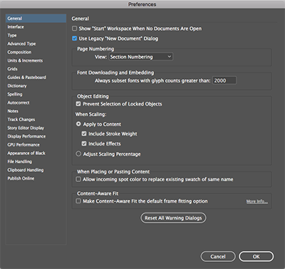
First, let's do a small change in InDesign's behavior with regards to the Start workspace. Press Ctrl-K (PC) or Command-K (Mac) to open the Preferences panel. Under General, deselect Show "Start" Workspace When No Documents Are Open. Finally select Use Legacy "New Document" Dialog and click OK. (Note that you can access the Start workspace at anytime by selecting Window / Workspace / Start.)
While we're at it, let's make sure we're working with the right unit of measurement. Your default measurement unit for print documents might be inches, but we want to use picas (we'll explain what these are a little later). To make this change, make sure you close any documents you might have open and choose Edit (Windows) or InDesign (Mac) and then Preferences > Units & Increments. Click Horizontal and Vertical, change them both to Picas, and click OK. If you're unsure how these preferences work, read the Preferences page for a more detailed explanation.
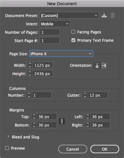
Now, close any open documents and go to File > New > Document, to access the New document dialog. You can also press Ctrl-N (PC) or Command-N (Mac) to start a new document.
The New Document dialog is a simplified version of what used to be a very intimidating panel. One option that stands out is the Intent field. If you click it, you will see that there are three choices available: Print, Web, or Mobile. The choice you make here determines the final output (or intent) of this document.
Go ahead and choose "Mobile" for intent. Now you can see how many of the settings have changed to prepare the document for digital output.
 |
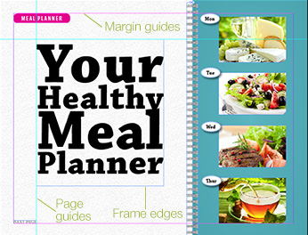
When you select "Mobile" in the Intent field, you'll see new default settings intended for digital devices like the iPhone X. |
For example, in Page Size, iPhone X is now set as a preset. The unit of measurement has changed to pixels, and the Facing Pages option has been turned off. InDesign has also turned on some background information about the document that will make it ideal for digital publishing (among these, note that the Transparency Blend Space has changed to Document RGB). Instead of boring us with the details, InDesign does what it needs to do to provide the final output we specified in the intent setting.
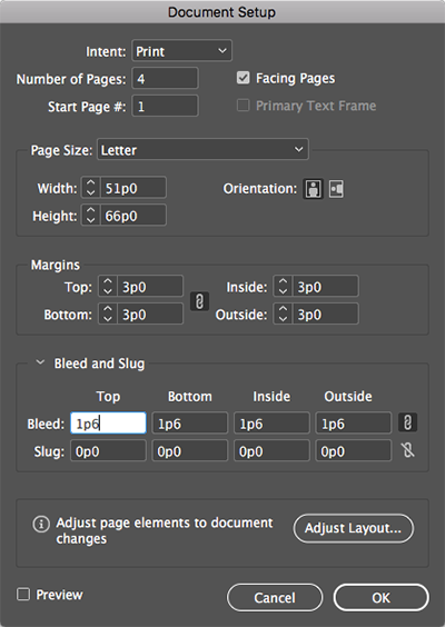
Let's switch the intent back to "Print" and set up your new document according to the following figure. CS6 users, click More Options on the right side of the New Document dialog to see the Bleed and Slug options.

Let's go over a few of these selections. First, the facing pages option allows us to bind the pages in such a way that facing pages are possible. Think of a magazine spread when you think of facing pages.
 |
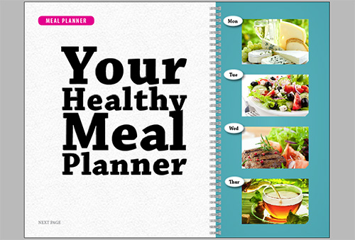
The Facing Pages option was used to create this publication. |
We've also set up the Page Size, Orientation, and a number of other settings for our document. It's a four pager, and note that you can set a custom start page. This is handy especially if you're creating a publication with many pages and you wish to break it up into several InDesign documents.
You can also set up the gutter or space between the columns (if you have more than one) and the margins of the document. We're going with three columns for our European cities article.
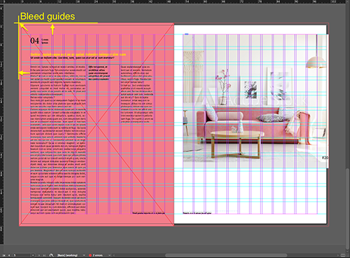
Now, let's look at our Bleed and Slug options. What exactly is a bleed area? A bleed is like adding an extra bit of margin beyond the edge of the document to insure that an image placed up to the very edge of the page will print correctly even if there's a slight misalignment during the printing or trimming process.
 |
Question: Is a bleed setting necessary to reproduce the sample above?
Answer: Yes, because the photo extends off the edge of the page. |
For instance, in the example below, the designer has placed several images up against the very edge of the page. Note that these images are placed a little bit beyond the page edge, up to the bleed area, which is shown by a red line on the document. Although the actual bleed area will be determined by the commercial printer, it's usually between 1/8 to a 1/4 of an inch.
 |
In this example, the fill bleeds off the edge of the page. |
Okay, back to the New Document dialog. Take a look at the chain icon to the right of the bleed settings—this is called the "Make all settings the same" option.
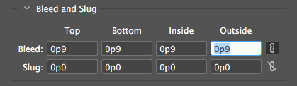
When activated, anything you enter in the first field will automatically propagate to all the remaining fields within that section. Although this option is turned on by default for the bleed, it is not for the Slug options.
The slug area holds printer information. It can be any instruction, comment or information you need the printer to have in order to do his job correctly. The slug area is discarded when the document is trimmed to its final page size so don't be too concerned with the font style you use—just make sure your printer can read it!
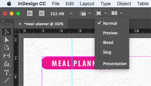
A neat little feature that we now have in InDesign CC (sorry, CS6 users) is the ability to preview the new document before we actually create it. Note that once you turn on the Preview checkbox you can't turn it off unless you cancel out of the dialog.
Document Setup
All right, so our settings are looking good—time to click OK. This will take us into our new document.
Uh oh, we just got a call from the printers. Looks like we need to change our bleed settings—serves us right for not checking with them first! We have a special dialog for this, and it's called Document Setup (you can find it by selecting File > Document Setup). You'll notice it's similar to the New Document dialog—we can use it to tweak overall document settings after a document has been created. Change the bleed settings to 1p6 picas and click OK.
CS6 users, click More Options to see the bleed settings.
 |
1p6 = 0.25 inches, so we've got a bleed area here of 0.25 inches all around the document. |
Margins and Columns
You probably noticed when you invoked the Document Setup dialog that it is significantly smaller than the New Document dialog, and by this I mean that there are fewer options available. The reason for this is that after you create the document, InDesign will give you page- or spread-level control over your document. So your margin and column settings can change depending on which page or spread is active.
Back when we created this document, we started with three columns. As expected, we have a three-column configuration on all the pages. But what if we want for the first page to simply have one column instead of three? No problem! Follow these steps:
 |
|
 |
| |
-
Make sure page 1 is selected in the Pages panel.
-
Go to Layout > Margins and Columns. (Note that this command is appropriately placed under the Layout menu, because any changes we make here will alter the design or layout of the document).
-
In the Margins and Columns dialog (as seen in the screenshot below), change the number of columns from 3 to 1.
|
|
 |
|
 |
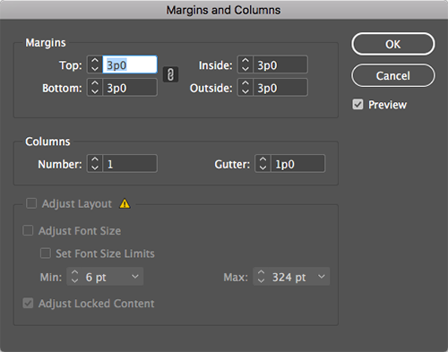 |
Don't worry too much about the alert icon next to Layout Adjustment. We'll cover this feature later in the course. |
As a result, since we had page 1 selected in the Pages panel, the modifications we made have been applied to only page 1, leaving the rest of the document untouched. This gives us granular control over layout of each page in our document.
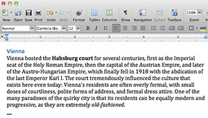 |
We'll start with text from a Word document that's already formatted—which is usually how designers get text, but that's not necessarily a good thing! |
Arguably the most important bit of content you can have in any document is text, and InDesign gives you two ways to add text to the page. You can either write text directly in InDesign, or you can do what most people do, which is to write your text in a popular word processing application and import the text into InDesign.
The main problem with using Microsoft Word or any other word processor is that you're very limited in the way of page design. A word processor pretty much expects you to create a single column of text that flows from one page to the next.
Well, this is where InDesign comes in to save the day, because in the way of layout and design, there's really not much that you can't do. The real genius comes from the fact that each letter, word, sentence, or block of text is inside a free-floating box or frame that you can place anywhere on the page. With this method you can quickly build as complex a design as your little heart can take. As a matter of fact, you're not limited to just a box shape or a rectangle. You can use an ellipse, a polygon, or even a star to contain your text, graphics, images!
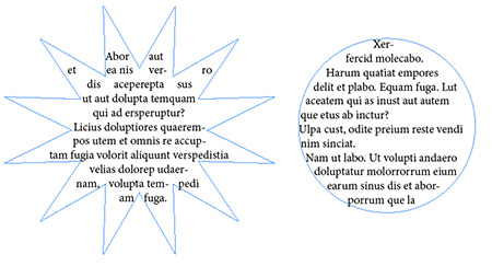 |
Text frames can be any shape you want, though the more extravagant shapes often require a lot of fussing to make the text look good. |
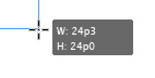
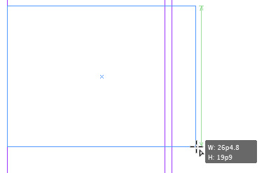
Are you ready to try it out yourself? With your document open, select the Type tool  from the Tools panel. In the middle of the page, click and drag to create a text frame approximately 24 picas tall and wide. Pay attention to the Smart Dimensions feedback that will tell you the width and height as you draw the frame.
Smart Dimensions feedback is a feature that allows live feedback when you're creating, resizing, or rotating page items. It will show you the size of what you're creating, and it will try to guess your intentions and match them with similar objects on the page.
 |
Smart Dimensions feedback nudges you in the right direction with your page items. |
As soon as you let go of the mouse button you see that InDesign places the text cursor inside the frame as if to say, "I'm ready for you to begin typing or placing text." Press Ctrl-2 (PC) or Command-2 (Mac) to zoom in 200%. This should make it much more comfortable to see what you're doing. Finally, it's time to begin typing. We're going to write "The Very Best of Europe", which happens to be the title of our piece.
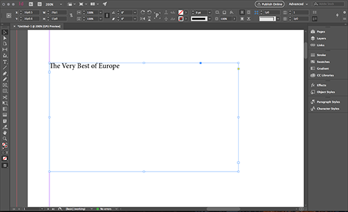
Once you're done typing, press the Esc key. This not only takes us out of text mode, but also makes the Selection tool  active, which is incredibly useful. As a matter of fact, we'll now use the Selection tool to place the text frame elsewhere on the page.
With the Selection tool active, click and drag the text frame. If you look closely, you will see control handles in the corners and sides of the frame. You can use these to rescale the frame and shape it however you want. Grab the bottom right control handle and scale down the frame until most of the title is hidden.
Now the text frame shows a red plus sign in the bottom right telling you that there's overset text, which means unseen text that has gone beyond the boundaries of our frame. This icon is called the out port. Remember this! You'll find yourself using it a lot when you start threading (or linking) text between frames.
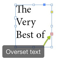 |
The red plus sign indicates that there's overset text. |
Importing Text From Word
It's time to get serious with the copy we're using on this European city article. So, use the Selection tool to resize the text frame so that the whole title is showing, and also make sure that you allow enough space for a paragraph or two. We'll get these paragraphs from a Word DOC you can find inside your Lecture One downloads. Here's how we'll insert them:
|
|
|
| |
-
With the Selection tool active, double-click inside the text frame.
-
Insert a paragraph return after the title.
-
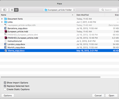
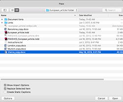
Go to File > Place and browse to vienna_copy.docx from your Lecture One downloads. Click Open.

Your text is now "loaded" into the Selection tool and ready to be placed. If you look closely, you will see the name of the file as well as the text for the first paragraph displayed. This is a handy feature for keeping track when you're loading and placing a lot of different text content.
-
Resize the frame as needed to avoid overset text.
|
|
|
|
|
Congratulations! You have imported your first Word document. Not to be ignored is the fact that InDesign placed (imported) the text, which has the effect of bringing along the text's formatting. This is not necessarily a good thing, since most of the time we'll be formatting the text ourselves. Hence, the next step would be to strip the text of any unwanted formatting.
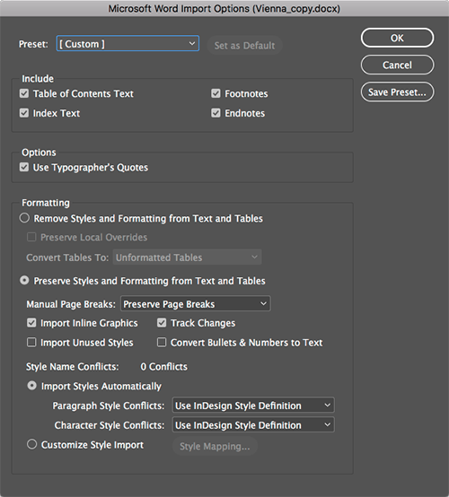
Let's try a different approach for importing text from Microsoft Word. Delete the text you imported by selecting the text frame and pressing the Delete key. Then, follow the same importing steps above, but this time we're going to change one option in the Place dialog: we're going to turn on Show Import Options.
As a result, we now have a window full of options that we can turn on and off to import exactly what you want from the text file.
 |
Different kinds of files have different import options. Here you can see the many options we have for changing how we import Microsoft Word files. |
The first section of this dialog allows you to toggle things like footnotes, endnotes, and so on. The last section allows you to preserve Word's styles and mesh them with any InDesign styles you might have created in the document.
But what I really like is to turn on the option called "Remove Styles and Formatting from Text and Tables," essentially stripping the text of any styling. I also select "Preserve Local Overrides" which allows any local (or manual) formatting—such as added italics or bolding—to be preserved. Finally, when we place the text and compare it with the previous import, we're able to see that the word Vienna is no longer formatted, but that local formatting such as bold and italic in the main body of the paragraph has been preserved.
Using the Story Editor
So now that you've got your text, what are you going to do with it? Once inside InDesign, text can be edited, formatted and manipulated any way you like. The Story Editor is a special place inside the application that allows us to work with pure text without the distractions of images, overset text, or any other page element. It is a floating window that previews only the text within a particular frame or in frames that are linked together.
To get to this special place, we need to select the text frame or insert the cursor inside a story. I personally like this second option, because it allows me to quickly find the text I need to edit. Insert the text cursor inside the text frame and go to Edit > Edit in Story Editor. It makes all the sense in the world to look under the Edit menu because, after all, we are editing text.
Inside the Story Editor, you'll see two columns. The narrow column to the left shows the paragraph styles and a vertical depth ruler that indicates how much text is filling the frame, while on the right you have the text itself displayed without layout or formatting distractions.
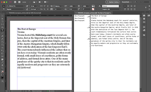
Before we make the necessary edits, let's do a little house cleaning. First, in the Application bar, select the 2-Up from the Arrange Documents menu button  . Make sure to select the portrait layout style 2-Up (two vertical rectangles side by side) and not the landscape style (two horizontal rectangles).
Now that both windows are side by side vertically, enabling us to compare to get a good view of both our raw text and our live layout, we'll make an example edit. Change the title from "The Very Best of Europe" to "The Best of Europe". As you can see, any changes you make in the Story Editor go live on the layout view as well. Go ahead and change the title back to "The Very Best of Europe." Finally, close the Story Editor window.
Text is at the heart of InDesign's power and flexibility, and in the next lecture we'll get our feet wet with the intricacies of character and paragraph formatting. But for now, let's recap the basics of placing text into a document:
|
|
|
| |
-
Text Frames: Use the Type tool to create a text frame of a specific size. The frame can be reshaped and resized using its control handles, and any text that doesn't fit in the frame (called overset text) can be accessed by clicking the out port (a + sign in a red box) in the corner of the frame.

-
Importing Options: Make sure to click Show Import Options when incorporating text from a document that's been formatted in a word processor. Take advantage of the Import Options to strip character and paragraph styles and preserve only local formatting (bold, italics) so you'll have less to clean up later.
-
Story Editor: The Story Editor helps us edit text without the distractions of the layout. It features two columns: the left shows the paragraph styles and a vertical depth ruler, while the right shows plain text without formatting. Changes in the Story Editor go live immediately in the layout view.
|
|
|
|
|
Text might be the heart of InDesign, but it's only the tip of InDesign's capabilities. Like text, images and graphics should not be thought of as elements that exist independently in a document. Just as we use text frames to contain text, we must place any imported image or graphical element in a graphic frame.
 |
InDesign allows you to contain graphics in frames, a technique demonstrated in this clever layout from Domino magazine. |
There are a couple of tools that help us in this department. For example, we have the Rectangle Frame tool  and the Rectangle tool
  , as well as the alternate tools underneath. These are all frames in various shapes that can serve as containers to images and graphics, the same as we discussed for text.
Creating a Graphic Frame
Let's begin by drawing a frame in the bottom half of the page. This is where we'll place the image.
Select the Rectangle Frame tool and click and drag to draw a frame. The size doesn't matter much now, as we're going to resize it according to the margin guides later.
 |
My first graphic frame is a random size, but note the feedback InDesign gives with that green line: that's telling us our new frame is the same size as another frame on the page. In this case, it's matching the text frame above it. |
Now choose the Selection tool and select the frame you just drew. With the frame selected, press Ctrl-D (Windows) or Command-D (Mac) to place an image inside the frame. The Place command works essentially the same as it did when you placed text. Place the palace.jpg image from your Lecture One downloads (found in the Links folder). Notice that the image has been placed inside the frame that was selected. (If you're using the latest version of InDesign and this is your first time placing an image you will be presented with the New Features widget that tells you about the new Content Aware Fit option. This feature automatically fits an image inside the frame based on the image content and frame size.)
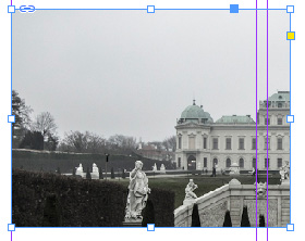 |
Now our graphic frame has an image in it—or a part of an image at least. We'll fix it soon! |
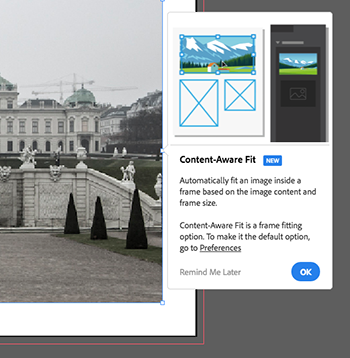 |
With the new Content Aware feature, you can fit an image inside a frame based on its content. |
As with text frames, graphic frames come equipped with control handles that we can use to resize and reshape. Go ahead and make sure that the frame sides extend all the way up to the margin guides (left, right, and bottom). As you resize the handles with the Selection tool, you probably notice that although the size of the frame is changing, the image itself stays the same.
This is a very important concept to grasp. There are two parts to a placed image: the frame that holds it and the image itself. When you resize using the control handles, you are in, in fact, cropping the image.
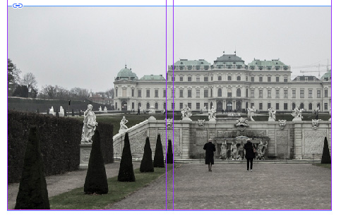 |
Our image now extends all the way between the margins, but it's still not the whole image. Don't worry, we're getting closer! |
However, there is a way to manipulate the image itself. Hover your cursor over the image, and as you reach the frame's center, you will see that the cursor changes to a hand. Furthermore, a donut shaped widget known as the Content Grabber appears.
Click the Content Grabber to select the image. InDesign will display a brown frame around the image. This indicates the actual dimensions of the image inside our frame. Now you can resize the image by using the control handles on this brown frame. To go back to selecting the frame, double-click the image.
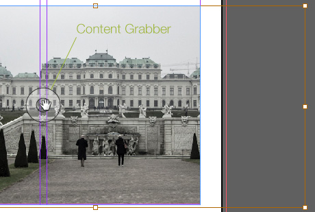 |
The donut-shaped widget known as the Content Grabber appears when you move your mouse to the center of the image. We'll use the Content Grabber and the brown frame that appears around the image to fit our image into our frame. |
Practicing the Process
Here is what we have so far: text placed, an image at the bottom, a full page's work! We wouldn't want to show this European cities article to our art director yet, as there's still a lot more to be done to make our layout attractive, but for now, congratulations are in order. You have completed your first placement of text and images in an InDesign document!
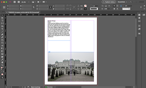 |
It might not be the prettiest thing you've ever seen, but it demonstrates the bread and butter of InDesign work: a page of properly placed text and graphic frames with content inside them. |
Now that we've completed the first page of our article, it's time for you to practice the process again on pages 2 through 4. In your Lecture One downloads, you'll find Word DOC files and pictures for three other cities: London, Barcelona, and Madrid.
Place the remaining text files and images on pages 2 through 4 of your InDesign document to finish the basic structure of the article. Keep in mind: there should be one city per page. To check your work, I've included a finished European article INDD and IDML files in the Lecture One downloads.
Save Your Work
Important: We're going to keep working on this article in the next few lectures, so let's save it. Choose File > Save As and save your article with the default options. This will save it as an INDD file. Remember, you can't open INDD files created in a newer version (such as CC) in an older version (such as CS6). But you can open older INDDs in a newer InDesign.
If you have a client that owns an older version of InDesign and asks you to back-save your current InDesign CC file to an previous one, go to File > Export > and under Format select InDesign Markup (IDML). A file with an IDML (InDesign Markup Language) extension can be opened in versions of InDesign CS6, CS5.5, CS5, and CS4.
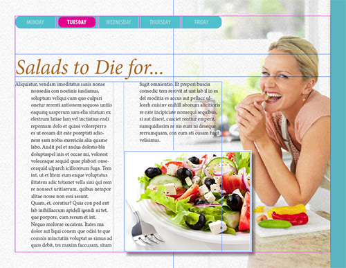
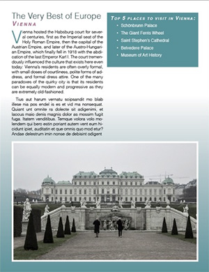
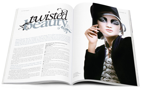
Just to give you a little taste of what we'll work toward with this document in the next lecture, let's end with this preview (below). Are you excited yet?
Below is a short video tutorial demonstrating image placement, so you can see the difference between image frames and image content in action.