You've been hired by a new travel agency to design their website. Discover Europe's target audience is young and hip, and they would
like their website design to reflect that, both in function and design.
One thing they definitely want is a responsive site: their audience consists of savvy young travelers glued to their smartphones, and they want a site they can pull up on the go.
 |
| If you want your site to appeal to young travelers, it has to look good on the devices they're familiar with! (Image credit: Ocean Home). |
Discover Europe has provided the text content and a logo, but they would like you to choose the photography. They've outlined some requirements
below.
Review the content in the europe folder. The images folder includes the Discover Europe logo in six color variations. Choose a color, referencing the link to see a CSS Mania color sampler page.
If you would like to modify the logo, open the logo.eps file in Photoshop or Illustrator. Feel free to modify the logo or completely redesign it! In fact, I encourage you to create an original logo design. If you use this project in your portfolio, you'll be able to say that you also designed the logo.
Text
In the text folder, you'll find 10 HTML files: a home page, eight country pages, and a contact page. The footer.html file contains footer text which should be included throughout the site.
Photography
Each page should include a
corresponding photo. Search for photography on Flickr. For best results, modify your search using two or three keywords. For example, "Paris Eiffel Tower" or "Scotland cliffs". Choose "All Creative Commons" in Flickr's Advanced Search settings. Toggle between "Relevant" and "Interesting" at the top of the search results.
 |
Many Flickr users have chosen to offer their work under a Creative Commons license. You can browse or search content under each type of license. |
Decide on a photography style. You might search for gorgeous panoramic landscapes, or candid, casual tourist snapshots. Choose at least one photo for each page of the site.
Use Photoshop to resize and crop your photo selections. The image sizing should be consistent from page to page.
Optional: Experiment with Photoshop actions.
Social Media Icons
The social-media folder includes icons for Facebook, Twitter, Tumblr, and Instagram. You can add these icons anywhere in your design (but most likely, the footer).
You'll be using a Bootstrap layout for this project, so head to http://expo.getbootstrap.com/ for inspiration. Study how each Bootstrap website handles the navigation element, logo placement, background images, font-styles and grid layout elements.
1. Create your Bootstrap layout using the installation method of your choice:
 |
|
 |
| |
- Option 1: Dreamweaver's Dreamweaver's New Document dialog
- Option 2: Download the Bootstrap framework
- Option 3: Link to the Bootstrap framework on the CDN (content delivery network)
|
|
 |
|
 |
For this project, you should save your html file as index.html in your europe folder. Save you custom style sheet as custom.css in your europe folder.
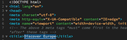
2. Enter "Discover Europe" as the document title.
 |
| Descriptive, accurate page titles are important for search engine ranking. |
Typekit Fonts
Typography is an important element of any website, so we'll start our design by choosing the perfect font.
In the early days of the web, designers were limited to working with system fonts like Helvetica, Arial, and Verdana. Today, you have thousands of custom web fonts to choose from.
Custom web fonts are a great thing, but they require extra setup. You can't just choose any font from your computer. You need to use an especially designed web font, prepared in special formats and licensed for use on the internet. Most importantly, you need to include a script in your HTML file to load the custom font in the user's browser, just like images and other resources are loaded.
Head to typekit.com to search for a font for the Discover Europe page content. Choose the Paragraphs option (this font should be legible in small paragraph text as well as the larger headings). "Include web-only families" should be checked.
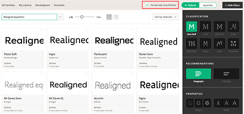
Choose a font and click to see a list of font weights and styles available within the font family.

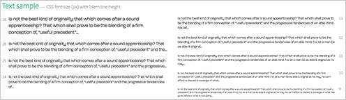
The DETAILS tab provides text samples so you can see how the font looks in paragraph format.
When you've found your font, click the "WEB USE: ADD TO KIT" button.

Click "CREATE A KIT".

Name your kit "discover-europe" and enter your domain name (the URL of your home page). This is an important step – the font won't load if the kit isn't registered to a particular domain. You don't have to type the http protocol before your domain – use the format "example.com".

If you've set up your server to use sub-domains, type a wild card (*) at the beginning of the domain to include all the sub-domains of the site, e.g. *.domain.com.
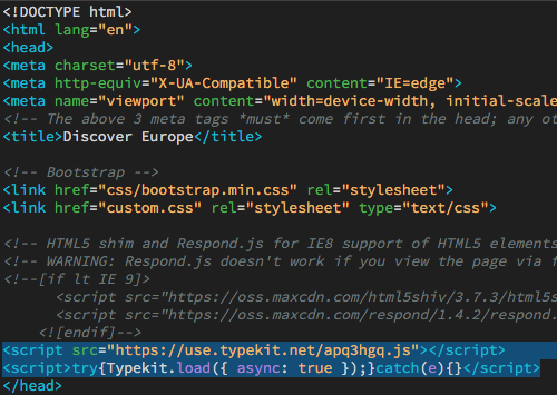
Copy the embed code.

Open Dreamweaver and switch to Code View. Paste the code into the document head, directly before the </head> tag.
Jump back to the Typekit window and click "Continue" to access the Kit Editor. If you've lost your Typekit window, you can return to the Fonts page and choose "Kits".
Select the weights and styles that you'll be using in the Discover Europe site. Choose one font weight for normal paragraph text and another weight for headings. The Discover Europe site does not include italic text, so you can uncheck the italic options to optimize the download.
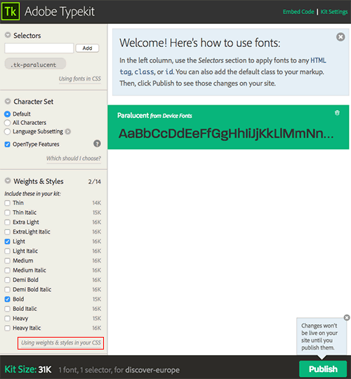
Click the "Publish" button to publish your kit. Typekit will notify you that it takes a few minutes to distribute the kit. In the meantime, you can do some CSS work.
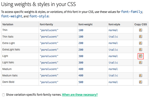
Click the "Using weights & styles in your CSS" link. Find the font-weight that you've selected for paragraph text and click the "Copy CSS" icon.
Back in Dreamweaver, toggle to the custom.css file. Insert your cursor at the top and type body {.
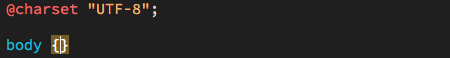
With your cursor planted between the two brackets, go to Edit > Paste.
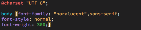
Return to your kit editor. Find the font-weight that you've selected for heading text and click the "Copy CSS" icon. Back in Dreamweaver, type h1, h2, h3, h4, strong {.

Edit > Paste the styles you copied from Typekit.

Toggle to Live View to see your fonts. If they haven't appeared yet, take a coffee break and come back. If you are still having trouble, read these guides:
Building the Home Page
1. Working in the Developer Workspace, insert your cursor into the document body. Use the Snippets panel to insert a Bootstrap navbar. Use the DOM panel to delete the left-aligned list and the search field.
Duplicate the list items, including the following links:
| England |
england.html |
| France |
france.html |
| Germany |
germany.html |
| Ireland |
ireland.html |
| Italy |
italy.html |
| Scotland |
scotland.html |
| Spain |
spain.html |
| Sweden |
sweden.html |
| Contact |
contact.html |
Select the "Brand" filler text and hit Delete. Type "img" and hit your Tab key. Dreamweaver will write an image tag for you.
Browse to the images folder inside the europe folder. Select the logo image of your choice. Enter "Discover Europe" as the alt text.

Set the "navbar-brand" to link to "index.html".

View the page in Real-time Preview. The logo is too big to fit the navbar so you'll need to make some adjustments, following the same process as the lesson.
2. Insert a "container" for the page content.
Expand the Files panel and open the index.html file from the text folder. Select all the text that is formatted in paragraph tags (don't select the document head or the body tag — just the paragraphs!), and Edit > Copy. Toggle back to your Discover Europe home page. Edit > Paste the paragraph content into the container div.
3. Insert your choice of photography. If you want the image to fill the width of the Bootstrap container at the largest screen size, use Photoshop to size the image to 1140px wide.
4. Insert a footer, including the content from footer.html and the icons from the social-media folder.
Styling the Home Page
View your design in Real-time Preview as you style page content. Start with the extra-small size, then make adjustments in the small, medium, and large sizes as necessary.
1. Use Bootstrap's helper classes to align content.
|
|
|
| |
- Make large images responsive by adding the "
img-responsive
- If you need to float an image to the left or right of the content, apply "
pull-left" or "pull-right".
- If your floated image overflows the content area (this sometimes happens) clear the float by adding "
clearfix" to the parent element.
- If you need to center an image, apply the "
center-block" selector.
- If you need to center text, apply the "
text-center" selector.
|
|
|
|
|
2. Customize the default Bootstrap styles to suit your design. This may include changing the background color of the navbar, adjusting the padding around the logo, changing the link colors, or any other modifications you wish to make.
First, identify the style that is currently formatting the element using Google Chrome's DevTools. Then, copy and paste the style into your custom.css file and modify the properties you'd like to change.
3. Preview in a browser and resize your window to see how your layout adjusts to different screen sizes.
If you'd like to see how your site looks on an actual phone or tablet, click the Device Preview icon on the bottom of the Document window. Capture the QR code using a QR app like "RedLaser" or navigate to the provided URL.

8. Keep an eye on the Status Bar along the bottom of the document window. If you see a green check mark, your code is in good order.

If you see a red x, there is an error in the code.

Click the red x to open the Output panel for a detailed list of errors.

Building Subpages
Use the home page as a springboard to create the other pages. Go to File > Save As. Name the new page england.html. Replace the page content and save. Repeat for the other pages.
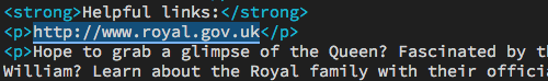
Each of the country pages includes a "Helpful links" section. I'd like you to format the "Helpful links" section in a way that stands out from the rest of the page content. You may insert it in a side column or in a box at the bottom of the page.
Wrap each URL in a link tag so it functions as a link.
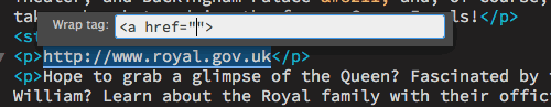
First, select the URL and Edit > Copy:
Hit Command-T on a Mac or Control-T on Windows. Type a href then hit your Return key. Dreamweaver will insert your cursor inside a set of quotes:
Edit > Paste the link, then hit Return.
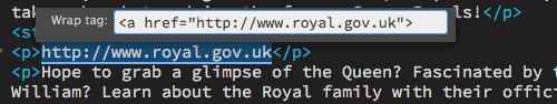
Dreamweaver will wrap the link for you, providing the opening and closing link tags.

The contact.html file contains only a short intro paragraph. You will add a contact form to this page in Exercise 5.
Preview your site in a browser, testing the links to make sure everything is working.
Post to Your Web Server
For this course, you are required to have a Web space for presenting your work online.
Your host should have Dreamweaver FTP capabilities
so you can easily transfer your files within
the Dreamweaver environment.
If you don't have a host yet, here are a few recommendations:
|
|
|
| |
- Site5 and GreenGeeks offer excellent service and customer service. The pricing plans vary depending on the length of the contract. Site5 charges $12.00 per year for domain names; GreenGeeks includes the domain for free with yearly subscriptions. Compare both plans to find the best option for you.
- Other options for various tiers of free hosting service include Xtreemhost, Byethost, and Uhostful.
|
|
|
|
|
Click here for a refresher on how to define your site and post files to your web server using Dreamweaver.
Summary
When your site is finished, briefly answer the following questions:
1. How did you modify the design in the extra-small, small, medium, and large media queries
2. Did you use any new HTML5 elements?
3. Did you use absolute positioning?

 Create
a series of pages based on given
content and guidelines.
Create
a series of pages based on given
content and guidelines.
 Produce
10 HTML pages for Discover Europe using supplied content and following client
guidelines.
Produce
10 HTML pages for Discover Europe using supplied content and following client
guidelines.