You'll tackle this exercise like any design project for a client. First we will gather the information we require to satisfy the needs and wants of our client and come up with a winning brochure design. So, who is our client? Our client is a major publisher—think Condé Nast—preparing to launch a new magazine to market. It's a travel magazine called Vacation, and it will be published and distributed to both print and digital formats.
Our client, who will go by the name of Publisher X, wants to promote the Vacation brand by creating a brochure all about the magazine. One major concern is that there was no budget set aside for this marketing venture. That means no money for any frills.
So, we'll need to think of creative ways to get more bang for our buck. To save some money, we'll make a four-page brochure on standard letter sized paper (8.5" x 11"), and we'll fold it using a two-fold configuration. This will give us the added benefit of being able to use the brochure for mass mail marketing as well.
To accomplish this last goal, the client wants the last page of the brochure to include a space for the customer's address, their return address, and a stamp. All the other design choices are up to you!
Before you begin, if you would like some extra tips and tricks—including more on keyboard shortcuts, document presets, and templates— read InDesign Tips for Power Users.
Setting Up the Document
The very first step in this process is to create a brand new document. Do you remember the keyboard shortcut for this? If you need a refresher go to File > New > Document and you will see the shortcut to the right of this command (Ctrl-N on a PC or Command-N on a Mac).
Set up your new document as follows:

If you're using a previous version of InDesign you may see a "Legacy" dialog box. In this case, setup your new document as follows:

Make sure you turn on the Preview box at the bottom of the New Document dialog so you can see what the document will look like before you commit to the changes. If you would like to save a document preset with these settings for later on (which is a good idea), name your preset "Two-fold".
Sketching Your Design
Now that you've created the basic raw document structure, it's time to begin imagining what your design might be. Usually this stage is not done on the computer, but on paper. The sketch can be as simple or as complex as you like.
This technique allows you to focus on the four most important design principles: contrast, repetition, alignment, and proximity—without getting distracted by less important elements like typography choices or even color in the early stages.
If you want to learn more about these design principles, The Non-Designer's Design Book by Robin Williams is a great read. (No, not that Robin Williams.)
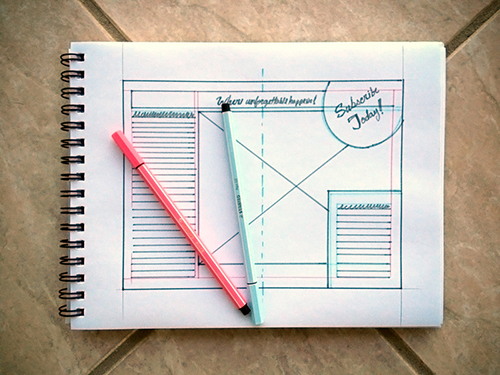 |
A simple sketch may be all you need to get an idea of what the final design will look like. |
To read more about different kinds of rough draft processes useful in graphic design, read
Thumbnails, Roughs, and Comps, Oh My!.
Although brochures can come in many shapes and sizes, there are some common techniques and principles that can mean the difference between a good brochure design and a great one.
One important design principle is emphasis. This is where you establish contrast by determining which elements are important and which are not. Important elements should be emphasized through design. Establish a clear hierarchy of information so the reader can scan the important points and understand what the brochure is about. Start to think about typography, font size, and spacing to establish hierarchy.
You'll also want to repeat various elements, colors, or fonts to create a unified look to the brochure. Proximity will also be an important consideration. Try grouping items that are similar close together. This will establish relationships between page items.
Another important consideration is making sure you're balancing design and functionality. What is the main goal of this piece? Of course, you want to make it look good, but what good is a beautiful design if it never reaches its destination? Because the main objective of this piece is to use it as a self-mailer, you need to make sure it complies with USPS regulations. Neglecting this aspect of your design will cause delays and even ruin the most beautiful brochure.
Because the United States postal system is very strict on what it allows to pass through the mail, you’ll need to make sure there are no design elements (logos, graphics, background images, etc.) in the area on the mailing panel where the address will go.
If you want to find out more about this topic, check out the following article about "6 Direct Mail Mistakes That Could Cost Thousands".
Finally, when it comes time to decide on typography, limit your fonts to only two or three at the most. Brochures created by new designers usually suffer from having way too many fonts. (Note that while I want you to start thinking about text formatting early on, it's in Exercise two that you will get a chance to polish and finish this brochure.) Use the following elements to design your brochure:
Gathering Materials
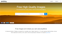 |
Use free stock photography to find fun, surprising images for your brochure. |
If you think about it, sketching your layout is essentially a process of deciding how to lay out your frames. Which means the next step is to gather the content that will go inside those frames. I've provided you—as a client would—with the primary copy that will go inside the brochure. But the rest is up to you.
Download the exercise ZIP file containing a DOC of the text, the brand logo, and a few images that will go inside the brochure. Regarding the copy, you will notice that it comes in a Word document that is marked off by section: the title, tagline, two sections, supplemental text (this should go somewhere in the interior of the brochure, most likely near the beginning), and the required callout box (which should say "Subscribe Today!").
Choosing the right supporting design elements—in this case, typeface(s) and supporting images—is very important to a professional final design. For the first exercise, don't worry too much about typography, as you will spend more time choosing typefaces in Exercise Two after you learn about character and paragraph formatting in Lecture Two.
But it would be good to start thinking about what images you need. Although I'm including a few images, feel free to use your own. If you do decide to choose your own, consider using images from various sources that allow use in commercial projects such as Pixabay.com. Look for bright, clear images that are inviting without being distracting. I encourage you to make choices that go beyond the generic vacation tropes of beaches and umbrella drinks—Vacation is a magazine that wants to stand out!
Want to see an example? Here's a document that you may use for reference. Take note of how it's been built according to document specs and how it manages content at the same time it meets USPS regulations. Download the file using this link. While you may use this document for reference, I'm expecting you to come up with your own unique design.
Preparing for the Next Exercise
Important: The brochure you create in this exercise is the first step in a two exercise process. In Exercise Two, you'll take the basic brochure you create here and enhance it using the skills you'll learn in Lecture Two. This doesn't mean you shouldn't make every effort in this exercise to produce a finished, high-quality product—you should! Think of this stage as the brochure you present to your creative director before the client sees it.
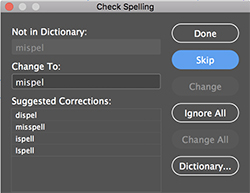
Check Spelling
As you near the completion of your project and you begin to prepare your files for publication, there is one very important step that you should get in the habit of doing. Check the spelling in your document by going to Edit > Spelling > Check Spelling, or simply using keyboard controls Ctrl+I for PC or Command+I for Mac, and the function will scan the text in your file and alert you of any questionable spellings. It works the same as most word processing applications.
You can also increase the vocabulary of your copy of InDesign by selecting Dictionary and adding obscure words that you commonly use.
Saving Your Work
Before you present anything to your client, you will need to convert your brochure design into an appropriate format for output. Although you could send the original InDesign document to your local commercial printer, this approach often leads to problems and unpredictable results. For one thing, the InDesign file would need to be accompanied by the entire supporting cast, and by that I mean all of the files that make the InDesign document possible. This includes all of the font files, all of the linked images and graphics, and any other files that may be linked to the document.
One way to avoid this mayhem is to simply create a PDF file. A PDF (Portable Document Format) has all the ingredients it needs to ensure a successful output whether it is print or digital. Rest assured that InDesign has the brains to create a PDF compatible to any output scenario. Why? Because the company that invented the PDF format is the same company that makes InDesign! It is our job, however, to point InDesign in the right direction. And we do this by picking the right PDF preset. Follow the steps below:
1. From the file menu select Export.
2. Browse to where you want to save the exported PDF document.
3. Choose "Adobe PDF (Print)" from the Save as Type (Windows) or Format (Mac) dropdown menu. Observe that there is also an Adobe PDF (Interactive) format. This format will be used when exporting a PDF file that has interactive elements in it—hyperlinks, bookmarks, etc.
4. Click Save.
5. In the Export Adobe PDF dialog, from the Adobe PDF Preset choose "PDF/X-1a:2001" preset. This preset will create a PDF that in 99% of the cases will meet the print requirements for a commercial printer. What's more: if you happen to have any RGB colors, this preset will convert them to the CMYK color model, ensuring a hassle free experience for both you and your printers.
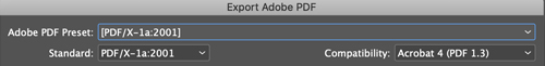
6. Click Export to accept the modifications.
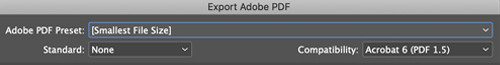
7. Repeat the process to create a PDF for digital distribution. The only difference is that in this case we want a slimmed down light file that can be uploaded and downloaded quickly. Think of email distribution. The "Smallest File Size" PDF preset is just what we need for this job.
For your submission, make sure to include both PDFs and the original INDD file, so your instructor can examine your workflow and process.
Reminder: if you need to back-save your current InDesign CC file to a previous version, go to File > Export > and under Format select InDesign Markup (IDML).
Finally, make sure to keep your INDD file for Exercise Two, where you'll work on polishing your brochure and preparing a client-ready design.