Part I: Two-Column Layout
For this part of the assignment, you will need to create a two-column layout, supplying your own content from a real or fictional Web site. I would like you to design the home page of the site, using three divs—one for the header, one for the navigation menu, and one for the main content, like so:
 |
A footer is optional, and
your menu can float either left or right. |
Recap the main properties used for CSS positioning in the following Review Kit before you begin your page:
1. Mark up the page
Start by the marking up the page content in HTML5. You'll need a header, 4-8 navigation links, and at least two paragraphs of body text.
To create "dummy" navigation links to other pages in
the site, enter a pound sign (#) instead of
a URL like so:
<a href="#">News</a>
<a href="#">Events</a>
<a href="#">Contacts</a>
This will create active links, but prevent the 404 missing page error when people click on your links.
Then wrap your main page sections in HTML5 sections and/or divs. Below is an example using only divs:
<div id="header">
<h1>Header text</h1>
</div>

<div id="menu">
<p>Navigation menu
...</p>
</div>
<div id="main">
<p>Body text
...</p>
</div>
Validate your page before you go any further! http://validator.w3.org
2. Basic CSS layout
All set? Create a link to an external stylesheet in the head of your page, like so:
<!DOCTYPE html>
<html lang="en">
<head>
<title>My Web Page</title>
<link rel="stylesheet" type="text/css" href="css/style.css"/>
</head>
<body>
<p>Lorem ipsum dolor sit amet, consectetuer adipiscing.</p>
</body>
</html>
Now create a .css document in a local folder called "css" and
make some basic styling decisions. (Remember
to match the name of your CSS document with
the name in the page head.)
Next... you know the drill! Choose font-family
styles/sizes for headers and paragraphs,
adjust letter-spacing
and line-height as needed, and set background
color and text color as desired. You can
also add specific styles for lists, links,
and more, as well as borders, padding, and
margin to box-level elements.
Tip: Using an external stylesheet,
you can simply adjust the styles, save your CSS document, and refresh
your HTML page in the browser to see your changes implemented.
3. Two-column layout
Now you'll create a two-column layout by specifying a width for either the "menu" or the "main" div and floating it left or right. I would recommend floating your menu to the left since you floated the main section to the left in the lecture.
As a reminder, floated elements are positioned vertically within normal flow, but are horizontally pushed all the way to the left or the right of the containing element. Content that follows a floated element in the markup then wraps around it. If the content following the float is too big (too wide, for example) to fit next to the float, it will appear below the float.
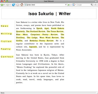
You will have some design choices to make. Will your columns be fixed or fluid? Make sure your header is prominent, your text is readable, and your navigation is clear. An effective home page template could be used throughout a small site. I'm looking forward to seeing your page.
Here is a screenshot of a two-column layout built using these principles:
4. Test your site
As always, remember to test your work in multiple browsers.
 |
Test your work in Firefox and Safari before Internet Explorer. |
Still unable to get part of your Web design working? Remember to check out Christopher's Web Development Troubleshooting guide for more step-by-step advice on how to get your CSS to work.
Part II: Pixel Positioning
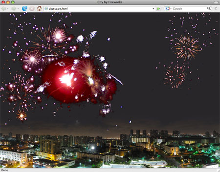
OK, time for some fun. In this project, you'll create an interesting
Web layout that will get you thinking about the benefits of positioning.
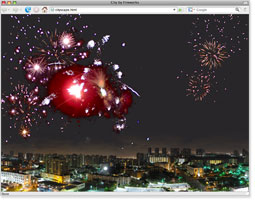
You'll use absolute and relative positioning and floats to create
the dynamic fireworks display layout you see here:
For this part of your assignment, I want you to explore the
possibilities of positioning elements through CSS, but
not in the usual way of taking a box with text
in it and flinging it around the browser
window!
First, I'll walk you through how I created mine. Then I'll have you create a CSS positioning layout of your own. You can set off some fireworks over your own home town or explore some other graphical project idea. All I ask is that your layout demonstrates:
 |
|
 |
| |
-
Use of absolute positioning to anchor one or more page elements.
-
Use of relative positioning to anchor two graphics together.
-
Use of a float to anchor one graphic to the left or right.
|
|
 |
|
 |
The Guide to the City by Fireworks
Building the Graphics
The first step in any solid design project, in my opinion, is to get great photographs. Thanks to the combination of Flickr, the photo sharing site, and Creative Commons, an alternative to full copyright, you can look for photographs to incorporate into your student work at no charge.
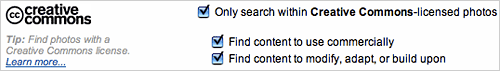
First, do an Advanced Search on Flickr (http://www.flickr.com/search/advanced/)
and enter a search keyword or two at the top
of the page. Then check off the Creative
Common options at the bottom of the search
form: "Only search within Creative Commons-licensed photos," "find
content to use commercially," and "find content to modify,
adapt, or build upon."
The search results look like any other photo search on Flickr's
site. However, the resulting images are licensed so that you can
use these images for your own projects as long as you give a
credit to the original owner.
One way to do that is to provide a text link back to the original photo's Flickr page, like so:
<a href="http://www.flickr.com/photos/teleject/112505959/">
teleject</a>
For this project, I picked out four photos. Three were fireworks
photographs from Flickr user rileyroxx
and I picked one photo that contained a city
landscape at night:
The first thing I wanted to do was lay the foundation for the page.
That meant getting the cityscape image prepared
for inclusion into the Web page. As is, the
photograph is a great shot of Miami at
night. However, I wanted the image to appear seamless when the browser window
resizes.
To do this, I worked in Photoshop. If you have Photoshop, click
here to see how I did it. If not, please use the completed
cityscape image from the exercise5 download folder.
City Placement
With the cityscape done, I turn my attention to inserting the image into the Web page. What I do is set up an HTML page with an HTML5 DOCTYPE.
<!DOCTYPE html>
<html lang="en">
<head>
<meta charset="utf-8">
<title>City by Fireworks</title>
</body>
</html>
Next I add a couple of CSS rules:
body {
background-color: #282629;
margin: 0;
padding: 0;
background-image: url('cityscape.jpg');
background-repeat: repeat-x;
background-position: bottom center;
}
html {
height: 100%;
}
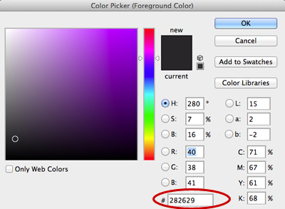
Remember the gradient? The base color that was used to make it is now the
background color in the body selector. You
can find the hexadecimal value for the background
color by double-clicking the swatch color
in Photoshop's toolbar. This will bring up
the Color Picker dialog and the hexadecimal
value will appear in the bottom (be sure to
uncheck the "Only Web Colors" box):
The next two rules:
margin: 0;
padding: 0;
Deal with making sure there isn't any margin and padding around the edges of the entire browser window. These properties come into play later on when we want to move and position the fireworks.
The next rules bring in the cityscape into the Web page:
background-image: url('cityscape.jpg');
background-repeat: repeat-x;
background-position: bottom center;
The first property associates the cityscape image into the background of the body element, and it tells the browser to repeat the image along the x-axis. The background position instructs the browser to set it at the bottom of the page.
The last rule, I have found, is mostly for Firefox:
html {
height: 100%;
}
This rule tells the browser to expand the visible portion of the Web document to include the entire height of the browser window. Since there isn't anything in the HTML document right now, Firefox assumes the viewable portion of the browser window technically isn't, well, viewable. This CSS rule forces Firefox to kick out to the entire height of the browser window, allowing the background image to rest comfortable at the bottom of the page.
So, with our city firmly in place, it's now time to bring on the fireworks.
Matching the Fireworks
The real hurdle for the fireworks images is that they are shown against
an almost-black nighttime sky. A black nighttime
sky is great for viewing fireworks, but the foggy Miami skyline had a nice
brown, musty color on it. So, the trick is to
match the background in the cityscape with
the fireworks.
As with the cityscape, this required some Photoshop trickery. If
you have Photoshop, click here to follow along.
If not, use the finished fireworks images from the exercise5 download folder.
Firework Placement
With the images made, it's time to turn my attention to placing
them on the page. (If you haven't already done
so, be sure to download the example and experiment
with the placement!)
To start, I insert the images into the HTML like so:
<div id="firework1">
<img src="fireworks1.gif" alt="" />
</div>
<div id="firework2">
<img src="fireworks2.gif" alt="" />
</div>
<div id="firework3">
<img src="fireworks3.png" alt="" />
</div>
For the first image, I want to move the fireworks to the right side of the browser window and place it in the upper-right corner. To do this, I set the position property to absolute as well as setting the top and right properties to zero:
#firework1 {
position: absolute;
right: 0;
top: 0;
}
If you recall, using absolute position takes an element out of the regular flow of the Web page. So this means that the other two images will "move up" in the Web page, like they were the first elements placed in the markup.
For the next image, I simply want to move a portion of it off the screen since it's already rather large as it is. So, I set a negative value for the top and left margins:
#firework2 {
margin-top: -100px;
margin-left: -100px;
}
For the next image, which I saved as PNG with robust transparency to give me a good layering effect, I'm going to use relative position. This allows me to move the image from its intended placement in the flow of the document. Specifically for this image, I move the image up 550 pixels by using a negative value and then move it to the left by setting the left margin to 66 pixels like so:
#firework3 {
position: relative;
margin-top: -550px;
margin-left: 66px;
}
That results in the final Web page—a nice fireworks display over a never-ending Miami landscape!
Conclusion
Many techniques—both coding and digital imaging—were used to pull off what appears to be a rather wonderful night in a city.
Being a professional Web designer involves having not only one
strong suit, but being able to utilize different
skills and bring them together in a cohesive manner.
Have fun with this part of the assignment—I am looking forward to seeing what you come up with. Don't worry too much about the quality of the imaging. Your design can be anything within reason, just show me that you can utilize CSS positioning using these parameters:
|
|
|
| |
-
Use of absolute positioning to anchor one or more page elements.
-
Use of relative positioning to anchor two graphics together.
-
Use of a float to anchor one graphic to the left or right.
|
|
|
|
|
 Use CSS to create a two-column layout with three sections: header, navigation menu, and main content.
 Use CSS to create a two-column layout with three sections: header, navigation menu, and main content.