Formatting Tables
There's so much more to CSS than formatting text, but without Dreamweaver,
this can be tricky stuff to conquer. Thankfully, the same Dreamweaver
tools you already know can format your layouts easily and with great
new options.
Tables and content areas can be formatted with stylish borders (not those
old 3D clunkers from the Web's olden days!), backgrounds, and spacing.
And just like text, the rules you create can be applied globally and
changed in a snap.
Layout Tables
When designing a site with tables using HTML, you have a variety of
options: cell spacing, cell padding, border, background color, background
image, and more. There's a lot you can do with these features as evidenced
by the many beautiful Web sites designed before CSS gained popularity.
But with CSS, we can extend these properties visually, and make them
easier to work with.
For example, your Web site might use the exact same table settings for every
image/caption combination. Picture an e-commerce site with pages of
products and their names. CSS will help
you to present the tables consistently on each page, and enable you to make quick site-wide changes when needed.
Sounds familiar,
I know—these
are the exact same benefits of using CSS for text formatting!
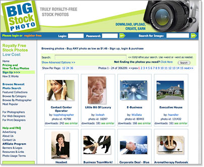 |
| The tables on the Big Stock Photo site get consistent
treatment, like borders and padding, without piles of HTML code. |
To try this out, let's insert a table in our Vintage Style Web page.
Put your cursor in front of the E in the word "Everything" and go to
Insert > Table. Give it two rows and one column, make it 150 pixels
wide, and apply zero cell spacing and padding. Leave the Border field
blank—delete the zero or any other number.
Select the table and set it to align right using the Properties Inspector.
Insert
skybar.gif from
the vintage folder in the first row.
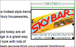 |
| For now, we just have a basic table
and some simple formatting on the caption. |
Type this caption
in the second row: "Retro candy is popular due
to its
quirky, nostalgic packaging." Format the caption text however
you'd like using a new CSS rule.
Now head to your trusty CSS Styles panel and create a new style.
This will be a class style since we don't want it to apply to all
of our tables
(rarely will you have a style you want to apply to every single table
in a site, but if you do, redefine the <table> tag).
Call the
class selector .imagetable and visit the Background category of the Rule Definition
dialog. Here we have the option to add an background image and determine whether or not it will tile, but we'll just use a solid color to
keep it
simple. I picked a light aqua.
Our next focus is the Box category—this
is where the real fun begins. Forget old HTML cell padding and spacing
that
was
always the
same on all sides. Here you can define exact padding and margin measurements
for each side of the table.
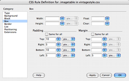 |
| I used plenty of padding on the
top and bottom of the table, and a little on the left and right.
This adds some
space around the image and caption, showing off some of the background
color. The margin adds some space outside of the
table—in this case a few pixels on the left so the text
doesn't run into the table. |
If you haven't seen your handiwork yet, click OK to save the settings.
Select the table, then right-click (Control-click Mac) .imagetable in
the CSS Styles Panel to apply it. Some padding features won't appear
in Dreamweaver, so preview in a browser. When you're
done, double-click .imagetable to open
the Rule Definition dialog again. Ready to add some more properties?
 |
Viewing your table in the browser will display the
padding and margin settings. |
Go to the Border category and check
out the options in the Style menu—you'll find everything from dotted
to dashed to outset to inset. Not only do you have a range of styles
to choose from, but you can
also decide whether to border all four sides of the table or just the top
or bottom edge (or right or left!). You'll also find settings for
the border color and thickness. I'm going to add some aqua dots around
my table to keep up my retro theme.
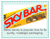 |
| Now that's a sweet table. If your border
does not appear, check that Border is not set to 0 in the Properties
Inspector. This would block any CSS border you create. |
Think of all the layout possibilities that these features open up to
you! This makes the concept of tables much less rigid, since you can now
pinpoint the padding and margins on each side. And you
can add great visual touches like non-tiling backgrounds and fancy borders.
Apply these settings to specific table columns and rows, and you'll have even more
flexibility.
Just remember your table hierarchy and CSS hierarchy from
your basic Dreamweaver days: Styles placed on portions of tables will
override styles placed on entire tables, and HTML formatting will override
CSS formatting.
Imagine what you can do with tabled navigation bars, grids of text
and images, and your overall layouts. But also consider how these
styles can apply to what tables are truly meant for: Data representation...
Data Tables
HTML tables were originally
designed to present data, such as scientific information.
Web designers got creative with tables and were able to use them to create
complex visual designs, often leaving us to forget the table's original purpose.
Data tables are
developed the same way that layout tables are (the code is all the
same, we just use the names to differentiate their purposes). So, needless
to say, you can style them the same way you would any other table.
Let's look at how we can make a data table
suit its purpose using CSS. First, consider the data you are presenting and how to make it readable
for the user. Alternating the background colors helps to guide the reader's eye across each row. You can use border treatments as well. Let's look at
a finished data table and pick apart the choices made:
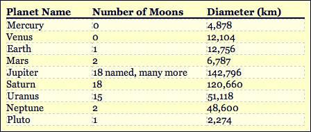 |
This data table is made clear and attractive with some
easy CSS techniques. |
Download
this
page and open it in Dreamweaver. Notice in the CSS Styles panel
that there are three rules at work here:
 |
|
 |
| |
.datatable. This rule
sets the font style and size and also adds padding, borders, and a yellow background color to the overall table.
.dataheader. This rule is applied only to the top row. It bolds the column headers and
adds a
bottom border to separate the headers from the data itself.
.datarow. This rule has been applied to alternating rows of the table to make
the data easier to read. A lighter background color is applied
(overriding the main table color), and a light, dashed border is used. |
|
 |
|
 |
Let's go back to our Vintage Style Source page and take a look at that
neglected left navigation bar. A whole lot of nothing is going on here,
but to make it look cool, all we need is CSS.
Our First ID Selector: #nav
Let's start by creating an ID selector for
the left table cell holding the links. ID selectors can be used to format
specific content areas like a left nav.
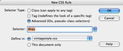
Create a new CSS rule. Select the Advanced radio button. Type #nav into
the Selector field. Don't forget that ID selectors begin with a # hash
or pound sign.
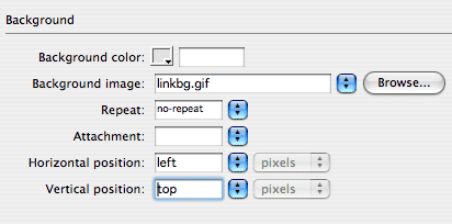
Go to the Background category of the Rule
Definition dialog. Here, insert the linkbg.gif image
from your vintage folder. This image would look strange repeated, so
set it to no-repeat and position it top and left.
Click OK.
To see this
new selector in action, apply the ID to the table cell. Select the
left table cell (note that the quickest way to select the cell is to
click your cursor anywhere in the cell, then click the <td> tag
at the bottom of the Dreamweaver window), then right-click (Control-click
Mac) the #nav selector in the CSS panel.
Choose Apply from the pop-up menu. Voilà—the
background image is in place.
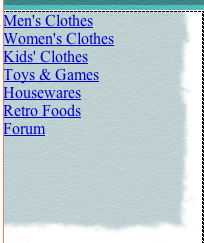 |
| Using background images with rough,
torn edges is a great way to soften a boxy table layout. |
Unordered Lists: #nav ul
The background image looks great, but the list itself needs some work.
We will tackle the unordered list <ul> next.
Click somewhere inside the list. Then use the tag selector in the lower
right corner of the document window to select the <ul> tag. Create
a new CSS rule. With any luck, you'll find that #nav
ul has been filled in for you.
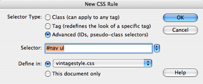 |
| Dreamweaver helps you along by writing
a descendant selector for the element you've selected in the Document
window. You can edit the selector name as necessary. |
#nav ul is a descendant
selector. It can be read as: "Select the unordered list
within the container element with an ID of #nav." This is very
specific. If you had two unordered lists in this layout (maybe one list
for the nav, and another list for some data in the content area), only
the nav list would be formatted with these settings. Quite handy.
Save #nav ul to your external style sheet
and move on to the Box category. Set the
margins and padding to 0 (this will remove the default margin around
the list). Click OK.
List Items: #nav li
Next up are the list items <li>. Click inside the list, then use
the tag selector in the lower left corner to select the <li> tag.
Create a new CSS rule. The text #nav li should be
entered in the selector field.
In the List category, select none from
the Type menu. This will remove the list bullets (they've been bumped
over to the left but they are still there).
In the Box category, add some padding
around the list items. Uncheck "Same for all" and add some
top and left padding.
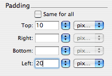 |
| The top setting adds 10 pixels of padding
above each list item. The left setting adds 20 pixels of padding
to the left. |
Links: #nav a
We've got the list items right where we want them. Now, we'll style
the links. Select one of the links, then use the tag selector to select
the <a> tag (links are enclosed in anchor tags). Create a new CSS
rule for #nav a.
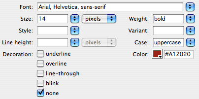
In the Type category, choose a font, size,
and color. Set the links in uppercase to
match the header. Also, set the decoration to "none" to remove
the link underlines.
Hover Effects: #nav a:hover
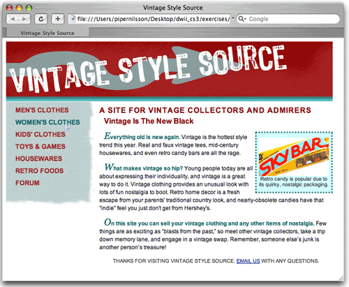
To finish up, add a hover style so the links change color when on mouse
over.
Create a new CSS rule. Type #nav a:hover into
the Selector field. In the Text category, set the text color to a dark
green.
Save your files and preview them in a browser to see how the hover works!
Bulleted Lists
Bulleted lists are an essential content type on most Web sites. Breaking
down important information into bulleted lists helps users to quickly
scan your information and find exactly what they need. Let's look at
some list options.
Download this
page and open it in Dreamweaver. You'll see that HTML tags are
used to set the basic bulleted list structure. The <ul></ul> tags
define an unordered list, and <li></li> mark out each list
item. Redefining the <ul> tag with CSS will allow you to set
the bullet style and apply other content area formatting, such as background
color or border, to the entire list.
Go ahead and redefine your <ul> tag now in the CSS Styles panel.
You can make it an internal style, if you like, since we're just working
on this one sample page.
Apply some simple text formatting in the Type category
of the Rule Definition dialog, then move on to the List category.
Notice that you can choose a different bullet style, such as a square,
number ("decimal"), or letter. You can even choose your own
graphic to use as a bullet to really customize the look.
You will want to set Position to "inside" if you add a background
color to the list area—if you leave it blank or choose "outside," the
bullets will sit outside of the color or background image and look a
little strange.
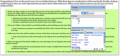 |
I used
padding, square bullets, and a background color to style my <ul> tags.
|
To further customize a list, you can create a new class style that is
used on the second-level (or any other level) of bulleted items. This
helps to distinguish the secondary items, and can even be used
to present content in outline format using the Roman and alpha bullet
styles.
 |
Italics and a different
bullet style were enough to set these list items apart from the
rest.
|
The Body Area
Tables, nav bars, and lists aren't the only content areas you can deal
with using CSS. The page body is a content area too. If you redefine
the <body> tag of the page, you can use the exact same properties
we've been using to add (or remove) margins, backgrounds, and more. One
of the most common uses is to set the page margins and padding to zero
(in the Box category of the Rule Definition dialog). Sure beats modifying
the Page Properties dialog for every single page.
From a visual design perspective, page margins can be a nice feature
to help give the page an open and airy feel. However, adding margins
in the body area may throw off other areas of your design. I find it
useful to set margins at zero on all sides, and then decide at the very
end if I should add them back in.
Creating a type selector for the <body> tag is the best way to
insert a background color or image for an entire page (and an entire
site with an external style sheet!). A simple background color or image
carried through all pages of your site makes the user feel at home and
can help reinforce your brand and attitude.
A talk about CSS wouldn't be complete without some mention
of compatibility. You already know from the experiences above that some
CSS features here and there won't work in every browser, even if they
show in Dreamweaver. And sometimes they won't show in Dreamweaver, but
work OK in most browsers.
Compatibility charts can be found online with a quick search
that detail each and every CSS property (there are tons!), and which
browsers they work in. This can be useful, but you typically won't be
dealing with all of the browsers they note, and certainly not all of
the CSS properties they mention. Instead, as for all Web features, you should
test your CSS based on your users' expected browsers.
As you test, compile a list of which properties worked,
looked wrong, or didn't appear at all for which browsers. Since things
can't look exactly the same for all Web users, decide based on some helpful
questions:
 |
|
 |
| |
-
What CSS features are absolutely essential to the design?
Which ones aren't as important? In our vintage site example,
the body text formatting was important to make our text readable
and applicable to the visual design we created. But the dotted
border around the image table was no big deal.
-
Are all of these elements visible in the newest versions of
popular Web browsers (Internet Explorer, Firefox, Safari)?
If they are not visible in all of the newest browsers,
it's time to rethink these "essential" features.
-
Are all of these elements visible in the browsers that are
most common to your users? If not, what percentage of viewers
will not be able to see them properly? If the percentage is
more than 5-10, you will want to do some tweaking.
-
When your essential or non-essential CSS features don't work,
is important content obstructed or hidden? Big changes are
ahead if the answer is yes! Cool design effects should never
interfere with the legibility of the content.
-
If a non-essential CSS feature doesn't look quite right (for
example, a dotted border appears solid in some browsers),
will the user experience suffer? Usually the answer is no. In this
case, just keep the style and understand that not
everyone will see it the way you intended.
|
|
 |
|
 |
Like any other part of a Web site, your CSS should be tested under conditions
that are common to your audience, and you'll need to make some compromises
when things aren't ideal in every browsing situation.
In the exercise, you are going to use CSS to format all of the text
and content areas on a 10-page Web site. If you'd like a little practice
before tackling the exercise, open the extrapractice.html page found
in your vintage folder. We've provided text you can use to create new
pages for the vintage site. Try out some new text and table styles, or
try your hand at some data tables or lists.
Once you're ready, head to the exercise where you'll really go places
with CSS!

