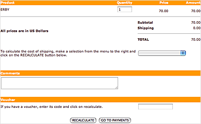
As a Web user, you are undoubtedly very familiar with the online form: Online forms are comprised of various fields, check boxes, and buttons used to collect data from the user and then do something with that data.
What is done with the data varies from form to form. In a search form, for example, a user input can be used to query a database. In a product order form, the data received can be added to a database or emailed to someone who will process the order.
 |
Forms typically include fields, menus, and buttons
for user input. |
How do forms work? Once a user fills out a form and presses the "Submit" button, the data is sent to a server-side script (usually written in CGI or PHP) which processes the data. When creating the XHTML document that houses the "front-end" portion of the form, a designer will typically just create the form elements—the various text fields, dropdown menus, and other elements that collect the data. Unless you have programming skills, it's unlikely you'll be asked to write any "back-end" code, though you may be asked to "point" the form to a script that will process the data once it is submitted.
Next in this lecture, you'll learn how to create the front-end of a form using XHTML. Creating the server-side script to process the form is beyond the scope of this course, but you'll be pointed to a few resources that can help you out with these back-end processes.
The Form Tag
To create a form, start off by including the <form> tag
in your document. It indicates where a form begins and ends, but doesn't
cause any visual change on the page.
Everything that is
enclosed in this tag is part of the same form, like form fields and
buttons which we'll talk about shortly. Note that
you can have more than one form on a single Web page, but you cannot nest forms
(that is, you cannot enclose one form inside of another).
Let's take a closer look at this tag:
<form method="post" action="script.php">
[form content]
</form>
There are two important attributes here: method and action.
Method
The method attribute tells the browser how the information in the form is sent to the server. It takes one of two values:
The Get Method
With the "get" method, the information is appended at the
end of the URL address. This method is used when the form submission
does not cause any "side-effects" (or, the information is
not kept or stored anywhere). That is, if the information is not added
to a database or emailed to anyone (for example, as in a database search),
then use the "get" method. An example of this is a search
form. The information is used to perform the search, but not saved
for later use by the site.
The Post Method
With the "post" method, the information is sent in the body
of the request. This method is used when you want to cause certain "side-effects:"
You want to add this information to a database or email it. Most forms
use the post method.
Action
This attribute specifies the location of the back-end script that
processes the form. For example, in the following code snippet, the
PHP script which
processes the form information must be in the same folder as the Web
page currently being viewed:
<form method="post" action="script.php">
Form Elements
After the opening form tag, you can start adding various form elements,
like fields and buttons. Most form elements use the <input> tag.
Let's look at an example of an input tag to get an idea of its structure:
<input name="name" type="text" />
This input creates a text field. We'll cover how this and
other elements work shortly.
You'll need to include at least two attributes
with the input tag: name and type.
The Name Attribute
The server-side script that processes the form identifies each form element by its name. So, if you hope to extract any data from the form, you'll need to include a unique name for every form element.
The Type Attribute
This attribute determines the kind of form element. The default form element is the text field (and if you don't include this attribute, the browser will display a text field). We'll go into the various form element types in a moment.
Making Forms Accessible
In order to help users who have non-standard browsers, you should also use the <label> tag with your form elements. Here is an example of its usage:
<label for="name">Name</label>
<input name="name" id="name" type="text" />
Visually, the above code looks like this in the browser:
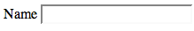
When you add a label with the "for" attribute
(where the value of the attribute matches the ID value of a form element),
it will associate that label with the matching form element. This makes
it easier for users with screen readers to know what label goes with
what form element. Also, in standard browsers, when you click on the
label name, the cursor will automatically be taken to the matching
form element. So, adding the label tag and ID attribute greatly contributes
to the overall usability of forms.
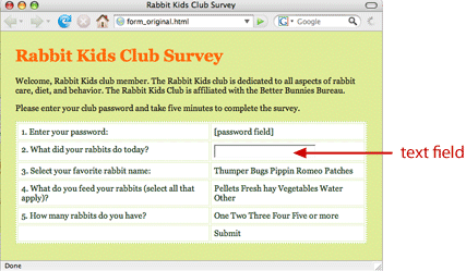
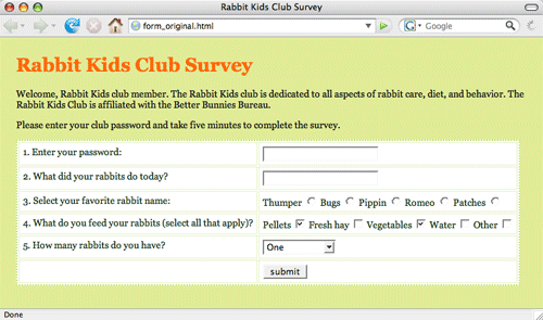
Creating a Form
OK, let's create a form together and learn how to implement
the various form elements you can use. Download your lesson6
folder to
get started, and open the forms_original.html file in the forms folder.
In it, you will find a survey marked up in a table. Wrap
the survey in form tags <form
method="post" action="script.php"></form> and
let's get going.
The Text Field
The text field is the most often-used form element. Browsers display it as a small box where a user can type in text. We've already looked at the code for a text field (in the examples above):
<label for="name">Name</label>
<input name="name" id="name" type="text" />
Create a text box for the question "What did your rabbits do
today?" (replacing the placeholder text currently in the page
that reads "[text field]"). If you label the question "activities",
your code should look like this:
<tr>
<td>
<label for="activities">2. What did your rabbits do today?</label>
</td>
<td>
<input name="activities" id="activities" type="text" />
</td>
</tr>
Notice that label goes in the first column, and the input tags go in the second column. Here is a screenshot of how that code would be rendered in the browser:
The Password Field
The password field is a lot like the
text field: It is a small box that users can type in text. The text,
however, is hidden by special characters (usually by asterisks or bullets),
thus shielding sensitive information from prying eyes.
Create a password field for the prompt "Enter your password:"
<tr><td>
<label for="password">1. Enter your password:</label>
</td>
<td>
<input type="password" name="password" id="password" />
</td></tr>
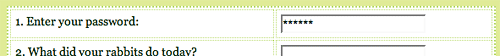 |
Notice that when you type in this field, the characters
are hidden. |
Radio Buttons
Radio buttons are small, round buttons
that are grouped together, letting the user select one button among
several options. Create radio buttons for the prompt "Select your
favorite rabbit name:"
<tr><td>
<label for "name">3. Select your favorite rabbit name:</label>
</td>
<td>
<label for="thumper">Thumper</label>
<input type="radio" name="name" id="thumper" value="thumper"/>
<label for="bugs">Bugs</label>
<input type="radio" name="name" id="bugs" value="bugs" />
<label for="pippin">Pippin</label>
<input type="radio" name="name" id="pippin" value="pippin" />
<label for="romeo">Romeo</label>
<input type="radio" name="name" id="romeo" value="romeo" />
<label for="patches">Patches</label>
<input type="radio" name="name" id="patches" value="patches" />
</td></tr>
Note that the name for the radio buttons must be the same for the entire option group. As the user can only select one option among the group, there is only one value that is passed to the processing script (and thus, only one name is associated with it).
The ID for each button, however, must be different (as there
can't be more than one ID value per Web page). And note the "value" attribute
in these radio button tags: They hold the value that will
be sent to the server if that button is selected. (Note: You can also
use the value attribute in any form element—it will assign a
default value for the element.)

Check Boxes
Check boxes, unlike radio buttons, are
not placed in groups. So, you can make a list of checkboxes, and a
user can select as many of these boxes as she'd like. (With radio buttons,
however, the user can only select one button
out of the group.)
Create check boxes for the prompt "What do you feed your
rabbits (select all that apply)?" The set-up is the same as for
radio buttons, except that "checkbox" is the input type:
<tr><td>
<label for="feed">4. What do you feed your rabbits (select all that apply)?</label>
</td>
<td>
<label for="pellets">Pellets</label>
<input type="checkbox" name="feed" id="pellets" value="pellets" />
...

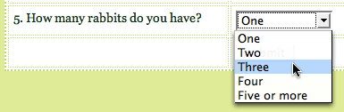
Drop-Down List
You can create a drop-down list where the user can select one of several options using the <select> tag. Enclose the various options in the <option> tag, assigning a value attribute for every option.
Create a drop-down menu for the prompt: "How many rabbits do you have?"
<tr><td>
<label for="number">5. How many rabbits do you have?</label>
</td>
<td>
<select name="number" id="number">
<option value="one">One</option>
<option value="two">Two</option>
<option value="three">Three</option>
<option value="four">Four</option>
<option value="five or more">Five or more</option>
</select>
</td></tr>
Submit Button
Every form on the Internet needs a Submit button. When a user button clicks the submit button, the form will be sent to the server. Place this in the second column of your form.
<input type="submit" name="Submit" value="submit" />
As you can see, forms can be created using a variety of tags and attributes to collect user information. Let's review these in the following video tutorial, where you'll see the front end of a form created from start to finish:
Running Time: 7:36. Read
the Transcript
Where To Go From Here
As I mentioned earlier, the front-end of your form is useless without
a server-side script to process it. So, once you have created all of
your text fields, check boxes, and buttons to gather all of the necessary
data, how do you create a script to do something with the
data?
On a professional project, you'd likely work with a programmer. For smaller budget needs, though, there are plenty of Web sites that provide free tools and form-processing scripts that you can easily use and customize for your site. Even with little or no PHP or CGI scripting knowledge, you can take advantage of these online resources and have your form up and running in no time.
Check out a site like Hot Scripts (http://www.hotscripts.com) to get started.
Special CSS Effects
OK, let's move on to exploring a couple of CSS effects that you can master, which I guarantee you'll use all the time in your professional work. You can effortlessly create vertical and horizontal navigation bars—and even create pop-out menus—by styling the humble unordered list.
Marking up a set of navigation links as a list also makes sense semantically;a set, at its heart, is just a list of links.
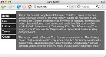
Creating a Vertical Navigation Bar
Let's create a basic XHTML page and examine how to create a vertical navigation bar. You can use any content you like but try to follow this structure.
First, let's look at some markup:
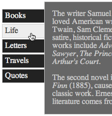
<div id="content">
<div id="menu">
<ul>
<li><a href="#">Books</a></li>
<li><a href="#">Life</a></li>
<li><a href="#">Letters</a></li>
<li><a href="#">Travels</a></li>
<li><a href="#">Quotes</a></li>
</ul>
</div>
<div id="main">
<p>The writer Samuel Langhorne Clemens (1835-1910) is one of the best loved
American writers of the 19th century. Under the pen name Mark Twain, Sam Clemens
published
over 30 works of literature, encompassing satire, historical fiction, short stories,
and nonfiction. His most notable works include <em>Adventures of Huckleberry
Finn</em>, <em>The Adventures of Tom Sawyer</em>, <em>The
Prince and the Pauper</em>, and <em>A Connecticut Yankee In King
Arthur's Court.</em> <p>The second novel in Twain's Tom Sawyer adventure
series, <em>Huckleberry Finn </em>(1885), caused a controversy when
published but is now considered a classic work. Ernest Hemingway once wrote that <q>All
modern American literature comes from one book by Mark Twain called Huckleberry
Finn.</q></p>
</div>
</div>
Here, we're wrapping all of our content in a div we named "content", and then we've split that content up into a "menu" div (which encloses our navigation menu) and a "main" div (with which we enclose the main content).
The "menu" div contains an unordered list of links. Create a CSS document and link to it from your HTML document. Done? OK, let's start styling this list:
#menu {
float: left;
width: 85px;
margin-top: 15px;
}
Here we've floated the entire navigation div to the left, and we've
specified a width and added a small margin at the top. Nothing you
haven't seen before, right? Now, to keep the main content div from "wrapping" around
the menu (we want to keep them as two separate columns), we're going
to apply
a
left-hand margin to that div to keep it in its place:
#main {
margin-left: 84px;
padding: 0 15px;
background-color: #666;
color: #ccc;
border: 1px solid #ccc;
}
Now, back to the navigation list: We don't want the default bullets
to appear beside the list items, so we'll get rid of those using the
list-style property. We also want to get rid of the default margins
and padding for the list as well. Notice that we're now styling
the <ul> tag within the menu div:
#menu ul {
list-style: none;
margin: 0;
padding: 0;
}
Next, we're going to style the individual anchor elements. As these items are supposed to look like "buttons", we want to treat them as block-level elements: we want to be able to add margins, padding, and a border. Anchor elements are, by default, inline elements, so we'll have to change that using the display property:
#menu a {
display: block;
text-decoration: none;
margin-bottom: 2px;
padding: 5px;
background-color: #222;
color: #eee;
border: 1px solid #ccc;
}
We also wanted to get rid of the default underline on links, so we've set the text-decoration property to "none." Then, we added some color, padding, and small bottom margin to separate the "buttons".
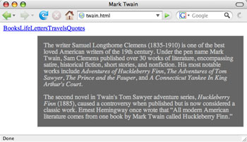
So far, our Web page looks like this:
This looks nice, but, for added interactivity, we'd like to change
the color of our buttons when the user hovers over them—we'd
like them to "light up" as the user passes his mouse over
them. To achieve this effect we're simply going to style the a:hover
pseudo-element within the menu div:
#menu a:hover {
background-color: #eee;
color: #333;
}
Recall that the :hover pseudo-selector is a special selector that allows you to specify CSS rules to an anchor element only when it is being moused-over. So here, we've changed the colors for the a:hover pseudo-selector, giving the appearance that it is lighting up when the user is hovering over it.
Creating a Horizontal Navigation Bar
To begin creating a horizontal navigation bar, delete everything in
your CSS file except the "main" div style, and begin with
the same XHTML markup. In the "main" div style, remove the margin-left
property—this will ensure the main box will be flush with our
upcoming navigation bar.
Then we'll style the "menu" div
by giving it a height, and getting rid of any default margins:
#menu {
height: 25px;
margin: 0;
}
And, like we did with the vertical navigation bar, we're going to set the list-style to "none" and set the padding to zero:
#menu ul {
margin: 0;
list-style: none;
padding: 0;
}
Now, for the individual list items: We're going to float each item to the left. This will cause the items to stack horizontally next to each other (as each will try to go as far to the left as they can without bumping into another list item):
#menu li {
float: left;
}
 |
| The float added to the li tag within the menu div
stacks the list items horizontally. Now we need to make them look
more like buttons. |
For the anchor elements, we're going to treat it similarly to the vertical navigation list. We're going to set them as block-level elements, get rid of their default underlining, and add some width, color, padding, and borders:
#menu a {
text-decoration: none;
display: block;
width: 65px;
padding: 4px;
text-align: center;
background-color: #222;
color: #eee;
border: 1px solid #ccc;
}
We can also style the a:hover pseudo element for this list as well:
#menu a:hover {
background-color: #eee;
color: #333;
}
Now your page should look like this:
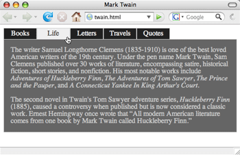
The buttons will also light up as they did in the vertical menu when the user mouses over them.
Dynamic Web Pages
While the Internet began as a way to exchange data between computers,
it has come a long way since its advent. We are no longer
restricted to a static document; Web technology is continually
evolving to offer more advanced ways for the user to interact with
Web pages.
Dynamic Web pages use a combination
of technologies (like HTML, CSS, JavaScript, PHP, MySQL, and Flash)
to create interactive Web pages.
A dynamic Web page can:
 |
|
 |
| |
-
change (or add, or delete) XHTML elements or CSS properties
on the fly, or in response to certain user actions (like
mouse clicks, mouse movements, or keyboard strokes)
-
create and process online forms
-
animate elements on the page
-
create interactive image slideshows
-
create dynamic calendars
-
create rollover buttons
-
replicate operating systems elements such as windows, file
selectors, and drop-down menus, or
-
create interactive Web applications
|
|
 |
|
 |
AJAX (which uses JavaScript and XML) is a popular technology for creating
dynamic Web pages, and is responsible for many of the hot social media
and Web application sites (like Flickr and Google Maps).
And while the full implementation of many dynamic effects requires
extensive knowledge of various programming and scripting languages,
even designers that only know XHTML and CSS can manage to create modest
interactive elements like online forms, rollover buttons, and drop-down
menus.
Animated Slideshow
To explore how dynamic page effects can be achieved, we are going
to create an animated slideshow that moves in response to a mouse event.
Specifically, we are going to create a menu that slides in a small
icon as the mouse moves from link to link. Watch it demonstrated in
this animation:
 |
| As the user hovers over the various
links, the icons will slide back and forth, revealing the appropriate
picture as needed. |
How It's Done
Now while this effect might look like Flash to you, it's actually
achieved through a clever combination of CSS and JavaScript. Don't
worry that you don't know how to write JavaScript—many Web designers
who use tons of JavaScript don't know how to write it at all. JavaScripts
for almost any purpose are available online at sites like javascriptkit.com,
so all you need to know is how to apply them to your XHTML and CSS
code. For this example, I've written the JavaScript features for you.
Go to your slideshow folder,
open up the slideshow1.html file, and we'll walk through it how it's
done.
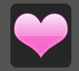
First, let's take a look at the actual image that we are using on
this page:

We are not using four separate images—just one large image,
400 pixels wide by 100 pixels high. We want to reveal only part of
the image at a time: Namely, we want to reveal only 100 pixels at a
time of the 400 pixel-wide image (or, to put it another way, one icon
at a time).
Say we want to place our slideshow at the top of the document under
the navigation? If we wrapped the image with a labeled div (and add
an ID attribute called "slideshow"), we could create a "window" from
which only part of the image is displayed. This is already done in
your slideshow1.html file:
#slideshow {
width: 100px;
height: 100px;
position: relative;
overflow: hidden;
}
As we learned in Lecture Five, specifying a width and height gives
a size to the "window," while setting the overflow property
to "hidden" hides everything but the 100x100 square. As coded,
it will display the default icon (the orange square), but by positioning
the element we can move the image to the right, sliding other icons
into view.
For example, the following code would place the heart in the viewing window:
#slideshow {
width: 100px;
height: 100px;
position: relative;
left: -100px;
overflow: hidden;
}
This is great, but the trick is to make this effect animated—to
show a moving transition between one position and another.
This is where the JavaScript comes in.
There are four different JavaScript files we will use together to
achieve the desired effect. They are all found in the scripts folder.
Adding JavaScript to an XHTML document is similar to adding CSS,
using the <script> tag with text/javascript
as the type, and a .js file as the source. Load these scripts into the
Web page by including the following in your XHTML header (anywhere
between the two head tags):
<script type="text/javascript" src="scripts/addLoadEvent.js">
</script>
<script type="text/javascript" src="scripts/insertAfter.js">
</script>
<script type="text/javascript" src="scripts/moveElement.js">
</script>
<script type="text/javascript" src="scripts/prepareSlideshow.js">
</script>
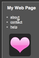
Now, let's take a look at the main XHTML markup for the menu, simple "dummy" links
indicated by pound signs (#):
<ul id="linklist">
<li>
<a href="#">about</a>
</li>
<li>
<a href="#">contact</a>
</li>
<li>
<a href="#">help</a>
</li>
</ul>
This is it for the relevant XHTML code. We just have a unordered list
for our menu, and we label that menu with the "linklist" ID.
Note that there isn't any code to display the image. Why is that? If
the user doesn't have JavaScript enabled (rare, but it happens), we
don't really want to display the icon, as it won't be able to do anything.
We only want to display the image when we know that the user will be
able to see the special effect.
So, we can use JavaScript to add the markup that displays the
image. That way, if the user doesn't have JavaScript, she won't
see an image.
So, let's take a look at the different scripts, in turn (note that
if you'd like to see the actual code, you can open the .js files in
your text editor):
addLoadEvent.js is a generic script
that loads up another JavaScript function as soon as the browser
displays the page. We will call this function in the prepareSlideshow.js
script, so that the prepareSlideshow function will be activated when
the page loads.
moveElement.js takes an element and
moves it a specified distance over a period of time. This is the workhorse
that will actually be doing the animating. The prepareSlideshow.js
script will call this function, and specify what elements
to move, and when and where to move them.
insertAfter.js is a short script that
is just responsible for adding a new element in the XHTML
markup. The prepared Slideshow.js script will specify what element
to add, and where to add it.
So, the three scripts above are basically generic scripts that are
designed for very specific functions: activating functions when the
Web page loads, moving elements, and adding new elements. These scripts
are actually designed to be used over and over again—you just
need to provide the right arguments (variables) to determine, for example, what function
to load, or what element to add where.
This is what the final script does: the prepareSlideshow.js script.
It pulls all of these functions together to achieve the desired animation
effect. In fact, if you look at this script in your text editor, you'll
see some familiar names (wrapped in lots of unfamiliar code, but that's
OK!). Roughly, this is what it does:
|
|
|
| |
1. It finds the list labeled "linklist", and adds
the icon image after it, which is wrapped in the div ID "preview".
2. It finds all of the links within the "linklist",
and the moveElement function assigned to them when they are
moused-over.
3. For each moveElement function that's called, it passes
the ID information of the image ("preview"), and
all of the relevant position information (that is, how far
over to move the image).
4. Finally, it calls the addLoadEvent function, so that prepareSlideshow
will activate when the page first loads.
|
|
|
|
|
Again, don't stress over the JavaScript. At this stage in your Web
design experience, it's very helpful to know how to add existing JavaScript
code to your page, like our slideshow code, without knowing how to
read and write JavaScript. All you need to do is save all of these
scripts to a scripts folder, tell your Web page to use them, and apply
some related CSS rules.
Finally, the last step involves adding the following CSS rule to your
style sheet:
#preview {
position: absolute;
}
The rules attached to the "slideshow" div that already exists
in your document, as mentioned earlier, defines the "window" which
reveals part of the image. Then, we just set the position property
of the image to "absolute", which will effectively provide
an "anchor" for the image against which it will slide back
and forth.
Once all of these elements are in place, you'll end up with a subtle
but stylish user-driven animation effect. You can probably see how
this can be adapted this to your purposes, even if you are not familiar
with the JavaScript. The lesson here is that the XHTML and CSS that
you have learned in this course can be combined with other Web languages
to enhance the functionality of the page. For a great example of this, check out this Quick Crit:
Creating a Workflow System
You'll find, with respect to each new Web project, that you are doing
some of the same work over and over again. There are snippets of CSS
code that you will use repeatedly. There is a certain consistent set
of folders and files that you will set up for each new project. But there
is just no reason for you to have to start from scratch every time
you begin a new project.
It is worth it take the time to develop approaches to organizing your
coding, so that you can create tools and shortcuts that will save you
time and effort in the long run. It may take you a few days to set
up a workflow system and develop some consistent coding techniques,
but this initial investment of time will keep you from having to do
the same work again and again every time you start building a new Web
site.
Here are a few tips for setting up a useful system:
Organize Your CSS
Organizing your CSS using "flags" will save you headaches
down the line when you need to go back and update your code. Flags
are simply comments that serve to break down your CSS into groups,
and they make it a lot easier to find a single line of CSS code when
you need to. For example, you could head all of the CSS rules pertaining
to navigational elements using a "navigation" flag:
/* Navigation-----------------------------------------------------
*/
People divide their CSS code up in different ways, but here is an
example of a useful grouping method:
|
|
|
| |
-
Layout
-
Navigation
-
Headings
-
Lists
-
Forms
-
Links
|
|
|
|
|
CSS Global Reset
Every browser has its own "default" CSS style sheet that
it incorporates into any Web page it renders. You override this default
every time you specify a rule in your own style sheet, but, without
an override, the browser will use the default. There are certain margins
and padding, for example, it includes for every element. Every browser
uses different defaults, so, if you don't override those defaults,
you end up with a Web page that will look a bit different in every
browser.
So, one method of "stripping" the default CSS from a Web
page is to incorporate a "global reset" into your style sheet:
this involves either setting a "zero" margin and padding
for all of your elements (e.g., * { margin: 0;
padding: 0 }), or setting some other neutral value. This gives
you a clean slate to work from, from which you can apply your site-specific
CSS rules.
There are different methods for globally resetting the CSS, but here
are a couple of examples to get you started:
http://meyerWeb.com/eric/thoughts/2007/05/01/reset-reloaded/
http://developer.yahoo.com/yui/reset/
Developing a Framework
What is a framework? A framework is
a "set of tools, libraries, conventions, and best practices that
attempt to abstract routine tasks into generic models that can be reused":
http://www.alistapart.com/articles/frameworksfordesigners
In other words, a framework consolidates the code snippets, folder
structures, scripts, and so on, that you tend to use over and over again.
To develop a CSS framework, you'll want to abstract away CSS code
you tend to use repeatedly in every project. These can include:
|
|
|
| |
-
A global reset (see the "CSS global reset" section
above).
-
Templates for common page layouts (2-column fixed, 3-column
fluid, and so on.)
-
Common typography settings.
-
Basic styles for forms.
-
Common widgets like drop-down menus, navigation tabs, and
buttons.
|
|
|
|
|
Then, break these down into individual style sheets, which you could
then just import into a master style sheet using the @import rule.
For example, you could create the following generic style sheets:
|
|
|
| |
-
reset.css
-
type.css
-
1colfw.css
-
1colfl.css
-
2colfw.css
-
2colfl.css
-
forms.css
-
widgets.css
|
|
|
|
|
And then create the following master.css style sheet, including what
generic style sheets you need for that particular site:
|
|
|
| |
@import url(reset.css);
@import url(type.css)
@import url(2colfl.css);
@import url(widgets.css); |
|
|
|
|
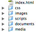
Create a General Site Framework
It is also useful to create a folder structure template with the set
of files and folders you use for all of your Web projects. This template
could include:
|
|
|
| |
- index.html file (as every
site needs one!)
- /css folder
- /images folder
- /scripts folder (for JavaScript
files)
- /documents folder (for
pdf files and Word documents)
- /media folder (for other
media files)
|
|
|
|
|
 Then,
once this template is in place, you can just copy this set of folders
into a new Web project, giving your site a solid structure to start
from.
Then,
once this template is in place, you can just copy this set of folders
into a new Web project, giving your site a solid structure to start
from.
Another variation of this could be to include an "assets" directory
where all non-Web documents reside. This allows you to keep your main
directories clean of any media elements:
|
|
|
| |
index.html file (as every
site needs one!)
/-/ (assets directory, the
folder name is a hyphen)
/-/css folder
/-/images folder
/-/scripts folder (for JavaScript
files)
/-/documents folder (for
pdf files and Word documents)
/-/media folder(for other
media files) |
|
|
|
|
And that's it for this lecture. Some of these topics were quite advanced, but my hope is that they'll inspire you to deepen your XHTML and CSS skills as you pursue your Web design studies.
 Learn how to create an HTML form and add basic form elements.
