Let's
start by revisiting the optimization endgame we introduced in Lesson
One. Saving images to a proper file size is the bane of existence
for many designers and production artists, until you develop a routine
way of dealing with the task.
Everyone
knows that a reasonable load time is a necessary part
of the equation when producing Web graphics, but what is a
reasonable load time? There are different opinions on how "heavy" a
Web page should be (including all the graphics on it): Some say 40K
is the upper limit, while others insist on a maximum of 100K. Different
factors will affect the choices you make.
Of
prime consideration is the content of the site: Will users be willing
to wait for downloads? To answer this question, you must know more
about your site users. Who are they, and what kind of connection
speeds do they have? Do
you optimize for the lowest common denominator or the highest common
denominator? Here are the two poles of the Internet user:
Most
of the time, you'll shoot somewhere in between. Knowing
your audience will influence your choices. In general, you should
learn methods to make the file size as small as possible, while retaining
the artistic and visual integrity of your graphics. We'll use this
lesson to go over some of those methods.
An
alternative to simply crunching file size is that you can use techniques
to ease load time and keep users engaged while they wait for files
to load. Two
areas of prime consideration include how
you create your images, and how you save them.
First,
we'll talk about methods you can utilize to keep your file size down
and improve the look of your graphics when designing and building
your images. Then we'll talk about some of the optimization methods
you can employ when saving your files and outputting them to a Web-ready
format. You'll be very familiar with Fireworks' Optimize panel
by the time you're done.
Earlier in the course, we used default image optimization
settings. These are fine in many cases, but optimizing "by hand" is
always the better option since every image has different needs. The
default settings work as follows:
|
Optimization Settings
|
|
GIF Web 216
|
Forces all colors to Web-safe colors. The color
palette contains up to 216 colors.
|
|
GIF WebSnap 256
|
Converts non-Web-safe colors to their closest Web-safe
color. The color palette contains up to a maximum of 256 colors.
|
|
GIF WebSnap 128
|
Converts non-Web-safe colors to their closest Web-safe
color. The color palette contains up to 128 colors.
|
|
GIF Adaptive 256
|
Contains only the actual colors used in the graphic.
The color palette contains up to a maximum of 256 colors.
|
|
JPEG - Better Quality
|
Sets quality to 80 and smoothing to 0, resulting
in a high-quality but larger graphic.
|
|
JPEG - Smaller File
|
Sets quality to 60 and smoothing to 2, usually
resulting in a graphic less than half the size of a Better Quality
JPEG but with reduced quality.
|
| Animated GIF WebSnap 128 |
Creates an animated GIF file (if multiple frames are available)
using a Web-safe palette of 128 colors. |

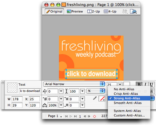
Let's
take the file called woodcut.png from
the course download area and go through a basic custom export using
the Optimize panel. This file
contains
a illustration
of
a fish floating
in water. The "water" is a blue gradient. (Gradients
are easily created using the Gradient tool, found under the Paint
Bucket tool in the Tools panel.)
With
the file open inside Fireworks, Choose Window > Optimize to
access the Optimize panel.
 |
Your Optimize
panel offers a wide range of GIF and JPEG options.
|
Turn Preview view on in your document
window so the changes you make in the Optimize panel will be visible.
Refer back to your original version as needed by clicking
Original, or compare different versions at the same time using the
2-Up and 4-Up views.
 |
Switch between
Original and Preview views to compare quality.
|
The
next step is to use the settings on this panel to optimize the graphic.
Since this graphic is line art, we might first want to try it out
as a GIF.
Choose
GIF from the dropdown and the Adaptive
palette. The Adaptive option makes a palette of all the colors used
in your
image (up to 256 of them). We'll discuss more about palettes later,
but in general Adaptive is a good choice if you're not sure which
to use.
Whenever
you make use of the GIF file format, you must also select the number
of colors your image will contain. The fewer colors, the lower the file
size. Therefore, the challenge here is to reduce your image to as
few colors as possible while keeping a reasonable amount of quality. In
the image below, I have set the Colors setting to 64. The fish image
in the background
is the
preview
(click
the Preview
tab
in the document view).
 |
These settings
give us a nice file size under 20K (shown in the lower left),
but lots of "banding" in the gradient area.
|
I
have found that, generally, GIFs and gradients don't work
well together. Most of the time, a gradient saved as a GIF will "band" (take
on stripes) because it requires more subtle variations of color
than a GIF can handle. For that reason, I prefer to save
almost any graphic that contains a gradient
as
a
JPEG. Compare the difference below:
 |
Here I've selected
JPEG, used a medium-high quality setting, and added a touch of
smoothing to get the size the same about the same as I had for
the GIF, under 20K
|
Above I have tried some JPEG settings. Since this is
still mostly a line art image, I had to keep the JPEG quality setting
pretty high. Too low and I'd blur out some of those nice crisp lines.
Comparing the two, the lines still aren't quite as crisp as the GIF,
but the difference in the gradient is tremendous.
But much of the challenge in optimization is choosing the right approach for each graphic.
Is this fish just a minor illustration to dress up the site, or is
it an essential image that influences a buying decision (perhaps the
fish is a poster for sale)? You must decide for yourself
the right
optimization
approach, based on image options, usage, and the site audience.
Try out some more of the GIF and JPEG settings (specifically
number of colors, quality, and smoothing) to see how they affect the
size. Can you find an acceptable 10K version?
Throughout
this lesson we'll look at a site that I worked on: the PBSKids/Teletubbies
Web site, along with some other examples. The Teletubbies project
offered up a full range of optimization challenges that can all
be dealt
with
in Fireworks.
Some
background information on this project first. The
site's audience was made up of parents, caregivers, and children
in libraries, nursery schools, and homes that
may not be equipped with the latest hardware and plug-ins. Because
of this demographic,
PBSKids required that the site be created without the use of any
Flash or other higher-end technologies.
At the same time, it was important that the site be sufficiently
colorful to appeal to kids.
 |
|
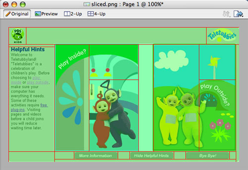
In
or Out? On this PBS/Teletubbies site, kids
could choose to play inside or outside. Colorful, quick
loading graphics influence decision-making.
|
Anti-Aliasing
Images
Anti-aliasing,
the first technique we'll look at, is designed to improve the appearance
of your graphics.
Anti-aliasing
creates a transition between "jagged" or "stair-cased" pixels,
so that they appear smoother and rounder. It's a method that plays
with our perception of lines and curves through shading. It's most
commonly used with text, although it can be used with any graphic
selection. You don't have to worry about losing detail because only
the outer edges are modified. It's a way of making bitmapped graphics
appear more like vector graphics.
 |
|
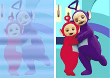
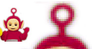
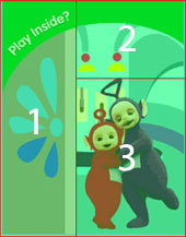
In
this graphic, the layers around each Teletubby are anti-aliased
so that square pixels are not visible. They
look even rounder, just as round as can be.
|
The
Teletubby graphics arrived at my agency as smooth vectorized (EPS)
images. Importing them into Fireworks, I chose to anti-alias them
in order to retain (or at least simulate) smooth edges.
 |
| Anti-aliasing placed some transitional pixels around
the edge to simulate smoothness. Without it, I'd have jagged
edges on my Teletubby. |
Remember
the Open dialog from Lesson
One? If you open or paste vector images and get the second Vector
File Options dialog, you can check Anti-Alias to
prevent the jagged look that can appear when opening.
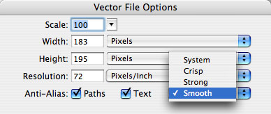 |
You can even choose the type of Anti-Aliasing
you'd like. Smooth is usually fine for Web graphics, but if
your edges look too soft, try a different type.
|
Anti-aliasing
can be used for a number of reasons. Generally, it's used on
selections. This is most useful when copying and pasting, cutting,
compositing,
and collaging images. If you decide to use this feature (which
you almost always should—it has no major downsides) the main
thing to remember is that you must check Anti-Alias before
you make your selection (anti-aliasing can't be added to a selection
that's already been made).
Specific
selection tools with this feature include: Lasso, Polygonal
Lasso, Marquee, Oval Marquee,
and
the
Magic Wand tool.
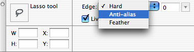 |
| The Edge menu in the Properties panel allows you
to choose the anti-aliasing setting for your selections. |
Anti-Aliasing
Type
You
might also consider anti-aliasing your text-as-graphics.
Technically, when you choose to anti-alias fonts, the program simulates
the percentage of a curve with a percentage of a color. Because
pixels are squares and can't accurately display curves, it works
this way: If a curve were to take up 25% of a pixel, anti-aliasing
would represent this by shading that entire pixel to 25% saturation.
 |
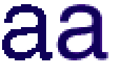
| Here you see an original button
from the Teletubbies site (top), enlarged anti-aliased text (middle),
and enlarged aliased text (bottom).
The soft edges make the text much cleaner and more readable. |
Because
anti-aliasing is based on adding colors to a graphic, it can
greatly increase the number of colors in a GIF image. You should
take that
into consideration when thinking about optimization. Again, the
trade-off between the aesthetics of the image and speed of download
comes into
play.
|
|
A
Closer Look. Magnified text reveals how
this works. The aliased text uses just a single color.
The anti-aliased text blurs the contours of the shape
by
adding 25% shading
around the edges, meaning more colors.
|
One word of warning. Generally, anti-aliasing
should not be used with fonts set to a very small point size because
they may appear blurry. In those cases, you might be better off with
plain old HTML or leaving your font with anti-alias turned off.
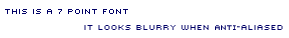 |
| Tiny type looks is much more readable—and
has a cool techy appearance—without anti-alias. |
Anti-aliasing
is a common strategy for larger type. Because of this, we're all
happy that applying this feature to type in Fireworks is such a simple
process! Here's how it's done...
Start a new document, or select some text on a document
you have created previously. Select what you've typed, then
choose an option from the anti-aliasing menu in the Properties panel.
You have four main options: No, Crisp, Strong,
and Smooth. Try each to see how your text looks. Any time you
feel your text is too blurry, reach for this menu to make a quick
change.
 |
Crisp and Strong are sharper anti-aliasing types,
while smooth is... smooth! |
You also have the option to use the same anti-aliasing
that your operating system (Windows or Mac) uses, or completely control
the anti-aliasing with the Custom option. In most cases, the top
four options are all you'll need.
Transparencies
and Matting
All Web graphic files are rectangular, but often the
art within them is not. When you have a non-rectangular object and
you want to remove the background, saving with a transparency or
matte
is
a great option. Both options are available in the Optimize panel.
Let's discuss what they are and how they differ.
As
the name implies, saving an image with a transparency preserves
a transparent area around an image. This allows the background
of a Web page to show through. Transparency
is not available for every image format, but if you're saving
as a GIF or PNG, transparency is supported.
|
| The checkerboard area in a Fireworks document represents
a transparent area. |
Matting is
supported by GIF, PNG, and JPEG formats. This technique simulates
transparency. You select a color that matches the background
of the Web page exactly. The matte fills or blends the transparent
pixels
with the selected color. This
avoids getting the jagged ring you sometimes see around transparent
images.
Matting is more successful when used on images that will
be placed over solid backgrounds. Transparency works out well when
the image must be placed on a patterned background.
Below is the Teletubbies logo
at the actual size used on the site, and magnified by 300%. You
can see the surrounding gray matting.
On
the home page, it appears as if the logo is on a gray background, but
in reality the image has a matte. At actual size, it looks transparent,
but when you look closer, you can see a gray outline around the edge.
 |
Teletubbies
logo
|
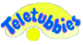 |
|
Teletubbies logo, up-close-and-personal.
The gray is unmistakable.
|
Now
that you see how useful these techniques are, I'm sure you'll want
to use them in your own graphics. So how's it done, you ask?
These
formats (unless you are using PNG-24, which is still not well-supported
by browsers) only save one level of transparency. This means that
only one single color
can
be made
transparent.
If any of
your pixels are partially transparent to give a soft, anti-aliased
effect, you'll have to decide what to do with them. Do you want
a hard-edged (aliased) transparency?
Or
do you
want to matte the image, blending those pixels into the background
by choosing a color?
Let's create a simple graphic with
transparency. Start a new document, and in the New Document dialog,
choose "Transparent" as the canvas color. You'll see a checkerboard
background, indicating transparency. If you start with a colored
canvas and later want to make it transparent, go to Modify
> Canvas > Canvas Color.
Use any of the vector shape tools to draw a non-rectangular
shape inside your canvas, and fill the shape with a color.
Switch to Preview view and choose GIF as the file format
in the Optimize panel. Initially, you'll see that your transparent
area has taken on the color of the Matte color swatch in the Optimize
panel (this is, incidentally, how to create a matte). To make the
area transparent, choose Index Transparency from the menu. (Alpha
Transparency is only for PNG-24s. Using this on a GIF will just revert
to Index Transparency.)
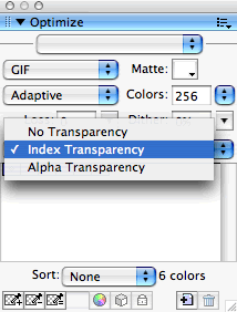 |
|
Choose Index Transparency
from the menu and your transparent area is all set.
|
Before you're ready to save, you should also choose a
Matte color so any partially-transparent pixels are told what color
to be. Decide this based on the intended placement of the graphic
in your Web site. Sometimes it's handy to save a few versions with
different matte colors if your image will go in a few differently
colored locations.
Additional
examples can be seen below:
 |
This
is a non-transparent GIF with a green matte. But what
if I wanted to create a white logo to appear on a green table
cell background?
I might create a transparent GIF with a green matte...
|
 |
|
...like so. Normally, this
would be used over a green table cell background (the green
background
has been removed
so
you can see what the matting looks like).
|
|
|
Here's
the same transparent GIF, this time placed over a table
cell with a green pattern.
|
There are times when the background canvas isn't what
you want transparent, or isn't the only area you want transparent.
Or times you may be given a graphic that is not in layers so you
can't simply make the canvas transparent.
When this happens, you'll need to make a selection
of the area you wish to be transparent. Open the file called pattern.jpg
from the course download area.
This pattern from India is on a white
canvas, and since it's a JPEG, the canvas isn't a separate
layer that we can easily make transparent.
We would like this image to sit on a blue background
and for its main white areas to be transparent so it blends in better
with the background. So we'll select the white areas and remove them.
Be sure you're working in Original view until we're ready to optimize.
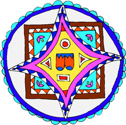 |
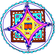
| I want the white areas of this image to be transparent,
showing through to a blue Web page background. |
First,
change the background color (Modify > Canvas > Canvas
Color) to blue, or any color you'd like. You won't
see this color yet because the image is covering the whole
background. We
want
to eliminate
the white areas to make them transparent. To do this, we'll
use the Magic
Wand tool  ,
which selects areas of a canvas that are comprised of the
same color. We will
use it to select white areas so that we can delete them.
,
which selects areas of a canvas that are comprised of the
same color. We will
use it to select white areas so that we can delete them.
After selecting the Magic Wand, set the Tolerance in the Properties
panel to about 35. This will ensure that the
tool will pick
up
the
majority of the white area.
Click with the tool once into one
of the white areas. A "marching ants" selection
of that
area will immediately appear. At this point, you could just
hit your Delete key to remove the area. But, you should first
return
to the Magic Wand options and set them to produce the cleanest
effect. To do this, choose Feather from the Edge field and
assign a feather value of 1 pixel. Now, go ahead and press the
Delete
key to remove the white area.
Repeat
this process with the remaining large white areas. To speed
it up, you can hold Shift and click multiple white areas with the Magic
Wand, selecting them all at once.
When you are done, your pattern should
stand alone against the background color.
Select
the Pointer tool and click once on
the side of the canvas area to exit the selection.
 |
The
difference between hard (left) and feather (right). If we had
chosen the Hard value from the
Magic Wand settings, our deleted areas would have had grainy
edges. |
Now
there is one more step to take before we export the file.
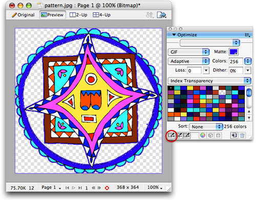
Open the Optimize panel and go into your Preview view.
Open the color swatch next to the Matte
field and hold the Eyedropper over your canvas color to
select it. This will ensure that any edges around the transparent
areas will blend with your canvas color.
Choose the GIF file format and choose Index Transparency.
I went with an Adaptive palette of 256 colors, but try some other
color
settings
and see
what you think is the best compromise between quality and size.
If you still see your blue background in your Preview
view, even after clicking Index Transparency, you can tell Fireworks
that blue is the color you would like to be transparent. Click
the eyedropper
icon
in
the
lower
left
of the Optimize panel, then click once in the blue canvas area
to make it the transparent color. (If the checkered background
is already visible when you go to Preview view, Fireworks has already
determined this for you.)
 |
Click
the circled button above to choose the color you would like
to be transparent. |
Now you can go to File > Export and
save the GIF. For now, just
export the image, not the HTML.
Open
a Web browser and choose File > Open and
browse for the file you just created. If you did the transparency
right, your image will look rather strange inside the browser.
Since it has not yet been placed inside an HTML page with
the proper background color, all you will see is the pattern
with a blue halo. This halo is the matte.
 |
| Against a
different background, like white, you will see your matte color
on some edge pixels. |
If
you want to see what the image will look like inside the
browser with the proper background color, redo your export, but this
time,
save the HTML as well.
 |
Choose HTML
and Images when you export. |
Open the exported HTML file inside the browser.
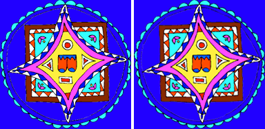
Your results should look something like the image below. This is
an especially handy technique if the image needs to sit over a
patterned background,
in this case one with a predominantly blue pattern.
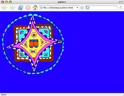 |
| Now you can
see that this transparent GIF will work well on a solid blue
background, or even a patterned background that is predominantly
blue. |
Image
Slicing
In
after-hours coffee joints, you'll meet Web designers who talk
about image slicing, murmuring
in hushed tones and nodding appreciatively. OK, they don't, but it
is an important technique.
Image
slicing is a combination of HTML and image editing. Simply
put, image slicing is a technique in which an image is cut up
into smaller pieces.
These smaller pieces, always rectangular as all images are, gain
their own independence, so to speak—they can be individually
edited, optimized, and animated. The individual files are then
put back
together
like a
puzzle within a table of an HTML page (CSS
can also be used).
 |
| The image slices that make up this page have been placed inside
an HTML table. Because the table's border has a width of 1 pixel,
the spacing has been thrown off. |
 |
| Once the borders have been rendered invisible
(by setting their HTML properties to 0), the image slices blend
together seamlessly. Thankfully, Fireworks does this for us! |
Slicing can, in reality, increase load time
(the opposite result of what you want). This can happen
because your browser makes an increased amount of concurrent requests
to the server, or because the individual slices add up to a slightly
higher file size than a single, large file. However, the human eye
perceives the whole image to load in quicker when it is
sliced. As smaller pieces are downloaded,
the eye "fills
in the blanks," reducing the PLT (perceived
load time). This is much better than the user not seeing anything until
the entire image is
done loading.
PLT and the ability to optimize each piece individually
are the main benefits of image slicing. Let's say for example you
have an image that consists of photographic elements, animations,
HTML text, and solid blocks of color. Then, image slicing might just
be
the thing for you! You can make the photo part a JPEG, the animated
part a GIF, and so on.
 |
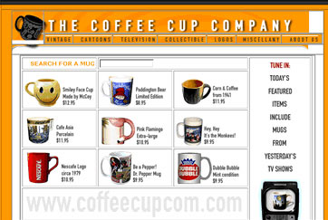
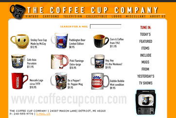
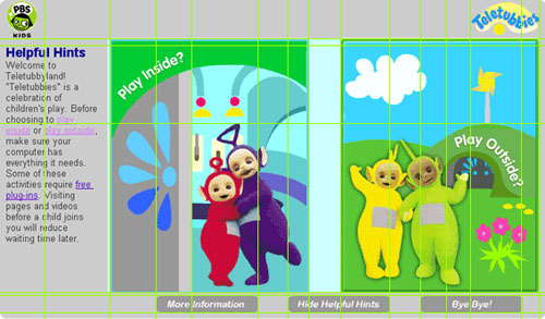
|
Here's
a schematic of how the PBSKids/Teletubbies home page
was created using Fireworks slices.
|
As
we've learned in previous lessons, the photographic areas in
my Teletubbies example would be best saved as a JPEG but the text
and solid color areas would
be
better suited for GIF format. Slices allow me to optimize these
each accordingly.
Image slicing also allows you to repeat identical
areas of the larger image
by
reusing
a small "sliced" image,
displaying areas of solid color with a colored table cell rather
than an image, and animating smaller sections of the large image
rather than animating the entire image.
How
to Create Image Slices
This
is easier than it looks. There are a number of different ways
to create slices, but for this example, let's run through how to
create
slices based on guides. Guide lines help you plan your slices
and align your artwork before you start slicing. You can import any
image into Fireworks to try this out as I explain it.
To
create guides you must have your rulers showing. Go to the View
menu and select Rulers. With your Pointer tool
selected, you can create and move a guide by clicking and dragging
from the ruler. You can pull horizontal guides from the top ruler,
and vertical guides from the left ruler.
When
you've got a finished image or page design ready to slice, drag
the guides onto your image, and align them to where you'd like your
slices
to
be. Consider what areas you'd like to be different individual graphics.
For example, I wanted the PBSKids logo to be a graphic of its own,
the buttons at the bottom on their own, and so on. Your guides may
cross over each other in certain places, creating more
divisions
than you're
looking
for,
but don't
worry—we'll
be able to adjust this a few steps down the road.
 |
|
Green
guides placed over the image help indicate places
to slice.
|
With your guides drawn, grab your Slice tool  from
the Tools panel and make sure that the "Show slices and hotspots"
button below it is active
from
the Tools panel and make sure that the "Show slices and hotspots"
button below it is active  .
Also be sure that View > Guides > Snap to
Guides is active. This means that as you make your slices,
they will automatically align with the guide.
.
Also be sure that View > Guides > Snap to
Guides is active. This means that as you make your slices,
they will automatically align with the guide.
Click and drag over your guides with the Slice tool,
snapping to the guides. Wherever possible, combine some of the guided
areas into a single slice. For example, my guides made 15 separate
pieces in my top bar, but I really only needed three.
 |
|
Slices are great, but keep
them under control by creating only the ones you really need.
|
Alternatively, you don't need to draw the slices at all—you
can choose "Slices Along Guides" when you Export and slices
will automatically be made based on your guides. This isn't recommended,
however, because you'll usually end up with more slices than you
need, as in our Teletubbies example.
Slices that you combine must be positioned next to each
other and must be of the same
dimension on the adjoining sides (all slices must become
non-overlapping rectangles). For example, you cannot combine
slices 1 and 2 below,
but you can combine slices 2 and 3.
 |
|
Slices 1 and 2 here don't have
the same adjoining dimensions, but 2 and 3 do.
|
If you're not happy with any slice, simply select it
with the Pointer and delete it, or resize it by dragging any of
its corners with the Pointer.
When
you're finished making slices, you can either save right away
or optimize each slice first (optimizing is recommended of course).
To go ahead and save, export and make sure you have "HTML and
Images" and "Export Slices" selected.
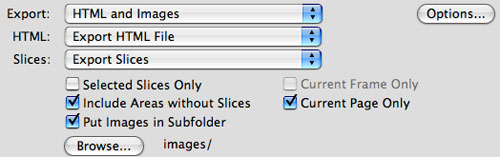 |
|
Use these settings for a basic
slice export.
|
Fireworks
automatically creates the image slices, placing them in a folder
with the associated HTML file.
In most cases, you will want to optimize your slices
prior to exporting. Click a slice with the Pointer, then go into
Preview view and your Optimize panel to choose your GIF and JPEG
settings.
If you have any blank slices, like the gray bar in the
top of my Teletubbies design, you can make this plain HTML coloring
instead of wasting file size with a graphic. To do this, simply
select the slice and choose HTML in the Properties panel.
I
know that sounds intimidating at first, but once you've done
it a few times, you'll be able to do it with your eyes closed!
Interlacing
and Progressive Files
Here's
another interesting technique that can ease the pain of slow
loading. When
a file is saved as interlaced or progressive,
its compression method affects how the image is loaded into the
browser
(or other graphic viewer).
A
low quality version of the image is presented on-screen, and
as it loads further the image becomes more defined until it reaches
its
final
state—the highest quality it was saved at. These files have a larger
file size (though usually only minimally larger).
Without selecting this
type of compression, your images, then known as baseline,
will load from top to bottom. As with image slicing, your Web
graphics may appear to load faster.
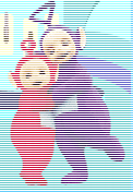 |
 |
An
interlaced image may look like this as it's loading into the
browser.
|
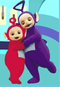
In
a matter of seconds, it resolves into the fully loaded
version of the same image. |
To
add this option to your images, all you need to do is check the
Interlaced item
or the Progressive item in the Optimize panel menu.
GIFs offer the Interlaced option, while JPEGs offer Progressive,
but the results are similar.
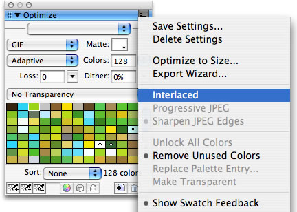 |
|
Just
check the Interlaced option to produce the loading effect
on a GIF, or Progressive JPEG for a JPEG. These options are
found in the menu in the top right of the Optimize panel.
|
Web designers live in a very different world than print
designers do when it comes to color. We don't have as much control
over how our work will be viewed. Various monitors, platforms,
and browsers display colors differently. There's no perfect solution,
but understanding color concepts can help you manage the issues
that may come up.
Let's wrap up this lesson by addressing the fundamentals for a Web designer.
Color and Bit Depth
Bit
depth refers to the maximum number of colors that appear in an
image, based on the monitor display. A bit is
the smallest unit of information that a computer understands: the
options are 1 or 0, "on" or "off." Every monitor
screen is made up of pixels, and each of these pixels has a specific
amount of bits assigned to it, depending upon the computer system.
 |
|
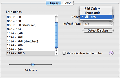
In your operating system,
you can set the number of colors and screen resolution that
appear on your computer monitor. Experiment with this a bit
to see the difference these settings make. On a PC, this
is found at Settings > Control Panel > Display. In
Mac OS X, go to System Preferences > Displays.
|
The number of bits assigned to each pixel is called bit
depth. The higher the bit depth, the greater range of
colors an image can hold. Typically, color resolution (different
than image resolution) is 8-bit, 16-bit, or 32-bit. Some users
with older setups (about 1% of the population at time of writing)
can only display 256 colors (8-bit color). If it's absolutely
necessary that this small group of users view your images exactly
as you created them, you should only use the 256-color palette.
Bit depth is a quality of both monitors and images.
But, no matter how high the bit depth of the image, it can only
be displayed at the monitor's bit depth. For example,
let's say you create an image with 16-bit color depth and you post
it to the Web. A viewer with a monitor resolution of 16 bits will
see your image as you created it, but a viewer with an 8-bit screen
will only see a maximum of 256 colors.
Recall that GIFs can hold up to 256 colors, so GIFs
will look about how you expected even on 8-bit monitors. JPEGs
have 16.7 million colors and will look best on 16-bit monitors
and up.
Color Gamut
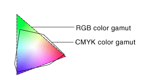
The color gamut is
the range of colors that any system can display (or print).
The RGB gamut contains the colors that can be seen
on a monitor. Some colors, such as pure cyan or pure yellow,
are outside of this gamut. If you receive an image in a mode
other than RGB (let's say you receive print pieces in the CMYK
mode) and open it in Fireworks, Fireworks will automatically
convert it from the original palette
to RGB. The
color values may be changed permanently because the color gamuts
of different modes are not the same, though usually the shift
is extremely minimal.
 |
|
The color gamuts of
RGB and CMYK color systems do not exactly correspond.
|
Modifying and Reducing Colors
Unlike JPEG files, which always have the same number
of colors, GIF files can range from two to 256 colors. The
more colors a GIF file has, the more space it takes up. Therefore,
a
simple
way
to
reduce file size is to reduce the amount of colors. Fireworks
make this process very easy for you in the Optimize palette, as
you've already seen.
When colors are reduced, blocky areas can appear, but
Fireworks has an easy solution for that too! Dithering is
a technique for simulating colors. It's actually an illusion,
a process of compensation in which adjacent colors fool the eye
into
seeing shades that aren't actually there.
Available colors in the chosen GIF palette are mixed
in a pixel pattern, in order to create the "look" of
additional colors. Look closely at a color comic strip in the
newspaper and you'll see the same effect. You should be aware that
this process
can increase file size, but it may be a worthwhile sacrifice.
Fireworks lets you choose how much dithering you would like in
your image with
the Optimize panel. Try various settings to see what result
you like best.
 |
 |
32-color
GIF with no dithering
|
32-color GIF with 100%
dithering
|
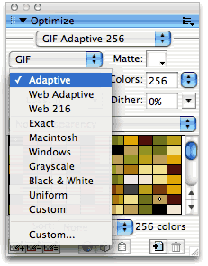
Palettes are another concept that only apply to GIFs
because of their limited colors. Palettes are chosen in the Optimize
panel and dictate the range of colors your GIF can have. So far,
you have used the Adaptive palette, which chooses the 256 (or fewer)
colors based on the colors in your image.
 |
|
Choose your palette here.
|
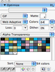
Here are other color palette options for the Fireworks user:
 |
|
 |
| |
Web
Adaptive:
This palette will "snap" colors to Web-safe colors if these
colors are in the adaptive palette and close to
Web-safe ones. Colors that are not similar to Web-safe
ones will remain colors that are not Web-safe.
Web
216: This palette limits your image
to the 216 colors that are available on both Windows
and Mac platforms (each platform
has 256, but only 216 overlap between the two platforms). It gives
the highest level of cross-platform consistency, but is usually
too limiting for your needs. Recall that 8-bit
users make up only a tiny sliver of the Web population, so you'll
rarely need this palette.
Exact:
If you have 256 or fewer colors in your image, this will
allow you
to keep the exact colors in your RGB image.
Macintosh, Windows:
These palettes snap the colors to the Mac and Windows system
palettes.
Grayscale, Black and
White:
These self-explanatory palettes change your image to grayscale
(up to 256 values) or black and white (two values).
Uniform: This
palette consists of a set of colors distributed uniformly
through the RGB options and is rarely used.
Custom: By choosing
a Custom palette you can select your own combination of 256
colors.
|
|
 |
|
 |
You can also make your own custom changes to an existing
palette using three buttons at the bottom of the Optimize panel.
Click a color in the panel and choose the color wheel to change
it. Click the cube button to snap a selected color to the nearest
Web-safe color. If there's a color that has to stay exact in
your palette, no matter which others are removed (often the case
with
logos), you can lock it in using the lock button so it won't disappear
or change.
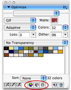 |
| Customize a basic Adaptive palette with these
features. |
Now
that you've learned how to squeeze your files down to size,
in the next lesson we'll talk about the bigger picture—how your
images
will fit into the overall structure of a Web site.