Web Typography | Typesetting


Typesetting

Grid-structured layouts from the 1950s are making a comeback in Web browsers today.

Typesetting is the artful arrangement of text on a page. Using font size, line height, margin and padding, the typographer controls how content is read.

Our ideas about typesetting are shaped by our experiences with it. A large page heading will stand out; small "terms and agreement" text may go unnoticed. Related information is grouped together, whereas wide margins differentiate one topic from the next.

On the Web, we've departed from the fixed page dimensions that frame the printed page. The Web is a shapeshifting canvas that must adapt to devices of all sizes and shapes. To find a solution to this imposed flexibility, designers are turning to fluid grids that borrow from designs of the 1950s and give them a contemporary twist.

In this lesson, we will apply principles of traditional typesetting to the modern Web.

In this lecture, you can expect to:

Explore the qualities of type and how they affect readability on the screen.
Learn how font size, measure, and line height affect the reading experience.
Explore both simple and complex visual rhythms for text layout.
Learn how to design text in a grid framework, focusing on popular frameworks Skeleton and Bootstrap.


Online, we tend to read not left to right but in an F shaped scan. Thus we need to organize and set our type accordingly.


Long lines of text need extra line height. Short lines of text require minimal line height.


Fonts with large x-heights need more line height.


Bold fonts need more line height.


Group related content together.


Reading is Hard; Typesetting Can Help


Choosing the right font is just the beginning of the battle for a Web designer. For starters, you have to consider how physically demanding reading text on a computer screen actually is. Reading long documents on an electronic display is tiring, and most people tend to scan the text instead.

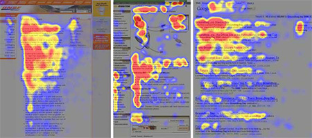
A Nielsen Norman Group eye-tracking study found that online readers tend to scan documents in an F or inverted L shape, rather than reading all the way through. In this heat map of reading habits across three different Web pages, red areas show the most eye attention, followed by yellow, then blue, with gray areas receiving no attention. How we naturally read online affects how we should typeset text online.

In many cases, this is fine, and page content can be formatted to induce scanning, setting important keywords in bold and highlighting text excerpts and pull quotes.

If you want the reader to settle in and really concentrate on the text at hand, however, you have to shape the content into a clean, legible format to make it as conducive as possible to longform reading. That's where typesetting comes in.

Typesetting is the artful combination of font size, line length, and line height, along with careful consideration of spacing and vertical rhythm. If you understand your content and how it should be read, you can use these tools to guide the reader through the text. 
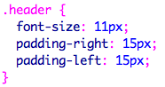
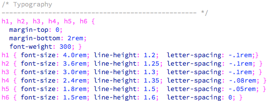
Font-Size

After deciding on a font, the typographer's task is to determine a font-size.

The standard paragraph setting is 16px, or 1em. However, the ideal font-size depends on the font. As we saw in Lecture One, fonts with small x-heights appear smaller than fonts with large x-heights.

Garamond Premier Pro, 16px FF Meta Serif, 16px

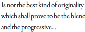
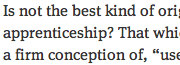
If your font has a large x-height, it will probably read well at 16px, or even at 14px or 12px. If your font has a small x-height, you might need to bump up the font-size to 18px.

Another determining factor is the amount of text. A short text blurb can be read in a small font-size without straining the eye. However, if the article is long and the font-size is small, reading becomes tiring after a few paragraphs.

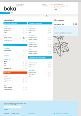
Article summaries on the New York Times are set in 12px Georgia.

http://www.nytimes.com

The full articles are set in a larger 15px font-size.

http://www.nytimes.com

Remember, it is harder to read on screen than on paper. Text on a screen is composed of tiny pixels. The outlines of the letterforms are not clearly drawn.

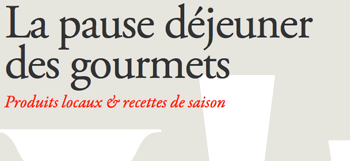
The current trend online is towards larger font settings. British Vogue uses a 22px font setting in Minion Pro. Very easy on the eye.

http://www.vogue.co.uk/

Font Size Units

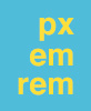
When it comes to sizing type, you'll need to choose a unit: pixels, ems or rems.  

Pixels are similar to the point sizes used in print design. You've probably used pixels before, so you have a good idea of how large 40px type is, and how small 10px type is. Pixels give designers exact control of how large type will appear on the screen.  

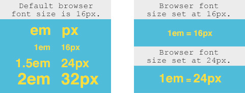
The em is relative to the browser's base font-size. By default, the base font-size is 16px, so text set at 1em will display at 16 pixels. Text set at 0.75em text will display at 12 pixels; text set at 2em will display at 32 pixels. 

However, users may override the base font-size in their browser preferences. If the user resets the base font-size to 24px, text set at 1em will display at 24 pixels. This is a great accessibility feature, allowing the user to choose a comfortable font-size depending on his or her needs. 

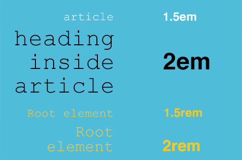
Calculating em sizes becomes complicated when working with nested content areas. If you set an article to 1.5em, and a heading inside the article to 2em, the font-size of the heading will be relative to the font-size of the article. So, assuming a base font-size of 16 pixels, the text in the article will display at 24 pixels (16 x 1.5), and the headings will display at 48 pixels (24 x 2).  

If these calculations tie you into knots, you'll be grateful for the rem unit. Just like the em, the rem is relative to the browser's base font-size. However, it doesn't compound like the em in nested content areas. The rem is always relative to the root element, the body font-size itself. If you set an article to 1.5rem, it will display at 24 pixels (16 x 1.5). If you set a heading inside the article to 2rem, it will display at 32 pixels (16 x 2). Each time, the browser uses the root element to calculate the font-size. The context doesn't matter.  

Easy calculation and good accessiblity makes the rem unit a clear winner in my opinion. Rem units work in every browser except IE8. If you have to support IE8, you'll need to use ems rather than rems. If you can drop support for IE8 (Microsoft itself no longer supports IE8 so you'll be in good company), I'd recommend rems over ems anyday.

Here's a recap of all three font-size units:


  1. Pixels: Pixels give designers exact control of what size type will appear on the screen.

  2. Ems: The em is relative to the browser's base font-size. Inside nested content, ems are relative to parent elements.

  3. Rems: Like the em, the rem is relative to the browser's base font-size, but unlike ems, the rem does not change in nested content. It is always relative to the root element, the body font-size itself.


Measure

Reading is work. The eye arrives at the end of each line of text, pauses, then doubles back to find the beginning of the next line. In typography, we use the term measure to mean the length of a line in characters, and this is how we, well, measure the amount of eye work each line takes.

If the measure is too short, the repeated pauses break up the flow of the text. If the measure is too long, the reader has trouble finding the next line after doubling back. The optimal measure for longform reading is between between 50 to 85 characters per line. To determine measure, we count all characters, punctuation, and spaces.

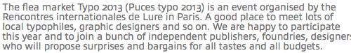
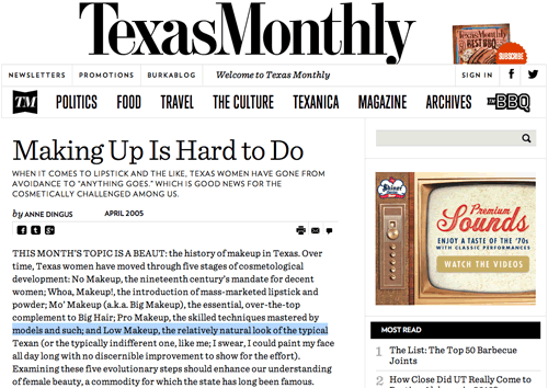
Let's see how the Texas Monthly, an online magazine, measures up. I'll select a typical line of text (not the longest, nor the shortest) ...

http://www.texasmonthly.com/story/making-hard-do

.. and copy/paste into a character counter (you can find a free one online at http://www.charactercountonline.com/). The result is perfectly in range: 76 characters. This means that the designers at Texas Monthly have done a good job making their text comfortable to read.

How can we set line length in a Web document? Well, line length can be set in pixels or ems. The methods produce different results when it comes to the font size set by the user's browser zoom level. Compare the examples below and click the links to see them in action.


  • Example A: No measure is applied to the article. The text fills the entire browser window.

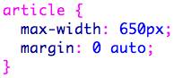
  • Example B: The article has a maximum width of 650px. Go to View > Zoom in your browser menu. Notice how the text wraps as the font size increases.


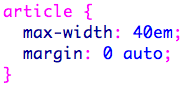
  • Example C: The article has a maximum width of 40em. Go to View > Zoom again. This time, the entire width of the article increases as you zoom. The text doesn't wrap.


If you want to control the exact number of characters per line, then setting the measure in ems is the solution. This technique works well for simple, one column layouts with long sections of text.

If you don't want the width of the text area to change when the text is resized—if, for example, you have a multi-column layout with small chunks of text—then you should define the width of the layout in pixels.

Line-Height

Line length is only half the dimensional battle. There's also how tall a line of text might be. Line height and line length work hand-in-hand to ensure a pleasurable reading experience.

When line height is too tight, the lines blend together, making the text hard to read, as you can see in the example below.

font-size:14px; line-height: 14px;

When line height is increased, the text feels open and legible.

font-size:14px; line-height: 24px;

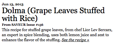
In fact, you can maintain legibility at small font-sizes by adding extra line-height. Online cooking Web site Saveur uses tiny 11px text for article intros, but adds 18px of line height to compensate. The second paragraph in the image below, set in 14px text, creates a visually contrasting color and texture.

Each paragraph has a different "typographic color" that implies the purpose of the copy. In other words, if you squint so the text blurs together, you'll notice that the top paragraph averages to a pale gray, and the bottom paragraph is a darker gray.

http://www.saveur.com/

Above the body text, of course, comes the title. Page titles, because they are usually a larger font size than the copy below them, require only a small amount of line height. Consider the two line title below, which is perfectly readable with a relatively tight line height.

http://www.saveur.com/

If too much line height is applied to page titles, the words float apart and the title doesn't read as a cohesive message.

http://www.saveur.com/

Line-height can be written using pixel values:

If the line-height is 24px and the font-size is 16px, that allows 8px of leading between the lines of text.

Or em values:

A line-height of 1.5em is one and a half times as tall as the base font size.

Or unitless values:

Using unitless values, simply multiply the font-size by the line-height value.

Unitless values are generally recommended as the more flexible option. If the font size varies from 16px to 24px, the line height will be scaled proportionally. In contrast, a line height of 24px will always be 24px, no matter the font size. Unitless values are the best bet for a responsive and flexible line height.

Vertical Rhythm

Of course, reading on the Web doesn't just stop with a single paragraph. The experience of scrolling down a Web page is like listening to a piece of music: an arrangement of beats and pauses. The space between text elements determines the vertical rhythm.

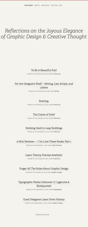
Designer Alexander Ross Charchar uses space to dramatic effect on his blog (http://retinart.net), which you can see below. The large Reflections title has a font size of 3em (three times the standard font size) with a line height of 1.17em. Wide margins are applied above and below.

Even scrolling through just a screenshot of Alexander Ross Charchar's blog, you can feel the tranquil vertical rhythm provided by the generous spacing.

The article titles and descriptions are grouped together, with a generous bottom margin separating one entry from the next, as you can see below.

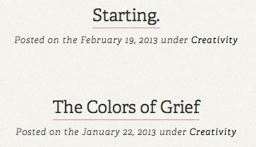
Meanwhile, on the article pages themselves, the page title is separated from the body text by a large margin. The paragraph text is slightly larger than the standard font-size, 1.055em, with a line-height of 1.75em. Watch the video below for a live version of this vertical rhythm experience.

The general rule is to set the spacing between paragraphs to match the line height. If Alexander had followed this rule and set the paragraph bottom-margin to 1.75em, it would have looked like this:

Instead, Alexander opted for a narrower margin of 0.875em. These adjustments are very subtle and must be done in accordance with each design.

Overall, Alexander achieved a perfect reading experience: he choose a legible font, determined the ideal font size, controlled the measure to average 70 characters per line, added sufficient line-height, and fine-tuned the vertical spacing between page elements.

Complex Vertical Rhythms

What happens when we move beyond the constraints of a relatively simple blog? The Web site for AIGA Los Angeles, a design conference, boasts a more complex layout with text, images, and multiple columns, but it pays the same careful attention as Alexander's blog to vertical rhythm. Watch the video below to see the home page's vertical rhythm in action.

Let's examine how this Web site works on a technical level. The thin gray borders divide the divs into sub-sections. The text is vertically centered within each sub-section: 8px above and 8px below, as you can see in the following screenshot:

The same gray borders divide the articles, but here, the margins are doubled to 16px.

Generous margins give plenty of space for each article to stand out and invite further exploration.

The article titles are 2.4em with a line height of 1em and 10px of bottom padding. Note that em and pixel values are mixed here, as you can see in the code below.

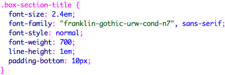
Setting the font size and line height in ems allows the text to adjust according to the user's preference. Setting the bottom padding to 10px maintains a precise 10px space between the page title and the date/byline.

In the AIGA site, each article varies in height, depending on the amount of content. Consistent top and bottom margins maintain order.

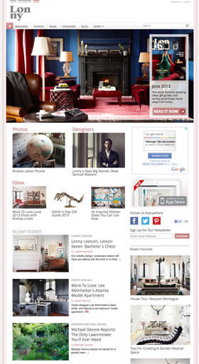
Online home decor magazine Lonny takes a different approach. The images set the vertical rhythm.

The images on http://www.lonny.com/ set the vertical rhythm through variety and placement.

Each image is 240 pixels tall. The article summaries are carefully edited not to over-extend the height of the image. The article title, byline, and description are closely spaced. Variation in casing, size, and color defines the role of each text element.

Notice how slight variations in color, case, and size help designate the different roles of the text on http://www.lonny.com/.

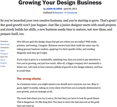
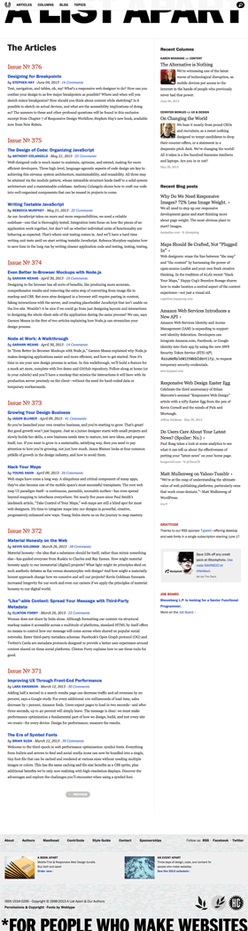
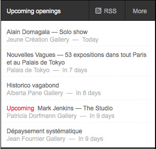
In this article listing from A List Apart, an online Web design periodical, each issue has a significant top margin. Vertical rhythm organizes the page into chunks of related content.

http://alistapart.com/

The spacing is beautifully executed in the articles as well. The byline and publication date are aligned with the page title. The red section title is placed closer to the paragraph below than the paragraph above, indicating a corresponding relationship.

The placement of the text elements in this article from http://alistapart.com/do a good job indicating how the different areas of text are related to each other.


Use open white space to create breathing space in your design.


Allow at least one element to overlap the border of the grid to catch the user's attention and invite interaction.


Use dark gray text instead of hard black on white.


Use CSS media queries to specify larger font sizes for larger displays.


Choose a framework based on how much functionality you need.


The Grid

After World War II, designers in Switzerland and Germany led a new movement in design, known today as the International Typographic Style. The philosophy involved an emphasis on order and cleanliness—as opposed to the more ornate styles of the early 20th century—using mathematically constructed grids to provide structure and unity.

Today, grids are back in vogue. Because they are based on the math of relative proportions, they are excellent for responsive layouts that can adapt to different screen sizes and devices. The Area17 Web site is a beautiful example, designed by Arnaud Mercier.

http://www.area17.com/

Grids provide a consistent page structure while adapting to variable content. A basic 12 column grid can be divided into three columns of four units each:

Two columns of six units each:


Four columns of three units each:

or any variation thereof.

Grids establish a visual hierarchy. In the example below from Slash, a Paris art magazine, the Gabriel Orozco article is a clear focal point—the largest image on the page. Bold black borders define high-level categories, and thin gray rules delineate sub-categories.

http://www.slash.fr/

In the close up below, you can see how subtle variation in text color helps define different purposes and sections for the text.

You don't need to fill every grid unit. If you have a limited amount of content, allow the remaining space to be empty, as with the lower left corner of the screenshot below.

You might even reserve an empty column along an outer edge, as a space to highlight key elements, which you can see demonstrated in the far left column below:

Böka's Web site is an example of a grid layout with soft, organic edges. The color scheme is pale and muted, so the grid structure isn't as apparent, and the simple three column layout provides structure without boxing the content in.

Finally, notice how the illustration of dinnerware blends into the gray page background on the right side of the page. Leaving a few open edges like this is a welcome relief from the contained spaces inside the grid.

http://boka.fr/

An illustration of a leaf creeps behind the boundaries of the right column. The organic shape of the leaf gives the page a humanistic feel, unblocking the grid.

http://boka.fr/

The large page titles have an organic shape.

http://boka.fr/

If the titles were set in all-caps, the design might feel too blocky.

http://boka.fr/

The home page for French designer Ora-Ïto maintains a rectilinear layout with its straight edges, but several key elements play with the structure of the div.

http://www.ora-ito.com uses a conventional rectilinear layout but spruces it up with a few overlapping elements.

First, a small red square overhangs the left edge of the container div.

http://www.ora-ito.com

The overhang is achieved by absolute positioning. The red square is given a high z-index so it sits on top of the container div. It is positioned 154 pixels from the top and 15 pixels to the left.

The photo gallery description overlaps the photo.

http://www.ora-ito.com

This is also achieved with absolute positioning.

The black rule along the top of the layout doesn't quite touch the left edge of the container. This header rule is reigned in with 15px of padding.

http://www.ora-ito.com

By aligning the rule with the logo rather than the grid container, a visual tension is achieved. The eye wants to pull the borders together. The staggered alignment is more interesting than if the rule had stretched all the way across. This same visual tension marks the other elements that overlap or break with the grid on the Ora-Ïto home page, leaving the user's eyes alert and creating a vibrant visual experience.

You might be wondering: what do these grids have to do with typography? Well, in the Ora-Ïto example, as in each of the grid layouts we've looked out, the typography fits beautifully because of how every element is contained in the grid. Each block of type, photo, and illustration is perfectly aligned, creating a cohesive design. Choosing the right structure for your typography to live in is just as important as choosing fonts and styles, and that structural choice is at the heart of typesetting.

Using a Grid Framework

Now that you know why setting your type into a grid is important, the next step is to actually implement the grid into your site.

Building a grid from scratch involves serious calculations and quite a lot of math. Luckily, there are many pre-built frameworks which provide the grid structure along with typography styles to boot. As you surf the Web, you'll notice that most sites use a grid framework in one form or another, especially text-heavy sites like magazines and newspapers.


Skeleton

Skeleton is a great grid framework to use because it's well-documented and consistently updated.

The first grid framework we're going to look at is called Skeleton. This framework has been around a while, and it's simple, powerful, and equipped for all the latest needs in Web development. Head over to http://www.getskeleton.com/ and take a quick look at the documentation.

Click the "Download" button to download Skeleton to the desktop of your computer. Unzip the file, and open index.html. Take a look at the HTML code and study how the layout is put together.

Next, open skeleton.css and scroll down to the Base Styles.

The html tag selector sets the font-size to 62.5%. This resets the base font size to 10px rather than 16px, making the rem and em units easier to calculate.

base font size = 10 pixels
1 rem = 10 pixels
1.5 rem = 15 pixels
2 rem = 20 pixels

The body tag selector determines the font styles which will appear throughout the site. Skeleton specifies a 1.5em font-size with 1.6 line-height.

The font stack indicates a preference for "Raleway". Raleway is a Google font, so it has to be loaded as an external resource. Toggle back to the index.html file, and you'll notice that Skeleton links to Raleway in the document head. If you aren't using Raleway, you'll want to delete this link and replace it with your own font links.

Skeleton provides a standard sans-serif font stack as a fallback for Raleway: "HelveticaNeue", "Helvetica Neue", Helvetica, Arial, sans-serif.

The font color is set to #222 (dark gray). On a luminous computer screen, pure black text has too much contrast against a pure white background. The dark gray font color creates a softer effect.

Skeleton's heading styles define the font-size, line-height, and letter-spacing of each heading level.

You can override any of these typography settings in your own custom.css file. Create your custom.css file and link it to your html file. The custom.css link should be listed last in order to override the styles in skeleton.css and normalize.css.

Bootstrap

Bootstrap offers more options than Skeleton but is a little more complicated to use.

Bootstrap is a more complex framework than Skeleton, with tons of jQuery plug-ins and formatting options. Head to the Bootstrap site at http://getbootstrap.com/ and click the Download Bootstrap button. Unzip the file, and open index.html.

The Bootstrap downloads folder doesn't include a index.html file, but you can create your own and copy the copy the Basic Template or one of the Example Templates.

The css folder contains four versions of the Bootstrap CSS file:


  • bootstrap.css - the standard Bootstrap theme in a contemporary "flat design" style, without gradients or beveled elements

  • bootstrap.min.css - the minified version of bootstrap.css

  • bootstrap-theme.css - an optional Bootstrap theme with gradient backgrounds and beveled elements

  • bootstrap-theme.min.css - the minified version of bootstrap-theme.css


You'll need to link your HTML file to one of these Bootstrap CSS files. I recommend using the bootstrap.css file as you work on your site (it is easier to read) and the bootstrap.min.css file when you are read to launch the final site for the public (the minified file will load faster in the Web browser).

Open the bootstrap.css file now. Scroll all the way to down to line 1084 to find the body style. The font-family is set to Helvetica Neue. The font-size is 14 pixels, slightly smaller than the standard 16 pixel default font-size. If you are using narrow columns of text, the small font-size is a good fit. If you are using full-width text columns, you'll probably want to use a larger text size.

Never edit the bootstap.css file directly. It is tempting to make a quick change, but you'll loose your changes when you update to a new version of Bootstrap.

Instead, follow this process for modifying the Bootstrap styles:


  1. Using the Google Chrome browser, right-click (or Control-click) the element you want to edit and choose "Inspect" from the dropdown menu.

  2. The DevTools window will list all of the styles that affect the particular element you've selected in the browser. Find the style that you want to modify.

  3. Copy and paste the style into your custom.css file. Then change any of the properties.


The styles in your custom.css will override the styles in the bootstrap.css.

Bootstrap also provides styles for lead paragraphs, blockquotes, and lists. Go to Bootstrap's website to find more info on Bootstrap's typography styles. Any of these properties may be modified as you please.

Choosing a Framework

Bootstrap and Skeleton are both solid frameworks, each offering reliable structures to build upon. Their type styles provide you with the basics, making it quicker and easier to get going on a project. Rather than writing new styles from scratch, you can easily modify the pre-built font sizes, colors, and line height values. Feel free to use the frameworks in any manner you like, deleting the styles you don't need and adding new styles to customize the design.

In deciding which framework is right for you, think about how much you need. Skeleton is a very streamlined framework with a light, efficient external stylesheet. For a small, simple Web site, it's perfect.

Bootstrap, meanwhile, provides a more robust solution, especially when you factor in the many jQuery plugins. The back-end code is more complex, but it offers a lot of functionality: responsive nav bars, image slideshows, and more.

Explore both frameworks to decide which solution is best for your project. 

Conclusion

Typesetting is an art Web designers have inherited from print designers, and it's just as important a principle for the screen as it is for the page. Whether you're designing freeform or in a grid, for mobile devices or a desktop, you should always be considering how your design choices affect the readability and attractiveness of your text.

Typesetting requires careful consideration of the content and how it should be read. By paying careful attention to font sizes, measure, line height, and vertical rhythm, you can guide your users through a seamless and content-rich reading experience.

 
Learn how to use proper HTML5 semantics to mark up your text.
Explore typographic refinements that catch and retain attention.
Learn how to use CSS3 effects—including shadows, transitions, and transforms—to enhance text.
Learn how to pair text with information graphics to tell stories and help users digest complex information.

Discussion
Share your thoughts and opinions on typography in the Discussion area.

Exercise
Plan and design the Web site for California Garden's online presence.