Back in the 1990s, the Web was a graveyard for visual designers. Many would argue that typography is the true mark of a designer (it's what separates designers from other artists) and in the bad old days, the Web offered precious little control over type.
Thanks to the CSS revolution, those days are mostly gone. Beautiful typography requires some effort, but it can be achieved on standard, non-Flash Web pages.
Feast your eyes on the two sites below before we begin the lecture. Notice that they are both blogs. Since most blogs are about type-based information that people ready on a daily basis, blogs are a great place to learn about effective and clever typography.
Case #1: I Love Typography
Hey, who doesn't love typography? Whereas Upstart Blogger focused on a single, sans-serif typeface, the I Love Typography site combines serifs and sans-serifs beautifully for contrast and hierarchy.
There are very few images on the site, and most feature—you guessed it—more typography. I really like the navigation, which features lightweight sans-serif type in a soft gray. Had the navigation been set in black, it might compete too much with the logo header. Despite the softness, the navigation is in a common location and has mouseover highlights, so it is still very easy to find and use.
Case #2: Typewolf
Finding inspiring type designs on the Web can be difficult. Sure, type is everywhere, but major sites often make less-than-inspiring choices. Where do we click, tap, or look for creative solutions?
One wonderful resource is a site called Typewolf that has been run by a designer called Jeremiah Shoaf since 2013. At Typewolf, Shoaf only showcases interesting designs, pointing out the impact of type choices from a designer's perspective.
|
Typewolf, designer Jeremiah Shoaf surveys exciting type designs on the Web. |
If you're interested in Web typography, bookmark the Typewolf site of the day page. There you will see some classic and some incredibly fresh, boutique designs for today's Web, such as this eyepopping site promoting cat food brand Smalls for Smalls.
Inspired? I hope so! Now let's get to work with a refresher on some typography basics that all Web designers should be familiar with. Some of this may be old hat to you, but in my experience, many Web designers neglect to properly learn typography, so it's important make sure these fundamentals are understood.
Developing an awareness of the characteristics of a typeface will help you make better font choices.
Components of a Letterform
Strokes are the lines that make up part of a letter. Think of the lines that are made by the "stroke" of a calligrapher's pen.
 |
Strokes (highlighted in blue) |
You've probably heard of serif vs. sans-serif fonts, but what are "serifs," anyway? Serifs are the small finishing strokes that are found at the end of the main strokes of a letter.
 |
Serifs |
In print, serifs are thought to enhance the legibility of type, as they guide the eye horizontally while you are reading. However, there continues to be much controversy as to whether serifs contribute to overall legibility. It is generally thought that, for Web typefaces in particular, sans-serif fonts are cleaner-looking than serif fonts and more legible. (But more on that argument later.)
The baseline is the imaginary line upon which the letters sit.
 |
Baseline |
Cap-height refers to the height of the capital letters of a typeface. The x-height is the height of the lowercase letter "x," or the height of the main body of the lowercase letter. The bigger the x-height with respect to the cap-height, the bigger and "meatier" the overall typeface will look.
 |
 |
Cap height |
x-height |
The ascender is the bit of a lowercase letter that extends above the x-height (for example, the stem of an "h" or upper portion of a "t"). Note that ascenders are often taller than the cap-height. The bit of a lowercase letter that extends below the baseline (for example, the bottom of a "q" or "g") is a descender.
 |
 |
Ascender |
Descender |
The counters are the negative spaces inside the letters.
 |
Counters |
Most type used in the main body of a page is classified as serif or sans-serif, but within these two main types are several more fine-grained categories.
Serif faces tend to look more "classical" than sans-serif faces. This makes sense, when you consider that they closely resemble the Roman letterforms from which they originate.
Serif fonts were used almost exclusively until the Industrial Era, when print advertising boomed and demanded typefaces that grabbed more attention. Sans-serif type was born during this time, and thus tends to have a more "modern" feel than the traditional serif type.
One popular method of classifying typefaces is to break down type into 12 different categories, five of which are standard serif types. You may not need to know them all (particularly because Web design involves some constraints on fonts, as we'll discover later). However, it is important that you are able to compare different typefaces within a category and make good design decisions.
Comparing Serif Fonts
Let's compare a couple of contrasting serif types:
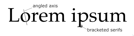
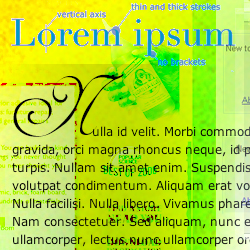
Garald style type, also known as Old Style, was at its height during the Renaissance. Palatino (shown below) is an example of a Garald typeface. It is characterized as such because of the angled axis of the "o" (it looks tilted), and the bracketed serifs. A bracket is the small wedge or curve where the stem of the letter meets the serif.
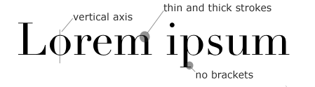
During the early 1800s, there was a shift from the Old Style to a more contemporary Didone (also called Modern) typeface. Take a look at the typeface below called Didot. The "o" has a vertical axis (it appears to stand up straight), and the serifs are not bracketed (the stem and serif meet at a right angle, making for a more modern feel). Also, there are extreme variations in the weight of the stroke from thick to thin.
Comparing Sans-Serif Fonts
Now let's compare a couple of contrasting sans-serif types. While all sans-serif typefaces fall under one category, they can be broken down further. Sans-serif types, as their name suggests, lack the serifs of their traditional counterparts. They tend to look more contemporary than serif faces, as they arrived on the scene much later.
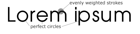
Geometric Sans is typified by the typeface below: Avant Garde. Notice how the round letters are perfect circles (hence the name, "Geometric" Sans). The strokes of the letters are evenly weighted; there is no thick-to-thin variance.
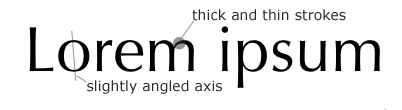
Now look at the typeface Optima, pictured below. Notice how we have a shift back to the more classical look of a serif face (but without the serifs). What features make it look more "classical"? It is called Humanist Sans because the varied weight of the strokes (from thin to thick) evokes the strokes of a calligrapher's hand, humanizing the type a bit. And, typical of many traditional serif fonts, the angle of the axis of the "o" is slightly tilted.
As you can see, not only are there subtle differences between seemingly similar typefaces, but those differences can affect the overall "feel" of a typeface.
Of course, we've only touched on a handful of typeface categories. There are many more serif classes, as well as classes dedicated to "decorative" types, non-Western alphabets, and even symbols (like Dingbats and Wingdings) that are not letters at all. I'll leave those additional typefaces for you to explore.
Points
Points are the traditional method for measuring typefaces. Historically, when typefaces were cut by hand, there were only a few standard sizes, measured in points: 10 point, 12 point, 14 point, and so on. A point is 1/72 of an inch, and you measure a typeface by counting the points from the top of the typeface's highest ascenders to the bottom of its lowest descenders.
Also note that x-height can dramatically affect how big a type looks. A typeface with a large x-height can look much bigger than a typeface with a smaller x-height, even though they are the same size, point-wise.
 |
A typeface with a large x-height, 44 pt |
 |
A typeface with a small x-height, 44 pt |
Ems
The em is another common unit of typographical measurement. An em is equivalent to the particular typeface's size. Thus, if you have a 12-point typeface, one em is equal to 12 points. A character is approximately half an em in length.
In CSS, both the em and the point are valid units of measurement for many selectors. But be aware that the actual size displayed in a browser can vary. The em, by its nature, is a relative unit of measure (it is dependent on the particular font you're working with). One point is roughly equivalent to a pixel, but this will vary depending on your computer and operating system.
Print Versus Web
Historically, typography is deep-seated in the medium of print, and its rules and best practices arose from working within this medium. And while many of these rules and best practices still apply to the Web, you must keep in mind that the Web is not print.
The printed page is static. As such, a designer is given complete control over her printed work. She knows that how she designs a page controls how it will universally and invariably appear on paper. Web designers are afforded no such comfort.
First of all, Web browsers give users a number of ways to alter the appearance of a Web page. They can resize the browser window, change the font size, and turn off certain features (like images and plug-ins).
If that wasn't enough to frustrate a designer, she must also account for the varied ways that different browsers render a page, as well as the differences between devices and operating systems. All of these variables make it difficult to create a Web page that will look the same for all users.
While there are methods for ensuring control over certain page elements like font size, these methods are generally not recommended, as they rob the end user of the ability to set these elements to his comfort level (thus decreasing overall usability).
A good Web designer knows how to work around limitations to create a page that looks good under most (if not all) circumstances.
Type in the Mobile Web Era
In the early years of web development there wasn't a huge selection of fonts to choose from. Most designers were limited to system fonts already installed on a user's computer when it came to typography. Many of system fonts already existed in the print world so designers were already familiar with the fonts. Web browsers could render the fonts easily making them the best choice at the time.
Today much has changed with the web. How we used fonts has evolved with the rise of responsive design. Designers now have multiple displays to work with such as mobile phones, tablets, and consoles. It became important to have more control over how fonts work on the web.
System Fonts
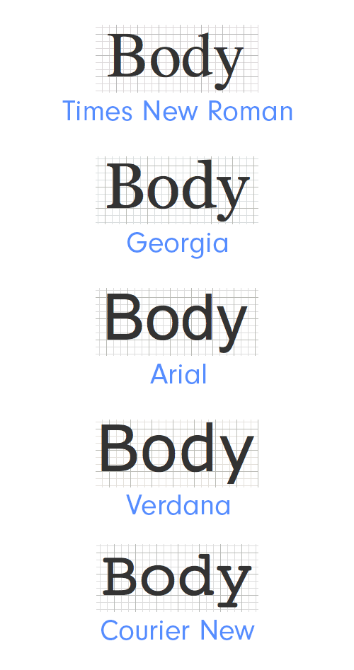
System fonts are bundled with operating systems, so that chances are, visitors to your site will already have the font installed. When you choose a system font, you can rest assured that it will render correctly in the browser. These system fonts are the tried and true friends of the web designer.
System fonts include Time News Roman, Georgia, Arial, Verdana, and Courier New. Each of these fonts should be familiar to you:
|
System fonts can be found on most operating systems . |
Web Fonts
With the introduction of web fonts, designers are now able to use fonts that are hosted on sites like Google Fonts or Adobe Typekit. Sites like Typekit provide the user with a large variety of typefaces to pick from. Some typefaces offered may need to be purchased to provide the designer a license to use the font but there are many free fonts to pick from.
|
Access to Adobe Typekit comes with your subscription for the Creative Cloud |
Web Fonts are connected to your website with some simple code. On the Typekit site, the designer will create a kit that will be connect to the designer’s site with some code. The site will then pull the information of that selected font in the kit and apply it to the website when visitors view it. Typekit gives a lot more options when it comes to web typography.
Adobe Typekit
In case you're not familiar with it yet, let's explore how to use Adobe Typekit.
To get started, visit https://typekit.com/ and sign into the site with your Adobe ID. Your Adobe ID is the username and password you created when signing up for the Adobe creative Cloud.
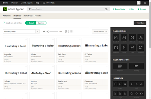
Once signed in, click on the Browse tab in the top left of the screen. This will direct you to a page where you can start looking through fonts.
At the top of the page is a search bar you can use to search for a specific font. If you don't know the name of a font you can upload a photo and have it scanned to identify the font.
|
Already know what you're looking for? Type the name here to locate it quickly. |
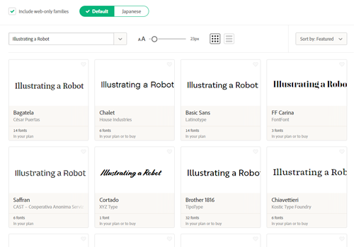
There is an area where you can type your own text to appear in the preview and various tools to help you visualize how the font choice affects your text. Also there is a check box to include web-only families. The left side of the page will show the fonts and previews of the fonts while on the right side are options to filter what you see.
|
Typekit gives you the tools to find the perfect font to use. |
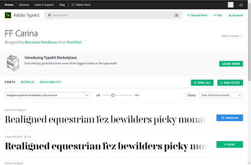
Click on the various previews to see more information about each font. A new page will open where new text can be entered to be previewed and specific styles can be synced to your account.
|
This font has one style that is part of my plan but the other will cost me money. |
When you sync a font it becomes part of your account and you can use the font in Photoshop, Illustrator, and other Adobe CC programs. You can sync the entire font family or just specific styles from the family. This comes in handy when creating mock ups but syncing a font alone will not prepare you to use it on your website. You still need to make a kit with any fonts you want to use in your website.
Creating a Kit
Let's take a look at how to create a kit. First, return to the browse section of Typekit. Find a font you would like to use and make sure it's a web font. Some fonts may cost money.
When you find a font you like, click on the preview panel to see all the styles of that font. Find the style or styles you like. At this point, you can sync the font if you want to use it in mock ups or future projects. Some fonts cannot be synced and are only avilable for the web.
|
Brother 1816 gives me a lot of styles to pick from. |
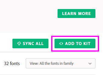
Navigate to the top right of the screen to find the button labeled Add To Kit.
|
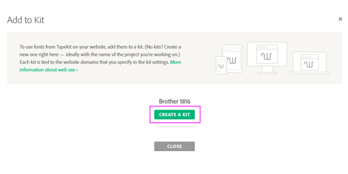
Even though it says Add to Kit, you will actually be creating for your first kit. |
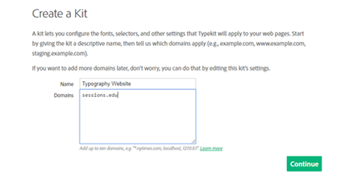
Clicking the button will take you to a screen where you will start putting together your kit. Next, click on the button labeled Create Kit.
A new window will appear where you can name your kit. Give it any name that's logically related to the site. (In the future you may have multiple kits so a good name can help you keep more organized and identify the kit easier.)
Under the name is where you will add the domain. Put the domain of your site here. Click continue when you are finished.
|
I put sessions.edu in as an example. Make sure you put in a domain where you are an admin or owner. |
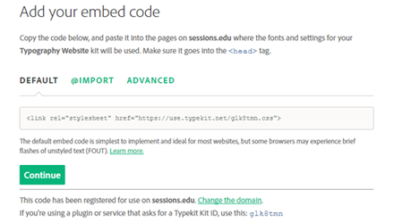
Earlier I mentioned that web fonts were connected to your page using some code. This is the page where you view the different ways to embed the font. You can just leave this set to default. Press Continue.
|
Typekit shows you the different ways you can attach the font to your website. |
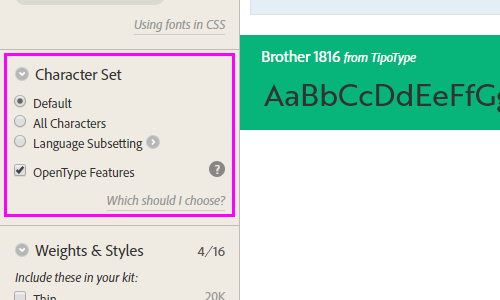
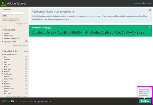
In this new window you will be able to adjust settings to use your fonts. At the top you can specify any selectors you will want the font to be applied to.
Just under the Selectors section is an area where you can decide what characters you'll need in the font. If you plan on using the font for your body text then having access to all possible characters might be good because it will give you access to not just numbers and letters but also some symbols or glyphs that are part of the font.
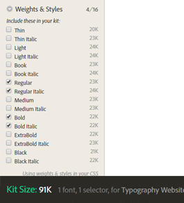
Finally, we can select the weight and style of the font. Before you decide to take all of them, remember that using many web fonts can slow down the loading of the page. Usually at this point you should already have an idea of what font weights you need but if you're following along just pick some random styles. At the bottom you will be shown the size of your selection. It gets bigger with the more weights or styles you add. You can always edit a kit after you make it if you change your mind.
|
Adding to many weights and styles could cause your fonts to load in slower. |
Click on Publish when you are finished with creating the kit.
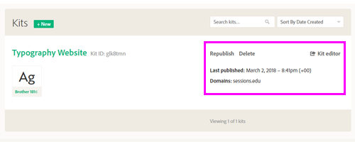
If you need to make changes to your kit at any time, you can click the link near the top right of the main page labeled Kits. Clicking on the link will take you to a list of your active kits. You can delete any kits you do not wish to use or edit a kit's name, domain, and fonts.
|
If you change your mind or need to update, Typekit makes it easy to edit, delete or republish the kit. |
With your kit created, you can now use the fonts that you selected in your website. Let's explore some of the options for choosing fonts.
Font Choice
Historically, a font was a particular cut and size of a typeface. Today, the word "font" is used interchangeably with the notion of a computer typeface. There are many things to consider when choosing the right font for your page.
For example, you must consider your audience, and what tone or feeling you want your page to evoke. Should your font be formal? Classical? Modern? Casual? Your font choice should fit in with the overall tone and look of the page.
Windows |
Mac |
Arial |
Arial, Helvetica |
Courier New |
Courier New, Courier |
Impact |
Impact, Charcoal |
Lucida Console |
Monaco |
Trebuchet MS |
Helvetica |
Webdings |
Webdings |
MS Serif |
New York |
What font you choose for your headings and titles will likely differ from your choice for body text. One popular method is to contrast your heading fonts with your body fonts (for example, using serif headings with a sans-serif body).
If you take this route, make sure that your fonts are different enough to properly contrast. Otherwise, they can clash. Using two different serif faces, for example, can be problematic.
In addition, it is best not to include too many different types of fonts, as this can result in a hopelessly chaotic and messy page. Try to keep it down to two or three different fonts, at most.
Page titles can use more decorative, less "legible" fonts, because they need to attract attention. (Of course, they need to be moderately legible if you want your audience to be able to read them).
Finally, try to choose fonts that were specifically designed to look good on computer screens. Verdana and Georgia are good examples of screen fonts. These were designed with a screen's lower resolution in mind, and thus tend to employ simpler strokes, a bigger x-height, more letter spacing, and a longer width.
Some argue that sans-serif fonts are more legible on screen than serif fonts, as the lower resolution tends to make the serifs look "messy." However, if use serif fonts that are specifically made for computer use (and take the resolution into account), then I see no reason not to use a serif font within a Web page, if the tone and feel of the design calls for it.
Specifying Fonts
In CSS, fonts are specified using the font-family selector. You can select a font by its name (surrounding it in quotes), or you can specify a more general font type, such as serif, sans serif, or monospace.
You can select as many fonts as you wish within a single font-family selector. If it is installed on the user's computer, the browser will try to use the first font in the list. If not, it will go down the line until it finds one that's installed. If you've specified a general font type—like serif—the browser will use the default serif font, if it is unable to find any of the other fonts on the list.
So, it is good practice to list your fonts from specific to general, placing the most desirable fonts first on the list (so the browser will use them, if possible), down to general font type. If worse comes to worst, the browser will at least display the right type of font.
Suppose I want to use Trebuchet as my main body font. Looking at the list of browser-safe fonts, I know that it is installed on most Windows computers. On Macs, however, Verdana may be as close as I'm going to get. And, if it comes down to it, I at least want the browser to display some sort of sans-serif font.
So, I'll write up my CSS for the body element like this:
body {
font-family: "Trebuchet", "Verdana", sans-serif;
}
While not a perfect system, it does provide some control over the typeface.
Column Width
Another area of Web design that has a huge impact on readability is column width.
The typographical term for column width is the measure. Measure is the width of a body of type. The ideal measure for text legibility is thought to be 60-70 characters in length (though 45-75 is still considered reasonable).
Designating a column's measure on a Web page can be tricky, as columns widths are often fluid (they expand and contract with the size of the browser window), and users can resize the text.
One way to control the measure of a page is to specify its width in ems. (One character, if you recall, is equal to about 0.5 em.) The resulting column will not be as fluid as one whose width is specified as percentages, but the user will still be able to resize the text without changing the column's measure.
For example, the following CSS will set the element labeled content as approximately 64 characters in width:
#content {
width: 32em;
}
 |
Column width set at 32 ems
|
The principle of column width can also be applied to any important text areas on your page—if your page is subdivided into columns, for example. If some columns are too narrow or too wide, they will become hard to read.
Alignment
There are four ways to align text: left alignment, right alignment, justify, and center. Each will have some effect on the shape of the text column as a graphic element in your layout.
In left alignment, text is shifted to the left side of the column, and the right side of the column is ragged (that is, the line length is uneven).
In right alignment, text is shifted to the right side of the column, and the left side of the column is ragged. It's an interesting effect that is generally hard to read.

Justified text is spaced in such a way that the column of text looks likes a block. Many books and newspapers use justified text, as it evokes a very formal feel. The block shape creates a nice graphic element but the spacing can make some lines hard to read.
Centered text is lined up along the center axis. Like right-aligned text, this can be an interesting effect for small paragraph of text but is generally fatiguing to read.
For
main body text, you should avoid setting text to right alignment or
centering. These approaches create a layout that is less legible,
because the eye is always forced to search for the beginning of the
next line.
Also for the Web, justifying text is generally not recommended, as browsers employ an unsophisticated method of spacing out words to keep the line lengths consistent, which makes for awkward and less legible word spacing.
So, until browser technology is better able to handle justifying text, it is best to left-align your main body of text. Left-aligned headings, additionally, look best with left-aligned main body text (as centered headings leave the page looking unbalanced).
In CSS, the text-align selector sets alignment. It can take left, right, justify, or center as a value:
#content {
text-align: left;
}

h1, h2, h3 {
text-align: left;
}
Line Height
The distance from one baseline to the next is known as leading. It's called this because back in the days of metal typesetting, typesetters would place strips of lead between the lines of text to create space.
In practical terms, the more leading you apply, the more space you create between one line and the next.
Using the
right amount of leading is essential to achieving optimal readability. If there is too much space between the lines, the eye is forced to search for the next line. If there is too little space, then the descenders from one line of text will run into the ascenders of the next line.
 |
Not enough leading makes the text hard to read.
|
 |
Increasing the leading improves legibility.
|
How much leading is required will depend on a number of factors, but it should be at least 120% of the type size. For example, if the type is 10 point, then the leading should be at least 12 point.
This percentage can increase depending on such factors as line length, typeface, and font size:
 |
|
 |
| |
-
Line length. The longer the line, the more leading required.
-
Typeface. Sans-serif fonts typically require more leading than serif fonts.
-
Font size. If the font is very small, you will want to increase the leading.
|
|
 |
|
 |
Additionally, given the lower resolution of computer screens, the Web will require more leading than print.
In CSS, you specify the leading using the line-height property. If you specify a line-height as a number with no units of measurement, then the browser will multiply the font-size by this number to determine the line-height.
For example, if you had a 10-point font, and you stated a line-height of 1.25, then the line-height would be 12 points. This is a convenient way of keeping your leading proportioned correctly.
The CSS would look like this:
#content {
font-size:10pt;
line-height:1.25;
}
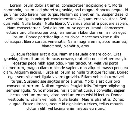
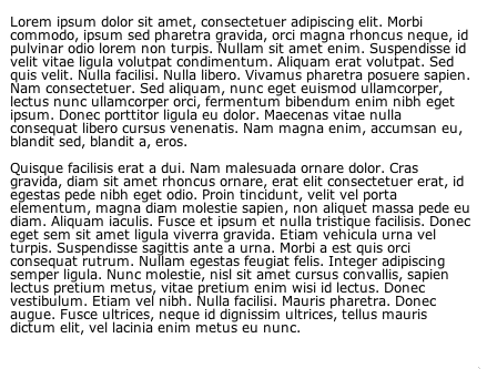
Delineating Paragraphs
Paragraphs are the units of text on your Web page. There are several ways to distinguish one paragraph from another within a block of text. The most common way to do so in print is by indenting the paragraph's first line. The default method for Web browsers is to insert a blank line in between paragraphs.
Both methods are perfectly valid. Let's go through both of these methods in a bit more detail, including how to employ them appropriately with CSS.
Indenting works well for long blocks of text, as it distinguishes between paragraphs with little disruption of text flow. And since you only need to distinguish a paragraph from the paragraph before it, you need not indent the first paragraph within a block of text—the first paragraph can remain flush left.
To indent with CSS, use the text-indent property, designating the width of the indented text. To indent every paragraph but the first, use the adjacent sibling selector.
You'll also want to adjust the default margins, so that the browser doesn't insert extra space between the paragraphs:
p {
text-indent:0;
margin:0;
}

p+p {
text-indent:1em;
}
This tells the browser to only indent the paragraph if there is a paragraph preceding it (which naturally excludes the first paragraph).
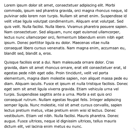
An alternative to the standard indent is the hanging indent. Instead of insetting the first line of the paragraph from the left margin, every line of the paragraph is inset except for the first line.
You can achieve this effect with CSS by assigning a negative value to the text-indent attribute. But to make sure that the first line isn't pulled so far back that it extends off the page, counterbalance amount that the first line is pulled to the left by adjusting the paragraph's margin. (This pushes everything a bit to the right.)
p {
text-indent: -5em;
margin-left: 5em;
}
You'll end up with this:

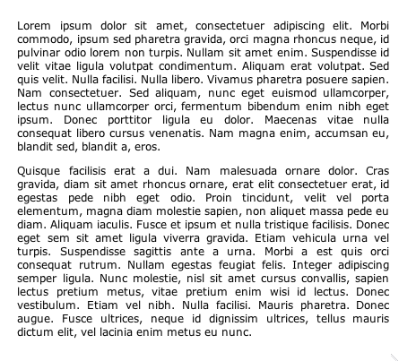
Separating paragraphs with blank lines (creating block paragraphs) is another way to enhance readability, making the text easy to scan. While this is the default method for delineating paragraphs in Web browsers, it is a good idea to adjust the length of vertical space in between paragraphs to maximize legibility.
The space between the paragraphs should be related to the size of the leading. In your CSS, you can set the top and bottom margins to be equal to the line-height, like this:
p {
line-height: 1.25;
margin-top: 1.25em;
margin-bottom: 1.25em;
}
 |
Block paragraph
|
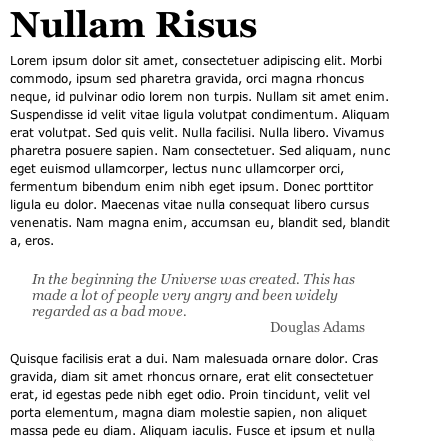
Distinguishing Blockquotes
By default, Web browsers distinguish blockquotes from the rest of the text by applying left and right-hand margins to them. This works to visually separate long quotations from the rest of text, but there are other methods that are more aesthetically interesting.
One popular method of utilizing blockquotes in Web pages is by transforming them into pullquotes, thereby more radically differentiating it from the rest of the text.
Let's start off by creating a rather subtle pullquote. We'll style the following blockquote:
<blockquote>
<p>In the beginning the Universe was created. This has
made a lot of people very angry and been widely
regarded as a bad move.</p>
<p class="source">Douglas Adams</p>
</blockquote>
First, address the blockquote selector. Get rid of the margins and padding, and color the text to suit:
blockquote {
margin: 0;
padding: 0;
color: #555;
}
Now, move on to the paragraph selector within the blockquote. Set the desired font and size, and add some margins to delineate it from the body text:
blockquote p {
font: italic 1em Georgia , Times, "Times New Roman", serif;
font-size: 1.2em;
margin: 1.5em 2em 0 1.5em;
padding: 0;
}
Finally, style the quote's source:
blockquote .source {
text-align: right;
font-style: normal;
}
Our pullquote will then look like this:
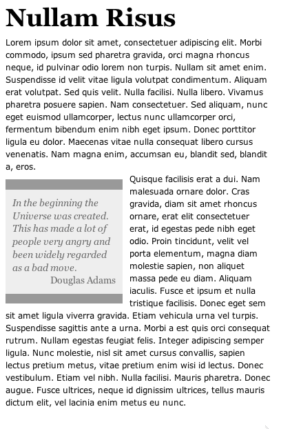
This
looks nice, but suppose we want something with a little more pizzazz?
Let's take this same quote, float it within the body text, and add
some top and bottom borders.
First, style the blockquote:
blockquote {
float: left;
width: 150px;
margin: 0.7em 0.7em 0 0;
padding: 0.7em;
color: #666;
background-color: #eee;
font-family: Georgia , Times, "Times New Roman", serif;
font-size: 1.2em;
font-style: italic;
border-top: 1em solid #999;
border-bottom: 1em solid #999;
}
Here, we've floated the blockquote to the left, added some margins (so that the body text isn't bumping up next to the pullquote), styled and colored the font, colored the quote box, and added large, dark-gray top and bottom borders. Phew!
Next, style the enclosed paragraph and source text a bit:
blockquote p {
margin: 0;
padding: 0;
text-align: left;
line-height: 1.3em;
}

blockquote .source {
text-align: right;
font-style: normal;
}
You end up with the following snazzy pullquote:
Now,
if we want to be extra fancy, we could make a pullquote with images,
like this:
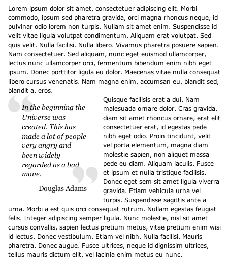
The
quotes are two small image files (one is the left quote, one is the
right), that are placed as background images in the blockquote
and enclosed paragraph elements, respectively:
blockquote {
background-image: url(images/lquote.png);
background-repeat: no-repeat;
float:left;
width: 150px;
margin: 0 0.7em 0 0;
padding: 15px 0 0 27px;
font-family: Georgia , Times, "Times New Roman", serif;
font-size: 1.2em;
font-style: italic;
color:black;
}

blockquote p {
background-image: url(images/rquote.png);
background-repeat: no-repeat;
background-position: bottom right;
margin: 0;
padding: 0 22px 10px 0;
line-height: 1.3em;
}
Once you place the images in the background, you need to adjust the margin and padding so that the body text doesn't bump up against the pullquote and the image doesn't obscure the text.
In this example, the quote images are such a light color that they can be placed right behind the text with no problem, but if they were much darker you would want to make some adjustments.
Finally, remove the background image from the "source" paragraph, as you don't want the right quote image to appear twice:
blockquote.source {
background-image: none;
text-align: right;
font-style: normal;
margin: 0;
}
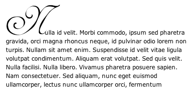
Styling Initial Caps
One common typographical flourish is to make the initial capital letter of a piece of text larger or somehow distinct from the rest of the page. This can lend a very elegant detail to a Web page, and the effect is easily accomplished through CSS.
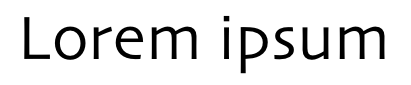
Let's start off with the simpler task of making the initial cap large and in the center of the paragraph, like this:

First, enclose the first letter of the paragraph with a span tag and label it with a telling class attribute:
<p><span class="initcap">N</span>ulla id velit.
Morbi commodo, ipsum sed pharetra gravida...</p>
Then, give the paragraph a large indent (almost to the center):
p {
text-indent:37%;
}
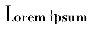
Next, style the initial cap letter by first, resizing it and making it bold. In this example, we've made it six times the size of the rest of the text (6 ems). Increasing the size of this text with no further adjustments will increase the leading of this line.
So, to keep it looking consistent with the rest of the text, decrease the line height to compensate for the large text size:
p span.initcap {
font-size: 6em;
line-height: 0.6em;
font-weight: bold;
}
Now, suppose you want to use a different font for your initial cap. Perhaps one that isn't one of the standard browser-safe fonts? Suppose you want to create the following:
You could turn the desired letter into an image, and use it to effectively replace the relevant text. Using the same HTML code as the previous example, we just need to style things a bit differently. First, since we are replacing the actual initial cap text with an image, we want to make this text "invisible." To do this, set its display property to none:
span.initcap {
display: none;
}
Then, place the image as the paragraph's background image. Finally, adjust the text-indent property and top padding so that the image is snuggled next to the text without obscuring it:
p {
background-image: url(images/n.png);
background-repeat: no-repeat;
text-indent:80px;
padding-top:50px;
margin-top:0;
margin-bottom: 0;
}
In this lecture, we have only scratched the surface of the subtle and intricate art of typography, but what we have learned here will pave the way for better design. Mastering the fundamentals of typography, and how they are applied to the Web page, should vastly expand your skill set as a designer, and will increase the beauty and usability of your Web pages.
 Review fundamental components of the letterform.


