If this is your first time creating wireframes, rejoice! Developing a good wireframe design in this course will give you a system and a template that you can apply to all your Web design projects.
Static wireframes are not the only approach to developing wireframes. Some Web developers prefer to present HTML wireframes to their clients.
HTML wireframes are—surprise!—HTML documents that outline the main page elements. Unlike static wireframes, you can interact with HTML wireframes, much in the same way as you interact with the final Web site. There are two ways to build HTML wireframes: text and visual.
Text Outline Wireframes
This type of wireframe includes a very basic "outline" of the page hierarchy, displaying the various page elements in order of prominence or importance. Such an outline does not represent the layout of the page, and so lacks the visual punch of static wireframes or "visual layout" HTML wireframes. However, given that the page's layout is really in the realm of page design, these types of outlines cleanly separate the wireframe from the page design.
One of the advantages of creating an HTML document with a clean hierarchical structure, is that it makes for a potentially clean transition into an HTML document that is ripe for CSS styling (thus, giving you a prototype that can be worked into the final site documents).
 |
This text outline HTML wireframe contains only the content and no layout or formatting. |
If you have the foresight to mark up your HTML wireframe document with labeled div tags, the transition to a CSS-formatted site can be even easier. You could even position the divs with CSS in the wireframe itself,
thus creating a more layout-like wireframe. The only potential
worry in doing this is that you can threaten to dip into the work
of the designer, which strays from the intention of the wireframing
process.
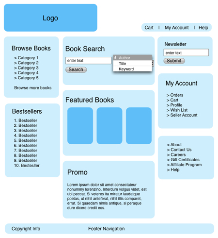
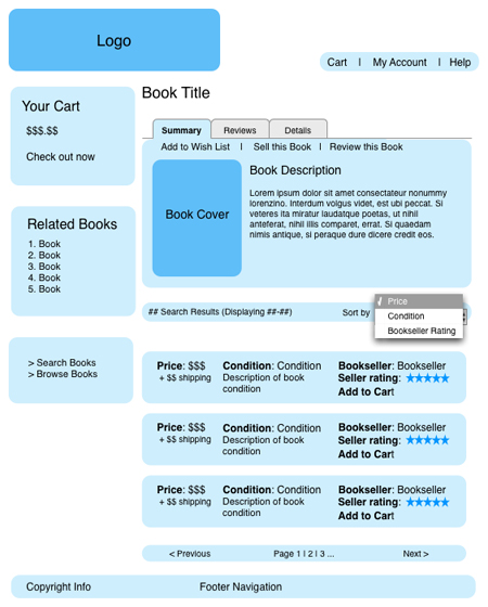
Visual Layout Wireframes
Visual layout HTML wireframes, much like their static counterparts, represent the visual layout of the page. One common method for creating this type of HTML wireframe is to use a program like Dreamweaver to create a quick layout that puts the various page elements in their expected places.
 |
This is part of a visual wireframe that includes non-functional form fields to give a sense of the functionality on the page as well as the page's layout. |
There is not a simple answer to this question, as each wireframing technique has advantages and disadvantages. How you create your wireframes ultimately is up to you, but keep the following considerations in mind.
The main advantage of creating static wireframes is that they are fairly quick and easy to create. If they are printed onto paper, they are easy to notate and the client can carry a copy with her to review at her leisure. Also, as they are not created from the same "building blocks" as the final product (HTML code), as there is not as much potential to confuse the wireframe with the final product and design.
On the other hand, HTML wireframes are much more interactive than static wireframes. The HTML wireframe is "clickable," and its pages are linked to one another, and thus the client can get a much better feel for how the site will eventually flow for the user. HTML wireframes are also much more amenable to user testing. (Note, though, that programs like Fireworks and Visio can create wireframes that are "clickable" and link to other pages of the wireframe.)
Once you have created the wireframes for your site (and the client has approved them), it is time to begin creating the page layouts in HTML. If you've created a neatly marked-up HTML wireframe, you may be able to translate this document to your site design layout, simply styling your wireframe elements with CSS. If you've created static wireframes, you should still be able to easily represent the planned design in HTML.
The goal is to keep your layouts simple so that they act as templates for placing your site content and visual design components later. You may only need two layouts for a small site—one for the home page and one for the remaining pages—or you may need several more for different levels and page types found in a larger project.
Most Web sites today (particularly business or corporate sites) are some variant of a single or multi-columned layout. These common layouts are structured, ordered, and generally make it easy for the user to find information (hence their popularity).
There are various methods for creating Web pages featuring one or more columns. Here we cover a few of the techniques used to create common HTML and CSS layouts:
One-Column Layouts
Suppose you want to create a simple, one-column design as in the screenshot below:
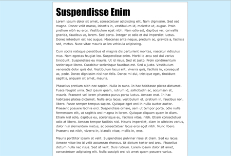
You could either create a fluid column (in which the column width grows and shrinks with the size of the browser window), or a fixed-width column (where the column width remains the same no matter what the browser window size). Both types of layouts have their own distinct pros and cons.
Fluid layouts are nice because all of the Web page fits within the horizontal space in the browser; you need not worry that there are bits cut off from the user's view, forcing him to horizontally scroll across the page to access everything. However, with fluid layouts you have less control over the design, as the size of various elements varies from user to user.
Fixed-width layouts, conversely, give the designer more control over the way the page looks, as the size of the elements remains static, but parts of the page may not fit horizontally in the user's browser window if the window is too small. So, keep these considerations in mind when choosing the type of layout that best fits your site.
To create a fluid one-column layout, you just need to adjust the left and right margins of the body element in your site's CSS:
body {
margin-left: 20%;
margin-right: 20%;
}
This effectively squeezes in the content of the page by adding space to the left and right.
Creating a fixed-width one-column layout can be a bit trickier. To create a simple left-aligned column, you just need to set a width for the body element:
body {
width: 600px;
}
If you want to center the column, you first need to wrap the contents of the column in a div element (here, I have labeled it content):
<div id="content">
<h1>Suspendisse Enim</h1>
<p>
Lorem ipsum dolor sit amet...
</p>
</div>
Then, in your CSS, add a 50% left padding to the body element:
body {
padding-left: 50%;
}
Finally, add a width and negative left margin to the div element equal to half the width of the column:
#content {
width: 600px;
margin-left: -300px;
}
The result? A centered, fixed-width, single-column layout.
Two-Column Layouts
Now, let's move on to creating some multi-column layouts. First, we'll tackle a two-column page:
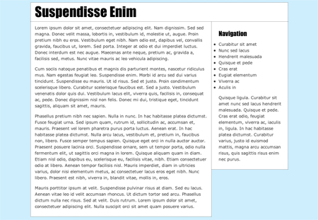
To create a fluid layout, first mark up your HTML by enclosing your header, main content column, and navigation column in their own div tags:
<div id="header">
<h1>Suspendisse Enim</h1>
</div>
<div id="main">
<p>
Lorem ipsum dolor sit amet...
</p>
</div>
<div id="nav">
<h2>Navigation</h2>
<ul>
<li>Curabitur sit amet</li>
<li>Nunc sed lacus</li>
</ul>
<p>
Quisque ligula...
</p>
</div>
The crux of this technique is floating the left-hand column (here, the "main" div) with CSS. Then the right-hand column "wraps" around it:
#main {
float: left;
width: 67%;
background: white;
margin-top: 0;
margin-right: 2em;
padding: 10px 1em;
border: 1px dotted #444;
border-top: 0;
}
Note that all floated elements need a width, so you also need to set a width for the floated column (and as this is a fluid layout, we're setting the width as a percentage). Then just tweak some of the other selectors—such as the margins and padding—to get it looking just as you want it.
The two other sections of the page—the heading and right-hand column—can just benefit from some minor aesthetic styling. For this page, we're just coloring the background white and adding some margins, padding, and a border:
#header {
background: white;
border: 1px dotted #444;
padding: 0 1em;
}

#nav {
padding: 10px 1em 10px 1em;
margin-top: 0;
background-color: white;
border: 1px dotted #444;
border-top: 0;
}
The technique for creating a fixed-width two-column layout is similar to the fluid two-column method. But, instead of setting the width of the floated column as a percentage, you give it a static width (for example, set in pixels).
Then give body element a width too, so the header and right-hand column are thereby given a width as well (the header, here, spans the width of the body, and the right-hand column's width is the difference between the body width and left-hand column).
body {
margin: 0;
padding: 0;
width: 800px;
font: 0.9em/1.5em Verdana, sans-serif;
color: #333;
background-color: #ceeefd;
}

#main {
float: left;
width: 440px;
background-color:white;
border: 1px dotted #444;
padding: 10px;
}
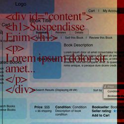
Three-Column Layout
The beauty of CSS is that, in theory, you are able to completely and neatly separate structure and content from style. That is, when laying out the HTML for your site, you should be able to structure the document in a way that makes the most sense, semantically and logically, of the page's information.
For instance, if your site is made up of a main article, site navigation, and some minor related information, you should be able to structure your HTML so that the most important content (such as the main article) appears first in the document, followed by the minor players. Then, if you want to place some of the minor information to the left of the main article within the page layout, you should be able to do so in the CSS, without having to rearrange the HTML.
While strict separation of content and style is lovely in theory, sometimes it seems a bit challenging to implement. In creating our three-column layout, however, we're going to take on the challenge of constructing CSS that lets us order the columns however we want, no matter how the content is ordered in the HTML.
When we're done, the page will look something like this:
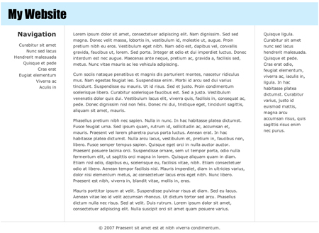
First, let's take a look at the HTML:
<div id="container">
<div id="header">
<h1>My Website</h1>
</div>
<div id="main" class="column">
<div class="wrap">
<p>
Lorem ipsum...
</p>
</div>
</div>
<div id="nav" class="column">
<div class="wrap">
<h2>Navigation</h2>
<ul>
<li>Curabitur sit amet</li>
</ul>
</div>
</div>
<div id="related-info" class="column">
<div class="wrap">
<p>
Quisque ligula...
</p>
</div>
</div>
<div id="footer">
<p>© 2007 Praesent sit amet est at nibh
viverra condimentum.</p>
</div>
We have three columns, a header, and a footer. Note that we have placed the main div first, as it is the most important piece of content. We've labeled the columns with the column class, and have also enclosed the columns in an additional wrap div.
Now let's begin structuring the layout. First, we'll float all of the columns by styling the column class:
.column {
float: left;
}
As all floated elements need a width, give the separate column divs the desired width. Here, we're making a fluid layout, and so we're setting the widths as percentages:
#main {
width: 60%;
}

#nav {
width: 20%;
}

#related-info {
width: 19%;
}
So far, our columns are laid out in the order that they appear in the HTML document, like so:
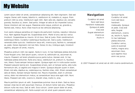
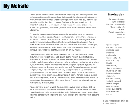
However, as illustrated in the final screenshot, we want the navigation column to be on the left, and the main column to be in the middle. To position our columns, first apply a left-hand margin to the main column that's equal in width to the navigation column:
#main {
width: 60%;
margin-left: 20%;
}
This creates a little pocket to slip the column into:
Now, to move the navigation column into that pocket, add a negative margin sufficient enough "pull" the navigation column over the middle column (which is 60% of the page's width) through the space created for it (which is 20% of the page's width):
#nav {
margin-left: -80%;
width: 20%;
}
All that's left to do layout-wise is adjust the footer so that it appears below the three columns. To do this, just set the footer's clear property to "both":
#footer {
clear: both;
}
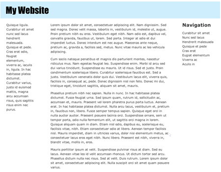
What if we wanted to switch the left-hand and right-hand column? We need not touch our HTML! We just need to adjust the margins of each column.
First, take out the -80% margin you added to the navigation column, and add the following margin to the related information column:
#related-info {
width: 19%;
margin-left: -100%;
}
Since this column was originally on the right-hand side of the page, we need to pull it farther over than the navigation column to stick it in the left-hand column space. That is, we need to pull it over both the navigation column (20%) and main column (60%), through the right-hand pocket (another 20%), This gives us a negative 100% margin:
Asymmetric Layouts
If you want to create a page layout that is a bit less conventional than the ordered, columned pages that dominate the Web, CSS positioning makes it quite easy to create an asymmetrical layout, like the one below:
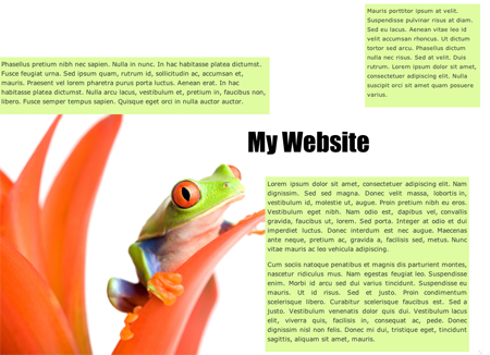
In the HTML, wrap the different "boxes" of content within their own divs, like so:
<div id="header">
<h1>My Website</h1>
</div>
<div id="main">
<p>
Lorem ipsum dolor sit amet...
</p>
</div>
<div id="small">
<p>
Mauris porttitor ipsum at velit...
</p>
</div>
<div id="medium">
<p>
Phasellus pretium nibh nec sapien...
</p>
</div>
In your CSS, set the position property for these boxes to absolute. Then size them (by setting their widths), and place them on the page using the top and left properties:
#header {
position: absolute;
left: 550px;
top: 300px;
width: 300px;
padding: 10px;
}

#main {
position: absolute;
left: 600px;
top: 400px;
width: 450px;
background-color: #dffca1;
text-align: justify;
padding: 5px;
}

#medium {
position: absolute;
left: 0px;
top: 130px;
width: 600px;
background-color: #dffca1;
padding: 5px;
}

#small {
position: absolute;
left: 825px;
top: 10px;
width: 250px;
font-size: small;
background-color: #dffca1;
padding: 5px;
}
In our header, for example, we've positioned it 550 pixels over, and 300 pixels down from the top left-hand corner of the page. If you want a fluid layout (one in which the boxes adjust their position according to the size of the browser), you can set the top and left properties with percentages.
We've also positioned the background image (the little frog), using the background-position property:
body {
font: 0.9em/1.5em Verdana, sans-serif;
color: #333;
margin: 5px 0 0 5px;
background-image: url(images/frog.jpg);
background-position: bottom left;
background-repeat: no-repeat;
}
In the following exercise, you'll develop both wireframes and layouts. Think carefully about which column structure you'd like to use to support your design.
 Learn the basic components of a Web site wireframe.
