Typography | Type Details and Hierarchy


Type Details and Hierarchy

Type in Action. This page design uses type arrangement, spacing, color, and size to create visual organization. Design: Mires Design.
In the last lecture, we looked at the letterform alone. Let's now focus on typography in context. The art of page layout requires you to pay attention to the big picture and the details.

The big picture is all about information hierarchy. Clear typographic decisions and the use of simple visual "tools" like spacing, color, and type choice helps create a visual logic for your design.

In the print world, the details count too. Your attention to little things (kerning, special characters, ligatures) conveys a message about the quality of a publication to its readers.

In this lecture, we'll look at both the details and the hierarchy of type, covering those essentials that distinguish a professional designer. We can't cover all the rules of typesetting (there are many of them) but we can help you take your type skills to the next level.

Take a deep breath. We're about to dive into the details.

In this lecture, you can expect to:

Learn about some of the typography details that distinguish a professional type layout.
Learn how to correct kerning, special characters, ligatures, and more in a print layout.
Explore the interaction between typestyle and leading.
Learn some principles of visual grouping and hierarchy through a case study.
Explore creating a visual hierarchy through a step-by-step demonstration.


You can't kern all day, but you should make the effort to do it on headlines and logotypes.


Attention to details such as special characters can enhance the perceived value of the publication. It says: "Great care taken here."


Don't manually replace special characters. Use search/replace functions to make these corrections.


Details, Details, Details


In this first part of the lecture, I'll introduce some of the typographic details that I look for in a designer's typesetting.

While it's a painstaking process that's often unnoticed by the average reader, typesetting is a key component in the perceived quality of any print publication. Ninety-nine out of a hundred readers of Vogue may not notice whether a text column is ragged right or contains widows. But that extra touch of finishing, a hard-to-define production quality, is essential to the magazine's quality status.

Oftentimes, type details are the first thing I look at in a print publication. I figure that if someone is paying attention to the typographical details, there is a good chance the rest of the design is working as well.
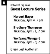
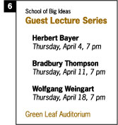
Kerning Letters

Kerning refers to adjusting the space between two letters. Kerning is usually focused on large type, logos, or headlines—places where inaccuracies are the most apparent.

Kerning Konundrum. Ask yourself: Is the a too close to the x or to the s? Move your mouse over the letters to see where to kern.
Why does kerning often need adjusted? Blame the digital design tools you love. Most people think good type will just pop out of the computer by default. On the contrary, the kerning between digital letters is usually approximated for convenience.

Should you kern every letter all of the time? No way. Most of the time, type is set small and the computer does a respectable job of getting it close enough to correct. But when you have large type like headlines or titles you should always take a second look—more than likely you'll find some flaws.

Make it your task for today to look around at large headline type and you'll start to see how widespread bad kerning is. Want 
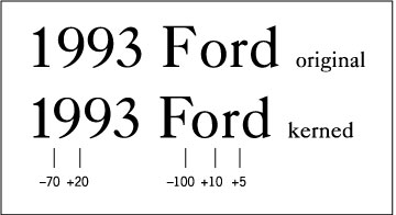
to know my kerning pet peeve? It's the number 19, as in 1997 or 1993. The space between the 1 and the 9 is almost always ill-spaced and in need of fixing.

In this "1993 Ford" example I did all sorts of kerning. Sometimes I subtracted space and other times I added space.

Kerning up Close. Adjustments need to be made to raw computer text.

What I am doing is looking at the positive and negative space created by the letter forms and adjusting the space so that the rhythm appears visually constant—flowing without gaps or tight spaces.

First I dealt with the most apparent problems—the space between the 1 and 9 as well as the space between the F and o. Then I went on to tweak other detail and tight spaces.

You could work on kerning all day—adjusting letterspace to greater and greater detail. Absolute perfection may not be attainable except by the best of us with lots of time, but the idea is to at least do some work to improve the letterspacing in the most prominent places, such as headlines or logotypes.

Space Invaders. Extremely tight letterspacing can be distracting.

One last comment: the absence of letterspace is not good letterspace. The problem is that the interior part of the the rounded letters (like the 9 or o or d) goes out of balance with the surrounding positive space (or lack thereof). This squeezing of space is common in advertising copy. I doubt that William Caslon (the designer of the typeface I used in the example) anticipated that people would one day scrunch and stretch his fonts into odd shapes and spaces.

By the way, one of the best places to learn about proper letterspacing is from stonecarvers—those who incise letters into architecture and monuments. If you mess up the letterspaces in that profession there is no "undo key." This practice has gone on for centuries and can be found in many ancient monuments.

Kern It. Use the Character panel in Illustrator (and other programs) to kern space between specific letters.

Want some kerning practice? Type the following text into your vector or page layout program: "Power Kerning." Set the type to a large size, 72 points using Times Roman. Now look at the letters three letters w-e-r. Do you see how the letter e looks too far away from the letter w? This is where you should "kern out" some space.

Precisely how to kern may vary from one program to another. 
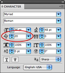
In Illustrator, and other Adobe programs, you would click between the two letters that you want to kern and look in the Character panel for the A\V field. To reduce space type "-30" or to increase space just type "30" (or whatever number you'd like to kern by).

Do you want to know what that number represents? It's based on the em space of the particular font and size you are using. The software divides the letter m into 1000 units, so if you wanted to kern a letter at half the width of the letter m (em is the width of an m) you would type 500 into the box. Half of 1000 is 500. Presto!

Of course, it's very unlikely you'd want to kern a letter that much. Usually it's just a small slice—like 20 or 50 or 100 out of 1000.

Go ahead and do some kerning of "Power Kerning." Start with the w-e-r combination but look for other flaws. I think there are several places you could add or subtract a bit of space. The space between the r and n seems a tiny bit too tight. Notice how the serifs almost touch—add a sliver of space. Can you see that the shape of the word becomes more integrated and it flows visually? Sometimes it's difficult to see the details on your screen, so zoom up close or print it out to appreciate the fine points.

Special Characters

Another clue that someone is paying attention to details is the use of special characters in the typesetting. These include accent marks, mathematical symbols, and various other marks like the monetary signs for yen, pounds, and euros.

Very Special. Unlock the power of your keyboard by using all the special characters.

Where can you find these? On a Windows computer, look for Character Map under the System Tools menu. On Mac OS X, click on International in your System Preferences, then choose Input Menu and check Keyboard Viewer. A flag icon will appear in the right side of your menu bar, from which you explore the keyboard. With the Keyboard Viewer open, hold down a modifier key or combination of them (like Option or Option-Shift) to see the special characters and their key combinations revealed.

You can use a combination of the Shift and Alt/Option keys to type these alternate characters. For example, Alt-G (on Windows) or Option-G (on a Mac) generates the copyright symbol. And Alt/Option-8 gets you a bullet.

If you want to put an accent mark over a letter (é) then first type Alt/Option-E. Don't be surprised if nothing happens, the computer is waiting for you to then type the letter on which to place the accent. So the sequence is Alt/Option-E and then the letter e itself. If I wanted the same accent mark over another letter (á) I would type Alt/Option-E and then the letter a.

Want to meet some special characters? Pick any article in a literary magazine, such as the New Yorker, or a cooking magazine such as Bon Appétit. Such magazines pride themselves on an international, cosmopolitan sensibility, and this is reflected in the use of special characters for any word imported from a foreign language.

Curly Quotes

Over hundreds of years, typographers developed a very refined sense of the letterform and spacing. Then along came the desktop computer and everyone forgot the rules. Or rather, they thought they could let the computer make all the visual decisions by default.

One easy typesetting error to correct is the quotation marks. Usually on computers, you see the straight quotes like "this." These straight quotes are actually inch marks or ditto marks.

The proper marks to use for print publication are of a curly variety, sometimes called smart quotes. The choice is:


You really want to use the curly quotes when typesetting print text. Notice that one curls down and the other curls up. For on-screen uses, particularly HTML text, straight is often considered cleaner and more readable.

Ligatures

The Signature of the Ligature. Joining adjacent letters can make them more readable. Move the mouse over to see the joined letterforms.
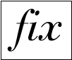
Ligatures are two letters connected together into a single special character for a better visual flow.

The most common are fl and fi ligatures but you may have seen the ae ligature as well. This was pioneered by Caesar, of course! :)

It's a great idea to use ligatures in headline type and a sign of excellence to see ligatures throughout the body type of paragraphs as well. If this sounds really hard to do, consider the capabilities of your digital tools. You can use the search/replace feature in your software to hunt down each fi combination and replace it with the corresponding ligature mark.

Dashes and Hyphens

Do you know the difference between a dash and a hyphen? Actually, there 
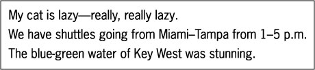
are two kinds of dashes: an em dash and an en dash.

The em dash is the longer of the two and is the width of the letter m. It is used when you want to signal a long pause in reading. It is used in the "My cat is lazy..." sentence below. Take a second to visually compare the long em dash to the en dash and hyphen in the other sentences.

A Dash of Salt. Spice up your typesetting by using dashes and hyphens correctly.

The en dash can be used as a substitute for the word "to" as in the sentence "We have shuttles going from Miami to Tampa..."

The short simple hyphen is used to join words together. I've demonstrated its use in the sentence: "The blue-green water was stunning."
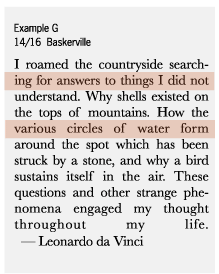


Don't underline type, use bold or italics instead to create emphasis.


Kerning, tracking, and other print spacing adjustments should be checked on paper.


Watch out for spacing problems when using justification. It's not always justified!

Leading or Linespacing

OK, it's time to discuss leading, or linespacing. First of all, "leading" is pronounced like "bedding" and refers to the spacing between lines of type on a page. Back when type was made out of metal and set by hand, typographers used small metal strips (made from lead) to separate each line of metal type. The word "leading" has persisted into the computer age but you can use the word "linespacing" as well.

As with any profession, typographers use their own jargon. Suppose we want to set a paragraph of text using 18 point Helvetica type with a linespacing of 20 points. In type-lingo we could say: "Set that in 18 on 20 Helvetica, please." We'd write that as: 18/20 Helvetica.

What can linespacing adjustments do to a column of text? Let's explore an example, from Leonardo (Da Vinci, not Dicaprio). I started off with 14/14 Helvetica, in example A:


Example A is set a bit too tight. You can see that the descenders of one line almost overlap the ascenders of the next line. Example B is a big improvement.

Now let's look at the difference using two different fonts can make:

Although Examples C and D are set exactly the same (14 point type on 16 point leading), Example D seems much more cramped.

This occurred because I changed the typestyle to Palatino. Because Palatino has a larger x-height and a slightly heavier stroke, all my careful linespacing has to be adjusted for this new situation. To fix it I would probably add another point of leading, making it 14/17 Palatino.

The big picture here is of course that linespacing should respond to differences in typestyle. In print publications, decisions on typestyle and linespacing are inseparable. As an exercise, I'd recommend you take a chunk of your favorite text, and set it in 4-5 different typestyles at 14/14 (that's a good starting place). You'll discover radical differences in the leading required. You might even post your findings to the Student Work area.

Are you still awake? I know the details can be a little less than thrilling. This isn't a fireworks show—it's typography. Patience and finesse are needed.

The End of the Line

"It's you and me baby, all the way to the end of the line"
—Fred McMurray to Barbara Stanwyck, Double Indemnity.

Another type detail I look for in a print publication is the "rag." When a column of text is justified to the left side, the right hand side becomes a bit ragged. In Example E below you can see a ragged area.

Does it bother you? Print designers will try several techniques to make a rag less bumpy and inconsistent. The first technique to try is hyphenation. That is demonstrated in Example F. Notice that hyphenating longer words reduced the ragged area.

In order to start hyphenation, I had to make sure it was turned on. This hyphenation control is usually under the "paragraphs" menu or floating window but its location varies from software to software. You can see that it automatically hyphenates some of the longer words making them fit better into the column space.

Caution: You don't want to do this by hand (usually). When the body of text gets reflowed or the column resized, the computer won't automatically remove the hyphens that you manually inserted. You'll end up with weird, stray hyphens in the middle of sentences something like—"I roamed the countryside search-ing for hyphens."

Justification and Tracking

You might ask: if we want to eliminate ragged edges then why not justify both edges of the column? It's a good-looking solution!

Let me 
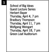
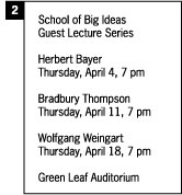
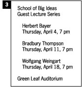
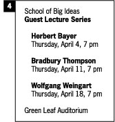
draw your attention to the problem with the center-justification approach illustrated in Example G. In order to "justify" the lines of type, the computer has to add extra space between the words.

This causes very inconsistent internal spacing and ultimately it disturbs reading. Some lines are too tight, others too loose. And look at that last line with huge gaps between words!

It's not uncommon, however, to see justified type in newspapers, magazines, and advertising. It creates a strong, structured-looking text column and is often appealing. With some care, justified columns can be made to work well. Just keep your eyes open and watch for problem spots.

So how can we take care of the visual problems center-justification presents? It will take some work, but we can set this a little better by adjusting tracking. Tracking is the adjustment of space between all letters over the entire paragraph. This is different from kerning which is adjusting the space between specific, individual letters.

In Illustrator, and other Adobe applications, you can set tracking by selecting a body of text and making adjustments as follows.

In the first setting of "Countryside" I added +100 tracking. Notice the wide spacing, also referred to as loose tracking.

In the second instance, I used -50 tracking. You can see that all of the space between letters is eliminated. This is called tight tracking.

Now take a look at the sample sentence, which at first has no tracking applied to it. Notice that when I used -10 tracking the word "existed" popped up one line. And when I used +25 tracking the word "answers" was pushed down one line.

These slight adjustments can have a major impact as they add up line by line, letter by letter. By looking at the last word in the sentence "mountains" you can see exactly how much space was gained or lost by applying tracking.

We've covered many, many details and you're on your way to guru status if you start applying the rules of kerning, special characters, curly quotes, ligatures, dashes/hyphens, linespacing, and tracking to all your typesetting.

But why stop there? Here are some additional high-end pointers that I didn't cover:


1. Orphans and Widows. Imagine the last word of a paragraph sitting all by itself on at the bottom of a column of text—that lonely word is called an orphan and should be avoided. A line of type pushed at the top of the next column is called a widow and must also be avoided if you have a heart. Use tracking to push or pull the words together with other words.

2. Eliminates Underlines. Real typographers use bold or italic to signal emphasis. Underlining is the limitation of the old mechanical typewriter being able to use only one font. So they invented underlining to compensate. We don't have to do that anymore.

3. Column Width. How wide should a column of type be? Should it run wall-to-wall or be broken into several columns? Readability experts say the optimum column width is about 1.5 or 2 alphabets—or between 39 to 52 characters.

4. Expert Sets. Some typefaces have "expert" versions which include all sorts of alternative and special letters—like two or three variations of the letter A depending on where in a word or sentence you might use it. They have swash letters, old style numerals and small cap letterforms (which are not just small versions of capitals, but adapted and modified).


Look for these elements as you peruse your print publications. The more you are aware of them, the more educated your eye will become.

When in New York City, you should visit the Morgan Library & Museum which has one of the few existing copies of Gutenberg's Bible and many examples of fine printing and typesetting. Much of early printing is exquisite and you can see examples of fine typesetting done hundreds of years ago. Ask to see books printed during the Incunabula—that literally means "the cradle" and refers to the early days of printing in Europe (1450-1500). Or by printers like Bodoni, Baskerville, Jenson, or Aldus Manutius. Because these books are very rare you'll need special permission to handle them or the curator will help.

If you're in a large city or university town you should see if your library has a collection of rare books. My typography students at the University of Florida have done studies in our Rare Books Library.


Look for examples of proximity and grouping in the text layouts you see around you.


Creating an information hierarchy is an iterative process; it requires many adjustments before it is done.


Hierarchy: First, Second, Third

Gestalt Grouping. Do you see two overlapping squares? Do you see a triangle? Both are only implied and exist only due to arrangement.
Humans have a tendency to organize the world around them to seek meaning. Principles of visual perception are studied by psychologists. You may have heard the phrase "the whole is greater than the sum of its parts." This is a primary notion of Gestalt theory.

You may have learned these things in your basic design classes but they still very much apply to typography.

You can create order in two basic ways. The first is by using arrangement and placement on the page to make things appear to group together. A gestalt guru would call this grouping by proximity. The closer one thing is to another then the more they tend to group together.

Visual Logic. With proximity, two circles tend to group because they are near one another. With similarity, two circles appear to group because of their visual properties (color green).

The second method of grouping is to control the properties of the type such as color, typestyle, typeweight, and so on. The gestaltists would call this grouping by similarity. These two principles make up a kind of visual logic.

To use an example from Web design, the information architect can apply these gestalt ideas to structure the flow of entire Web sites. They carefully plan the sequence and order that the Web surfers encounter information. It's something like making an outline for a high-school term paper. In my experience with Web design I've found that many Web sites have a poor information hierarchy. Designers focus on look and feel more than order and organization.

Who's on Third?

Let's take a closer look at a page design by typographer Jan Tschichold. It's a great example of visual grouping and hierarchy. It's written in German, but even if you can't read the language, you can still get a sense of how the information is organized.

Tschichold is a master of typographic hierarchy: every element on the page can be ranked according to its order of importance. The more important the content, the more emphasis it has. Use the interactive illustration below to explore the structure of the information on the page.


Information Structure. Roll over the buttons to deconstruct the hierarchy.

This is an example of the asymmetric typography which Jan Tschichold first advocated in the 1930's. His work and ideals (to seek simplicity and pure function of information) were influential in that era. It was called an International Style because designers hoped that since it was simple it could communicate on a more global level. It was a radical concept and rejected traditions in typography.

Tschichold was also one of the first to arrange the page asymmetrically. The empty space of a page became useful. He was influenced by investigations into basic visual composition by European painters like Piet Mondrian, the Bauhaus school, and the De Stijl movement.

Josef Müller-Brockmann's Swiss design uses scale, proximity, and type weights to organize the information on this 1955 music poster.

Creating a Visual Hierarchy

Tschichold's achievements can seem daunting to use in the real world. How would we apply these principles in a less esoteric layout project? To wrap up this lecture, I'd like to run you step-by-step through the thought process of organizing a body of type by using spacing and other typesetting properties.

The School of Big Ideas (to which I belong, of course) has hired me to lay out a poster for its lecture series.

Box 1. I start with a body of text. It's not completely random but it could certainly use some visual hierarchy.

Box 2. I've used linespaces to group the info. To break it apart into clusters.


Box 3. I've used indented space to group the list of speakers and make them seem separate from the location and title info.
Box 4. I've used bold type to emphasize info and make it attention-getting.
Box 5. Can you see what I've done? I made some info a bit smaller and some a bit bigger. I also made some info italic.
Box 6. I applied color. You can see that color is a very powerful tool to help create order and visual grouping.

Fleshing Out the Skeleton

The point of this brief demonstration is that you can use very simple visual tools like linespacing or typeweight to create a visual logic and hierarchy in your type.

A larger lesson to draw here is that information design values function over form. Or rather, information designers think that the best use of form is to make information clear, not to entertain, bedazzle, and decorate. Form is the servant of Function.

In Lecture One, we talked about Beatrice Warde and her Crystal Goblet idea: that typography should transmit the content so directly that is like a crystal-clear wine glass. If all of design were that way, the world would be logical but also quite plain and bare bones. While some design situations demand clear information, other situations demand a more sensual, emotional approach.

In later lectures, we'll explore the more expressive side of typography. We're at the end of Lecture Two. I hope you now have a sense of the visual logic that can be created with typography.

     
Learn about what makes typography expressive.
Learn about three key aspects of expressive type: letterform, layout,  
Explore the three key aspects of expressive type through a series of case studies.
Compare the structures and functions of music and typography.
 

Discussion
Share your thoughts and opinions on the Discussion Board.

Exercise
Apply your understanding of type details and hierarchy to a dual exercise.