|
|
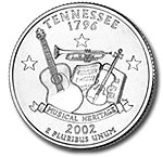
United
States Quarter. Newer mintings
celebrate individual states on the reverse. The front side
retains its traditional design.
|
Recently
the U.S. government issued a special series of quarter-dollar coins, celebrating each U.S. state on the reverse.
Look
at the example (right) from the state of Tennessee. The front side of
the coin is the traditional quarter design but the back of the coin
features images that identify the unique musical heritage of Tennessee.
Each of the 50 states gets its own showcase.
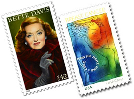
It
is common to see postage stamps also take on alternative subject matter—from pop culture personalities
to natural landmarks to social awareness causes. They have grown beyond
simply using historic leaders to symbolize
the government and the nation.
|
|
Postal
Stamps. Personalities from pop culture and social issues are
topics.
|
So
here is the concept for our project: We will do the same with the US
currency.
In
the same way that postal stamps have moved beyond solely historical,
patriotic and nationalistic symbols to using cultural, contemporary
icons we will design a "new dollar" for the twenty-first century.
Or,
if you're one of the school's international students—from over
90 different countries—you may prefer to choose the currency of your
own country.
Let's take a moment to explore type history and culture with the following Review Kit before you begin creating your currency design:
Directions
Our
primary design concern with the "new dollar" is rethinking
its symbolic qualities. What new icons represent the people of the United
States? Bill Gates, Britney Spears, WalMart, the Space
Shuttle? What is relevant to the 21st century?
A
secondary aspect to consider are the functional qualities—such as
the prevention of counterfeiting. Currency designers use watermarks,
color-shifting ink, microprinting, and security threads to impair duplication.
Before
you begin your project, check out these Web resources: Bureau
of Printing and Engraving and the United
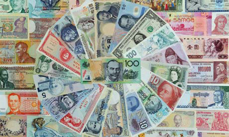
States Mint. Here's some more inspiration in the form of a currency collage:
|
|
|
Currency Around the World. Photo credit: Torsten Blackwood/AFP/Getty Images. |
|
|
|
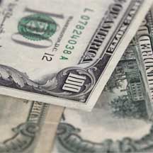
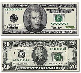
United
States Currency. Former versions of the $20 bill. |
Actually,
the U.S. banknotes were redesigned fairly recently, but the focus was on
security and usability, not the image or symbolism. The Treasury designers
write:
"The
currency still has a familiar American look. The size of the notes,
basic colors, historical figures and national symbols are not changing.
New features were evaluated for their compatibility with the traditional
design of U.S. currency."
Our
goal is in this project is much different: to use typography, image,
language, graphics to push beyond the traditional symbols.
Focus
on the $20 bill. Open format and full color are your options. Remember
that you are designing one banknote in a system of currency. How would
the $5 be different from the $10?
This
project brings together type, graphics, and image (illustration/photo).
If you think pop icon Elvis Presley is a great symbol of the nation—then how should you treat the typography on the banknote? Should
the typestyles and arrangement suggest 1950s Rock 'n Roll or the later
Elvis years in Las Vegas?
Or
maybe you want to create an official look-and-feel. How can an illustration
style or typographic style work together to make the dollar (only some
paper and ink) appear valuable?
Because
this is a concept-driven project, don't get bogged down in the "realities"
of the problem. Keep your mind in motion, and check out this student work:
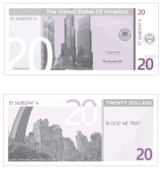 |
| This 20 dollar bill, designed by Sessions student Kate Caryk, uses clean typography, negative space, and minimal color to create a modern bank note indicative of the United States of America. |
If
you have access to a scanner, you might begin your project by scanning
in a bill in digital format, using the original as a template to modify.
But remember to keep it legal. Currency can be reproduced in print but
must be 150% or 75% of the actual size, it can be reproduced only as
one-sided, and should display the message "not legal tender."
If
you don't have a scanner, so much the better; your design will be less
derivative.
Save
your work as a PNG or JPEG, at 150% the size of an actual note. We want to
make sure there is no possibility someone could print and spend the
money you're designing!