Designers who design with type understand that type rarely works alone. Typography
is a communication tool that should work hand-in-hand with illustration
and layout to create a complete message.
|
|
| Roll over this magazine layout for Utne Reader (Design: MSP Communications)
to see the perfect integration of image and text in a layout. |
Don't
let type choice be an afterthought. Make it harmonize in both style
and composition with the rest of your design work.
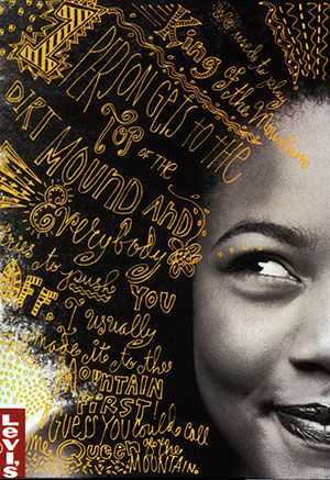
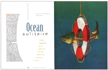
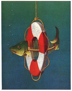
What's
the deal with the illustration above? It
is a magazine spread from the Utne Reader in which the type on the
page echoes the illustration. It is a great example of the
integration of type and image.
Roll
over the illustration (right) with your mouse and you can see that the
arrangement of the type reflects and responds to the illustration. The
outline of the life-saving ring is defined by the main body of type.
The O is elongated to almost exactly reflect the shape of the ring itself.
And finally, the word "solitaire" is fragmented like the bones
in the helpless fish.
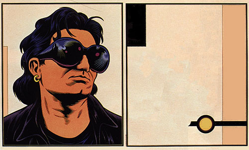
Below is
another example of how type and image work together. It's
a layout from Rolling Stone magazine, an industry icon for layout designers.
|
Rolling
Stone magazine spread. Roll over the image to see the placement
of type. Art director, Fred Woodward, 1994. |
What
I've done in the graphic above is eliminate all of the typography. I've
left only the illustration and basic composition and color. Those certainly
set a style. If you use your mouse to roll over
the image, however, you can see the type jump into place.
The
style and color of the illustration accounts for much of the look and
feel of this layout. Do you think the art director considered the integration
of the type? It obviously isn't just "stuck on" as an afterthought.
The type has a lot of personality itself.
This
magazine spread—like most design work—was a team effort. Fred
Woodward was the acclaimed art director, but the designer was Catherine
Gilmore-Barnes, who dealt with the layout and composition of all the
elements. The illustrator, Malcolm Tarlofsky, was most likely commissioned
for just this one article. And in this case, there was a calligrapher
too; Anita Karl rendered the blackletter-style FLY.
Sometimes
a type designer will choose to forget all that uptight stuff about fine
typography and throw history and tradition out the window. You saw this in Lecture One when you learned about Neville Brody, the master of this very approach.
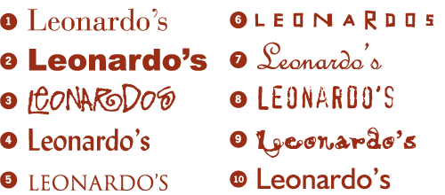
Let's
look at a number of examples from designers Licko, Heine, Medina, and
Segura who approach type design from various angles.
Display
typefaces aren't neutral and quiet in their design. They have a very
strong personality and trendy style which limits them to specific uses
and applications. This face, Narly,
would be great for some display copy in a grunge-hacker high-tech advertisement—but not in that many other situations. Designer Zuzana Licko used
a font bitmap as a starting point and "evolved" the visual
variations from that basic form.
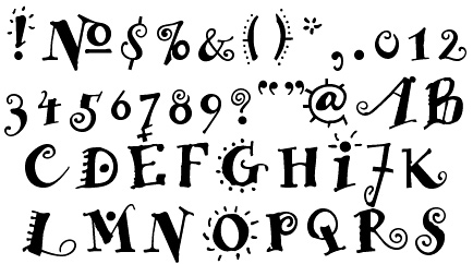
The typeface Remedy below is also very distinct
in character and attitude. It's easy to pick out of a crowd. Because
it's so strong, a little bit of it goes a long way. In the beginning, it may have been interesting and
exciting, but it soon became trendy and overused in the 1990s.
Its novelty was gone. Such is the life span of display faces...
|
|
|
Remedy Double by Frank Heine
|
Remedy
is distributed by Emigre and was designed by Frank Heine who lives and works in Germany. Where
does inspiration come from for display type designs like Remedy?
Maybe it's just in the air? In the late 1980s, there were a number of
examples of a similar quirky-style hand lettering.
|
|
|
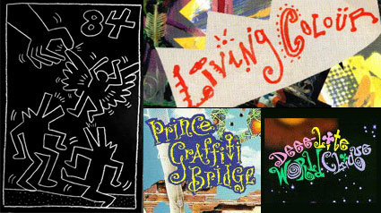
A
drawing by artist, Keith Haring. And playful type from the album covers of bands: Living Colour,
Prince, and Deee-Lite.
|
One of
the earliest samples is for the logotype for the band Living Colour,
by a design team called the Thunderjockeys. You can see similar work in other
album covers such as those of Prince and Deee-Lite.
I
think you can also see a resemblance to the artwork of Keith Haring
who was an influential NYC artist at the same time. It is composed of
simple line drawings and primitive shapes that you might see in totems
and tattoos. Typographer Frank Heine brought those forces and styles
together—whether consciously or unconsciously—in the typeface
Remedy.
To
continue our exploration, let's take a look at a series of contemporary display type designers draw inspiration from the world around them.
Pablo Medina
The
typographic design of Pablo
Medina reflects his cultural environment. He is influenced
by the unpretentious, sometimes imperfect designs hand lettered
by sign-painters in communities in North Bergen, New Jersey and Manhattan's
East Village where he lives. From these neighborhoods, he extracts typographic forms and visual experience.
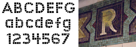
One
of his recent typefaces, Union Square, is based on the mosaic tile work
found in the subway system of New York City. His typefaces are based
on local culture as opposed to the sameness of our 24-hour global info-culture.
|
|
|
Medina used tile mosaics in the subway stops
as a reference for his typeface Union Square.
|
Carlos Segura
|
|
|
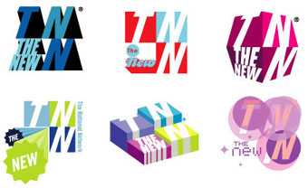
Cable station TNN (now defunct) identity graphics. Design:
Segura Inc.
|
You might
know Carlos Segura from his Chicago-based
firm Segura Inc. or from his popular digital type foundry T-26.
Like Pablo Medina, Segura has a Cuban heritage. He was born in Cuba
and emigrated to Miami. Jobs at a number of advertising agencies eventually
brought him to Chicago.
T-26 began
in 1994 as a way for Segura to distribute his own fonts but it soon
became a conduit for many others to showcase their type work. T-26 now
hosts hundreds of typefaces designed by scores of designers worldwide.
In art4d magazine
he describes the philosophy behind the foundry: "At the time, it
was very difficult to find 'experimental' type without going
through an extensive search, or drawing it yourself, so we focused on
a plan that was to build a 'community' of global designs from
sources that were being ignored, such as new, up-and-coming talent and
students."
|
|
|
Neo Bold by Carlos Segura, one
of his first faces |
Similarly,
in another interview, Segura says an important purpose
behind T-26 was to open the doors of the exclusive, cloistered world
of type design to innovative design made possible by new desktop computer
technologies. "If you were a beginner, or an unknown font designer,
your chances of being taken seriously were slim at best by the top foundries
of the time. We opened the doors of opportunity to everyone who wanted
to send us something to look at. And we got some amazing stuff."
At Fontworks,
Segura explains that typography is a creative, expressive medium—and that he treats type as an image: "We don't view typography
as just a vehicle for doing words. For us it's more of a canvas to paint
the feeling of what you're saying about body language rather than text
as language." I think this echoes the point of this lecture, that
typography can be dramatic and expressive.
Gunnlaugur Briem
Like Segura, Icelandic designer Gunnlaugur Briem believes that typography is about more than merely a way to display language. His fonts show a sensitive awareness of the people who will come into contact with them. In 1990, he was tasked with updating the main typeface for the prestigious London Times, and in 1995 he was called upon by Iceland's Library for the Blind to create a font that artfully combined Braille symbols and Latin lettering.
|
Gunnlaugur Briem's BriemGauntlet is based on traditional Icelandic woodcarving. |
Briem's font BriemGauntlet taps into Icelandic history, modeling itself after a traditional style of Icelandic woodcarved lettering. The resulting font is ornamental and distinctive, not only a carrier of information but also a symbol of cultural heritage.
As Briem points out on his Web site, we already have more than enough masterpiece typefaces, but we still have a constant demand for "different flavors, a variety of emphasis, wood types, hobgoblins." Briem's work has shown a consistent ability to adapt typography to unique design challenges without losing a sense of individual expressiveness.
Jonathan Barnbrook
|
Jonathan Barnbrook collaged together a variety of typefaces to quote Tibor Kalman in his provocative 1999 billboard installation. |
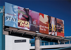
British designer Jonathan Barnbrook brings a strong social conscience to his work, and he is not afraid to express bold or controversial opinions in his designs. A two-time art director for editions of political magazine AdBusters, Barnbrook is well-known for his billboard project "Designers, stay away from corporations that want you to lie for them" (a Tibor Kalman quote), which debuted at the 1999 AIGA conference in Las Vegas.
Barnbrook embeds nods to his causes and beliefs into all his work, even down to the allusive names of his fonts: Newspeak, Prozac, Shock and Awe, and Doublethink. He has stated that he believes design should serve as "a weapon for social change," and he admits a lack of patience with typography that strives to be "neutral" or "transparent."
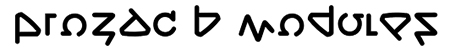
You can see this embrace of both progressive politics and bold, non-transparent typography in Barnbrook's Prozac font, which is distributed through Barnbrook's own VirusFonts foundry. Prozac was created as an experiment "to make a universal alphabet with as few shapes as possible." The entire font is based on six shapes, which are rotated and/or flipped to generate different forms. Barnbrook explains the philosophy behind this experiment as a call to analyze the goal of typography: "We wanted to hint at the relationship between simplifying letterforms and the complexity of meaning conveyed through words."
|
Jonathan Barnbrook's Prozac is a highwire typographic feat: it uses only six shapes—rotated and flipped in various ways—to create an entire font. |
Barnbrook's work is a good example of display typography that elevates the medium, lacing letterforms with challenging ideas.

 ecially
true in advertising design. At most
you'll be reading only a headline or small bit of copy, not pages and
pages. I think most advertising relies mostly on clever copy writing
and strong photography or illustration to communicate a concept. So
it's difficult (but not impossible) to find examples of ads which use
typography alone as the primary communication tool.
ecially
true in advertising design. At most
you'll be reading only a headline or small bit of copy, not pages and
pages. I think most advertising relies mostly on clever copy writing
and strong photography or illustration to communicate a concept. So
it's difficult (but not impossible) to find examples of ads which use
typography alone as the primary communication tool.