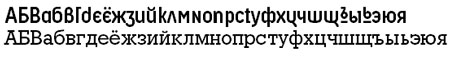
A
Class of Your Own
 |
All similar,
all different. We'll explore how to identify
type by the little characteristics that differentiate
each letter.
|
At a certain level, typography is about classifying
things. To be good at it, you've got to think like Charles
Darwin, or perhaps your school librarian.
Imagine
you are walking on the beach, and you come across a pile of stones. There are many ways to begin grouping and classifying them. Perhaps
you could pile them together by size: big, medium, and small. Or maybe
by color. They all are sort of brown-gray but some have more blue in them and others are more reddish. You could group
them according to which are the smoothest or which ones would be best
used for skipping on the pond.
It's the same with typography. Numerous systems for classifying type
exist, each of which reflect the agendas and personalities of the designers
or historians in charge. To learn typography, it's wise to start with
a widely accepted system. The
one that I think is the best—not too big, not too small—is the
classification scheme used by Adobe Systems which was adapted from the Association Typographique
Internationale (ATypI) in Europe.
Some schemes
for organizing type are too small—you could just group everything
into three areas if you wanted: serif, sans, and other. Or you could make
just two groups—those fonts I like and those fonts I hate. Dividing
things into the ATypI categories adds complexity and forces you to look
very carefully. This is the mark of a connoisseur and expert, not just the aspiring
amateur.
The ATypI
organization classifies typography into 12 categories. If they're right,
we should be able to use them to group every letterform on Earth! Here
they are:
 |
|
 |
| |
- Venetian
- Garalde
- Transitional
- Didone
- Slab Serif
- Sans Serif
- Glyphic
- Script
- Display
- Blackletter
- Symbol
- Non-Latin
|
|
 |
|
 |
What visual clues will help us decide
how to organize the complex world of typeface styles? Before we explore
the ATypI categories, let's discuss what to
look for.
What
follows is a guide to some of the more important and elusive details.
These details all relate to the earliest origin of the letterform as
a written artifact: handmade with pen and ink. Certain shapes naturally
arise because
of the shape of the broad-nibbed pen and the angle at which it is held against
the surface.
|
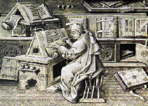
The medieval scribe knew every letter in detail
because it came off the end of his pen. Is it the same today with
computer typography? |
Axis
Look
carefully at rounded letterforms such as the lowercase o or e.
 You'll
see that some are angled to the left. If you've ever done calligraphy,
you'll know this comes from the angle at which the pen is held in the
hand. This is also known as the "stress" of a letter.
You'll
see that some are angled to the left. If you've ever done calligraphy,
you'll know this comes from the angle at which the pen is held in the
hand. This is also known as the "stress" of a letter.
In
the illustration above right, the slight leftwards angle indicated in
red is caused by the pen stroke.
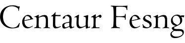
Stroke
Variation
|

|
| The
left letterform has an even, monoweight stroke. The letterform on
the right has extreme thick and thin variation in the stroke. |
In
typestyles based on written forms you can see the effect of the hand
and the pen on paper. Some parts of the line are thin and others are
thick. This mostly occurs in serif faces. Sans serif typefaces have
a more mechanical quality which you can see in the uniform weight of
their stroke.
As
you'll see later, there are very few thick/thin differences in the strokes
of sans serif faces.
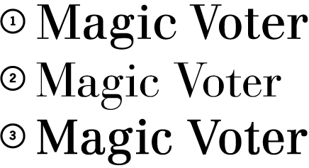
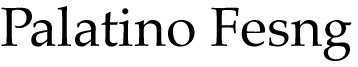
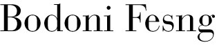
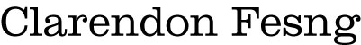
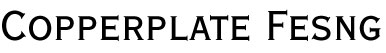
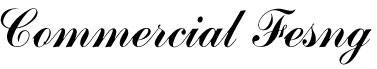
Serif
Details
One
of the most telltale features of a typeface are its serifs, those pointy
little parts at the end of strokes. These three serif fonts are apparently
similar. And yet the points on each
one are distinctively different. Roll over
each one with your mouse to find out how.
|
 |
 |
Baskerville. Look at the pointed tip of the serif and the way it connects
to the stem stroke. |
Bodoni. Look at where the serif meets the stem (the bracket).
It is a sharp angle. |
Clarendon. Look
at the end of the serif—it is flat, slab-like, and not
pointed. |
When
you examine serifs, look
for three key features:
|
|
|
| |
1.
The points on the serifs.
Some are soft and rounded, others sharp or angled.
2. The base of the serif
is sometimes slightly arched.
3. The place where the serif joins the stem of the letter is
called the bracket. Sometimes
they meet at hard right-angles, other times they are smoothly
curved. |
|
|
|
|
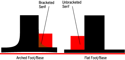 |
The
red block indicates the bracket area—where the stem and serif
meet. On the left there is a strong arch but on the right there
is no curved arch. The red line indicates the baseline. Notice
how the foot of the serif on the left has a slightly arched base.
|
OK,
now that you know the main things to look for, let's delve into
each of the 12 categories. Later, we'll take an in-depth look at
serif and sans serif fonts.
Although Gutenberg invented printing in Germany,
the center of early printing quickly became Venice, Italy, where the
Renaissance was in bloom. Thus the name of our first category, Venetian.
Printers created these type styles by copying the styles of calligraphy
used by the scriptoriums in the area. This style was prevalent from
about 1470 to 1500.
The clue that usually makes this style detectable is the lowercase e.
In Venetian styles, the crossbar is angled. Compare it to the e in the
next category.
2.
Garalde
This category name is a combination of Garamond and Aldus (Manutius)
who were two prominent typographers of this era. This is also sometimes
called Old Style. As the Renaissance spread through Europe, so did
typographic styles.
What
are the clues you've got a Garalde? The best indications are a horizontal
cross bar on the lowercase e, and strongly angled axis/stress on the
rounded letters. The bracketed serifs help to distinguish it from
the Didone category (below).
3.
Transitional
This category is somewhere between 2 (Garalde) and 4 (Didone).
Thus it is called transitional. These typefaces have some visual qualities
of both categories. If you can't figure out whether a typeface is
a Garalde or a Didone, just call it a Transitional.
The
clue to transitionals are their bracketed serifs combined with a vertical
axis/stress in the rounded letters.
4.
Didone
This name is a combination of Didot and Bodoni, who were two preeminent
printers using this style. This category is also called Modern. It's
described as Modern in the sense that it was a clear shift away from
Old Style (Garalde) faces. Didone typefaces are more mechanistic and
less humanistic. They were introduced in the early 1800s.
Some clues to Didone: Their axis/stress is vertical. There are extreme
thick and thin variations in their strokes. Their serifs meet at sharp
right-angles and there is no bracketing.
5.
Slab Serif
As
the name implies, the serifs on these faces are very thick. These styles
are sometimes called Egyptian. This has to do with the newsmaking expeditions
into Egypt by Napoleonic adventurers. There are several subcategories
of slab serifs. The most notable is Clarendon. Typewriter styles also
fall under slab serif.
Some slab serif clues: Their serifs are very heavily bracketed and are
usually blunt-ended instead of rounded or tapering.
6.
Sans Serif
Chop
off the serifs and you have sans serif. This style came into use during
the industrial revolution (mid-1800s) but sans serif styles hit their
popularity in the early 1900s and became a symbol of modern design.
This
is a large category that has some important subdivisions.
 Geometric
sans. These sans serifs
have a very geometric quality. The round letters are perfect circles
and the strokes are generally the same weight with almost no thick/thin
variation.
Geometric
sans. These sans serifs
have a very geometric quality. The round letters are perfect circles
and the strokes are generally the same weight with almost no thick/thin
variation.
The
example is a geometric sans serif and you can easily see this by
comparing the o or e to the other examples. They are strongly circular.
The example used is Century Gothic from Monotype. It is essentially
a clone of the face Avant Garde by Herb Lubalin and Tom Carnase
in 1970.
 Grotesque. When this style was first introduced in the 1800s people thought
it was unrefined and ugly; they called it "grotesque."
The style of the lowercase g is the traditional "looped"
stroke like most serif faces.
Grotesque. When this style was first introduced in the 1800s people thought
it was unrefined and ugly; they called it "grotesque."
The style of the lowercase g is the traditional "looped"
stroke like most serif faces.
This example is a basic grotesque style. It has the characteristic
looped lowercase g. Its proportions are more condensed—the letterforms
are taller than they are wide. The example used is the face News Gothic,
designed by M.F. Benton in 1908.
 NeoGrotesque. These
were developed a bit later (thus
the name Neo–new– Grotesque) and
have a new "hook" style lowercase
g.
NeoGrotesque. These
were developed a bit later (thus
the name Neo–new– Grotesque) and
have a new "hook" style lowercase
g.
The sample typeface is a neoGrotesque; its proportion is more square
than condensed. The example used is Helvetica, designed by Hoffman
and Miedinger in 1957.
 Humanist
sans. These sans serifs, deep down,
really want to be serifs. They tend to have more thick/thin strokes. Although
this sample face doesn't look like a serif, it does have other qualities
of serifed type, such a thick/thin strokes and a slightly angled axis
in rounded letters.
The example used is Optima, designed by Hermann Zapf in 1958.
Humanist
sans. These sans serifs, deep down,
really want to be serifs. They tend to have more thick/thin strokes. Although
this sample face doesn't look like a serif, it does have other qualities
of serifed type, such a thick/thin strokes and a slightly angled axis
in rounded letters.
The example used is Optima, designed by Hermann Zapf in 1958.
7.
Glyphic
These
faces have qualities that make them appear as if they had been carved
into stone or cut into metal. The serifs are usually short, pointy,
and triangular. Many of these glyphic faces (but not all) are comprised
only of capital letters.
8.
Script
These faces mimic cursive handwriting. Some are very decorative and
flourished as if made by a quill pen, while others appear as brushstrokes.
The impression is handmade more than mechanical. Italics are variations
on Roman faces, but scripts are independent styles in themselves.
9.
Display
This
is another large category. Until the mid-1800s, most printing was oriented
toward printing books. Then technology brought other forms of media
to the masses—magazines, advertising, posters. Type had to become
attention-getting. It had to "pop off the page" for the purposes
of commerce.
Display faces aren't meant to read in large quantities.
They usually are decorative and quirky. They have strong personalities.
10.
Blackletter
Blackletter typefaces
are based on early German handwriting styles. The strokes are very vertical
and angular. When printing first began in Germany this was the obvious
"local" style to use. But when the Renaissance began in Italy,
more rounded Italian styles of calligraphy were copied which resulted
in the basic forms we use to this day.

11.
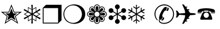
Symbol
There
are some fonts that aren't letters at all but collections of symbols.
For example, there is one called Sonata that is entirely made up of
marks used in musical notation. The one demonstrated below is Zapf Dingbats.
Sometimes symbols fonts are called Pi fonts.
12.
Non-Latin
Into
this category go all non-Western alphabets such as Cyrillic, Greek,
Arabic, and Kanji. The world is full of other alphabetic systems.