The
Origin of the Species
How well do you know your letterforms? Sumner
Stone, art director and co-designer of the ITC Bodoni typeface, made
this comment about type literacy today:
"...As a culture, [we] are out of touch with our alphabet, even
though we are surrounded by letterforms. How many people, even well-educated
people, know anything about where the alphabet comes from or why characters
look the way they do?"
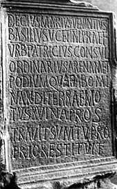 |
When
in Rome. Stone inscription from the
Roman Coliseum. This is a layout job with no Undo key.
|
He's
got a point, so let's begin our exploration of the typeface with a little
trip through time:
All
Roads Lead to Rome
The
core of every typeface is the alphabet shape itself, which in most Western
countries is Latin or Roman.
The
basic forms of our Western alphabet originate from Ancient Rome. Not
only is Rome the root of our letter shapes, but Rome is
also the root of Western languages (like English) and much of Western
culture as a whole, from the arts to law to philosophy.
It's
amazing that you can look at a monument or coin that has survived 2,000
or more years and recognize the letterforms and probably somewhat understand
the words as well.
Of
course, there are numerous other alphabets on the planet—Cyrillic (used in Russia, for example), Greek, Arabic, and Hebrew, to name just a few. The system
of characters in the Chinese language are ideograms—representing a whole idea—rather than alphabetic symbols,
which indicate a single sound element.
The
Language of Letters
When in
Rome (they say) you must "do like the Romans do." The same
principle applies to typographers. They use a very specialized language
to describe the qualities and character of letterforms. To really learn typography, you must master this arcane terminology.
Let's
start with the word itself: typography.
Myths and realities abound. One of my first-year students once came
into my class thinking the course had something to do with maps. He
had confused typography with topography. Pretty close! Other
students think that we do calligraphy in
type class, creating
handwritten forms with pen and ink.
To be
specific, typography means the mechanical
reproduction of letterforms—the art of the printed letterform,
as opposed to making letterforms by hand. What typographers do falls into
two main categories:
And just
think of all the applications of typography: logomarks, body copy in
books and magazines, expressive type in posters, advertising headlines.
These days, typography refers to just about any visual aspect of words
and letters in any media—digital, motion, print, and so on.
 |
|
Typography is
so much a part of our world that we almost don't see it. Boost
your type perception, awareness, and consciousness by looking
for type everywhere. |
Fonts
Versus Typefaces
To begin
with, we should clarify the difference between a typeface and a font. These days most
people use them as interchangeable words meaning the different visual
styles of letterforms. But the expert typographer knows differently.
|
|
A letter is raised from
the surface of the slug. Note that it is reversed so that it will
be right-reading when printed.
|
Originally,
in the early days of printing, type was cast as tiny metal slugs and
arranged by hand—one letter at a time. Can you imagine how long it
would take to set up a newspaper page? And the letters had to be cut
in reverse so that they would appear correctly when printed. Imagine having
to read backwards all the time! This was the life of the letterpress
typographer.
This basic
method persisted until the middle of the 20th century (about 500 years
since it was invented by Gutenberg). If you look at books printed in
the early 1900s and before you can still see (and feel) the actual
imprint/indent made by the inked metal type onto the paper.
Much of
the terminology used in type goes back to these early days of metal
letters. The word font best refers
to the actual physical metal thing and the term typeface best refers to the image or print it leaves on the printed page. Of
course in our computer age, this doesn't quite make sense because we
no longer use real metal fonts but instead digital data stored on a disk.
Back then,
a font referred to one single cut—one specific weight and size of all the characters—of a typestyle.
One typestyle, like Bodoni in my
example, is made up of many, many individual fonts.
Remember
that each size of type had to be cut by hand—there were no pull-down
menus on a computer or scaling tools! They couldn't cut an infinite
number of sizes so they settled on popular ones—10, 12, 14, 18, 24,
36, 48, 72 and so on. If they wanted to use 45 point type they were
out of luck. I wonder what Gutenberg would think about today's typesetting
technology?
|
|
|
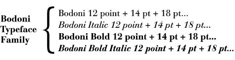
The typeface
family Bodoni is made up of many related fonts, each with a specific
size and weight. |
A typeface
family is the complete collection of fonts of the same visual style—all with the same style, but different sizes (12 pt, 14 pt, 18 pt)
weights (bold or heavy) and cuts. A cut is an edition of a typeface, almost like a vintage of a wine.
To further
complicate matters, different type foundries can have slightly different cuts of a single typeface like
Bodoni. The one I've used in the example above was originally cut by
the Bauer type foundry. A Bodoni cut by another foundry might be slightly
heavier in stroke weight, or have more exaggerated serifs or it may
more authentically reproduce the original designed by Italian printer
Giambattista Bodoni in the 17th century.
Roman
and Italic
The standard upright letterform we see every day is called Roman.
This has to do with the fact that the shapes are derived from the letterforms
on monuments in Italy (and Rome in particular). Gosh, it seems all roads
do lead to Rome!
Originally, italics were considered a completely separate typeface. The slanted forms were
developed by Aldus Manutius (and his typecutter Griffo) in 1501 to mimic
the fine manuscript handwriting of the period. Today, italic versions are usually made to stylistically accompany the
Roman faces. The italic version of some sans serif faces may be called obliques.
Upper
and Lower Case
I'm
sure you've heard capital letters called uppercase and small letters called lowercase.
What is this, some form of type snobbery? "Typecasting," maybe?
Back
when type was made out of individual metal letters, it was organized
in two separate wooden cases. You guessed it! At the printer, where
a page was set one letter at a time, capital letters were stored in
the "upper case," and the small letters were kept in the one
underneath, called the "lower case."
Another
little-known fact: The uppercase forms are derived from letterforms
chiseled into the top part of a Roman monument, building, or pillar
called a "capital." Hence the term capital letters.
Points
and Picas
 |
In every inch are 72 points,
and 6 picas.
|
Anyone with a computer knows how
to select 12 point type in their
font menu. But what does this measure mean?
We're used to measuring things in inches, or millimeters, or even these
days, in pixels. Well, typography's different. Type has its own system
of units called points and picas.
To
measure a letterform, start with one inch and then divide it into 72
parts. Each unit is one point. This
is the smallest measurement unit. It is used to measure the size
of type as well as other line and page measurements.
A
unit of 12 points is called a pica.
Six of them fit in one inch. Pica are generally used to measure a page layout.
Begin
at the Baseline
The
invisible line on which all letters sit is called the baseline.
This is the starting point for measuring many other aspects of type.
Another
important mark is called the x-height.
It is the distance from the baseline to the top of a lowercase letter
x. Keep this word in mind, as we'll discuss it more later. You can see
that most of the visual substance of a letterform exists in the x-height
area. Only a few bits might stick above or below the lines. This broad
area (from baseline to x-height) is also called the body.
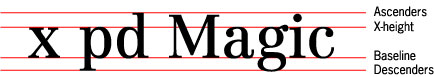
Any
parts of letters that extend below or above the baseline or x-height
are called descenders (below) and ascenders (above).
Two examples above are the letters p and d. The lowercase g also pokes
below the baseline and could be called a descender, but it has a special
name, a loop, due to its shape.
You
may also notice that the capital M doesn't quite make it to the same
height as the ascenders. The cap height is usually slightly smaller than the height of the ascenders. But that's
not always true. Sometimes the cap height is the same size or even exceeds
the ascender line. In typography, the rules are broken all the time.
That's what makes it an art, not a science.
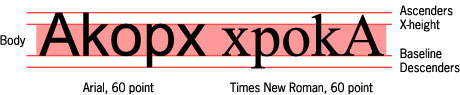
How
is type measured, exactly? Even this is something of an art. When we
say we are using 60 point type, this refers generally to the distance
in points from the bottom of the descenders to the top of the ascenders
in a font. Below is an example using Arial and Times. Both faces are
60 points but optically—to the eye—Arial will appear bigger.
|
|
|
Even though both faces here are set at 60 points, you can see with
your own eyes that they are not visually the same size. |
If
I measured from the top of the k (ascender) and the bottom of the p
(descender) in both typefaces it would add up to 60 points. However,
the interior proportions of the typeface do not align. Arial has a much
larger x-height than Times, which
causes this face to appear heavier or more dense on the page.
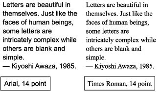
Imagine
an entire page of type set with Arial versus Times. You can tell by
the example below that Arial would have a heavier look and feel
on the page.
|
Both typefaces are 14 pt. But the visual impact of Arial is stronger
not only because of a heavier stroke but because it has a larger
x-height. |
Typographers
call this overall impression of density the "color" of a page
even though it is printed in black and white. And it all goes back to the
x-height.
How
are you doing so far? As you've discovered, type terminology is intricate
and arcane. Typography is a specialized art. If you master its language
and become a type-wizard, you will join the secret club that has existed
at least since the time of Gutenberg and early printing some 500 years
ago.
Let's round out your exploration of the letterform with the remaining
elements to look for...
The
Anatomy of the Letterform
The
most important bit of a letterform's anatomy
are its serifs, if it has them.
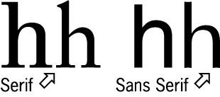
Serifs are the pointed elements at the end of strokes. They are key in identifying
a typeface, almost like a fingerprint. If a typeface has no serifs it
is called sans serif—sans means "without" in French (thus, "without serifs"). In the
next section we'll look at the many varieties and type of serif and
how they are useful in telling one typeface from another.
The
names for some other parts of letterforms are strangely based on human
body parts. No, there aren't parts of letters called livers and toenails,
but some letters do have shoulders and ears. No kidding!
In
the examples below, you can see that the small stroke jutting out from
the lowercase g is called an ear.
And that the horizontal stroke on the capital E is called an arm,
one end connected to the stem and the other projecting into space. The shoulder is the arch-form
you find in the lowercase m, h, n. And the slow curve of the S is called
a spine for obvious reasons.

We've
already introduced the serif, which
is the pointed element at the end of a stroke. The stem is the major, thick stroke of the letterform usually vertical or diagonal
from which all the other parts grow. You can see that identified in
the capital E above. The counter is the negative space enclosed by a stroke. Even the partly enclosed
interior area, of the lowercase n for example, could be called a counter.
The bar is the horizontal connector
between strokes. Some elements only appear in specific letterforms.
For example, the Q has a tail stroke. And
only the capital G has a spur, which
is a tiny pointed element.
And
finally I should mention the bowl.
This is the curved stroke that encloses the counter space. You can also find bowls in R, P, and similar letter shapes.
Read
the Transcript
Whew,
you've learned a lot of terms so far in this lecture. Here's a quick
review before you move on:
 |
|
 |
| |
Typography: The mechanical reproduction of letterforms.
Typeface: A collection of single fonts, all with the same
style.
Font: One single cut of a typeface, a specific
weight and size.
Point: Unit of measurement (1/72 inch), used to measure the size
of type as well as other line and page measurements.
Pica: Unit
of measurement (1/6 inch) generally used to measure the page layout.
Descenders and ascenders: Parts
of letters that extend below or above the baseline or x-height.
x-height: The distance from the baseline to the top of a lowercase letter.
Arm: Horizontal
stroke projecting into space from the stem of a letter.
Ear: Small
stroke jutting out from a lowercase letter.
Stem: The major, thick stroke of a letterform.
Counter: The negative space enclosed by a stroke. |
|
 |
|
 |


 There are two other details of interest: The lower case r has a serif attached on the arm, and the upper case C has a serif attached to both upper and lower arms. These attributes are not common with other slab serifs.
 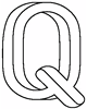 The display face Implausible was designed by Utah-based designer Regan Johnson. He writes, "It is inspired by optical illusions," which I think you can see when you look at letters like the Q. Like most display faces, it was created to suit a specific purpose, in this case the designer's personal visual identity. It is a clever, optically designed sans serif.
 For me, the original Caslon Old Face remains more distinguished and elegant with its fairly long ascenders, long descenders, and small body. However, Replay and its shorter descenders creates a face more adept to modern usage. An interesting detail: The uppercase A has a sheared, slightly cupped apex, with the main stem projecting slightly to the left of the thin stroke. This simple and elegant characteristic visually links the two typefaces.