Typography | The Language of the Letterform


Two Type Projects

Brian Slawson's University of Florida students working on large-scale chalk letters. As you'll discover, there's no better way to get to grips with the letterform than to roll up your sleeves and draw them.

The purpose of this exercise is to put type under the magnifying glass—to begin looking very closely at the forms of letters. The exercise has two separate parts.

The first part is to actually draw specific letterforms (using good old-fashioned hand-and-eye coordination) in order to appreciate their visual characteristics. Digital designers, trust me—there is no better way to get familiar with the letterform!

The second part involves collecting letterforms that inhabit the world around you. You'd be surprised at how many outstanding examples of typography are etched into your everyday environment. In the exercise, you'll collect some rubbings and post a report on your findings.

Supplies needed: Sharp pencil, ruler or straight edge, broad tip black pen or fine-tipped pen, dark-colored wax crayon or pastels or soft-leaded pencils. Standard copier paper or thinner paper for tracing exercise.

In this exercise, you're expected to:

Recreate the four given letters by hand on a provided grid.
Compare and report on the visual differences of the letterforms.
Choose a single letter to illustrate using the same grid technique.
Mark up the letter with labels that demonstrate your understanding of letterform anatomy.
Collect five rubbings of typography from your environment
Describe the rubbings, with additional details on your favorite of the five.


Assignments are evaluated for understanding of concepts covered in the lecture.


Part I: Letterform Squares


Setting Up the Project

Visually replicate the letterforms using the downloadable grid.

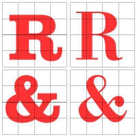
Your goal in this task is to visually replicate four letterforms. I've made a 4x4 grid onto which I've placed a few letterforms. By looking carefully at the images you should copy them onto another gridded layout.

I've selected two letters from the Clarendon typeface and two from the Bodoni typeface. As you are copying them, you should observe and compare the visual differences very carefully and write down some notes, as you will be required to write a brief report to accompany your work. You'll need a sharp pencil, a ruler or straight edge, and perhaps a fine point and broad tip black pen.

First, download the grid PDF and print four or more copies. This is the grid onto which you will hand draw the letters.

Also download the squares PDF file, which shows the letters above at full size, and print the page for your visual reference.

Examining the Four Letterforms

Attentively examine the four provided letters (two Rs and two ampersands) and look very carefully at how the curves and straight lines intersect with the gridded background.

Rough in the letterform one grid unit at a time. Then, stop and look at the overall drawing. It's difficult to do perfectly at first. Look for odd proportions, curves that don't flow smoothly, awkward angles, and then touch up the details.

Once you're satisfied, use a fine-tipped black pen to finalize the outline of the letter you've drawn. Then, most importantly, fill in the letterform solid black with a broad-tipped black pen, making sure you do not go beyond the black outline. We do this because it's much easier to appreciate the positive/negative forms of a solid, filled-in letterform rather than an outlined form.

Repeat the process for each of the four supplied letters. Remember that the four final letters need to be crisp, clean, filled-in in black, and drawn as accurately possible. This exercise demonstrates your talent as a draftsperson and your powers of observation, both of which are necessary in typography. Though you may not become a designer of typefaces, understanding the intricacies of type anatomy makes you a better graphic designer.

Scan or take digital photographs of your results. Save your work as a PDF or JPEG files. Include with your image submissions a brief description of the visual differences between the letterforms.

Part II: Letterform Show and Tell

Next, you will present a single lowercase letterform of your choice and identify the aspects of its anatomy that you learned in the lecture. Your letter could be x, y, z, p, or something else. Perhaps an initial? Find a letterform in a typeface that really interests you. Do not use a script letterform for this piece.

Enlarge the letter of your choice to a workable size and apply it to a grid. Remember to clearly name the typeface at the top of the grid sheet.

Mark it up with labels to explain the elements of typography you see. Imagine you are diagramming the letter to explain its component parts to your youngest nephew, for example. The elements you might illustrate include baseline, descender, ascender, x-height, arm, ear, stem, counter, and so on as it applies to your chosen letter.

Scan or take a digital photograph of your results. Save your work as a PDF or JPEG file.

Before you begin, refresh your memory on the essential vocabulary of typography with the following Review Kit:


Part III: The Great Letterform Dig
Making Your Rubbings

I found these letters on my old WWII-era Frauka camera and used a pencil to make the rubbing.
Type is everywhere. It's not only on printed materials but also on plastic, metal, wood, glass, stone, and other materials. Some of the earliest examples of typography come from those carved into ancient stone monuments that have endured through the ages.

And today you can find type on the bottom of your running shoes, on sewer covers, on your car, on architecture. It's carved into gravestones, molded into plastic signage, punched into leather.

The focus of this task is to find examples of type in unusual places like those mentioned above and use a "rubbing" technique to gather the samples. We are looking for type that is extruded from or indented into materials—something that is not on a printed page. Look in the kitchen, go outdoors, walk to the city park, explore widely.

Gather five examples from a variety of sources. Look for different styles of letters.

You can even search in parks or public places; look for statues, monuments, or plaques. Look on the street and on industrial equipment. Look on your car. Visit your local graveyard (be respectful). Check out signage on buildings.

A dark-colored wax crayon works best to make your rubbings. You might also try pastels or soft-leaded pencils. Standard copier paper should work fine, but thinner paper may help you capture more small details.

The results will be grainy and gritty. Enjoy the imperfections and illegibility. This will help you to recognize letters as image and part of your environment rather than as something to be read and forgotten. Include a photograph of the rubbings you create.

Reporting Your Findings

To accompany your five rubbings, you will write up descriptions of your findings. Include the following:


  • What products or objects did your rubbings come from?

  • Describe visual character of the letters themselves. Are they beautiful or ugly? Why? Do they reflect a time period or fit the nature of the place, material, or product?

  • Clearly describe the typestyle of each rubbing. Are they sans serif, serif or script?


Indicate clearly in your anthropological report which is your favorite rubbing of the five. Investigate and dig a little deeper into the history of the chosen rubbing.

For example: Who designed/created it (if known)? What time period is this piece from, and what is its purpose? What are some specific anatomical characteristics of the typeface? What commercial typeface does it most closely match? Answer these questions in a 150-200 word report.

If you are not sure which commercial typefaces to study, Justcreative.com has published two solid lists of essential fonts, which you can access by clicking here and here. These lists are good starting points, but I encourage you to explore further to see where your favorite rubbing fits in the world of typefaces!

Pllease take a photograph of the piece that your favorite rubbing came from, and submit the JPEG file with your posting.


Grading Criteria:

What your instructor expects you to do:
 
Create a hand drawing of four given letterforms on grids, showing attention to the specific details of rendering each character and the differences between the two typefaces.

Describe the visual differences between the letterforms.

Present a hand drawing of a single solid letterform (not script) on a grid, labeled to demonstrate your understanding of several of the different elements of typography such as (but not limited to): baseline, descender, ascender, x-height, arm, ear, stem, and counter.

Make five rubbings of raised or carved type and describe what products they come from, their typestyles (whether they are sans serif, serif or script) and visual qualities.

Write a 150-200 word report on the most significant rubbing example that clearly indicates additional details about the type including who designed/created it (if known), where and when the piece is from, what its purpose is, some anatomical characteristics of the face used, and what commercial typeface it most closely matches. Include a photograph that clearly shows the letters on the object of your favorite rubbing.

How to Post:

Once you're done, go to the Dropbox for this exercise and attach your files (as PDFs or JPEGs) with a brief comment.

Include the following in your Dropbox posting:

1. Digital images showing the four drawings of the letterforms, along with a brief description of the visual differences among them.
2. Digital image of the show-and-tell exercise grid with anatomy markup.
3. Digital images of your five rubbings and a brief description of the location, material, circumstances, visual qualities, and typestyle of each rubbing.
4. Your 150-200 word report on your favorite and most significant rubbing.
5. A photograph clearly showing the letters on the object of your favorite rubbing.

I look forward to seeing your work!

If you have a question before sending your completed exercise for grading, send a message through Canvas to contact your instructor.