The Signs of Human Manufacture
Think of any man-made object in the world around you, and try to visualize what makes it distinctive.
Chances are, you thought about the pattern made by a human manufacturer. Our environment is made of distinctive man-made patterns: the shingles on roofs, the links of wire fences, the interlocking shapes of bricks and stones in walls, a series of lights down a hallway. The great things about humans is that we like to put things in order, whether we are building pyramids or laying carpets in abandoned warehouses.
Geometric patterns are a great opportunity for the texture artist because they represent such an obvious and natural application for texture tiling. Picking up what's truly characteristic about a geometric pattern and repeating it can create a whole world of texture information.
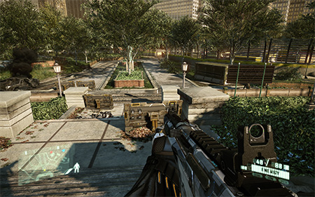 |
This screenshot from Crysis 2 shows various surfaces made up of geometric patterns: the
brick walls around the potted trees, the stone columns, and the wood planks beneath the player. |
At the same time, the tiling effect can just as easily be ruined by conspicuous detail. So in this lecture, we'll explore how to create texture tiles for a brick wall. This will provide a foundation for geometric textures you'll create in the exercise.
Let's begin with some insights into working with this type of source material.
As we discussed in Lecture One, on a professional job you may find yourself working with stock source images—depending on the culture, art style, budget, and so on, at the game studio.
In this class, I'd encourage you to work with some photographic source material of your own. Here are some thoughts on getting together your source images.
The Perspective Issue
As far as possible, a texture image should be "flat," exhibiting no apparent perspective, like a decal applied to a model plane.
With any photograph taken in the real world, however, some perspective may be visible—and especially so with photos of geometric patterns, which tend to reveal perspective. As much as you may try to make sure the image plane is parallel
to the plane of the wall when you're shooting texture source
with your digital camera, there will simply be times when you
can't get the shot you want.
Sometimes you will have to stand
at an angle, shooting slightly from the side when you prefer
to shoot from directly in front of the wall. More often, you
will need to shoot at an upward angle when taking photos of a
building. This was the case when I shot the image below. You
can still get what you need from an image like this, but you
will need to first correct for the perspective, removing it from
the image.

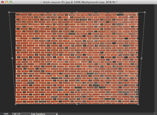
Perspective Correction
As always, you may need to work with different parts of this
image, so you should do any color correction before you start.
Likewise, if you perspective correct the entire image, and save
it, you can use it later without repeating this effort.
Distort (Edit > Transform > Distort)
is an incredibly handy tool for fixing perspective problems. The Distort
transformation
provides a handle for each corner, and you can move these handles
separately to alter the image. By moving the handles for the
top two corners apart, as shown below, we can correct for the
fact that the brick pattern is receding into the distance, toward
some unseen vanishing point. Use the sides of the image as reference,
and line up the vertical mortar lines so that they actually become
vertical in the image.
The above image is shot in such a way that the horizontal mortar
lines are very straight. However it may prove necessary to make
minor adjustments as we work with the texture.
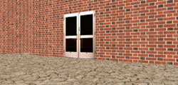
Don't Forget Scale!
As you are shooting source imagery, don't forget to think about about scale. The image below shows
you what a 512x512 chunk of our source image looks like on our
geometry.

My very unscientific survey of one doorway on one building
(hey, it's the building I shot the brick from, so this isn't
total guesswork!) indicates that a doorway is about 28 bricks
in height. Our sample doorway has extra fancy stuff on top, and
a little space above that, so as you can see that in the image above
my scale is way off.
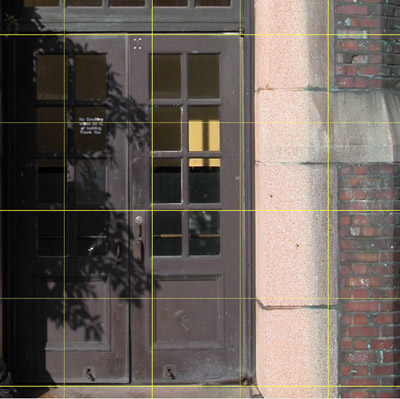
Given the scale of our geometry, a single brick tiling texture should
be about 42 bricks high. (Remember, the scale will not be the
same in all games).

The sample of 42 bricks is a large chunk of our source image, and a lot
to work with. For the sake of being able to making this a more
useful lecture, let's work with 1/4 that many bricks, and plan
to combine four of our textures, tiled 2x2, into one texture
for our "game."

Planning Ahead: Preserving the Pattern
For
this part of the lecture use the source image "brick.jpg"
found in your course downloads.
The image below shows a 1024x1024 selection over the source
image.
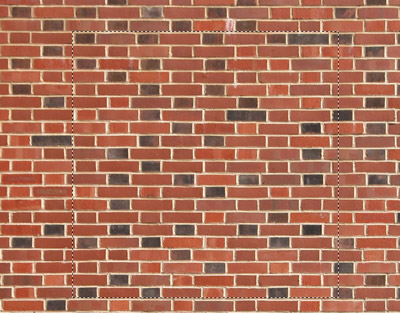 |
Click the image
above to get a closer look. |
Now is a good time to start to plan ahead for some of the
other concerns that arise when working with textures that have geometric
patterns. If we look closely at the selection above, we can see
that I've tried to place the top edge so that it just includes
a horizontal line of mortar. I've lined up the left edge of the
selection as best I could with the vertical lines of mortar.
I was careful to include the mortar.
The left edge starts with
a half brick. The right edge of the texture will need to end
with a whole brick to preserve the alternating pattern, and the
right edge should not include mortar, since that is present on
the left side of the texture.
The bottom edge of the selection very conveniently stops at
the edge of the brick, and does not include the mortar, which
is present at the top of the selection (we wouldn't want two
lines of mortar in a row when this texture is tiled).
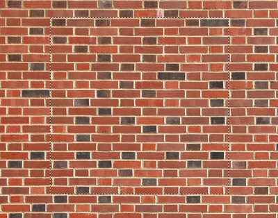
Unfortunately,
the bricks also alternate between half and full bricks vertically,
and we now have a half brick on both the top and bottom of the
selection. A quick check of the results shows quite clearly the
way in which this will disrupt the pattern of the brick.
One option is to select an extra row at the bottom. This will
mean that our selection will be larger than 1024. We'll have
to resize to 1024 to end up with a square texture, which will
result in the bricks being slightly compressed vertically. We
could also select slightly less at the bottom, which would result
in the bricks being slightly stretched after we resize to 1024.
Fortunately, with a difference of one brick in about 21, the change
won't be at all obvious.
In the image below you can see that I've deselected a portion
of my previous selection, on both the bottom and right edges.
Notice how it preserves the brick pattern. Of course, we'll still
need to do some work to make it tile seamlessly.
 |
Click the image
above to get a closer look. |
Below is our brick texture tiled in Photoshop. We're very
close here to having seamless tiling!

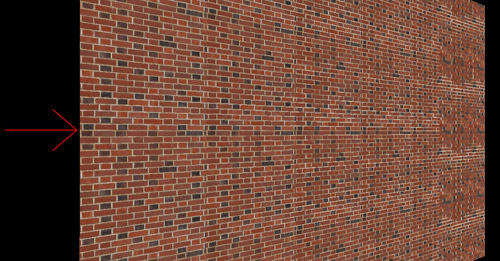
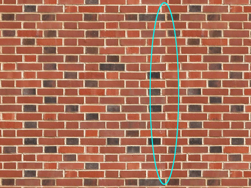
Perspective Correction and Tiling
The biggest problem with the tiling is shown below and circled
in blue. We did our best to insure that the horizontal lines
were truly horizontal, but a little further adjustment is necessary.
A slight adjustment using Distort may be enough to fix our
problem. To work on the texture, first select one tile, and copy
and paste it into a new layer. This way we can see the changes
relative to the background layer with our unaltered texture.
There is a handle in the middle of the right edge of the Distort
bounding box that allows you to move both of the right corners at once.
Holding down the Shift key while you move will assure that you
only move in one axis, in this case the vertical. By lifting the
right edge of the texture up very slightly, we can make the horizontal
mortar lines match up a little better. See the image below.

We've lifted the right edge of the current layer away from the bottom of the tile, but the brick in the layer behind should work to fill that space. Flatten the image to combine the layers. To see some more perspective correction in action before continuing on with your brick pattern, watch the following video tutorial:
Select only the tile that has been altered, and tile that new texture
3x3 to
see
how
it tiles
now.
The last step can be an improvement, but we'll still have a seam
to deal with. So, we move it into the center of the texture as
shown below.
We can choose a portion of the original source image to paste
over our latest texture, to cover the seam. If we take that approach,
remember that we resized the brick we took from the source image.
Or, we can use the previous version of the texture, before the
seam was moved to the middle.
Setting the layer opacity, as shown below, allows us to make
sure the brick pattern on the top layer lines up with the bricks
on the bottom layer. Then it is a simple matter to erase the
left and right edges of the texture, to expose the edges that
already tile on the bottom layer.
Again, we should proceed carefully
as we erase, and make sure the texture looks as good as it can.
As you can see below, our texture is looking pretty good tiled
in Photoshop. It is time to test it in 3D.

Conspicuous Detail in Patterned Textures
Textures like our brick texture have a very strong pattern of their
own, and this can make it less likely that any particular detail
will stand out enough to draw attention to the fact that we're
looking at a tiled texture. Our current brick texture looks pretty
good in the 3D view shown below. Yet, there are still a couple of things
that could be improved.
Different
3D systems cope differently with the display of textures in 3D.
In the image above, the bricks toward the right look somewhat
different from the bricks on the left. This is due to the way
the texture is reduced in pixel dimensions for display in 3D—or to put it more simply, the bricks on the right look different
as a result of being further from the camera.
At the top of the texture there is an area of what looks like
slightly dirty, or perhaps just slightly darker brick, and when
tiled, this creates a horizontal line of such brick that is somewhat
noticeable (indicated by the red arrow in the image above). If
we look closely at the texture we see that in fact the darker
brick occupies more of the texture, and the solution may be to
change the lighter areas rather than the darker.
There is one brick that stands out a bit, circled in red.
This brick is half black and half red. It is a simple enough
matter to cut and paste over it a less conspicuous brick from
elsewhere in the texture.
The process of reducing the appearance of tiling is really
the same as that used in the previous lecture, so I won't take
you through that process again for our brick texture.
Common
patterns in textures include various types of brick, block, and stone, and wooden structures such as those constructed
from planks. Most often patterns of the type discussed in this
lecture occur in man-made materials, but nature does provide some
surfaces with geometric patterns as well.