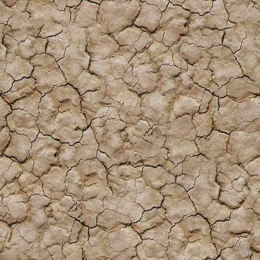
A common problem that you'll need to address when creating
a tiling texture is conspicuous detail that draws unwanted attention to
the fact that the texture is tiling. Tiling textures is an efficient
way to decorate large surfaces in games, but we don't want it
to be obvious.
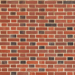
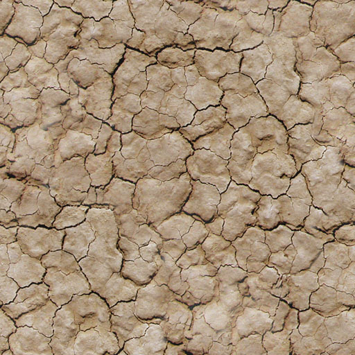
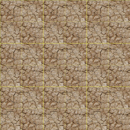
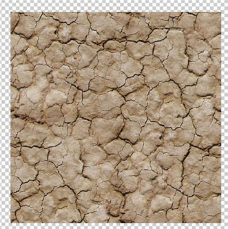
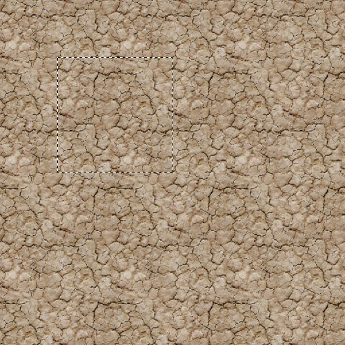
The image below shows our texture from Lecture One tiled three
times horizontally and three times vertically. In this case a
pattern can be seen clearly in this image in Photoshop: a diagonal
line of a darker color.

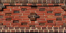
With the grid turned on, we can see that this darker color
lies just below a line that runs from the upper left corner of
the texture to the lower right corner. There is also a bit of
it in the upper right corner of the texture (remember, the image
below shows nine copies of the texture).
If we edit the image, it will be important to avoid painting over the edges
of the texture, since we've gone to such trouble to be sure those
tile.

Removing Conspicuous Detail
Working on a single copy of the texture, you might want to
use the grid to select the texture, then use Select > Modify
> Contract to protect the edges of the texture. I would recommend contracting by at least 1 pixel, and also feathering the selection by at least 1 pixel.

Working with the Dodge tool, it should be a simple matter to
lighten up the darker areas of the texture so that they more closely match
the rest of the image.
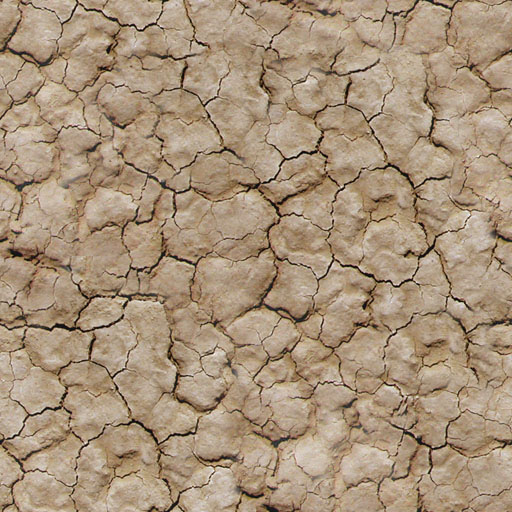
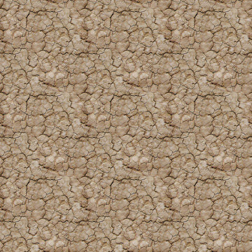
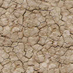
Tiling the texture 3x3 again shows us the results. It should
be no surprise that noticeable dark areas remain around the edges
of the texture (check the location by turning on the grid).
Because
we avoided lightening the edges, they are still darker than the
rest, and this is visible. But had we lightened the edges, there
would have been no way to guarantee that the lightening we did
on the right edge of the image, for example, would match the
lightening we did on the left edge.
We've dealt with a very similar problem before by moving the
edges of the texture to the center.
Since the total image is made of nine copies of a single 512x512
texture that tiles seamlessly, any 512x512 piece of this image
will likewise tile. That means that we can use the dotted grid
lines to make a selection like that shown below, copy and paste
the selected area into a new layer, and that selection will tile.
What used to be the edges of the tiling texture, where the
darker areas lie, are now in the middle of the texture where
we can lighten them without disrupting the tiling.
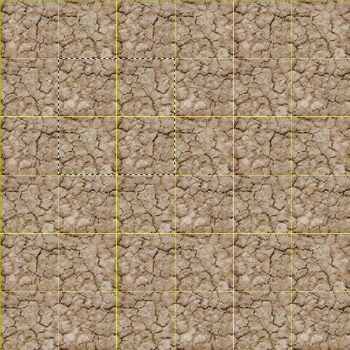
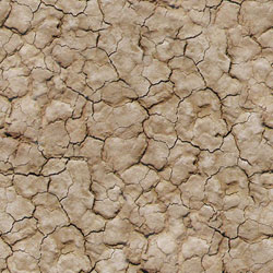
Tiled 3x3 again, you can see the improvements below.
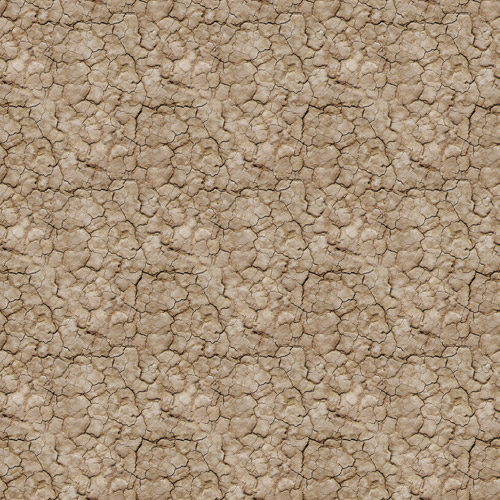
This is much better, but the critical eye will point out that
we can still tell that this is a tiled texture. Actually, a game
artist will almost always be able to tell. Looking at the image
in Photoshop, you may or may not see detail that draws your eye,
and that you would like to remove. But looking at the texture
in Photoshop may not be enough. Some problems will become more
apparent when the texture is viewed on a 3D surface and seen in perspective.
Testing Your Texture in 3D
Since your tiling textures will be viewed on 3D surfaces in
a game, it is best to see them that way in order to decide if
they are ready, or need more work.
Usually, the simplest approach
will be to apply the texture to a plane in your favorite 3D package,
and make the texture tile or repeat across the surface. It is best
to make sure that the texture
is displayed on each quad of the plane, and then to be sure that
the plane is made up of at least four quads in each axis. There
will be situations where you will see problems when the texture
is displayed this way that you would not see in Photoshop.
To
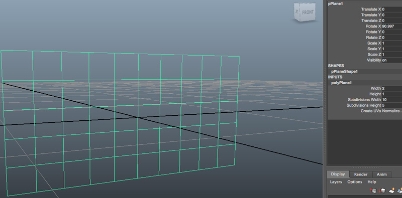
test your texture in Maya, create a polygon plane and orient
it as shown below. Notice the size and subdivision inputs I used on the right.
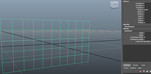 |
Click the image to get a closer look. |
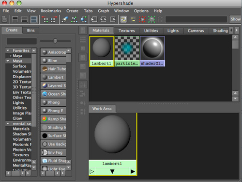
In
the Hypershade dialog (Window > Rendering Editors > Hypershade),
press the middle mouse button (or Command key on a Mac) and drag a Lambert
surface from the Create tab on the left into the Work
Area, as shown below.
Now use the middle mouse button (or Command key) to drag the File icon
from 2D Textures (in
the Create tab), and drop it onto the Lambert
icon in the Work Area. Recall that File enables you to load an external
texture.
From the menu that appears when you drop it, choose the color option.
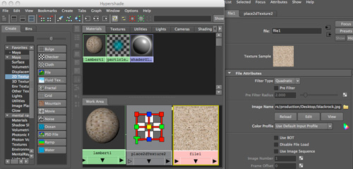
Double-click
the
File
icon
in the
Work
Area
to
access
File
Attributes
in the Attribute Editor, which displays in the main Maya window.
In the Attribute Editor, click
the folder icon next to Image Name to load your texture image.
 |
Click the image to get a closer look. |
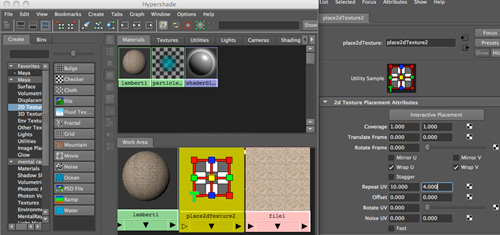
Double-click
the place2dTexture icon in the Work Area to access the UV texture
parameters in the Attribute Editor. Note: If the place2dTexture icon is not visible, right-click (PC) or Command-click (Mac) the
Lambert
material
and
choose Graph Network or middle-drag 2d Placement (from the General
Utilities section of the Create Maya Nodes menu) onto the File icon and
choose Default from the menu that appears.
In the Attribute Editor for place2dTexture, set U to 10 and V to 4 (in
the Repeat UV fields), as shown below. I chose these settings because
the
plane
has
a width-to-height
ratio
of
10 to 4, and we want each tile to remain square.
 |
Click the image
to get a closer look. |
To apply your texture to the plane, select the plane and right-click
the Lambert in the Work Area, choosing "Assign Material to Selection"
from the pop-up menu. Press the 6 key to see the texture on your model.
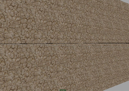
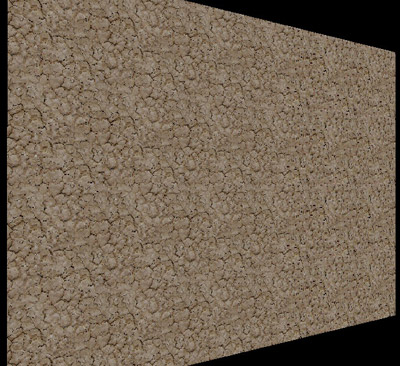
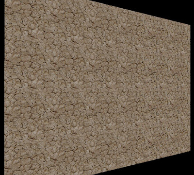
Move
in close to the plane, as shown below, to check your texture
for obvious patterns.
In the image below, an area that draws the eye is circled in
red, and another area that attracts unwanted attention is circled
in blue. These problems are much more subtle than the one we
just fixed, but we will want to address these problems as well.

In order to get a better idea of the location of the problem
areas it can be helpful to identify the edges of the texture.
This is a matter of displaying
the outlines of the faces, as shown below.
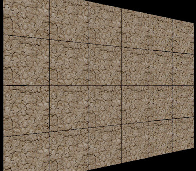
Comparing the two images above, and looking at the 3x3 tiled
texture image in Photoshop, I can see that the problem area
wraps from the right edge of the texture onto the left. So, I
will once again move these edges to the middle of the texture,
so that I can make the changes without having to work with the
edges of the texture. I can do this by selecting and working
with the area shown selected below (I used the grid to make this
selection).
Correcting Issues
I will try to solve this problem two ways: First, I will take
steps to eliminate the rather long horizontal cracks, and second,
try to further lighten the area that appears darker than the
rest of the texture.
I could try using the Clone Stamp tool to solve the first
problem. But I think I'll have more control if I draw
a selection around the area I want to change, and then move it
around the image looking for a region that I can copy and paste
to cover the problem area, using the Eraser tool to make it look
natural. I will choose an area that does not have the kind of
extreme detail that will draw the eye, such as areas containing
larger or darker cracks.
I used the Dodge tool to lighten the darker areas. Below is the texture before adjustment and after.
 |
 |
Click each one for a larger version. |
The image below reveals the changes much better:
At this point, the texture looks pretty good. There is one
dark crack that draws the eye a bit. There are also a few areas
of a slightly lighter color that seem to lie in nearly vertical
and horizontal lines. You should now know how to go about fixing
these problems. It will be common to do this many passes, or
even one or two more, in order to arrive at a point where you
have a texture that tiles seamlessly without unnecessarily attracting
the eye to certain details, and to the fact that we are looking
at a tiling texture.
The Big Texture Trade-off
As with all things in games, there is a trade-off here. As you
work with the texture to reduce the extreme detail, you also
remove some of the character. An organic surface like the one
we have been working with will often have a wide variety of different
shapes and colors, and not usually be very regular or uniform.
What we have been doing is eliminating the things that stand
out, and in doing so, we have made the texture more uniform in
terms of color, and in terms of the size and shape of the cracks.
If we go too far, we could end up with something that could look
quite artificial.
Each artist will make his or her own choices in this regard.
Some of you will think the texture looks just fine the way it
is. Some of you may think that my next attempt still needs further
work. In the game industry, you will have your peers to give
you feedback on such considerations, and your art director as
well, of course.
I gave it two more tries before arriving at this texture:
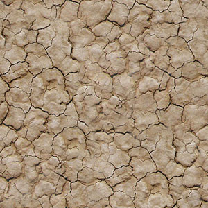 |
Click the image
to get a closer look. |