|
|
 |
| |
-
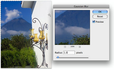
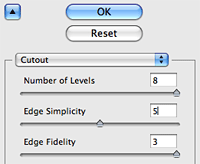
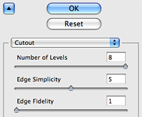
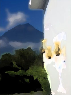
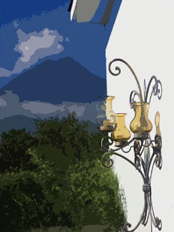
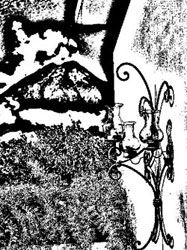
Number of Levels: This controls the number of color or tonal
levels you will have in your image. Here I have selected the
maximum of 8.
-
Edge Simplicity: This slider controls the complexity of the
shape edges in the image. Higher numbers result in more simplified
shapes. Here I have selected the minimum of 0.
-
Edge Fidelity: This controls how closely your Cutout edge follows
the position of the original edges in the image. The impact of
this adjustment in this image is minimal with an Edge Simplicity
= 0. (As you raise the Edge Simplicity value, adjusting the Edge
Fidelity will have a greater impact.)
|
|
 |
|
 |
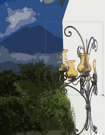
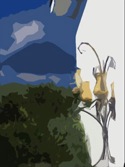
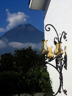
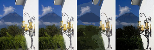
Here are a couple of before and after images and settings for you to see the impact and interactivity of the Cutout values:
Notice the impact of changing the Edge Fidelity from 1 to 3 when your
Edge Simplicity is 5. Let's use Levels of 8, Edges Simplicity
of 0, and Edge Fidelity of 3 for our final version:

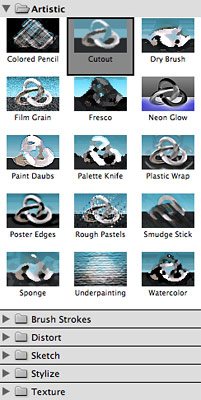
Experiment Some More
While you are in this dialog, experiment with several other artistic
filters and their controls. Make sure you try the Dry Brush and the Watercolor
filters with this image for some pleasing variations.
You will find as you gain more experience with these filters that different images tend to respond better to some filters than to others. If you have a background in painting and drawing, you will recognize these associations quickly.
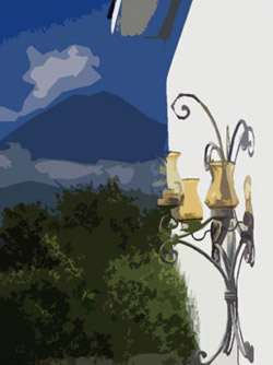
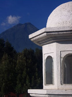
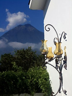
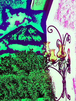
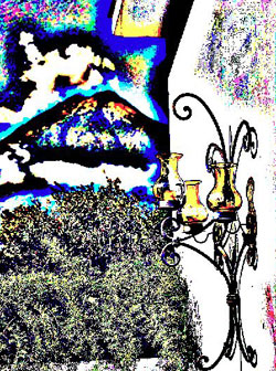
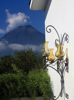
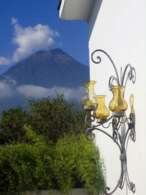
An image like Antigua Volcano View does not contain a lot of detail, but has a few broad areas of similar colors. The sky, the mountain, the side of the house, and the bushes are good candidates for using the Cutout, Dry Brush, and Watercolor filters—but are not particularly good subjects for using the Neon Glow filter.
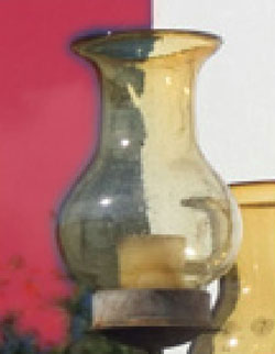
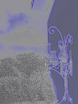
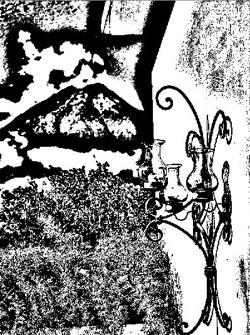
Try the Palette Knife filter and you will notice that while most of
the areas in the image work well with the filter, the high detail glass
lights do not.
 |
 |
Dry Brush |
Watercolor |
 |
 |
Palette Knife |
Neon Glow |
Before we jump into the many creative ways you can use filters on your photos, let's recap the process of applying filters in this video tutorial:
Running Time: 4:05. Read
the Transcript
Sometimes you can use standard filters in very creative ways to achieve unexpected results. For instance, here is an example of how the same standard sharpening filter we used above can be used to creatively alter the image rather than simply to enhance its original appearance.
Open the original Antigua
Volcano View. Make a duplicate copy
and name it "Antigua Volcano View_Super Sharpen."
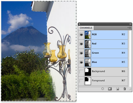
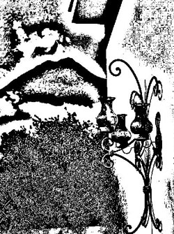
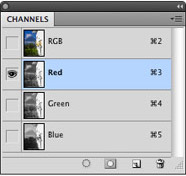
As you did before, toggle through the three channels in the Channels
panel: Red, Green, and Blue. Select the channel with the best overall
contrast between elements in the image. Here, the Green channel has
the best overall contrast. The channel you select in this case will
have a big impact on the final results.
With only the Green channel selected, choose Filter > Sharpen > Unsharp
Mask.
Remembering that sharpening is an edge contrast enhancement tool,
we can extrapolate and wonder: What would happen if we applied huge
amounts of sharpening? Would our image become edgier and edgier? Indeed.
When you understand how a tool works, you can apply it in a non-standard
way to achieve creative results.
Assign the following outrageous Unsharp Mask (take no prisoners) settings:
Amount of 500, Radius of 25, Threshold of 0.
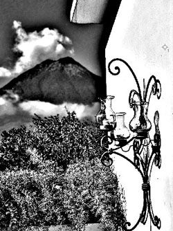
Note how the image is definitely edgier. Now repeat that by pressing
Ctrl/Command+F. This key command applies the last filter and settings.
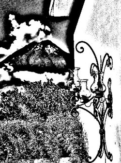
Edgier still! Now apply it one more time (Ctrl/Command+F).
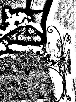
Super edgy! Notice how this is essentially a line art image now...
one generated through the use of sharpening edges in the image.
Now, just for grins, view the composite RGB channel of this image
with the Green channel converted essentially to black and white.
Make a copy of this image and name it "Antigua Volcano View_Super
Sharpen_All." Sharpen the Red and Blue channels the same way you
did the Green channel.
 |
 |
Red channel |
Blue channel |
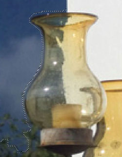
Look at the details in the image, and especially at the glass lights,
the bushes, and the mountains. You will quickly see the value of having
the good contrasts between the elements in your image: There's
better detail reproduction.
And finally, turn the composite RGB view on for this "Antigua Volcano View_Super Sharpen_All" image.
Pretty interesting image, huh? Experience will help you control these creative alterations.
Try different sets of sharpening values as well, like a Radius of
10 or 50 instead of 25. Or try altering your Amount and Radius
values with each step. You can also select various portions of images
and
apply filters to them separately and/or using different settings.
There are infinite possibilities... and that's the point.
Once you understand how Photoshop's tools work, you can use them in an infinite variety of ways to create images with unique artistic properties.
To finish up Part I, let's look at the three variations of images
we have constructed so far:
 |
 |
Starting image |
Sharpened image |
 |
 |
Cutout |
Super sharpened image |
In Part I of this lecture, we saw how filters can be used to enhance an image, add an artistic/illustrative look, or creatively alter images.
In Part II, we will apply filters to images in the context of a project, creating a travel brochure to encourage folks to visit Guatemala. Our emphasis will be on selecting and using filters that: 1) Create an appealing impact for the travel brochure, and 2) Suit the specific characteristics of the image.
In putting together a cover for our travel brochure to Guatemala, we are looking for images that will appeal to people with enough disposable income to allow them to travel. They will be well educated, sophisticated, and likely to respond to various types of tasteful illustrative styles and effects. When reviewing images for a publication project, you're looking for images that are appropriate for the audience you're trying to reach and the message you want to deliver. And when you are looking through your images, be sure to be aware of images within images. Sometimes a portion of an image you already have will be a terrific addition to your design.
Choosing Images
I think the image we enhanced in Part I would make a great cover image. It's elegant and simple, so it will deliver the visual punch needed for the front of the brochure. Let's think about the supporting images for the rest of the brochure and what we can do with them.
The remainder of the images are selected to emphasize other aspects of Guatemala that should appeal to a vacation traveler. We'll use filters on each of them. Why use filters on them? That's a good question, and I hope you asked
it!
We could just use the photographs themselves, and create
a very nice brochure. But here we have decided to add some visual effects
that will help our brochure stand out from other brochures that may
also have good quality photos. Filtered images often sacrifice some
detail, which in this case can be good so that viewers can focus on
the overall theme rather than on a very specific item in a photo.
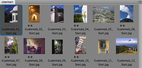
First, using Adobe Bridge, which we'll explore in Lecture Six, I'll prepare a series of photos for us to review for our brochure.
Let's consider each image in turn, make our final selection and then
experiment with filter effects to see if we can make each image eye-catching
without destroying important features of the photograph.
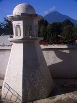
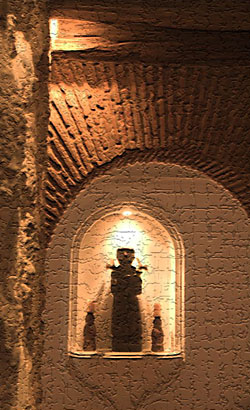
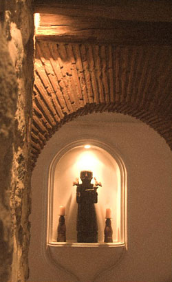
There are two images from which to choose. Both of these images show interesting and similar architectural features.
We will choose image
#1,
the simpler of the two images. Image #2 has too much distracting detail.
With many images, simple is better...
this is a good rule of thumb to keep in mind when you are shooting
images as well!
Filter Selection
First, I noticed the same background volcano in this image we have
in the main image... so let's nix it with a simple crop. Make a duplicate
copy of the image, select your Crop tool, and click-drag an area primarily
focused on the dome. Press Enter to make the crop.

Name this image "Guatemala Architecture Crop and Filter" and
save it as a PSD file.
Choose Filter > Filter Gallery. The
Filter Gallery provides you with access to a wide range of the artistic,
textural, and creative filters.
Since this is an architectural image, let's focus on the filters that
emphasize lines and edges... open the Sketch folder in the Filters
Gallery.
Here, we'll experiment with two of these filters: Chalk & Charcoal
and the Graphic Pen. Click Cancel for now and we'll do some set-up work before applying the filters.
Applying Chalk & Charcoal
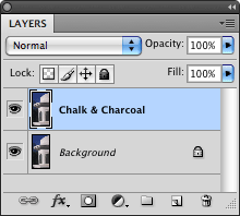 Activate
the Layers panel if it's not already open by selecting Window > Layers (F7).
Right-click on the Background layer (or use the Layers panel flyout menu)
and select Duplicate Layer. Name this layer Chalk & Charcoal.
Activate
the Layers panel if it's not already open by selecting Window > Layers (F7).
Right-click on the Background layer (or use the Layers panel flyout menu)
and select Duplicate Layer. Name this layer Chalk & Charcoal.
When you are trying out filters, create a separate layer for each
filter you apply so you can easily turn the layers off and on to compare them. In addition,
you can move the filtered layers up and down in the stack and blend
them together to create some interesting blended effects.
You can also convert your image into a Smart Object so that the filters remain editable any time you like. To do this, go to Filter > Convert for Smart Filters to turn the Chalk & Charcoal layer into a Smart Object. Now when you apply the filter, you can edit it later by double-clicking its name in the Layers panel, just as you did with layer styles in Lecture Four.
Note that there are downside to Smart Objects: Some commands can't be applied to Smart Object, and each Smart Object greatly increases the size of your file.
Now return to the Filter Gallery (Filter > Filter Gallery) and apply the following settings on the Chalk & Charcoal filter:
|
|
|
| |
Charcoal Area = 8. Use this to control the darkness and contrast
of the background. Eight provides a good balance in this image.
Chalk Area = 15. Use this to control the detail and brightness
of the foreground architecture. Fifteen provides a nice bright
foreground while maintaining a darker background, which will
emphasize the architecture.
Stroke Pressure = 1. This provides the best combination of detail
and contrast in the strokes. |
|
|
|
|
Check out the results—what do you think?
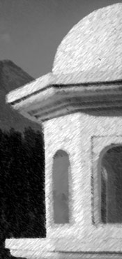
This filter, like many others, is also affected by the foreground and background colors selected in the Tools panel. Try repeating this filter with very different colors selected and compare the results.
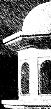
Applying Graphic Pen
Duplicate your Background layer (make sure you're on the Background
layer and not your new filtered layer) and name it Graphic Pen. Make
sure this layer is on the top of the layer stack. Each time we introduce
a new filter, be sure to follow this process. Go to Filter > Convert for Smart Filters if you'd like to make this a Smart Object so you can edit the filter later.
Return to your Filter Gallery and go to Graphic Pen, or go to Filter > Sketch > Graphic
Pen directly.
Here's a handy tip for adjusting filter field values. Instead of dragging
the filter-characteristic sliders or typing in values in the fields
(which requires you to pay attention to the sliders and fields), simply
tab (press the Tab key) to the field and use your up and down arrows
to quickly and smoothly change the field values while you watch the
changing effects on your image.
Apply the following settings:
|
|
|
| |
Stroke Length = 15. This maximum value maintains the greatest
amount of detail.
Light/Dark Balance = 50. This create a nice balance between
the light architecture and the dark background.
Stroke Direction = Left diagonal. This creates stroke lines
that move toward the architecture. This focuses the eye on the
building. |
|
|
|
|
Remember to click each layer off and on to compare them.
Blend the Two Layers
One of the many advantages of digital art is our ability to quickly
and easily try various combinations. Here, we can try out a blend of
these two sketches.
Arrange the layers so the Chalk & Charcoal is on top of the Graphic Pen
layer. Adjust the Opacity for the Chalk & Charcoal to 50%.
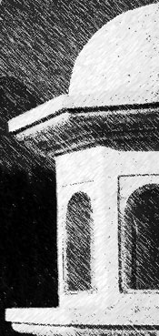
Note the interesting blending of the two layers, with the tension
between the upper right to lower left strokes on both Chalk & Charcoal
and Graphic Pen layers.
Combining and blending filters can provide more interesting and unique effects. Let's have another look at the process in this video tutorial:
Running Time: 2:05. Read
the Transcript
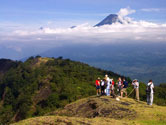
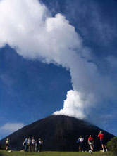
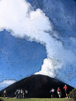
There are three images to choose from here, all featuring volcanoes!
Mother nature wrought some interesting mountains in Central America:
All three images are interesting and have their strengths!
The one I like best is the middle
image with the erupting volcano in
the background and people in the foreground. There is a good sense
of depth and a subtle asymmetry and a pretty blue sky that nicely offsets
the black volcano. The red shirts provide some nice color contrast
as well.
This is one of those images that enables people to picture themselves
at the scene. The simplicity of this image's composition is also, once
again, a strength!
Name this image Guatemala Volcano and Filter and save it as a PSD
file.
Filter Selection
This image has large areas of consistent color and texture including
volcano, steam, sky, and grass. So filters that emphasize these larger
areas will be effective. Here, we will try two filters: Dry Brush under
the Artistic section and the Ink Outlines in the Brush Strokes section.
Applying Dry Brush
Duplicate your Background layer and name this layer Dry Brush. Through
the Filter Gallery Artistic section, select Dry Brush and apply the
following settings:
|
|
|
| |
Brush Size = 1. A small Brush Size, in addition to a large Brush
Detail, helps retain image detail.
Brush Detail = 10. A maximum value here helps keep the human
forms recognizable.
Texture = 3. A maximum value retains some of the appropriate
texture, especially on the volcano slopes. |
|
|
|
|
Compare the results:

The specifics are nicely simplified, like the details of the tourists,
and you still get the feel of the overall scene. Nice.
Applying Ink Outline
On a new Background duplicate layer named Ink Outlines, access the
Ink Outline Filter in the Brush Strokes section of the Filter Gallery
or through Filter > Brush Strokes > Ink
Outlines.
Apply the following settings:
|
|
|
| |
Stroke Length = 2. A short brush Brush Stroke helps maintain
image detail.
Dark Intensity = 1. A small value helps minimize the brooding
feel in the image and helps retain some detail in the volcano
slope.
Light Intensity = 25. A modest value, along with the small Dark
Intensity, maintains a good contrast in the image. |
|
|
|
|
As you work with more images and more filters for this project, compare
the visual impact of each image, and begin to compare the looks of
these with the other images you are using and modifying.
Blend the Two Layers
Arrange the layers so the Dry Brush is on top of the Ink Outline layer.
Adjust the opacity of the Dry Brush to 75%.
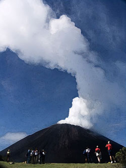
Notice how the visible 25% of the Ink Outline adds an subtle hard edge
to the softness of the Dry Brush.
When I began sorting out these images, I really liked this
image and
knew we would use it. It contains an attractive native with some wonderful
patterned and the colored cloth that is so representative of the culture.
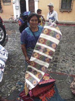
Remove the Competing Background
Prior to applying a filter, let's remove the competing background
image elements of the other people and the bicycle. Here, we will both
crop and clone out the background.
Make a duplicate copy of this image and name it Guatemala Native Crop
and Filter. Choose the Crop tool and create a tight crop around the
woman and her cloth.
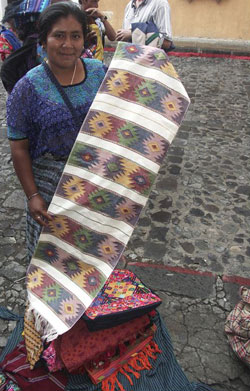
Duplicate the cropped background layer and name the layer Cloned Background.
Using the cloning tools and skills you learned in Lecture Two, remove
the remaining background people and objects from the image. The Clone
Stamp tool is very effective here. Take care to extend the rear image
elements, such as the wall, curb and cobblestone street behind the
image. Be sure to use the proper size of cobblestones to preserve
the impression of depth.
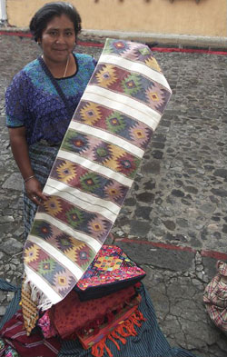
Filter Selection
This image demands a filter that will emphasize the fabric patterns
in the cloth and the woman's dress, while at the same time we must
preserve, and not unpleasantly distort, the woman's face and
expression. Photographs of people must be handled carefully when filtering!
When I first looked at this image, I had a filter in mind: Poster Edges. Sometimes you just know where you want to go. I knew this filter would
emphasize important lines in the image without distorting them.
Applying Poster Edges
As always, duplicate the background and name the duplicate with the
filter we will use.
Through the Filter Gallery Artistic section or Filter > Artistic,
select Poster Edges. Apply the following settings:
|
|
|
| |
Edge Thickness = 0. A minimal value creates thin outline edges
that nicely frame all the pattern elements.
Edge Intensity = 10. A maximum value, along with the the zero Edge
Thickness, adds to the framing of the fabric elements.
Posterization = 6. A maximum value provides just enough color
variation. |
|
|
|
|
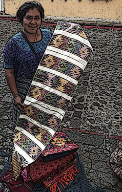
Note how this filter and these settings emphasize the fabric patterns
and colors, while at the same time preserving the facial expression.
There is also a nice hand-drawn quality that goes well with the handmade
craft presented here.
Remember to view your image at 100% size on screen to see the best representation
of how that filter affects your image. Select View > Actual
Pixels (or press Ctrl/Command+Alt/Option+0).
Like the native image above, this
violet iris image cried out for
inclusion. The short depth of field, soft background, slight asymmetry,
and the simplicity of composition make this a very easy and pleasant
image.
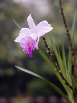
Filter Selection
For this image, we will want to concentrate on some filters that will
emphasize the softness of the flower and retain some of the subtlety
of the color variations, and perhaps even further de-emphasize the
background.
So we will want to steer away from filters that emphasize edges (such
as the Poster Edges filter that was so perfect for the previous image)
and lean more toward filters that will apply softer effects. The two
filters I have chosen to use here are the Smudge Stick filter and the
Grain filter.
Applying the Smudge Stick
With your background layer made and named, head to the Artistic area
of the Filter Gallery or Filter menu and choose Smudge Stick. As the
name implies, the image will be softened in a similar way to a fine
artist's smudge stick or blending stump. Apply the following settings:
|
|
|
| |
Stroke Length = 2. A low value here retains detail in the image
and keeps edge thickness light.
Highlight Area = 0. A minimum value keeps the light highlight
area from becoming too blown out.
Intensity = 6. A medium value here controls the overall image
contrast. |
|
|
|
|
Note how this filter and these settings emphasize the softness of
the flower and the subtlety of the color variations. A great deal of
detail has been maintained.
Applying the Grain
On another background duplicate, let's use a texture-based filter.
These filters, found in the Filter Gallery or Filter menu under Texture,
apply (you guessed it) a texture to the overall image. You can make
your image appear to be applied to a canvas, for example.
I'm going to use a Grain texture on this image. It's another filter that
will add interest but preserve detail.
Apply the following settings:
|
|
|
| |
Intensity = 15. A modest value moderates the impact of the grain.
Higher values are too soft for my liking.
Contrast = 50. A medium value here creates a good contrast between
the lighter flower and darker background, but does not overdo
it.
Grain Type = Soft. Try both Regular and Soft. Here I have selected
Soft to apply a more subtle effect, but Regular can be effective
as well, so long as the intensity is not too high. |
|
|
|
|
Note how this filter and these settings also maintain the softness
of the flower and the subtlety of the color variations.

Try blending these two filter layers together to achieve
some interesting subtle variations.
Our sorting process yielded one art/artifact
image that we liked for
this layout. This image has an appropriately primitive, mysterious look
about it. Perfect to appeal to the adventurous travelers reading our
brochure.

Crop the Image and Remove the Finger
Create a duplicate copy of this image and name it Guatemala Art_Crop.
Using the Crop tool, crop out most of the left wall. This will have
the double benefit of removing this uninteresting wall and creating
a more interesting asymmetrical view of the art artifact. Then clone
out the remaining finger in the lower left.

Filter Selection
Here we can choose to either emphasize the primitive rocky look or
soften it and emphasize its mysterious nature. Let's try both the
Craquelure texture and the Diffuse Glow filters to accomplish these
two effects.
Applying the Craquelure
On a background duplicate, go to the Texture section of the Filter
Gallery or Filter menu and choose Craquelure. This applies a rough,
cracked texture to an image. It can be set to look like huge bricks
or stones, or tiny, light cracks.
Apply the following settings:
|
|
|
| |
Crack Spacing = 25. A modest value here creates a medium-sized
crack pattern.
Crack Depth= 2. A small value moderates the visual impact of
the cracks so they do not overwhelm the view of the artifact.
Crack Brightness = 8. This high value reduces the visibility
of the cracks around the lighted artifact to increase its visibility. |
|
|
|
|
Here, the Craquelure filter enhances the primitive look of the image.
As you can see, you must be careful with such aggressive filters, as
they can take over the image. Additionally, texture filters
like this one have become so commonly used that they can sometimes
look obvious or lazy. You should always customize the settings.
Applying the Diffuse Glow
On another background duplicate layer, we'll use a Distort filter.
Filters in the Distort category of the Filter Gallery or Filter menu
can provide really interesting looks, like a glassy texture or a twirl
of the image contents. We'll use Diffuse Glow with these settings:
|
|
|
| |
Graininess = 6. A medium value here applies a moderate amount
of soft graininess to the image.
Glow Amount = 1. A small value minimizes the amount of glow
added to the highlight... it doesn't require much.
Clear Amount = 16. This moderate high value enhances the contrast
of the effect. |
|
|
|
|
This filter softens the entire image, emphasizing its mystery.
I had a few strong contenders for inclusion. Ultimately the still
life image you see here won the day as a quintessential Central American
scene.
Filter Selection
This image already has a soft graininess about it, so let's emphasize
that. One of the best filters for adding an overall texture is the
Texture Filter.
Applying the Texturizer
On a new background duplicate layer called Texturizer, let's explore
Sandstone Texturizer features. In the Filter Gallery or Filter menu,
choose the Texture section and the Texturizer option within.
This filter offers several different texture types that are easily
customized. Choose Sandstone from the Texture menu in the dialog and
apply the following settings:
|
|
|
| |
Texture = 25. While the canvas texture looks nice here, choose
the sandstone because it's more subtle.
Scaling= 100%. This medium value creates visible but not overwhelming
texture elements.
Relief = 4. This moderate value applies an effective, but not
obnoxious, amount of relief in the texture pattern elements.
Light = Upper left. This controls the direction of light used
to create the texture. Upper Left matches the preexisting lighting
in the image. |
|
|
|
|
The Sandstone texture adds to the overall graininess of the image
and enhances the rustic look of the image.
With this filter applied, we now have a full set of images for the
brochure that emphasize the lovely and rustic qualities of our destination.
Final Thoughts
When choosing and applying filters to images, there's no one correct
filter or set of values. The filters you choose will depend upon the
nature of the image, what you want to enhance or modify, the look
you want to create, and the message you want to deliver. You may want to create several versions on several layers and compare the results.
Once you have gained some experience with filters you will begin to
even pre-visualize how you might apply them when you initially capture
your images. And remember, typically less is more when it come to applying
filters... it's easy to overdo it.
Happy filtering!

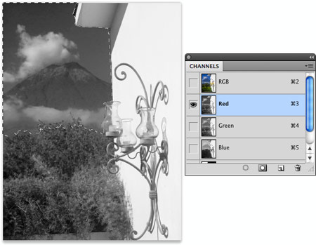
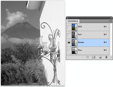
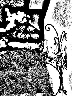
 Open the Channels panel and toggle through the
three channels to see which
one will
provide
us
the best
tonal
separation
between
the
foreground and background.
Open the Channels panel and toggle through the
three channels to see which
one will
provide
us
the best
tonal
separation
between
the
foreground and background.