In the final days of the project, you will have made any needed edits, really taken care of the design details, and started getting your file ready for print. When you have a final draft, print it out and present it to the client or send him a PDF.
After the file is vetted, you will go through the stages of proofing, then prepress, and finally the job will ship. Let's take a look at the steps in this process, starting with preflight.
What Is Preflight?
Once your client has approved your design, it's time to get it ready for print. The next step is making sure that the digital aspects of your file are in order. This part of the process is called "preflight," a name borrowed from the process pilots go through prior to takeoff.
In aviation, preflight is a thorough check that makes sure the plane's controls are all working and the plane is ready to fly. The designer's preflight is designed to protect the integrity of the job and the safety of the designer's vision in its transfer to the press.
A preflight checklist goes through all the different elements of your project in order to ensure that everything is set correctly before you send it out to your printer. Fonts, links, colors, and inks...everything gets a full check for accuracy and inclusion. But why go through these tedious steps?
Here's why: the dreaded phone call at 3 a.m. from your printer, claiming that you forgot to include the headline font for your project, or that you are missing images in your layout, or that your colors were all set to run as spot colors, not process. Even if the phone call happens during waking hours, it's truly a nightmare.
You can download a starter checklist by clicking here (also available in the Course Downloads area). Keep this handy for all of your print projects and edit it as needed.
InDesign Preflighting
InDesign has built-in preflighting that acts like an automatic checklist for you. The document is constantly being checked while you work, and you can view its information live in the Preflight panel (Window > Output > Preflight).
 |
The Preflight panel alerted me to missing fonts and missing image links. |
The software basically acts as another set of production eyes to look at the job before it is sent out, but you still need to understand what to look for. Many of the alerts that this brings up will not affect your project or will simply call to your attention something you're already aware of.
To make sure InDesign's preflighting checks your document for the right things, define a profile. Click the flyout menu in the Preflight panel and choose Define Profiles. Create a profile that is appropriate to your print job. For example, you might set it to alert you if there are any RGB colors in your document.
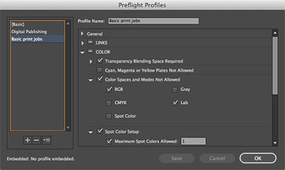 |
Defining a preflight profile |
Here are some of the main things to have the Preflight panel profile check for:
 |
|
 |
| |
-
Fonts: Are any of the fonts corrupt, embedded, or protected?
-
Links and images: Are all of the images still in their expected locations?
-
Colors and inks: Does the readout match your specs for inks? Are any of the images in a color space other than CMYK or grayscale? (This is the most common catch in preflight for me.)
|
|
 |
|
 |
Definitely pay attention to any of the errors that appear in a preflight. If one of your images is in RGB color mode, for example, preflight can catch this and bring it to your attention. However, it's up to you to make a note of which images require updating, open them, change the color mode, save them, and update the links from within InDesign. Preflight doesn't fix anything, it just brings things to your attention.
Also keep in mind that many times printers use second and third shift people (people working late into the night) to run film or set up print jobs—and they often have been working too long and may be tired or inattentive, so you want to set a job up to make it as "foolproof" as possible.
Repairing Color Space and Resolution Issues
Preflight isn't very complicated, and needs only be done as the last step before packaging for print. It's really not even a process, but a quick check that InDesign does for you. More than anything (for me at least), it is good for catching images that fall outside the CMYK or grayscale color space. Since this comes up a lot, let's quickly discuss how to handle it:
Okay, so everything in your Preflight seems to check out...but wait! There seems to be an image that is still in the RGB color space. Whoops! Easy mistake. So now what? First, let's identify the culprit. The Preflight panel tells you the file name of the image.
Now you can head over to the Links panel. Select the correct filename in the Links panel, then click the Edit Original button (pencil icon) at the bottom of the panel. This will open up the image in Photoshop. In Photoshop, make the shift to CMYK, then save. If saving as a separate filename, relink the image using your InDesign Links panel. Check your Preflight panel to ensure that the problem is resolved.
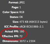 The Links panel is also useful in solving resolution issues that may or may not come up in your Preflight panel check. For every image, the Links panel displays really critical information. You can see the filename, the last time your link was updated, and two last pieces of vital info: the file's actual PPI and effective PPI.
Now, if you've been vigilant in preparing all of your images for print, you'll have ensured that all of your images are 300 ppi or higher at their native resolution. This would be the file's actual PPI.
But here's the catch. On occasion, with all of the shuffling and scaling and cropping that goes on in a placed image, it's often possible to lose track of a few details. So while your file may be 3" x 5" at 300 ppi, you may have accidentally scaled it to 4" x 6"—not a huge leap—without really thinking about it. This alters the PPI at which the file will actually print...the effective PPI. Using the Links panel, you can find out exactly what the effective PPI is and determine if you've scaled anything past 100% scale, which would cause it to print below the 300 ppi level.
If you catch a resolution issue like this, perform the same steps as the color space fix, hopping to Photoshop to make the edit. Adjust the resolution in Image > Image Size in Photoshop. You'll need to determine the size of the image in your layout, increasing the dimensions of this image to these dimensions at 300 ppi. Just be sure that the resolution adjustment doesn't create any blurriness or other issues.
Lastly, save the file in Photoshop, then update the link through your Links panel in InDesign. Make sure that the image doesn't shift in scale or position. Then resume the preflight process or wrap up by finalizing your files for print.
Done preflighting? Time to get the files ready for your printer. This can be done either with an InDesign package that contains the INDD and relevant files, or it can be done with a print quality PDF file.
Making an InDesign Package
InDesign's Package command (File > Package) is used to create a file folder on your computer that houses all of the necessary files to print your job. You'll use this folder to deliver all of your files to the printer. Running Package will automatically run a preflight check beforehand, so even if you didn't pay much attention to your Preflight and Links panels earlier, you have one last chance to find problems here.
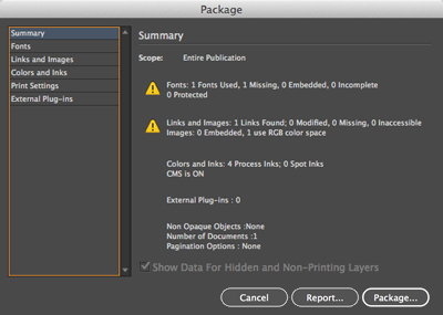 |
The Summary page of the Package dialog shows me that I've got one missing font file and one image that uses RGB color space. |
Page through each section of the Package dialog to ensure that all of your files and settings are exactly as you intended. Click Cancel if needed to go back and make fixes.
 |
The Links and Images section of the Package dialog tells me the color space and ppi information in case I missed it earlier. |
When you're ready to roll, click Package and InDesign will make a new folder. This folder will contain a copy of your INDD file, all of its linked images, and copies of any fonts used in your document. This "package" is a self-contained file system that grants your printer easy, well-organized access to all of the files needed to print the job. It's no coincidence that this is a fantastic way to deliver your "final art" to the printer.
If you ever need to edit your InDesign file or its links after running the Package process, be absolutely sure to do so from the files within the package itself. This is a common occurrence, as you may package a document, print it out from the packaged file, and only then catch an error. Editing this file and updating the link from within the package is totally okay. Editing the original file that is not part of your package won't do, unless you want to repackage the whole thing.
Just remember: All of the linked images for your printer are in this self-contained file system. Once the new INDD file is created within this package, it only remembers links and images within its newly created Links folder.
Having INDD files of the same filename can also be confusing. So I always save my print-ready document as something like "ITF_Stationery_v5_PRINT.indd" so I don't accidentally edit the wrong document.
PDFs
It is becoming common practice to send a print-quality PDF in lieu of InDesign packages. A PDF, as we discussed earlier in the course, has plenty of advantages. For instance, the file can't be edited by accident. It arrives as a "locked" file, but one that is a print-ready document if set up properly.
As you know, you can export a PDF using File > Export. Usually, the default settings for a print ready file (the Press Quality preset) are a good start. This at least insures that all of the images go out at an acceptable resolution, provided they already exist at 300+ppi.
Here are a few additional things to check inside the Export Adobe PDF dialog:
|
|
|
| |
-
In the General page of the dialog, look at the Pages box. Do you want a PDF with all the pages in the document, or just a range? You should also specify if you want the file to contain spreads. Otherwise it will break all spreads into single pages.
-
Under Compression, all of the numbers should indicate a ppi of 300 or more. I usually don't touch anything in here, but it is important to check so you don't end up with a low-res print.
-
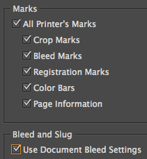
Marks and Bleeds: Now this is important stuff! If you set up your bleeds in InDesign and then export to PDF without checking the appropriate boxes, your PDF won't have the bleeds. If you are sending a print-ready PDF, it's safe to check "All Printer's Marks." (If you're curious what this does to the PDF, try it yourself!)
Assuming you created your bleeds from InDesign's Document Settings (and you should have!) you will also need to check the "Use Document Bleed Settings" box. I would never use the manual bleed settings from within the Export PDF dialog. That's just asking for trouble, because how will you know if your images are in the proper bleed area?
-
The other tabs may come into play if your printer requires something very specific or unusual. However, I've never needed to play with these. Seems like a good way to mess something up.
|
|
|
|
|
On occasion, you may have a request for a PDF that uses very special and very specific protocols like "X-1a." My experience with these requests has always been related to sending a print advertisement to a magazine. While I can't tell you exactly what "X-1a" does to the PDF (that's for the printer to understand), I do know that it is an industry standard that helps ensure your PDF is more likely to print properly regardless of technology issues or settings problems.
And I can tell you how to create a PDF with this preset, in case this ever comes up: just select the X1-a preset in the Export PDF dialog. (You'll notice there are other X- options here too.) Once you've selected this option, don't play with any other settings. Any changes will violate the very specific settings standard!
Package vs. PDF
 |
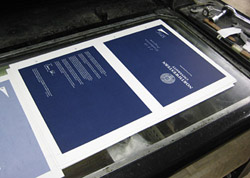
Make life easier for the prepress tech. Packages for big jobs, PDFs for small, digital jobs. |
When it comes to shipping your job to print, I would recommend using an InDesign package whenever you have the option. The depth of an INDD file allows the printer a bit more flexibility in setting the file up for prepress.
However, a PDF ripped using the Press Quality preset with all of the printer's marks turned on can make sense for small, simple jobs like a four-color postcard. This is especially the case for something intended to run on a digital press. There's not a lot of prepress time for these sorts of jobs, so there's usually no need for all the flexibility of an InDesign package.
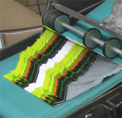
For massive jobs with tons of images, lots of pages, and the need for lots of editing during proofing, you better bet an InDesign package is the right choice. Why?
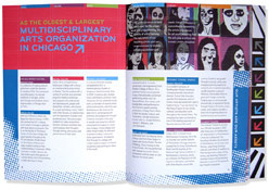 |
| Many pages, many colors, many images, and loads of text. This job required an InDesign package so corrections could be made by the printer if needed. |
Once your printer has put your file through their prepress process in order to rip (make a PDF of) the proofs, changes are marked on the proofs. The prepress department is then responsible for handling those corrections in the controlled prepress environment. Once they have prepared your file for print, it is most efficient for all edits to be made through the printer. Otherwise you will have to make them yourself and resend the file, undoing all of their prep work. In the end, this just means a big waste of time and money.
If you consider that they may have taken five hours to get your 50-page book's files print-ready, it would make sense that you don't ask them to do this all over again. They may have taken care of things like trapping issues, color management, photo retouching, fixing typos, or anything, really... depending on what the job's needs are. So, PDFs can be really great, quick, convenient tools. But use them wisely.
I always export a high-quality PDF for reference and drop this into the InDesign package before archiving (or zipping or compressing) the file. Point out to your printer that this is provided for him to check against your ripped InDesign files. Since an INDD file can have strange font issues or broken links, a high-res PDF is a reliable way of cross-referencing the designer's intent.
PDFs are useful for other purposes as well. When sending drafts for approval, I always use PDFs. They can usually be emailed easily (if you use the Smallest File Size preset) and can be opened on any computer thanks to Adobe's proliferation of the free Acrobat Reader software. You may prefer a face-to-face explanation with printouts or a hand-built comp, which is completely understandable. In fact, this is a great idea for pieces with unusual folds or unique design ideas. A PDF isn't very good for indicating dimensionality.


 Finding out that you misspelled the title of your 20,000 finished piece project after you open the package from the printer is not a good learning experience, and it is a sound reason for your boss to fire you or for your client to "lose" your number.