Print Production | Software and Materials


Software and Materials

Ink, paper, swatches, and software. We'll talk about it all in this lecture.

In the last lecture, we learned a ton about the big-picture processes behind print production: client management, print vendors, offset printing. Now, let's take a step back and look at the specifics of software and physical materials.

Software is a world that you're relatively familiar with by now, so we'll review the main concepts in design software and talk specifically about the role of software in the print production process. These foundation concepts are crucial to carry into your professional career.

We'll then head deeper into the rabbit hole of print materials with a closer look at different types of presses, bindings, papers, and inks (like spot colors and PMS colors).

In this lecture, you can expect to:

Learn about managing vector and raster files for print.
Explore the software steps involved in creating a print document from start to finish.
Learn about alternative printing processes.
Learn about the options available for binding, inks, papers, and varnishes.
Learn how to choose and use spot colors and how to simulate them with CMYK.


Always use the best application for the job.


QuarkXPress has increasingly fallen out of favor in the design industry. InDesign has made great (and quick) strides to become the industry standard.


Versions of INDD files from newer versions of InDesign may not work with older versions of the software. If you're saving a document in a newer version of InDesign for someone to open in an older version, save it as an IDML.


Know your printer's preferences. Would they prefer an InDesign package or a PDF?


PSD and TIFF files are not lossy like JPEGs, and PSDs are easiest to use throughout the Adobe Creative Cloud.


Stick with InDesign for multi-page documents of any kind.


Keep client files in a job folder and inspect and convert files as needed before beginning any work.


After placing an image in InDesign, don't move it elsewhere on your hard drive or you'll break the link. Use the Links panel to relink files if needed.


Digital presses offer excellent quality for small print runs.


Letterpress printing is expensive, but lends a hand-crafted charm to certain projects.


Concepts in Digital Software


In graphic design as we know it, all of our work is contained in a digital environment. Even if you do an entire poster by hand, building type and image with collage and paint, you'll need to digitize everything in order to get it printed.

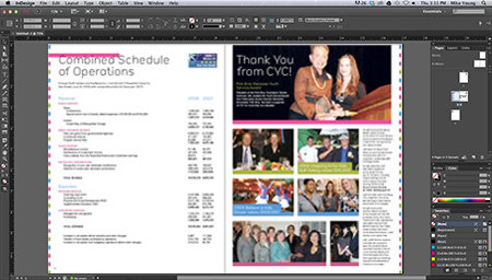
A print design in its digital home, InDesign

Thus, it's really important to understand how your computer captures, creates, and interprets your design. This understanding will support your use of software to carry out different tasks.

You wouldn't use Illustrator to create book layouts any more than you would use InDesign to do photo editing. These programs have been developed for over a decade to handle very specific tasks.

There is a lot of overlap in tasks though, which can be very convenient but also kind of misleading. For example, Photoshop, Illustrator, and InDesign each allow you to play with layering and transparency options such as Multiply or Overlay. Tools like this give you a lot of streamlined creative control. But you must be smart about over-building image layers in InDesign when it may be smarter to do this in Photoshop. Simple, right?

With the Creative Cloud concept, Adobe has made it a point to recognize that all of these programs are necessary to the design process individually, but in the end, all of the formats must understand how to merge with one another in some way.

Thanks to Adobe's clever engineering, you can copy Illustrator drawings into Photoshop, place JPEGs into Illustrator, and place just about any kind of image into InDesign amidst hundreds of pages of well-managed text. However, with great power comes great responsibility. Just because InDesign will allow you to place a web-sized JPEG or PNG into a print brochure doesn't mean it's a smart idea.

Computers and software are pretty brilliant these days, but they're not built with common sense. This is where you come in.

Vector and Raster: The Yin and Yang of Design Files

The simplest way to define an image file is to first consider if it's vector or raster. Let's take a moment for a quick refresher of these two file types and how they relate to print.

A vector file defined by paths

A vector file is a collection of mathematic equations that the computer uses to define Bezier curves (from the Pen tool), circles and squares, outlined type, and all those great paths and fills that you create in Illustrator and InDesign. The computer understands the shapes and remembers where they go and how they interact.

The beauty of a vector file is that it has no need for resolution. A vector logo drawn in Illustrator can be scaled down to the size of a dime, then scaled up to the size of a continent, and it will never lose image quality or become pixelated. This is because the image doesn't really contain pixels. It's just an idea that the computer translates into pixels so you can see it on the screen.

The all-too-familiar pixels that make up raster files

A raster file (or bitmap), however, is constructed in pixels. If you take a 3" x 3" image at 72 ppi (web resolution, remember?) and print it out at 3" x 3" on paper, it's going to look terrible. Similarly, if you have an image of the same size at a decent print resolution and scale it to the size of a billboard, it will look incredibly ragged.

Each file type has its own pros and cons. For example, pixels do a much better job of simulating a printed photograph because they allow for the minute variations in tone and contrast that make up a photographic image. Vector shapes are much more suited for hard edges, things like logos and typography.

The Role of Your Software in Print Production

Now that we have a formal way of organizing our file types, let's take a look at the software we use to manipulate these files, in the context of the production process.

Adobe InDesign: The Silent Genius

No matter what you're designing for print, odds are the project is going to end up in InDesign. It's not always necessary, but it sure is the smartest way to approach anything in print design. (A quick note: I recognize that QuarkXPress is still in use for some in the publishing industry, but I haven't used QuarkXPress, or met many who use it, since I started my career in print design.)

InDesign's magic is in handling multiple pages of text, raster photos, vector drawings... well, just about anything you can throw in there. It's a fantastic catch-all for your project—the place where you can collect and manage all items of a print project. It's especially adept at handling large amounts of text in ways that Photoshop and Illustrator can't come close to.

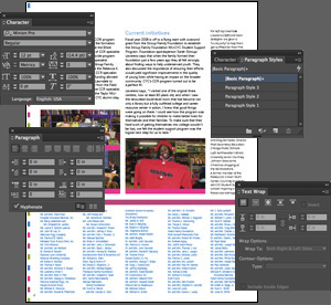
InDesign and a few of the many panels that handle text

Its power is in its role as a link between the designer and the prepress crew at a print shop. InDesign allows you to see swatches, color mixes, ink settings, and tons of other options that a prepress specialist will be using to get your job ready for print.

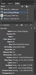
The file type associated with InDesign is INDD (extension .indd). An important thing to remember about INDD files is that they don't actually hold that much information. The only content that an InDesign file actually holds is text, formatting, and the location of graphic elements. Everything else you see in an InDesign file is "linked." That is, InDesign remembers where your images, logos, and other files are, understands how they interact with other images and text, and knows where they are on your computer. But these images don't actually exist inside the file anywhere.

(InDesign will allow you to "embed" your images in the document, but there's not really a need to do this. It will only increase your file size and limit your ability to live edit the image.)

Another important thing to remember about INDD files: if you save an INDD file in a newer version of InDesign, such as CC, and try to open it in an older version, such as CS6, it won't open. In these cases, save your file as an IDML instead.

When you send a file to print, you will use the Package option in InDesign (File > Package), which copies and collects all of your linked files into a file folder for you. The intent here is to create a package, a self-contained file folder that you can send to your printer. This will contain every possible item needed to run the job successfully, meaning the InDesign file and its linked files.

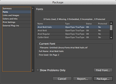
The Package option in InDesign will provide you with an overview of the files and settings in your document and will alert you to any issues such as missing fonts and images.

The package will also contain all font files used in your design. The prepress folks will use these fonts on their machines to ensure that no confusion is created between your version of a font and theirs. Otherwise all of your careful typesetting could be absolutely slaughtered.

Another option with InDesign—and this is a big deal these days—is its ability to export to PDF (File > Export). Adobe's PDF, or Portable Document Format, is a fantastic tool for ensuring that any computer, using any operating system, regardless of its available fonts, can open and read a file and see it as it was intended. The elements of a PDF are locked into place and cannot be edited in a PDF reader. This is a great way to ensure that no information in your design is lost, altered, or corrupted. It's not perfect in this respect, but it does extremely well.

A PDF file can contain both vector and raster information across multiple pages and can be used for screen-quality viewing in a file size small enough to email. It can also be used to deliver a high-resolution print ad—full of clean text and the richest photography—at a file size that is large but a resolution plenty high enough for the most upscale magazine.

Adobe Photoshop: The Raster Master

Photoshop, of course, is your go-to for editing all aspects of raster files. It's also quite smart these days when it comes to handling and manipulating vector objects, which it stores in layers until they are converted to pixels.

From a production perspective, you should use Photoshop to resize files, adjust resolution, do color correction, retouch problem areas, and change color mode when needed from RGB to CMYK or grayscale.

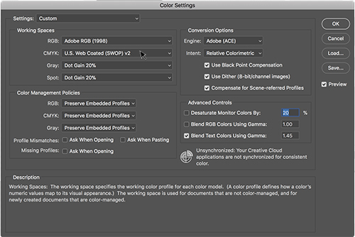
You can adjust Color Settings in Photoshop (Edit > Color Settings) and other Creative Cloud applications for the type of paper you plan to use.

Whenever possible, save any raster files handled in Photoshop as layered, high-resolution file types like PSD or TIFF. Saving files in JPEG format, even as high-res JPEGs, causes information loss with every save, which is an advantage for web use, but a disadvantage in print. PSDs and TIFFs are non-lossy, so convert to one of these whenever possible. I personally prefer layered PSDs because they are Photoshop-specific and more natural to the Creative Cloud/Suite concept.

Photoshop can open nearly all file types, including some vector files. But don't be misled by this, or get fooled into thinking it's a good idea to work on an Illustrator EPS in Photoshop! Remember the software's intent...it does best with rasters.

Adobe Illustrator: The Vector Inspector

Illustrator is a software environment designed to create and manipulate vector shapes. It can be used for layout, especially in situations where there are more graphic elements than text, though I personally prefer to do anything that will print in InDesign.

Common examples of Illustrator projects are logos and business cards, as you might expect. And because of the multiple artboards feature, you can simulate a multiple-page document with artboards. I've seen this used to handle the various sides of a cat litter bag, for instance, with different artboards used to cover the different panels of the bag. This was provided to a printer as print-ready art, but I would never recommend this personally.

You can choose the number of artboards in Illustrator's New Document dialog, however Illustrator is not recommended for multi-page documents.

The most common vector file you'll receive or create for use in a print document is a logo. However, you can expect to eventually come across things like architectural renderings, city maps, and myriad other situations in which straight lines, hard shapes, type, and color fields are the main event.

Illustrator does best with AI, EPS, or PDF, all of which will give varying levels of editability.

Putting the Software into the Process

Now you have a good sense of where the Adobe trifecta comes into play. Let's try to put it into context with an example project. Click here to grab the Lecture Two download files and follow along. You can also find the Lecture Two downloads in the Course Downloads area.

Here's the situation: your client at NDO gets in touch, you determine a project to move forward with (an 8.5" x 11" event flyer for an upcoming show), and then everything is all set to move forward. He sends you a Microsoft Word file, an EPS logo, and three photographs of varying format, resolution, size, and color space. You know you'll need to get all this in a form that will print at a great quality, at the scale of a small flyer. We'll do this by packing it all into InDesign and sending it to print.

But first you'll need to look at all the files and make sure they're in good shape. Organize your files on your hard drive, putting them in a centralized location. (Not your desktop!) More often than not, the best way to do this is create a "job folder" that contains all the necessary files for any given project.

The job folder should contain everything given to you by the client.

Early in the process, develop a system of subfolders for your job folder. For example, "Images," "Sketches," "For Print," "From Client," and "Client PDFs" could be good starters. You should develop a system that works best with your workflow, but the point is to keep everything clean and neat. Otherwise, your job folder will turn into a total mess, which will slow you down in the end.

Now, for the individual files. Check them one by one to see what's needed and make changes as appropriate. Start by opening up the logo in Illustrator, because EPS is a vector file format. Make sure that the file isn't corrupt, that the color space is appropriate, and resave if necessary. The color space you should be working in right now is RGB so we can convert everything to CMYK in one fell swoop at the end.

Repeat the process with the image files. Check the size and resolution of each one (Image > Image Size) and the color space (Image > Mode). You'll want 300 ppi images in RGB mode, sized appropriately for an 8.5" x 11" event flyer.

Keep in mind that if you receive small or low-res images, scaling up to large dimensions will degrade the quality. You'll have to make some design judgment calls... should you use the images at all? Can you use them at a small size as an intentional part of the design? Save your converted images to PSD.

In a real world project, you'll probably have a few rounds of changes to make to these photos, so my recommendation is to keep them in RGB format until your whole design is just about ready to go to print. When you're sure you won't make any more changes, use Image > Mode and convert to CMYK.

Open up the Word DOC, copy the text, and paste it into InDesign. Be aware that any bold, italic, underlining, or other text styling will be lost or possibly broken in this copy and paste! Even if InDesign preserves styling from a Word DOC, it's always a good idea to strip it and build your own styles in InDesign.

Once your text is copied and styled to your liking, you can begin to import your images into InDesign. This isn't a copy/paste of images and graphics. And it's not an embedding of images, like you may have done in Illustrator for previous projects. This is File > Place in InDesign, which creates a link to the file as it exists on your hard drive. We'll revisit this process in more detail later in the course.

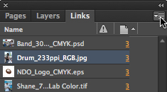
From here on, it's just a matter of working your design magic. Any editing that happens to your images (such as in Photoshop) will be reflected automatically or once you update your links in InDesign. Try it out! Select one of the images in the Links panel (Window > Links), then click the flyout menu icon in the upper right of the panel and choose Edit With > Adobe Photoshop.

Make a change to this image in Photoshop (for example, desaturate it or adjust its levels). Save the changed file, then go back to InDesign. If you see the change immediately, you're all set! If not, go back to the Links flyout menu and choose Update Link (or Relink if you've saved the file under a different name).

Take a few moments to keep playing with the files in InDesign, Photoshop, and Illustrator and think about how you would turn these into an attractive, cohesive design. Save an INDD file to use in the next step.

If this really were your client, you would save different versions of your design if necessary, and when the job is ready, send it off for client approval. Once he gives the thumbs up, you can get ready to deliver your files to the printer. There are a few ways of doing this.

Delivering Your Files

With your INDD file for the flyer ready, package it up in InDesign (File > Package). Review each part of the dialog for any warnings such as broken image links (which might occur if you move a file) or missing fonts. We'll talk more about packaging later in the course, but for now your work with the flyer is complete. Nice job! Now imagine that you're ready to get this package to the printer.

Once you have used InDesign's package feature, it's time to archive or ZIP the package folder and send it to your printer.

This can be done in a variety of ways, and the best way for any job depends on the printer's preferences and the file size you're dealing with. Often enough, a zipped file is small enough to be sent via email. And of course, any printer will accept a USB flash drive with all of the appropriate files. You can get a flash drive that can store up to 256 gigabytes.

In some cases, when shipping a flash drive doesn't make sense, you may need to use a variety of web-based file transfers.


  • Google Drive: You can transfer up to 15 gigabytes free using Google's cloud sharing service. Link

  • Dropbox: Another web-based file transfer service that allows you to upload at least 2 gigabytes of files free of charge. Link

  • FTP: Stands for file transfer protocol. This method is a bit dated and complex in that you need software, often free, to log in and enter a password to complete the transfer. You would also need a web host server to move the files to where the second party could download from.

  • Peer-to-peer: A network that connects online companions, or peers.

  • Third-party transfer sites: There are many sites available you can use to transfer large files. Sizes and costs vary among them.


As an alternative, many commercial printers have moved to a simple web page upload tool that simplifies the process to about two steps and requires no special software and minimal savvy. In the end, you will need to work with your printer to determine the fastest and most reliable solution for sending your files.

Other Printing Methods

You know the next step...get that project printed! We've already talked about how offset litho works in the last lecture, but that isn't the only print method out there. It just happens to be the most accessible.

Let's take a brief look at some other options, which you may or may not encounter in your entire design career. In the end, these likely won't need any print production processes other than those you've learned here. But they are important to know because they often impact the budget of your job in a big way, when the need arises.

Offset Web Press

An offset web press is simply an offset litho press that feeds the paper from a giant roll, rather than sheet-by-sheet. This allows things to go much more quickly when larger volumes are being printed, such as coupons destined for a national newspaper. Offset web is great for print jobs like this, where quality falls a bit, but quantity and speed are more important. We're talking quantities in the tens or hundreds of thousands. This is a situation where offset web is superior to offset litho.

The offset litho press previously discussed is known in the industry as "sheetfed" as opposed to "web." Most offset jobs will be run on a sheetfed press. Assume offset litho when the term "offset" comes up unless offset web or digital offset are specified.

Digital Offset

Digital offset is a broad term for a somewhat recent development in commercial printing. The gist of this technology is that printing companies have taken familiar forms like color laser printing and inkjet printing and developed them into high-quality, higher-volume printers known as digital presses. They operate on the same basis as their household equivalents, but they are the size of a car and perform much more beautifully than your desktop printer would.

There seem to be two major technologies behind digital presses: digital offset presses and toner-based presses. In my experience, the dominant manufacturers for these machines are HP and Xerox, respectively. HP's Indigo Press is a digital offset press with some amazing technology behind it. It uses inks that are much more fluid than those for a traditional offset press. In fact, they are more similar to the inks of an inkjet printer. The accuracy of an Indigo press is now "dot for dot" like the quality of a traditional offset press. That is, the Indigo reproduces the same kind of dot patterns that an offset litho would, presenting a remarkably similar color quality, ink density, and level of detail.

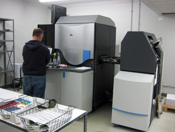
An HP Indigo digital press

The advantage, of course, is that digital presses can generate and modify their printing surfaces on the fly by altering the image on their electrically charged rollers. These rollers replace the burned screen and blanket rollers of a litho press. Because the Indigo (for example) requires no physical offset screens or manual setup, the setup costs are much lower.

Digital offset is great for small runs of items—in the realm of 50-1,000 items—because there is no need for burning plates or prepping the offset press. This makes the job quicker, less expensive, and ideal for situations where something in the design, such as a personalized address, needs to change with every item. There is typically a quantity of items where, when deciding to go with digital or offset, you will see a price break. That is, due to the setup and operation costs of a particular press, the price per unit will see a dramatic shift.

Digital offset's available print size is always smaller than an offset press sheet. For instance, digital offset printing options are limited to a print area of 11" x 17". In toner-based digital presses, which are more or less giant color Xerox machines, the press sheet may be closer to that of an offset press. There is no standard to speak of in digital offset, so check with your printer to see what he has to offer.

Gravure

Rotogravure, or gravure for short, involves engraving the image onto a copper cylinder and rotating it against long reels of paper that are later trimmed to size. It is a rotary printing press like offset litho. However, its uses are wider-ranging than offset, especially where high quantity, quality, and tremendous speed are an absolute necessity. This is the case with mass-produced magazines, corrugated cardboard packaging, and specialty processes like vinyl flooring. Gravure is the fastest and widest kind of press available.

Letterpress

Letterpress, the oldest form of printing, applies a solid plate with letters and images pressed to paper. The area that prints is raised above the non-printed areas. This is the very same method that Gutenberg perfected. It is a very rare process today, but a beautiful form of printing that is kept alive by typographers and printers who embrace and appreciate this timeless craft.

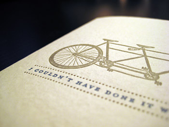
Letterpress has a lovely old-time feel, and is making a comeback for greeting cards and invitations.

Using the same principles as the letterpress process, flexography involves the application of a flexible surface to uneven surfaces such as cardboard, cans, coffee mugs, and so on.

Screen Printing

Also known as silk-screen printing, screen printing uses a fine mesh of stainless steel or fabric (at one time using actual silk, but now a cheaper synthetic fabric that emulates silk is widely used). The screen is mounted on a frame and non-print areas of the screen are blocked out with a stencil. A squeegee is used to force the ink through the open areas of the stencil. It can be used on cotton tee shirts and other fabrics, banners, posters, and more, but it is generally reserved for continuous tone images such as logos, text, and images of solid color.

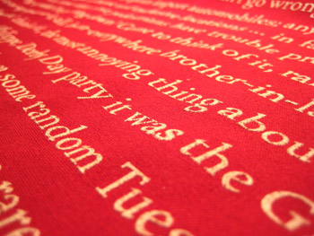
Screen printing on fabric
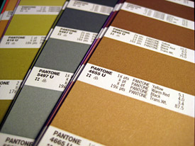
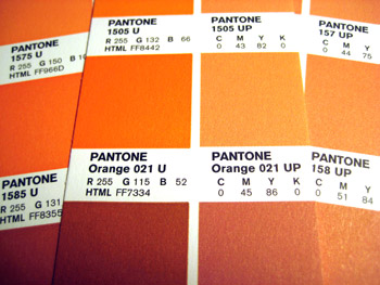


Inspect booklets, magazines, and books to compare binding methods.


Low-budget projects may be spiral bound or key-ring bound.


Signatures can affect your design choices when some pages are black-and-white and some are full-color.


Ask your printer for paper swatchbooks or samples to help you understand weights.


Cover weight can be used for more than covers. Business cards, brochures, and some booklets use this as well.


Your paper choice will come down to aesthetics and budget.


Spot colors are used to add a special, very specific color to a design.


PANTONE swatch books help you choose colors and determine how they will look on different papers.


The PANTONE Color Bridge book helps you find the closest four-color mix to the spot color you want.


When running a varnish or UV coating on a specific area, denote that area with a vector shape in an obvious color, on a layer marked "Varnish."

Binding Methods

When it comes to putting together your multi-page document, regardless of the printing method you choose, there are a few common ways to do approach it. Things to consider include cost, perceived quality, and available page count. Let's take a look at the big three types: saddle stitch, perfect binding, and case binding. Remember finding these in Exercise One's scavenger hunt?

Saddle Stitch

Saddle stitch is a very common binding process because it's quick, easy, and cheap. As a result, it's also kind of cheap-looking. Take a look at the spine of any small magazine, pamphlet, or catalog. If it's under a certain page count, you are likely to find what look like staples holding the thing together.

Though they are similar to staples, the wire that you see in this binding actually comes off of a long spool, is cut, stabbed through the spine of the piece, and folded flat from the inside. The nature of this process, which happens rather quickly on automated rails, is more similar to stitching than stapling, hence the name.

This is a very budget-friendly process, but is only available under a certain number of pages. Your printer will determine what page count exactly.

A saddle stitching machine (top) and saddle stitched booklets along a rail of the machine (bottom).

Perfect Binding

Just as common as saddle stitching, perfect binding is essentially an assembly of the interior pages of a publication glued to an exterior cover. Often, the cover is a similar weight to the interior pages, as with a magazine or paperback book. You may recognize this kind of binding from magazines such as National Geographic.

Perfect binding requires a certain volume of pages in order to accommodate the gluing process. Again, this minimum number is a good issue to address with your printer when the time comes.

Case Binding

Case binding is the process used to create hardcover books. It is similar to perfect binding, except a strip of fabric is added to reinforce the gluing of the spine. The covers of the book are glued to thick end pages, which are in turn glued into the spine with the interior signatures. This makes the whole structure of the book more durable.

Other Binding Options

Outside of the three main options we just covered, there are many choices in binding a project. Very basic techniques like key-ring binding or plastic spiral binding may be appropriate for the lowest of budgets. Your printer may offer special techniques like grommeting, hand-stitching through the cover or spine with special thread, post binding... The list is pretty long.

In fact, you may even choose to avoid binding all together by creating a piece that folds to size in order to create multiple pages.

Imposition and Signatures

Imposition is a term that describes how press operators will print multiple documents using large sheets of paper that will be folded later. This allows for faster printing, simplified binding, and lower production costs. Imposition is the process of arranging pages correctly prior to printing so that they fold in the correct order. To someone unfamiliar with the imposition process, the pages may seem to be arranged randomly; but after printing, the paper is folded, bound and trimmed. If correctly imposed, the pages should all appear in the correct orientation and readable sequence.

A signature describes a single press sheet that has been printed, folded, and trimmed. Multiple signatures are combined to form all of the pages in a multi-page document.

Luckily, you won't need to spend a lot of time worrying about signatures and imposition for most jobs. Your software and your printer's prepress team tend to handle imposition and the organization of signatures. However, you should be aware that, in special instances, the way a signature is created would affect your job in a big way.

For instance, imagine you are printing a 64-page book. The whole job is done on the cheap, printed in black-and-white, but the client is dying for a full-color photo spread. Because of the way signatures are printed, folded, organized, and bound, you must consider that only four (or perhaps eight) pages in this book will have color on them. The location of these pages will always be relative to each other. For instance, you could have two sequential color spreads in the dead center of the book. Or you could have the second spread and second-to-last spread in full color.

To gain a better understanding of signatures, grab a saddle-stitched magazine and start taking it apart. Notice how the center spread has the "staples" coming through it? How the page disappears into the gutter and connects to another page on the other end of the magazine? That's a signature, and at some point this folded, divided spread was a giant flat sheet, printed alongside its neighboring spreads.

More on Paper

Paper is a huge deal in your design. The brightness, color, texture, and thickness of the paper in your printed piece are all important decisions. A flimsy business card gives the impression of a weak business; a wedding invitation on metallic purple paper may come off as tasteless. In the end, you must be the judge of the "feel" your paper gives off.

Paper companies expend great energy producing paper swatch books to send to designers. Agencies and design firms make it a point to collect these swatches and update them yearly because they are the only way of seeing what kind of paper is out there.

There's no reason to put off collecting swatch books! When you begin working with a printer, he will be able to send you paper swatches as needed. You may want to start ordering and collecting swatch books from your local paper suppliers. Ask your printer for recommendations for paper suppliers. You may also start by searching online for major paper brands. Their web sites will often make it easy to find a regional paper rep, or even order samples direct.

Ways to Define Paper

When communicating with your printer, you are going to need to describe the paper for any given print job by addressing a series of specifications. Through these terms you can indicate the paper's thickness, coating, color, and brightness. A paper that I have worked with frequently would be spec'd as "Monadnock Astrolite Smooth 110# C, Ultra White."

This spec defines the paper company, their branded paper grade, and the paper's finish, weight, and color. Monadnock is a paper company that makes a grade called Astrolite, a premium uncoated paper in a variety of weights and finishes. The spec calls for a sheet with a smooth finish, a heavy stock (100# C), and a very bright whiteness.

Let's take a closer look at how these kinds of specs are defined.

Weight

The weight of a paper describes its thickness. In paper specs, this is given in pounds (lb), which may seem kind of odd at first. A typical sheet of copy paper may be 24 lb. text weight, while a very thick business card stock may be 100 lb. cover weight. There doesn't appear to be a consistent standard for indicating these numbers but you may often see things like 100# C and 100C as representations of 100 lb. Cover.

Important terms related to paper weight:


  • Pounds (#): Why would you describe the thickness of a paper in pounds? The naming convention comes from the weight of 500 sheets of that specific kind of paper. For example, 500 unprinted, uncut sheets of 24 lb. writing paper would weigh 24 pounds. The same goes for a ream of 80 lb. cover. Naturally, the thicker and stiffer the sheet, the heavier a pile of it will be.

  • Text: If you look in any book or booklet, the interior pages are likely to be text weight. This kind of sheet is light and flimsy, and would be spec'd using a T (for example, Wassau Astrobright 70#T means 70 lb. text weight).

  • Writing: Writing weight papers and text weight papers are of the same caliber, easily compared to a sheet of copy paper. Traditionally, writing papers contained cotton content. Cotton makes for a soft, smooth-writing, and tactile stationery page. This isn't always the case nowadays, so check your swatchbook to verify. An average Writing weight would be 28#W, which is comparable to a 70#T.

  • Cover: A cover weight paper is traditionally intended, quite literally, for the covers of books. But we use it for all kinds of things these days. A 60 lb. cover page could be used for a light-but-sturdy brochure. At this thickness, the sheet will flex readily but won't wrinkle or crumple very easily. A 110 lb. cover sheet is great for a business card that will feel extremely stiff. Cover weights are determined by measuring 500 sheets of 20" x 26" paper (note the large scale here). This basis weight is abbreviated by using a C (for example, Monadnock Astrolite 110#C).

  • Bristol, cover bristol, and double-thick cover: These kinds of sheets are made by pasting or laminating two papers together to get a thicker, stiffer page. The thicknesses here are similar to that of cover weight. A 130# DTC, for instance, is extremely thick and stiff, a bit like mat board.


A note on paper weights: A 70 lb. text paper is the same thickness as a 28 lb. Writing paper. Confusing, right? Remember, this number comes from the weight of a ream at a given size. Unfortunately, this given size isn't consistent across the different classes of paper weights. Writing weight is measured from a 17" x 22" sheet, whereas cover weight is measured from a 20" x 26" sheet. What?! Likely, the size of this ream is relative to the traditional use of this kind of paper. A text weight is derived from a ream of 25" x 38" sheets, which would be suited for a larger press. This means more signatures, more pages, and ultimately a better situation for the "text" of a thicker book. The writing weight sheet size of 17" x 22" is about the size you'd need for printing two-up pages of stationery on a smaller press. Of course, the implication is that you'd do more "writing" on this smaller, smoother, and higher quality stationery sheet.

The idea behind this weight terminology seems pretty irrelevant to people outside the paper industry; I've never met a designer who spent any time weighing a ream of paper. What's important to remember is that the higher the "weight," the thicker and stiffer the page.

Finish

There are all kinds of paper textures available. Any texture or lack thereof is created when a paper is manufactured. A paper's finish can create a reliable printing surface or an interesting hand feel.

Wove paper will have no distinguishable texture. The paper's surface is flattened to receive ink in a reliable way, with minimal bleeding and no disruption as a result of imperfections. This may also be called smooth finish.

Laid paper has a little more tooth to it, as the pulp is "laid" into the mesh without being overly compressed. (A paper's tooth describes the tiny pits in the surface that create the grainy feel associated with a thick drawing paper.)

Depending on the manufacturer's intent, a laid paper may feel as toothy as a drawing paper. This may add a pleasurable texture to a project that needs it, or compromise the surface of a project that doesn't.

This example shows you the "tooth" of laid paper. An embossed design added even more texture.

Color, Brightness, and Coating

Whites and off-whites from a paper swatch book

The color of a sheet is a rather obvious descriptor and will come from your manufacturer's swatch book. For the majority of projects, however, you will deal with white papers. A curious thing to discover for many new designers is the amazing variety in white papers. Eggshell, off-white, soft white, bright white, ultra white...paper companies have gone to great lengths to give you plenty of options.

Though the companies' names for white papers are inconsistent between manufacturers, paper brightness is rated by a consistent score. For example, you may see a basic white paper at 85 brightness, while an ultra white premium sheet may be 103 brightness. While the degree of white of your page may seem inconsequential at first, you must consider how the brightness of a page causes your colors to pop, text become more legible, or photos sharper and full of contrast. Brighter isn't always better, though, and this will always come down to the needs of your project.

Paper companies and printers will provide you with swatchbooks for making your selections.

An easy comparison for paper projects is a high-end cologne package and a box of organic granola. Which one would you put on the whitest paper available, and which would you put on unbleached, recycled cardstock?

As you've already learned, a paper can come coated or uncoated. The coating provides an ideal place for the ink to land and settle, improving color saturation. This coating can be glossy, matte, or dull. An uncoated sheet will allow the ink to soak into the paper fibers, rather than suspended in the coating. The fibers can slightly distort the edges of text or other areas that require sharp lines or definition.

The PANTONE swatches on the left are on uncoated paper. Notice the dull, flat colors compared to the coated swatches on the right.

More on Ink

We've covered the basic concepts behind four-color process and grayscale printing, and explored the many papers you can print on, but without a doubt there's a lot more to discover when it comes to ink. Outside of the standard CMYK process colors, designers often use spot colors, or specially blended inks that are printed singularly, as opposed to part of a layering of halftones.

Spot Colors: Brilliant!

To be very clear, a spot color is simply ink that is pre-mixed for a specific hue, often one that can't be created by a four-color CMYK mix.

One advantage is that you're getting the perfect color for a specific job, such as the exact logo orange instead of a CMYK approximation. The other advantage of a spot color is that the tone created on paper is a purer one, created from only one kind of dot, as opposed to a mix of four colors of dots. While this may not be evident in tiny areas of color, it will definitely improve the impact of a flood, or full-page application, of color. It really boils down to the way that the dots fall on the page; if is a consistent dot screen, the eye is less likely to notice the presence of dots, giving the flood of color a smoother, richer tone.

In instances where a job requires both a full-color mix and a spot color (or multiple spot colors), a specialty press may be used. Many printers will have access to five- and six-color presses. Some presses are available that can run upwards of 10 colors! In a situation where your printer doesn't have access to a specialty press, your job may be run in two passes through the press: the first for CMYK, the second for any spot colors. In between passes, the printer would need to clean the press and change the inks, adding labor expense to your budget. Beware of situations like these by planning ahead and discussing all production possibilities with your print rep.

In addition to four-color mix and spot colors, a press can apply varnishes, coatings, and sometimes lamination, foil, and other specialty finishes. For example, if your client requests an annual report with lots of full-color photography, a big glossy logo on the cover, and lots of the company's brand color throughout, you could run the report as a six-color job. The six "inks" would be cyan, magenta, yellow, black, one spot for their corporate color, and a gloss varnish to highlight the logo on the cover.

Spot Colors and Their Importance

Companies spend a lot of time, effort, and money on maintaining their brand, especially by controlling our associations with a certain color. There's a Coca-Cola red, a McDonald's golden yellow, a John Deere green...and you can bet that any competitor who tries to use these trademark colors is walking into some nasty litigation.

Any kind of company—not just the largest ones—should have standards for color use in their logo and associated branding. This goes for a local coffee shop as much as it does for Starbucks. To create consistency in a brand is to create an image of reliability. As the shepherd of the print production process, you need to know when spot colors are a necessity and direct your client to use them whenever the budget allows for it.

Spot Colors and Color Text

The type of color ink you use is particularly important if you ever intend to print small text in color!

When text is run as black, the integrity is easy to maintain because the dots for the image all come from one plate. When small text is created from multiple hits in the press, meaning from a four-color mix, the odds of fuzzy and out-of-registration letters increases dramatically. This is the case with any kind of small line work or similar detail.

The best way to print small color text, if you absolutely must, is with its own spot color. Even the best printer in town will be wary of running a job with small four-color text.

PMS Colors: The PANTONE Matching System

When specifying a spot color for a print job, the designer has to be able to communicate the necessary formula for mixing the spot color's inks. Luckily, we don't all have to be ink-mixing wizards, and we can choose our colors from a massive selection of pre-printed swatches. This standard, observed by designers and printers alike, is called the PANTONE color matching system. Other standards exist for different areas of the world, but for North America, PANTONE seems to be the uncontested standard.

My colorful selection of swatch books

Using a collection of swatch books, designers can view and specify all kinds of colors, from conventional mixes to fluorescents, metallics, and pastels. By specifying a PMS color, a designer communicates a swatch number 
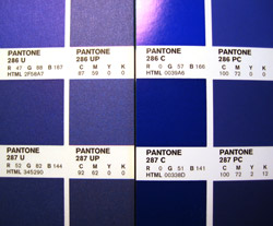
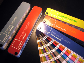
in his specs as well as his InDesign swatches. The printer references these numbers to determine the appropriate ink mixes for each swatch.

Different PMS swatch books exist for different levels of coated paper because the paper's coating will dramatically change the tone and depth of any printed color. You may compare, for instance, Solid Uncoated, Solid Matte, and Solid Coated books. It's important to reference the proper book for your desired paper.

Using PMS for Non-Spot Colors

Within the matching system, it is possible to spec a four-color mix as if it were a spot color. This is especially handy in situations where a spot would be great but the budget isn't there.

In situations where the specificity of a PMS spot is needed, but only CMYK inks are available, PANTONE provides us with a matching system for that too. Using the Color Bridge swatch book, it's possible to see just how close a four-color mix can come to your spot color. Sometimes you can get lucky with your selected color, but often the difference is dramatic because a PMS color is mixed from a combination of inks whose gamut far exceeds that of a CMYK on-press mix.

The Color Bridge swatch book is a combination of PMS Solid Ink swatches and PMS Process swatches, paired side-by-side. The process swatches are denoted with a P, such as UP which means uncoated process. The swatches are matched as closely as possible. Color Bridge allows you to directly compare the color shift between a solid and a process color. It also provides the CMYK percentages needed for the process equivalent. It's an important tool for seeing just how similar (or terribly disparate) the color shift is when considering using a four-color mix instead of a spot.

Making a comparison in Color Bridge: Notice how a PMS Orange (left) is much more vivid than its CMYK equivalent (right).

PMS colors are particularly handy for adding pop to common colors that CMYK just can't handle. In a four-color mix, orange tones come out a bit muddy, blue tones aren't very rich or vibrant.

It's important to note that a PMS color doesn't necessarily add any cost to a job. In certain situations, such as a two-color job on a two-color press, using PMS inks can actually help save you money. In the end, you are paying for the number of inks, the size of the press, and the work it takes to prepare the press to run your job. All costs after this point are nominal, unless you request something that requires any of this work to be repeated.

Draw Downs

A PANTONE swatchbook is the best way to get a good sense for all of the colors you need to reference. However, keep this in mind: If you ever need to see exactly how a PMS solid will look on a particular kind of paper (such as a color or off-white sheet), you can order a draw down from your printer.

In a draw down, the printer will mix a small amount of the PMS ink that you want to use, apply it to a card or brayer (a roller), and "draw it down" across a sample of your specific paper. This can be an important tool in controlling the predictability of your ink color in unusual situations. In some instances, you may order a draw down when you need to see the ink in a larger swatch than what's available in the PMS swatchbook.

On-Press Coatings
Varnishes

As mentioned before, one of the ink tanks on press can be used to apply a clear protective coat called a varnish. Varnish is basically ink with no pigment. Its advantage is that it can be applied selectively with a plate in the way that other inks can. This effect is commonly used to put a noticeably glossy area on an otherwise dull sheet, drawing attention to certain elements of a design. For an especially subtle effect, a tinted varnish may be used.

Varnishes create a protective layer—gloss, satin, or matte—over the other inks in the job. Thus, it is usually the last hit on the press sheet. This enhances color and protects the inked areas from dirt, smudges, fingerprints, and scratches. However, a varnish isn't as reliable for protection as an aqueous coating or UV coating.

Any printer can run a varnish, but not every printer may not have access to aqueous or UV coating machines.

A varnish can be assigned to the design using a layer in your InDesign file. You will need to create the area (preferably as a vector shape) and then bring this to a layer distinct from the rest of your art. Label the layer "Varnish" and make the vector shape a violently obvious color. Why all the cautious behavior? Well, you wouldn't want the area intended as a varnish to print as an ink... What a mess! As with any other dimension of a print job, take the time to communicate very explicitly with your printer about your expectations.

Aqueous and UV Coatings

Aqueous coating protects against the same elements as varnishes, but it's a better protectant. In addition to its superior protective properties, an aqueous coating dries much more quickly—in hours rather than days. It's water-based and more eco-friendly than varnish.

Another big difference is that aqueous is applied via a separate coating tower at the end of the press run, and can only applied in a "flood." That is, it can't be applied like a spot varnish, only in a consistent layer across the press sheet. Thus, it's intended as a layer of attractive gloss or an overall protective element. This is applied to pieces that you anticipate seeing a lot of scuffing and handling, like an oversized postcard, for example. Is also used to protect coated papers that have been run through a digital press. The inks in a digital press don't adhere reliably to a coated sheet, while uncoated sheets are unaffected.

UV coating is the best protector of them all. It is applied as a clear liquid and immediately cured with UV lamps. This coating combines the selective application of a varnish (a specific area) with the superior protection of aqueous, and an even higher level of gloss than either option.

All of these on-press coatings can have different finishes, if desired. Want a varnish without the gloss? Order up a dull varnish. Varnish and UV can be applied as gloss (shiny), dull (matte), and satin (in-between). Aqueous can be applied as dull or satin.

     
Learn the components of creative brief and print specs documents.
Learn how to define quality objectives for a project.
Learn about project scheduling and budget constraints.
Explore methods of locating and working with local and online printers.
Learn how to request and present a print quote.
 

Discussion
Share your thoughts and opinions on print production with other students.

Exercise
Design a save-the-date card for a client utilizing a professional spec sheet.