At ease, soldier. In this lesson, we're going to explore how to add textures to a 3D character in military gear. You learned a basic process for UV texture mapping in Lesson Five. First, the UVs
are unwrapped, and a template is exported. Then that template is
used as a reference for painting the texture map.
We're going to follow the same process in this lesson, doing our reference research and finessing all the details in Photoshop until we get a texture map we're happy with.
The process will start with a walkthrough of how to texture the soldier's body.
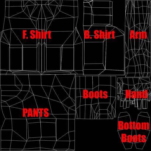
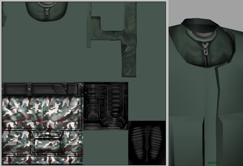
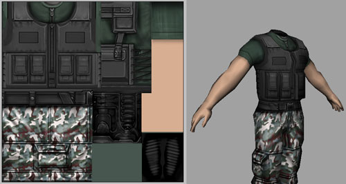
Below is the UV template
for a soldier's body. Download it and follow along as I paint a texture
map for it.
 |
Right-click (Control-click on a Mac) to download this texture map. |
You're already familiar with the concept of the UV template and how
to organize what UVs work with the geometry. So instead of
going through that whole process again, let's just dive in and start
working.
Research and Reference
What we need to do first is gather as much reference
as possible to create our military character. So let's head to the
Web and get some reference. You can never have too much reference,
as it can come in handy at any point in the project.
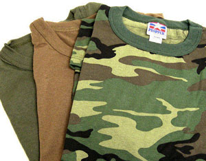
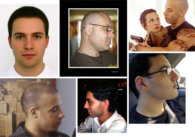
Well, I spent some good time on the Web and here
is some of the reference I found:
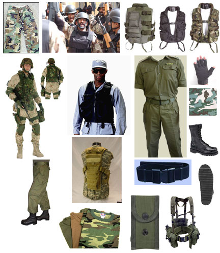 |
Always compile some visual reference materials before you start a project. |
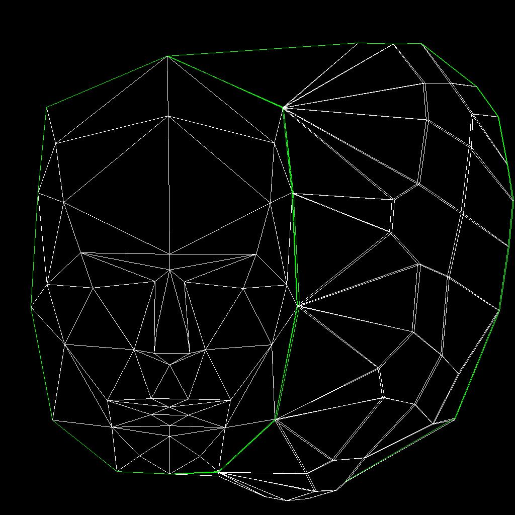
In an earlier lesson I gave you
a quick tour so that you know where the parts of the template lie
on my model. For this lesson I will just show you one image (below)
with the UVs and I will label which UVs go with what
geometry. That way, we can spend more time on character
painting.
 |
Template view of the body |
Getting Started
Because our character is a military soldier,
we need to use camouflage, blacks, and neutral colors (nothing
too bright).
Let's start off with a good base texture—how
about green? Before we do that we need to create a new document.
I want to work a little larger than we did before, so for this file
I want you to create a new 1024x1024 pixel document, and name it "Soldier".
Using the reference you gathered, I am sure you
have a nice green you can use for the background color. Once you
have applied a background color I need you to open the Body.tga file (the UVs)
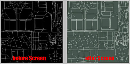
and copy that layer into your Soldier file.
Done it? You'll
no longer see the green background layer, but all you have to do is
turn the UV layer into a Screen layer (this will drop out the black
and you will be able to see anything that has white in it).
Once
you've copied that layer to your Soldier document, name it UVs,
and make sure to always keep this toward the top of your Layers panel.
This will help you view your UVs correctly when you are painting
your character.
OK, now let's really get started. I am going to
start off with the pants. I want the pants to be camouflaged,
and also the pocket and a belt. I am basing this choice on the
reference I compiled—your pants may be different but the techniques
I will show you are the ones I want you to use.
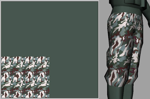
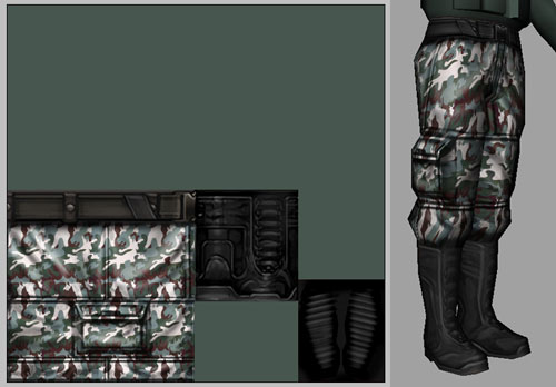
What I wanted to do first was to make a good
camouflage texture that tiles well for the pants. So I added the camouflage
texture to the pants and checked my progress. Save your texture in its current
state. Below you can see how it looks applied to the model. You'll do this in the exercise that follows this lesson.
Wrinkles, Seams, and Such
We are off to a good start. The texture is OK
(though you can see some areas we need to fix up), but my main concern
is how flat the texture looks. We really need to give it some life
and this is where the reference comes in handy. We need to add wrinkles,
seams, and any other details that we would generally see in pants. So take a
good, close look at your reference shots of pants and let's see if we can mimic
the look of pants by painting in these details.
What we want to do is make a layer on top of the
camouflage layer, and using black, white, and grays, paint in the details
of the pants. I also added a belt to the pants because in most of the soldier
references I found the soldier was wearing a belt. Soldiers have to keep their pants up, I guess.
A good thing to
remember when you are painting the details is to start off with a
brush that has very little opacity and build up your details. If you
start off at 100% opacity, everything will take on the same color
range. Start with about 10% and build up from there.

The Boots
Let's move onto the boots. What I did with the boots
was start off with a base color (I used R: 50 G: 50 B: 50) and I mostly
used the Dodge and Burn tools to create the boots. I would use the
Burn tool to create the dark areas of the boot (the parts that would become
almost black from use).
 |
The dark parts |
And then, I'd use the Dodge tool to create the highlights
(the white areas of the boot) on the boot.
 |
The highlights |
This is not a process that can be done quickly.
You will have to use different sized brushes, adjust the
highlights and shadows, and use the Rectangular Marquee tool to create
hard edges. After working on it for some time (I also used the Brush
tool at the end to add some details that the Dodge and Burn tools
could not get), I came up with this boot:
Always remember, this is your artwork. My way
of doing things may not always be right, but this works for me. If
you have a way you like to work, go for it—I am just showing you
the fundamentals.
The Shirt
We are making some good progress, but remember
this takes time. It is not something you will pick up right away.
So don't get frustrated, just enjoy it because it is fun. OK,
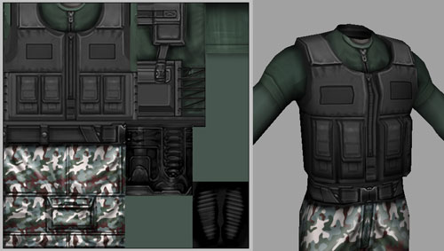
time to move on to the shirt and the vest. I found some great reference
photos on vests—vest pockets and shirts. So I will be using that reference
a lot when I am painting. Let's start off with the shirt. Let's make
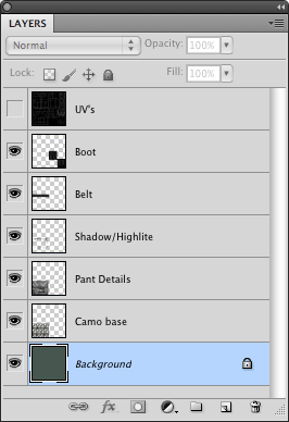
another new layer and call it Shirt. Before I go any further, this
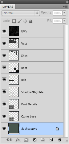
is what my Layers panel is looking like so far:
So open your shirt reference in Photoshop and
use this as a guide when you are painting (I hope you have been doing
that all along because you really need to look at your reference
when you are painting).
This is the reference I will be using to paint
my shirt:
The nice thing about doing this shirt is we only
have to do part of the shirt because most of it is covered by the
vest.
You can see here that the shirt takes up
a very small part of the UV space. Painting this should take no time
at all. I want the shirt to be almost the same color as our base
color. So on that new layer we made, let's start to paint the shirt.
Remember to use your airbrush at a low opacity and build up
from there. Using the steps we have already learned to paint the
pants and the shoes, the shirt should be a breeze for you.
As you can see from the image above, I only had
to paint part of the front of the shirt and a little bit on the sides. I
did use my reference as a guide (and that is what reference is for—a
guide. It does not have to look exactly like it). However, because I painted
the shirt and saw it was pretty boring, I made two shirts, one
with a zipper and one with a shirt inside it.
The Vest
Only a few more things to do on the body and then we
are ready to move on to the head. We are now ready to start the vest.
As you can see in my reference on the top of the page, I did find
a lot of references for vests. This is because I really wanted to make
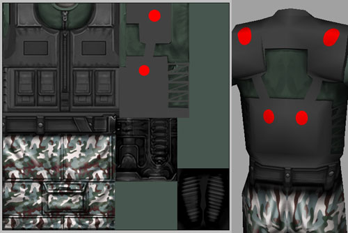
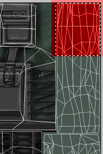
this feature stand out and be really cool. So, let's get started. I
again look at the UVs to decide the area I need to paint (noted
below in red).

You know the drill—you should be an expert by
now. I am going to start painting the vest using black, whites, and
grays, and when I get the look I want, and I am ready to add some more
detail, I start to use the Dodge and Burn tool. I will start
off by selecting a base color for the vest. I think R: 90 G: 90 B: 90 will
work. So make a new layer (make sure it is on top of the Shirt layer)
and name it Vest.
Fill that layer with the gray color we selected
above. But there is a problem—now everything is that color. So, what
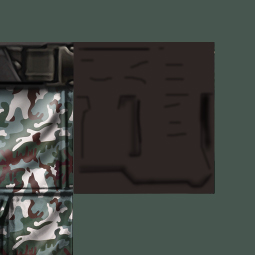
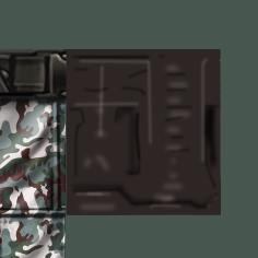
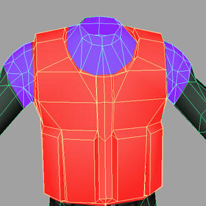
we need to do is make a layer mask. Grab your Polygonal Lasso tool
and draw a selection around the UVs that make up the vest.
And add a layer mask to the vest layer.
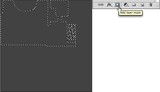 |
Adding a layer mask |
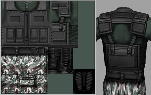
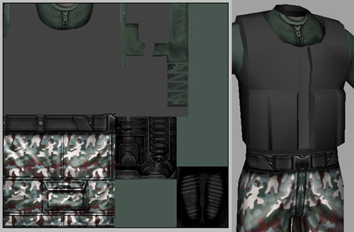 |
Template and 3D view |
I am going to start off with something simple: the pockets. And you ask, why is it simple? Because there
are four of them, and all we have to do is make one and then duplicate
it! Once we duplicate one of them, we can make slight changes to each pocket,
making them all look different.
Here is the reference I will be basing the pocket
on, and this is where I will be putting it on the vest:
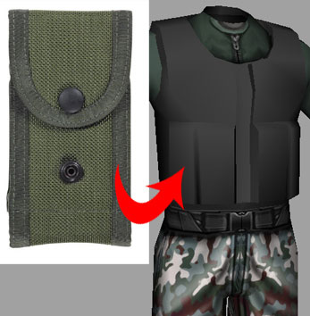
Using the techniques we've covered earlier, I painted this pocket based on my reference photo.

All you need to do now is turn on the UV layer
(for a guide) and duplicate the pocket you made, three more times. After
duplicating the pockets, do some slight painting on all the pockets so it
looks like you painted all four from scratch.
 |
Pockets with detail |
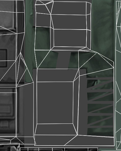
Let's go ahead now and add the final touches to
the front of the vest by adding more pockets, a zipper, and various
details to make this look more believable.
To make things look believable, think about adding details (highlights, shadows, dirt,
and so on) without trying to make it perfect. If you get stuck, check your reference photos. (I can't stress this enough.)
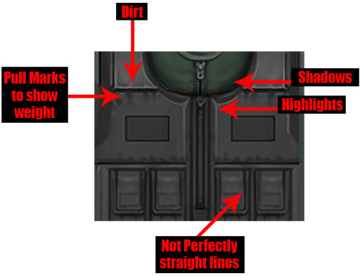 |
Highlights, shadows, dark areas, dirt, and pull marks all add realism. |
The Back of the Vest
We are almost done with the front of the vest, so let's turn around and start to work on the back. As you
look at the UV template, you will notice that we are missing half
of the back.
Or are we? Not really—the character modeler who created this model for us actually saved us some time. In the
UV editor in his 3D package, he took the UVs of the back of
the vest and cut them in half. After cutting them in half, he placed
the UVs right on top of each other.
Here's what that does. When
we are painting the back of the vest, whatever we paint in our UV
space will appear on both sides of the back of the vest. If you are
still a little confused, take a look at this:
Since that makes sense now (I hope) let's start painting.
 |
Painting the back panels |
Arms and Hands
Let's move on to the shirt sleeve, the arm, and the
hand, and then we are done with the first texture and we can move
onto the head. First, let's make a layer and call it Sleeve, and while
we are in the Layers panel, take a look at mine so we can
see if we are both on the same track:
 |
My Layers panel at this point |
You might be looking at your Layers panel
and saying to yourself, "How the heck does he have so few layers?" Well, we really don't need hundreds of layers with just subtle
paint strokes on them. Once you paint something and you are happy with
it, merge the layers together, to keep your Photoshop file clean and
organized.
Take a look at the image below. This will give
you a good idea where we want the sleeve to end (where you see the
red).
Now, with the Sleeve layer selected, go in and
paint the sleeve.
 |
Painting the sleeve |
It's time to move onto the arm and the hand. This one
is going to be a little more difficult and it will take some time and
practice to get this area to look correct. The reason for that is that
we see arms and hands everyday and we know what they look like. So
if they don't look correct, the eye will pick that up. The best
thing to do is shoot some reference of your own arm and hand (if
you do not have a digital camera, I am sure you can find any of this
reference on the Web).
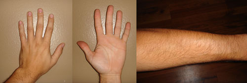 |
These hands do a lot of Photoshop work, let me tell you. |
Go ahead and make a layer below the Sleeve
layer and call it Arm. Now using your Eyedropper tool, go ahead and
pick the skin tone value that you want to use. For mine, I used R: 216
G: 174 B: 146. Go ahead and grab the Lasso tool and make a selection
around your UVs for the arm and the hand that you want to fill
with the skin tone value you picked.
How does it look? I like the skin tone color, but we need
to add details to the arm (veins, elbow, and hair).
Here we will
use the same technique we have been using all along, but we need to be even more
accurate with the look of the arm. For the veins, I will use the
Dodge and Burn tools to make the veins visible. When you create your own texture for a model in the exercise and in future projects, remember to keep
going back and forth from your texture to your model as much as possible,
to make sure you are on the right track.
 |
Adding detail to the arms |
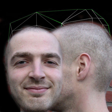
Let's move on to discussing how to paint a texture for the soldier's head. The process is the same
in many ways, but different in others. We'll be working with
a simpler head model. Download the head and the UV template
below.
 |
Click here or on the image to download the full 1024x1024 version of this template. |
Research and Reference
As with the body texture, you will start
with research. Our soldier's body is in a photo-realistic style, and the
face should match. So once again, search the Internet until you
have a nice collection of faces to work with.
You want to start with the most orthographic photos you can find, meaning straight on from the front, and
straight on from the side.
I found it fairly easy to find pictures
of faces from the front. Finding reference for the side of the
face was a little more tricky. Long hair can get in
the way, as can hats, and anything else that obscures part of
the face. Politicians often put high-quality images of themselves
on their Web sites, but they tend to be older than military-age males. A search for mug shots produced a lot of front and side views of
the same face, but many of these are black and white, or have
long hair, or are otherwise inappropriate. But after tailoring my search terms and spending plenty of time to find exactly what I needed, I came up with a good selection:
Here are some of the images I collected in my research:
If you're able to shoot your own reference
pics, and you have an appropriate model to work with, then that
is the way to go. It is always better if you can start with exactly
the reference you need. You have much more control when you actually
shoot the images yourself.
In this case, I did not have a model handy, but I found an equivalent with some shots from ImageAfter.com, a free image site with photos shot just for this purpose. Using my reference material as inspiration, it was much easier to find the final source images that would be right for the job. Click here to download a ZIP containing the four views I used so you can follow along.
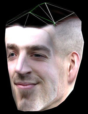
The Texture Map
The idea is to create a texture that "wraps"
around the head, one which includes the front, back, and sides
of the head in one image as indicated on the template.
Below is a nearly finished texture map
for the head. With lots of texture memory available, more games
are including both sides of the head in the texture, and the
top and sides as well. The front and one side can be enough though,
especially when the model is more "low-poly" ("low polygon" for efficient rendering in the game, a concept you'll explore more when you learn 3D modeling). In such a case, the side part of
the texture is simply mapped to both sides of the head.
The UV
mapping itself is not a matter for this course though, so what
we need to do is paint a texture map using the UV template provided.

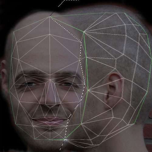
The Face Views
Using layers in Photoshop, place your front
view over the template. Temporarily set the front layer to about 50%
opacity so that you can see better how the layers line up.
You'll need to scale the image to fit the
template (Edit > Transform > Scale or Ctrl/Command-T). The chin and head don't line up, and that will
require a little work later, but for the moment I'm most concerned
with lining up the eyes, nose, and mouth.
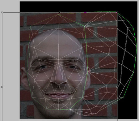 |
Transforming the image to align with the template. |
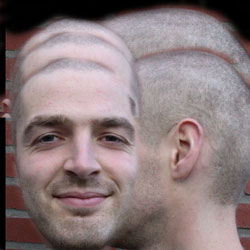
Next the left side view should come in, also at about 50% opacity.
Usually the eyes will line up one over the other, as shown below.
The sideburns (or in this case, the razor stubble) should line up so that the hairline
in the front view lines up with the sideburns in the side view. The base of the ear should
line up with the top of the eye. A tip for this is to imagine the character was wearing
a pair of glasses: The arm of the glasses would lie where the ear meets the head, and line up with the middle of the eye or slightly above.
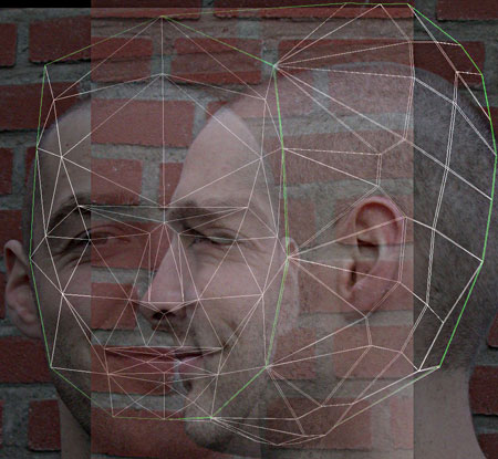
The image below shows the two layers without
transparency, in their correct sizes and positions.
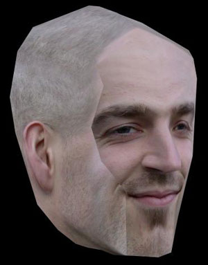
This would be a good time to test the texture
on the model. We want to know about problems as early as possible,
and make the necessary adjustments. I'll load it onto the model that I have handy in Maya to check it out. In the exercise, you'll be given your own model to try.
 |
The texture "wrapped" around my model. |
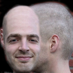
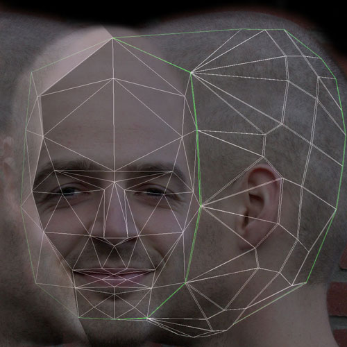
Not a bad start. Next you'll need to get
rid of the hard edges between the two views, and blend one into
the other so that they appear to be one seamless face. Most of
this step takes place in the top layer, the front of the face.
I used a soft-edged Eraser
tool to get rid of the darker edges of the front of the face. I used
the Clone Stamp tool, set to about 50% opacity, to further smooth the intersection
of these two images.
The nostrils can be tricky.
You'll want to zoom in close in order to line things up just
right.
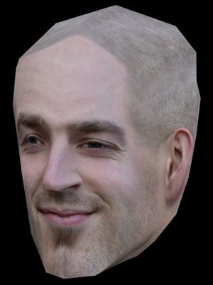
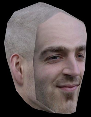
The 3D model associated with our UV template has quite a long nose,
so our source image model gets a slight Pinocchio treatment when I test the texture in 3D:

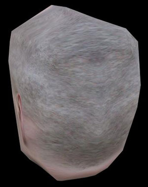
The Top of the Head
I used copies of the head as a start to
texturing the top of the head. This is going to take a lot of
work with the Eraser and Clone Stamp tools, but it's nothing you haven't tried in the past.
 |
 |
Before and after some careful editing. Don't worry that the head looks stretched out here. Remember that it will wrap around the model. |
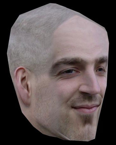
Here's how my results look on the model:
Low-Poly Compromises
The bald head looks quite lumpy.
This is part of the compromise with low-poly characters. This head
model was created for a character with hair, and since it was
modeled for a first-person shooter, this character wasn't intended
to be seen close up and standing still.
Another compromise is in using one part
of the texture for both sides of the head. One result of this
is that there is a seam down the middle of the head, and the
texture on one side will mirror the texture on the other. This
creates a pattern that is not natural, and is usually quite noticeable.
In this case we, the texture artists, have been given a low-poly
model, and a tight texture budget, and a model with a UV layout
designed to allow us to economize on the head texture—and we
have to make the most of it.
Do keep in mind that you should avoid this
sort of pattern whenever the polygon count and budget of your game allows. Generally, the bigger the poly count and budget, the more detail you can have in your textures and the resulting models.
Now let's finish up our texture...
Polishing and Problem Solving
We have a good basic texture in place, but a few issues here and there that we can address and clean up.
The texture stretches a bit toward the
top of the head, and also in the front. In the texture artist
role you may be able to ask, and the modeler may be able to fix
or improve, problems like this. But even without the help of a modeler, you can improve the issue, if not completely solve it.
Think creatively. Could the character have
a bald spot? If he is bald on top, there would be no stubble,
and flesh would have less detail. The less detail in the stretched area,
the less noticeable the stretching will be. This is just one
idea—when you're put in this situation, experiment, and see what happens when you change this or
that.
The next problem that we need to address
is the seam on the other side of the face. The two sides of the
face are not the same, so the single side texture doesn't match
on the left side. We can make the left side of the face match
the right without making the facial features symmetrical. We
only really need to change the area behind the cheekbone and
deal with some of those shadows.
To copy the whole side of the face to a
new layer, you'll have to merge all of the layers that make up
the face now. Be sure to save under a new file name first so you still have your editable layers in another file. Then select all of the face layers and go to Layer > Merge Layers.
I used the UV template as my reference,
selecting to that shape as closely as possible. This will help
me line things up on the other side, and ensure that I have enough
overlap to work with. Because I'm not feathering the selection,
I'll need to use the Eraser tool to soften the edge later.
 |
I selected with the Polygonal Lasso tool using no feather. |
 |
I copied my selected area to a new layer (Layer > Layer via Copy) and placed it on the left. |
It doesn't line up perfectly on the other
side, but it's pretty close. This would be a good time to see how
things look on the model, with fully opaque layers of course:
Hey, looking good! Now the seam is entirely
in the texture. And we know how to handle that. Are you ready
for some more quality time with the Eraser tool and the Clone
Stamp tool?
Below is a good start. There are still some
differences in the color of the cheeks that I would probably deal
with. The shadows of the temples, chin, and especially the eye
need to be removed or reduced. I'll leave you with all of the
fine-tuning and finishing touches required to make your texture
map really shine. Are you happy with the contrast, the hue of
the skin...? Once facial features are in place, it's all about polishing the details to a point you're comfortable with. OK, over to you!
 |
Polished head |