Kerning and Tracking
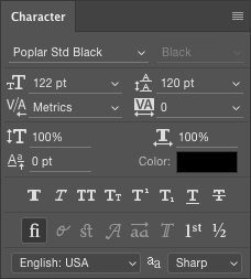
Kerning refers to the space between individual letters, close together or far apart. The kerning controls ![]() can be adjusted with numbers, individually, or by using a set approach. To use them, place your cursor between two letters that you want to adjust. The default setting is usually "Metrics," which adjusts the space between letters according to the specific sizing the font designer chose. If the font is well designed, it will also include hints that will let you use the other setting of "Optical." This approach will space the letters within a font according a optimum readability. You'll find this feature included mainly in OpenType fonts, which we discussed briefly in the lecture.
can be adjusted with numbers, individually, or by using a set approach. To use them, place your cursor between two letters that you want to adjust. The default setting is usually "Metrics," which adjusts the space between letters according to the specific sizing the font designer chose. If the font is well designed, it will also include hints that will let you use the other setting of "Optical." This approach will space the letters within a font according a optimum readability. You'll find this feature included mainly in OpenType fonts, which we discussed briefly in the lecture.
Whereas kerning refers to the adjustments between individual letters, tracking ![]() , which you'll find to the right of kerning, is space adjustments according to a block of selected text, or a word.
, which you'll find to the right of kerning, is space adjustments according to a block of selected text, or a word.
Kerning and tracking are often confused. But if you remember that kerning is for individual letters, and tracking is for words and sentences, you'll see the difference.
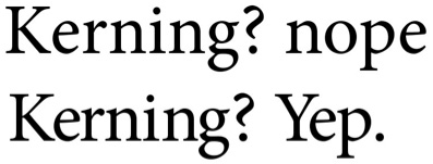
Poor kerning is noticeable. In the first line above, the spacing between the letters is loose and irregular. You'll improve at this tricky task when you study typography in more depth.
Scaling
The next layer of controls are a bit dangerous. The top two controls in this section of the panel are for vertical ![]() and horizontal scaling
and horizontal scaling ![]() . They are dangerous because they let you distort the shapes of letters. This is a particular issue for me as a designer who works with type. If you distort letterforms, squeezing or widening them, you, more often than not, will end up destroying the intrinsic balance of their design. Type is designed. Each letter in a font is designed, culled, drawn, and decided on. With the simple click and drag of your mouse you can break that down. Or not. This is an issue more for a typography course, but it is important that you are aware of it all the same.
. They are dangerous because they let you distort the shapes of letters. This is a particular issue for me as a designer who works with type. If you distort letterforms, squeezing or widening them, you, more often than not, will end up destroying the intrinsic balance of their design. Type is designed. Each letter in a font is designed, culled, drawn, and decided on. With the simple click and drag of your mouse you can break that down. Or not. This is an issue more for a typography course, but it is important that you are aware of it all the same.
Style, Case, and More
If we look further down the panel, we see the presets for bold, italic, all caps, small caps, and more. These are settings you will find in most word processing and layout programs. They are great short cuts for changing the style or case of your text, but only use them if your typeface does not come with its own alternate version (such as Arial Bold or Myriad Italic) designed especially for this purpose.
There is a row below these options that that you may not have seen before in another program. These are more advanced typographical settings including ligatures, alternative glyphs, swashes, and other higher-end typographic alternatives. And these are settings that you only find in OpenType fonts, and then only in OpenType fonts that happen to support the extra glyphs.
Suffice it to say that while Photoshop is not a typographer's dream, it does give you access to a number of advanced and special typographical features and functions. The choice on employing them within your Photoshop document is of course, up to you as designer and digital imaging specialist.