- Bleed area: The bleed area gets cut off, but it enables your design to go out to the edges of the publication's ad area without a border.
- Trim size: The trim line indicates where the ad actually gets cut. Everything inside it will be visible in the publication.
- Live area: The live area is where all of the important aspects of your design should go. This ensures some margin before hitting the trim line.
We'll look at these areas in action in the video coming shortly.
In the following example, our client is Adobe and the product we're promoting is Photoshop. Ads come in all sorts of sizes, and orientations, each with different and very specific measurements to work with. We'll refer to Wired magazine's advertising specifications for our ad. The ad will be a half-page horizontal and its specs can be seen listed part way down the page.
Once we know our size and placement, we can figure out how to best get the ad's message across in a unified, balanced, convincing, and attractive way.
Planning the Design
It's a good idea to look first at the copy (that's another word for the text) to get the gist of what the ad wants to say. Then you can make decisions about what kind of image to use. Often a client will provide the image as well as the copy. And it's our job to make the page work.
For this ad, we'll be taking a trip to the archives and crafting an ad for Photoshop CC.
Here's the copy I'll be using:
Headline: When life gives you lemons Photoshop makes them prettier.
Body: Adobe® Photoshop® CC software delivers state-of-the-art imaging magic, exciting new creative options, and blazingly fast performance. Retouch images with new Content-Aware features, and create superior designs as well as movies using new and reimagined tools and workflows. Learn more at adobe.com/photoshop
Think about that headline. What would fit with that?
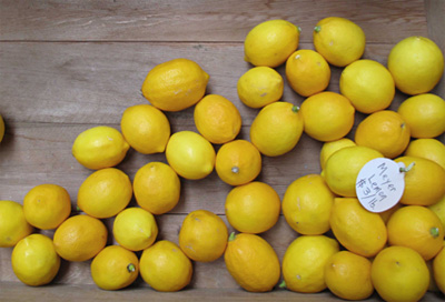
Here's the image I decided to start with.
There are several reasons for my choice ("rawlemons.jpg" in your Lecture Four downloads). The first is rather obvious. It's a grouping of lemons. Another reason is that this is a photo that is composed in or near the Golden Ratio of 1:1.61803. If you haven't heard about this odd number, that's okay. You'll learn about it in later design studies. Images that follow the Golden Ratio are typically more pleasing to the eye than others.
Also note how the main shift of the image moves your eye toward the lower-right corner of the page. That's another reason for choosing this image, as this is the direction we're going to use as the basis for setting up the composition of the ad. We let the image tell us where things should go. Okay, let's start.
Our specs say the ad's full bleed (which means the image runs off the edge) dimensions are 8.25 inches x 5.625 inches. This measurement is the size we'll make our Photoshop document momentarily. The next measurement we will need to be concerned with is the trim size, which is the size the ad will be when the paper is trimmed or cut to fit in the magazine. In this case, that'll be 8" x 5.375. So we can say we have a quarter-inch bleed on the piece.
The third measurement is the live area. This is an inset like a margin, making sure that the important parts of our ad (the text, and type, for instance) don't get cut out. On the ad we're about to create, that's 7.5" x 4.875". On an aesthetic level, it also lets our eyes have breathing space before we embark on the ad itself. It's a way to set a pace to the rhythm of a page, something you'll get more familiar with as you continue your studies in design. But you can see here how we use them.
Setting up our Photoshop document, we'll use all three sets of measurements. We start, as I said above, with a Photoshop document is 8.25" x 5.625".
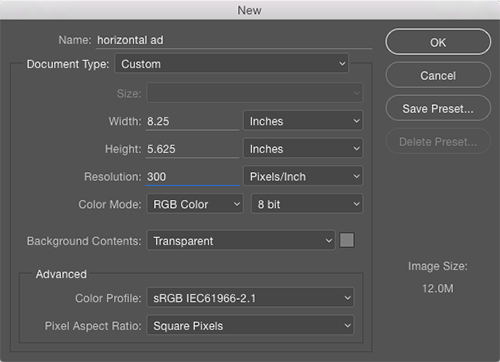
Note all the important parts: Resolution 300 ppi, Color Mode RGB, Background Contents Transparent.
Using the Ad Specs
Okay, time to start the ad. In the video below, you'll see that I've dropped my lemons image onto the canvas. The next step is to draw out guides that relate to the specifications of bleed, trim, and live areas.
We set up guides simply by enabling our rulers (View > Rulers), then clicking and dragging on the ruler area into the document. In the video you'll learn how to shift the zero-point of the rulers so that you can get an accurate set-up with the guides.