Paint Options for This Course
You can choose to use either oil or acrylic paints through this course.
Be aware that several of the exercises are geared more towards the advantages of oil paints in capturing realism. If you choose to use acrylic paints, make sure to use mediums to lengthen the dry time of your paint and to control its thickness, so it flows more like oil paint.
If you choose to work in both oil and acrylic, that is acceptable. Just never mix the two together in the same painting. Oil and water, as the saying goes, do not mix. Interpret the saying literally, as mixing the two will cause your painting to be structurally unsound and may lead to cracking.
 |
Oil is my medium of choice, and you'll see examples of my work in oil throughout the course. |
Watercolor and Other Paint-like Materials
Watercolor is actually considered more of a drawing medium. It comes with its own challenges, as it requires you to soak the paper and deal with different degrees of dryness and wetness. In addition, watercolors require you to consider the white of the paper when mixing and applying colors, as watercolors are much more transparent than oil paints and require more care when applying layers.
Likewise, I would avoid using other art "paint-like" art materials like oil bars, poster pens, spray paint, or water-based oil paint. Though each are valid tools used in art making, they are each too particular and are too unlike the methods discussed in this course.
Oil Paint
Oil paints, as the title implies, are an oil-based medium. Oil paints consist of a pigment (some type of mineral or dye of a particular hue), and an oil based filler that suspends the pigment molecule, allowing the color to flow and making it possible to blend.
Oils are the more traditional oil painting medium and have been used throughout art history for centuries. The advantages to using oil paint are that oil colors are typically richer and are easier to blend into one another. By staying wet for longer periods of time they increase the amount of time you have to work an area of your painting. They are also more archival in comparison to acrylic painting.
The disadvantages are that they are more toxic than acrylic paint and many of the mediums that you will use may be flammable. Waste accumulated from painting with oils should be properly dispersed with at a place designated for taking oil waste. Check with local recycling centers, waste sites, art stores, dry cleaners, or auto parts shop to find out someplace close to you that will accept your oil paint waste. This includes anything that ever touches oil paint or any of your oil-based mediums (rags, brushes, old oil paint tubes, and so on).
Acrylic Paint
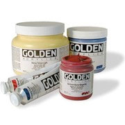 |
| Golden paints are my preferred acrylic brand. |
Acrylics consist of pigments suspended in an acrylic fluid. Acrylic paints are valuable in that they are water-soluble, meaning you can thin them out with water. They also don't require any toxic oil paint mediums, meaning they are better suited for working indoors. Similarly, there are a number of mediums available to be used with acrylic paint that can replicate most of the effects of oil paint, such as lengthening the dry time, as well as changing the finish of the paint from gloss to matte. I prefer Golden brand acrylic paints because of the quality of their colors.
The biggest disadvantage to acrylics is that acrylics have a tendency to dry a different color than they appear wet. It is difficult to predict exactly what color acrylic will dry as. To work around this, I suggest making test strips of your paints as well as different colors that you mix up. Let them dry to see how they compare. Make sure to label them. You will find that working acrylics in this way is similar to using color PMS swatches in commercial printing.
Since acrylics dry faster, make sure to keep your jars and tubes of paint closed at all times when not in use. You may be able to keep colors that you mix for another time if you are quick to seal them in small, airtight plastic containers. You can sometimes add a little water to a color to keep it from drying up. Do this if you notice that the surface of the paint is beginning to build a skin.
|
Recommended supplies for this class: |
|
Drawing Materials
- HB pencil
- kneaded eraser
- paper to sketch on (no particular requirements)
Brushes
- flat brushes (size 2, 4, 6, 8, 10)
Palette Knife
- Palette knife (diamond shaped ones work best)
Canvas
(at least 8" x 10")
- pre-stretched canvas or canvas board
Mediums
For oil painting, not to be used with acrylics
- Stand Oil (recommended - Gamblin Stand Oil)
- Odorless Mineral Spirits (Recommended GAMSOL)
- Brush cleaning solvent (recommended - Terpenoid Natural
Paint
Recommended Brands - Gamblin oil paints, or Golden Acrylic paints
- Titanium White 150 ml tube
- Cadmium Yellow Medium 37 ml tube
- Naples Yellow 37 ml tube
- Yellow Ochre 37 ml tube
- Cadmium Orange 37 ml tube
- Cadmium Red Medium 37 ml tube
- Cadmium Red Deep 37 ml tube
- Burnt Sienna 37 ml tube
- Burnt Umber 37 ml tube
- Perm Green Light 37 ml tube
- Sap Green 37 ml tube
- Cerulean Blue 37 ml tube
- Ultramarine Blue 37 ml tube
- Ivory Black 37 ml tube
Other Items
- Palette
- Easel
- Light source
- Still life objects
- Jars (including a Silcoil jar if possible)
- Newspaper (for cleaning your brushes)
|
Download a PDF version of the list. |
Let's Walk Before We Run
But first, let's talk about the important process of drawing to paint. Why are we discussing drawing in a painting course, you might ask? Well, simply put, drawing is the foundation of painting. Both drawing and painting explore the two-dimensional representation of form. Drawing is just the dry, black-and-white version, while painting is the wet with color version.
Just as importantly, since the Renaissance, drawing has been the painter's primary tool for preparing to paint. It's a way of investigating the subject matter, experimenting with formal elements, and developing a concept that is worthy of putting on canvas.
 |
 |
Here you can see the preliminary drawing (left) that I did for a large scale painting (right). |
Make no mistake about it: You will spend hours and hours on your paintings.
And then you'll spend some more. It's essential that you have a solid
plan for painting before you set it in motion. It's also vital that
you give yourself the chance to explore different creative possibilities—to let your imagination run around a bit—before
you start to execute your vision.
It may not seem obvious, but even artists who work in a surrealist
or abstract styles can benefit from learning how to draw from life.
No matter what style you work in, you're still dealing with how people
see things.
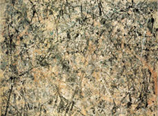
Even the noted abstract painter Jackson Pollock studied life drawing. Learning to draw taught Pollock how color, light, and shadow work in real life and how to see things spatially using the laws of perspective. Drawing educated his color choices and helped guide his hand when he used his characteristic drip-painting technique. His drips would create deep constellations of paint in space that were much richer than the lackadaisical speckle painting you might do to decorate a tile for your bathroom.
And it isn't hard to image how the surrealists
benefit from working from life, as the basis of most surrealism is a
psychological and subconscious interpretation of what we see all of
the time. Salvador Dali's melting clocks wouldn't be as
effective if he couldn't accurately draw according to the rules
of perspective. Being able to understand and manipulate the laws of
physics, visually, makes his work much more convincing and creates
a powerful impact on the viewer.
 |
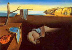 |
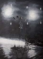
Paintings by
Pollock (left) and Dali (right) may not look like "real life"
but still are strongly influenced by laws of perspective, color,
and light. |
I've said it before—drawing is fundamental to art!
A third reason to draw before you paint is that it's very important
to think about ways to implement the fundamental concepts and techniques
that you typically explore while drawing, in your painting. Here are some key concepts that every artist should consider:
 |
|
 |
| |
- Mass and space
- Positive and negative space
- Perspective
- Proportion and scale
- Contour lines and edges
- Light and shadow
|
|
 |
|
 |
In order to implement these concepts in your painting, you'll need to be able to first realize them in your drawings.
In the exercise that follows this lecture, I'll ask you to do four or five preliminary drawings of a still life subject that you will paint as you move through this course. In this lecture, I'd like to discuss some fundamental concepts that I would like to see you tackle in your drawings.
For an overview of my approach to preliminary drawing, check out this video tutorial. I'll be reviewing this at the beginning of the exercise that follows.
For those of you who've taken my Drawing I course, some of these concepts will be very familiar (though challenging nonetheless). For those who haven't had that pleasure yet, this lecture is packed with need-to-know info. Either way, I'll focus throughout on the particular elements that will help you in your painting process.
Basic Forms
The first step in analyzing the world around us is to break down the objects we see into their basic forms. Try to decide what form the object(s) you are looking at are most like. Is each object a cube, sphere, cone, cylinder, or pyramid? Or are they some combination of those three-dimensional shapes?
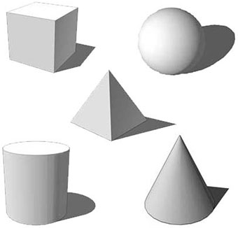 |
Ask yourself if the objects you are drawing
are composed of cube, sphere, pyramid, cylinder, or cone shapes. |
Focusing on these fundamental shapes will bring you closer to representing the essence of the subject you are drawing or painting. In art, the key is not to record every last detail but to somehow convey the "simple truth" of what you see.
Every object you see can be broken down into some combination of basic forms. Here's an example:
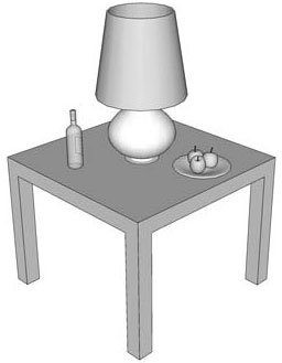 |
Objects on a table can be seen as an interplay of cubes, spheres, cylinders, and cones. |
Lines and Planes
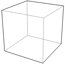
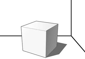
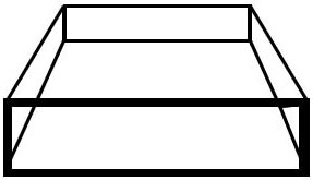
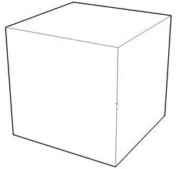
Breaking things down further, we can see that basic forms are made up of planes. Interlocking planes create the illusion of mass. See how the planes in this cube come together to create a feeling of mass:
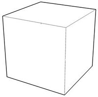 |
This cube is a basic form. It is made up of lines that combine to make shapes, that in turn combine to make a form. |
Round objects are made up of planes as well, but they are made up of lots and lots of planes that wrap around the object. For example, this round object (a paper lantern) is made up of many adjoining planes:
 |
A sphere can be represented by many adjoining planes, each catching light at a different angle. |
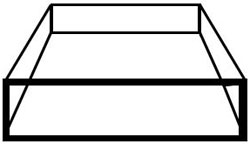
As you can see, the interconnection of planes creates the illusion of mass. We only need to see three sides of a packing crate to judge its volume. But how do we convey a plane?
Well, a plane is made up of lines that connect to make a shape. A single line floating in space is hypothetically possible in geometry, but doesn't really exist in the world we observe with our eyes. Even a hair from your head has some dimension to it.
Planes are created by the interconnection of three or more lines:
 |
Four lines on their own are just four lines. Connected, they become a square, resting on a plane in space. |
Mass and Space
Another fundamental concept to remember is the idea of mass and space. In drawing and painting, we are generally trying to represent the illusion of three-dimensional objects in a two-dimensional plane.
Take a look around the room you are in. Your room is most likely filled with objects that have mass and take up space. The walls, floor, and ceiling all have mass as well. But how you can you tell which objects are big or small? Or which objects are heavy and solid, and which are light and insubstantial?
|
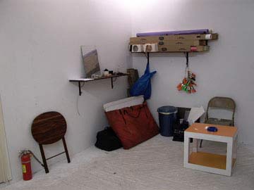
Objects in my studio |
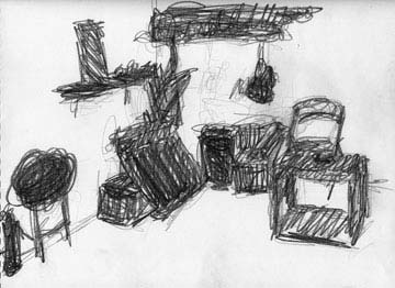 |
This gesture drawing
helps to show the space taken up by the objects: their mass. |
The first thing you should notice about the objects is that they take up space in the room. A sense of each object's mass is created by the interaction of the object with the intersecting planes formed by the walls and the floor.
Thus, an object with mass is said to create volume when you can feel it inside of a room. Let's illustrate this with an object not often found indoors:
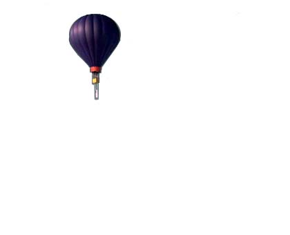
|
Here this lonely balloon floats in a field of white. The balloon has mass but no volume, since the page it's on is just a big, flat piece of white. |
How big is the balloon? How light or heavy? It's hard to tell without the contextual information provided by other objects or the perspective lines provided by hills or a horizon.
Now let's add some scenery:
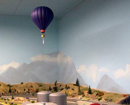
|
Not so lonely |
Suddenly, because we added the corners of the room, the picture has a clear volume that is filled by the mass of the balloon and the model village below. The lines provided by the corners of the room help us assess the size and proportion of the various objects in the composition.
Here's how the math works:
 |
Lines + lines = plane |
|
Planes + planes = mass |
 |
Mass relating to other masses = volume |
Positive and Negative Space
As we look at mass and the space around it we can also divide what we see into two categories: positive and negative space. The area that contains mass is the positive space and the empty void around it (and sometimes within it if the object has holes in it) is the negative space.
Below are some examples of positive and negative space in drawing and painting:
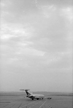 |
 |
Here, the positive space is taken up by the airplane and runway on the bottom edge of the photo. The empty sky is the negative space. Even though there is much more negative space than positive space, the photo still feels balanced. |
In this drawing, the positive space is the plane, the only object
in the composition. The negative space is the empty void around
it. |
 |
Here, the silhouette of the girl is the positive space and the room around her is the negative space. Photo by Marie Evelyn. |
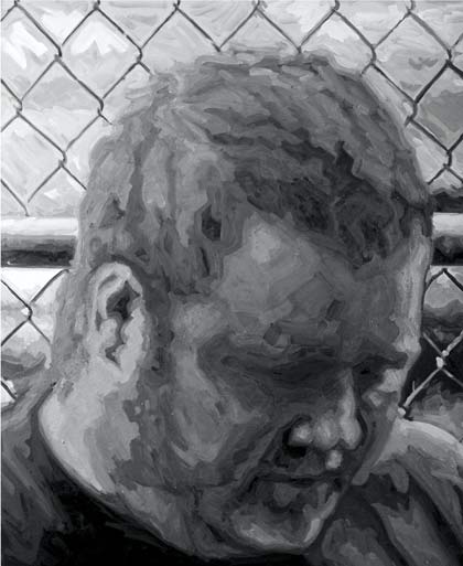 |
In this large portrait, the mass of the head
fills up most of the painting with positive space, leaving very
little negative space around it. |
When you are composing your painting in your preliminary drawings, remember to think about the balance between the positive and negative space. Frame your subject to support the theme of your painting.
Perspective and Foreshortening
The theory of linear perspective was developed by the artists of the Renaissance. But the effect of perspective has been with us a whole lot longer.
Perspective is the visual phenomenon that makes objects appear to become smaller the further away from you they are, depending upon your vantage point (or perspective, as it were).
Of course, the objects don't actually get smaller—this is only an illusion. But it's noticeable when you look carefully at any large objects, even those quite close to you. When part of an object facing you appears too large, and part of it facing away appears too small, it is said to be foreshortened.
Here's an example:
|
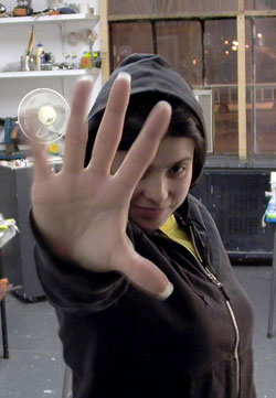
Paparazzi are very good at getting foreshortened photos of stars. |
In the photo above, we know that the subject's hand appears so much larger than her head because of foreshortening. In our minds, we instantly translate this to mean that her hand is closer to us and her head is further away from us. If her hand really was this large in comparison to her head, she would have a terrible time trying to find gloves that fit.
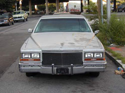
Here's another example of foreshortening:
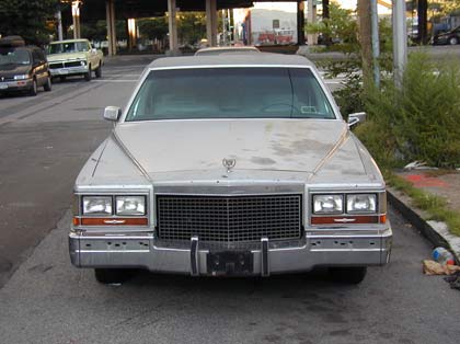
|
Who says American cars aren't boxy? |
Remember that every object can be broken down into basic forms that adhere to the laws of perspective. In the diagram above, you can see how foreshortening makes the front of the car seem bigger, and the back of it smaller.
The Vanishing Point
A basic knowledge of the theory of linear perspective can be helpful in painting. Let's review the major concepts now. We'll use this diagram as a starting point.
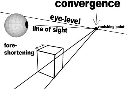
When we view the world around us, we view things with the eye level as the center of our vision. The eye level is the horizontal line that our eyes rest on. If you move your head up or down, or tilt it left or right, you will change the angle of your eye level.
If we look at a series of objects on a flat plane (such as a series of cars on a straight stretch of highway) we can see that the objects appear to shrink into a vanishing point. An object that is located right on the horizon almost appears to vanish altogether—hence the name vanishing point.
As objects get further away from us they appear to converge into these vanishing points. When objects get smaller and come together as they recede toward vanishing points it is called convergence.
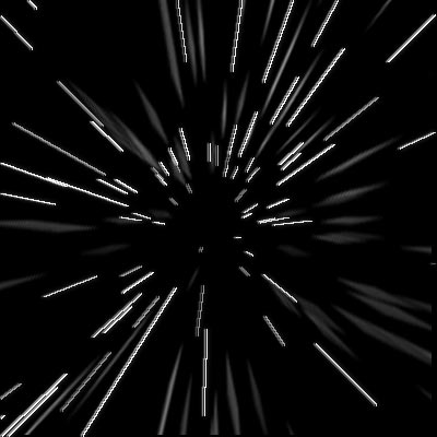
|
As we hurtle through the stars
at warp speed, they appear to converge at a vanishing point.
|
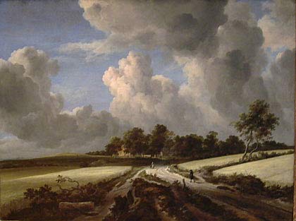 |
Notice how the road converges toward the lower
center of the painting, focusing on the little figure in the center
of the road. Everything is receding toward this vanishing point,
where the painter wished to direct our eye level. |
In its most basic form, the car we looked at earlier is a rectangular solid that adheres to the rules of convergence. Every line is directed towards a vanishing point where all lines appear to meet.
Now, the concept of vanishing points might seem easy to grasp if there were just one type of perspective. But in fact there are several different kinds you might need to think about, depending on the size and proximity of your subject.
One-Point Perspective
One-point perspective occurs when there is only one vanishing point. All objects in your line of sight appear to vanish into the same point in the distance. This occurs very seldom in nature, as it requires that everything in view is laid out perfectly relative to other objects on a grid.
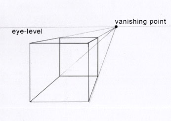 |
One-point perspective |
You might see something like this effect in a rail yard
with multiple train tracks stretching into the distance. The road painting
you saw above is an example of one-point perspective. The person standing
in the road was the "vanishing point."
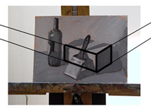
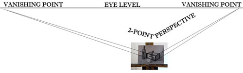
Two and Three-Point Perspective
Two- and three-point perspective occur when everything appears to disappear into two or three vanishing points.
Two-point perspective
occurs when you are quite close to a subject or subjects and the effects of foreshortening begin to occur. You will see objects at more of an angle in instances of two-point perspective:
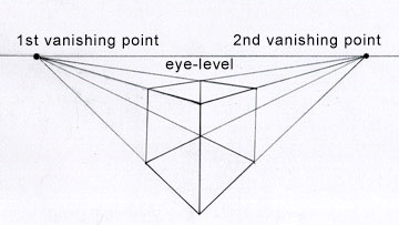 |
Two-point perspective |
|
This painting
has two vanishing points waaaaay off in the distance. |
Three-point perspective is when an object appears not only to vanish to the right and to the left, but also upward or downward, depending upon whether the object extends above or below your eye-level. This generally occurs when you are very close to a large subject.
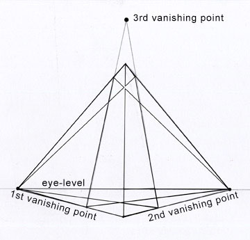 |
Three-point perspective |
Take a look at this skyscraper and notice how it appears to disappear to the right, left, and up into the sky.
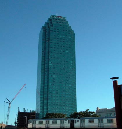 |
They keep making them bigger and bigger. |
Proportion and scale are two important
concepts to think about in your preliminary drawings and paintings. Both concepts govern how all of the elements within
your piece relate to each other in size.
Proportion refers to
how big one object is compared to another object (or part of an object) that is next to it.
A good example is the human figure. How many heads tall is the
entire figure? Typically humans are 7 heads tall. The proportion
of one head to the number of heads that fit into the entire body is
approximately 1:7. This is a rule of thumb that artists have been using to keep figures in proportion for centuries.
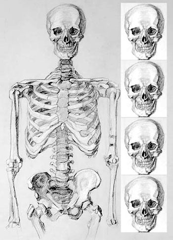 |
This skeleton is four skulls tall from the
top of the skeleton to the bottom of the pelvic bone. Once you
find the measurement of one object in your drawing, you can check
the proportions of everything else in your drawing in relation
to that measurement. |
Scale relates to how things compare in size. We
know that because of perspective, objects appear to get smaller as they
recede into space away from us. Two objects can be the same actual size and proportionate to each other even if one is scaled down in appearance.
A good analogy for this is model trains.
They come in a variety of smaller scales in relation to the really big "real"
thing.
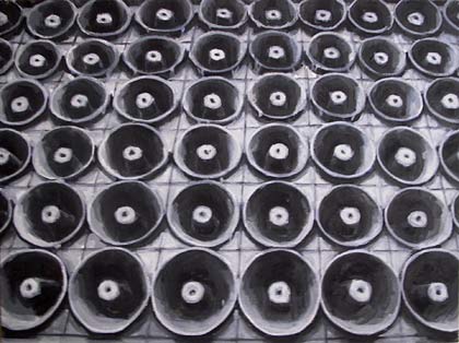 |
See how the speakers at the top appear to be
smaller in scale, even though we know they're all the same size? The speakers give the illusion of receding into space.
Of course, this is a flat painting and it isn't going anywhere. |
Keeping Your Proportions Straight
Now, when working on our flat piece of paper, remember to keep
your proportions correct by comparing how big something is in your
painting in comparison to other objects in your painting.
If I'm planning a drawing that contains a fire hydrant and some apples,
I need to consider how big an apple is compared to a fire hydrant.
A real fire hydrant is several "apples high."
 |
These are either very large apples or else the fire hydrant
is very small. We would assume that a fire hydrant would be more than three apples
tall. |
A good way to keep everything proportionate in your drawing is to compare the measuring points in your drawing. A measuring point occurs every time a line starts, stops, or changes direction.
 |
Every time a line start, stops, or changes
direction, it creates a measuring point. |
As you begin drawing, keep careful track of the distance between measuring points. It is important to keep your measuring points relative on your picture plane. If one measuring point is higher than another point in real life, it should stay that way on your drawing.
For example, the top of the box above is higher up than the point in the upper right. Your drawing wouldn't be correct if the upper-right point were higher up than the middle point. Your cube would be askew, and it wouldn't be in perspective.
Compare these measuring points to one another to keep your
drawing proportionate. Ask yourself, "Which point is higher,
which one is lower, which one is more to the left, and which one is more
to the right?"
Another concept to consider in the initial stages of your drawings is the location of your contour lines. A contour line is a type of line used to describe the edges of your
object. If you've ever looked at a topographical map or a computer-generated
3D drawing of an object in which just the outline skeleton was showing, you've seen examples of a contour line.
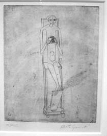 |
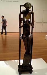 |
Here you can see how the painter/sculptor
Alberto Giacometti drew a contour line drawing as a preliminary sketch for his work Figure Holding a Void. |
There are three types of contour line for you to consider:
Outer Edge
The outer edge is the line that makes
up the outer edge of your object as it appears on your page. Think
of a cookie cutter in the shape of your object. The actual shape of the
cookie cutter would be in the outer edge of the object. This
is also generally the shape of the positive space in the work.
 |
The outer edge goes around
the outer edge of your object. |
When you are drawing the outer edges of your objects in your composition, make sure that they all stay proportionate to one another.
Inner Edges
The inner edges are all of the edges on the object that you can see that are within the outer edge.
See how these inner lines added to the diamond shape now give it the
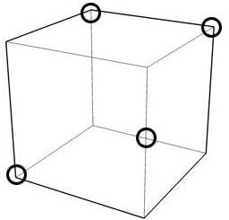
appearance of a cube? Inner edges really help define the structure of the object. Use measuring points to keep your inner edges accurate.
 |
Just by adding in the inner edges we have turned
what was some weird diamond shape into what appears to be a three-dimensional
cube. Already we have a sense of mass in our drawing. |
Hidden Edge
Just because you can't see part of an object doesn't mean it doesn't exist. The world is made up of three-dimensional objects that we can walk around and view from different angles. When you are painting, you are trying to convey an awareness of this three-dimensional reality on the flat plane of your canvas.
Hidden edges are the edges of your three-dimensional object that you can't see. Sometimes, during the preliminary drawing or underpainting phase, it helps to draw in the hidden edges of your object to keep things in proportion.

|
Drawing in the hidden edges helps us make sure that our object really will take up space and hold mass. |
Why is this approach helpful? Drawing in the hidden edges forces you to concentrate on the three-dimensional qualities of your subject. You need to imagine the front, back, top, bottom, and sides of your object all at once.
If we draw in the hidden edges and they don't add up to creating a three-dimensional form, then we know we have an error in our perspective. This means we should check our proportions by comparing our measuring points once more.
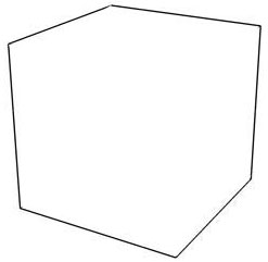
Here is an example of an object drawn without much thought to its hidden edges:
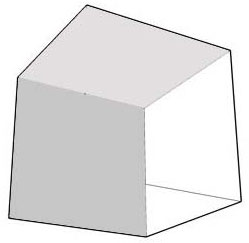 |
This cube is all kinds of messed up. |
Now here is the same object drawn according to the rules of perspective. You can bet that hidden edges were drawn and later erased in this drawing:
 |
This cube is true in its representation of three-dimensional space. |
Make sure to follow the laws of foreshortening, convergence, and the rules of perspective when you are drawing. If your drawing or painting contradicts the laws of physics, there is a good chance you made a mistake in your measurements.

|
Just for fun, see how the hidden edges of this sphere go around and around. |
Still with me? Here's a final killer concept I'd like you to bring to the first exercise in this course: light and shadow.
The thing is that the contour lines in your drawing are really just the skeleton of your work. To really add meat to our objects, to make them appear more life-like, we need to introduce the idea of light and shade.
When laying out your painting, you should think about how areas of
light and shade work themselves into your composition. The first
step in doing this is to separate the parts of your painting into basically two
parts—the light part and the dark part—by finding the shape of the
cast shadow.
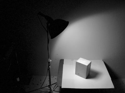
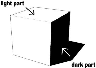 |
A strong light source will separate any subject into areas of light and dark. |
The shape of the cast shadow (the dark part of your drawing) will depend upon the distance of the light source from the object and the angle at which the direction of light is hitting it.
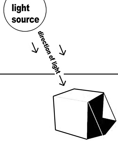
|
|
Changing the direction of light can help you control the placement of light and dark areas in the composition. |
Identifying light and dark areas is extremely important before you begin to think about color in your painting. The contrast between light and dark is essential information to the eye. Different parts of your painting may ultimately be the same value (level of light or darkness) even though they are different colors! Therefore, you must use your preliminary drawings to analyze the basic value contrasts in your subject.
The light part is the part of your painting that is hit by direct light. Pay attention to the light source and what direction the light that hits the subject comes from. Light pours from a light source onto the objects in your composition. Think of the light source as a type of vanishing point in reverse: the light begins at the source and then spreads out as it gets further away from the source. Also notice that the light source gets weaker the farther it gets from the source, and the wider the area it covers.
The dark part, as you might imagine, is the part of the painting that is cast in shadow because part of the subject is blocking the light from hitting it directly. Some light may be reflected into this area from other objects in your composition. But because it is not direct light it will never be as light as the part of the painting that is in the light part.
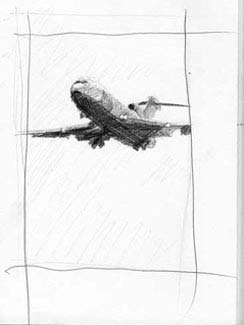
 |
Here is a thumbnail sketch I drew separating
the light part and dark part in my drawing. You can tell that
the light source was very close here, as the shadows quickly get larger
the further they go from the object. |
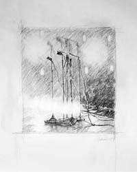
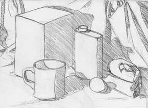
In the exercise, I'm going to ask you to create a series of preliminary drawings or thumbnail sketches before you begin painting. So, let's wrap up this lecture with some advice on those.
Thumbnail sketches are quick little drawings that give you ideas for the composition of your painting and what problems you might run into.
It's better to confront problems in this quick manner than to struggle for hours or days during the actual painting process. It is a good idea to always draw a couple of thumbnail sketches of your subject matter from different angles to figure out which compositions might work best for your piece. When a thumbnail sketch is created to work out compositional problems, it is termed a compositional study.
When doing a thumbnail sketch, you should work out your drawing by including outer and inner edges. Then you should separate the light part and dark park by defining the shadow edge and the shape of the cast shadow. Once the shape of the cast shadow is determined, you should tone that area evenly.
Here are some examples of thumbnail sketches:
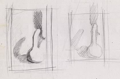 |
Here are two thumbnail sketches for a painting
of a gourd that I painted in white. |
 |
Do several thumbnail sketches
from different angles, composing your subject in different ways
before you begin your painting. |
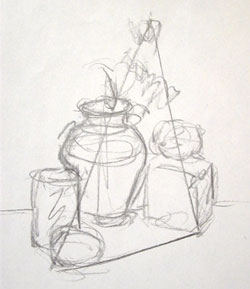 |
| Notice how none of these drawings are taken past the dark part/light part stage. The idea is to capture the composition quickly and to make an assessment of the basic forms of the subject, the direction of the light source, and the shape of the shadows. Since we are focusing on compositions at this stage, no other information is necessary. |
Drawing in Your Sketchbook
Doing preliminary drawings for paintings shouldn't be the only time you draw, of course! You should get in the habit of drawing in your sketchbook all the time. This practice will keep your hand and eye trained. It is like lifting weights before competing in the Olympics. It is important to always be in shape, a condition that's achieved by constant training.
Take some time out of each day to draw the world around you. Try to always work from life at first, as that will give you the greatest amount of information to learn from.