Materials
You'll need the following supplies to complete this
project:
 |
|
 |
| |
- Canvas board
- Small and large brushes
- Titanium White
- Ivory Black
- Red, blue, and yellow
- Palette
- Palette knife
- Painting knife
- Easel
- Light source
- Mediums (Stand Oil and odorless mineral
spirits)
- Brush cleaning solvent (if you are using oil paint), or Water (if you are using acrylic paint)
- Jars (including a Silcoil jar if
possible)
- Newspaper
|
|
 |
|
 |
This video tutorial shows how I approach monochromatic painting. Please watch it then read the detailed exercise notes that follow. And let me know if you have any questions!
From Dark to Light
Learning how to create different levels of value in paint is a skill that can only be learned through experience.
You might imagine that if you just added white and black in certain percentages that you would create a series of tones whose value would be in direct relation to the percentage of black and white that you added. For example, if you added 50% black and 50% white, you would assume that you would get a gray in the middle of black and white.
Yeah, well, that doesn't happen. Different paints work differently (depending on the individual pigments that make them up) and some colors are more dominant than others.
For this assignment you will be creating a value scale. What you should do is get a strip of paper about 9" long. Use a material that is heavier than notebook paper—whatever you have. You should then prime it with gesso. After the gesso has dried, you should mark off the strip into 9 equal areas with a pencil, giving yourself equal-sized squares.
In the first block on the left you should paint a daub of pure Ivory Black using
black straight from the tube. Then in the last block all the way
on the right, you should add in pure Titanium White.
Ivory Black and Titanium White are good choices of a black and white
to use, as they are both strong colors that are relatively neutral in
tone and are very useful when mixing with other colors. Then in
the remaining seven squares, I would like you to paint each square so that they go from darkest
to lightest.
Here is an example of how mine looks:
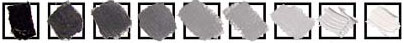 |
Try to keep the difference in
value from dark to light at even intervals.
|
Pay particular attention to the fifth square as that rests in the middle
of the set and should be the middle gray between the pure black and
white. Try to notice how the black and white work with one another
and how different degrees of each pigment will alter the value of the
color you are mixing. Mix all of your colors beforehand on your
palette so that you can easily compare all of the values to one another
before you apply them to your paper.
Take a photograph of your value scale, save it as a 72 ppi JPEG, and
include it in the Dropbox for this exercise when you are done.
Mixing Color Values
For this next part you will see how adding black and white will
change the value of a color.
Create three strips, each with 11 squares. One strip is for a red
value chart, one is for blue, and one is for yellow.
For each chart, place your pure
color in the middle square. Now place black in the leftmost
square
and white in the rightmost
square.
In the remaining squares mix either black or white with your
color until you create a value strip ranging from black, shades of
your color
mixed with black for four squares, your pure color, shades of your
color mixed with white, and then pure white.
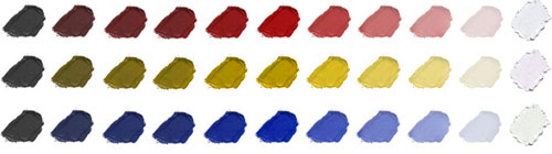 |
Step up the value at even intervals
from black to the pure color to white.
|
Take a photograph of your value scales, save it as a 72 ppi JPEG,
and include it in the Dropbox for this exercise when you are done.
Now we get to start using all that we've learned about the physics of light. We're going to paint a purely monochromatic painting using just black
and white. Remember, monochromatic means using only one color and its various
values.
 |
Remember to mix your values
with a palette knife to keep your areas nice and clean and to
avoid overmixing.
|
You should mix a series of nine values on your palette, just as you did
in your value scale assignment.
Make sure that you mix enough paint that you
will be able to cover your entire canvas. Don't worry if you mix
more than you will ultimately need. Get used to the fact that there
will be paint on your palette at the end of day that you will wipe away
and dispose of. That is the nature of the business. It is better
to have paint left over than not enough. This is painting; get
used to it. You're either doing it or you're not.
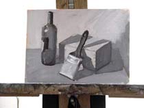
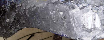
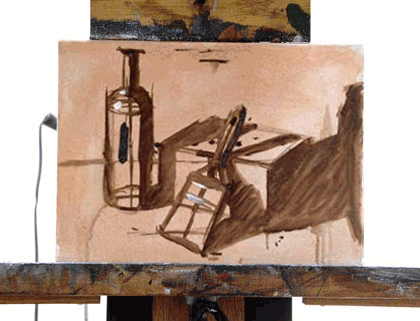
Using the still life that we set up in the previous exercise we will now paint a monochromatic painting, concentrating only on value. Recall your underpainting in Burnt Umber from the last exercise:
 |
Here's where we left off in our
last exercise. We had completed an underpainting in Burnt Umber.
|
Let's review our work to date from a value standpoint. We have already separated and toned the light part and dark part of the painting. Thus we can now determine that all of the areas in the cast shadow will be
darker than the areas in that are in direct light.
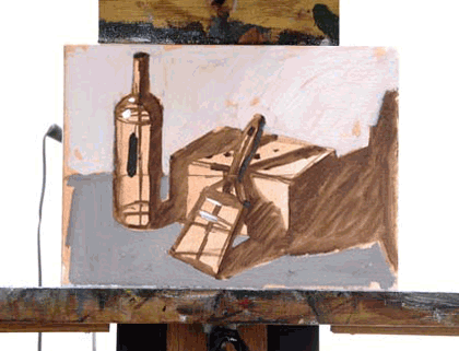
Identify the Darkest Areas
Start out by finding what you determine to be the darkest area on your canvas. It will be the core shadow on one or more of your objects. If just a few areas in the painting have a similar value, go ahead and paint all of them. Just remember to compare those values to the midtone.
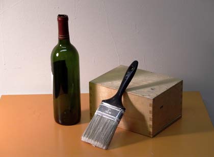 |
Look back at your still life to identify the darkest area—the core shadow—and areas of reflected light in it. Next, look for the brightest areas, the highlights.
|
All of your core shadows on your canvas couldn't possibly be of the same value unless they are all of the same local value originally and are all lit exactly the same. You may find this tone to be anywhere within the lower register of the pre-mixed values that you have created. Feel free to add white or black to any of the tones in order to get the proper value. I can tell you right now there is no way that you will find a pure black in your canvas as pure black never shows up in nature.
There is always some kind of reflected light, or else your eyes would naturally compensate to give it some tone.
I use pure black in some of my paintings but only because I realize that it creates an unnatural effect, which, because of content and style, I find to be necessary. During this learning stage, though, you should be more concerned with understanding how the world around you works rather than developing any personal style or direction as that will all come to you naturally after you have gained enough skills and insight to be able to make those decisions. Otherwise, you will be limited to only what techniques you discover through happenstance.
Identify the Lightest Areas
Next, paint the areas that appear to you to be the brightest. These may
be little highlight areas, or may
be large areas that are brighter than the midtone.
You will probably need to come by and touch these areas again before you finish the painting, but it is important to have the brightest areas demarked so that you can accurately make comparisons while painting.
There is a good chance that you will need to tone down the highlights to some value darker than pure white as pure white doesn't appear often in nature unless you are looking directly into a light source. You will be surprised to find that if you can keep your values relative to each other, you will be able get a wide spectrum of values that will be high in contrast, but that never go to the extremes of pure white and pure black.
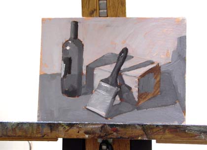
 |
Here I have painted in the darkest and lightest parts in the painting.
|
Block in Large Areas of Value
Next you should block in large areas of value. These should include the cast shadow and any midtones.
Don't be too concerned with being perfect at this point. It is more important that you fill in areas quickly so that you begin to have areas of value to compare. You'll never know if an area is too dark or too light unless you can compare it to other areas on your canvas. The most important thing is that the values in your paintings relate to one another on your canvas.
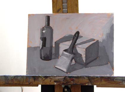
 |
Block out areas of cast shadow and midtones.
|
Remember to ask yourself questions as you go. Force yourself to compare different areas of the canvas and compare different areas in your still life. For example: "Is this area darker or lighter than the other areas of the canvas?" and "I know that the bottle is darker than the wall behind it, but is it lighter or darker than the table top?"
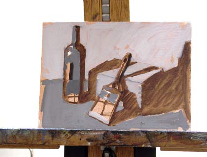 |
Different objects in your painting may share similar values. Notice that the midtone on the box is the same as the value used the wall.
|
Proceed to mix and add paints, trying to capture the tonal qualities of your subject matter.
 |
Keep in mind that the values
in the cast shadow of an object are always darker than any area
of the object that is in direct light.
|
Remember to pay attention to the edges of your objects and to keep the
areas in the direct light a bit thicker in paint and the areas in the
cast shadow a bit thinner in paint, so as to create the proper amount
of projection and recession with your materials. Remember, paint light thick and paint shadow thin!
Refrain from getting too detailed during these early stages. Work around the entire canvas, making sure to work in the paint evenly rather than finishing one spot and then moving on.
 |
Move around your canvas to work in the paint evenly.
|
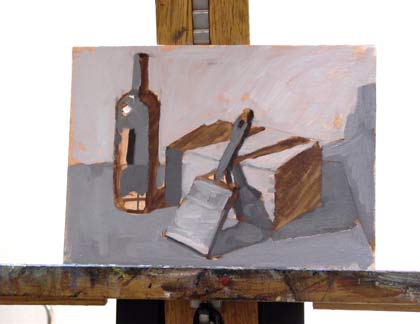
Continue to compare and correct, making areas lighter or darker as needed. You will see that your painting will appear more and more realistic and detailed as you follow this process.
 |
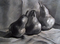
All this with just nine levels of value.
|
Finishing Touches
When you get to the end, you should add or revisit the highlights. Make sure to use just a few as needed. Flat, hard, reflected surfaces will have brighter highlights than soft, dull surfaces. The highlights will generally be the lightest spots on your painting.
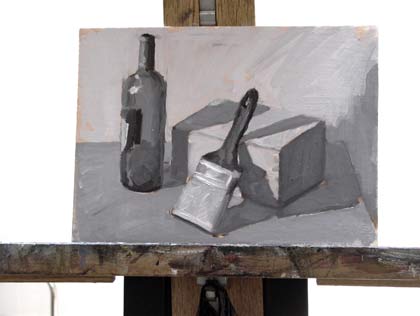 |
Here you can see the additional highlights on the brush.
|
Note: If you'd
like to take down your still life once you
have received a grade for this
exercise, you may. We'll work on new ones for
the remaining exercises.
When you are done, scan in your painting or
photograph it and upload it to the Dropbox
for review. Be sure to scan your painting at
300 ppi and then reduce the size of the image
so that no side is larger than 700 pixels at
72 ppi.
If photographing your painting, make sure that your photograph
contains the entire canvas, with little showing
off the canvas. Resize the image so no side is larger than 700 pixels
at 72 ppi.
Feel free to clean up your image in Photoshop to make it more like
the actual painting if the photograph or scan alters its appearance. Do
not use Photoshop to fix errors in your work. Do not!
Save your file as a JPEG.
 |
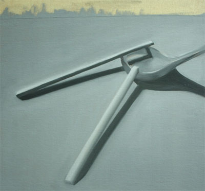
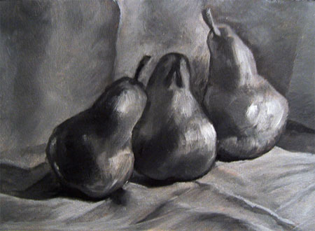
 |
| Student work by Shymiin Core (left), Mila Miles (right). |
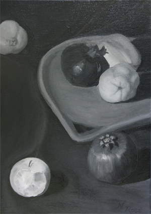
|
| Student work by Natasha Rose. Click on any of the images above to see larger images. |