Moving
Forward with the Mercury Approach
In
the previous lecture, we looked at the many directions the RSL Communications project
could take. That was the rough stage, now let's look at the fine variations
of a few samples.
 |
 |
|
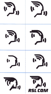
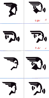
The
thumbnails to the left and right are a few of the trials for
the mercury logo approach. |
Since
the Mercury logo is a face, it requires a lot of attention. The expression
is very important and very subtle. Some of the faces look too old, some
look too young. In a few instances we even arrived at a face that looked
dumb or uninterested.
Look
around at the thumbnails and see if you can register different facial
expressions for each of them. It is interesting how different they can
be! We were looking for a proud, heroic figure to give the company a
strong, reliable appearance.
The
thumbnail with "RSL COM" under it was close, but there was
still something wrong where his ear connects to the "sound waves," and
it was still a little too complicated. It is closest to the next stage
which we presented to the company:
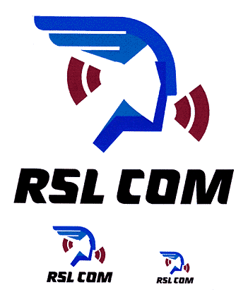
This
was an early "final" stage Mercury for a preliminary meeting
with RSL COM at their headquarters in New York City. Note that a logo
has to be presented in several sizes to prove that it remains legible
from billboard to letterhead.
Although
the logo seems final, there is still a lot of fine-tuning to be done
once a "final" gets client approval. If you compare the logo above
with the corrected and fine-tuned version below, you will see that this
one
is
more stylized,
and has
a cleaner
structure.
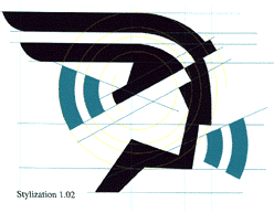
All
the lines are now on a grid to make sure they have equal thickness
and that the negative space is balanced. We were very close to done,
or
so we thought. We'll catch up with RSL Communications one last time at the end
of this lecture. But first, let's talk some more about this idea of
refining your logo to a final version.
You've researched like crazy, designed dozens or even hundreds of
preliminary marks, found the perfect typeface, and narrowed your concept
down to the best of the best. But that's not where the story ends.
In most cases, like RSL COM logo above, the design you've decided on needs
some final tweaking before it's ready for launch. But at this point
in the process, you may have stared at your logo for so long, that
it's hard to see where to tweak or when to stop tweaking.
Try to step
back and look at your logo as objectively as possible—as if you've
never seen it before. Does it look crooked? Oddly spaced? Too drab
in color? When you've identified problems, take time to correct them
carefully, considering:
 |
|
 |
| |
-
Placement of every single letter of type. Is the kerning
or tracking attractive? Are the letters close enough to feel
bound together, but far enough apart to be readable?
-
Alignment of images and type. Is everything properly aligned
to a grid? Or if intentionally misaligned, does it look intentional
and not like a mistake?
-
Color. Have you selected proper colors that will work well
in the intended media—packages, Web sites, trucks—wherever
the logo will go.
-
Line weight. Are your lines of an appropriate weight for
printing at various sizes? Are the weights consistent throughout?
- Legibility. Do tweaks to all of the above affect the legibility
of the image or text?
|
|
 |
|
 |
 The
logo for Alaska's travel industry is an example of one with clearly
intentional misalignment. None of the letters share a common baseline
on a grid, lending a feel of ruggedness that's appropriate for Alaskan
travel. This was likely dealt with extremely carefully in the fine-tuning
stage of its development. If any one of these letters was moved up
or down slightly, the intentional misalignment might look more like
a design oversight.
The
logo for Alaska's travel industry is an example of one with clearly
intentional misalignment. None of the letters share a common baseline
on a grid, lending a feel of ruggedness that's appropriate for Alaskan
travel. This was likely dealt with extremely carefully in the fine-tuning
stage of its development. If any one of these letters was moved up
or down slightly, the intentional misalignment might look more like
a design oversight.
It's also likely that the designers of this logo dealt with the space
between the letters very carefully. Notice how neatly they all fit
together without feeling squashed.
 Television
network HGTV most likely went through a similar process in the development
of their initial logo. They may have also worked with the details of the negative
space "G" to make it as readable as possible without outlining it.
Additionally, they probably had to work very carefully with the line
weights of the "TV" letters because fine lines can often get lost on
television more readily than they do in print.
Television
network HGTV most likely went through a similar process in the development
of their initial logo. They may have also worked with the details of the negative
space "G" to make it as readable as possible without outlining it.
Additionally, they probably had to work very carefully with the line
weights of the "TV" letters because fine lines can often get lost on
television more readily than they do in print.
As you can see, the fine-tuning considerations vary quite a bit based
on the nature of the design as well as the intended usage.
Logo Delivery and Manual
When it's time to deliver the final logo to the client, you'll typically
need to provide a range of files. These depend on the client's
planned uses of the logo, but typically include: vector files (EPS
and/or AI) for scaling to any size, files for print (TIFF and/or JPEG),
files for the web (JPEG and/or GIF), and possibly others.
Additionally, it's wise to present your final logo in a few design
mock-ups so the client can understand how the logo will look in its
intended media. You might Photoshop it to a photo of a delivery truck,
create some simple letterhead, or insert it in a sample web banner.
Finally, every good logo relies on consistency of presentation to
make it memorable with consumers. For this reason, the logo designer
typically supplies the client with a brand manual (also
known as a standards manual, style manual, logo guide, or other similar
name). The brand manual defines how the logo should (and should not) appear in various media. You should collaborate with your client
often in the production of this document so you account for all of
the planned uses of the logo and leave it flexible enough for other
designers to use.
The manual may include diagrams of how much space to place around
a logo, samples of colors that are acceptable to print the logo in,
horizontal vs. vertical usage, where the tagline should sit, typefaces
that should accompany the logo in written documents, and so on. It
can be
a brief
document
with
lots
of flexibility
or hundreds
of pages long with tons of rules, as is often the case for a multi-national
corporation.
 Many
companies keep their brand manuals top secret so competitors don't
learn trade secrets. But some brand manuals are available freely
online for designers to peruse. Open source content management system
company Joomla! provides all of the company's
brand
manual
and logo
information
right
on its website. Check
it out here. It outlines the logo structure, tagline use, color palettes,
and more, and should give you a good idea of what brand manuals typically
contain, though of course they vary with every client and logo design.
Many
companies keep their brand manuals top secret so competitors don't
learn trade secrets. But some brand manuals are available freely
online for designers to peruse. Open source content management system
company Joomla! provides all of the company's
brand
manual
and logo
information
right
on its website. Check
it out here. It outlines the logo structure, tagline use, color palettes,
and more, and should give you a good idea of what brand manuals typically
contain, though of course they vary with every client and logo design.
Student Steven Graw considered some brand manual rules and fine-tuning needs when he completed a logo for fictitious company Fisher Investments. Explore his thought process and final design in this Quick Crit.
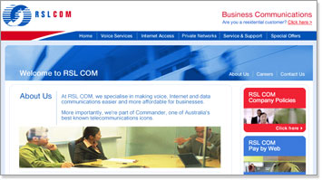
Now let's take another look at the RSL Communications project. Just imagine that
you've finalized your logo, worked on your brand manual, and now...
A
Sharp Turn in the Project
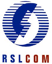
We
received notice from the highest level in RSL Communications that the company
had decided to go for a more traditional look (similar to the AT&T
logo). It was decided that an old circle logo with two receivers
we
had developed early on was the one the client wanted—we had to discard
the Mercury approach entirely.
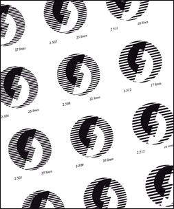 |
The development stage and the
line study of the "Circle" logo. |
Now
we had to develop and fine-tune a whole new logo. We found that we had
to create several variations to correspond to different sizes, because
lines cut across the image, and larger logos can handle more lines without
getting smudgy. So a small logo had to be slightly different from a
big one.
After
a lot of tweaking, we arrived at the perfect combination of lines and
colors and the client was very happy with the result. A brand manual,
letterheads, business
cards, and other stationery was produced.
I
would have rather developed the Mercury logo—this one was a little
too traditional for me—but I was pleased with the final result.
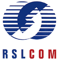
We
were ready to pack it in, cash our checks, and go home. It had been
a long, long process to arrive at what you see below. Of course, this
logo design project was for a huge company, and we had a team of designers
to work with. Many jobs need not be so complex or so long, and many
are not. But you should never be careless. They don't call it corporate
identity for nothing; it is, after all, the very identity of the company.
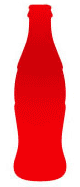
 When
Coke acquired its logo before the turn of the century, there was no
competition.
Since then, the success of its refreshing beverage has created a strong
brand that makes the logo instantly recognizable almost anywhere.
When
Coke acquired its logo before the turn of the century, there was no
competition.
Since then, the success of its refreshing beverage has created a strong
brand that makes the logo instantly recognizable almost anywhere.