Stacked Bars or Lines
Normally bars and lines are positioned with their baselines positioned at zero. Measuring all your bars or lines from the same baseline helps you compare them.
However, when you have several categories that are parts of a larger whole, then stacking them on top of each other lets you see the contributions of each category to the whole.
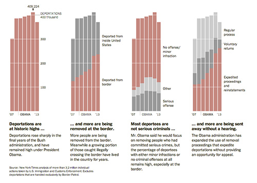
For example, in the following graph from the New York Times, the columns show total deportations. Stacked columns show the different types of deportations. The second graph shows gray columns, representing
deportations from inside the U.S., stacked on top of the tan columns, which show deportations from the border.
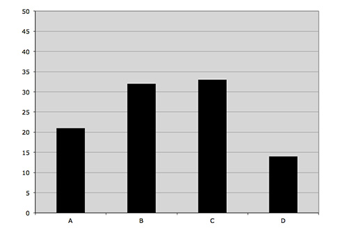
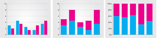
Another type of stacked bar is the stacked percentage chart, which shows the columns as percentages of 100%, highlighting their proportionality to the whole rather than their actual numbers. The three kinds of bar or column charts are shown below.
You can do the same kind of stacking to better show proportions with line charts as well. When you stack lines on top of each other, color the area below each of the lines.
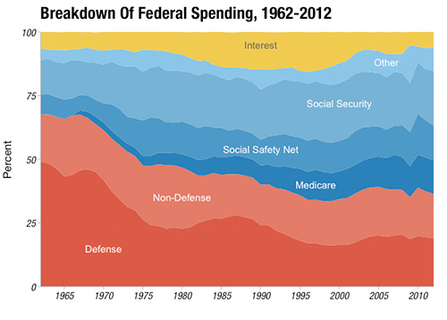
The following stacked line graph (also called a stacked area graph) shows the different sectors where the federal government spends its money.
Since the data is showing spending over time, a line graph is a good choice. And since it's important to see how spending priorities have changed (note how the proportion of defense spending has decreased while Medicare and Social Security have increased), then stacking the lines helps see those changing proportions.
Pie Charts
Though many information designers condemn pie charts because of their low accuracy with readers, they remain very popular because of readers' familiarity with them.
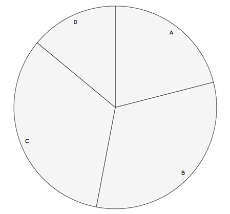
Pie charts show different parts to the whole, and each part is represented by a different slice of a circle.
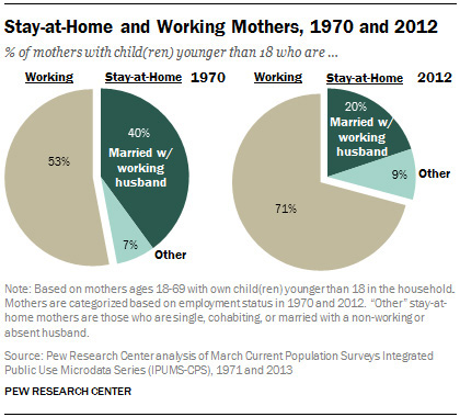
The following pie chart from the Pew Research Center shows the proportion of working mothers and stay-at-home mothers, and how those proportions have changed from 1970 to 2012.
Visit the Eager Eyes post on "Understanding Pie Charts" for further discussion about the merits and pitfalls of using pie charts.
Anatomy of the Chart
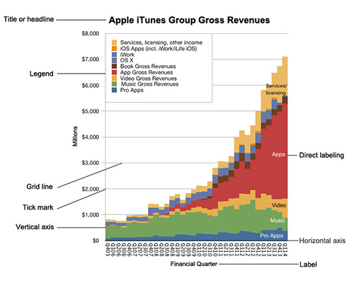
Each kind of chart encodes the information with a different visual property, but every kind of chart has a set of common features. Let's look at the anatomy of a typical chart.
|
Chart adapted from www.asymco.com
|
Charts are usually put on a set of axes. The horizontal line is the x-axis and the vertical line is the y-axis. Tick marks show the spacings between units on the axes.
Sometimes horizontal and vertical lines extend from the tick marks into the graph area—we call those grid lines. Both axes should be labeled and the tick marks should be labeled.
The whole graphic should have a title or headline. If there are color or symbol encodings, a legend or direct labels should explain to the reader what those encodings mean.

Now that you know the anatomy of a chart, the different kinds of charts, and the basic concepts of visual encoding, it's time to actually make a chart. Follow along!
There are many different software programs that can generate charts from data, but you'll use Adobe Illustrator, which provides more opportunity for a designer to customize the chart and integrate them into larger infographics.
Choosing the Graph Type
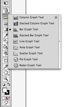
The Tools panel in Adobe Illustrator contains the Graph tool, which allows you to quickly generate various kinds of graphs.
Click and hold the small triangle at the lower-right corner of the Graph tool icon to reveal the graph tool options.
Decide which graph would best serve your data and select that graph type. In this example, choose the Column Graph tool (the first option).
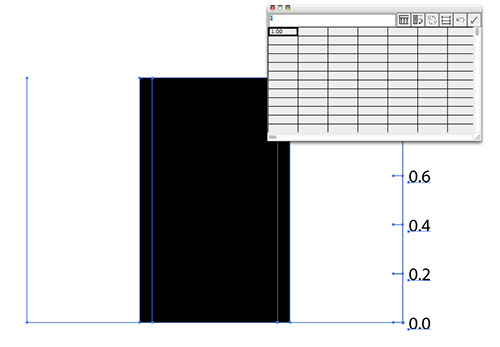
Now define the size of your graph. You can either click and drag a rectangular area on your artboard, or you can simply click and enter a width and height dimensions in the dialog box that appears.
Illustrator automatically creates a graph with a single data point as its default value. A window appears that looks like a spreadsheet, where you enter your data points. The only data point is 1.0, in the top left corner of the spreadsheet.
|
| Adobe Illustrator's graph generator
|
At this point, you can enter data in each cell of the spreadsheet, but it's much easier and more accurate to copy and paste the data from a spreadsheet program like Microsoft Excel.
Adding Data
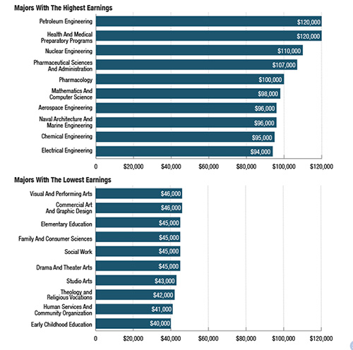
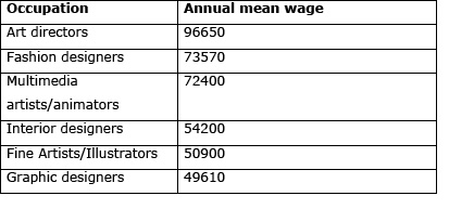
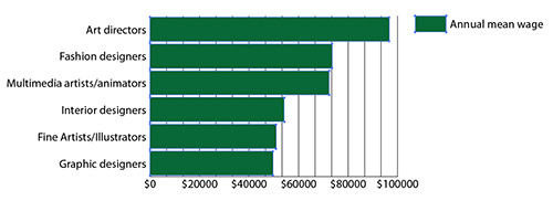
We'll provide the data for this example. The data is from the Bureau of Labor Statistics for the average annual salaries of select designers.
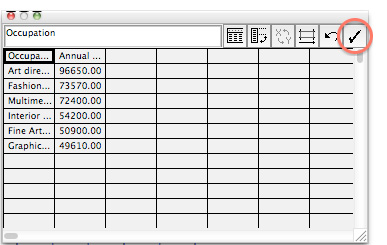
Copy the two columns and seven rows of data, and in Illustrator, paste it in the top left corner of the spreadsheet window. When you're done, click the checkmark icon to apply.
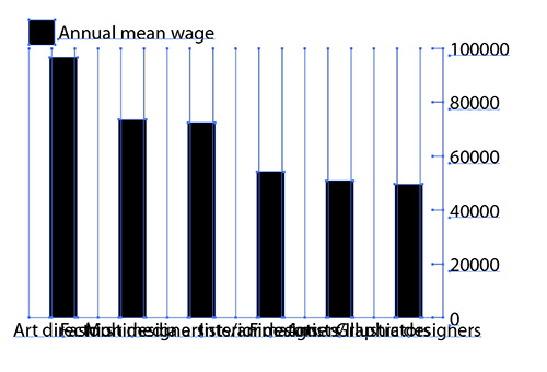
Close the spreadsheet window to see the resulting graph.
|
It's not pretty, but it's a good start.
|
Obviously, we have to do some more editing to get the text legible, but we've got a graph! Illustrator plots all the values for each occupation as columns. The vertical and horizontal axis labels are positioned automatically.
Editing the Graph Type
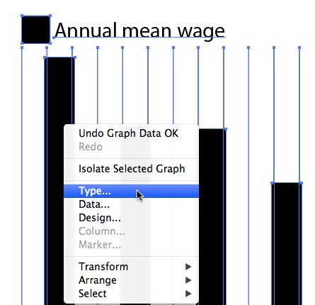
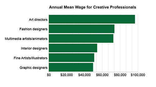
Now, let's do some clean up. The names of the professions collide with each other, which make them impossible to read. Perhaps a bar graph, where the rectangles run from left to right, would work better than a column graph.
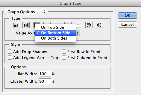
You can change the graph type at any time. Right-click (Windows) or Control-click (Mac) your graph and choose Type.
In the Graph Type dialog box that appears, choose the Column Graph type and click OK.
|
Select a horizontal bar graph.
|
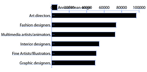
Illustrator changes your column graph into a bar graph. The names of the professions now run horizontally and are easier to read, though we'll still need to do some editing for the top of the graph.
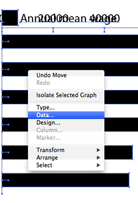
If, at any point in time, you need to edit the data itself, you can Right-click/Control-click your graph and choose Data.
The spreadsheet window will appear again, and you can copy and paste new data or edit the existing data.
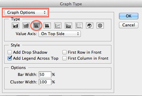
Graph Options
Now let's explore some of the graph options. Right-click/Control-click your graph and choose Type again.
The Graph Type dialog box appears, which gives you options for the placement of the legend, the width and spacing of the bars, the position of the axes, the appearance of the tick marks and grid lines, and other preferences.
If it's not already selected, choose On Bottom Side from the Value Axis dropdown menu. Deselect the Add Legend Across Top option, and enter 100% or Bar Width and 90% for Cluster Width. (Illustrator keeps the same settings from the most recent graph that was created, so your initial settings may be different).
Click OK. Your graph changes, reflecting your settings in the Graph Type dialog box.
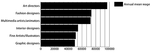
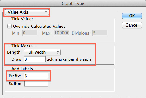
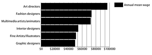
Now things are looking legible! There are a few more adjustments you can make. Right-click/Control-click your graph and choose Type again. Change the top pulldown menu to Value Axis. Choose Full Width for the Length of the Tick Marks, enter 3 to draw more subdivisions, and enter a dollar sign ($) in the Prefix field. Click OK.
The graph now adds a dollar sign before each of the labels on the horizontal axis, so it's clear that the graph is about money. The tick marks extend the full width of the graph.
Customization
The final graph is a group, which Illustrator treats as a single object. To make any modifications, you can use the Direct Selection tool.
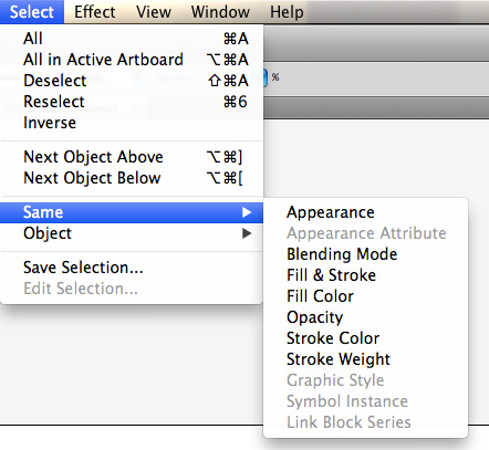
Click an element of your graph to select it. You can use the menu option, Select > Same to choose other elements that share similar properties.
For example, choose one of the black bars. Now choose Select > Same > Fill Color. All the black bars, including the one in the legend, become selected. You can also Alt-Click (Windows) or Option-click (Mac) the same element multiple times to select similar elements.
Select all the black rectangles, and change the fill color to an attractive green color as a reference to the money theme of the graph.
Continue making customizations to polish your graph. Select the grid lines and choose a light gray for the stroke color. Add a comma to each of the labels on the horizontal axis to separate the thousands, and change the font family and size, if you wish.
If you want to delete a graph element, you have to ungroup the group, which you can do by pressing Shift-Ctrl-G (Windows) or Shift+Command+G (Mac). Unfortunately, once you ungroup the graph group, you can no longer make global edits to the data or change graph style options. You've been warned!
The final graph example has been ungrouped, the legend has been deleted, and a title added. Congratulations, you've made your first graph!
Read more about how to generate and customize charts in Illustrator from FlowingData and consult Adobe's documentation on the Graph Tool.
Making charts and graphs in Illustrator is a straightforward and fairly simple process. But making effective charts is a whole different story.
Edward Tufte, in his landmark book, The Visual Display of Quantitative Information, lays out essential principles of graphical integrity that are the foundation for modern information design. Let's examine his most important ideas, starting with "data-ink ratio."
Data-Ink Ratio
Tufte's defines his concept of "data-ink ratio" as the proportion of marks that are used to present actual data compared to the marks used to show the entire graph.
Tufte urges designers to maximize the data-ink ratio so that, essentially, we see more data and less interface or framing elements, such as grid lines, redundant labels, and extraneous borders. Tufte's data-ink ratio is about data density and striving for clean, minimalist graphics.
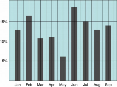
This graph has a low data-ink ratio because much of the ink is used in the grid lines and as the background color.
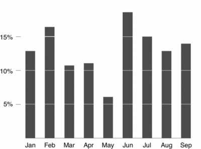
This graph of the same data has been edited to demonstrate a high data-ink ratio. The ink that we see is used mostly for the data elements.
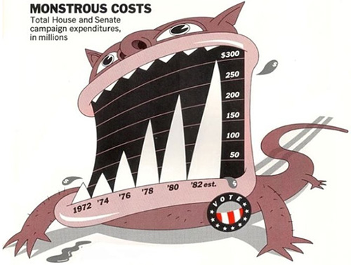
Chart Junk
A concept related to the data-ink ratio is chart junk, which refers to any extra decoration on a chart. Tufte is an ardent critic of any kind of decoration because it doesn't contribute to the communication of the data. Chart junk is basically extra ink.
Chart junk includes any frivolous elements like illustrations, ornamental fonts, or fancy framing. Chart junk also includes deliberate distortions to the graphic for the purposes of decoration or style. For example, the bars of a chart that are made to appear 3D may look cool, but they make it difficult to compare lengths.
The following chart is a classic example of chart junk. The monster gobbling the chart is rendered with its teeth as the data columns. Although a memorable illustration, as a data visualization, it emphasizes style over data, and the distortions counter the point of using lengths to compare information.
|
An example of chart junk.
|
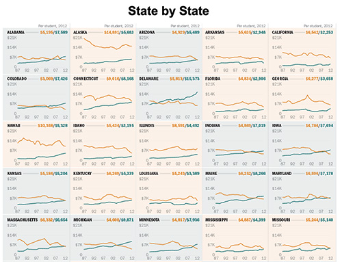
Small Multiples
Tufte champions the idea of small multiples, which are small, similar graphs placed in a series. This visualization, from the Chronicle of Higher Education, is an example of how small multiples make it easy to compare spending on higher education by the state (gold) or by the student (blue).
By putting each state side by side, readers can quickly spot the differences and variations between graphs.
|
An example of small multiples from the Chronicle of Higher Education.
|
Humans are attuned to visual differences and to any violations in a pattern. It's how our brains are wired, and it allowed our ancestors to survive in the wild. Using small multiples takes advantage of that natural way of seeing.
Successful Data Visualization Principles
Edward Tufte summarized his ideas on effective data visualization in the following list of principles:
 |
|
 |
| |
- Have a properly chosen format and design
- Use words, numbers and drawing together
- Reflect a balance, a proportion, a sense of relevant scale
- Display an accessible complexity of detail
- Often have a narrative quality, a story to tell about the data
- Draw in a professional manner, taking care with the technical details of production
- Avoid content-free decoration, including chart junk
|
|
 |
|
 |
These are wise words that should guide your thinking and practice of data visualization.
In the next exercise, you'll have a chance to give form to these ideas and explore the different ways charts and graphs can communicate data.