Art Direction
In this exercise, you'll continue your work on Vacation magazine. As a matter of fact, you've been doing such a good job that you've been promoted to art director of the whole project. Congratulations! Your bosses at Vacation were really impressed with your design for the "Trending!" section of the magazine, and they specially liked the fact that you did a lot of research to make sure you got it right. They know that this next task will take someone that's willing to put in the time to research and can really understand the popular trends out there.
As such, you will be in charge of designing the cover of the magazine. More specifically, for this exercise you will design a cover for the iPad version of the magazine. If you want to learn more about the life of an art director, click here to read about my experience as an art director.
Go ahead and download the Exercise 5 files. You'll find my example of a cover document, and you'll find the images and cover text you've been assigned to use.
Important: Unlike other exercises, the design must include only the provided images, so your task will involve figuring out how to put your unique spin on incorporating them.
Let's recap what this exercise asks you to do:

|
|
 |
| |
- Research trends in cover designs for this type of publication.
- Design a cover for the iPad edition of Vacation magazine, using the provided images and text (found in the download files).
- Leverage the power of master pages for an optimized workflow.
- Incorporate paragraph rules in your design.
|
|
 |
|
 |
Before you dive in, keep the following points from the client in mind:
Keeping these important points in the back of your mind will help you immensely. Now for the basic specs: iPad Retina resolution 1536 x 2048 pixels size, portrait orientation, RGB color.
Designing the Cover
Although we can't go into the many details and intricacies of designing a magazine cover, it's important to note that countless hours go into the design and production of a well-executed magazine cover. Fortunately for you, I'll mainly get into the technical aspects of this task and leave the creative to you.
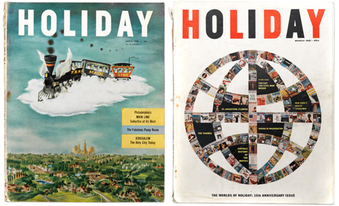 |
Look to classic magazine covers for inspiration. To read a fascinating history of Holiday, a classic mid-century travel and culture magazine, click here. (Image credit: Vanity Fair) |
Begin by creating a new document. Because the commercial and marketing teams have decided that the iPad version of the magazine needs to come out first, you will use the Mobile intent in the New Document dialog. In print, usually the cover is constructed in a single InDesign document and later added to the package sometime before it goes out to the printers. We will follow the same strategy of creating a single document for the iPad version of the cover.
Create a new document and select the Mobile intent. Now you may choose the iPad Retina from the Page Size presets. Here's a look at what your New Document dialog settings should look like:
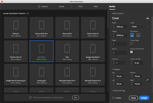
Given the fact that we're designing for digital distribution, we need not worry about bleeds. No primary text frame or facing pages will be necessary. Also, note that I'm choosing 112 pixels (px) for the margins. This value comes straight out of Apple's own documentation for the Human Interface Guidelines in iOS. It so happens that the height of the Tab bars and menus in iPads with retina displays is 112 pixels, and so we're dialing it in to make sure that the iOS menu does not interrupt any important content on the cover.
Begin by laying down the basic shapes for the titles, graphics, images, and text frames. You may choose to use rectangle frames for images and regular rectangles for both the text and the magazine logo. I'm partial to the look that you can achieve by using a full-bleed background image, so that's what we're going for in this design.
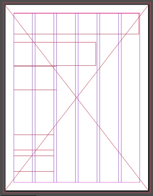 |
Here is an example of a six-column style layout you can use to design your cover. |
Of course you can only go so far with just empty frames. Use the files in the Links folder to place images and text. Take note of the fact that the magazine logo or title will be actual text that you will style later.
Here are the specifications for what you'll need for the cover:
|
|
|
| |
- Define a master page with the basic elements of the cover. This master must be flexible enough for you to use in every cover issue redesign.
- Use paragraph and character styles to clearly establish text formatting.
- Create object styles when appropriate to define the look of graphics and other types of frames.
|
|
|
|
|
And here are a few tips for your process:
|
|
|
| |
- Be consistent. Consistent design from one edition to another will give an identity to your publication. Research the big name magazines: GQ, Vogue, Sports Illustrated and Wired, just to name a few. What do they all have in common? Branding. Establish common elements that will remain constant in all issues of the magazine.
- It's all about planning. Without a doubt, the cover is the most important part of the publication. It is the face on the model. It's what determines whether the reader will buy the product or put it back on the shelf. Therefore, you have to put a lot of effort and you have to plan ahead. What is the goal and how do I achieve it? What fonts should I use? How can I set the right mood with color? These are all questions that you should ask yourself ahead of time.
- Get inspired! Research is the name of the game. Find out what the competition is doing. What do you like? What would you improve? Get inspired by what you see and do your own thing.
- Practice your technical skills. No matter how good the design may be, execution is about knowing how to use the tools at your disposal.
|
|
|
|
|
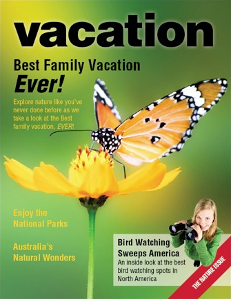
Be creative and don't be afraid to mess things up; you can always undo any mistakes you make. Here's what my final design looks like:
Don’t forget to perform your Spell Check by using the keyboard controls Ctrl+I for PC or Command+I for Mac.