Exercise Goals
If you stop and think about this exercise for a moment, you will realize that you already have everything you need to accomplish this task successfully. In Lecture 3, you learned how to automate design and formatting tasks by creating and using styles. And finally, you were able to learn and practice the techniques necessary to master InDesign tables.
That said, a catalog is a great project to showcase all those techniques because it offers you a chance to design a multifaceted layout with many different elements, including "comparison shopping" information that needs to be organized clearly, efficiently, and attractively.
 |
A good trade show catalog is a great opportunity for a designer to show off their skills, as you can see in this well-organized and color coordinated mock-up from Neuconcept. |
Now that you've created and perfected a brochure, a slightly larger and more complex catalog is a logical next step in the evolution of your InDesign skills.
Client Specifications
Vacation magazine wants you to design a catalog to promote the exclusive vacation packages available to magazine subscribers. The marketing team has determined that this catalog will be used at trade shows, mainly in North American and European venues. PDF copies will also be needed to send as part of email campaigns.
The publisher wants an eye-catching design that will communicate the main theme of "dream vacation." A successful design will convey this theme through the appropriate use of color, typography, and overall composition. The final design should feel fresh and professional.
Here are the specs:
 |
|
 |
| |
- Size: 8.5 x 11 inches
- Number of pages: 4
- Color: 4/4 (which means full color on both sides of every page)
|
|
 |
|
 |
Now that you have the full scope of the project, let's get started. First download the Exercise Three files to obtain the needed graphics and text copy. You may also use your own images if you'd like, and you can also add placeholder text if needed. The goal is to have the best design possible, so don't limit yourself to only the provided files.
What's Included
What exactly do your provided files consist of? Here's a rundown:
|
|
|
| |
- Catalog text: The catalog_text Word DOC includes the tagline for the catalog, the intro text that should precede the catalog entries themselves, text for each city, and price data for inclusion in a table.
The first part of the tagline—"Your Dream Vacation..."—should appear on your cover, and the conclusion—"... is within your reach"—should appear on the first page.
Note that most of the other text (besides the table data) is lorem ipsum (placeholder text), and can be modified as needed for your design. However, try to stick to roughly the same amount of text as provided for each section, as these are the word limit constraints the catalog writers will be working with.
- Images: Along with the catalog DOC, I've included five images of the five destinations (Brazil, Mexico, New York City, France, and Rome), along with a background image and a cover image of balloons.
Feel free to replace these images with your own, but again: make sure you have a unique image for each city, and pay attention to the dimensions of the provided images (especially the cover balloons and background images) to choose images that fit the specs of the catalog.
|
|
|
|
|
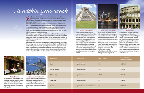
How I Did It
Here is one example of how to turn the copy provided into an attractive catalog interior:
The above layout is meant to demonstrate a possible solution to this design challenge. Therefore, my design's aesthetic decisions need not be emulated. In fact, I'm confident that your original design will be way better than mine!
Planning and Building Your Catalog
Before construction of your catalog begins, keep in mind that you must be able to establish a clear hierarchy in your text so that different levels of importance are easily seen by the way the text is formatted. When setting up styles, establish clear visual differences between the main title and a subtitle, the subtitle and a body paragraph, and so on.
Consider the two proto-"layouts" below. Even with no real "content," we can immediately see that the layout on the right is more organized and less overwhelming than the layout on the left. This is because it has clear visual hierarchy.
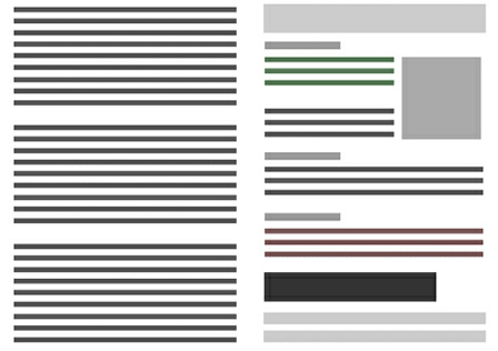 |
Creating good visual hierarchy is about creating distinctions between different elements to guide your readers' eyes and help them figure out what content is most important and how different content relates. (Image credit: www.uberflip.com) |
Along with good visual hierarchy, I'm going to be looking for a demonstration of your ability to use the following techniques from Lecture Three in your final designs:
|
|
|
| |
- Using well-formatted tables to organize data. You can convert text to tables, which is usually the more efficient route, or create a table from scratch. Format headers and cells with layout choices that help the reader process the information the table contains. Table formatting and layout is an art in and of itself, so don't rush this step.
- Using cell and table styles to demonstrate your ability to automate formatting tasks.
- Using paragraph and object styles to streamline your design workflow.
|
|
|
|
|
More on Paragraph Styles
As you read the instructions to this exercise, you begin to notice a pattern. Everything seems to point to one major predominant theme, the use of InDesign Styles. There's no way around it, the most important InDesign feature you can ever learn is being able to define a style, particularly a paragraph style. This is why creating and applying paragraph styles is the most important requirement for this exercise. That said, here are a few extra pointers to help you along.
Be aware of "foreign" styles. When you import a Word file, you're not only bringing in the text but also all of the Word styles that have been applied to the said text. Luckily, InDesign is smart enough to know when it has been invaded by these Word styles and show a disk icon next to the style name, in the paragraph styles panel. That is why sometimes you will see names like; Normal, Heading 1 and others even though you haven't created any paragraph styles.
That said, the best thing to do is catch these BEFORE you begin formatting your text. Another important point to remember is when to use paragraph styles and when to use character styles. Truth be told, you will be using paragraph styles 90% of the time. So a good rule of thumb is to use paragraph styles in most cases and only use character styles if you need to format a single word or character within a paragraph. (Feel free to review Lecture 3 if you need a refresher.)
That being said, I have created an InDesign document that uses styles efficiently (TextStyles.indd). Please feel free to download it and have a look at how both character and paragraph styles have been applied to the text.
Finally, here's a great tutorial on paragraph and character styles from the help section of adobe.com that can help complement and reinforce what you’ve already learned.
Saving and Showing Your Work
Perform a Spell Check in your document by using keyboard controls Ctrl+I for PC or Command+I for Mac. Because the client has decided to use this design for multiple distribution channels, you will need to submit the following files:
|
|
|
| |
- A high-resolution, print-ready PDF file.
- A low-resolution PDF file suitable for web distribution.
- The original InDesign document. No fonts or linked images will be required.
|
|
|
|
|
Refer back to Exercise 2 for instructions on creating the two different PDFs.