How They're Built
As a Web user, you are undoubtedly very familiar with the online form. Online forms are comprised of various fields, check boxes, and buttons used to collect data from the user and then do something with that data.
What is done with the data varies from form to form. In a search form, for example, a user input can be used to query a database. In a product order form, the data received can be added to a database or emailed to someone who will process the order.
 |
Forms typically include fields, menus, and buttons
for user input. |
How do forms work? Once a user fills out a form and presses the "Submit" button, the data is sent to a server-side script (usually written in CGI or PHP) which processes the data. When creating the HTML document that houses the "front-end" portion of the form, a designer will typically create just the form elements—the various text fields, dropdown menus, and other elements that collect the data. Unless you have programming skills, it's unlikely you'll be asked to write any "back-end" code, though you may be asked to "point" the form to a script that will process the data once it is submitted.
Next in this lecture, you'll learn how to create the front-end of a form using HTML. Creating the server-side script to process the form is beyond the scope of this course, but you'll be pointed to a few resources that can help you out with these back-end processes.
The Form Tag
To create a form, start off by including the <form> tag
in your document. It indicates where a form begins and ends, but doesn't
cause any visual change on the page.
Everything that is
enclosed in this tag is part of the same form, like form fields and
buttons which we'll talk about shortly. Note that
you can have more than one form on a single Web page, but you cannot nest forms
(that is, you cannot enclose one form inside of another).
Let's take a closer look at this tag:
<form method="post" action="script.php">
[form content]
</form>
There are two important attributes here: method and action.
Method and Action
The method attribute tells the browser how the information in the form is sent to the server. It takes one of two values:
The Get Method
With the get method, the information is appended at the
end of the URL address. This method is used when the form submission
does not cause any "side effects" (or, the information is
not kept or stored anywhere). That is, if the information is not added
to a database or emailed to anyone (for example, as in a database search),
then use the get method. An example of this is a search
form. The information is used to perform the search, but not saved
for later use by the site.
The Post Method
With the post method, the information is sent in the body
of the request. This method is used when you want to cause certain "side effects," as in you want to add this information to a database or email it. Most forms
use the post method.
The action attribute specifies the location of the back-end script that
processes the form. For example, in the following code snippet, the
PHP script (which
processes the form information) must be in the same folder as the Web
page currently being viewed:
<form method="post" action="script.php">
Form Elements
After the opening form tag, you can start adding various form elements,
like fields and buttons. Most form elements use the <input> tag.
Let's look at an example of an input tag to get an idea of its structure:
<input name="name" type="text" />
This input creates a text field. We'll cover how this and
other elements work shortly.
You'll need to include at least two attributes
with the input tag: name and type.
The Name Attribute
The server-side script that processes the form identifies each form element by its name. So, if you hope to extract any data from the form, you'll need to include a unique name for every form element.
The Type Attribute
This attribute determines the kind of form element. The default form element is the text field (and if you don't include this attribute, the browser will display a text field). We'll go into the various form element types in a moment.
Making Forms Accessible
In order to help users who have non-standard browsers, you should also use the <label> tag with your form elements. Here is an example of its usage:
<label for="name">Name</label>
<input name="name" id="name" type="text" />
Visually, the above code looks like this in the browser:
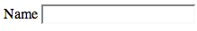
When you add a label with the "for" attribute
(where the value of the attribute matches the ID value of a form element),
it will associate that label with the matching form element. This makes
it easier for users with screen readers to know what label goes with
what form element. Also, in standard browsers, when you click on the
label name, the cursor will automatically be taken to the matching
form element. So, adding the label tag and ID attribute greatly improves
the overall usability of forms.
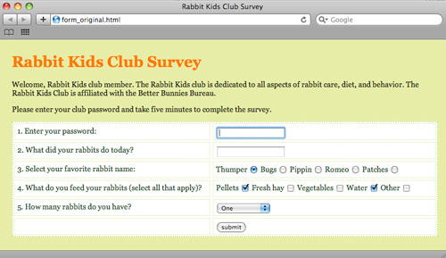
Creating a Form
OK, let's create a form together, and learn how to implement
the various form elements. Download your lesson6
folder to
get started, and open the form_original.html file in the forms folder.
In it, you will find a survey. Wrap
the survey in form tags <form
method="post" action="script.php"></form>. Use CSS to manage your layout. Styles can be applied to your form and label tags as well as any containers, such as divs, that hold the form components.
The Text Field
The text field is the most often-used form element. Browsers display it as a small box where a user can type in text. We've already looked at the code for a text field (in the examples above):
<label for="name">Name</label>
<input name="name" id="name" type="text" />
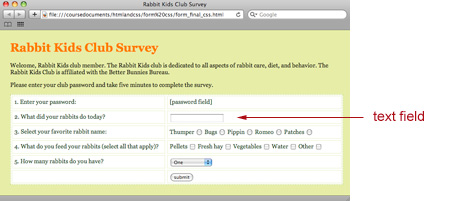
Create a text box for the question "What did your rabbits do
today?" (replacing the placeholder text currently in the page
that reads "[text field]"). If you label the question "activities",
your code should look like this:
<div class="row">
<span class="question">
<label for="activities">
2. What did your rabbits do today?
</label>
</span>
<span class="form_field">
<input name="activities" id="activities" type="text" />
</span>
</div>
Notice that label goes in the first column, and the input tags go in the second column. Here is a screenshot showing how that code renders in the browser:
The Password Field
The password field is a lot like the
text field; it is a small box that users can type in text. The text,
however, is hidden by special characters (usually by asterisks or bullets),
thus shielding sensitive information from prying eyes.
Create a password field for the prompt "Enter your password:"
<div class="row">
<span class="question">
<label for="password">
1. Enter your password:
</label>
</span>
<span class="form_field">
<input type="password" name="password" id="password" />
</span>
</div>
 |
Notice that when you type in this field, the characters
are hidden. |
Radio Buttons
Radio buttons are small, round buttons
that are grouped together, letting the user select one button from
several options. Create radio buttons for the prompt "Select your
favorite rabbit name:"
<div class="row">
<span class="question">
<label for="name">
3. Select your favorite rabbit name:
</label>
</span>
<span class="form_field">
<label for="thumper">Thumper</label>
<input type="radio" name="name" id="thumper" value="thumper" />
<label for="bugs">Bugs</label>
<input type="radio" name="name" id="bugs" value="bugs" />
<label for="pippin">Pippin</label>
<input type="radio" name="name" id="pippin" value="pippin" />
<label for="romeo">Romeo</label>
<input type="radio" name="name" id="romeo" value="romeo" />
<label for="patches">Patches</label>
<input type="radio" name="name" id="patches" value="patches" />
</span>
</div>
Note that the name for the radio buttons must be the same for the entire option group. As the user can only select one option among the group, there is only one value that is passed to the processing script (and thus, only one name is associated with it).
The ID for each button, however, must be different (as there
can't be more than one ID value per Web page). And note the value attribute
in these radio button tags: They hold the value that will
be sent to the server if that button is selected. (Note: You can also
use the value attribute in any form element—it will assign a
default value for the element.)

Check Boxes
Check boxes, unlike radio buttons, are
not placed in groups. So, you can make a list of checkboxes, and a
user can select as many of these boxes as she'd like. (With radio buttons,
however, the user can only select one button
out of the group.)
Create check boxes for the prompt "What do you feed your
rabbits (select all that apply)?" The set-up is the same as for
radio buttons, except that checkbox is the input type:
<div class="row">
<span class="question">
<label for="feed">
4. What do you feed your rabbits (select all that apply)?
</label>
</span>
<span class="form_field">
<label for="pellets">Pellets</label>
<input type="checkbox" name="feed" id="pellets"
value="pellets" />
  ...

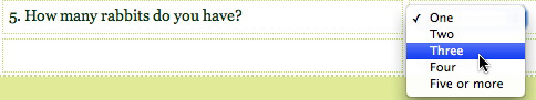
Drop-Down List
You can create a drop-down list where the user can select one of several options using the <select> tag. Enclose the various options in the <option> tag, assigning a value attribute for every option.
Create a drop-down menu for the prompt: "How many rabbits do you have?"
<div class="row">
<span class="question">
<label for="number">
5. How many rabbits do you have?
</label>
</span>
<span class="form_field">
<select name="number" id="number">
<option value="one">One</option>
<option value="two">Two</option>
<option value="three">Three</option>
<option value="four">Four</option>
<option value="five or more">Five or more</option>
</select>
</span>
</div>
Submit Button
Every form on the Internet needs a Submit button. When a user clicks the Submit button, the form will be sent to the server. Place this in the second column of your form.
<input type="submit" name="Submit" value="submit" />
Take a look at the final results for
the Rabbit Club page.
As you can see, forms can be created using a variety of tags and attributes to collect user information. Let's review these in the following video tutorial, where you'll see the front end of a form created from start to finish:
Where to Go From Here
As I mentioned earlier, the front-end of your form is useless without
a server-side script to process it. So, once you have created all of
your text fields, check boxes, and buttons to gather all of the necessary
data, how do you create a script to do something with the
data?
On a professional project, you'd likely work with a programmer. For smaller budget needs, though, there are plenty of Web sites that provide free tools and form-processing scripts that you can easily use and customize for your site. Even with little or no PHP or CGI scripting knowledge, you can take advantage of these online resources and have your form up and running in no time. Check out a site like Hot Scripts (http://www.hotscripts.com) to get started.
Like HTML, CSS is also evolving with new and different specifications. What we have learned so far are the properties and selectors that make up the CSS 2.1 specification. But just like HTML5, there are new additions in the CSS3 specification that reflect the robust kind of Web we interact with every day.
CSS3 builds on what you already know about CSS to add exciting new ways to style Web pages. We can now round corners, add gradients, and apply sexy drop shadows with ease. All of these fancy elements previously required clever use and manipulation of cumbersome image files in the past. Internet Explorer 9 promises to support many of these new CSS properties. So, while cross-browser support for most of these properties is limited, it is right around the corner. I'll explain specific support for each of the properties as we introduce them below.
Let's explore a few these new CSS3 properties through styling of a small contact form.
Rounding Corners
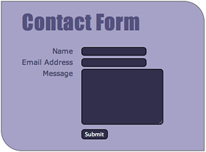
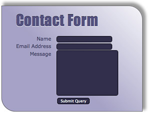
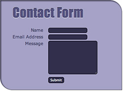
Let's begin with the basic form contact-form.html, found in the lesson6/forms folder. This is an HTML5 document with a few simple form fields and some basic CSS. All features that you are already familiar with. It looks like this:
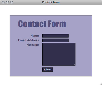 |
A simple form with simple styles. Soon to get some CSS3 treatment... |
Let's start by adding rounded corners to the form fields. To do this, we are going to use the border-radius property:
input, textarea {
    background-color: #322e4a;
    color: #fff;
    border: 1px solid #000;
    border-radius: 6px;
}
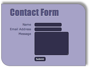
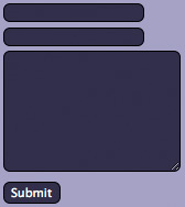 What this property does, in this instance, is add a rounded border with a six pixel radius to all four corners of the input and textarea elements.
Our form elements now sport subtly rounded corners. You can make the roundedness more or less pronounced by increasing or decreasing the radii of the border corners.
Note that this is a fairly simple use of the use of the border-radius property. Let's explore the property's versatility.
You can define all four corners of your element at once by using border-radius, or you can style individual corners by specifying border-top-right-radius, border-bottom-right-radius, and so on. Let's play with the div that our contact form lives in to demonstrate:
#main {
    background-color: #4e4874;
    color: #fff;
    border: 1px solid #555;
    padding: 20px 40px;
    margin-top: 50px;
    border-top-right-radius: 40px;
    border-bottom-left-radius: 40px;
}
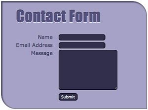
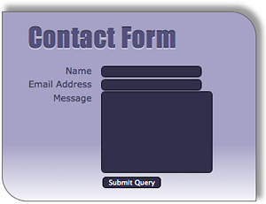
This adds a rounded corner to the top right and bottom left corners of the element only:
We can also define the horizontal vertical radii of the corners separately as well, making our corners more elliptical rather than perfectly round:
#main {
    ...
    border-top-right-radius: 50px 25px;
    border-bottom-left-radius: 50px 25px;
}
 Here the horizontal radius is 50 pixels, while the vertical radius is 25 pixels, making the corners appear more flattened.
The versatility of this property promises a wide range of possible effects, though note that only Safari 5+, Opera 10.5+, Chrome 5+, and Internet Explorer 9 currently support the border-radius property. To use it in Firefox, you'll need to add the moz-border-radius property like so:
#main {
    ...
    border-top-right-radius: 50px 25px;
    border-bottom-left-radius: 50px 25px;
    -moz-border-radius-topright: 50px 25px
    -moz-border-radius-bottomleft: 50px 25px
}
If you're really into it, you can learn more about this syntax for Firefox here. Thankfully, future versions of Firefox promise transition to border-radius.
Text Shadows for Bevel Effect
Next, we're going to explore the text-shadow property to create a three-dimensional effect on our header. The text-shadow property can be used to create a variety of text effects: Not only can it create the standard drop-shadow behind text, it can also create embossed, letterpress-style, and even glowing text.
Let's start with a look at the syntax applied to a class called shadow:
.shadow { text-shadow: 2px 3px 5px #333; }
The first two values define the shadow offset: This shadow appears two pixels to the right and three pixels down from the text. The third value defines the shadow blur radius. The bigger the shadow blur radius, the more diffuse the shadow appears. The final value determines the color of the shadow.
The above values would yield the following:

Let's apply the text-shadow property to create an interesting inset effect on our contact page header:
h1 {
    font-family: Impact, sans-serif;
    font-size: 41px;
    font-weight: normal;
    letter-spacing: 1px;
    margin: 10px 0 30px 0;
    color: #554f7e;
    text-shadow: 0px 1px #fff, 0 -1px 0 #000;
}
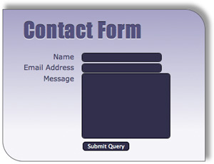
With one new line of CSS, we've placed two shadows, a light and a dark, to create the effect. The first shadow (light) is placed slightly below the text. The second shadow (dark) is placed slightly above the text (note the negative offset value). This creates a subtly three-dimensional header for our form:

Safari 4+, Firefox 3.5+, Chrome 2+, and Opera 9.5+ boast full support for text-shadow. There are no plans to include text-shadow in Internet Explorer 9, as they have their own proprietary filter for creating text shadows (see this page if you want the gruesome details).
Subtle Drop Shadows
Let's now add a drop shadow to our form using the box-shadow property:
#main {
    background-color: #a6a1c5;
    color: #403b5f;
    border: 1px solid #555;
    padding: 20px 40px;
    margin-top: 50px;
    border-top-right-radius: 40px;
    border-bottom-left-radius: 40px;
    -moz-border-radius-topright: 40px;
    -moz-border-radius-bottomleft: 40px;
    box-shadow: 7px -7px 10px 2px #999;
}
The syntax for box-shadow is similar to the text-shadow property: The first two values define the horizontal and vertical offset of the shadow, and the third value (which is optional) defines the blur radius. The fourth optional value sets a spread distance: the larger the value, the farther the shadow spreads from the element. The fifth value determines the color of the shadow.
So, here we have a shadow that is offset 7 pixels to the right of the element and 7 pixels up from the top. It has a 10 pixel blur radius and 2 pixel spread:
There is also an optional inset value that you can tack on to the beginning which, if set, puts the shadow inside of the element:
box-shadow: inset 2px 2px 4px #322e4a;
This makes the element appear as if it is behind, or punched into, the parent element.
Only Opera 10.5 and Internet Explorer 9 support the box-shadow property. For Safari 3.0+ and Chrome 1.0+ you need to use -webkit-box-shadow. For Firefox 3.5+, you need to use moz-box-shadow, but Firefox will transition to box-shadow in version 4.
The Safari/Opera and Firefox workarounds both use the same syntax as box-shadow, so the complete CSS code would look like:
#main {
    ...
    box-shadow: 7px -7px 10px 2px #999;
    -moz-box-shadow: 7px -7px 10px 2px #999;
    -webkit-box-shadow: 7px -7px 10px 2px #999;
}
In-the-Browser Gradients
Finally, let's add a gradient to our form using CSS. Really? Really! Prior to CSS3, we could only add gradients to an element by placing a background image behind the element. Now, both Safari and Firefox support values to the background-image property that add gradients as background images to elements. Unfortunately, both Safari and Firefox have separate properties to accomplish this task, as well as distinct syntax.
Let's take a look at the code to add a gradient to our form background:
#main {
    ...
    background-image: -moz-linear-gradient(top, #a6a1c5,
    #f5f5f9);
    background-image: -webkit-gradient(linear, left top,
    left bottom,
    from(#a6a1c5), to(#f5f5f9));
}
The first line of code adds a gradient to "Gecko engine" browsers, such as Firefox. Let's examine the syntax of this line: The first -moz-linear-gradient value tells the browser where to begin the gradient (top). (You could also specify this value as a percentage.) It also implies the direction of the gradient as well (here, top to bottom), though you can change the direction of the gradient if you wish (more on this shortly). The third and fourth values specify the colors of the gradient; the first color (#a6a1c5) fades into the second (#f5f5f9).
The code above renders in Firefox like this:
If we wanted to change the direction of the gradient, we could specify an angle:
background-image: -moz-linear-gradient(left top 45deg,
#a6a1c5, #f5f5f9);
This would angle the gradient 45 degrees, like so:
We can also designate color stops as well, which are spots where we want a certain color to end. If we wanted to stretch out the first color of our gradient, for example, so that it ends further down the contact form box, we could do so thusly:
background-image: -moz-linear-gradient(top,
#a6a1c5 70%, #f5f5f9);
Our form would look like this:
All of the gradients we have created so far have been linear gradients, but if you really want to get fancy, you can add radial gradients with moz-radial-gradient. Check out the syntax for that here.
Now, back to the second line of our code—the one used by Webkit engines (such as Safari and Chrome):
background-image: -webkit-gradient(linear, left top,
left bottom, from(#a6a1c5), to(#f5f5f9);
The linear value tells the browser it is a linear (rather than a radial) gradient. The second and third values determine where the gradient begins and ends (again, you can also use percentages). Here, the gradient begins in the top-left corner and ends in the bottom-left corner. These values also determine the direction of the gradient. If we wanted it to flow from left to right, instead of top to bottom, we could use "left top" and "right top" as our start and stop values. Finally, the "from" and "to" color values determine beginning and ending colors.
Since CSS gradients only enjoy support from limited browsers (Firefox, Safari, and Chrome), you'll probably want to include an additional gradient background image for other browsers, as well as a background color (in case the background image fails to load). Browsers that support CSS gradient values will not load the alternate background image.
The complete code for our gradient, including an image and color for compatibility purposes, would look like this:
#main {
    background-color: #a6a1c5;
    background-image: url(images/background.jpg);
    background-image: -moz-linear-gradient(top, #a6a1c5,
    #f5f5f9);
    background-image: -webkit-gradient(linear,
    left top, left bottom,
    from(#a6a1c5), to(#f5f5f9));
}
This is only a start to look at the power of what gradients can do. There's a great online gradient generator at http://www.colorzilla.com/gradient-editor/ that provides pre-made swatches to pick from, as well as methods to add your own color stops. With only a few lines of CSS, we can create subtle and not-so-subtle effects that would otherwise require Photoshop and img elements to produce.
But please remember: we are all adults, and with great power comes great responsibility. Let's not overuse or abuse these new tools for fear of making very tacky or unfriendly Web sites. Let's always be mindful on making sure our Web sites enhance the content they promote and are a pleasure for our visitors.
CSS Navigation
All right, I know that as cool as CSS3 can be, all of the browser issues can be tedious. So let's wrap things up by exploring a couple of easy, cross-browser-friendly CSS navigation techniques that I guarantee you'll use all the time in your professional work. You can effortlessly create vertical and horizontal navigation bars—and even create pop-out menus—by styling the humble unordered list.
Marking up a set of navigation links as a list also makes sense semantically; a set, at its heart, is just a list of links.
Creating a Vertical Navigation Bar
Let's create a basic HTML page and examine how to create a vertical navigation bar. You can use any content you like but try to follow this structure.
First, let's look at some markup. Because we're nesting divs, I've again added some spacing to this code for readability, but for the sake of file size, this should be taken out of the final markup:
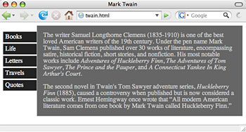
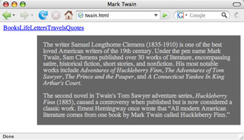
<div id="content">
 <div id="menu">
  <ul>
   <li><a href="#">Books</a></li>
   <li><a href="#">Life</a></li>
   <li><a href="#">Letters</a></li>
   <li><a href="#">Travels</a></li>
   <li><a href="#">Quotes</a></li>
  </ul>
 </div>
 <div id="main">
  <p>The writer Samuel Langhorne Clemens (1835-1910) is
  one of the best loved American writers of the 19th century.
  Under the pen name Mark Twain, Sam Clemens published
  over 30 works of literature, encompassing satire, historical
  fiction, short stories, and nonfiction. His most notable
  works include <em>Adventures of Huckleberry Finn</em>,
  <em>The Adventures of Tom Sawyer</em>, <em>The Prince and
  the Pauper</em>, and <em>A Connecticut Yankee in King
  Arthur's Court.</em> <p>The second novel in Twain's Tom
  Sawyer adventure series, <em>Huckleberry Finn </em>(1885),
  caused a controversy when published but is now considered
  a classic work. Ernest Hemingway once wrote that <q>All
  modern American literature comes from one book by Mark
  Twain called Huckleberry Finn.</q></p>
 </div>
</div>
Here, we're wrapping all of our content in a div we named "content", and then we've split that content up into a "menu" div (which encloses our navigation menu) and a "main" div (with which we enclose the main content).
The "menu" div contains an unordered list of links. Create a CSS document and link to it from your HTML document. External CSS is important for this task so you can apply your navigation to a whole site.
Let's start styling this list:
#menu {
    float: left;
    width: 85px;
    margin-top: 15px;
}
Here we've floated the entire navigation div to the left, and we've
specified a width and added a small margin at the top. Nothing you
haven't seen before, right? Now, to keep the main content div from "wrapping" around
the menu (we want to keep them as two separate columns), we're going
to apply
a
left-hand margin to that div to keep it in its place:
#main {
    margin-left: 84px;
    padding: 0 15px;
    background-color: #666;
    color: #ccc;
    border: 1px solid #ccc;
}
Now, back to the navigation list. We don't want the default bullets
to appear beside the list items, so we'll get rid of those using the
list-style property. We also want to get rid of the default margins
and padding for the list as well. Notice that we're now styling
the <ul> tag within the menu div:
#menu ul {
    list-style: none;
    margin: 0;
    padding: 0;
}
Next, we're going to style the individual anchor elements. As these items are supposed to look like "buttons," we want to treat them as block-level elements: we want to be able to add margins, padding, and a border. Anchor elements are, by default, inline elements, so we'll have to change them using the display property:
#menu a {
    display: block;
    text-decoration: none;
    margin-bottom: 2px;
    padding: 5px;
    background-color: #222;
    color: #eee;
    border: 1px solid #ccc;
}
We also want to get rid of the default underline on links, so we've set the text-decoration property to "none." Then, we add some color, padding, and small bottom margin to separate the "buttons."
So far, our Web page looks like this:
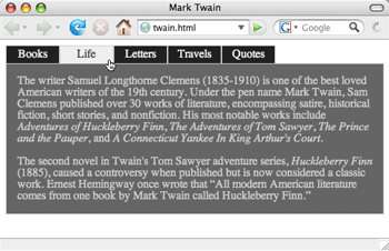
This looks nice, but, for added interactivity, we'd like to change
the color of our buttons when the user hovers over them; we'd
like them to "light up" as the user passes his mouse over
them. To achieve this effect we're simply going to style the a:hover
pseudo-element within the menu div:
#menu a:hover {
    background-color: #eee;
    color: #333;
}
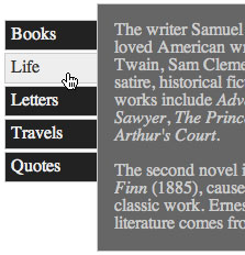
Recall that the :hover pseudo-selector is a special selector that allows you to specify CSS rules to an anchor element only when it is being moused-over. So here, we've changed the colors for the a:hover pseudo-selector, giving the appearance that it is lighting up when the user is hovering over it.
Creating a Horizontal Navigation Bar
What if you don't want a vertical navigation bar? It's easy to switch from vertical to horizontal just by adjusting the CSS.
To begin creating a horizontal navigation bar, delete everything in
your CSS file except the "main" div style, and begin with
the same HTML markup. In the "main" div style, remove the margin-left
property—this will ensure the main box will be flush with our
upcoming navigation bar.
Then we'll style the "menu" div
by giving it a height, and getting rid of any default margins:
#menu {
    height: 25px;
    margin: 0;
}
And, like we did with the vertical navigation bar, we're going to set the list-style to "none" and set the padding to zero:
#menu ul {
    margin: 0;
    list-style: none;
    padding: 0;
}
Now, for the individual list items. We're going to float each item to the left. This will cause the items to stack horizontally next to each other (as each will try to go as far to the left as they can without bumping into another list item):
#menu li {
    float: left;
}
 |
The float added to the li tag within the menu div
stacks the list items horizontally. Now we need to make them look
more like buttons. |
We're going to treat the anchor elements similarly to the vertical navigation list. We're going to set the anchor elements as block-level elements, get rid of their default underlining, and add some width, color, padding, and borders:
#menu a {
    text-decoration: none;
    display: block;
    width: 65px;
    padding: 4px;
    text-align: center;
    background-color: #222;
    color: #eee;
    border: 1px solid #ccc;
}
We can also style the a:hover pseudo element for this list:
#menu a:hover {
    background-color: #eee;
    color: #333;
}
Now your page should look like this:
The buttons will light up as they did in the vertical menu when the user mouses over them.
And that's all there is to it! You now know how to create list-based navigation that is easy to restyle any time. On top of that, you've also learned to extend your HTML and CSS skills with front-end form design, and special CSS3 effects.
 Learn how to create an HTML form and add basic form elements.
