Using Div and Span Tags
We briefly introduced the <div> tag
and <span> tag in the last lecture.
You learned that <div> defines a block-level section, while <span> defines
an inline area.
Both the <div> and <span> tags
are great "generic" elements that you can use to delineate
the sections of a page to be styled by CSS. For our positioning purposes,
we will use only <div> tags. This allows us to define blocks and position
them where we like on the page.
The <div> tag, by itself, works somewhat like a paragraph tag in that it puts a line break before and after the content that it wraps. It differs semantically from a paragraph, however, as it's intended to mark out sections of an HTML document.
These sections can be as broad as the general content of the Web page, or as narrow as, say, the copyright information in a footer. Used in conjunction with unique ID attributes, <div> elements are ideal for breaking up your document into meaningful sections (header, footer, and so on), which can then be styled and positioned using CSS.
 |
Standard layouts, like this one (and some unusual
layouts) can be created by positioning <div> elements. |
Setting Positioning Properties
Before we go into the various properties used to position elements in the page, it's helpful to know how elements are positioned in normal flow: the default method the browser uses to layout elements if other position properties aren't specified.
Download the lesson5 folder and head to the fish folder inside. What
we have is an HTML document with two specified
divs. In the CSS document, you'll
note
the following properties are assigned margin:
10px; and padding: 10px;, as well
as some basic borders and text styles.
In normal flow, block-level elements (like <div>) flow vertically from top to bottom, in the order that they appear in the markup:
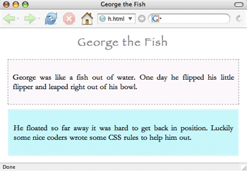 |
Two div elements in normal flow |
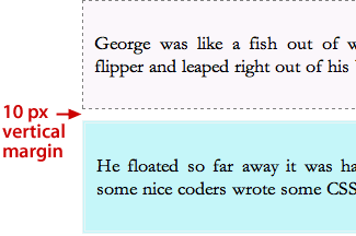
Let's review the difference between inline elements and block-level elements. Inline elements like <span> or <em> flow from left to right. When block-level elements are stacked vertically, their vertical margins collapse—instead of adding the bottom margin of one element to the top margin of the element below it (10 + 10 = 20 pixels) the browser will just apply the largest margin (in this case, 10 pixels).
Now, you can move an element out of normal flow using the position and float properties.
These two properties are the key to moving around content within your
Web pages. Designers use boxes to position all sorts of content within
a Web layout. The main column of text on a Web page could have any
number of smaller content items associated with it, each precisely
or relatively positioned (and styled) using divs.
Let's explore the position and float properties.
Use the position property to—surprise!—precisely position block-level elements on a page. You can position elements relatively or absolutely.
Relative Positioning
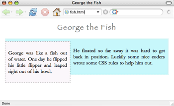
We'll start with relative positioning. Take a look at the markup in the HTML document:
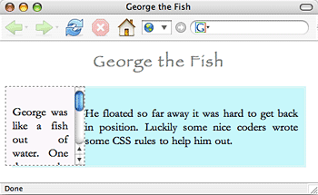
<div id="fish">
<p>George was like a fish out of water.
One day he flipped his little flipper
and leaped right out of his bowl.</p>
</div>
<div id="bowl">
<p>He floated so far away it was hard to get back in position.
Luckily some nice coders wrote some CSS rules to help him out.
</p>
</div>
Here we have two divs: "fish" and "bowl". Suppose we apply the following CSS rules:
#bowl {
border: 3px double #e9f4f5;
position: relative;
top: -20px;
left: 40px;
background-color: #c5f6f9;
text-align: justify;
margin:
          10px;
padding: 10px;
}
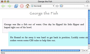
What have we done here? We've set the position property of the "bowl" div
as "relative." This means that the browser will initially
place that div within the normal flow (right after the fish div).
The top and left properties specify where it will go from there. (You can also use bottom and right instead of top or left, though it's recommended that you pick one pair or the other.)
The rules will offset the bottom box -20 pixels from the top of its default position (moving it up) and 40 pixels from the left of its default position (moving it right) resulting in the following:
Before you carry on, play around
with the values to move the bowl div around the page! Notice that
however you resize your browser, the location of top
left corner of the positioned box relative to
the other box will not change.
Absolute Positioning
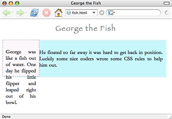
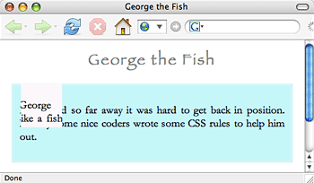
Let's contrast that with absolute positioning. Just use the same code, except we'll change the position value from "relative" to "absolute":
#bowl {
    border: 3px double #e9f4f5;
    position: absolute;
    top: -20px;
    left: 40px;
    background-color: #c5f6f9;
    text-align: justify;
    margin: 10px;
    padding: 10px;
}
The resulting page looks like this:
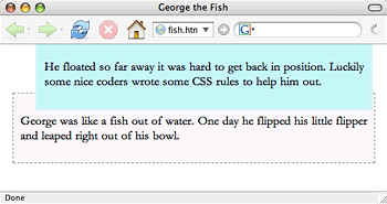
Yikes, what happened here? The header and top box "fish" stayed in the same place, but the bottom box "bowl" moved up to (and off) the top of the page, and it just won't budge.
Here's why. When a browser positions an element absolutely, it takes it completely out of normal flow, and begins its positioning from the edges of its containing element (that is, the element it's inside). You define the edges it is starting from by using the properties "top", "bottom", "left" or "right". And if you specify, say, "right: 50px", it will move 50 pixels from the right edge of the container.
In this case, the containing element of this div is the browser window.
Why is that? Well, the containing element of an absolutely positioned element is its nearest positioned ancestor (that is, the nearest ancestor that has a position value of absolute, relative, or fixed). The direct ancestor of this div element is the body element, but it doesn't have a position value. So, the container element becomes the browser window instead: that is why the padding specified for the body element doesn't apply to this div (and why it is so big). A div could also have another div as its nearest positioned ancestor.
So, the div element is offset 20 pixels up from the top left corner of the browser screen and 40 pixels from the left of the screen. Thus, the top of the element is cut off from view, as it is pushed up inside of the top of the browser window.
Before you move on, try toggling between relative and absolute settings and notice what happens when you change the values.
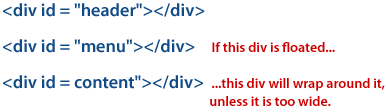
So, to summarize:
Floats
Floated elements are positioned vertically within normal flow, but are horizontally pushed all the way to the left or the right of the containing element. Content that follows a floated element in the markup then wraps around it. If the content following the float is too big (too wide, for example) to fit next to the float, it will appear below the float.
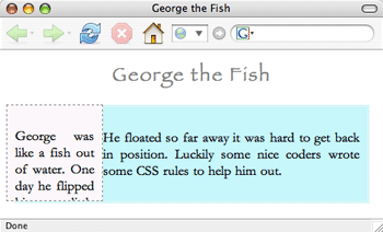
Let's try this out with our fish page. First, remove the positioning property from the "bowl" div to restore it to its original location.
Next, let's float the first div element:
#fish {
    width: 200px;
    float: left;
    border: 1px dashed gray;
    background-color: #fbf7fb;
    text-align: justify;
    margin: 10px;
    padding: 10px;
}
Now, our page looks like this:
The "fish" div, now 200 pixels wide, is pushed to the left
edge of the containing element (here, the body), and the content following
it (inside the "bowl" div), now flows around it. Resize your browser
to see how it works.
To float an element, you need to assign "left" or "right" for the floatproperty, and then specify a width. All floats must have a width (though a width can be a relative unit, like a percentage). If you float an image, though, there's no need to specify a width in the CSS, as all images come with a width already!
Experiment with different property settings, applying them to each div, to see the results.
Extra Practice: Add div tags to create a page element and apply positioning properties to it.
In a moment, we'll look at ways to control the page elements you just learned to position. But first, let's compare absolute positioning, relative positioning, and floats in this video tutorial:
Controlling Page Elements
Setting Visibility, Clipping, and Overflow
To make an element "invisible," use the visibility property
to hide it from view.
To make our fish box disappear, just add the following:
#fish {
    width: 200px;
    visibility: hidden;
    float: left;
    border: 1px dashed gray;
    background-color: #fbf7fb;
    text-align: justify;
    padding: 10px;
    margin: 10px;
}
Now our fish box is invisible. You'll notice though that the browser still makes room for the element—there is a space where the element used to be. In other words, the visibility property doesn't affect the layout of the page; it just controls whether or not we can see certain elements.
Note: If you want to completely remove an element from a layout, use the display property instead, and set its value to "none".
Overflow
Sometimes you'll want to make the content of an element overflow or "spill out" of the element area. For example, suppose we apply the following width and height settings to the "fish" element, removing the visibility setting:
#fish {
    width: 100px;
    height: 100px;
    float:left;
    border: 1px dashed gray;
    background-color: #fbf7fb;
    text-align: justify;
    padding: 10px;
    margin: 10px;
}
Note that we've very tightly sized both the width and height of the element. But we have so much text that it doesn't fit in a 100x100 pixel area—the text just spills out of the box. The default behavior is for the content to just spill outside of the element, like this:
This may not be the behavior you want—you may want to maintain the dimensions of the box. Perhaps you'd prefer that any overflow is simply cut off (or hidden from view), or maybe you'd like a scroll bar to accommodate the extra text?
You can achieve these effects using the overflow property. You can set the property to "hidden", effectively cutting off the overflow from view:
#fish {
    width: 100px;
    height: 100px;
    float:left;
    overflow: hidden;
    border: 1px dashed gray;
    background-color: #fbf7fb;
    text-align: justify;
    padding: 10px;
    margin: 10px;
}
This results in:
Or, you can set the overflow property to "scroll". This adds a scroll bar to the element:
#fish {
    width: 100px;
    height: 100px;
    float:left;
    overflow: scroll;
    border: 1px dashed gray;
    background-color: #fbf7fb;
    text-align: justify;
    padding: 10px;
    margin: 10px;
}
You'll note that the "scroll" value will always add the scroll bar, even if the content fits in the containing element and there is no overflow. That's not good. If you want to attach a scroll-bar only if there is overflow, use the "auto" value instead. Try increasing the dimensions of the fish box to see how it works.
Clipping
What if we only wanted to show a small piece of an element? We could apply the clip property to absolutely positioned elements to "clip out" a visible piece while hiding the rest. Using it is a little complicated, so let's start by trying it with the fish passage. First, make the fish box 100px square and absolutely positioned:
#fish {
    position: absolute;
    width: 100px;
    height: 100px;
    border: 1px dashed gray;
    background-color: #fbf7fb;
    text-align: justify;
    margin: 10px;
    padding: 10px;
}
Now, we're going to add the clip property:
clip: rect(5px, 80px, 75px, 15px);
Now, our element looks like this:
Pretty neat, but you're probably wondering what the heck just happened! What we defined in the clip property was an area (specifically a rectangle) that serves as a "window" to show through some of the element, while hiding the rest.
Let's look more closely at the code. First, we've defined a shape of the clip (or "window"). We've set it as a rectangle (which, for now, is the only possible option). Then we've designated where the edges of the rectangle are relative to the top, left-hand corner of the object, in the following order: top edge, right edge, bottom edge, left edge.
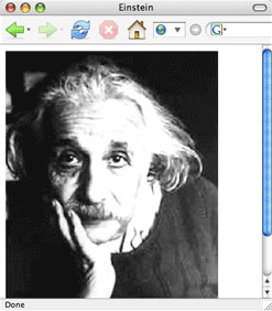
Still confused? That's understandable! Go to the einstein folder in
the lesson5 folder. In the enclosed HTML document, a <div> tag
wraps a link to an image of Einstein:
<body>
<div id="einstein">
<img src="einstein.gif" alt="einstein photo"/>
</div>
</body>
Now apply the clip property in the CSS document to the einstein ID:
#einstein {
    position:absolute;
    clip: rect(5px, 80px, 75px, 15px);
}
What happened? It doesn't take the great man to figure it out. The clip property is showing only part of the image.
 |
Clipping an area of a div |
This shows where the clip is relative to the rest of the element:
 |
|
 |
| |
-
The top edge of the clip window is 5 pixels from the top of the element (the first number).
-
The right edge of the clip is 80 pixels from the left edge of the element (second number).
-
The bottom edge of the clip is 75 pixels from the top of the element (third number).
-
The left edge of the clip is 15 pixels from the left edge of the element (last number).
|
|
 |
|
 |
You are also allowed to use negative values (e.g., -20px), which would pull the clip out of the element area.
Note: Older versions of Internet Explorer don't like the clip property. IE ignores the required comma separated values and only supports an optional comma-less method of separating values.
Creating and Using ID Selectors
Using ID selectors along with div elements is an ideal way to split up your page into logical chunks, based on a content section's role on a page (whether it be a page header, footer, or navigational element). Not only does it make it easy to manipulate these different parts of a page using CSS, but breaking down the content by function also makes more meaningful sense of the HTML code. A couple of things to keep in mind, however, as you endeavor to assign ID tags to sections of a Web page:
1. Remember that you can only assign one HTML element a particular ID tag.
If you call one div element "navigation", you cannot use that ID name in another div on the Web page. If you need to assign a particular role to more than one element on a page, use the class attribute instead.
2. Don't imply presentational aspects in your ID names.
Even if you do plan on putting your navigation menu to the right of your main content, don't name it something like "rightcol". You want to assign an ID name based on what the element does, rather than what it looks like. So, your navigation menu should be called something like "nav". That way, if you (or your client) ever decide to change the location of the navigation menu (like to the left of the main content instead), you aren't stuck with an ID name that implies it should be somewhere else!
This hearkens back to golden rule: Presentation should be strictly separated from content. Nothing in your HTML should control (or imply) how the page looks.
Extra Practice: Add special controls to page elements.
Column-Based Layouts
Let's switch gears now to look at how to create columns in your layouts. Most professional Web sites feature some version of the column-based layout. A more minimalist site may get away with a single column, but a robust site with more information will probably be split into two or more columns.
 |
The site may look complex, but it's a one-column layout. |
 |
This sophisticated design is simply a version of a multi-column
layout. |
The main strategy for creating a column-based layout is to:
Fixed and Fluid
There are two main kinds of layouts: fixed and fluid.
A fixed layout is one in which the columns are a static width; they remain the same size no matter how big the browser window is. Fixed columns are created by setting a width to the relevant div. If we want our "main" div to be 350 pixels wide, we would write the div ID like this:
#main {
    width: 350px;
}
A fluid layout is one in which the columns stretch or shrink as the browser window is resized. They are created by assigning a percentage to the relevant div. Below, we're telling the browser that the "main" div is 45% of the width of the containing element:
#main {
    width: 45%
}
One advantage of a fluid layout is that it takes advantage of all the space on the screen; you aren't left with large swaths of empty space. And, all of your content fits inside the browser window; you don't have to worry about text being cut off, or forcing your users to scroll horizontally in order to see the rest of the page.
A disadvantage of a fluid layout is that you ultimately have less control over the design when you can't predict the exact size of the elements on the screen. And, if text is squeezed into too small of a space, or columns are stretched out over too large an area, your page can look odd or even be illegible.
In short, both fixed and fluid layouts have their advantages and disadvantages, and you'll have to decide which one to implement according to the needs of your particular site (or your particular design tastes).
Let's work through creating a few fixed and fluid layouts. Open the
condos.html file in your condos folder and create a CSS document called
condos.css to follow along.
One-Column Fluid Layout
The easiest layout to create is the one-column fluid layout. You just have to assign a percentage to the left and right margin of the body element.
For example, you can use this CSS to style the body element of the page:
body {
    font: 13px verdana, sans-serif;
    background-color: #cad6d7;
    margin: 0 25%;
}
The result in your browser is this:
The margin is set to be 0 at the top and bottom and 25% on the sides.
One-Column Fixed Layout
Creating a centered, fixed one-column layout is
a bit more involved. First, wrap all the content in your page body
in a div, and give it an ID attribute:
<div id="content"></div>
Then, apply a width, some padding, alignment, background color, and border to this div:
#content {
    width: 500px;
    padding: 15px;
    text-align: justify;
    background-color: #cad6d7;
    border: 1px solid black;
}
Next, add a 50% padding to the body element:
body {
    font: 13px verdana, sans-serif;
    padding-left: 50%;
}
Finally, add a left margin to the div that is equal to half the width of the column:
#content {
    width: 500px;
    margin-left: -250px;
    padding: 15px;
    text-align: justify;
    background-color: #cad6d7;
    border: 1px solid black;
}
This gives us a page that looks like this:

Two-Column Fluid Layout
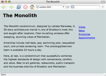
Let's move on to creating a two-column fluid layout which, when we're through, will look something like this:
The main column should be fluid, but the navigation column's width will be fixed. Delete your "content" div, and remove everything from your CSS file:
You'll see that your document contains some other divs, sectioning
off the header, main text column, and navigation:
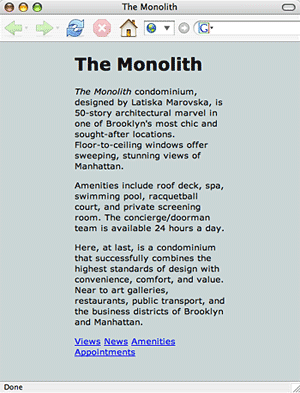
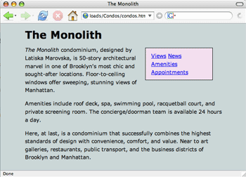
<div id="header">
<h1>The Monolith</h1>
</div>
<div id="main">
<em>The Monolit
...
</div>
<div id="menu">
<a href ="blank">Views</a>
...
</div>
Essentially, what you're going to do is float the menu to the right. As all floated elements need a designated width, we are going to assign the menu column a width, as well as some other attributes:
#menu {
    float: right;
    width: 150px;
    margin-right: 1.67em;
    border: 1px solid black;
    padding: 10px 1em 10px 1em;
}
We're also going to add a left and right-hand margin to the body element to squeeze the columns in a little, as well as specify a font and background color:
body {
    margin-left: 10%;
    margin-right: 10%;
    font: 0.9em/1.5em Verdana, sans-serif;
    background-color: #cad6d7;
}
The only thing left to do is to tweak some of the lesser aesthetic properties of the menu:
#menu {
    float: right;
    width: 150px;
    margin-top: 5px;
    background-color: #f3deee;
    margin-right: 1.67em;
    border: 1px solid black;
    padding: 10px 1em 10px 1em;
}
Notice that the menu is floated, but far down the page because its div in
the HTML code is after the main div. This is an easy fix: simply cut out
the entire menu div and paste it above the main div in the HTML page. The
order of your divs in your code matters.
Two-Column Fixed Layout
You can create a fixed-width two-column layout similarly. Instead of setting the width of the main column using percentages, however, you set it using a length (like pixels).
Then, just give the body element a width, which will thereby set the width for the header and navigation column as well (the navigation column will take up the remainder of the width of the body—here, 360 pixels—and the header will span the whole length of the body):
body {
    margin: 10px;
    padding: 0;
    width: 800px;
    font: 0.9em/1.5em Verdana, sans-serif;
    background-color: #cad6d7;
}
#header {
    margin-left: 10px;
}
#main {
    float: left;
    width: 440px;
    padding: 10px 1em;
}
#menu {
    padding: 30px;
}
The page will remain the same as the browser resizes to be smaller. When the browser size becomes narrower than 800px, the width of the body, a scroll bar will appear so that the user can scroll to the right to see any content on the page that is outside the browser window.
Extra Practice: Create a page layout with fixed and fluid columns.
Comparing Structural and Presentational Markup
The beauty of CSS is its ability to completely alter the look of a Web
page without touching the underlying HTML. The paradigm demonstration
of CSS's power is the CSS Zen Garden (csszengarden.com),
which showcases dozens of CSS style sheets created by graphic artists as
applied to one HTML document.
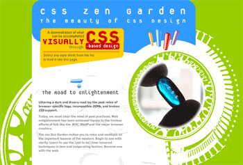
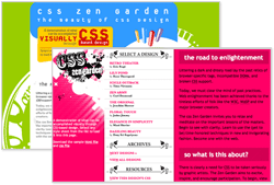
Below is a screenshot of the CSS Zen Garden page without a style sheet applied. Notice how readable it is, even in its bare bones state:

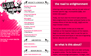
Then, we start to see the transformative power of CSS as we add a stylesheet:
 |
CSS Zen Garden dressed
in a style called "Organica
Creativa" |
So, we've radically changed the look of the site just by styling the page with CSS. We haven't touched the HTML code! The power of CSS to manipulate the way elements look is evident when we compare the page with and without a style sheet. Importantly, all of the structure and content of the page is intact without the CSS (which shows how accessible the page would be to non-standard browsers). Any and all presentational aspects are applied using the CSS style sheet.
And we can change the look of the site completely, by simply switching the style sheet:
 |
This style is called "Pretty
in Pink." |
Here we have the same page, the same HTML structure,
just different styling applied to the elements. So, here, we've not only
changed the colors of the elements and their underlying graphic images,
but we've also changed where the main sections (the menu,
main content, header, and so on) are located on the page.
The CSS Zen Garden is an excellent resource for understanding how to push the envelope of CSS-enabled designs. For more information and further introduction into CSS, check out the book The Zen of CSS Design. It's by the site's owner Dave Shea and Sessions course developer Molly E. Holzschlag.
Troubleshooting CSS Positioning and Browser Inconsistencies
Despite how powerful, versatile, and easy-to-use CSS is, beginning designers often become quite frustrated when taking a stab at creating their first page layouts. The "rules" that browsers are supposed to follow when floating, positioning, and stacking elements can be quite complicated, and, to make matters worse, not all browsers actually follow the rules. This can result in pages that behave unexpectedly, erratically, and differently in different browsers.
CSS Troubleshooting Basics
So, what do you do when you're having trouble with a CSS-based layout? Rather than throw up your hands and revert back to table-based layouts, just take a deep breath, relax, and try the following tips:
1. Don't reinvent the wheel.
Many professional designers have already come up with clever and ingenious ways to circumvent the various glitches and browser bugs that make trouble for CSS-based layouts. There is no reason not to take advantage of their wisdom. Make use of the various methods, tutorials, and tips out there for creating CSS layouts. There are oodles!
2. Make sure your code validates.
We've already covered this in a previous lecture, but it's worth repeating. Most browsers try to make sense of invalid or otherwise bad markup, but not all of them reconcile errors in the same way or to the same degree. Coding errors can make your page behave unpredictably, and, given all the tools out there to clean up your code, there's little reason to have invalid code.
3. Be aware of the box model problem
CSS elements, as you know, have content, padding, borders, and margins. When you specify a width for an element in CSS, what exactly are you specifying a width for? According the W3C standards, you are specifying the width for the content only. The padding, borders, margins are all extra, and are not included as part of the "width" calculation. For example, suppose you code the following:
#box {
    width: 100px;
    padding: 10px;
    border: 10px;
}
The W3C would say that the width of the content is 100 pixels, and the width of the entire element is 160 pixels:
Unfortunately, when Microsoft started implementing CSS into Internet Explorer 5 for Windows, they decided to interpret the box model differently. According to Internet Explorer's box model, when you specify a width for a CSS element, you're not just specifying the width of the content; you're actually specifying the width of the content plus its borders and padding (but not the margins). Confusing, I know.
Let's look at the above code again. According to IE, the width of the entire element would remain 100 pixels (not 140 pixels). Instead of expanding the box to add borders and padding, thereby increasing the width of the entire element, IE would shrink the content in its effort to include the padding and borders in the entire width.
So the width of the element's content would shrink to 60 pixels (100 pixels minus the margins and padding):
Here's a visual explanation:
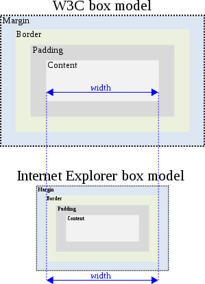 |
This illustration of the box model problem from Wikipedia.org might help you visualize the issue. |
When attempting cross-browser/cross-platform designs, a change in the interpreation of our content's width can really affect our designs. When IE 5 came out, elements were a lot narrower than when displayed in other browsers that adhered to W3C standards. This wreaked havoc on CSS page layouts, and various hacks had to be invented to correct this problem.
4. Choose a solution to the box model problem.
When your layout doesn't look how you expect it to, you have several possible solutions:
Solution one: Declare the correct DOCTYPE.
While Internet Explorer 6 rectified the box model, Microsoft wanted to ensure that pages designed for IE 5 were backwards-compatible, so they gave designers the ability to specify when a page should be rendered using the old standards (what's known as quirks mode). Only when a page is rendered in standards mode will Internet Explorer use the W3C box model.
So, how do you make sure Internet Explorer is in standards mode when it displays your Web page? You have to declare the right DOCTYPE. In short, to ensure that Internet Explorer renders your page using the correct box model:
|
|
|
| |
- Declare the correct DOCTYPE.
- Do so in the first line in your document.
- Do so without typos!
|
|
|
|
|
This solution should be your first choice when working on box model issues. If you are absolutely, positively sure that you have declared the DOCTYPE in the first line and with no typos, but are still experiencing box model issues, there are additional solutions to try...
Solution two: Use the box-sizing property.
The advent of CSS3, which we'll introduce in detail in the next lecture, brings a host of new CSS properties to the table. One of these properties is called box-sizing. This property defines how the browser interprets the box model. That is, whether the width and height settings include the border and padding or not. In other words, you can make modern browsers behave like Internet Explorer in quirks mode.
To do this, just set the box-sizing property to border-box (which includes the padding and border in the width and height measurements), as opposed to content-box (which excludes the padding and border from these measurements). Note that Firefox alternatively uses the -moz-box-sizing property, and Safari uses -webkit-box-sizing. Below is an example of applying these three properties to an element id:
#sidebar {
    width: 300px;
    -moz-box-sizing: border-box;
    -webkit-box-sizing: border-box;
    box-sizing: border-box;
}
While it may be an odd solution to force browsers to render elements as an outdated (and non-standards compliant) browser would, it does have the desired effect of making your results consistent and predictable. Sometimes if you can't beat 'em, join 'em.
These properties are supported by IE8+, Firefox 1.0+, Opera 7.0+, and Safari 3.0+.
Solution three: Use conditional comments.
The "conditional comments" trick is not only useful with the box model problem, but also works for any browser bugs particular to Internet Explorer (and, unfortunately for a browser that dominates the market, there are many).
There is a special set of comments that only Internet Explorer recognizes and understands. Enclosing any bit of HTML within these comment is ignored by any other browser. Here is an example of a conditional comment:
<!--[if IE 8]> Any HTML inserted here will be ignored
by all browsers except Internet Explorer 8.
<![endif]-->
If you want to include some HTML specifically for Internet Explorer 8 and below, use the following conditional comment tags: <!--[if lte IE 8]><![endif]--> Any HTML inserted between these tags will be ignored by all browsers except Internet Explorer 8 and below. The lte within the comment stands for "less than or equal to." You can also use gt ("greater than"), gte ("greater than or equal to")... you get the picture.
If you want to target any Internet Explorer version, just use: <!--[if IE]><![endif]--> Any HTML inserted here will be ignored by all browsers except Internet Explorer.
Note that we can only use conditional comments within the HTML code; we can't use it in our CSS. So how can we use these special comments to cater our CSS to Internet Explorer peculiarities? We can create a separate CSS file, just for Internet Explorer, and then link to this file within the head of our HTML file, like so:
<link href="style.css" rel="stylesheet" type="text/css">

<!--[if IE 8]>
<link href="ie.css" rel="stylesheet" type="text/css">
<![endif]-->
By placing this conditional comment below the link to our standard CSS file, then all browsers pull in the style.css file, but only Internet Explorer pulls in our special ie.css file.
When Internet Explorer renders the page, any CSS that is included in this additional file overrides the CSS code in the standard CSS file. For instance, we can include different widths and heights for certain elements in the ie.css code that compensate for Internet Explorer's box model bug, thus ensuring that our browsers render the layout consistently.
Solution four: Applying padding/border to parent elements.
It's worth noting that the rendering bug we're trying to solve happens only when an element has a declared width and either a value set on its padding or borders. Another strategy to avoid all this CSS hackery is to apply the padding to an element's parent and leave the width on the child—or vice versa. This may entail wrapping the offending div within an additional div, like so:
<div id="wrapper">
<div id="sidebar">
...
</div>
</div>
Then, in your CSS, apply the desired padding to the wrapper, and size the sidebar:
#wrapper {
    padding-right: 30px
}
#sidebar {
    width: 300px
}
While effective, the downside to this method is that it may require you to add some additional (and non-semantic) divs to your markup.
Clearing Floats
Another display bug that you are likely to encounter, and need a solution for, relates to floats, particularly when nesting a float inside of a container element.
Imagine that you are floating an element—say, a sidebar—within another element with some main content. If there isn't much content in this floated element, and the sidebar is shorter than the container element, then all is well. But if the floated sidebar element becomes longer than the container, then we end up with something like this:
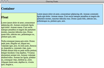 |
The messy result of nesting floats with an unbalanced amount of content |
Gah! What we want to happen is for the containing element to completely contain the floating element, so that its border extends all the way down and around the float. But what actually happens is that the borders of the containing element stop as soon as its content stops, and the float dangles rather unattractively beneath it.
How can we get the containing element to behave as we want it to? There are a few popular methods to solving the "float clearing" problem: the generated content solution (sometimes called the "clearfix" solution since the class selector is often called .clearfix) and the "overflow workaround."
1. The generated content ("clearfix") solution
Tony Aslett, along with positioniseverything.net, came up with a clever method of clearing floats. But, before we try out his method, let's briefly look at where it came from. An old method for clearing floats involved adding an additional element in the container element, and then applying the clear property to that element with CSS. While the method worked, it involved adding superfluous markup to our HTML document for the sake of presentation, which violates the spirit (if not the rule) of separating presentation from content.
Aslett borrowed from this method, but instead of adding extra content to the HTML portion document, he added extra content via the CSS. How is that done? CSS is not in the business of adding content, only styling it, right?
Well, yes and no. There are a few CSS pseudo-selectors that can be used to add content to an element, one of which is the :after pseudo-selector. So, what you can do is add a bit of content (say, a period) to the containing element via this pseudo-class, and then apply the clear property to that bit of content. The CSS ends up looking something like this:
.clearfix:after {
    content: ".";
    display: block;
    height: 0;
    clear: both;
    visibility: hidden;
}
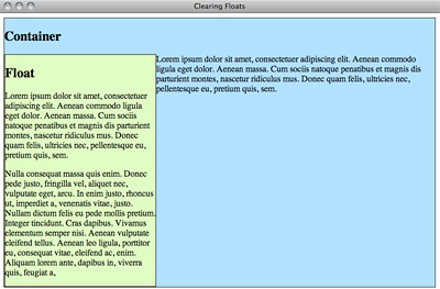
Note that we've also set its height to zero, and the visibility to hidden, so that the period doesn't actually show up to users in the containing box. Now, all that's left is to add this class to the containing element within our HTML:
<div class="container clearfix">...</div>
Now, our problem is fixed:
While this method works, there is a bug that keeps this method from displaying properly in Internet Explorer. Older versions of IE don't support generated content CSS selectors. This is important to know, but does get a bit complex, I'll admit. You can read the details here or print and save them for when you're feeling more comfortable.
2. The overflow solution
There is also a solution that makes use of the overflow property we learned earlier. This solution, attributed originally to Paul O'Brien, applies this property (setting it to auto, hidden, or scroll), as well as a width, to the containing div:
.container {
    overflow: hidden;
    width: 100%;
}
Boom! That's it. Well, there are some drawbacks.
Setting the overflow property (which we cover in a little bit more detail below) to hidden is recommended above the other two choices (of auto or scroll) as it avoids the default scroll bars of the scroll value. Also, some browsers might display a scroll bar if the width of the child element exceeds the stated width of its parent.
Either the clearfix or the overflow solutions may get the job done. My advice is to use the solution that works best for your needs.
Further Troubleshooting Resources
Unfortunately, Internet Explorer is known for many browser bugs in addition to its issues with the box model and generated content selectors. If you're having problems getting a page to look right in Internet Explorer (or any other particular browser), and you know that your HTML and CSS validates, you might want to check out positioniseverything.net, which explains CSS bugs in various browsers (and how to get around them).
 Review the purpose of div tags in marking up page sections.
