There are three different ways to apply or associate CSS to an HTML document: inline, internal, and external. Let's go over them.
Inline
Using the inline method, you can put CSS rules right inside the body of your HTML page like so:
<html>
<head>
<title>My Web Page</title>
</head>
<body>
<p style="text-align: justify">Lorem ipsum dolor sit amet,
consectetuer adipiscing elit.</p>
</body>
</html>
This method is not much different from applying presentational formatting via HTML. That is, you're still controlling the look of the page tag by tag, and you gain none of the more universal control you get by implementing CSS style sheets. While you may see some Web pages constructed in this fashion, I recommend you avoid using the inline method in your work.
Internal Style Sheet
A second method is to put a CSS style sheet right inside the head of your HTML document by enclosing the CSS rules in a <style> tag:
<html>
<head>
<title>My Web Page</title>
<style type="text/css">
p {
    text-align: justify;
}
</style>
</head>
<body>
<p>Lorem ipsum dolor sit amet, consectetuer
adipiscing elit.</p>
</body>
</html>
Using this internal method, you can control the look of certain elements across the entire page. It's thus a step up from the inline method. This works fine if you are only creating and styling one Web page. But if you are working with an entire Web site, this method is impractical. Presumably, you will want to keep the look of all of your pages pretty consistent, and this can become a nightmare if each page has its own style sheet.
If you want to, say, change the color of the links in your whole site to green, you would have to change the color of the anchor selector on each and every style sheet. So the internal style sheet approach doesn't really take advantage of the power of CSS. You don't experience that until you work with external style sheets.
External Style Sheet
Here, instead of including the CSS rules right within the HTML document, you include them all in a separate document that you link in the header of your document. CSS documents are just text files that have the .css extension. In the following example, we are linking to a style sheet named "style.css" that is located in the "css" folder of a local site.
<html>
<head>
<title>My Web Page</title>
<link rel="stylesheet" type="text/css"
href="css/style.css" />
</head>
<body>
<p>Lorem ipsum dolor sit amet, consectetuer
adipiscing elit.</p>
</body>
</html>
You can also use the import method to attach your stylesheet. This line, too, goes in the head of your document:
<style type="text/css">@import url(css/style.css)</style>
Attaching an external style sheet is really the preferred method of working with CSS, as you can link one style sheet to multiple pages. So, you can have a single style sheet that controls all of the pages in your Web site. If you need to change the colors of the links in all of the Web pages within a site, instead of making changes tag by tag, or page by page, you simply change one line in the global CSS style sheet.
The style sheet itself is just a text document (created with any text editor) with a list of all of the relevant CSS rules. The text document is saved with the .css extension.
The structure of CSS code is fairly straightforward. Let's take a look at some simple code:
body { background-color: #eee; }
Here we are applying a background color to the body element, and this line of CSS demonstrates the basic format for all CSS:
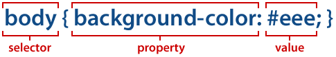
The selector indicates what HTML tag to apply the rule to. The property picks out what aspect of the HTML element we're styling, whether it is color, size, position, or some other thing. Every property that we're styling must have a value—that is, we must indicate what color, how big, or where to put it.
You can list several different properties for a selector but must separate them with a semicolon (;). For example, if you want to set both the text and background color for all paragraphs, you should use the following code:
p { color: #ff0099; background-color: white;}
It is good practice to put a semicolon after the end of every property declaration, even if you are only setting one property. And, when coding entire style sheets, it's a good idea to set only one property per line. It makes the code much more readable, like this:
p {
    color: #ff0099;
    background-color: white;
}
Basic Properties and Values
To get the ball rolling, let's just look at one basic property and value of CSS: color. You can do try this inline CSS with any HTML document you've created so far.
The color property controls the text color inside of any HTML element:
<p style="color: #ff0033">What's in a name? That which we
call a rose by any other name would smell as sweet.</p>
The above code would change the color of text thusly:

Let's bold some of our text as well:
<p style="color: #ff0033">What's in a name? That which we
call a rose <span style="font-weight: bold">by any
other name</span> would smell as sweet.</p>
The font-weight property (which we go over in more detail shortly) controls the "thickness" of text. Here we've made text wrapped in the <span> tag thicker by assigning it the "bold" keyword value. Now, the paragraph looks like this:

Writing CSS
We've learned that the basic structure of a CSS rule looks like this:
selector { property: value; }
Any HTML element (or "tag") can be a selector—from the body element,
to the paragraph element, right down to anchor and image tags. So, any element
is "styleable" in this manner (though not all properties
work with every element). This accounts for the great versatility of
CSS, as we can control all sorts of properties—from color, size,
position, even visibility—for any and all pieces of an HTML
document.
Here's a reminder of the main tags you've learned so far:
Tags |
<html></html> |
<dl></dl> |
<table></table> |
<head></head> |
<dt></dt> |
<thead></thead> |
<title></title> |
<dd></dd> |
<tbody></tbody> |
<body></body> |
<em></em> |
<tr></tr> |
|
<h1></h1>, <h2></h2>, ... |
<strong></strong> |
<th></th> |
<p></p> |
<code></code> |
<td></td> |
|
<ol></ol> |
<q></q> |
<img> |
<il></il> |
<blockquote> </blockquote> |
|
|
<ul></ul> |
<a></a> |
|
CSS Inheritance
Before we get into the nitty-gritty of coding CSS, I want to talk
about the essential notion of CSS inheritance.
For some CSS properties (though not all!) the children elements
inherit the properties of their parents. A paragraph element,
for example, is the child of the body element (that is, the
paragraph is "contained" inside
the body). As such, it inherits certain CSS rules that we might
define for the body.
For example, consider the following style sheet:
body {
    font: 13px sans-serif;
    color: #555;
}
p {
    color: red;
}
By default, the paragraph element inherits both the font and color
settings of its parent: the body element. So, any text within a paragraph
tag is also a 13-pixel sans-serif font; we need not duplicate
that rule by putting it in the paragraph selector.
If we want to style
the text inside of our paragraphs differently than the parent element,
we can override the inherited values.
So, above, while we colored the text of the body element gray, we've overridden that
color in the paragraph element by specifying that its text should
be colored red.
Classes
If you add a rule to a paragraph selector, that rule is applied to all paragraphs
in the relevant HTML document(s). But what if you wanted to apply
certain styles to some paragraphs, but not others? One way to do that
is to use the class attribute.
What is a class attribute? The class attribute simply lets you categorize
your elements into various kinds, and any number of elements
on a page can have the same class.
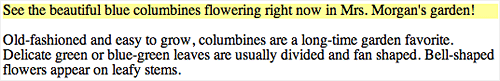
For example, suppose you want to apply a yellow background to all
news items on your page (and there may be more than one paragraph that
is a news item), but not all paragraphs of your page. You can apply
a specific class to those paragraphs within the HTML document that
are news items, and then style that class in your CSS.
Start a new HTML document and add the following code to the body.
Notice the class attribute here and the name I have given it, "news".
So, first add the class to the HTML:
<p class="news">See
the beautiful blue columbines flowering
right now in Mrs. Morgan's garden!</p>
<p>Old-fashioned and easy to grow, columbines are a
long-time garden favorite. Delicate green or blue-green
leaves are usually divided and fan shaped. Bell-shaped
flowers appear on leafy stems.</p>
If you preview the page, nothing will happen yet, because we have
not assigned any CSS rules to the class. Let's do that using an internal
style sheet, rather than the inline style we used in our rose example.
Move up to your document's <head> area. Within the <head></head> tags,
insert the tags that define our internal style sheet:
<head>
<style type="text/css">
</style>
</head>
Inside those tags, we can style our news class:
<head>
<style type="text/css">
.news {
    background-color: #ffff99;
}
</style>
</head>
Important note: Be sure to put a period
(.) in front of all class names—that indicates that we are styling
a class rather than a regular HTML element.
Now, the resulting page looks something like this:
You can also restrict the class styling to certain elements. If you
want to only apply a yellow background color to paragraphs with
the "news" class (perhaps you want to style images with that
class name differently), just put the paragraph selector in front of
the class name:
p.news {
    background-color: #ffff99;
}
IDs
Another way to pick out certain elements for specific styling is by
assigning an ID attribute.
IDs are a lot like classes, except you can only assign one element
on a page a particular ID. This is useful for breaking up your page
into unique sections. For example, most Web pages have some sort of
header, a menu, and a section for the main content. You can assign
individual IDs to different sections, and apply unique styles
to them.
To try this out, start with a fresh HTML document and insert the
following code in the body. You should recognize that this will create
a heading, a subheading, an unordered (bulleted) list, and a paragraph
of text.
<h1>My Web Business</h1>
<h2>Menu</h2>
<ul>
<li><a href="index.html">Home</a></li>
<li><a href="about">About</a></li>
<li><a href="projects">Projects</a></li>
<li><a href="contact">Contact</a></li>
</ul>
<p> This portfolio represents some of the biggest,
baddest projects we've completed this year. Browse,
interact, and enjoy, then consider whether our design
capabilities can meet your branding needs. We'd be
delighted to hear from you.</p>
So far, the page looks something like this:

Let's divide this page into logical sections. I've added some extra spacing here, which I normally avoid to keep from bloating the file size of my HTML pages, so you can see the hierarchy of our sections:
<div id="header">
 <h1>My Web Business</h1>
</div>
<div id="menu">
 <h2>Menu</h2>
 <ul>
  <li><a href="index.html">Home</a></li>
  ...
 </ul>
</div>
<div id="main">
 <p>This portfolio represents some of the
  biggest, baddest projects...
 </p>
</div>
You may be wondering at this point: "What are div tags?"
The <div> tag defines a block-level section or division within
a Web page. (When an element is a block-level
element, it has a line break before and after it. This is
contrasted with inline elements,
which do not contain line breaks.)
The name block-level element connotes
its function in a Web page: They can be stacked, moved around, and
sized in various ways. Div tags are very useful for dividing up a page
into logical sections.
Note: You will recall from our introduction to HTML5 that there are new tags that add semantic value to the structure of a Web page, eliminating the need for piles and piles of <div> tags. But you can still use divs as needed in HTML5. We will explore various CSS principles using divs, but you can apply these same principles to the new HTML5 tags (like <header> and <section>) too.
Once we mark up the page with ID-labeled divs, we can then style
those sections. And until the divs are styled, you won't see any visual
difference on your page compared to the old version without divs.
To style these divs, let's try an external style sheet. First, create
a new, blank text document and save it as business.css. Save it in
the same directory as your HTML page. In the CSS document, the only
code belongs to the styling—no HTML tags here!
In your new, blank file, enter the following. Don't worry if you don't
know what all of these properties do yet—all of that comes later!
#header  {
    background-color: #006699;
    color: white;
    width: 100%;
    padding: 15px;
}
#menu  {
    float: left;
    background-color: #99cccc;
    padding: 10px;
    margin-right: 10px;
}
#main {
    color: #000033;
}
Note the hash sign (#) in front of the ID names—that just indicates
that we are styling a specific ID attribute.
Now we need to get our HTML page and our CSS document talking to
one another. Go back to your HTML page and add the following code
between your <head></head> tags. This code tells the HTML
page where the CSS rules are:
<link rel="stylesheet" type="text/css" href="business.css"/>
Now save your page and check out the results!

Also note that you can style particular elements inside of divs. Say
we wanted to color the anchor elements in the "menu" div
differently than the links in the main content div. We would just add
the anchor selector after the ID name to target just the links inside
the menu:
#menu a {
    color: #000033;
}
We can do this with any selector (not just ID selectors). For example,
suppose we wanted to color the link items inside of ordered lists differently
than the rest of our links. We could target those elements like this:
ol a {
    color: #cc0000;
}
This tells the browser: "When anchor elements are inside of
ordered list tags, color them red."
If we wanted to change the color of our header, or put the menu on
the right instead of the left, doing so would be as simple as changing
a line or two in our CSS. And since we used an external style sheet
file, we could apply the very same styles to as many pages as we like
just by adding the appropriately identified <div> and <style> tags to each HTML page.
The Span Tag
What if you want to apply specific formatting within a paragraph? The <span> tag is also useful for marking up content to be styled with CSS.
Used in conjunction with the class and ID attributes, the <span> tag
helps you assign class attributes to inline sections of text. Unlike
the <div> tag,
which creates a block-level element, <span> is
an inline element (meaning that you can wrap
a word or sentence right within a paragraph), then color or otherwise
manipulate it with CSS.

In the above example, I simply wrapped a few words with the <span></span> tags,
like this...
<span class="highlight">Browse, interact, and enjoy</span>
I used a class attribute called "highlight" to bold
and color the text.
Additional CSS Concepts
1. Adding Comments
You can add comments to a CSS style sheet. This is useful for adding notes for yourself (or for anyone trying to make sense of your code) that explain the organization of your style sheet. Comments begin with a forward slash and an asterisk (/*), and end with an asterisk and forward slash (*/), like this:
/* This is a comment, which is used to clarify snippets of CSS code */
2. Combining Selectors
You can combine more than one selector, allowing you to apply styling to a bunch of selectors at once. Just separate them by commas:
h1, h2, h3  {
    color: #00ffff;
}
3. Adding More Than One Value
For some properties, you can set more than one value. To do so, just separate the values with a comma (and also note that values with more than one word are enclosed in quotes):
h1, h2, h3 {
    color: #00ffff;
    font-family: Verdana, "Trebuchet MS", sans-serif;
}
4. Applying More Than One Class to an Element
You can assign more than one class name to an element. Just separate the class names with a space:
<img src="images/products/blender.jpg" class="product sale"/>
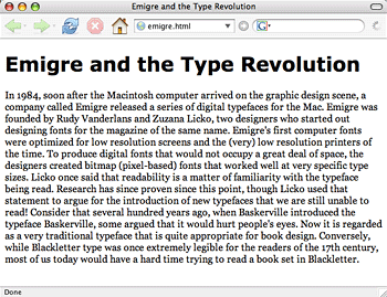
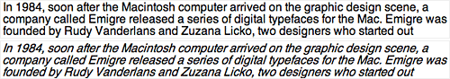
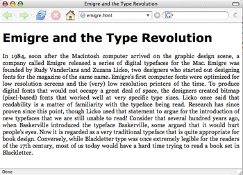
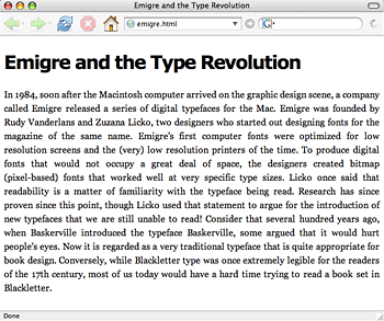
OK, if you're with me so far, I'm sure you're dying to get your hands
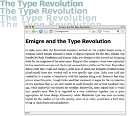
dirty with some code. Download your lesson4
folder now. Inside is an emigre folder containing emigre.html,
a page about Emigre fonts to follow along with this next section
on typography. Setting this long paragraph of text will help you make
decisions about the readability of your fonts.
Typography in CSS
Selecting a Font-Family
Superior typography is one of the main benefits of using CSS, so let's look at different parameters for designing type on a page.
To specify the font in a certain element, you use the font-family property.
It's a good idea to begin any project by exploring basic options for
paragraph and header styling. Create these rules in your text editor,
save the document with an emigre.css extension in your emigre folder,
and then view your HTML page (the CSS file is already linked in the
HTML page for you).
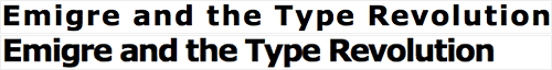
h1 {
    font-family: Verdana, Arial, sans-serif;
}
p {
    font-family: Georgia, "Times New Roman", serif;
}
Nice, right? You'll note that we can specify more than one font-family here. How does the browser know which font to display, you may wonder? It starts off with the first font: if that font is installed in the user's operating system, then that font is used. If the first font is not installed, then the browser moves on down the line until it finds a font that is installed.
The last font that is listed is a generic font type (serif), which
displays the system's default serif font. It is advisable to include
a generic font-family at the end of the value list (serif, sans serif,
and so on) as there is a possibility that the user won't have the specific
font you specify installed on his computer. While certain
standard fonts are often installed on Windows, Mac OS X, and Linux, users have
the option of uninstalling these, so you can never be sure what any
particular
user has installed.
Specifying a generic font-family will at least display a font somewhat similar to the font you really want. There are five different generic font-family types:
 |
|
 |
| |
-
Serif: Serif fonts have small finishing strokes (called "serifs"), and are generally associated with more traditional typefaces. Times New Roman is the paradigm example of a serif font. Georgia is a font made specifically for screen legibility, and so is a great choice for Web use.
-
Sans-serif: Sans-serif fonts are fonts that lack serifs. Arial is a typical sans-serif font, and Verdana is a sans-serif font made specifically for the screen.
-
Cursive: Cursive fonts have strokes joining the letters together, like cursive writing. Zapfino is an example of a cursive font.
-
Fantasy: Fantasy fonts are typefaces used primarily for decorative purposes. These can work well for display purpose highlights but it's generally not a good idea to use them for long blocks of text. Party LET is an example of a fantasy font.
-
Monospace: Monospace fonts are fonts whose characters all have the same width, like a typewriter type face. Courier and Monaco are examples of monotype fonts. They are often used to represent samples of computer code.
|
|
 |
|
 |
Experiment with different values for the font-family property, viewing the changes in your browser, before you continue.
Size Properties and Values
You can set the size of a font using the font-size property.
h1 {
    font-family: Verdana, Arial, sans-serif;
    font-size: 1.8em;
}
p {
    font-family: Georgia, "Times New Roman", serif;
    font-size: .9em;
}
There are various units of measurement available to set your size
with. You can set the size using absolute units, which represent a static length. These include:
|
|
|
| |
- inches (in)
- centimeters (cm)
- millimeters (mm)
- points (pt) (1/72nd of an inch)
- picas (pc) (12 points)
|
|
|
|
|
Or, you could use relative units, which represent measurements that vary in relation to the user's default font size. These include:
|
|
|
| |
- pixels (px) (which vary according to the computer's pixel size)
- em (1 em is the default font size)
- x-height (ex) (the x-height is equal to the font's lowercase "x")
- percentages (%)
|
|
|
|
|
You can also set the size using one of the following keywords:
|
|
|
| |
-
xx-small
x-small
-
small
-
medium
-
large
|
-
x-large
-
xx-large
-
smaller
-
larger
|
|
|
|
|
So, what measurement should you use? Most designers tend to use either pixels or ems. Pixels let you have more precise control over the design of the page (particularly when you measure other elements in pixels).
However, Internet Explorer users can't resize the text when it is set in pixels. This decreases the usability of the page, as users won't be able to alter the text size to their comfort level. Ems, which are a relative unit, give you less control over the look of the page, but are a bit more friendly to the end user.
Weights, Styles, Variants, and Decorations
If you like typography, you'll be excited to know that further options exist beyond selecting font-family and size. Weights, styles, variants, and decorations can each be modified to give you more precision.
Try out each of the following on the Emigre page.
1. Using Font-Weight
The font-weight property controls the weight (or thickness) of a font.
p {
    font-weight: bold;
}
Possible values include:
|
|
|
| |
- normal
- bold
- bolder
- lighter
- 100, 200, and so on through 900 (where 400 is normal thickness and 700 is bold)
|
|
|
|
|
2. Using Font-Style
You can set the style of a font using the font-style property:
p {
    font-style: oblique;
}
There are three possible values:
Oblique styled fonts are just like the normal font, but just tilted a bit forward:
 |
Helvetica normal
vs. Helvetica oblique |
Italic styled fonts are also tilted like oblique fonts, but they are actually a separate typeface from their normal counterparts (notice the difference between how the i's, m's and n's are formed):
 |
Times
New Roman normal vs. Times New Roman italicized
|
Unfortunately, most modern browsers render italic and oblique fonts the same, so at this point it doesn't much matter that you specify.
At this point we ought to mention the HTML tags that appear to perform the same function as the font-weight and font-style tags:
It looks like these tags perform the same function as the font-style and font-weight CSS properties. However, unlike the CSS properties, these tags are not really meant to control the presentation of the text (or specify how it looks). Rather, they are meant to point out the function of certain text—to point out that that "this text is emphasized," rather than "this text is italicized." This information is important to screen readers, for example.
You may decide that you'd rather emphasize your emphatic text by coloring it red. I could easily do that by styling the <em> tag:
em {
    font-style: normal;
    color: red;
}
Then, this HTML:
<p>I was <em>very, very</em> upset by the
disheartening news.</p>
would look like this:

Furthermore, remember that not all italicized text is really emphasized text. Take a book title, for example. Conventionally, it is represented by italicized text, but you wouldn't want to say that we are trying to put emphasis on text titles by italicizing them. In fact, it would be semantically inappropriate to wrap them in <em> tags. Rather, we would probably want to mark them up with their own class:
<span class="book" >The Lion, the Witch, and the
Wardrobe</span> by C.S. Lewis
and then style that class as italicized:
.book {
    font-style: italic;
}
That way, we don't rely on HTML for presentation, but leave that up to CSS!
3. Using Font-Variant
You can also turn the text into small caps by using the font-variant property:
p {
    font-variant: small-caps;
}
This takes one of two values: small-caps or normal.
4. Text-Decoration
You can add various effects to text by using the text-decoration property.
p {
    text-decoration: line-through;
}
It takes the following values:
|
|
|
| |
-
none
-
underline (puts a line under the text)
-
overline (puts a line over the text)
-
line-through (puts a line through the text)
-
blink (makes the text blink)
|
|
|
|
|
Line-through is of course a classic style to use for the omnipresent online price discount!
5. Using Alignment
Here's a technique you can apply to a section of a page. You can align text in a block-level element using the text-align property.
body {
    text-align: justify;
}
It takes one of four values:
|
|
|
| |
- left (aligns the text to the left)
- right (aligns the text to the right)
- center (centers the text)
- justify (justifies the text)
|
|
|
|
|
 |
Notice the subtle difference between justification
and left alignment. |
6. Using Letter-Spacing and Line-Height
In print, there are two ways to adjust the spacing in your text: kerning is the process of adjusting the spacing between the letters, while leading is the spacing between the lines.
Using CSS, you can adjust the horizontal spacing between the letters using the letter-spacing property. It takes as its value some length:
h1 {
    letter-spacing: 2px;
}
You can assign a negative length (such as, -2px) to squeeze the letters more tightly together. Use a positive number to spread them farther apart. This level of control is particularly helpful for headings.
 |
A heading with 2-pixel letter-spacing
(top) and a heading with -2-pixel letter-spacing. |
You can adjust the space between the lines of text using the line-height property. Try applying this to the page body, then to the paragraph.
body {
    line-height: 1.5;
}
The line-height is the distance from one baseline (the invisible line on which the text rests) to the next. If you assign a line-height using no units of measurement, then the browser multiplies the value by the font-size to determine the line height. So, if you had a 10-pixel font, and you specified a line-height of 1.25, then the line height would be 12 pixels. For the Web, a good line-height to use is 1.5.
 |
Text with the line-height set at 1.5. |
I hope you'll agree
that the text is much easier to read with these rules applied!
Review the process of attaching an external style sheet and writing CSS properties for text in the following video tutorial:
In this next section, we'll discuss how to style lists and links. These are two areas of a page in which a Web designer can distinguish him or herself. We are so used to seeing default options for these items that a variation can be a nice design detail.
Lists
Let's make some modifications to a list, shall we? In your lesson4
folder is a lists folder containing an
HTML page with a list. You can customize lists using the list-style-type property:
ul {
    list-style-type: square;
}
This changes how the list-item marker (whether it's numbers or bullets) will look. There are a bunch of different values for this one. Listed below are just some of the more common list-style types:
|
|
|
| |
- none (No marker. This is actually an invaluable setting to turn off any list markers, so that you can customize the list to your liking.)
- disc (default bullet—just a little filled circle)
- circle
- square
- decimal (marker is a number)
- decimal-leading-zero (01, 02, 03, etc.)
- lower-roman (i, ii, iii, iv, etc.)
- upper-roman (I, II, III, IV, etc.)
- lower-alpha (a, b, c, etc.)
- upper-alpha (A, B, C, etc.)
|
|
|
|
|
 |
The default bullet changed to a square. |
Links/Pseudo-Classes
You can style hyperlinks like any other
text. Go to the links folder in your lesson4 folder to find out how.
You can, for example, remove the default underlining of links by setting their text-decoration property to none:
a {
    text-decoration: none;
}
You can also change the default blue color:
a {
    color: #ff0099;
}
 |
Link color changed to pink |
When styling hyperlinks, we often want to indicate when the link is being hovered over, clicked on, or that it has already been visited. We can target this specific state of a link by using pseudo-classes. There are four pseudo-classes for the anchor element:
|
|
|
| |
a:link (unvisited link) a:visited (visited link)-
a:hover (moused-over link)
a:active (selected link) |
|
|
|
|
Let's style our links by highlighting them and changing their color to red with a yellow background when the user hovers over them:
a:hover {
    text-decoration: none;
    color: red;
    background-color: #ffff99;
}
Now, our links look like this when we hover over them:
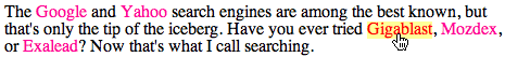
As you can see, link styling
offers tremendous potential for creating links that are more interactive
and support the overall graphic scheme of the page.
A word of warning,
however. With all of the CSS typography options available to you,
it may be easy to get a little carried away with
using various
fonts and font effects.
Operate some tasteful discretion when styling your text. Don't include more than two or three typefaces on one page, and try to use fonts that are optimized for on-screen readability (like Georgia and Verdana). Be judicious with your color choices (yellow text on a white background is a bad idea, for example), and, for goodness sakes, never ever make your text blink!
OK, we've done a lot with typography in this lecture. Before we move
on to the exercise, I'd like to show you how some of the concepts taught
earlier in the lecture can be applied to style page sections. It begins
with the profound concept of the box model.
Additional Styles for Page Elements
Every box-level element on a Web page can have adjustable margins,
padding, and a border. Not all of these parts are always visible, but
they are always there (even if they are collapsed). To get a better
idea of how the CSS "box model" works, let's look at a representation
of all of these features:
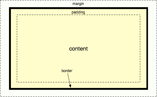
Each page section that is designated a box generally contains content (text,
images, and so on). Around the content is a border,
like a box. The border's thickness, style, and color can be adjusted
(and can be made invisible, as well).
Between the content in the box and the border is a space created by
the box's padding. Whatever background
color or background image you have in the element appears behind the
padding as well. Between the element's border and any surrounding elements
on the page is the margin. The margin
is what provides some "breathing room" between box elements that
are next to one another.
Borders
CSS provides many options for styling the borders around elements.
Open box.html found
in the box folder of your lesson4 downloads. Create
a blank CSS document called box.css in the same folder to follow along.
Let's take a look at the different properties related to border styling:
1. Using border-width
As its name suggests, the border-width property changes the width
of the border. You can assign the values thin, medium,
or thick, or you can set the width with a length value (such as
2px).
2. Using border-color
The border-color property sets the color of the border. The values
of the color can be specified in plain English (red, blue, and so on),
or as a hexadecimal value.
3. Using border-style
The border-style property changes the style of the border. Border-style
takes one of the following values:
|
|
|
| |
-
solid
-
double
-
groove
-
dotted
-
dashed
|
-
inset
-
outset
-
ridge
-
hidden
|
|
|
|
|
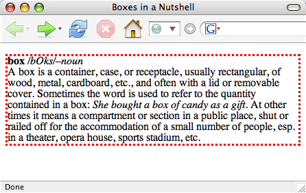
You can combine these properties into one with the border property:
p {
    border: 3px dotted red;
}
This would produce:
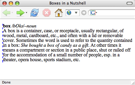
With any of these properties, you can also pick out just one side
of the element, by specifying top, bottom, left, or right:
p {
    border-left: 2px dashed blue;
}
This would produce:
Margins and Padding
Need some breathing room? That's good, because white space is the
designer's best friend.
You can adjust the margins and padding of an element using the margin and padding properties.
They both take as their values lengths, percentages, or auto. Like
the border property, you can specify which side of the element you
are setting the margin or padding for.
You'll see a div ID wrapped around the content on your box page: <div
id="content"></div>. So let's apply some
margin values to it (taking out the old border property as well,
and adding a new one):
#content {
    border: 3px dotted red;
    margin-right: 5px;
    margin-left: 5px;
    margin-top: 10px;
    margin-bottom: 10px;
}
Let's now add some padding. You can set all the values for margins
or padding at once. Using the margin or padding property with one value
sets all four sides with the same value:
#content {
    border: 3px dotted red;
    margin-right: 5px;
    margin-left: 5px;
    margin-top: 10px;
    margin-bottom: 10px;
    padding: 10px;
}
Setting the margin or padding property with two values sets
the top and bottom margin to the first value, and the left and right
margin to the second value:
#content {
    padding: 5px 10px;
}
Or, if all four sides have different values, you can do the following:
#content {
    padding: 5px 200px 10px 10px;
}
This sets the top, right, bottom, and left padding, respectively.
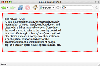
Here we've created some white space to the right of our box.
Background Colors
To add a background color to an element, just use the background-color property.
It takes a color as its value.
Let's add a background color to our box:
#content {
    border: 3px dotted red;
    margin-right: 5px;
    margin-left: 5px;
    margin-top: 10px;
    margin-bottom: 10px;
    padding: 5px 200px 10px 10px;
    background-color: #e8f7f8;
}
Now, our page looks a bit livelier:
Background Images
To add a background image to an element, use the background-imageproperty.
For instance, to add a background
image to the box from the previous example, just code the following:
#content {
border: 3px dotted red;
margin-right: 5px;
margin-left: 5px;
margin-top: 10px;
margin-bottom: 10px;
padding: 5px 200px 10px 10px;
background-color: #e8f7f8;
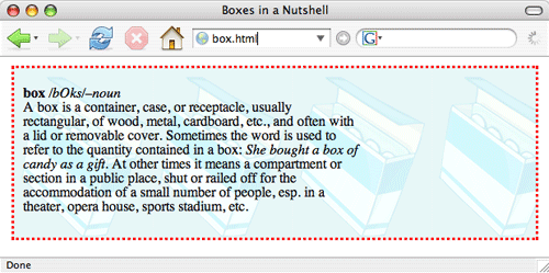
background-image: url(boximage.gif);
}
The url address is the path that points to the image which is already
in your box folder.
By default the browser tiles the image behind the content:
Not too bad, but I don't want my background image interfering with
the readability of the text. Fear not! I can control the tiling
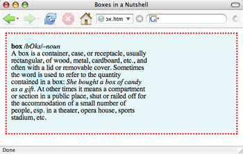
of the image using the background-repeat property:
#content {
    background-image: url(boximage.gif);
    background-repeat: repeat-y;
}
To tile an image just horizontally, or just vertically, use the values
repeat-x (tile horizontally) or repeat-y (tile vertically).
Or, setting that property to no-repeat means
that the image will not be tiled:
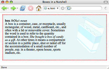
Better, but I would prefer if the image was placed off to the right
in the empty area.
You can more precisely position a background image by using the background-position property.
This property takes as a value lengths, percentages, or keywords (such
as "top right" and "bottom left"):
#content {
    background-image: url(boximage.gif);
    background-repeat: no-repeat;
    background-position: 20px 10px;
}
This positions the image 20 pixels over, and 10 pixels down, from
the upper-left hand corner of the box. I'm going to try top right to
get my box in the proper position:
#content {
    background-image: url(boximager.gif);
    background-repeat: no-repeat;
    background-position: top right;
}
Some Notes on Color
Since your page designs will likely involve color for Exercises Four through Six, I'd like to wrap up this lecture with some notes on choosing a color scheme. There are a few techniques I use when attempting to find the right color scheme for a design project.
The first step in picking the right color scheme is understanding what emotion I want to bring about in my designs. For example, is it a financial business Web site I'm building? If so, I usually want to go with the conservative choice of blue. If it's a Web site about an action movie or a sports star, I might want to pick the color red.
Once you know what kind of emotion you want to bring about, try to pick a central color that reflects that emotion and use that color as the foundation of your color scheme. Colors have psychological associations, so it's important to choose them carefully. Below is a table of colors and the positive and negative traits associated with them:
Color |
Positive Traits |
Negative Traits |
Red |
Power, hunger, impulsiveness |
Anger, forcefulness, impatience, intimidation, conquest, violence |
Yellow |
Intelligence, joy, organization |
Criticism, laziness, or cynicism |
Blue |
Tranquility, love, acceptance, patience, understanding |
Fear, coldness, passivity, and depression |
Orange |
Steadfastness, courage, confidence, friendliness, cheerfulness |
Ignorance, inferiority, sluggishness, and superiority |
Green |
Hope, growth, good health, freshness, soothing, sharing |
Greed, constriction, guilt, jealousy and disorder |
One concern about color is that different cultures associate different meanings to colors. The chart above reflects more of a North American attitude towards color. When designing for different areas of the world or working on an international project, be sure to address the cultural connections of color with your client.
Working Around the Color
Not everyone does it this way, but once I have color I want to build my color scheme around, I cheat!
The formal approach is to use techniques involving color harmonies
(http://www.websiteoptimization.com/speed/tweak/color-harmony/). You can also visit sites that are exclusively devoted to choosing color schemes. Two good places to start are colourlovers.com and colorcombos.com.
Once I've established the main color I want to build my design around, I can search for color schemes that use that color as the base. If I don't have that main color picked out, I risk wasting time doing undirected searches—hopping around from one color scheme to another waiting for an "a-ha!" moment of discovery that rarely comes.
The Beyond Cheating Approach to Finding that Right Color Scheme
Photographs have a way of capturing the right mood and tone for the site that can be equal or better than any color scheme we can pick out on our own. When researching colors for a client, if you come across a photo with the appropriate colors, scan it into your computer as an image (if it's not already).
Then upload it to this fabulous Web site called colorhunter.com. This site takes your photo and returns the color palette of that image for you, including the hexadecimal values. Ingenious!
 Learn three ways of associating CSS rules with an HTML document.
