Lecture Topics
In this lecture, you can expect to:
- Learn how to create and style horizontal navigation using HTML and CSS.
- Learn how to use CSS properties to create an alternate CSS layout.
- Learn how to add web fonts to your site's HTML and CSS.
- Learn how to apply simple CSS3 effects.
Horizontal Navigation Menus
In previous lessons, you learned how to create 2-column layouts and vertical navigation menus. But how do we create horizontal navigation?
If you've been wondering how the heck you turn a vertical list-based nav into a horizontal bar, then wonder no more! In this lesson we will give you many tools for styling navigation.
Let's take a look at a few different website layouts that utilize horizontal navigation, then we'll dive into the code.

Horizontal navigation at the top of the page
The Mt. Holyoke College website displays a large blue header area at the top of the page with a centered horizontal navigation menu beneath a centered logo. There's also a small, left-aligned secondary navigation menu at the very top of the page. You've probably seen many variations of this layout before!
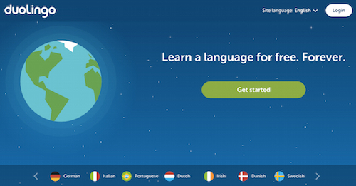
Horizontal navigation at the bottom of the browser window
The Duolingo website uses a more unconventional horizontal navigation scheme. Rather than placing a menu at the top of the page, the navigation menu is at the bottom of the browser window, below a minimal home screen.
This isn't a traditional layout, but it works due to the clean simplicity of the site design.
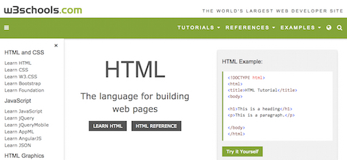
Horizontal and vertical navigation
W3Schools takes advantage of both horizontal and vertical navigation menus. There's a simple, dropdown horizontal menu featured at the top of the page, aligned to the right. There's also a vertical navigation menu featured in the left sidebar. It's hard to say which is the primary and which is the secondary menu here. They both seem to serve different important functions!
Let's explore how to use CSS to style navigation.
Using the Inline Display Property
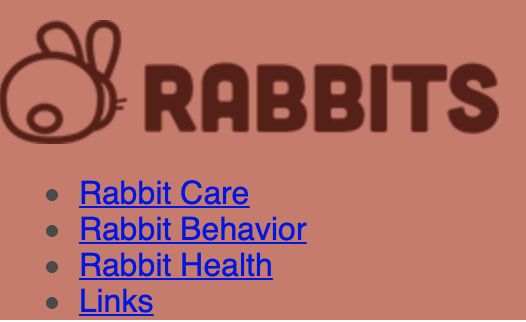
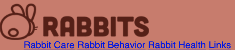
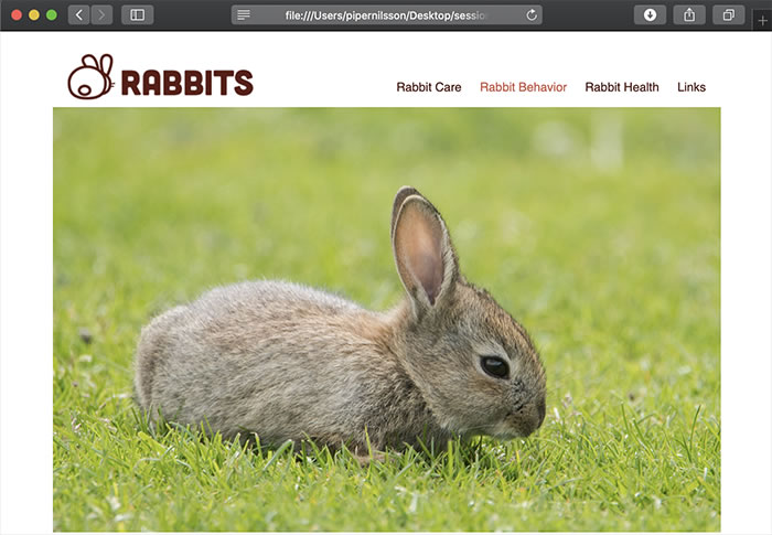
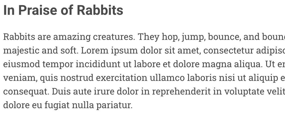
Ready to give it a try? Download the html-lesson5 folder and move it into your sessions-creative folder. Open the index.html file in your code editor. The header contains a logo image (which is wrapped in a link tag) and a list of links.
<header>
 <a href="index.html"><img src="images/logo.png" alt="Rabbits" class="logo"></a>
   <nav>
      <ul>
        <li><a href="care.html">Rabbit Care</a></li>
        <li><a href="behavior.html">Rabbit Behavior</a></li>
        <li><a href="health.html">Rabbit Health</a></li>
        <li><a href="links.html">Links</a></li>
      </ul>
   </nav>
</header>
Open the file in a browser. By default, list items are block elements, stacked one on top of each other.
To create a horizontal list, change the list items to inline elements, so they stack side by side.
Add the following CSS rules in the external style.css file. Note that we are using the "nav ul" descendant selector. These styles will format the unordered list inside the nav.
nav ul {
  list-style-type: none;
  margin: 0;
}
nav li {
  display: inline;
}
Note
The display; inline; rule removes the line breaks between block-level elements.
This gets the links on one line, but the work doesn't end here. As it stands, this navigation menu is difficult to read.
Add some padding to the right of each list item to give the navigation links some breathing room.
nav li {
  display: inline;
  padding-right: 20px;
}
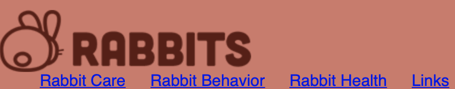
Ah, that's more like it! What if we wanted to make our horizontal navigation bar look more like, well...a bar? To accomplish that effect, add a background color and some padding to the ul element, like so:
nav ul {
 list-style-type: none;
 margin: 0;
  padding-top: 10px;
  padding-left: 20px;
  padding-bottom: 10px;
  padding-right: 0px;
  background-color: #552017;
}
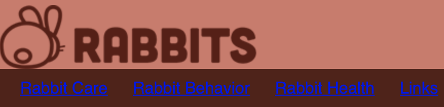
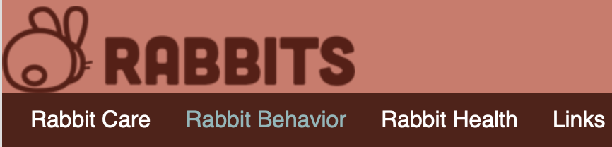
Let's choose a different color for the links and remove those link underlines! We'll do that using a descendant selector that targets the anchor links inside the nav:
nav li a {
  text-decoration: none;
  color: #fff;
}
nav li a:hover {
  text-decoration: none;
  color: #8ab7ba;
}
Remember to add hover styles to your links when using text-decoration: none. If you are not using the standard underlines, you need to give site visitors a clear indication of what's clickable text and what isn't.
Important
If you remove link underlines, make sure that it's clear your navigation is clickable.
As a final detail, adjust the padding around the logo image in the header.
.logo {
  padding-top: 10px;
  padding-left: 20px;
  padding-bottom: 10px;
  padding-right: 20px;
}
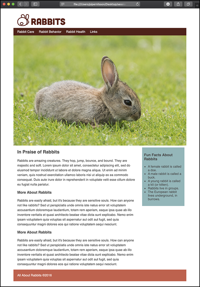
An Alternate CSS Layout
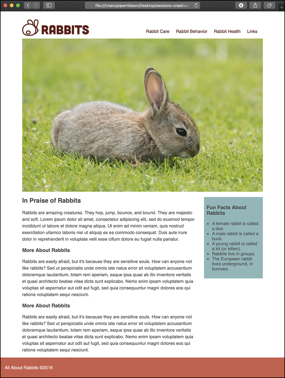
Looking at the Rabbits layout in the browser, it looks kind of boxy. The header is a rectangle, the nav bar is a rectangle, the photo is a rectangle, and so on.

Let's open this up. Change the body background color to white, #fff.
body {
  background-color: #fff;
  font-family: Helvetica, Arial, "sans-serif";
  color: #4a4a4a;
  margin: 0;
  padding: 0;
}
Delete the header background color (I've marked out my background-color property in comment tags, but you may delete it).
header {
  /*background-color: #d47869*/
  padding-top: 20px;
}
Delete the container background color.
.container {
  /*background-color: #fff;*/
  max-width: 900px;
  margin: 0 auto;
}
Already, this feels more open. However, notice how the content is indented slightly? The original version of this layout used a margin between the content and the edge of the container. Without the contrasting background color, the margin is no longer necessary.
Delete the left padding from the logo.
.logo {
  padding-top: 10px;
  /* padding-left: 20px; */
  padding-bottom: 10px;
  padding-right: 20px;
}
Delete the left padding from the article.
article {
  margin-right: 250px;
  /* padding-left: 20px; */
}
Delete the right margin from the aside.
aside {
width: 200px;
float: right;
background-color: #8ab7ba;
padding: 10px;
margin-top: 20px;
/* margin-right: 10px; */
}
The content aligns perfectly with the image now.

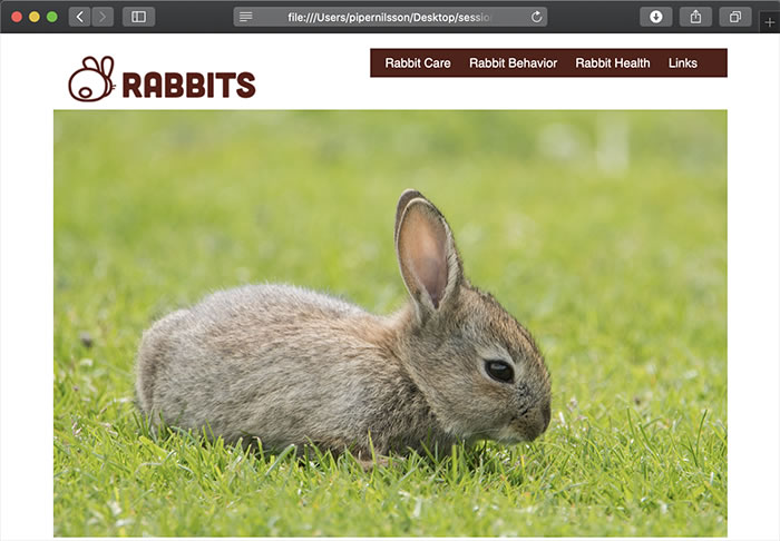
Many websites place the logo on the left, and the navigation links on the right. How is this done? Float the logo to the left:
.logo {
  padding-top: 10px;
  padding-bottom: 10px;
  padding-right: 20px;
  float: left;
}
Add a style to float the nav to the right:
nav {
  float: right;
}
The logo and nav are side-by-side, but the nav is too high.
It takes some trial and error, depending on the height of the header, but adding 35px of top margin will put the nav in the right place.
nav {
  float: right;
  margin-top: 35px;
}
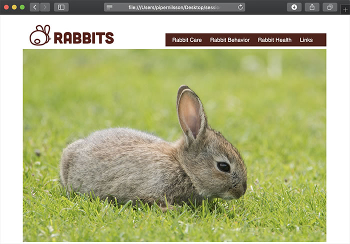
To finish up, remove the background color from the nav and change the link colors:
nav ul {
  list-style-type: none;
  margin: 0;
  padding-top: 10px;
  padding-left: 20px;
  padding-bottom: 10px;
  padding-right: 0px;
  /*background-color: #552017;*/
}

nav li a {
  text-decoration: none;
  color: #552017;
}
nav li a:hover {
  text-decoration: none;
  color: #8ab7ba;
}
Have you ever noticed how on some websites, the footer spans the full width of the browser? To create this effect, go to the index.html source code.
The footer is currently nested INSIDE the container div.
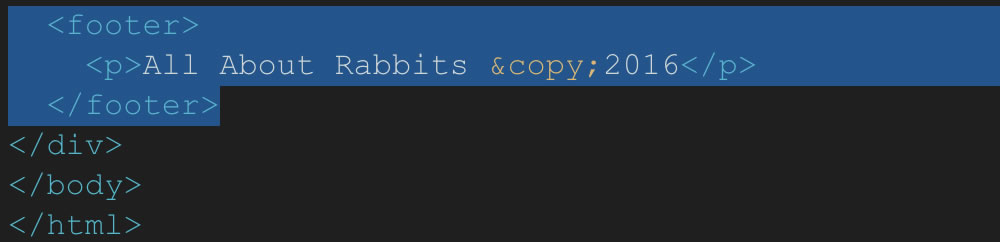
Cut and paste the footer AFTER the container's closing div tag.
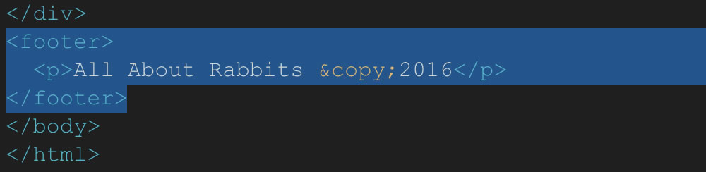
The footer is no longer contained by the container div. The layout feels more expansive.
The text inside the footer should align with the text inside the main content area. Add a container div INSIDE the footer.

This moves the footer text neatly under the paragraph text. Our alternate layout is done!

Using Web Fonts
You've already got a good handle on using CSS to transform text. Why not take that typography to the next level?
Note
Web fonts are fonts that reference a font library on the web.
Not to be confused with web-safe fonts, web fonts aren't pre-installed on a visitor's operating system, but instead reference an external font library on the web. That font is then rendered in the visitor's web browser. If the typography on your favorite blog has a hip, contemporary feel, chances are that website is using web fonts. Here's an example:
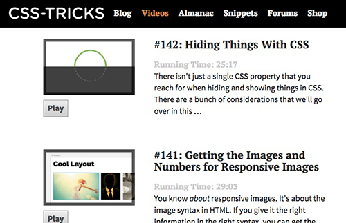
The CSS Tricks Website uses a mix serif and san-serif web fonts. Headings are in "Pt Serif" and body text is "Source Sans Pro."
The benefit of web fonts is that the possibilities are endless. While many sites offer paid subscription models, there are free options as well—the most notable being Google Fonts.
To incorporate Google fonts into the Rabbits home page, browse through the font library until you find something that strikes you. You can select multiple fonts to use in your site. But proceed with care! Because web fonts must reference external font libraries, too many web fonts can slow down the load time of your site. At this stage, I recommend adding no more than three font styles to your site.
Important
Using too many web fonts can slow down the loading of your web pages.

You can select the exact font styles you want within a font.
Google provides a "embed" code which will load the fonts in the user's browser.
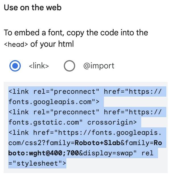
Copy the embed code.
Paste the embed code in the <head> of your HTML document.

Next, you need to tell the browser where you want the fonts to display. Copy one of the CSS rules to specify families:
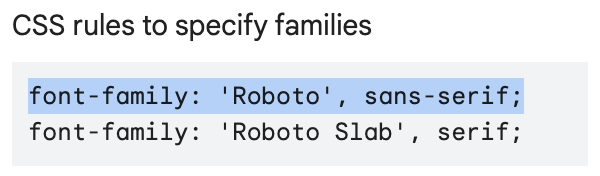
Copy the CSS rule.
Add the font names to your CSS styles just as you would with any other font. I chose "Roboto Slab" as the body font in a regular "400" font-weight, and the sans-serif version of Roberto for links and headings, in the bolder "700" font weight.
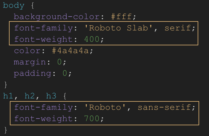
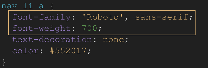
Here's what my text looks like after adding web fonts:

The links are styled in Roberto in a bold font-weight.
The body text is styled in Roberto Slab.
CSS3 Techniques
CSS3 is the most recent iteration of the CSS language. CSS3 includes lots of neat effects and add-ons that bring greater interactivity to web pages. Some of these more complex effects include things like transition effects and animation. Other CSS3 capabilities include rounded corners, color transparency values, and shadow effects for text and box-level elements.
Let's look at a few useful CSS3 techniques now!
Border-radius
The CSS3 border-radius property is used to apply rounded corners to an element. The rounded corners can be subtle (like a gentle softening of the edges of a box) or extreme (turning a box into a perfect circle). Here's some sample code for the border-radius property:
HTML:
<div class="corners1"> ... </div>
CSS:
.corners1 {
    border-radius: 10px;
    background: #f60;
}
And here are a few different examples of what the border-radius property looks like in action!
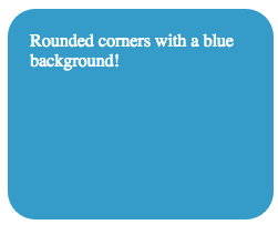
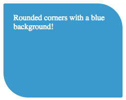
Rounded corners applied to an element with a blue background color and white text:
.box1 {
    border-radius: 25px;
    background: #09c;
    color: #fff;
    padding: 20px;
    width: 200px;
    height: 150px;
}
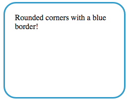
Rounded corners applied to an element with a blue border:
.box2 {
    border-radius: 25px;
    border: 3px solid #09c;
    padding: 20px;
    width: 200px;
    height: 150px;
}
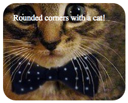
Rounded corners applied to an element with a background image:
.box3 {
    border-radius: 25px;
    background-image: url(cat.jpg);
    color: #fff;
    background-position: center;
    background-repeat: none;
    padding: 20px;
    width: 200px;
    height: 150px;
}
You'll only notice the border-radius property in action if you've assigned a different background color or border color to the box element in question. If the box element is white and the rounded corners are white, they'll be invisible!
Finally, you can apply different values to the box element to control each corner of the box. Assigning to different values creates a neat "leaf" effect!
.corners1 {
    border-radius: 3px 50px;
    background: #09c;
    color: #fff;
    padding: 20px;
    width: 200px;
    height: 150px;
}
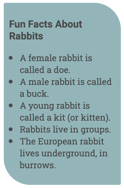
Try out rounded corners in your Rabbits page.
aside {
  width: 200px;
  float: right;
  background-color: #8ab7ba;
  padding: 10px;
  margin-top: 20px;
  border-radius: 3px 50px;
}
RGBA Colors
You've already learned about using HTML hex codes (like #fff or #40ff00) to choose color values on the web. Now, what if you wanted to assign a color to an element with a bit of transparency?
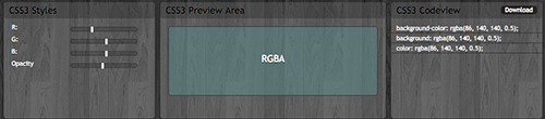
RGBA colors are RGB color values that include an alpha channel. RGB stands for red, green, and blue. RGB represents the different ways red, green, and blue light get added together to display all the colors you see on the web. The A in RGBA stands for alpha. The alpha channel represents transparency. When defining RGBA color values, 1 represents completely opaque (you can't see through the color at all) and 0 represents completely transparent (the color is invisible).
One of the great things about generating CSS3 effects is that there are many tools on the web that help shortcut the process. When adding RGBA color to a website, I turn to my favorite CSS3 resource, css3maker.com.
I've created the transparent aquamarine color shown above by dragging the RGB and Opacity slides in the left-hand column. When I'm ready to add these values to my website, I can copy the appropriate code snippet from the right-hand column:
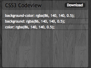
The first value list represents the red channel, the second green, the third blue, and the fourth represents opacity. 0.5 is equivalent to 50% opacity.
Text-Shadow
Last but not least, CSS3 offers some neat effects for adding captivating text shadows to your site! Here's the code for a simple text shadow:
text-shadow: 1px 1px 1px #000;
The first value of 1px represents the horizontal length of the shadow. The second value of 1px represents the shadow's vertical length. The third value of 1px specifies the shadow's blur radius (how crisp or blurry the shadow appears). The fourth and final value you should recognize as the shadow's color. Shadows are commonly gray or black, but you can play around with different color values to achieve different shadow effects.
As with RGBA opacity, you can get a bit of help creating text shadows using the css3maker website: http://www.css3maker.com/text-shadow.html
When applying shadows to text, it's important to remember that less is more. Whereas drop shadows, gradients, and beveled edges used to be very popular on the web, current design trends lean in the favor of flatness and minimalism.
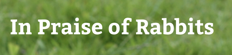
That said, if you're placing text on top of a background pattern, adding a text-shadow will give the text a boast.
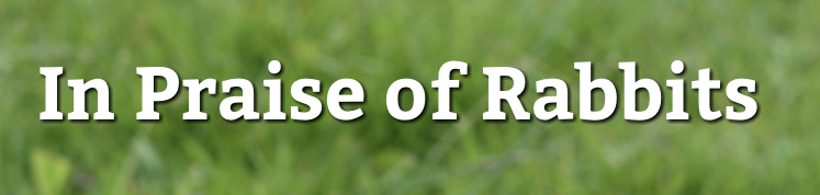
The text-shadow gives the heading extra contrast against the grassy background.
Use text shadows with care, and use them in ways that support the readability of the text and match the tone of the design.
Ready to give it a try? Hop on over to Exercise Five to put your advanced CSS knowledge to the text with horizontal navigation, web fonts, and CSS3 effects!