Project Brief
In this project, you'll transform your Books n' Beans website into a two column layout using CSS floats.
To finish it off, you'll add the Menu, Gallery, and Contact pages, checking your work against the rest of the site to make sure every page feels like part of a whole.
Important: Before beginning Exercise 3, duplicate your files so you don't overwrite your Exercise 2 website! Duplicate the html-exercise2 folder and rename it as html-exercise3. Both project folders should be nested inside the sessions-creative folder.
Back to Top
CSS Reset
Every browser's default styles are a bit different, so if we want our site to look and act the same way across the web, we'll have to start with a reset.
Reset styles are, quite simply, CSS styles that will overwrite the default browser styles. If you do a quick search online, you'll find a number of helpful reset style sheets created by different web designers. The important thing to know about reset styles is that they're meant as a starting point. Reset styles are designed to provide you with a blank slate, so you can troubleshoot spacing and sizing issues one element at a time.
Expand your html-exercise3 folder. Copy these styles and paste them at the top of your style.css:
html, body {
	margin: 0;
	padding: 0;
}

h1, h2, h3, h4, h5, h6 {
	line-height: 1;
	margin: 0;
}

p {
	margin: 0;
}

ul, ol {
	margin: 0;
	padding: 0;
}

li  {
	margin: 0;
	padding: 0;
}
Always insert reset styles at the top of your list of styles, so you can override the basic formatting with more specific styles further down.
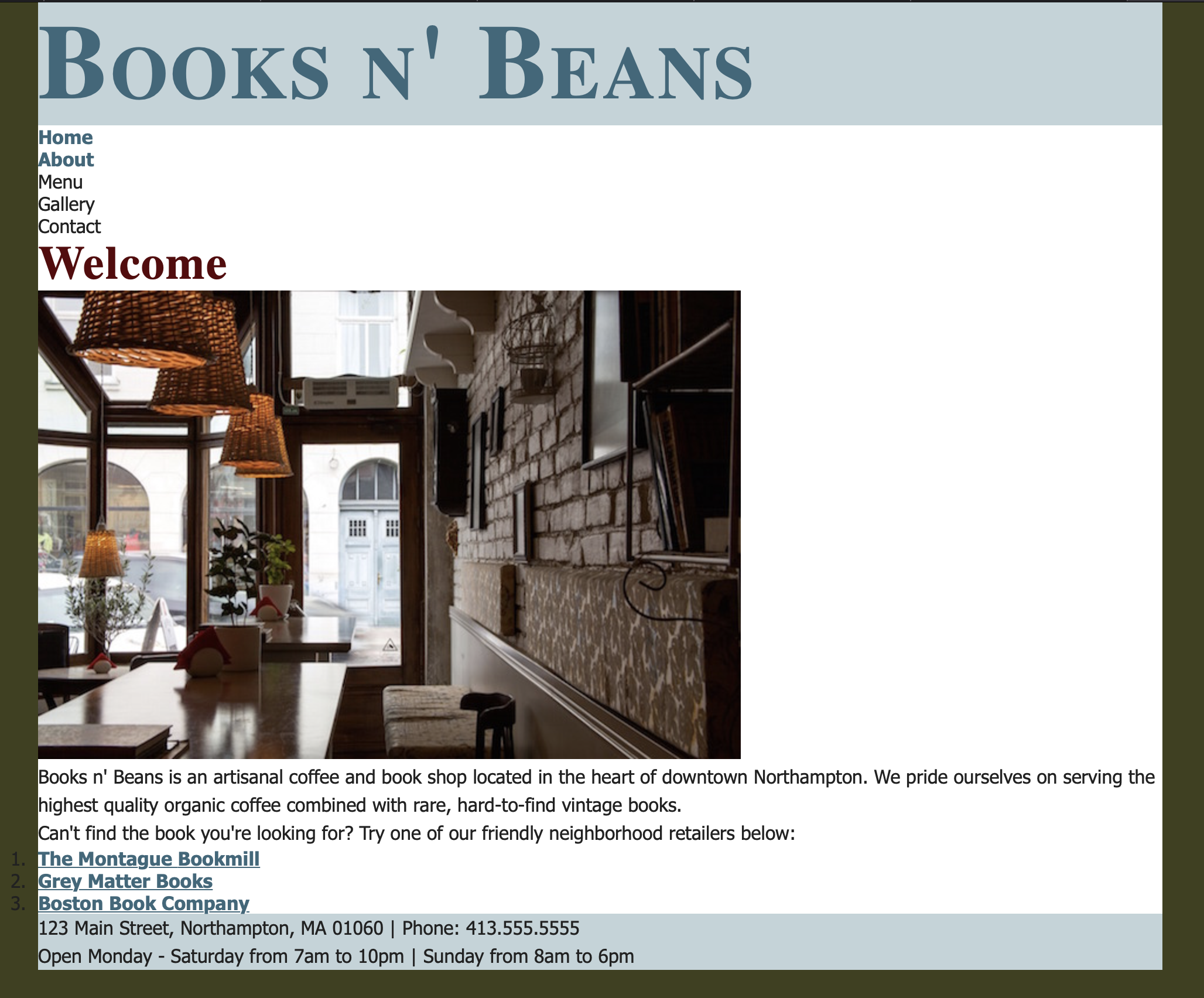
The Books n' Beans website with margins and padding reset
Hmm. It looks like our reset styles have solved some of our spacing problems, but created some others. Reset styles remove unwanted space between divs, but they can also squish paragraphs and bullet lists too close together. After adding reset styles to your site, it's your responsibility as a designer to go through and customize each style. We'll do that in just a moment! First, let's take a look at our site header and footer.
Back to Top
CSS Box Model
Header and Footer
Notice that the header and footer divs on the Books n' Beans site are exactly the height of the text inside of them. This doesn't give the text a lot of breathing room.
Let's add some top and bottom padding inside the header and footer divs. Adjust the padding values depending on what looks good in your layout.
.header {
	padding-top: 10px;
	padding-bottom: 10px;
}
.footer {
	padding-top: 20px;
	padding-bottom: 20px;
}
Menu and Main Divs
We also need some padding at the top of the menu div, and some padding at the bottom of the main div.
.menu {
  padding-top: 20px;
}
.main {
  padding-bottom: 20px;
}
Element Selectors
Now, let's add margins and padding to our headings, paragraphs, and list elements. Change this style rule:
h1, h2, h3, h4, h5, h6 {
	line-height: 1;
	margin: 0;
}

To this:

h1, h2, h3, h4, h5, h6 {
	line-height: 1;
	margin: 0;
	padding: 15px;
}
In the CSS box model, margins control space outside of block-level elements, while padding controls the space inside blocks. By keeping our heading margins at 0, the site header can stay firmly planted at the top of the page, but the text on the inside of the header and main content area gets 15px of breathing room on all sides. Adding a margin might move the actual blocks around, and adding padding just moves the content inside the block away from the edges.
Now let's add 15px of padding to the left and right of the paragraph element so the text doesn't bump up against the sides of the page. We'll control the space between paragraphs using margins:
p {
	margin-top: 1em;
	padding-left: 15px;
	padding-right: 15px;
}
Our paragraph text should now be aligned with the heading text, with a healthy 1em margin between each paragraph. But wait! You may notice that the lists overhang the edge of the container.

Apply 15px of left padding to the unordered list, and 40px of left padding to the ordered list.
ul {
	padding-left: 15px;
}
ol {
	padding-left: 40px;
}
Ah, that's better! Everything lines up.
The image also needs some padding. We'll use a descendant selector to add padding to any image inside the main div.
.main img {
padding-left: 15px;
}
Make any further adjustments as needed in your layout. Adjust the margin and padding in your layout to your heart's content!
Here's a refresher:
Equal padding on all sides:
li {
margin: 30px;
}
Margins styled individually:
li {
	margin-top: 0;
	margin-right: 10px;
	margin-bottom: 0;
	margin-left: 30px;
}
The same margins as above, written in shorthand:
li {
	margin: 0 10px 0 30px;
}
If you are unsure of where your divs are located and how your changes are affecting your page layout, try adding a border to a specific box element:
li {
	margin: 0 10px 0 30px;
    border: 5px solid orange;
}
Looking good? Let's add some floats to incorporate a column-based layout.
Back to Top
Floats
To get the two-column layout we're looking for, we'll want to start by floating the navigation menu to the left of the page. This can be accomplished by adding a left float to the menu div. We'll also want to assign a width to the menu, as floated elements without set widths can act in unpredictable ways!
.menu {
	float: left;
	width: 200px;
}
This moves the menu to the left of the page, but to get the full effect, we don't want the "main" content div to wrap under the menu.
The easiest way to achieve this is to apply a left margin to the main div. Make sure the left margin is wide enough to clear the width of the menu, including any extra padding.
.main {
	margin-left: 220px;
}

Check to make sure the proper formatting is applied to the About page before moving on.
Back to Top
Site Navigation
By this point you may have noticed that we're missing the final three pages of our site: the Menu, Gallery, and Contact pages.
Before we build these pages, we'll need some links. Open your index.html and about.html files and modify your navigation menu:
<ul>
<li><a href="index.html">Home</a></li>
<li><a href="about.html">About</a></li>
<li><a href="menu.html">Menu</a></li>
<li><a href="gallery.html">Gallery</a></li>
<li><a href="contact.html">Contact</a></li>
</ul>
Back to Top
Menu Page
Now, let's add a Menu page to the site to indulge our coffee-loving patrons. Rather than starting from scratch, I'd recommend starting from a copy of the Home page. Open the index.html file and save as menu.html (be sure to save all files in the html-exercise3 folder).
Open your new menu.html file in your code editor. Edit the document title:
<title>Menu - Books n' Beans</title>
Delete the home page content in the main div. Add the content from the menu.txt file.
Wrap the Menu heading in h2 tags.
<h2>Menu</h2>
Wrap each of the food and beverage sections in a class called "menubox," starting with the Coffee section. and repeating the process for Tea, Pastries, and Specialty Items.
<div class="menubox">
<h3>Coffee</h3>
<p>Espresso<br>
Americano<br>
Macchiato<br>
Latte<br>
Cappuccino</p>
</div>
After wrapping each section in a "menubox" class, add the .menubox class selector to your style sheet. The example below includes a border. Please customize the border thickness and color to match your site design.
.menubox {
	border: 1px solid #999;
}
Customize the .menubox style to your liking. Be sure to include:
- A border
- Margins and padding, as needed
- A background color (optional)
Use a descendant selector to format the headings and paragraphs inside the menubox divs, for example:
.menubox h3 {
  margin-bottom: 0px;
  padding-bottom: 0px;
  color: #38687b;
}
.menubox p {
  color: #38687b;
}
Continue to make adjustments until you're happy with your Menu page.
Back to Top
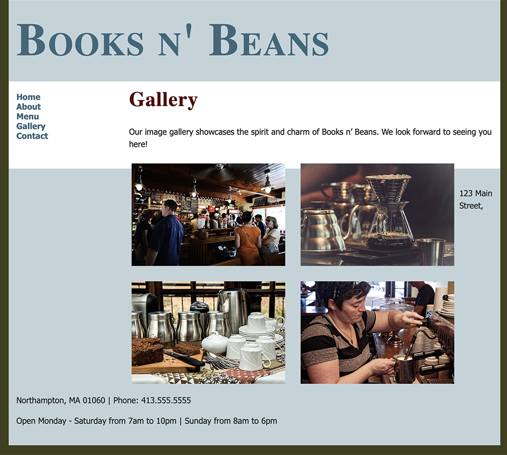
Gallery Page
Open the Books n' Beans index.html file and save as gallery.html.
Edit the document title:
<title>Gallery - Books n' Beans</title>
Delete the home page content in the main div. Add the content from the gallery.txt file.
Wrap the Gallery heading in the correct heading tags and wrap the remaining text in paragraph tags. As you can see, there's very little text to format on this page. The meat of this page is in the images, which we'll be laying out in a clean floated gallery.
Browse through the gallery-images folder and select four images for the gallery page. We're looking for fresh content here, so make sure you're not using images that have appeared elsewhere on your site! At least one of the images you choose should feature real people. Images of people will help your site feel more alive, which is important for a business that caters to humans!
Add the four images you've selected to the gallery page HTML. Use empty alt attributes (alt="") so they will be skipped by screen readers.
<img src="gallery-images/coffeeshop.jpg" alt="">
Next, we'll add a special image class to the beginning of each image. This will allow us to target just images with the class name of "gallery" in our CSS, instead of targeting every image on the site.
<img src="gallery-images/image.jpg" alt="" class="gallery">
See the snippet below for an example of what the image code might look like in your document. You may be using different images in your design, so don't copy the code word-for-word. Just use this example as a guide:
<p>Our image gallery showcases the spirit and charm of Books
n' Beans. We look forward to seeing you here!</p>

<img src="gallery-images/busycafe.jpg" alt="" class="gallery" >
<img src="gallery-images/coffee-fancy.jpg" alt="" class="gallery">
<img src="gallery-images/coffeecups.jpg" alt="" class="gallery">
<img src="gallery-images/barista1.jpg" alt="" class="gallery">
Now, let's take a look at the results.
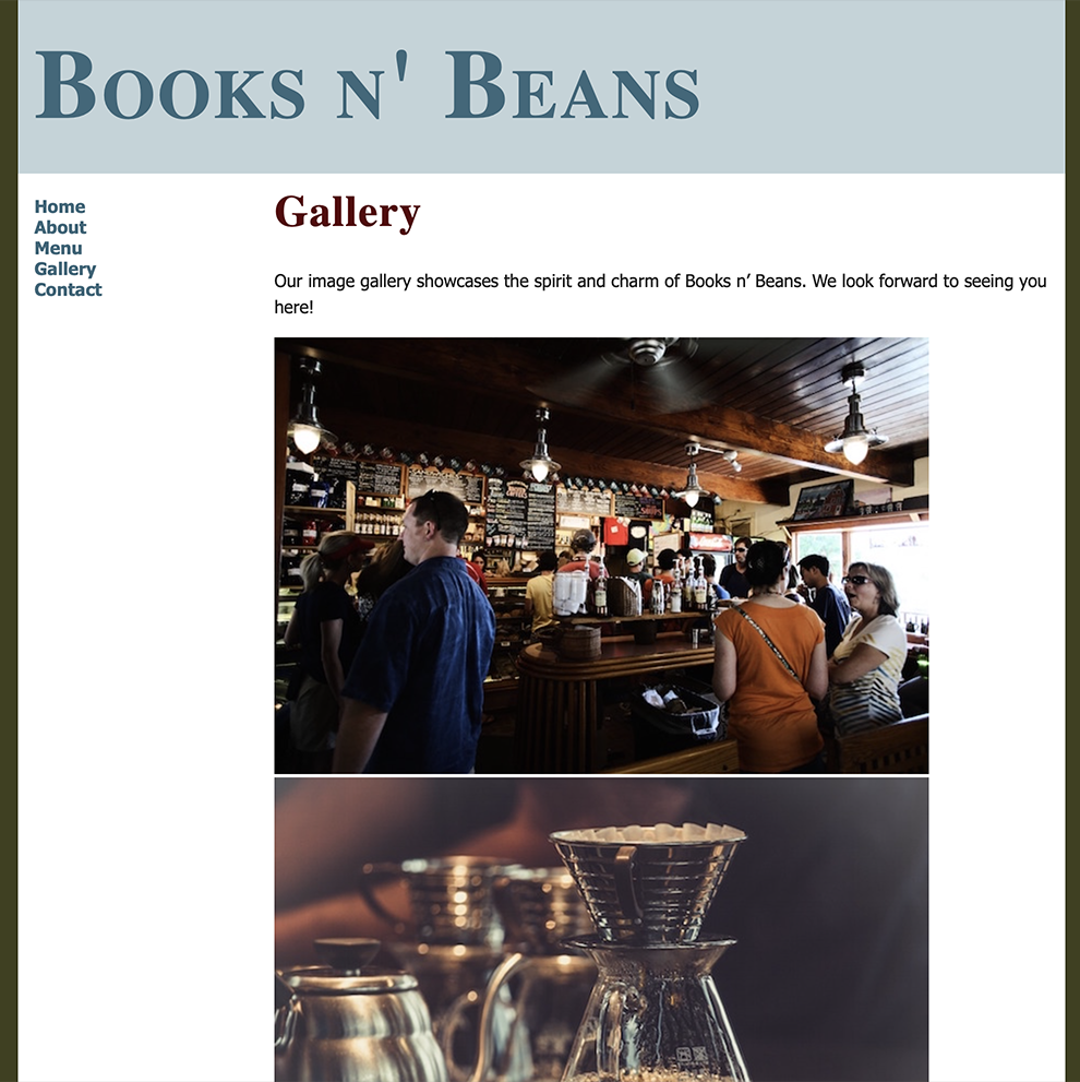
Hmmm. Our high-resolution images look very nice, but this isn't a very user-friendly gallery! Let's use CSS to decrease the size of the images and lay these out in an appealing grid.
img.gallery {
	width: 300px;
	float: left;
	padding: 10px 10px 20px 20px;
}
If you were to preview in a browser now, you'd see a jumbled mess. The floated images are taken out of the document flow, and the main div isn't tall enough to push down the footer.
To fix this, set the footer to clear "both".
.footer {
clear: both;
}
Better!
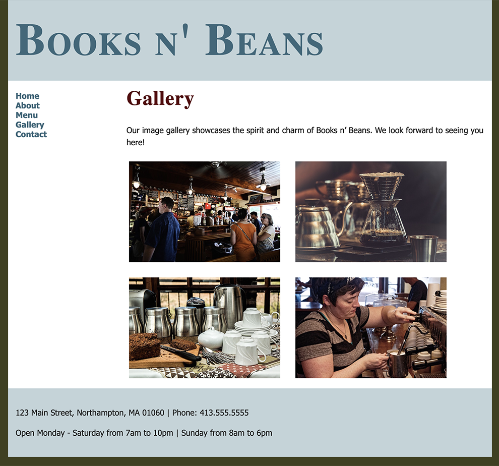
Using the above style rules, I've restricted the width of the images to 300px. I then used the float: left; property to flow the images to the left, creating a 2x2 image grid. Finally, I applied padding to the top, left, bottom, and right of the images to give them some breathing room. Without any padding, the images would appear as a solid block—not very pretty. Using these rules as a guide, experiment with different widths, padding, and margin settings until you find the sizes and spacing that works best with your design.
Back to Top
Contact Page
Open the Books n' Beans index.html file again and save as contact.html.
Edit the document title:
<title>Contact - Books n' Beans</title>
Insert the content from the contact.txt file. Wrap the Contact page heading in the correct heading tag and wrap the rest of the text in paragraph tags.
Back to Top
Design Refinements
Before publishing your Books n' Beans site to the web, I'd like you to incorporate one design element that will take this design to the next level. Using the resources listed above for inspiration, choose one of the following design elements from the list below to incorporate into your final site:
- Background image. Add a background image to the body of your site. Choose a high-quality graphic from Pixabay, and make sure you've chosen something that won't interfere with the readability of the text.
- Image captions. Add a custom class to incorporate descriptive caption text below the images on each page.
- Testimonials. Add patron testimonials to the site. Wrap text in the HTML <blockquote> element and assign custom styles to this element to give your blockquotes some pizzazz. Get creative with this one, and have fun making up some quotes!
At this point you should have five functional, well-designed pages on your site. When you preview the Books n' Beans website in your browser, do you find that the site looks consistent from page to page? Consider the following questions as you review your design:
- Does each page look like it's part of the same website?
- Are there any big differences in the color styles, font styles, or sizes that might be confusing to users?
- Have I made appropriate color choices for this design?
- Do my color choices follow good color-matching principles?
- Do my type styles work well together?
- Do the headings feel distinct from the paragraph text?
- Do my design choices follow web accessibility standards?
- Does the code validate, is the text readable, and are there any color choices or background patterns that might impact usability?
FTP
Ready to post? Use your ftp tool to connect to your web space. Upload the entire html-exercise3 folder. Add the folder name to the end of your URL to view the page in a web browser, for example:
https://www.sessions-creative.com/your-name/html-exercise3/
Back to Top
Testing
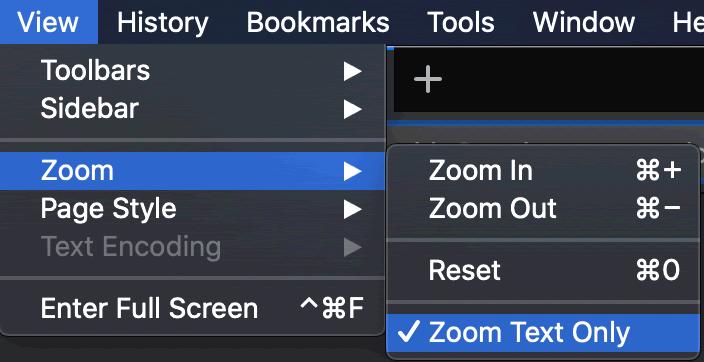
How does your design hold up when the text is resized in the browser?
Accessibility Testing: Text Resize
Users with low vision often increase the default font size. Is your layout flexible enough to accommodate changes in font size?
Download and install the Firefox browser on your computer if you don't have it already.
Launch Firefox and navigate to your web URL. Go to View > Zoom and select "Zoom Text Only".
Hit Command + to zoom the text. How does your layout hold up? If a content area overflows, check to see if the div has a "height" property. Fixed height values don't adjust to changes in text size.
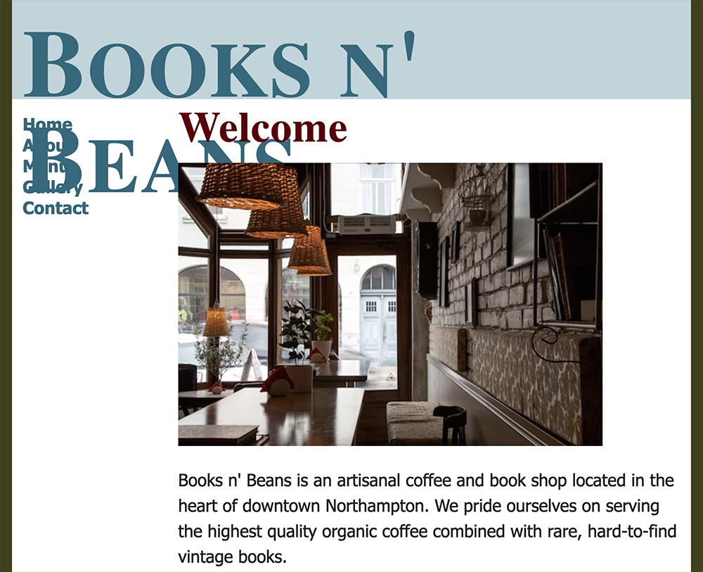
Here's the problem in my layout - a fixed height value on the header div.
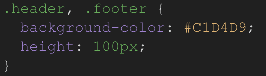
After I delete the height value, the header div expands to fix the enormous type. It is not my ideal layout, but it's what the user wants.

Back to Top

