In which we add CSS to our stylin' coffee shop site
In Lecture Two, we learned how to add CSS styles to HTML pages. We learned how use HTML elements and different CSS selector types (ID, class, and span) to assign styles to parts of a page. And we explored how to use CSS to format and style page text and color.
In this exercise, we'll add an external stylesheet to our unstyled Books n' Beans page. Then we'll transform the default serif type and boring blue links into something that's a better match for our quirky independent coffee shop/book store!
Project Goals
Attach an external stylesheet to the coffee shop site.
Use CSS selectors to structure site pages (divs) and differentiate the style of specific areas (classes and spans).
Develop a basic design for the color and typography of your site.
Write CSS rules to consistently style site color, typography, and links.
Upload, validate and troubleshoot your work.
Project Brief
Ready to start styling? For this exercise, you'll be working on the Books' n Beans site you created in Exercise One.
If there were any errors in your Exercise 1 submission, now is a great time to correct them. Again, run your site through a HTML5 validator. You can enter the URL of each page in your site or upload a file, so feel free to check your work for errors along the way.
Important: Before beginning Exercise 2, make sure to duplicate your files so you don't overwrite your Exercise 1 website! The easiest way to do this is duplicate the html-exercise1 folder and rename it as html-exercise2. Both project folders should be nested inside the sessions-creative folder.
Note: If you need to resubmit Exercise One but you overwrite the files when working on Exercise Two, you instructor won't be able to accept the resubmission. Be especially careful with file naming and folder organization throughout this course.
Remember to use lowercase letters for file and folder names. Short folder names without space marks will be easier to type into the URL after you post your folder online. Clearly label the exercise folders as you work through each exercise in this class.
Our Books n' Beans pages should already include clean, valid HTML5 markup. Now, it's time to add the appropriate CSS selectors so we can start styling the page.
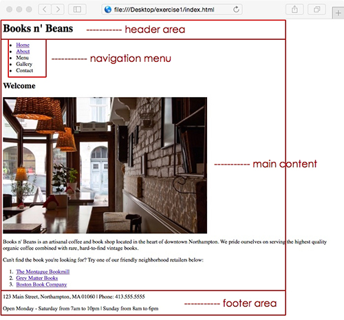
Before I start adding CSS selectors, I like to envision what the final product might look like. You don't have to have an exact image in mind, but it's important to think about where the header and footer will go, what the navigation bar might look like, and how the content is going to be laid out on the page. Here's an example:
I used Photoshop to make a few quick layout notes, but a notebook and pencil work just as well—sometimes even better—for sketching out your design!
So far, we're working with a pretty simple page layout: a header, a main content area, a navigation menu, and a footer. We can choose to add new selectors or style additional page elements as we go, but it's important to work from big to small when planning your page layout.
Ready for some style? Open the index.html file inside your html-exercise2 folder.
We'll divide the page into sections using divs. The <div> tag defines a block-level section or division within a web page. (When an element is a block-level element, it has a line break before and after it. This is contrasted with inline elements, which do not contain line breaks.)
The name block-level element connotes its function in a web page: They can be stacked, moved around, and sized in various ways. Div tags are very useful for dividing up a page into logical sections.
Ready? Wrap the h1 heading in a div called "header".
<div class="header">
<h1>Books n' Beans</h1>
</div>
Wrap the list-based navigation menu in a div with a class of "menu."
Now let's designate the main content area of our site. Wrap the page content (from the Welcome heading to the end of the ordered list) in a div with a class of "main".
<div class="main">
  <h2>Welcome</h2>
  <img src="images/coffee-shop.jpg" alt="">
  <p>Books n' Beans is an artisanal coffee...</p>
  <p>Can't find the book ...</p>
  <ol>
    <li><a href="http://www.montaguebookmill.com/">The Montague
      Bookmill</a></li>
    <li><a href="http://www.greymatterbookstore.com/">Grey Matter Books</a></li>
    <li><a href="http://www.rarebook.com/">Boston Book Company</a></li>
  </ol>
</div>
Close the main div right after the list of friendly neighborhood retailers, before the paragraph text containing the café address and phone number.
Now, wrap the address information and business hours at the bottom of the page in a div called "footer". The footer div should begin before the line of text that reads "123 Main Street…" and should end after the store hours, right before the closing body tag.
<div class="footer">
<p>123 Main Street, Northampton, MA 01060 | Phone: 413.555.5555</p>
<p>Open Monday - Saturday from 7am to 10pm | Sunday from 8am to 6pm</p>
</div>
Finally, I'd like you to wrap all of the visible page content in a div called "container". Begin the container div right after the opening body tag, like so:
<body>

<div class="container">
<div class="header">
<h1>Books n' Beans</h1>
Close the container div after the footer, before the ending body tag.
<div class="footer">
<p>123 Main Street, Northampton, MA 01060 | Phone: 413.555.5555</p>
<p>Open Monday - Saturday from 7am to 10pm | Sunday from 8am to 6pm</p>
</div>
</div>

</body>
</html>
Note that the header, menu, main, and footer divs are nested inside the container div. The order in which you open and close your divs is important, so keep track of the div nesting order. Before you go any further, make sure the Home page markup validates properly using a HTML5 validator.
If you're getting validation errors, here are some troubleshooting questions:
Have you forgotten to close any divs?
Have you opened and closed divs in the right order?
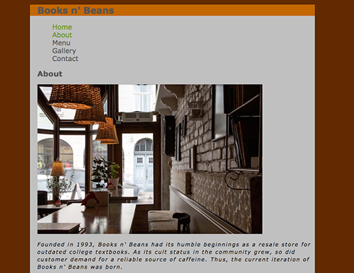
About page
MArkup
Open the about.html file inside your html-exercise2 folder.
Add the proper markup to the About page. Just like the Home page, the About page includes:
container div (.container)
header div (.header)
menu div (.menu)
main div (.main)
footer div (.footer)
The order of the markup on both pages should look something like this:
Some of the text on the About page differs from the Home page text, but the divs should begin and end in the same order. We'll be carrying this format throughout our entire site, so if you're ever unsure, use the markup on the Home page as a guide.
External Style Sheet
Create a new file and save it into your html-exercise2 folder with the name style.css.
Add a link to the style.css in the head of the index.html file and the about.html file, like so:
The Books n' Beans website will need a signature color scheme. Need some inspiration? Head to Adobe Color and click Explore.
Take a moment to consider the brand image you want to project for the cafe. Cozy, vintage? Or slick and modern? After choosing a color palette, you can click each color swatch to copy the hexadecimal color code.
Your site won't look any different until you add CSS rules to your style sheet. So, now that we're already thinking about color, why don't we start there?
Choosing Background Colors
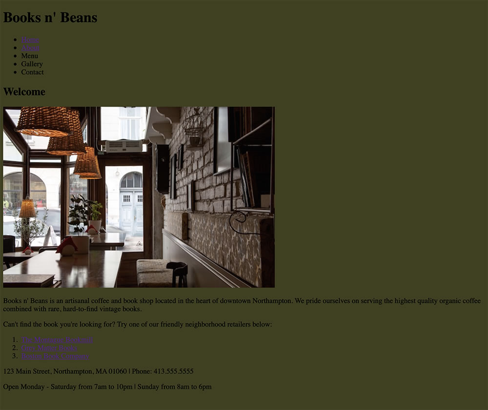
After you've made some basic color decisions, we'll start by adding a background color to the body of the site. Copy/paste the code snippet below into the first line of your style.cs
s file.
body {
    background-color: #3F401E;
}
In the snippet above I've used the hex code value #3F401E, a dark green, for the background of the site body. I've included the color for example purposes only, so make sure to select your own custom background color before moving on.
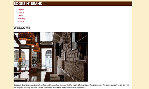
Here's what my Books n' Beans Home page looks like now:
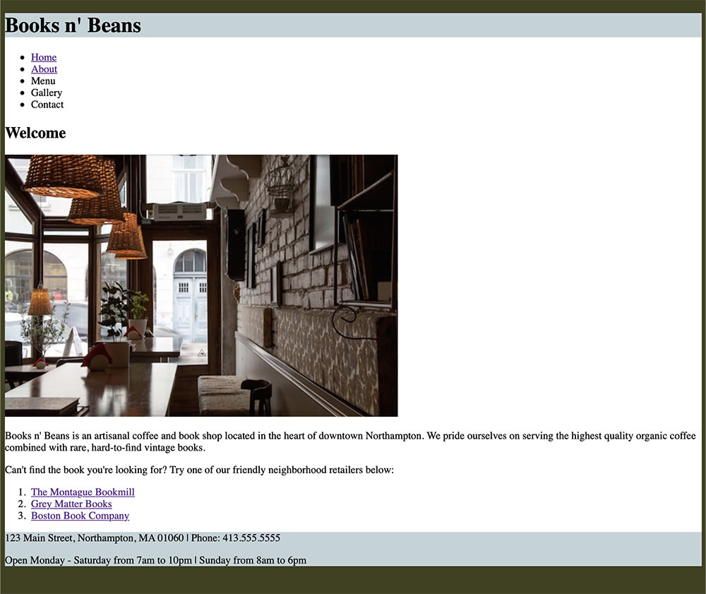
Next, I'd like you to add a background color to the container div. I'm using a white background for my container, but you may choose any color you like.
.container {
    background-color: #fff;
}
White is always a good choice for page areas with a lot of text context.
Finally, add a background color to the header div and footer div.
Here's a pro CSS tip: if you're using the same value for multiple CSS selectors, there's no need to list each selector separately. Rather than adding each selector to your style sheet like this:
If you've added the correct markup to your pages, the changes you make to your style sheet should be reflected on both the Home and About pages. Not seeing any CSS styling on the About page? Check to make sure you've added a link to the external style sheet in the head of the page!
Defining The Container width
Before we start customizing font styles, I'd like you to add one helpful CSS rule that will make your page easier to read. Let's see what happens when we assign a width and a centered margin to the container div. Add the following CSS properties to your .container style:
The result is starting to look much closer to a traditional web page layout. Assigning a maximum width of "960px" to the container div effectively restricted the width of everything inside the container—which includes the header, menu, main div, and footer. Assigning a margin of "0: auto" centered the div in the middle of the page. Now, no matter the size of the browser window, the container will always appear centered.
If you are thinking that the text is too close to the edge of the container div, I agree! We'll learn about margin and padding in the next lesson. For now, just leave it like this.
Defining Font Styles
It's time to let your heart run wild with CSS font styles! First, I'd like you to choose a font-family for the body style.
Rather than apply a custom font to every single element, you can cover all bases by declaring a font for the entire site body. This will make it so no text on your site goes unstyled!
When choosing font families, remember to use complete font stacks to ensure cross-browser compatibility.
body {
font-family: Tahoma, Verdana, Segoe, sans-serif;
}
The body font-family can be overwritten for individual elements, like links, list items, or headings, but it's an important global style for your website.
Next, choose font styles for the headings, paragraphs, and lists. It's okay to use black text if it works with your site design.
Include custom styles for each of the following selectors in your stylesheet:
Reminder: To change the background color of an element or div, use the CSS "background-color" property. To change the font color, use the "color" property.
Adjust letter-spacing and line-height as needed. You don't need to demonstrate the use of every text property you learned about in Lecture Two, but I'd like to see at least two out of the six properties used from this list:
letter-spacing
line-height
font-weight
font-variant
text-transform
text-align
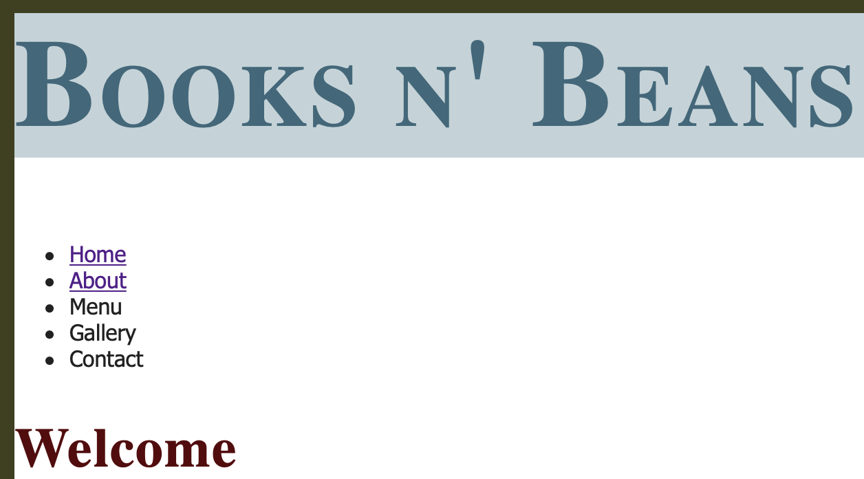
Check out the Books n' Beans header, menu, and Welcome text pictured above. The page headings have been changed to a deep blue and I've added a letter-spacing of 2px to give the headings an airy feel, and I've used the font-variant property "small-caps" for a professional, distinguished look.
My lists and paragraph text are using a dark gray font color with a custom line-height of 1.5.
I don't expect to see these exact styles on your site, but I do want to see you transform any default browser font styles into something more creative!
Formatting Links and Lists
Let's add some style to the top list of links. Start by removing the default underline that appears under the anchor links. The underline is an important signifier that said, "Hey! This is a clickable link!" Now, with the power of CSS, we can use other visual signifiers like color and font weight to make links stand out.
To remove the underlines from all anchor links, you'd add the following rule to your style sheet:
a {
	text-decoration: none;
}
That rule will remove every single link underline from the site. If you wanted to, say, remove the underlines from the navigation menu links but leave the underlines in the ordered list links at the bottom of the page, you'd specify like this:
.menu ul a {
	text-decoration: none;
}
While we're at it, let's remove the bullet points from the navigation menu at the top of the page!
.menu ul {
	list-style-type: none;
}
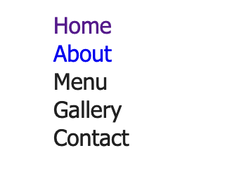
Hey, looking good! But we're still looking at those default blue anchor link and violet visited link colors. Start by changing the anchor link color to something that's a better match for your page. You might also like to set the links in a bold font weight.
a:link {
  color: #38687b;
  font-weight: bold;
}
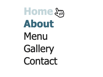
Because we've removed the underlines, it's a good idea to give visitors another visual indicator to let them know these are clickable links. Why not add a link hover pseudo-class?
a:hover {
    color: #C1D4D9;
}
There are four pseudo-classes for the anchor element:
a:link (unvisited link)
a:visited (visited link)
a:hover (moused-over link)
a:active (selected link)
Set the a:visited and a:active link states to the same color as the a:link color. You can do this using a group selector:
Styling visited links to display in a different color is really only useful on large content aggregator sites like Reddit, where a visitor is scrolling through many different links at once.
Visited links shown in brown, unvisited shown in blue. It’s easy to get lost scrolling through hundreds of cute animal pictures, so these different link styles are helpful!
Be sure to style links in a different color from the rest of your page text! A visitor should never have to go on a scavenger hunt to find your page links, and obscuring that information can lead to an accessibility nightmare!
There’s a link in there, but it’s hidden among the rest of the text!
Much better! I’ve added a bold font-weight as well, just to make it extra clear.
Resist the temptation to change the vertical navigation menu to a horizontal menu in this exercise. We’ll be working with horizontal menus later in the course, and it’s important to keep this menu vertical in preparation for creating floated sidebars in exercise 3. The current navigation menu may not look beautiful, but we’ll be getting there soon!
Save your CSS style sheet and refresh your HTML page in the browser to view the final changes. Make sure to view all pages to make sure your CSS rules are working properly across the site.
Ready to post? Use your ftp tool to connect to your web space. Upload the entire html-exercise2 folder. Add the folder name to the end of your URL to view the page in a web browser, for example:
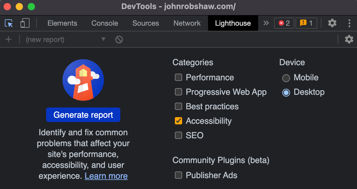
Does your color scheme meet accessibility guidelines for color contrast? Find out using Chrome DevTools.
Accessibility Testing: LIGHTHOUSE
Download and install the Chrome web browser if you don't have it already.
Launch Chrome and navigate to your web URL.
Press Command+Option+C (Mac) or Control+Shift+C (Windows). DevTools will open in a panel on the right. Choose the Lighthouse tab from the dropdown options on the right.
Select "Accessibility" and "Desktop". Click "Generate Reports". After 10 to 30 seconds, DevTools provides a report. Your report gives you various tips on how to improve the page's accessibility.
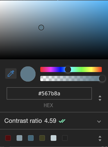
In this example, I've received a contrast alert. I'll expand the "Background and foreground colors do not have a sufficient contrast ratio" alert. I have an alert for my h1 heading. I'll click the h1 link to jump to the style.
DevTools shows me the style currently formatting my h1 text. Clicking the blue color swatch next to the color property will open a color picker.
There is a "no" icon next to the contrast ratio, indicating a problem.
If I move the circle in the color picker down to choose a darker shade, the "no" icon goes away. This darker shade has enough contrast to pass the test. I can copy and paste the HEX value into my style.css to update my design.
The WebAIM guidelines suggest a minimum contrast ratio of 4.5 for small text, and 3.0 for large text. This is a good standard to follow, but use your own judgment. If your text is HUGE, then you can get away with a lower contrast ratio. Bold fonts need less contrast than light fonts. Wide fonts need less contrast than thin fonts. Look at the text objectively—the human eye is the best tool to judge the overall readability of the text.
After checking the color contrast of your design, you might decide to make some changes to your custom.css. When you're done, repost to your web server, replacing the original files. Go to your URL and hit the refresh icon to see the changes.
If it still looks like the old version, you probably need to clear your browser cache.
Click the icon with the three dots in the top-right corner of Chrome's browser window.
Click More tools and then Clear browsing data. Select "Cached images and files" and click the Clear data button.
Refresh your browser again to see the changes.
Our Books n' Beans site is well on its way, and we'll be expanding on its layout design in the next exercise. For now, I look forward to seeing your work!
Student Ishrat Jahan used a coffee-colored background combined with a green accent color for navigation links. The sans-serif body text is italicized, with customized letter-spacing and line-height.
Student Binh Bau combined two browser-friendly sans-serif fonts, Trebuchet MS and Tahoma, in this Books n’ Beans design. The color palette is warm without feeling heavy, and the uppercase headings (styled with text-transform CSS) add a nice touch.
Student Roger Young combined muted greens to create a largely monochromatic color palette. Note the serif “Welcome” heading (Palatino) combined with the san-serif body text (Optima).