Designing
Your Cover
Most
magazine covers are around 8"x11" or larger and created in
CMYK color mode in a very high resolution for printing.
To
begin, click and download the Illustrator or InDesign template
file from the following links.
1. Once downloaded, open your chosen document. You will notice a series of guidelines to assist you in creating your magazine cover design. The green guideline represents your safe area, meaning any important design elements are safe from being trimmed when the document is cut to size during printing.
The black guideline represents where the document will be trimmed. This guideline is aligned with the crop marks outside of the bleed area. These are used by the printer to trim, or crop, the document. (Crop marks would remain with the design when it goes to print, but for now they are there for educational purposes. They will be deleted when you delete the "template" layer before you submit your assignment).
The red guideline represents your document's bleed. Bleed is the part of your cover's design that will be trimmed off when the cover is cut to it's final size during printing. Make sure that no elements key to your design is in this area.
2. Make sure you have the "template" layer selected and place the EPS file of your final magazine logo. When positioning the logo, recall the magazine examples you've seen in the lecture and the ones you found in your research.
 |
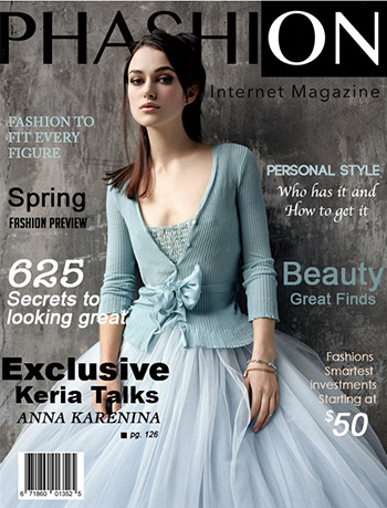
Student Erin Ramsdale did a nice job matching the black and white logo to the color scheme of her design. At
this stage, you may want to change the color of your
logo to fit your planned design. |
3. Select
the most intriguing of your stories and choose one image as the main
eye-catcher. Keep in mind what you learned from the story
of I.D.'s cover and your other research.
Bring
your image onto your template file and position as needed. You may also
want to do some tweaking to the image in Photoshop, such as retouching, cropping,
or modifying the background.
Take
close notice of the negative space around the image and how the image
interacts with the logo at the top. Make any changes you feel are best
accordingly.
4. Use
the Type tool to place the dominant headline for this topic/image as well as any
subheading that accompanies it. Make
sure that it, along with the image dominates the cover. Consider placement
of the headline (around the image? Over the image?), font, and color.
5.
If you choose to present other, secondary stories on the cover, make
sure that they are given minimal visual attention while still handled
tastefully. You may also like to add other standard magazine elements
to the cover like the month or price.
6a. Delete the "template" layer and go to File > Save As... and name your document
"cover_design". If you are using Illustrator, go to Export > Export As... and when the Export window comes up select JPEG
for the format and make sure that Use Artboards is checked. Now you have a JPEG version for submission to the course (don't submit
till you have the spread done as well).
6b. Delete the "template" layer and go to File > Save As... and name your document
"cover_design". If you are using InDesign, go to File > Export... or Command "e" and when the Export window comes up select JPEG. Now you have a JPEG version for submission to the course (don't submit
till you have the spread done as well).
Planning
Your Spread
With
the cover finished, you'll
create a two-page introductory spread for your cover story. So let's
look at a few spreads to get you started. Also, take some time to review
the spreads in the lecture and the various successful approaches you
can take at presenting an article.
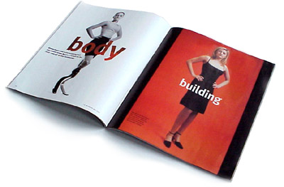
In
the opening spread of the I.D. story, the designer has chosen to use
very little article copy in order to create good contrast and impact
before entering the text-dense area on the following pages.
 |
The
introductory spread for the I.D. article is very sparse and dramatic,
with just the article title, images, and some supporting text. |
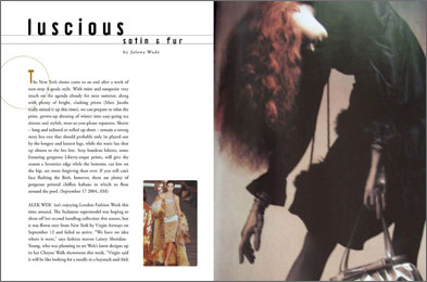
In
the Phashion spread shown below, by student Lauren Bzdak, the article
begins right away. With the loose leading and use of just a small portion
of the page, she does not overwhelm the reader with text. The text
is nicely balanced with the large image on the right and the small
image taking up the bottom of a column.
 |
| In
Lauren's spread, some geometric accents (a circle at the beginning
of the body copy and two lines along the title) add interest, and
there is plenty of white space. |
Additionally, check out the following Review Kit to recap the essentials of creating a layout with a grid:
Designing
Your Spread
Like
the cover, you'll begin with a template, this time of a two-page spread.
Click the links below to download the full-sized template of your chosen application.
1. Open
the file and once again you'll see the guidelines creating a template on your background layer.
 |
| Though your text and image placement will certainly be different than the Brody example from the lecture (the gray areas above), the grid may be similar. |
2. Measure
and place some grid lines (three columns per page) on your template layer
to help you position your content.
3. Choose
your images for the spread—the number is up to you, but typically
one main image and a smaller image or two are best. Don't reuse
the image on your cover, but related images
are great. Size and position your images considering the grid and negative
space.
4. Add
at least the headline and a subheading, but it is up to you how
much
text you want to put in addition to this such as body text, pullquotes,
or captions.
5. Use the process creating JPEGs that you did when you created your cover design for submitting your spread design.
Thinking
about your research, your logo, your cover, and your spread, answer
the following questions:
1. What
magazines did you research before beginning your designs? If
possible, provide links to the magazines' Web sites so your instructor
can check them out. How do you feel this research affected your
designs, and what magazine do you think had the most impact
on your own design decisions?
2. When
someone sees your cover on the newsstand, what do you feel
will be communicated to him/her immediately? Why?
3. What
is communicated by your use of images, text, and layout in your
spread? What will make the reader want to continue reading the
article?
4. What
was the biggest challenge when you created your cover? Your
spread?

