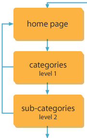
After
coming up with a suitable hierarchy for your site, you'll want to
think about several aspects of visual design that will impact the
relationship you create with your site visitors. The formatting,
colors, and graphics you use to present your navigation and site architecture
should
quickly direct users to exactly what they're looking for, and make
them feel comfortable all the while.
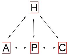
Navigation
Schemes
Of
critical importance is site navigation.
There are many reasons why navigation is so important for any Web
site, but the mere fact that
our goal is to turn our visitors into customers makes for the compelling
argument that navigation becomes even more important in the e-commerce
environment.
Navigation
schemes include:
 |
|
 |
| |
-
Primary
navigation: This
is the main toolbar where the majority of site navigation
occurs.
-
Secondary
navigation: These
are navigation elements used in specific sections of the
site.
-
Persistent
navigation: Typically found in headers and
footers, these are navigation options that remain on every
single
page of the site.
|
|
 |
|
 |
Let's
look at these schemes on Amazon.com:
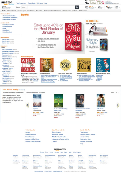 |
The
main page of the Books category at Amazon.com (middle removed for length). |
The
primary navigation area, in blue at the top of the page, offers the
main methods for browsing the site as a whole, linking users to main
categories and global shopping features like the cart and account info.
A
secondary navigation is found in the left column. This is
an expansion of the Books department, offering every subcategory
within Books. The secondary navigation bar content varies from
department to department. The secondary navigation in a department like
Electronics will have a very different listing of subcategories.
Finally,
the persistent navigation can be found at the bottom. These
links are available no matter where you are in the site and bring
the users to important parts of the site not related to the actual
shopping. Good
candidates for persistent navigation include the about page, any
policy pages, and copyright and contact info.
Navigation
Design
You'll
notice that many Web sites use the horizontal bar approach as a means of
primary navigation. This approach can be very handy for the main navigation bar because,
as Amazon has shown us, you drive new and return users to main content areas, like the cart, that will not change frequently like subcategories might.
Other
primary and secondary navigation types include standard
toolbars in vertical positions. Persistent navigation
is used on almost every large, professional e-commerce site as a
means to ensure that visitors can get to the information they need
quickly.
All
of these forms of navigation design are considered conventional,
and most experts agree that deviating from them too radically can
cause
usability
concerns. Remember, the more intuitive it is to get around, the more
products the user will see and ultimately purchase.
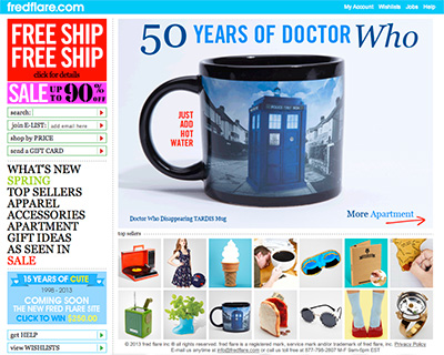 |
| Even
bold, fanciful shops like fredflare.com use clean, standard
navigation buttons. Notice in this example that the primary shop
navigation
is on the left, while persistent navigation is in the top bar. |
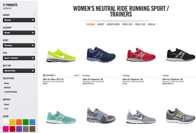
Nearly all e-commerce sites define their navigation area with
a colored background. This approach, in addition to consistent placement
of navigation, helps separate the navigation from the main
content areas. Additionally, visual treatments are typically
applied to navigation links to help users understand that they
are clickable. If the links are comprised of text, a CSS property
may add an underline and/or change the text color when the
user hovers over it with the mouse. If the links are graphics,
rollover treatments are commonly used, swapping a new button
graphic in when the user rolls over the button. Usually just
a subtle change in color or effect is needed, as in the example
below.
 |
| Text links on the left side of jr.com
get a CSS highlight effect when rolled over. This technique helps reinforce
the "clickability" of navigation elements. |
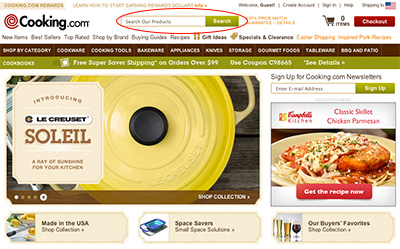
Color
and Commerce
One
of the most fascinating aspects of working in a worldwide medium
such as the Web is that we have to become more highly attuned to
what appeals to people from other cultures.
The
use of color in design can make or break a site. Imagine a site trying
to sell books on health and well-being that's designed all in black?
Or a site that's appealing to heterosexual men that uses liberal doses
of
pink?
For the most part, these would be considered dangerous (or at least unexpected) color choices.
Well,
when we study culture at large, we find that this becomes even more
challenging because there are cultural differences in how color is
perceived.
| Color |
Cultural
Significance |
|
Red
|
In
China, red is used to express celebration and good luck. Combined
with white, the power of both colors increases the significance.
In Western culture, red can represent boldness, activity,
rage or aggression.
|
|
Blue
|
Interestingly,
blue is considered the safest color to use around the globe
because there are no known negative cultural
connotations. In China, the color represents immortality. In Judaism, blue is a holy color. In Hinduism, blue is the color
of the god Krishna.
|
|
Green
|
In
many cultures, green is seen as very calming and uplifting.
One caution for U.S. designers using color for global audiences
is to not associate green with money, which of course is common
in the U.S. because all of our paper money is green. This is
actually quite rare, as most countries around the world use multicolored
paper money and do not associate green with wealth or finance.
|
|
Yellow
|
In China, yellow is an imperial color. In western cultures,
yellow is often associated with happiness, children, and joy.
|
|
Purple
|
Purple
is a problematic color. In Catholic Europe, it has had a long
association with mourning and death. In the U.S. and many
other cultures, purple is related to mysticism, new age, and
alternative religions. In parts of the Middle East, purple is
associated with prostitution. Designers should use purple with
great care. It's not surprising to learn that purple is found
in nature very infrequently.
|
|
Orange
|
In
product packaging, particularly in the U.S., orange is used to
express cheap or inexpensive. As a result, it should generally
be avoided in sites attempting to express luxury and elegance.
|
|
Brown
|
While not as widespread in positive connotations as the color
blue, brown is a very neutral color and is almost always associated
with nature.
|
|
Gray/Silver
|
Gray is used worldwide as a neutral color. Silver tones tend
to express sophistication and technology, at least at this time
in history.
|
|
White
|
While so very commonly used for contrast in design, white has
paradoxical cultural significance of a rather profound nature.
In most western cultures, white is a symbol of salvation, holiness,
and purity. But in some western and many eastern cultures, white
represents death and mourning.
|
|
Black
|
Black also has profound cultural paradox: It is the color of
death and mourning in many cultures, representing also the dark
spirit world and evil. In contrast, black has long been associated
with elegance and sophistication, especially in cosmopolitan,
prosperous, and progressive areas of the world.
|
You'll
notice that The Jewelry Source sample site is done in white with
orange-gold and blue. How do you think these colors work with the luxury
jewelry being sold? If you're using the template in your exercises,
consider now how you might change the color scheme, or why you would
keep it the same if you feel it is appropriate.
Black is considered
to be very elegant and when combined with jewel tones,
setting up an expensive and upscale environment rather than one
that is dark and depressing. However, the use of black is generally
thought
to be a bad idea unless you have a very specific goal in mind—its
bold appearance isn't right for every site and stands out much more
than a typical white background.
 |
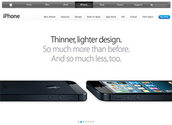 |
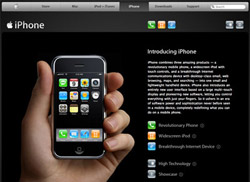
Apple went with a black site (left) to promote the launch of the first generation of its sophisticated
iPhone, then back to white when it became a more commonly used device. |
In choosing colors for a site, consider a palette of just two or three
main colors to keep the design cohesive: a single main color, a single
body text color, a single accent color. Additional colors can later
be chosen as needed that relate to the palette.
The main
color of a palette is often taken from (or closely related to)
the
company's
logo
color. A main color is typically used prominently on every page:
within the banner, on headline text, in the navigation, and so on.
An accent color is used less frequently but helps specific components
of a page to stand out, like sale items and important headlines. Variations
of these colors (lighter or darker, more saturated or less saturated)
help to give you more options so the page is not monotonous.
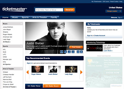 |
Ticketmaster.com's previous layout
used blue as its main color, based on the corporate logo. While blue
is used in many places on the page, several values and saturations
of the color add variation. Orange is used as an accent. |
The color of the body text is usually chosen in relation to the page
background color so there is adequate contrast for readability. Commonly,
white is the background while black is the body text color or vice
versa. Variations on these are fine as long as contrast is maintained
and the colors relate to the other colors in the site.
Layout and Typography
Unlike highly creative site types, like designer portfolios and edgy
band discographies, e-commerce sites need a somewhat more conservative
approach to layout and type. We discussed this early in relation to
navigation, and it applies throughout an e-commerce page design.
Basic
grids and straightforward fonts are the name of the game for the
simple reason that you want your focus to lie on the products themselves.
The surrounding interface should be essentially "transparent," a no-brainer
way to get to the goods.
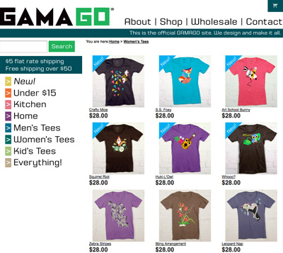 |
At gama-go.com,
the tees are totally creative, but the surrounding layout is
clear and something shoppers can quickly understand. Shoppers
have seen a layout like this many times before, even if the design
elements within it are unique. |
In most cases, you'll want to use sans-serif fonts (like Helvetica,
Arial, and Verdana) for long passages of text, small text, or for important
links because those are considered easiest to read by most Web users.
Serif
fonts
and other
decorative
type can
be
used for promotional text, large but short areas of text, and other
less essential copy.
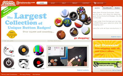 |
Prickie.com's former design uses a
simple sans-serif typeface for most of the text, like navigation
and item descriptions. A serif typeface is used in promo graphics as an accent.
|
Like colors, pick just a couple of fonts to prevent distraction, and
use variations of those fonts as needed, such as bold and italics,
for emphasis.
How
we use language on our sites can be persuasive—or
not! Just as the human voice can express a multitude of sound and
fury,
so
can
the written word. Using the right words can help encourage your
customers and help them feel more secure.
When
I speak of "voice" in the sense of content, I'm referring to the
character of the language used,
as well as its personality. To
get a sense of voice in marketing, watch TV commercials closely—you'll
hear all kinds of approaches to get certain responses. As always,
well-written and expressed language will best influence the audience.
Writing
for the Web demands that we find the appropriate voice and use it.
Just as the visual design of your site is the physical face it presents
to the world, so is the language the vocal aspect, and it can influence
or offend just as easily as visual elements can.
If
you are catering to a very specific audience, write to that audience.
If you're selling hip clothes to teenagers, you're going to want to
speak to them in their own language. Using a stern or authoritarian
voice in that situation would simply not work. Below, you see the Delia's home page, a site offering clothing and accessories
for young adults. The language is very short and energetic. Plenty of exclamation points and a cute pun or two for good measure. The colors bright and vibrant. All engaging to the audience.
 |
Delias.com delivers youth-oriented language and tone appropriate
for its audience. The text is also concise for quick reading.
|
Conversely, if you're trying to sell
heavy-duty pickup trucks, using a loose or cutesy voice could be disaster. In this
case, you'll want to use a confident,
strong voice that expresses security and reliability, such as found
on the Ford F-150 site below. Note also the colors and typefaces that contribute to a heavier overall look and feel. Along with
the language itself, these features all work to convey a more conservative image
than the Delia's site. Again, all of this harkens back to the "know
your audience" concept. Only then can we take all of our Web site knowledge
and apply it effectively to the individuals we want to have as our
customers.
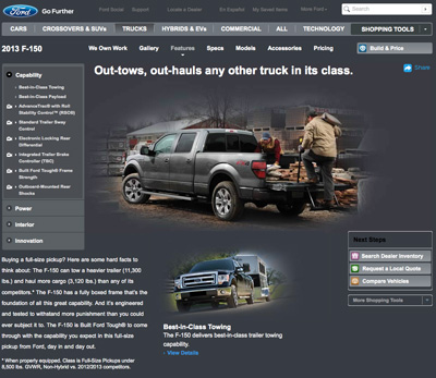 |
Here, the text is more conservative
and direct, delivering specifications and other information in
clear language.
|
Working
with Text
The
computer environment itself has many constraints in the context of
visual communications. Our eyes tire easily, attention spans are
limited. As a result, writing for the Web has become a study of its
own.
The
most important concept to arise out of writing for the Web is that
of chunking. Chunking is the
breaking down of information into digestible portions. This keeps
the writing clear and provides plenty
of visual white space so the eye can rest and
be guided to the next
information.
In
chunking, the use of tables and lists have very important roles,
since both are excellent means of displaying details without overloading
the eye. Some of the content you can successfully input into well-designed
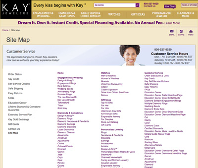
tables includes the following:
|
|
|
| |
-
Financial
information: Many
companies and organizations (especially banks) use tables
to display financial data.
-
Calendar-based
information: Tables
are a natural choice to design a calendar layout for the
Web.
-
Product
tracking or feature comparisons: Many e-commerce
companies use tables to reflect product status, availability,
pricing, tracking, and comparison.
|
|
|
|
|
|
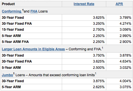
WellsFargo.com places
loan information into simple tables for better display. |
|
Adobe.com
offers an Acrobat product feature comparison in tables. |
With
a strong database attached to any of these examples, the integration
of content and technology becomes clear.
Lists
are extremely useful, too—especially bulleted lists. They help to:
|
|
|
| |
- Assist
the content writer in his or her goals to improve pace.
- Keep
information chunked.
- Ensure
clear communication of ideas.
- Break
up the visual space for improved readability.
|
|
|
|
|
Notice
how the list on the following page helps break up the space while
honing in on important points:
 |
| Imagine
if the bulleted lists on kingarthurflour.com's products pages were instead compiled
paragraph form. This would have been more readily ignored by the reader, and possible even result in more returns because shoppers were not familiar with the product details. |
Ordered
lists are very helpful in certain cases, especially if you're giving
directions (such as steps on how to order), as in the following example:
|
|
|
| |
1. Fill
out your shipping and billing addresses.
2. Choose
your method of shipping.
3. Enter
your credit card information. |
|
|
|
|
Editing
Editorial
concerns are abundant on the Web. It's almost as if people think,
well, it's the Web, we don't have to spell things right or talk
good. ;)
Wrong.
Having
a few good grammar books for your language on hand can be helpful,
and if the budget and human resources allow, having an editor or
editorial team is excellent.
Also,
don't underestimate the important of spell-checking. Would you want
to give your credit card information to a site rife with misspellings?
Another
topic that interests me a great deal is how to write without bias
toward gender, race, or physical ability. The American Psychological
Association (APA) has published some excellent style guidelines in
this area. I highly recommend reading these guidelines and making
them available to anyone with whom you will be developing site content.
 Learn about site architecture for e-commerce sites.
