Dropdown Menus
Dropdown menus allow users to select from a list of options.
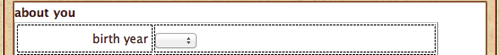
Insert your cursor in the upper-right table cell of the "about you" fieldset. Click the Select (List/Menu) icon  in Insert panel (or Insert > Form > Select (List/Menu).
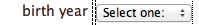
Give the menu an ID of "birth-year" and a label of "birth
year" in the Input Tag Accessibility Attributes dialog.
A small dropdown menu will appear along with the "birth year" label. Select the <label> and drag it into the left table cell.
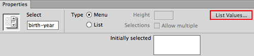
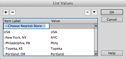
Select the dropdown menu and click the List Values button in the Property inspector to add the list items.
|
Make sure the Menu radio button is selected, then click List Values to enter the menu items. |
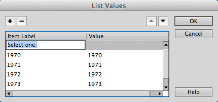
Add a few list items for the "birth year" dropdown menu. Give each entry an Item Label (the text the user will see for each choice) as well as a Value (the results you will receive).
|
Use the plus icon to add list items, and the minus icon to subtract items. |
Did you notice in my above example that I included an Item Label called "Select
One:"? I don't want my users to actually pick this, but it is a helpful reminder to choose an item from the menu.
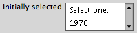
To make sure "Select One:" is visible when the page first
loads, use the Initially selected option
in the Property inspector.
|
|
Select the list item that you would like to appear when the page first loads. |
Try out this dropdown menu to see another way to format a menu visually. This formatting method won't change how you receive the form results, but it will help to organize the items for the user:
Now look at the List Values for this dropdown menu:
|
Simple punctuation breaks up the menu so the items are quicker to scan and select. |
List Boxes
List boxes bear a distinct similarity to dropdown menus. They are so similar that they share the same insert button, Property inspector options, and List Values window. The difference? A list box can be several lines long, and it allows for multiple choices if the user holds down the Command key (Mac) or Ctrl key (Windows).
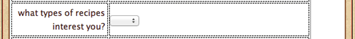
Insert your cursor in the right column of the second row and click the (List/Menu) icon in the Insert panel.
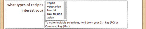
In the Input Tag Accessibility Attributes dialog, give the menu an ID of "interests" and a label of "what types of recipes interest you?"
Select the <label> and drag it over to the left cell.
Click the List radio button in the Property inspector to make it a list menu rather than a dropdown menu. Choose the number of visible lines with the Height option. Enter the various items into the List Values dialog.
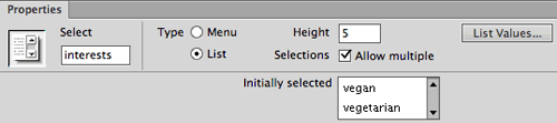
Checking "Allow Multiple" will allow users to select multiple items. If you choose this option, it's helpful to provide instructions such as "To make multiple selections, hold down your Command key (Mac) or Ctrl key (Windows)."
|
Notice the scroll bar in the above example. It
doesn't matter how many items are added to this list box—they
will only take up five lines of space. |
Text Areas
A text area is simply a multi-line text field. Text areas are useful for comments, message board posts, and other lengthy
typed responses.
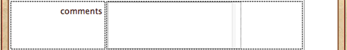
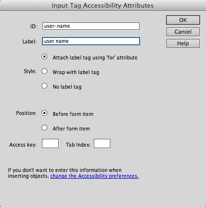
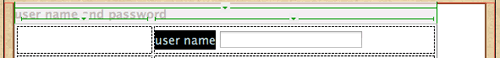
Insert your cursor in the right column of the third row. Click the Text area button  in the Insert panel (or Insert > Form > Textarea). Give the text area an ID of "comments" and a label of "comments".
Select the "comments" <label> and drag it over to the left cell.
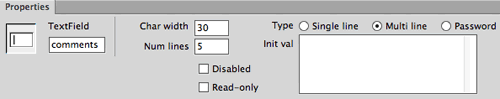
The width of the text area is dictated by the Char width field in the Property inspector. Change this value to "30".
|
Always allow a little extra space to the right
of the text area—the character width may vary depending on the
user's default font size. |
The height of the text area is set by a property called Num
Lines (number of lines). If the user types beyond the allotted
space, scrollbars will appear.
|
Even though I have chosen a visual area of 30
characters wide by five lines tall, the amount of text the user
can enter is unlimited and scrollbars will appear if needed. |
This fieldset is finished—ready for the next set of elements?
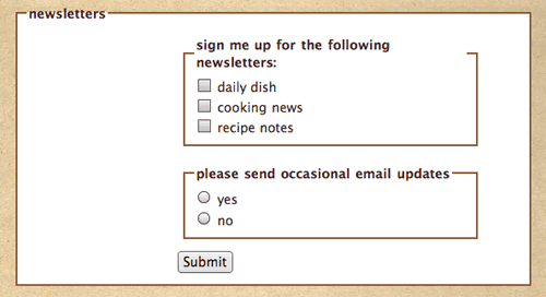
Checkboxes
Checkboxes allow selection of multiple options. "Check all
that apply:" is often used to introduce a series of checkboxes.
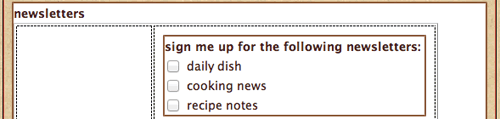
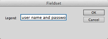
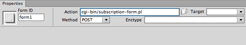
Click inside the upper-right cell of the "newsletters" table. You will need a nested fieldset to contain the checkboxes. Choose the Fieldset button  (or Insert > Form > Fieldset) to insert a new fieldset. Enter "sign me up for the following newsletters:" into the Legend field.
Press your Right arrow key to move your cursor to the right of the legend. Then click the checkbox button  in the Insert panel or choose Insert > Form > Checkbox. Give the checkbox an ID of "daily-dish" and a label of "daily dish".
Press Shift-Return to create a line break, then insert another checkbox
with an ID of "cooking-news" and a label of "cooking news".
Press Shift-Return again to insert a third checkbox. Give it an ID of "recipe-notes" and
a label of "recipe notes".
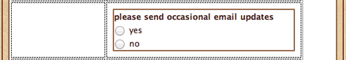
Radio Buttons
Radio buttons retrieve mutually exclusive data. Only one option can be selected; clicking one radio button in the group turns off the other. Try it here:
Click your cursor inside the second row, right column of the "newsletters" table. Choose the Fieldset button (or Insert > Form > Fieldset) to insert a new fieldset. Enter "please send occasional email updates" as the fieldset legend.
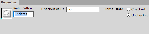
Press your Right arrow key to move your cursor to the right of the legend, then click the Radio Button icon in the Insert panel  or go to Insert > Form > Radio Button. Give the radio button an ID and checked value of "yes". Then hit Shift-Return and add another radio button with an ID and value of "no".
After creating both buttons, make sure that they are both assigned the name "updates" in the left field of the Property inspector. When several radio buttons have the same name, they are part of the same group. If you plan to have two or more sets of radio buttons, each set should have a different name so they don't exclude each other's choices.
 |
|
Both the "yes" and "no" radio buttons have the same name. This tells the browser that they are part of the same group. |
You can also create a group of radio buttons using the Radio Group option  in the Insert panel. This opens a dialog in which you can program all of your radio buttons at once to avoid any naming mistakes.
Buttons
In order to submit a form, you'll need a Submit button that
tells the data where to go (this is where the back-end processing comes
in).
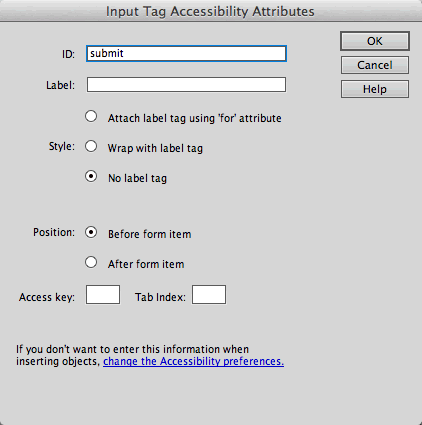
Insert your cursor in the last row, right column of the nested table and click the Button icon  in the Insert panel, or Insert > Form > Button. Enter "submit" in the ID field. Leave the label blank. Select No label tag from the style menu.
|
Buttons don't require a separate label. |
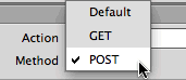
When you insert a button, it has a "Submit form" action by default and is labeled "Submit." Selecting "Reset form" or "None" will change its action as well as its label.
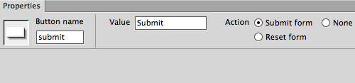
The most important feature of a button is its action. You can't re-label a Reset button with the name "Submit" and expect it to submit the form. You must choose the correct action using the radio buttons in the Property inspector:
 |
|
 |
| |
Submit form: This button submits the data to the form handler.
Reset form: This button clears all of the data entered in the form by the user. Most users find this to be redundant or confusing (wouldn't you hate to accidentally click Reset after filling out a long form instead of clicking Submit)?
None: On its own, this button will do absolutely nothing when clicked. That's right, nothing! However, special code can be added to the form to give a None button special attributes—for example, you can select the button and apply a behavior such as a form validation script. |
|
 |
|
 |
Buttons look like gray boxes in Windows or blue-clear "jellybeans" on
Mac OS X. If you want to customize the design of the button, use an image field. Click the Image Field icon in the Insert panel  or go to Insert > Form > Image Field, browsing to select your custom-designed button graphic. That's it—the "Submit form" action and the form handler code will take care of the rest.
Final Design Adjustments
One more detail to finish up. Previewing the form in Live View, you'll notice that there is a lot of space around the nested fieldsets.
|
There is too much space surrounding the nested fieldsets. Also, too many borders. |
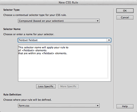
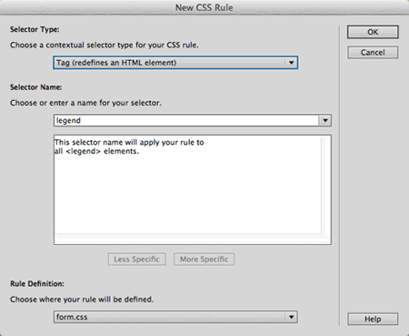
This is easy to modify using CSS. Create a new CSS rule, choosing the Compound selector type. Type fieldset fieldset into the
Selector Name field. This is a descendant selector that means "select
any fieldset that is nested inside another fieldset".
|
This descendant selector only applies to nested fieldsets. The main fieldsets will not be affected. |
In the Box category, set padding to "0" (same for all). Set the top, left, and right margin to "0", and the bottom-margin to "10px".
In the Border category, set the border style to "none" (same for all). Click OK. Preview in Live View to see how it looks.
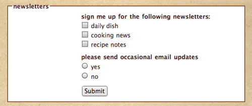
|
The margins, padding, and borders have been removed from the nested fieldsets. |
Other Form Elements
There are a few other form elements in the Insert panel. You won't use them often, but you should know what they do.
|
|
|
| |
Hidden Field: Hidden fields are used to provide important data to the server without the user seeing it. For example, each time a form is sent to the Webmaster as an email (rather than to a database), the form needs to know the Webmaster's email address. You'd enclose this data in a hidden field so it is transmitted without the user seeing it.
File Field: This adds a field with a Browse button to that the user can upload a file to your server or send one to you as an attachment. Using such a field requires some complex scripting on your part (or your tech person's part!) and a server that can accept files from outside sources.
Jump Menu: A Jump Menu is used for dropdown menu navigation bars rather than dropdown menu form inputs. Using a Jump Menu, you can add navigation options to a dropdown menu. After selecting an option, the user is sent to a specified hyperlink. |
|
|
|
|
The Spry Validation widgets look just like their text field, textarea, checkbox, and
dropdown menu counterparts, but the orange starburst seems to indicate
some kind of special power.
Open the form_spry.html file from the recipetree folder.
A fieldset and table have been set up for you. Click inside the upper-right
cell of the table, then choose the Spry Validation Text Field  icon from
the Insert panel, or Insert > Form > Spry
Validation Text Field.
icon from
the Insert panel, or Insert > Form > Spry
Validation Text Field.
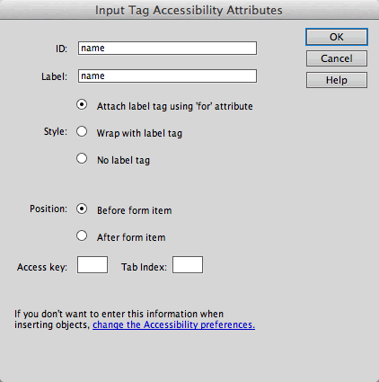
The Input Tag Accessibility Attributes dialog
looks the same as always. Enter "name" as the label and ID. Choose the "Attach label tag using 'for' attribute" option, and click OK to exit the dialog.
Mouse over the text field in the Document window. A blue tab identifies it as a Spry text field.

Click your cursor inside the label, then use the Tag
selector to select the <label> tag. Drag and drop into the left
cell.

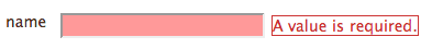
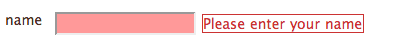
Preview in Live View. Don't enter anything into the
name field—just click the "Submit" button. Sure enough,
a message pops up stating that this is a required field.
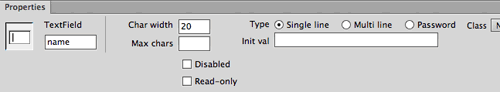
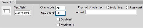
Exit Live View and select the text field. Just like a normal text field, you'll see options for setting the character width, type, and initial value.
|
The Property inspector with the field selected. |
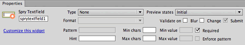
Click the blue Spry TextField tab to see the Spry properties.
|
The Property inspector with the blue Spry tab selected. |
Lots of goodies here:
|
|
|
| |
The Type menu
allows you to validate against a certain type of data, for example,
the data must be formatted as an email address, a credit card number,
a phone number, or a URL. If you don't have a specific requirement regarding the format, leave the type set to "None".
It is helpful to give users a Hint for
how to enter the data. For example, a hint for "date of
birth" might read "MM/DD/YYYY".
The Validate on checkboxes determine
when the validation process will occur: Blur (as
soon as the user clicks outside the field), Change (as
the user edits text inside the field), or Submit (when
the user tries to submit the form).
The Preview states menu allows
you to preview how the field will look in its valid or required
states. |
|
|
|
|
Choose Required from the Preview states menu in the Property inspector. The default error message "A value is required" is not very helpful. Replace this default text with something more user friendly, like "Please enter your name."
The Spry Validation Textarea, Checkbox,
and Select widgets work much the same way.
Try them out—insert one of each and play around with the settings.
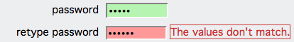
The Validation Password widget enforces rules for passwords. For example, you could require all passwords to contain a minimum of five characters. If your user enters four characters, he or she will get an error:

If your user is setting up a new account, you might want to use a Validation Confirm widget. After creating a new password, ask the user to retype the password. If the user fails to type the exact same password, the widget returns an error message stating that the values do not match. This will prevent any potential password errors—maybe your user thought he typed "tomato," but really, he typed "tomatoo."
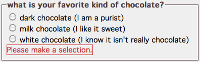
The Validation Radio Group widget requires a selection from a group of radio buttons.
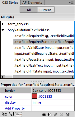
Each validation widget comes with an external style sheet, which can be used to modify the appearance of Spry elements. For example, if you don't like the red border around the validation message, edit the.textfieldRequiredStatestyle.
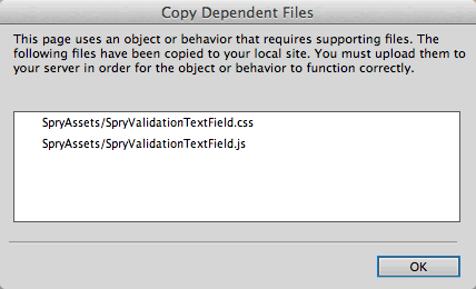
When you save a file containing Spry elements, Dreamweaver will copy the Spry CSS and JavaScript files to your local site. You need these files in order for the Spry validation to work. Be sure to upload the SpryAssets folder to your remote server when you're ready to launch your site.
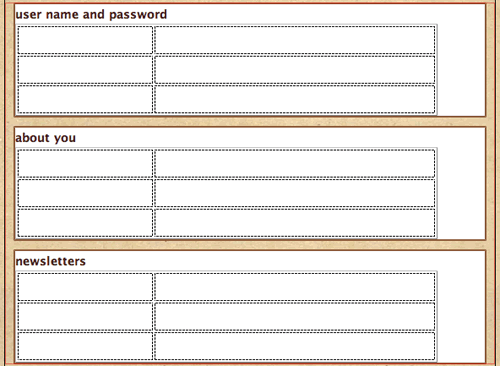
Tables are a practical way to organize form elements, but if you're a CSS fanatic, you might prefer to use divs. Let's explore this now. Open form_tableless.html in
the recipetree folder.
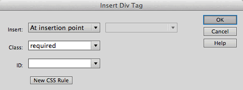
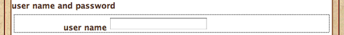
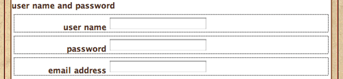
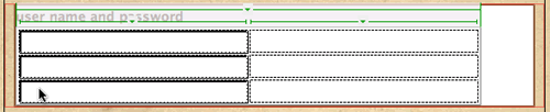
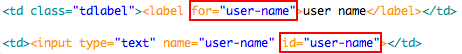
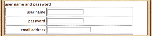
Click inside the "user name and password" fieldset. Go to Insert > Layout
Objects > Div Tag. Give the div a class of "required" and click OK.
Press the Right arrow key on your keyboard to move your cursor to the right of "Content
for class 'required' Goes Here".

Click the Text Field button  in
the Insert panel (or Insert > Form > Text
Field) to insert a "user name" text field into the div.
in
the Insert panel (or Insert > Form > Text
Field) to insert a "user name" text field into the div.

To finish up, delete "Content
for class 'required' Goes Here".

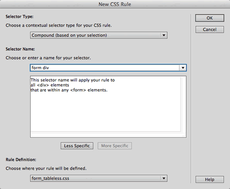
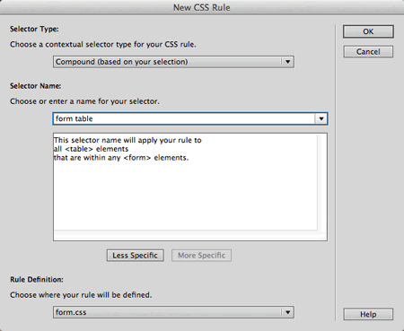
Create a new CSS Rule. Choose the Compound selector, and enter form
div into the Selector Name field. This descendant selector
will style any div within the form area.
In the Box category, set clear to "both" (this
will force each div to appear in separate rows), padding to "5" (this
will add some padding inside the div), and margin to "5" (this
will add a margin between the divs). Click OK.
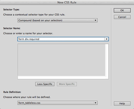
Create a new Compound selector and type form div.required into
the Selector Name field. This rule will apply to any div with a class of "required"
inside the form area.
In the Type category, set
the font-weight to "bold" and click OK.
Create a new CSS rule and type form
div.optional into the Selector Name field. This will select any div
with a class of "optional" within the form area.
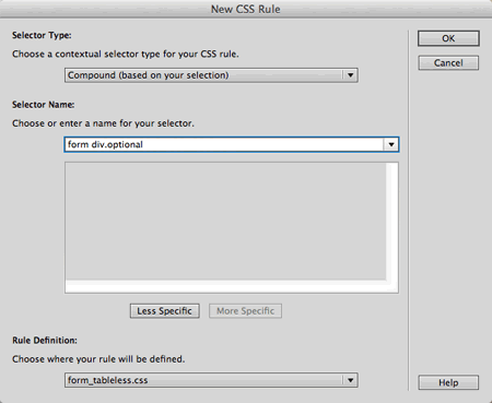
The optional form element labels should be set to "normal" font-weight.
One more element to style: labels. Create a new rule called form
div label. This will style any label inside a div inside the
form area.
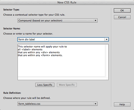
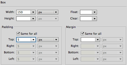
In the Box category, set float to "left" (this
turns the label into a block element and pushes it to the left) and set
the width to 150 pixels (this will create
a column effect). Uncheck "same for all" under padding and
add 5 pixels of right padding.
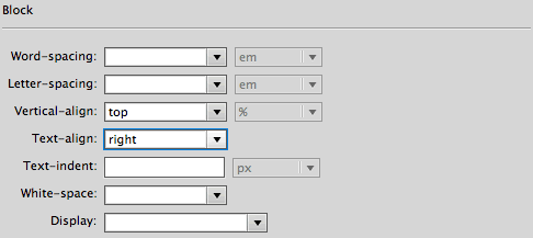
In the Block category, set
the text-align to "right". This
will right-align the labels against the form elements. Click OK and see
how it looks.
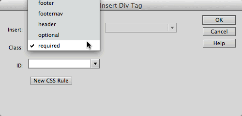
Click below
the div, then go to Insert > Layout Objects > Div
Tag to insert another div. Choose a class of "required" from
the Class menu in the Insert Div Tag dialog.
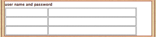
Insert a text field labeled "password" into the new div.
To finish up this fieldset, insert a third div with a class of "required" and a text field labeled "email address".
As you can see, aligning text fields with CSS is quite easy. However, it gets tricky when you add checkboxes.
Click inside the "newsletters" fieldset and insert a new div, choosing "optional" from
the Class menu in the Insert Div Tag dialog.
Insert a checkbox with a label of "sign me up".
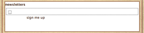
|
Checkboxes and radio buttons
require extra formatting. |
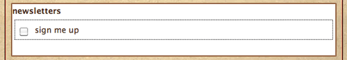
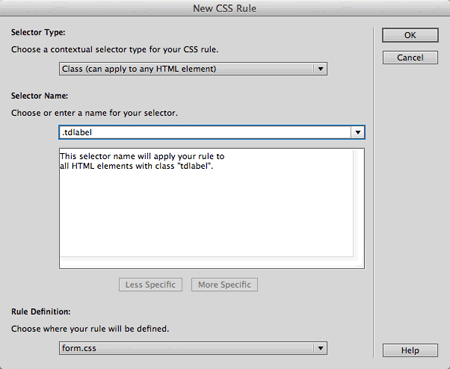
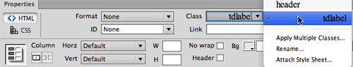
The checkbox label is out of alignment. Create a new CSS rule called .radiolabel.

In the Block category, set
the text-align to "left" and display to "inline".
This will left-align the labels next to the checkbox.
In the Box category, set float to "none".
This overrides the "left" float on the form
div label selector. Click OK.
Select the "sign me up" label (click inside the
label, then use the Tag selector to click the <label> tag). Apply the .radiolabel style. Problem solved.
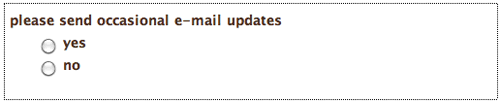
Let's try a radio group. Insert a div with a class of "required".
Click inside the new div and insert a fieldset (radio button groups look nicer nested inside their own fieldsets). Give the fieldset a legend of "please send
occasional email updates" and click OK.
The new fieldset will appear in the Document window. Click your Right arrow key to move your cursor to the right of the fieldset legend, then click the Radio Group button  in the Insert panel.
Name the
radio group "email-updates" (this will identify the group
in your form results). Add "yes" and "no" labels
and values.
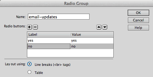
The labels will be staggered at first:
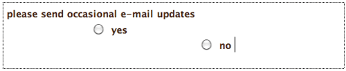
Select the "yes" <label> and apply the .radiolabel style
to push it into place. Repeat with the "no" <label>.
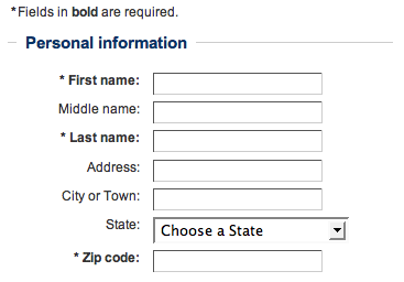
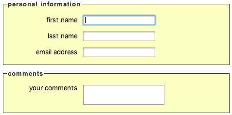
 Learn about front-end and back-end form design.

 to insert a form. Or, if you prefer, go to
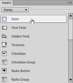
