All of the layouts we've covered so far have used floats for positioning,
shifting divs to the left or right. The content oozes into place.
Absolute positioning (AP) takes a completely
different approach. Each div is positioned as an individual element,
aligned to precise coordinates. Absolutely positioned divs are taken
out of the normal flow of the document, which means that they are no
longer affected by other divs.
The advantage is that you will be able to place the AP div wherever
you want. The disadvantage is that you have to carefully plan the height
of each content area to prevent unintended overlaps.
Setting Up Your Divs
Let's see how this works. Create a new document and name it "ap.html".
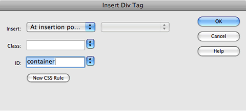
Go to Insert > Layout Objects > Div Tag.
Give the div an ID of "container".
Click inside the container div and press your Return key a few times to
give yourself some space to work. Delete the filler text.
With your cursor
planted inside the container div, go to Insert > Layout
Objects > Div Tag. Give the new div an ID of "header" and click OK.
Delete the filler text, and type "Header" inside the div. Select the "Header" text and format it with
h1 tags by choosing Heading 1 from the Format
menu of the Property inspector.
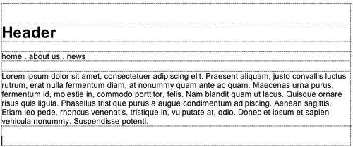
Click your cursor below the header div, but still inside the container
div. Insert another div (Insert > Layout Objects > Div
Tag) and give it an ID of "nav". Type some fake links
into the nav div, like "home, about us, news."
Click your cursor below the nav div. Go to Insert > Layout
Objects > Div Tag and give the div an ID of "mainContent".
Insert some dummy text inside this div (just copy/paste any paragraph).
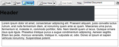
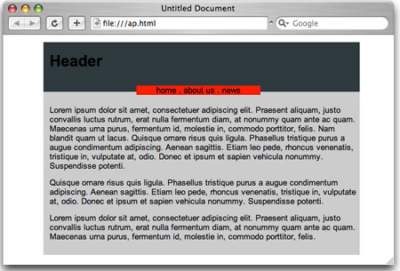
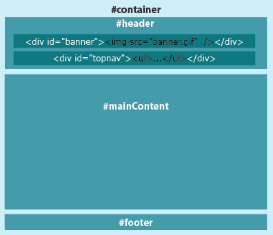
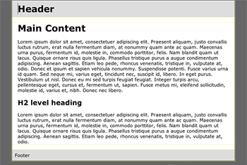
Your document should look something like this—three divs nested
inside the container div. They are in normal flow, with no positioning
applied.
Positioning the Divs
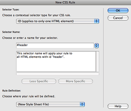
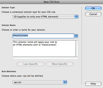
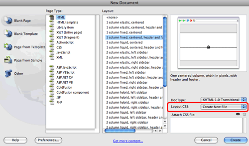
Create a new CSS rule. Choose the ID selector type (or Advanced in Dreamweaver CS3)
and type #header as the selector name.
This ID selector will style the header div. Define the rule in a new style sheet file.
In the Background category, choose a background
color for the header.
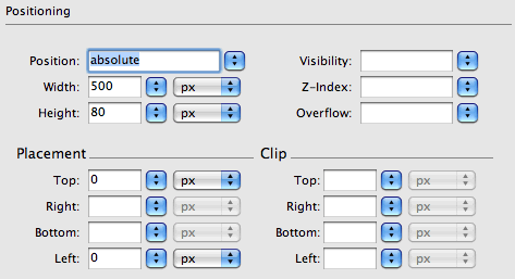
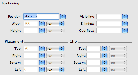
In the Positioning category, set the positioning
type to "absolute". Give the div a width of "500px" and a height
of "80px". Set the placement to "Top: 0" and "Left: 0".
Click OK.
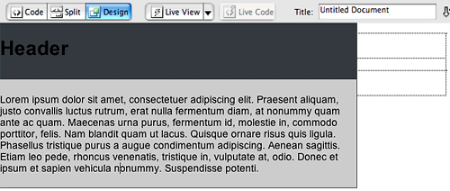
The result might look a little strange. The header div has been taken
out of the normal flow. It is overlapping the other divs.
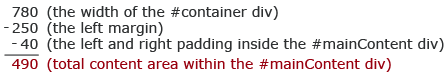
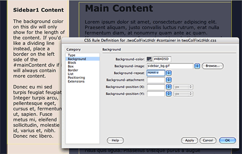
Let's line up the other divs. Create a new CSS rule, #mainContent.
In the Background category, choose a background
color for the mainContent div.
In the Positioning category, set the position
to "absolute" and the width to "500px". Don't enter a height value—it
is uncertain how much content will go in this div, so we will just allow
it expand down as necessary. Set the placement to "Top: 80px" (so
it sits just below the 80 pixel header) and "Left: 0". Click
OK.
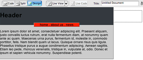
Looking better, but what happened to the nav div? It is completely hidden
behind the other divs. Let's move it up to the top.
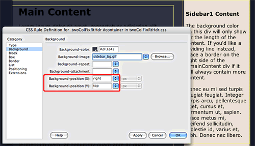
Create a new CSS rule, #nav.
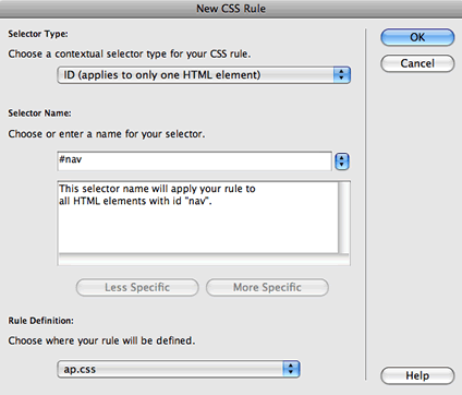
In the Background category, choose a color
for the nav div.
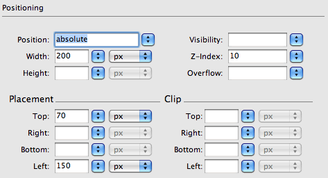
In the Positioning category, set the position
to "absolute" and the width to "200px". To make sure that the nav
div is placed on the top of the stacking order, give it a high z-index value,
like 10.
Set the placement to "Top: 70px" and "Left: 150px". Click
OK.
All three divs are in place. However, the left-aligned layout might
not be the effect you want. On large browsers, there is a lot of empty
space on the right—it doesn't feel balanced.
Centering the Layout With a Containing Block
How can we center this layout? You might have noticed that there is
no "align-center" property in the Positioning category. Let's
consult the World Wide Web Consortium, www.w3.org—always
a good idea when you're not sure of the best approach to a challenge.
The mandate is:
Interpretation, please? A containing block is
a div that contains other divs. In the page we are working on now, the
header, nav, and content divs are nested inside the container div. This
means that the container div can be used as a containing block.
However, another factor is involved—the containing block must
have a position of absolute, relative,
or fixed. There are four positioning types:
 |
|
 |
| |
Absolute: An absolutely positioned element is pulled
out of the normal document flow. It can be placed anywhere on the page.
Relative: A relative element stays
in the normal flow, but it can be offset from its original position
with the properties top, right, bottom, and left.
Fixed: A fixed element will stay
in the exact same place, even when the browser window scrolls.
Static: A static element appears
in the normal document flow. This is the default positioning
type.
|
|
 |
|
 |
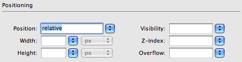
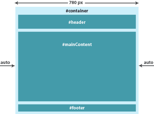
Our container div has a default position type of "static". To
make it work as a containing block for its nested AP divs, change the
position type to "relative".
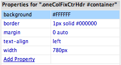
Create a new CSS rule for #container.
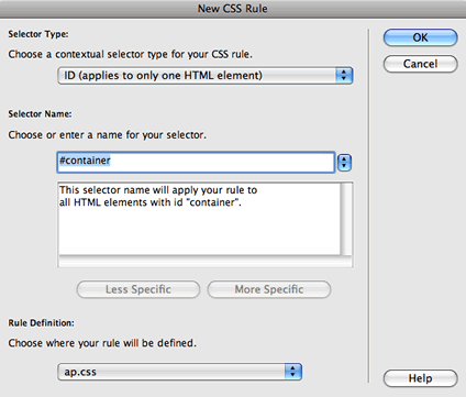
In the Box category, set the width to
"500px". To center the container div in the browser, set the right and left margins to "auto."
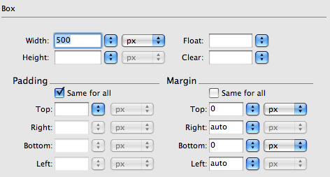
In the Positioning category, set the position
to "relative." Click OK.
Save and preview in a browser. The container div is centered, and the
nested AP divs are placed in relation to the container.
Overlapping Effects with AP
Jumping off from this basic concept, you can literally place elements
anywhere on the screen, creating all kinds of overlapping effects.
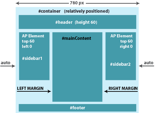
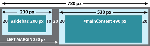
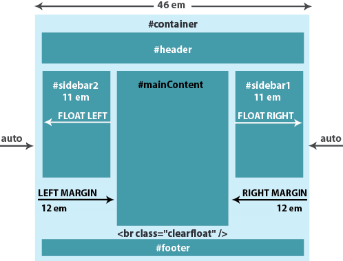
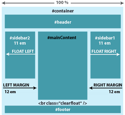
Dreamweaver provides two CSS layouts with AP elements. The 3
column, absolutely positioned, header and footer layout looks
exactly like a 3 column fixed layout. However, the sidebars are absolutely
positioned rather than floated. The container div is relatively positioned.
Each absolutely positioned sidebar opens up all kinds of options. The
sidebar's status of "absolute" makes it qualify as a potential
containing block. That means you can nest another AP div, setting its
position in relation to the sidebar.
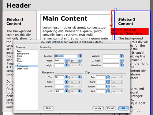
Below, I've inserted a div in the sidebar and given it a red background
color. In the Positioning category, the
position type is set to "absolute." The placement is set to "Top:
90px" and "Left: -20px". This moves the div down 90 pixels
and over 20 pixels, in relation to the top left corner of the sidebar.
 |
The absolutely positioned sidebar can
be used as a containing block for more AP elements. |
This is just a simple example, but think of all the cool overlapping
effects you could create using this method.
Something to watch out for: Make sure that the content area is taller
than the sidebars. The mainContent div is actually pushing down the footer.
If the mainContent div is too short, the footer will be hidden behind
the absolutely positioned sidebar columns.
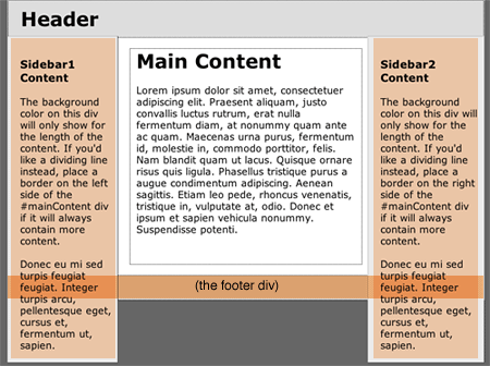 |
The sidebar columns
are overlapping the footer div.
|
You may have noticed an option in the Insert
menu, Insert > Layout Objects > AP Div. This is a shortcut—it
inserts a div that already has the position type of "absolute." You
can drag the AP Div anywhere you want, or resize it using the handle bars.
Pretty cool, but the bad news is that the
ID selector is saved as an internal style in the HTML file—not
in the external style sheet. This means that the style won't be available
on other pages in the site.
I recommend using Insert > Layout
Objects > Div instead. It only takes a second to set the
positioning using the CSS Styles panel, and you'll have the option to save
the ID selector to your external style sheet.
Adding Content and Design Elements
With the CSS layout of your choice in place, text and images can be
added quickly and easily, just as if you were working with table cells.
Needless to say, you'll start by deleting Dreamweaver's placeholder
text. Then just paste, type, or insert any content that you like.
Adding a Top Nav
You might decide to add a top nav below the header. There are several
ways to go about it.
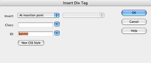
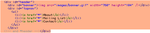
The most direct method is to add two nested divs inside the header div.
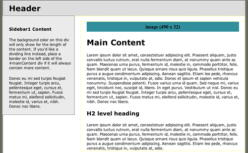
Insert the banner image in the banner div,
and the nav list in the topnav div.
To insert a nested div, click inside the header div, then go to Insert > Layout
Objects > Div Tag. Choose "at insertion point" from
the Insert menu.
Then click below the banner div and insert another div for the topnav.
Sometimes it can be tricky to insert your cursor in the right place,
so if you have any trouble, just switch to the code view and type in
the div tags yourself.
Another approach would be to insert the banner.gif as a
background image.
Set the position of the header div to "relative" and
the position of the nested topnav div to "absolute." Then align
the topnav div along the bottom-left corner of the header div. You'll find these properties
in the Positioning category of the Rule Definition dialog.
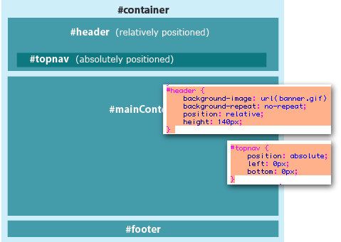
Image Floats
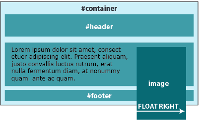
If you need to align an image to the right of a text block, set the image to float:
right. Create a class style with the float property (found in the Box
category of the Rule Definition dialog), then apply it to the image.
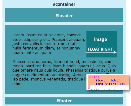
If you would rather align the image along the left edge, set it to float:
left.
To float several images in a column, add the property clear:
right. This will force each floated image to clear down to the
next row. You could also add a top margin, allowing some space between the
images.
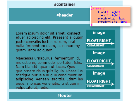
To create a photo gallery with rows and columns of images, set each
image to float: left.
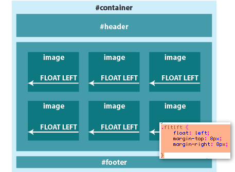
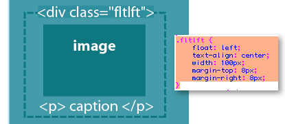
You can use this same method to float an image together with a caption.
First, insert the image and caption in a div. Then, create a class style
with the float property and a width property (both found in the Box category
of the Rule Definition dialog).
Don't forget to apply a width to the
floated div. Floated elements must have a defined width to work properly.
Images already have a width, but you have to specify a width for divs.
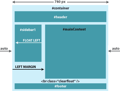
Clearing Floats
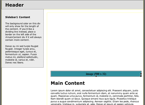
Floats are a very useful layout technique, but there is one glitch to watch out for. Let's say you start out with a long, narrow image and a short paragraph of text.
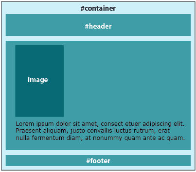
You float the image to the right, but then something strange happens.
The float is working properly—the image has floated over to the right, and the paragraph has shifted up to fill its place. However, the image is now overlapping the footer at the bottom of the page. Not the effect you were after.
When you float an image, it is taken out of the document flow. It can't push down the footer; it has no physical presence.
Normally, a longer text paragraph would do the job of pushing down the footer, wrapping below the image. However, if your image is taller than your text area, you will have to resort to some extra markup to force the footer to stay below the floated element. This is called "clearing the float."
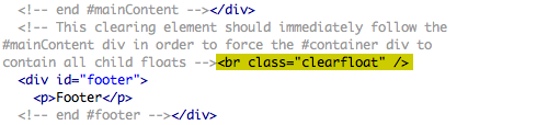
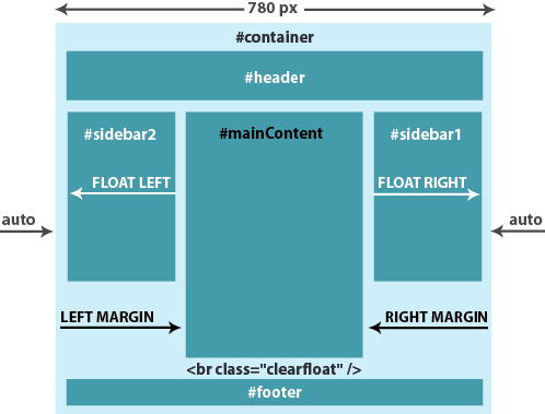
Dreamweaver uses a clearfloat element in the 2 column fixed, left sidebar, header and footer layout.
The mainContent div is followed by a <br> tag with a class of "clearfloat". This is the clearing element.
 |
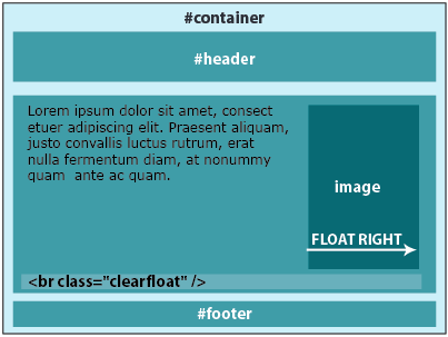
| Here, the clearing element is inserted after the closing tag of the mainContent div. This forces the container div to expand to contain the floated sidebar. |
A comment tag informs you that the clearing element should follow the mainContent div in order to force the container to contain the child floats (in this case, the floated left sidebar). If it weren't for this clearing element, a long sidebar would overlap the footer.
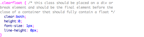
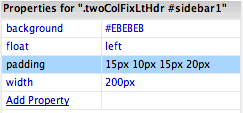
Open the twoColFixLtHdr.css to take a look at the "clearfloat" class selector that is applied to the br tag.
 |
| The clearfloat class selector is saved in the external style sheet. |
The clearfloat class selector is set to "clear: both", meaning it will clear any elements, whether floated left or right.
The height, font-size, and line-height are set to the smallest possible amount, to ensure that the clearfloat element does not cause any extra vertical space that might create a gap in the layout.
You can use this technique to clear a float inside any div, anywhere in your document. Let's go back to the example with the long, narrow image and the short paragraph of text. To fix the layout, just add an extra clearfloat element inside the mainContent div.
The HTML code would look like this:
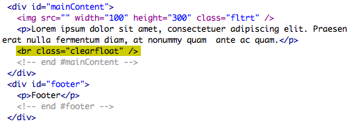 |
Here, the clearing element is inserted before the closing tag of the mainContent div, forcing the mainContent div to expand to contain the floated image. |
Just one extra line of code. Not bad for a hack.
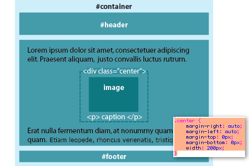
Centering an Image
If you need to center an element within a div, set the left and right
margins to "auto."
Extending the Design
When you finish your first page design, it can be used to produce many,
many more pages for the Web site. If all pages will share the same layout,
use a copy of the first page to make the second page, and insert the
new content. The .css file will already be linked and active. Repeat
the process to create all the remaining pages.
If your Web site will contain multiple page layouts, you can use the
body class selector to customize each page.
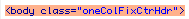
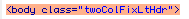
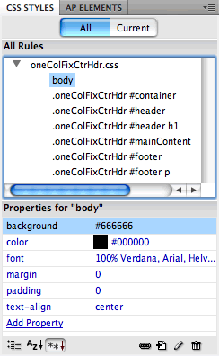
Each Dreamweaver CSS Layout has a unique class applied to the body tag:
 |
 |
| This class identifies the 1 column
fixed, centered, header and footer layout. |
This class identifies the 2 column fixed, left
sidebar, header and footer layout. |
Each div is formatted with a descendant selector:
.oneColFixCtrHdr #mainContent
This descendant selector applies to the mainContent div in the 1 column fixed,
centered, header and footer layout.
.twoColFixLtHdr #mainContent
This descendant selector applies to the mainContent div in the 2 column fixed,
left sidebar, header and footer layout.
This might look like gibberish, but it serves a very useful purpose—the
mainContent div in the 1 column layout can be formatted differently than
the mainContent div in the 2 column layout.
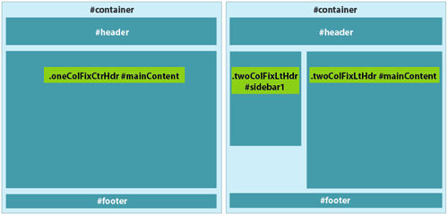
The first step is to identify the divs that will vary between the two
layouts. I've highlighted them below in green:
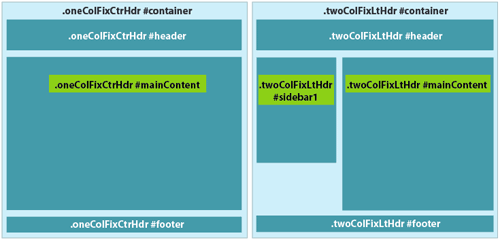
The mainContent div is a different width in each layout. Also, the sidebar1
div only exists in the 2 column layout.
The header, footer, and container divs don't vary—they use the
same formatting in each layout. This means we can remove the body class
selectors from these divs. After we meld the two style sheets, our selectors
will look like this:
Combining the two style sheets takes a little copy/paste work.
First, create the one column layout. Save the oneColFixCtrHdr.css file
in your local root folder, along with the HTML file.
Next, create the two column layout. Save the twoColFixLtHdr.css file
and the html file in your local root folder.
Open the oneColFixCtrHdr.css file. Select
the .oneColFixCtrHdr #mainContent descendant
selector and go to Edit > Copy.

Open the twoColFixLtHdr.css file.
Go to Edit > Paste to add the oneColFixCtrHdr
#mainContent descendant selector.
Now, remove the body class selectors from the divs that
won't vary between the two layouts. Delete the .twoColFixLtHdr body
class selector from every div except "sidebar1" and "mainContent."
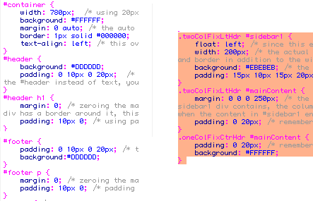
To finish up, go to File > Save and
save the style sheet as global.css in your
local root folder.
Open the one column html file. Using the CSS Styles panel, select
the oneColFixCtrHdr.css file and click
the trash can icon to delete it. Then click the link icon and browse
to attach the global.css style sheet.
Repeat for the two column html file. First, delete the twoColFixLtHdr.css external
style sheet. Then, attach the global.css style
sheet.
Both layouts are now attached to the global.css external
style sheet. If you make any changes to the common selectors like "body" or "container", it
will affect both layouts. If you make a change to a descendant selector,
like .oneColFixCtrHdr #mainContent, it
will only affect the mainContent div in the one column layout.
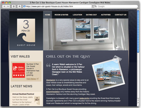
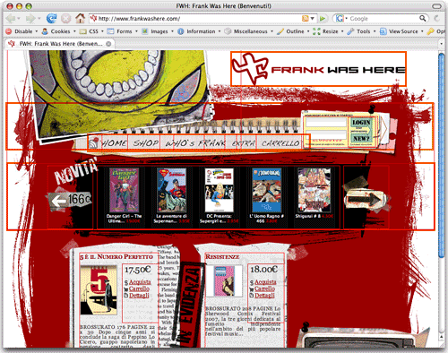
The Capgemini Web site shown below is an excellent example of a multi-layout
design. Here we see that some content areas from the home page are also
used on second-level pages, like the header and navigation. The second-level
pages have some new content areas of their own, like the right column.
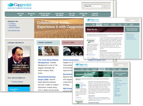 |
The use of CSS throughout
the Capgemini Web
site provides an innovative, classy, and consistent look—exactly
what this company wants to convey to its audience. |
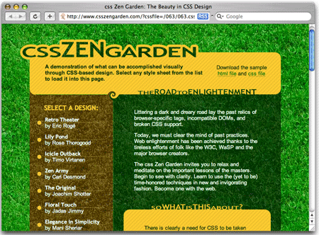
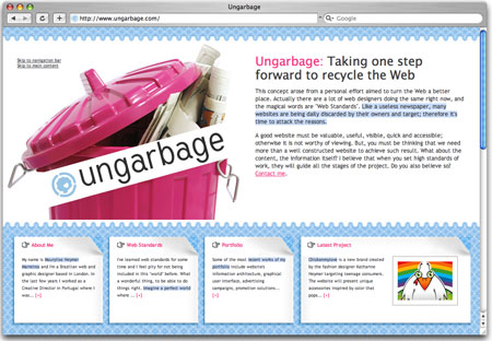
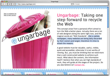
 Explore
the different types of CSS layouts.
Explore
the different types of CSS layouts.


 .
. 