Event Handlers
User tasks that trigger behaviors are known as events or event
handlers. There are a large number of possible events, including mouseovers,
mouseouts, clicks and double-clicks. Dreamweaver will choose an event
for you when you create a behavior. However, you can change the default
event using the Behaviors panel.
|
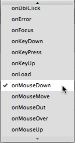
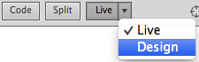
To change an event handler, select the event in the Behaviors panel and click the double arrow menu. |
Let's take a look at the most commonly used event handlers:
 |
|
 |
| |
onLoad and onUnload can be applied to the page body (select <body> in the Tag inspector at the bottom of the Document window). These events cause an action
to occur when the page loads fully (onLoad) or when the
page
or
image
is
closed
or exited (onUnload).
onAbort performs an action when the user stops the loading of the page (by leaving the page before it has finished loading or clicking the browser's Stop button).
onClick calls an action when the user clicks an element. This event can be applied to a specific item like a link or an image. onDblClick is a variation, performing the action when the item is double-clicked.
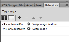
onMouseOver and onMouseOut perform an action when the user's mouse passes over (onMouseOver) or off of (onMouseOut) an element. These events are used together to create image rollovers.
onMouseDown and onMouseUp perform actions based on the state of the user's mouse button while over an element. onMouseDown means the button is pressed, onMouseUp means it has been released after having been pressed. Both events are best applied to images or links. |
|
 |
|
 |
Advanced Image Behaviors
Image behaviors aren't limited to basic rollovers. More complex image swapping behaviors can be created to add functionality and interactivity to a design. One word of warning (I know, I know): remember that images slow page load time, so use them sparingly.
Multiple State Rollovers
In a typical image rollover, there are two states: on and off, or onMouseOver and onMouseOut. However, additional states can be added for more complex rollovers. The first is a "down" state, using the onMouseDown event, and the second is an "up" state, using onMouseUp.

|
First, hold your mouse over the image to see the on state. Press and hold your mouse to see the down state, then release your mouse for the up state. (If you have trouble seeing all four states, try another browser, such as the latest version of Firefox.) |
You'll need four different images to create this effect, though the differences can be subtle.
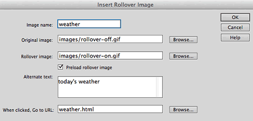
Creating this behavior begins with a simple image swap using Insert > Image > Rollover Image, just as we did earlier in the lecture.
After you've inserted your basic image swap, select your "Today's Weather" image, then click the <a> link tag surrounding the image using the Tag selector in the lower-left corner of the Document window.

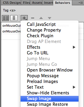
With the <a> link tag selected, click
the plus sign icon in the Behaviors panel, choosing Swap Image from the list of behaviors.
 |
The behaviors in gray are not available for the element you've selected. |
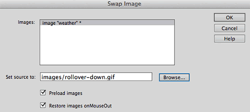
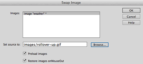
A dialog will pop up. Choose the image you'd like to swap—in this case, the "weather" image. Browse to select your "down" state
image. Leave the two checkboxes checked and click OK.
|
We only have one image in this page, but if there were many images, you'd need to select the image you want to swap from the list. |
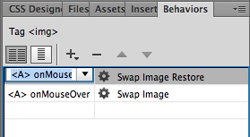
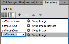
Your new swap will appear below your original two swaps (the "on" and "off") in your Behaviors panel. But now there's a conflict: two different images have an onMouseOver state!
Access the events menu and choose a new event handler: onMouseDown. Before proceeding, preview your page in the browser to see if the down state works with your initial swap.
Now on to the fourth and final state, the "up" state,
which will appear when the user presses then releases the mouse button.
Repeat the process, selecting the <a> link tag, clicking
the plus sign icon in the Behaviors panel, choosing Swap Image from the list of behaviors, and browsing to select the up state
image in the Swap Image dialog.
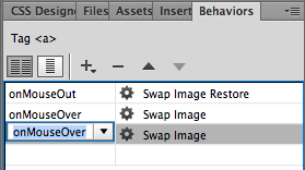
Give the behavior the event handler of onMouseUp.
Preview in a browser to see all four states in action!
If you need to make a change, like selecting a different image file for one of the states, double-click the event handler in the Behaviors panel to open the swap dialog. Remember that you must select your image before you can see any of its behaviors in the Behaviors panel.
Alternate Image Swaps
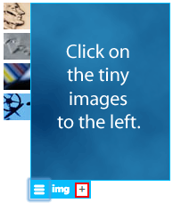
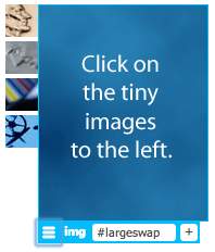
Here's another image swap that triggers a different result. Mousing over (or clicking) an image does not replace the image itself, but rather replaces a different image somewhere else on the page, like this:
|
Do what the big blue box says! As you click each little image, notice where the swapping occurs. |
Open the index.html file inside the alternative-image-swap folder.
Switch to Live View and select the large blue image. Click the plus sign to apply an ID to the image. Type #largeswap into the ID field.
|
|
Give the large image an unique ID so it will be easier to find in the Swap Image dialog. |
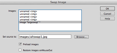
Switch back to Design View to access the Behaviors panel. Select the first of the four thumbnail images. Click
the plus sign icon in the Behaviors panel, choosing Swap Image.
This opens our trusty swapping dialog.
|
Naming the image came in handy here. Without the "largeswap" ID, you wouldn't know which image to swap. |
In the Images list, select the "largeswap" image (if you don't do this, the little thumbnail image will be selected by default, creating a standard rollover, rather than a swap occurring on a separate image).
Browse to the images fold inside the alternative-image-swap folder and select altswap1.jpg (this image corresponds
to the first tiny image). Uncheck "Restore..." to
keep the new large image in place until the user clicks another image. Click OK.
Repeat this process on the remaining thumbnail images to get the finished product. When you're done, preview in a browser to make sure the proper images are swapping with the proper event.
Pop Up Behaviors
JavaScript is often used to makes things pop on a page: new browser windows, special alerts, and even navigation features. So let's switch gears to discussing how to create page functionality with pop up behaviors.
Pop Up Windows
Pop up windows get a bad rap these days because of all of the pop up and pop under ads littering the Web. However, these tools can also be
useful, functional parts of a Web site, delivering site
help windows, product descriptions, image close-ups, and other information
that is better delivered accompanying a full page rather than replacing
it.
|
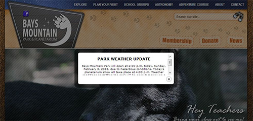
Pop ups don't have to be annoying! This pop up alert for the Web site of Tennessee city park Bays Mountain serves an important purpose: it alerts visitors to bad weather and closures. Click here to read about ITD Interactive's design process for this site, including their pop up strategy. |
The behavior for pop up windows lies not on the page being popped, but
the page containing the link to the pop up. The page that pops
up has no special code or behavior.
Open the index.html file inside the pop-up folder.
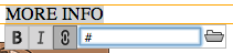
To begin, you'll need a dummy link. Switch to Live View. Double-click to edit "MORE INFO", then click and drag to highlight the text. Type a pound sign (#) in the Link field.
|
Typing a pound sign in the Link field will give your text full linking properties, but will not link to any specific document. |
Toggle back to Design View. With the link selected, choose Open Browser Window from the Behaviors panel.
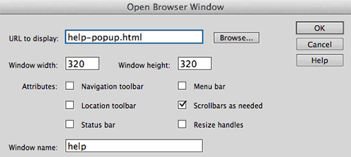
|
In this dialog, you'll provide the path or URL of the page you want to pop. |
Browse to the path or URL of the page you plan to pop and enter in the size you'd like this window to appear. Give it a name—again, a good habit—which will also make it possible to easily target this window with other links if you choose.
Attributes are the features that the browser window can include, such as the Location toolbar (also known as the address bar) and the Status bar which sits at the bottom. Scrollbars and Resize handles allow the user to scroll or change the size of the window if needed to see all of your pop up page content.
Click OK and you're all set. You can choose another event handler if you like (onClick is the most common), and adjust any of these settings later (like window size, which is often trial and error) by double-clicking the behavior in the Behaviors panel. Preview in a browser to test your pop up.
Are you wondering how some Web sites pop up advertisements as soon
as you open the home pages? By using the Open Browser Window behavior applied
to the <body> tag with an onLoad event! Many users have software
that blocks onLoad and onUnload pop ups because they are not triggered
by the user's demand but rather the opening or exiting of a page. But
don't worry: onClick and onMouseOver pop ups will appear for most
users with this software because it does not block user-triggered (voluntary)
events.
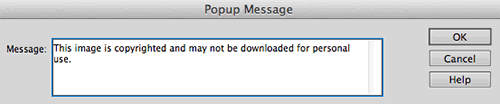
Alert Messages
When used sparingly, and only for genuinely important announcements, an alert message (referred to as a "Popup Message" in the Behaviors panel) can bring useful information to users' attention. Click the image below for a sample.
Alerts that must appear when a page is loaded, aborted, or closed are applied to the page body, while alerts coming from mouse events are applied to text links or images.
Select the item that will trigger the alert, choose Popup Message from the Behaviors panel, enter your message, click OK, and you're done!
|
Alerts like this (placed on an image) deter people from downloading images they shouldn't. This alert does not physically prevent download, and Web-savvy folks can easily work around it, but some users might shy away. |
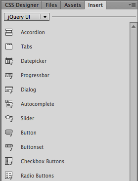
jQuery UI
Image behaviors and pop ups are great (well, OK, I'm not sure anyone would call pop ups "great" with a straight face!), but they're really only the tip of the iceberg when it comes to Dreamweaver's plug and play Javascript options.
jQuery UI widgets are pre-built packages of HTML, CSS, and JavaScript that you can insert into your Web pages to add useful interface functionality.
|
Choose Design View to access these jQuery UI elements. The Insert panel's jQuery UI category is not accessible from Live View. |
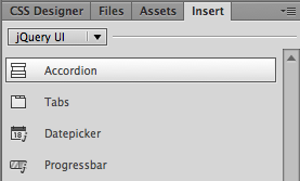
We'll be looking at the form widgets in Lecture Five, but for now, let's try out some useful interface widgets, starting with that first item on the list: accordion menus.
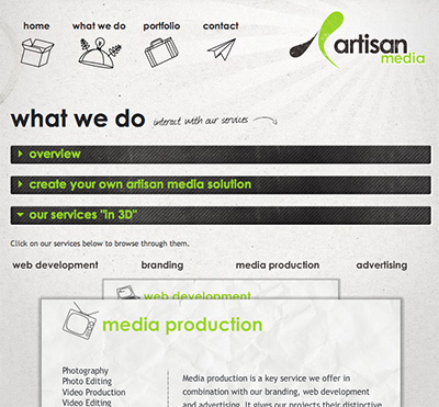
Accordion Menus
An accordion menu (or accordion panel) is a stack of collapsible content panels. They can be horizontal or vertical, and they make a great interface choice for mobile users, as they compress a large number of choices into a small area that the user can expand as needed.
|
Miami Web design studio Artisan Media features an accordion menu on their "What We Do" page. This menu provides a neatly organized set of options that keep the user in control, and the vertical stacking is a nice complement to the horizontal navigation bar at the top. |
To see how they work, do your own expanding of the jquery-accordion folder and open the index.html file.
Switch to Design View. Insert your cursor inside the gridContainer div. Expand the Insert panel and choose the jQuery UI category. Click Accordion.
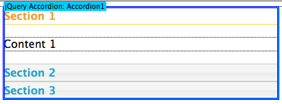
An accordion menu will appear on your page, identified by a blue jQuery Accordion tab.
Take a look at Code View to see how the accordion menu is built.
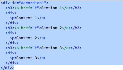
The accordion menu is contained by a <div>. Each section (or below, I suppose, if it's really an accordion!) is marked by a <h3> heading and a nested content <div>.
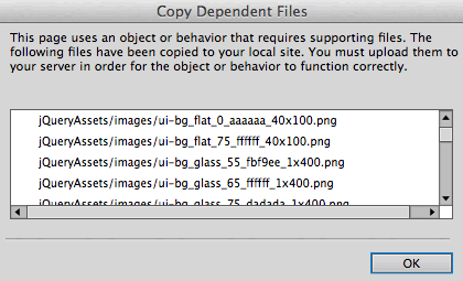
Go to File > Save. A dialog will pop up asking you to copy the dependent files needed to build the accordion. This includes JavaScript files (.js), CSS files, and several PNG images. Click OK.
In Code View, you'll find that the .js and .css files have been linked to the HTML file.
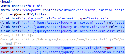
The JavaScript and CSS files are also listed in the Related Files toolbar.

Preview your file in Live View. The accordion is already working. Clicking a heading will open the corresponding panel.
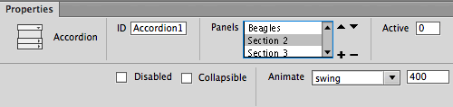
Toggle back to Design View and select the accordion by clicking the blue tab. Go to Window > Properties to open the Properties inspector. Here, you'll find all the controls you'll need to modify the accordion. Use the + icon to add panels, or the - icon to subtract panels.
If you leave "collapsible" unchecked, one panel will always remain open. Experiment with different animation settings to control how the panels open and close.
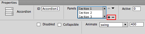
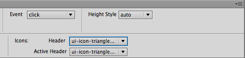
You can also choose different header icons from the dropdowns on the right. Rather than a triangle, you might like an arrow or a plus sign.
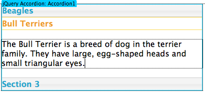
Type a heading and some content into Section 1. Enter as much content as you like. You could even insert an image if you wanted.
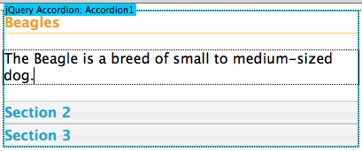
Select the accordion tab again, then choose Section 2 in the Properties inspector.
When the Section 2 panel opens, type a heading and enter some content.
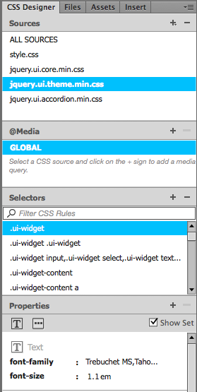
To edit the appearance of the menu, toggle to Live View. Expand the CSS Designer panel and select the jquery.ui.theme.min.css file. Select "Show Set", then look at the selectors one-by-one. Feel free to edit the font-families, colors, border styles, and so on.
Here are a few styles you might like to edit:
|
|
|
| |
.ui-widget
Basic font styling.
.ui-widget-content
The content area of the selected panel. Note that this style, like many others, contains a background-image. If you want to change the background-color of the content area, you'll need to delete the background-image first.
.ui-state-default, .ui-widget-content .ui-state-default, .ui-widget-header .us-state-default
The non-selected headings.
.ui-state-default a,.ui-state-default a:link,.ui-state-default a:visited
The font-color of non-selected headings.
.ui-state-hover, .ui-widget-content .ui-state-hover, .ui-widget-header .ui-state-hover, .ui-state-focus, .ui-widget-content .ui-state-focus, .ui-widget-header .ui-state-focus
The non-selected headings during the hover state.
.ui-state-hover a,.ui-state-hover a:hover,.ui-state-hover a:link,.ui-state-hover a:visited
The font-color of non-selected headings during the hover state.
.ui-state-active,.ui-widget-content .ui-state-active,.ui-widget-header .ui-state-active
The selected heading.
.ui-state-active a,.ui-state-active a:link,.ui-state-active a:visited
The font-color of the selected heading.
.ui-corner-all, .ui-corner-top, .ui-corner-left, .ui-corner-tl
.ui-corner-all, .ui-corner-top, .ui-corner-right, .ui-corner-tr
.ui-corner-all, .ui-corner-bottom, .ui-corner-left, .ui-corner-bl
.ui-corner-all, .ui-corner-bottom, .ui-corner-right, .ui-corner-br
The top-left, top-right, bottom-left, and bottom-right corner radiuses.
|
|
|
|
|
Accordion panels can be styled in all kinds of creative ways.
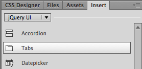
Tabs
Accordion menus can give you plenty of wow for your jQuery buck, but they aren't the only interface organizational tool in the barn. When it comes to visual sectioning strategies, you can't go wrong with tried-and-true tabs.
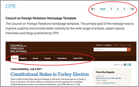 |
Tabs don't have to be complicated to work well. Concentric Studio's portfolio of their site designs features unobtrusive tabbed navigation with subtle gradients to make the chosen tab stand out. And look—there's another style of tabbed navigation on the home page template they built for the Council on Foreign Relations! |
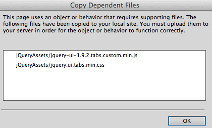
Let's take a look at how to make them in Dreamweaver. Expand the jquery-tabs folder and open the index.html file. Switch to Design View. Insert your cursor inside the gridContainer div, then click Tabs in the Insert panel.
Go to File > Save All to copy the dependent files.
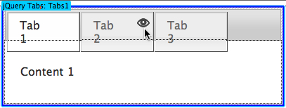
To insert content, hover your mouse over a tab and click the eye icon that appears. Type a new label and insert content into the panel below.
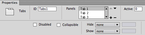
Using the Properties Inspector, you can add panels, subtract panels, and choose different animated effects when tabbed panels are hidden or shown.
Working in Live View, edit the border-styles, background-colors, and font colors in the jquery.ui.theme.min.css file:
|
|
|
| |
.ui-widget
Basic font styling.
.ui-widget-content
The content area of the selected panel.
.ui-widget-header
The header which surrounds the tabs.
.ui-state-default, .ui-widget-content .ui-state-default, .ui-widget-header .us-state-default
The non-selected tabs.
.ui-state-default a,.ui-state-default a:link,.ui-state-default a:visited
The font color of non-selected tabs.
.ui-state-hover, .ui-widget-content .ui-state-hover, .ui-widget-header .ui-state-hover, .ui-state-focus, .ui-widget-content .ui-state-focus, .ui-widget-header .ui-state-focus
The non-selected tabs during the hover state.
.ui-state-hover a,.ui-state-hover a:hover,.ui-state-hover a:link,.ui-state-hover a:visited
The font color of non-selected tabs during the hover state.
.ui-state-active, .ui-widget-content .ui-state-active, .ui-widget-header .ui-state-active
The currently selected tab.
.ui-state-active a, .ui-state-active a:link, .ui-state-active a:visited
The font color of the currently selected tab.
.ui-corner-all, .ui-corner-top, .ui-corner-left, .ui-corner-tl
.ui-corner-all, .ui-corner-top, .ui-corner-right, .ui-corner-tr
.ui-corner-all, .ui-corner-bottom, .ui-corner-left, .ui-corner-bl
.ui-corner-all, .ui-corner-bottom, .ui-corner-right, .ui-corner-br
The top-left, top-right, bottom-left, and bottom-right corner radiuses.
|
|
|
|
|
Tabbed panels present a lot of content in a small amount of screen space. Shopping sites often use tabs for product info.
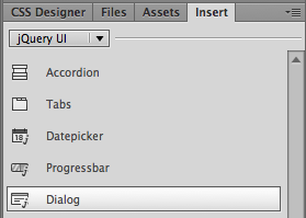
Dialog
Last not but not least in our rundown of jQuery UI insertions, we have the dialog widget, a fancy alternative to a pop up window or alert message.
Expand the jquery-dialog folder and open the index.html file. Click to insert a Dialog.
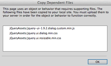
Go to File > Save All and copy the dependent files.
Insert your cursor inside the jQuery dialog box.

Open the Insert panel and choose the Common category. Click to insert an Image. Browse to select the sizing.jpg from the jquery-dialog image folder.
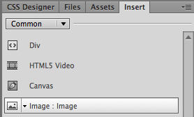
Delete the "Content for New Dialog Goes Here" filler text.
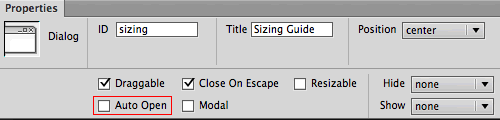
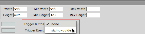
Click the blue jQuery tab to edit the dialog properties. Uncheck "Auto Open" so the dialog won't appear when the page first loads. Instead, choose "sizing-guide" as the trigger button.
Assign a descriptive ID to the dialog (this is especially important if you have more than one dialog) and type in the title that will appear at the top of the dialog box. You can decide whether you want the dialog to be draggable or resizable. If you check "Modal", other items on the page will be disabled when the dialog is open.
Define the width and height of the dialog. In this case, the dialog should be 543 pixels wide.
 |
 |
In most cases, you won't want the dialog to open automatically when the page loads. Add a button to your layout (Insert > jQuery UI > Button) and use the button as a trigger. |
Switch to Live View and click the Sizing Guide button to test the dialog.
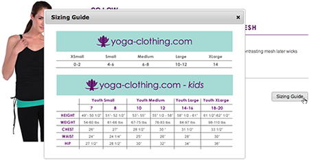 |
Ready, click, go: click the Sizing Guide button to launch the dialog. |
As always, the CSS Designer panel is there for your styling needs. Edit the following styles in the jquery.ui.theme.min.css file:
|
|
|
| |
.ui-widget
Basic font styling.
.ui-widget-content
The content area of the selected panel.
.ui-widget-header
The dialog header.
.ui-corner-all, .ui-corner-top, .ui-corner-left, .ui-corner-tl
.ui-corner-all, .ui-corner-top, .ui-corner-right, .ui-corner-tr
.ui-corner-all, .ui-corner-bottom, .ui-corner-left, .ui-corner-bl
.ui-corner-all, .ui-corner-bottom, .ui-corner-right, .ui-corner-br
The top-left, top-right, bottom-left, and bottom-right corner radiuses.
|
|
|
|
|
 Review how to create basic rollover images.


