CSS Selectors
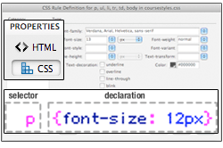
A CSS rule consists of two parts: the
selector and the declaration. The selector tells the browser what to format and the declaration tells the browser how to format it.
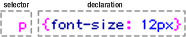 |
This CSS rule instructs the browser to "select all paragraphs and set the font size to 12px. |
Tag Selectors
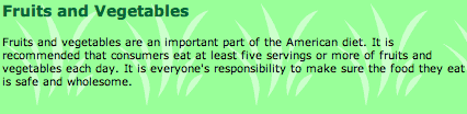
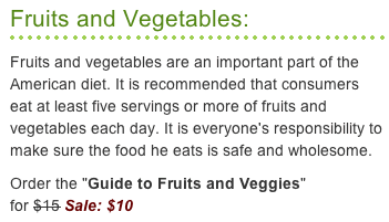
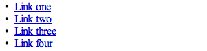
Browsers come with default formatting for HTML elements like <h1> headers and <p> paragraphs. An un-stylized text block would look like this:
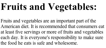 |
The default setting for headers is big and bold. |
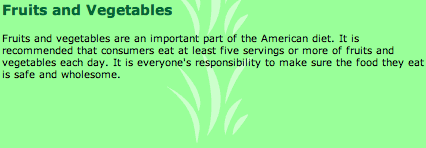
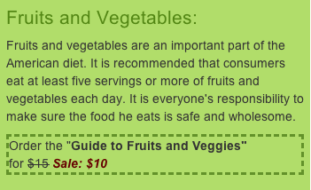
Using tag selectors, you can redefine the appearance of headers and paragraphs, changing
the font size, weight and color:
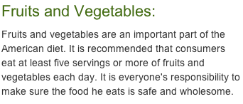 |
A h1 tag selector was used to format the heading. A p tag selector was used to format the paragraph. |
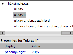
Each element in an HTML page is inserted inside a tag, which means that tag selectors can be used to format literally everything. A few handy tags are listed below.
 |
|
 |
| |
<body> Use the body tag selector to add background colors or patterns to the page body.
<h1> <h2> <h3> <h4> <h5> <h6> Use h1-h6 tag selectors to format headings and subheadings. There are six levels of headings, with h1 as the most important and h6 as the least.
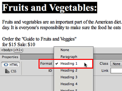 |
Select the text, then choose a heading level from the Format menu in the Property inspector. |
<p> Use the p tag selector to format paragraph text.
<strong> Use the strong tag selector to embolden important words or phrases in the text. Clicking the B button in the Property inspector will wrap text in <strong> tags.
|
Clicking the B button in the Property inspector will wrap text in <strong> tags. |
<em> Use the em selector to format text that you would normally set in italics, like a quote, a technical term, or an idiomatic phrase from another language.
|
Clicking the I button in the Property inspector will wrap text in <em> tags. |
<img> Use the img tag selector to add borders, margins, and padding around images.
|
|
 |
|
 |
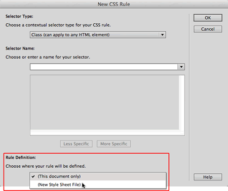
Creating a tag selector begins in our handy New CSS Rule dialog. Select Tag from the Selector Type menu, then choose a tag from the menu to the right of the Selector Name field.
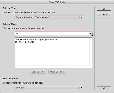 |
Choose the Tag selector type to format elements set within html tags like paragraphs <p> and headings <h1>. |
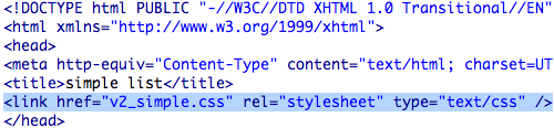
Class Selectors
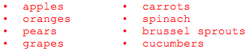
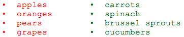
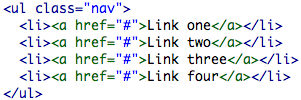
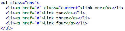
Class selectors come in handy when you need to be more specific than a standard tag selector. For example, let's say you have two lists:
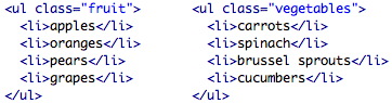
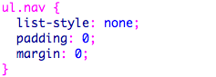
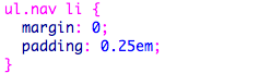
Lists are contained within ul tags:
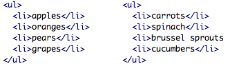
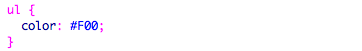
Therefore, both of these lists could be formatted using the <ul> (unordered list) tag selector:
Easy enough. However, how would you make the fruit list red, and the vegetable list green?
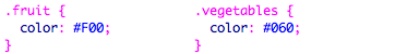
You would need to add a class selector to each list:
And write separate class selectors:
As you'd probably expect, since you're now pretty familiar with the
New CSS Rule dialog, creating a class selector begins right there. Select
the Class selector type, type in a name, and you're on your way.
Note that all class selector names begin with a dot (Dreamweaver will
put it in for you if you forget).
ID Selectors
ID selectors are used to format unique page elements—for example, a company logo.
ID selectors and class selectors are almost interchangable. You could format the "fruit" and "vegetable" lists using ID selectors rather than class selectors, and you'd get exactly the same results.
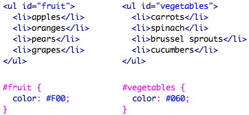
However, there is an important point of difference: each ID selector can only be applied to one element per page. You could format any number of lists with a .fruit class selector, but you can only format one list with an #fruit ID selector.
To create an ID Selector, use the New CSS Rule dialog. Choose the ID selector type. Then enter the name of your selector, beginning
with a # (hash or pound sign).
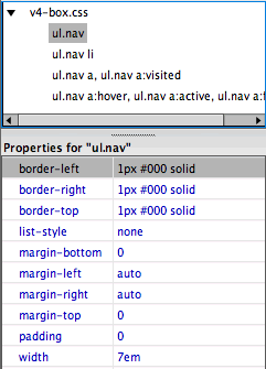
Descendant Selectors
Descendant selectors are used to target elements within other elements.
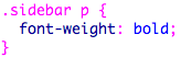
This descendant selector would format any paragraph within the content div:
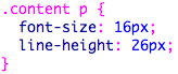
And this descendant selector would format any paragraph within the sidebar div:
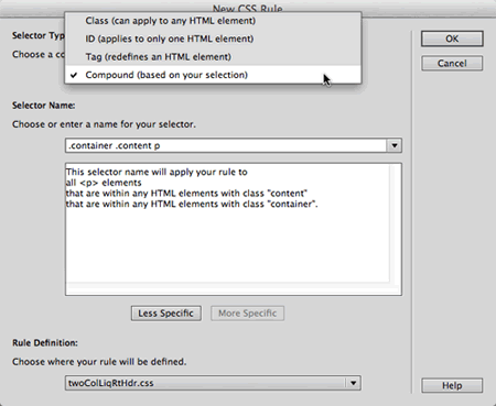
If you select a page element before you create a new CSS rule, Dreamweaver will write the descendant selector for you. Choose Compound (based on your selection).
 |
Descendant selectors are used to select elements that "descend" from another element higher up in the document family tree. |
Group Selectors
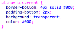
You'll often apply the same formatting to multiple elements. For efficiency's sake, group the selectors together.
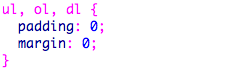
Each selector must be separated by a comma. For example, this group selector removes margins and padding from all unordered lists, ordered lists, and definition lists:
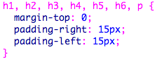
Here's another group selector which adds left and right padding to headings and paragraphs:
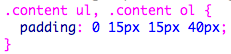
Group selectors can include a wide range of selector types. Here's a grouping of two descendant selectors. Note that .content ul is for the unordered lists inside the content div, and .content ol is for the ordered lists inside the content div:
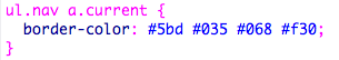
Pseudo-Class Selectors
Now on to the fun topic of link states. You might be familiar with these already, but let's review:
|
|
|
| |
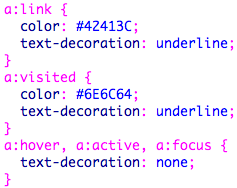
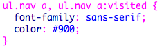
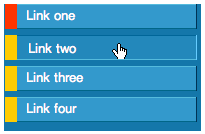
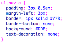
a:link: This is the typical state of a link when it has never been visited—it's just sitting quietly on your page waiting for some action.
a:visited: This state appears when the viewer has visited the link previously, but is not currently doing anything with the link like clicking on it or mousing over it.
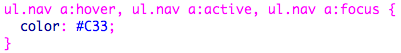
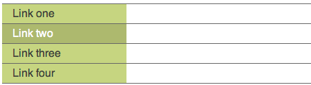
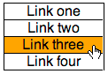
a:hover: A designer favorite! This state appears when the user's mouse is hovering over the link—looking much like a JavaScript image rollover.
a:active: This is a brief state, only appearing for the duration of time that the user's mouse is actively clicking on the link.
a:focus: This state will create a rollover effect when using a keyboard rather than a mouse to tab through the navigation options. |
|
|
|
|
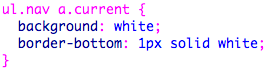
You must define your link selectors in the following order:
|
|
|
| |
a:link a:visiteda:hovera:active |
|
|
|
|
A mnemonic for remembering this sequence is LoVe HAte: L-link V-visited H-hover A-active.
Listing your link styles in the correct sequence will ensure that your a:visited link styles override your a:link styles, and that your a:hover styles override both the a:visited and a:link styles.
When two rules target the same element (in this case, both a:link and a:visited format links) the last rule to be defined wins out.
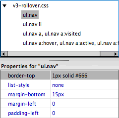
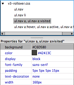
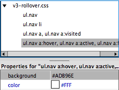
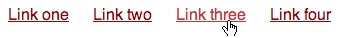
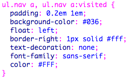
The a:hover, a:active, and a:focus selectors are often grouped together, since they receive the same formatting during the rollover state. The complete set of link styles looks like this:
Hierarchy of Styles
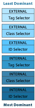
All this talk of selector types brings us to the important topic of hierarchy—CSS hierarchy, that is.
The best way to remember the hierarchy of CSS is that the closest style wins. External styles are the "farthest" from the item you're modifying—all the way over in some other document. Internal styles are much closer—just at the top of your HTML code. Therefore, an internal style will
override an external style.
In addition, a class selector will override a tag selector, because the code used
to apply a class selector is wrapped around the item you're styling.
ID selectors carry more authority than classes. If a class selector and an ID selector are in conflict, the ID selector will win out.
CSS will accommodate styles that don't conflict with one another, combining them rather than knocking out the less dominant. That's where the intriguing term "cascading" comes into play (I know you were wondering).
Such issues are paramount when troubleshooting. If you apply a style and don't see a change in your document, there's a good chance that another style is overriding the style you're trying to apply.
The Code Navigator is a helpful tool to identify conflicting styles. Select the page element you need to troubleshoot, then go to View > Code Navigator to study the styles in effect.
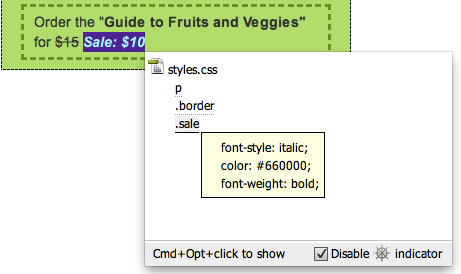 |
Keep Disable indicator checked. Otherwise, the Code Navigator icon will pop up whenever you hover over any page element, which becomes annoying. You can access the Code Navigator by Alt-click (Windows) or Command-option-click (Mac) instead. |
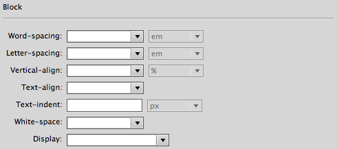
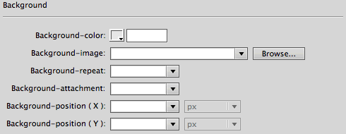
Style Settings: Overview
Now that you know how to create internal and external styles using each of the major selectors, we can focus on style settings—the attributes that make your styles so stylish!
Defining Style Attributes
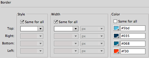
After clicking OK in our trusty New CSS Rule dialog, Dreamweaver supplies us with the following settings:
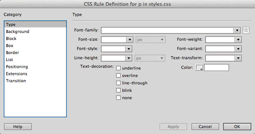 |
The CSS Rule Definition dialog is used to edit style attributes. |
The various style attributes are organized into categories on the left. Your
style may contain attributes from all of the categories, just
a couple, or in many cases, just the Type category.
Style Settings: Type Attributes
Type Styles
The Type category allows you to control typography settings such as font size, weight, and color.
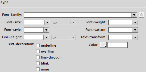
Most of the options here are self-explanatory, while others (sigh!) are a little more complicated. Let's look at each one.
|
|
|
| |
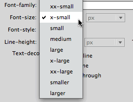
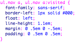
Font-family offers serif, sans-serif, monospace, and cursive font stacks.
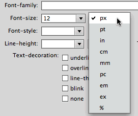
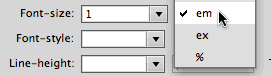
Font-size can be set in a number of different units (points, pixels, ems, and so on) which we will talk about in the next section.
Font-weight refers to the boldness of a font. Did you know that you have more options than just plain normal and bold? Click the menu next to the Font-weight field to choose a variation, or enter a numerical weight (ranging from 100 to 900—normal is somewhere in the middle while the standard bold weight is around 700).
Font-style includes "normal" and "italic" and a surprise newcomer: "oblique." Oblique is handled differently from browser to browser. In some browsers, it will act as italic, slanting the text, while in other browsers it will revert to normal. So italic is still your best bet for slanted text.
Font-variant includes an option for "small caps" (where lowercase letters are set as small capitals).
Line-height specifies the height of each line of text, also known as line spacing. To improve the readability of long sections of text, specify a line height slightly larger than the font size.
Text-transform displays text in uppercase, lowercase, or capitalized (where the first letter of each word is capitalized, also known as "Headline Case").
Text-decoration allows you to add underlining, overlining, line-through (also known as strikethrough), or a blinking effect. You may choose more than one of these options. For the sake of all that is right and good, please avoid blinking.
Color sets the font color. Click the color chip or enter a specific hexadecimal color code. |
|
|
|
|
You do not need to apply all of these type settings—the fields you leave blank will simply default to normal (such as no decoration, normal case, standard line height, and so on).
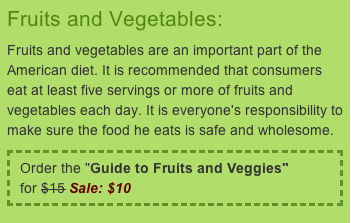
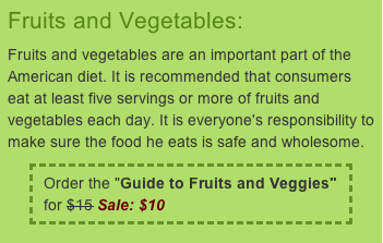
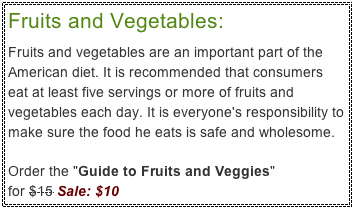 |
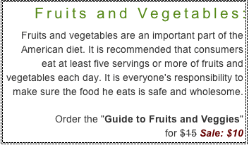
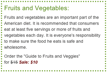
In the above CSS example, the header style includes font, size, weight, and color. The main paragraph style includes font, color, and line spacing. A strikethrough was added to the original price, and red, italicized text denoted the sale price. |
 Discover how CSS is used to style Web sites.

 .
. 
 .
. 