So far in this class, we've used horizontal lists to format navigation on large screens:

And vertical lists to format navigation on small screens:

This is a simple, effective solution. However, if you have a lot of links, they might take up too much space on small, mobile devices.
Using jQuery, you can compress a full navigation bar:

Into a simple icon:

What is jQuery? As you might remember from your earlier HTML/CSS studies, jQuery is a free, open source JavaScript library that is designed to make designers who use HTML and CSS (that's us!) have an easier time talking to JavaScript and accessing some advanced dynamic features.
Go to responsive-nav.com. Here you'll find a great, lightweight jQuery plugin that will get you started with your responsive navigation bar. It's very easy to use.
Click the DOWNLOAD button on the site. Then unzip the responsive-nav.js-master folder and move it into your local site folder.
Using Dreamweaver's Files panel, expand the demos folder. Double-click to open the index.html file inside the simple folder.
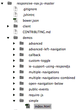
Switch to Code View. Here, you'll see the basic components which make the responsive nav work. The document head contains links to a responsive-nav.css file (which styles the nav) and a responsive-nav.js file (which provides functionality).
The unordered list is inserted in a <nav> with a class of "nav-collapse".
A script tag is inserted just above the closing body tag, which tells the browser to associate ".nav-collapse" with the responsive navigation function.
Go to File > Preview in a Browser. Make your browser window large, and you'll see a list:

Make it small, and you'll see a Menu button:

Let's take a look at another version of this responsive nav bar. Expand the advanced folder and open the index.html file. Go to File > Preview in Browser. At large screen sizes, the links are styled as a horizontal list.

At small screen sizes, the links compress into a "hamburger" icon.

The advanced nav bar uses the exact same script as the simple nav bar, but it contains more formatting in the external style sheet.
Close both index.html files when you're done checking them out.
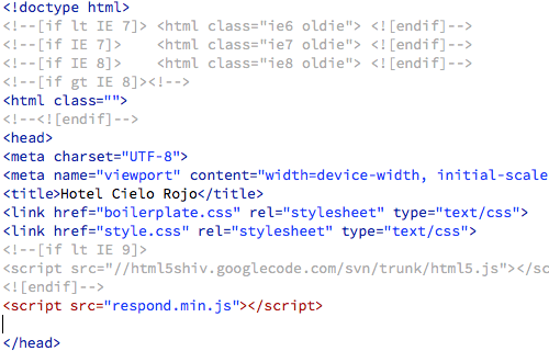
Ready to apply the responsive navigation plugin to your own design? Download the hcr folder from the course downloads area. Move it into your dw1exercises local site folder. Open the index.html file inside the hcr folder.
The Hotel Cielo Rojo home page contains a completely unstyled unordered list. We'll turn this basic list into a responsive nav bar, following the Usage Instructions from responsive-nav.com. jQuery plugins are often updated, so it is important to reference the instructions on the plugin website.

There are four steps to getting our plugin ready: linking the files, adding markup, and hooking up the plugin. Let's go through them one at a time.
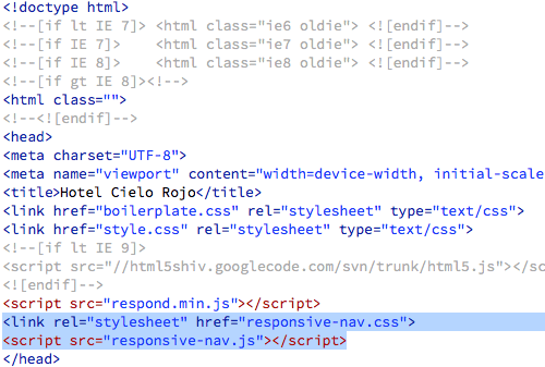
1. Link the Files
Copy these links:
<link rel="stylesheet" href="responsive-nav.css">
<script src="responsive-nav.js"></script>
Switch to Code View. Insert your cursor into the document head and press your Return key to create an empty space.
Then, Edit > Paste.
Using your Files panel, select the responsive-nav.css and responsive-nav.js files and drag them into the hcr folder.
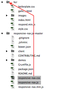
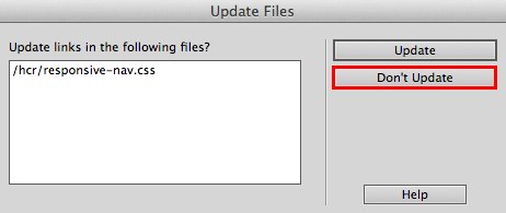
If Dreamweaver asks you to update the links, click Don't Update.
You'll know that the responsive-nav.css and responsive-nav.js files are linked correctly when they appear in the related files toolbar.

2. Add Markup
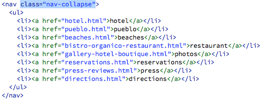
The navigation list must have a class of "nav-collapse" in order for the script to take effect. Insert your cursor inside the opening <nav> tag and type class="nav-collapse".
3. Hook Up the Plugin
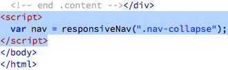
Copy this script:
<script>
var navigation = responsiveNav(".nav-collapse");
</script>
And paste just before the </body> closing tag.
Go to File > Preview in Browser. Resize your browser to test the responsive nav. At large screensizes, you'll see the list of links. At small screensizes, you'll see a MENU button. The script is working, but the nav bar could use some styling.
Take another look at the demos folder. Open the styles.html file inside the advanced folder.

The first few styles provide basic formatting for the body and viewport. We don't need these styles, since we already have body styles in the Hotel Cielo Rojo site.
We do need the styles related to the "nav-collapse" element. Select the first .nav-collapse style:
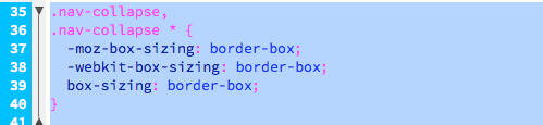
and extend your selection all the way down to the bottom of the page, to the last "nav-toggle" style. Go to Edit > Copy to copy the selection.
Hop back to the Hotel Cielo Rojo index.html file. Use the related files toolbar to toggle to the responsive-nav.css file.

Scroll all the way down to the bottom of the stylesheet. Insert your cursor below the final media query.
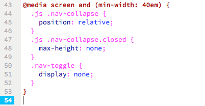
Edit > Paste the styles you copied from the advanced demo folder.
Go to File > Preview in Browser. The top-nav is stacked in two rows of links, but this is easy to change.

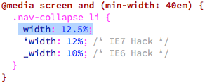
Back in the responsive-nav.css file, and look for the .nav-collapse li style inside the @media screen and (min-width: 40em) media query.
The list items are set to 25% width—that's why they fit four in a row.

To fit eight in a row, the width should be 12.5%.
This worked, but it's a tight fit. The "restaurant" and "reservations" links are getting chopped off.
Back in the responsive-nav.css file, change all the media queries to 50em rather than 40em. This way, the hamburger icon will pop up before the nav bar squeezes too much. There are 4 media queries in the responsive-nav.css file—change all 4!

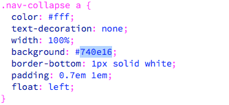
We can also change the color of the nav bar. Look for the .nav-collapse a style:

Change the background to #740e16.
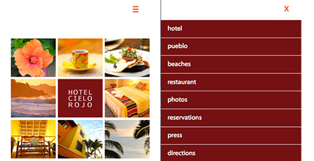
Go to File > Preview in Browser and make the browser window smaller and larger. At large screen sizes, you'll see the horizontal nav bar. At small screen sizes, you'll see a hamburger icon, which you can click to expand a vertical menu.
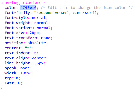
If you'd like to change the color of the hamburger icon, look for the .nav-toggle:before style in the responsive-nav.css file. Change the color to #740e16.
Preview in a browser. The nav bar is done!
jQuery Lightbox
Now that you've tested the water with a lightweight jQuery plugin that helped you build a snazzy responsive nav bar, let's now try something exotic called a lightbox.
jQuery lightboxes come in handy for image galleries. Go to frescojs.com to find a highly functional and lightweight jQuery lightbox. Feel free to browse the examples and look through the documentation. When you're ready, click the DOWNLOAD LIGHT button. Unzip the fresco folder, and drag it into your local site folder.
Note: I'll show you how to include the Fresco lightbox, but it's important to keep the instructions on the documentation page open in case you get confused.
1. Link Files
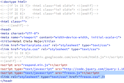
The Fresco lightbox requires a link to the latest version of the jQuery library. You could download the jQuery files and and post them on your own Web server, but it is easier to link to the jQuery library on a content delivery network. Copy the following script tag:
<script type="text/javascript" src=""></script>
Open the gallery.html file in the hcr folder and switch to Code View. Insert your cursor into the document head, and press your Return key to create an empty space.

Paste the script tag.

The jQuery library is often updated, so make sure you're using the latest version. Go to http://code.jquery.com/. There are several versions of jQuery to choose from. jQuery 2.x doesn't offer support for IE 8 and below, so choose the latest version of jQuery 1.x instead. Click the link for "minified" (this file has been compressed to load faster in the browser).

Copy the URL at the top of the browser window.

Back in Dreamweaver, find the script tag you just pasted into the document head. Insert your cursor in between the quotation marks for src="" ...

... and Edit > Paste the URL:

And that will include jQuery. The next step is to copy the following links:
<script type="text/javascript" src="fresco.js"></script>
<link rel="stylesheet" type="text/css" href="fresco.css" />
Insert your cursor just below the link to the jQuery library, and press Return to create an empty space.

Edit > Paste.
Expand the fresco folder in your Files panel, then expand the nested css and fresco folders. Select the fresco.css file and the skins folder, and drag into your hcr folder.
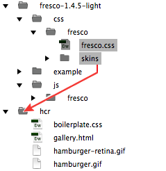
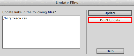
If Dreamweaver asks you to update the links, click Don't Update. The fresco.css file contains links to images in the skins folder that you don't want to mix up.
Expand the nested js and fresco folders. Select the fresco.js file, and drag into your hcr folder.

You should have the fresco.css file, the skins folder, and the fresco.js file inside your hcr folder.
2. Add Markup
You'll find instructions for adding the Fresco markup on the Usage page.
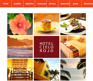
The Hotel Cielo Rojo image gallery contains a list of small, thumbnail images:

The small images link to larger, full-sized images.

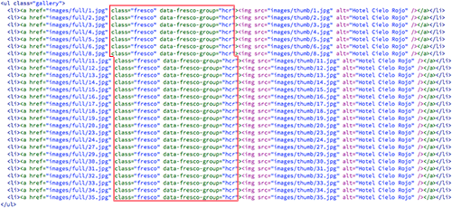
Add a class of "fresco" to each <a href> tag. Also, add a data-fresco-group attribute, so all the large images will be grouped into an image gallery.
Copy the code below:
class="fresco" data-fresco-group="hcr"
Insert your cursor inside the first <a href> tag, just before the closing bracket.

Press your spacebar, then paste the code.

Repeat. Paste the same class and data-fresco-group in each <a href> tag. Remember to press your spacebar before each one.
Go to File > Preview in Browser. Click any thumbnail image to test the lightbox.
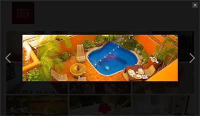
If your gallery doesn't work, run through this checklist.
 |
|
 |
| |
- Did you include a link to the latest version of the jQuery library in your document head?
- Did you add links to the fresco.js and fresco.css files in your document head?
- Is the link to the jQuery library listed before the links to the fresco.js and fresco.css files in your document head? The jQuery library must load before the other scripts.
- Did you move the fresco.js and fresco.css files into your hcr folder? Click fresco.js and fresco.css in your Related files toolbar to make sure the files are linked correctly.
- Did you add the "fresco" class and data-fresco-group attributes to each
<a href> tag?
|
|
 |
|
 |

 Incorporate jQuery navigation into a Web page.


 Store your image files in a specific folder called "images" inside your local site folder.