Forms contain two main components: the front end and the back end. The front end presents the form elements that the user sees and interacts with. The back end is invisible to the viewer and constitutes the code and server interaction that generates results or transmits data.
|
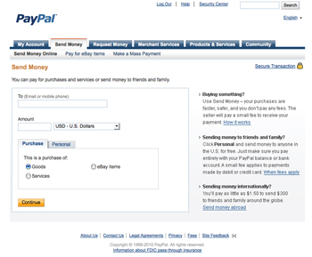
If you send someone money through PayPal (for your latest eBay win, perhaps?) you'll start the process by filling out a form in the front end. When you submit the form, the back end code will be processed to transmit the necessary information to PayPal's server. |
Designing the Front End
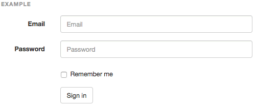
Good design makes filling out forms less of a chore. Form labels must be large enough to read easily. Any instructions must be brief. The user should be able to differentiate between required and optional form elements, and choose the correct button with just a glance.
These goals can be easily achieved by sticking to standard design conventions. Keep it simple! This is not the time to go avant-garde.
 |
|
 |
| |
1. The
overall page design should be consistent with the other pages in the site,
including the site logo and navigation. Sounds like common sense,
but if this is overlooked, users feel as if their form results
will be going somewhere other than the intended site.
|
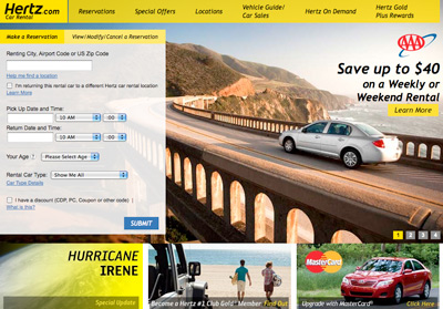
Global colors and graphics incorporate
the Hertz rental
car form into a clear and consistent design. |
2. Align all form elements
to the left. Centered alignment slows down the process
of clicking from one form element to the next.
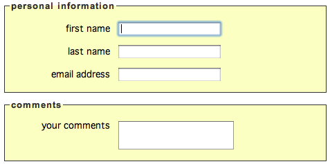
3. Group related form elements into fieldsets. For example, you might create separate fieldsets for "personal information" and "comments." Fieldsets divide long forms into manageable sections. The legend tag provides a descriptive title for each fieldset.
|
By default, fieldsets are bordered by a thin gray line. You can override fieldset background colors and borders using CSS. |
|
|
 |
|
 |
Implementing the Back End
To make a form work, you'll need a form
handler on your web server. A form handler is a specially-coded script that tells the form data what to do. One form handler might tell the data to go sit in certain fields of an existing database, while another might process the user's response and calculate the resulting statistics.
Form handlers are typically Perl or PHP-coded CGI scripts, though
they can employ other scripts like ASP instead. If this is all alphabet
soup to you, don't worry. In many cases you can find a free or inexpensive
pre-written script online. Some scripts will need to be transferred to your
server, while others are hosted on outside servers. Even better,
many web hosting companies provide scripts, so you may not have to look
further than your own host.
|
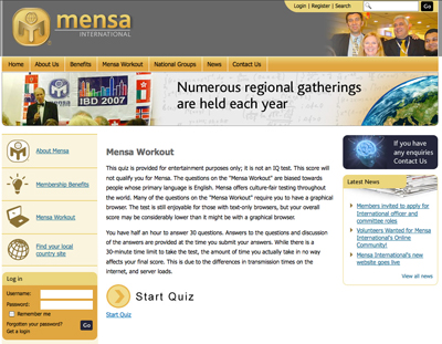
When a user takes the Mensa Workout test, test answers are submitted to the Mensa web server where scores are calculated. Results are instantly returned to the user (displayed in the browser) and may also be kept in a database on the server. All of this is achieved through the form handler. |
In most cases, you'll use a CGI script to process your forms. To implement
CGI form handlers, your server should have a special directory
called a cgi-bin (you cannot create this
directory yourself; it is
supplied by your host).
Now would be a great time to see if your web host has a cgi-bin for your CGI form handlers. Expand the Files panel and connect to your web server. View the files on the Remote Server. If you see a folder called "cgi-bin" at the root of your site, you've got one and you're all set.
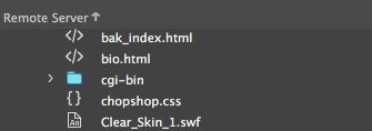
|
In my Remote Site files, I have a cgi-bin directory. In fact, my host even supplies a form handler for me to use. To learn how this free form handler works and what it does, I'll check the documentation for my host or contact their tech support. |
If you don't have this directory, contact your host to see what other form handling options you have. Some hosts, particularly free or very low-cost hosting plans, do not offer form handling. However, you can still use handlers provided by outside servers, as you'll see in the exercise. The ability to process a script on your own server is not required for this class.
Forms and Form Elements
Starting a Form
Ready to design a form of your own? Download the forms folder from the Course Downloads area and open the index.html file.
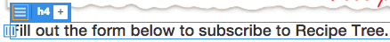
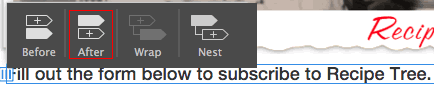
Toggle to Live View and select the "Fill out the form below to subscribe to Recipe Tree" heading.
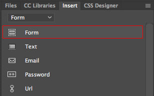
The form will be inserted after this heading. Expand the Insert panel and choose the Form category. Click "Form".
|
The Form category of the Insert panel offers quick access to common form elements. |
Choose "After" from the insert options.
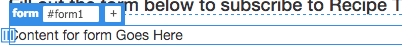
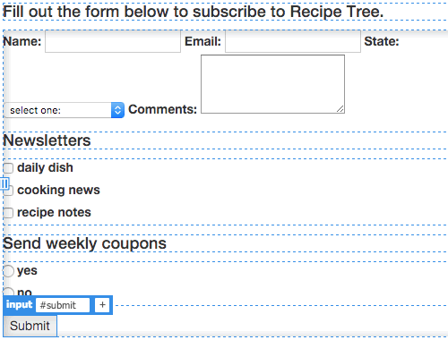
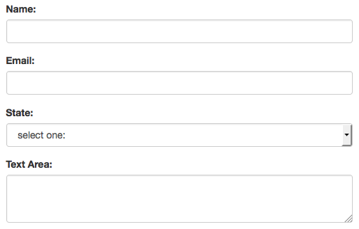
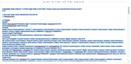
The form looks like this in Live View:
And like this in Code View:
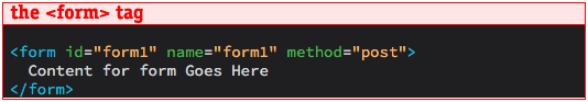
In order for the form to function, all of the form elements must be inserted within the form tags.
Text Fields
Text fields capture
user data like names, addresses, and passwords.
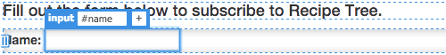
Our text field will go within the form. Working in Live View, make sure the form is selected (you'll see it outlined in blue as shown below).
Click "Text" in the Insert panel to insert a text field. Choose "Nest" from the insert options.

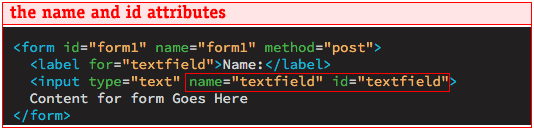
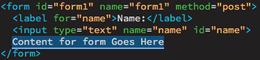
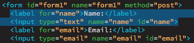
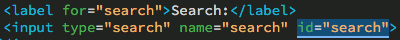
Toggle to Code View and look for the text field you just inserted. The "input" is the text field and the "label" is the label before the text field.
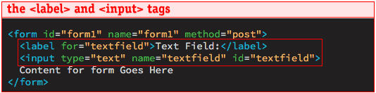
Change "Text Field:" to "Name:"
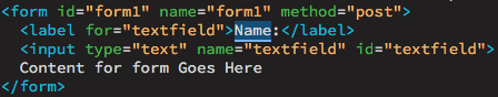
Notice how the input field has a name and ID? These attributes are not visible in the browser, but they come in handy when you receive the form results. Each line of data will listed with its name and ID.
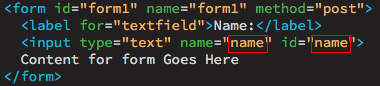
If you have more than one textfield, you'll want to change the name and ID to something more specific. We are using this textfield to collect the user's name, so change the name and ID of the input to "name":
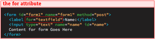
The label includes a "for" attribute. This lets the browser know that the label is "for" a particular input field. Using the "for" attributes is very important if you want to design an accessible form. Otherwise, the screen reader will have no way of knowing which input field relates to which label.
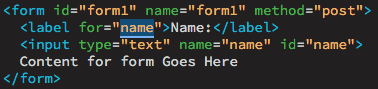
Change the "for" attribute to "name".
Before we move on, select the "Content for form Goes Here" filler text and hit your Delete key.
Email Fields
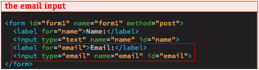
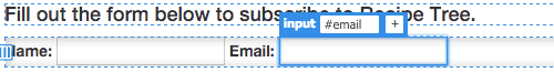
Toggle back to Live View. Select the input field to mark the place for the next insertion.
Click "Email" in the Insert panel to insert an email field. Choose "After" from the insert options.

Email input fields come with a name, ID, and label of "email", so you don't have to make any changes. Cool!
You'll notice that we do a lot of switching back and forth between Live View and Code View as we build this form. When you insert form elements in Live View, you get an accompanying label tag along with the input. When you insert form elements in Code view, you just get the input. This is why I always insert form elements in Live View. However, I've found that it is quicker and more precise to edit the names, IDs, and "for" attributes in Code View. Hence the toggling, but it all pays off!
Select Menus
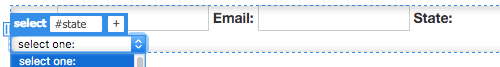
Select the email field to mark the place for the next insertion.
Click "Select" in the Insert panel to insert a select menu. Choose "After" from the insert options.

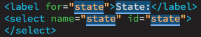
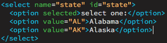
Toggle to Code View. Change the label to "State", and the name, ID, and "for" attribute to "state".
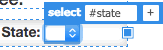
Toggle back to Live View and select the small dropdown menu.
Go to Window > Properties and click the List Values button.
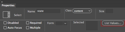
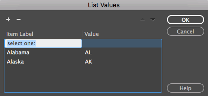
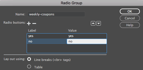
Select menus allow users to select from a list of options. Each menu item requires an Item Label (the text the user will see for each choice) as well as a Value (the results you will receive). Go ahead and enter the following options:
|
Use the plus icon to add list items, and the minus icon to subtract items. |
Did you notice in my above example that I included an Item Label called "select
one:"? I don't want my users to actually pick this, but it is a helpful reminder to choose an item from the menu.
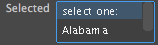
To make sure "select one:" is visible when the page first
loads, use the Selected option
in the Properties Inspector.
|
Select the list item that you would like to appear when the page first loads. |
Entering all 50 states would be quite a chore, but luckily, a quick Google search results in a list of select values from freeformatter.com. Copy the options starting from "Arizona" on down (you don't need the <select> tags)
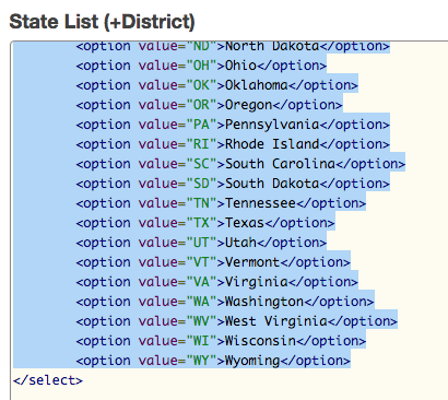
Toggle to Code View, insert your cursor after the "Alaska" option, and Edit > Paste.
Click the paint bucket icon in the left coding toolbar and choose "Apply Source Formatting" when you're done.
Text Areas
Toggle back to Live View and select the select menu to mark the next insertion point.
Click to insert a "Text Area". Choose "After" from the insert options.
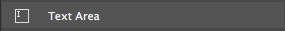
A text area is simply a multi-line text field. Text areas are useful for comments, message board posts, and other lengthy
typed responses.
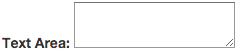
Toggle to Code View. Change the label to "Comments", and the name, ID, and "for" attribute to "comments".

To finish up, add a "rows" attribute to control the height of the text area.

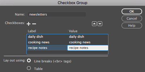
Checkboxes
Toggle back to Live View and select the text area field. Click to insert a "Checkbox Group", choosing "After" from the insert options.

Enter the following items into the Checkbox Group dialog. Choose the "Line breaks" option and click OK.
|
The Checkbox Group dialog offers layout choices of "line breaks" or "table". Choose "line breaks" if you are planning to control the form layout using CSS. |
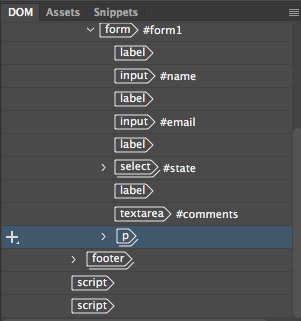
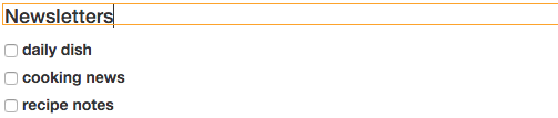
The series of checkboxes appears on the page, but it needs some sort of heading. Use the DOM panel to select the paragraph tag that is holding the checkbox items (you'll need to expand the form element and drill down to find the paragraph tag).
Toggle to the HTML category of the Insert panel and click "Heading: H4". Choose "Before" from the insert options.
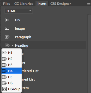
Triple-click the "This is the content for Layout H4 Tag" filler text.
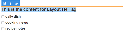
Type "Newsletters".
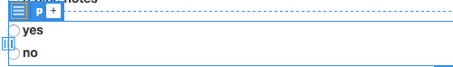
Radio Buttons
Use the DOM panel to select the paragraph tag again.
Choose the "Form" category in the Insert panel, and click to insert a Radio Button Group. Choose "After" from the insert options.

Clicking Radio Button Group will open a dialog in which you can program all of your radio buttons at once.
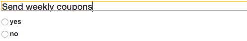
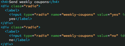
The "yes / no" radio button group needs a heading.
Keep the paragraph around your radio button group selected. Switch to the Insert panel's "HTML" category and click "Heading: H4". Choose "Before" from the insert options.
Triple-click "This is the content for Layout H4 Tag".
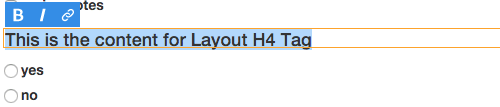
Type "Send weekly coupons".
Submit Button
In order to submit a form, you need a Submit button. Use the DOM panel to select the paragraph around the radio button group.
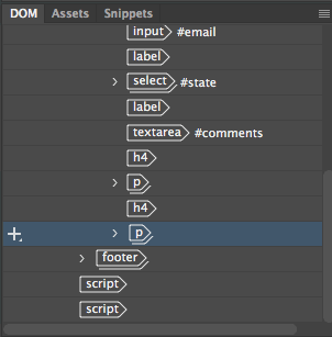
Choose the "Form" category and click to insert a "Submit Button". Choose "After" from the insert options.

We have inserted all the form elements, but the layout is quite a jumble. Not to worry, Bootstrap can get it in shape.
Designing Forms with Bootstrap
It isn't easy to style forms. Labels and input fields don't line up on their own. Luckily, Bootstrap provides a library of CSS styles for form elements. Head to http://getbootstrap.com/ to study the basic form example.
Bootstrap Formatting: Input Fields
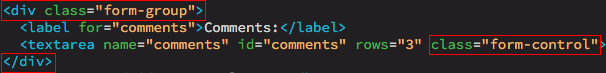
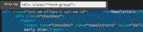
Bootstrap will line up your input fields for you, but you need to add some extra formatting. Each label and input tag should be wrapped in a div with a class of "form-group". Each input tag needs a class of "form-control".
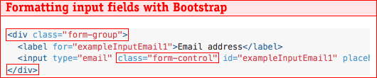
Toggle to Code View to apply the Bootstrap formatting. Select the first label and input field:
Hit Command-T (Control-T in Windows) to wrap the tags.
Type <div class="form-group"> and hit your Return key.
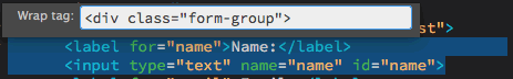
The label and input fields are wrapped!

Click the paint bucket icon in the coding toolbar and choose "Apply Source Formatting" to make the code easier to read.
Now, you need to apply the class of "form-control" to the input.
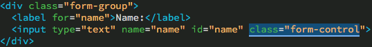
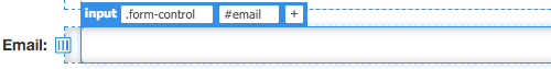
Apply the same formatting to the other input fields. Select the email label and input, wrap them in a div with a class of "form-group" (the keyboard shortcut to wrap tags is Command-T on a Mac or Control-T in Windows), then apply the "form-control" class to the input field.
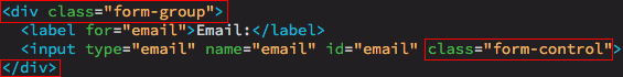
Select the "state" label, the select menu, and all the options in the select menu (including the </select> tag). Wrap in a div with a class of "form-group". Then, apply a class of "form-control" to the select menu.
Apply the same formatting to the text area.
Go to File > Real-time Preview to see the results. This looks a lot better!
Bootstrap Formatting: Checkboxes and Radios
The checkboxes and radio buttons look okay now, but it is good practice to use the same Bootstrap formatting as the other form elements.
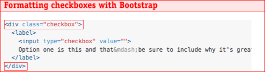
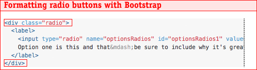
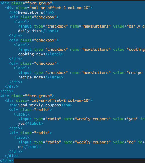
Checkboxes need to be inserted in divs with a class of "checkbox" and radio buttons need to be inserted in divs with a class of "radio".
We will tackle the checkboxes first. Start by deleting the <p> and <br> tags.
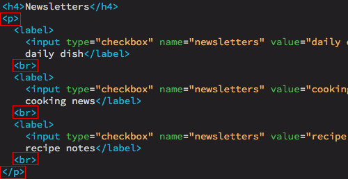
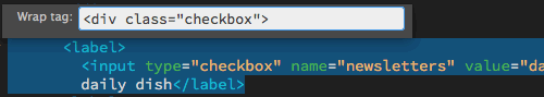
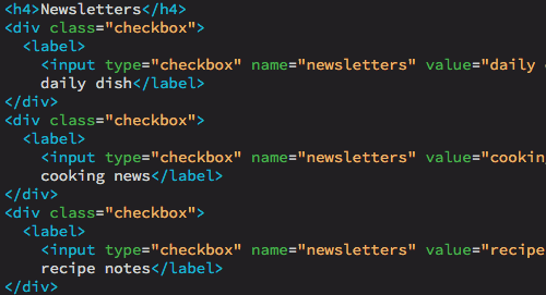
Wrap each of the checkboxes in a div with a class of "checkbox".
Click the paint bucket icon to Apply Source Formatting, and your div will look like this:
Moving down to the radio buttons, delete the <p> and <br> tags.
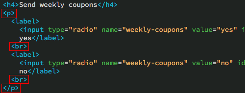
Wrap each radio button in a div with a class of "radio".
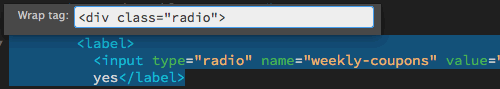
When you're done, your code will look like this:
Bootstrap Formatting: Buttons
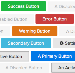
Bootstrap can transform basic buttons into something more special.
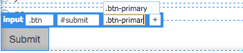
Select the Submit button in Live View.
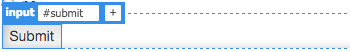
Click the + sign to add another class to the button: .btn
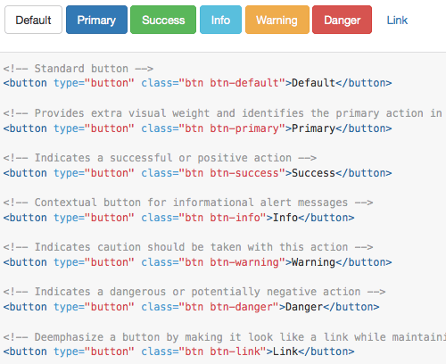
You have a choice of several button styles:
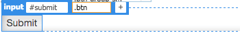
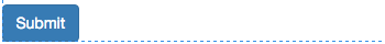
The blue button style will work with this design. Click the + sign to add another style to the button: .btn-primary
The final button looks a look better! Of course, if you want to customize the color of the button, you can do so by searching for the .btn-primary style in the bootstrap.css, copying it into your custom.css, and changing the background-color property to the color of your choice.
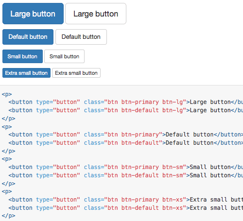
Bootstrap also gives you options for modifying the size of the buttons. If you want your button to be larger than average, apply a class of ".btn-lg". For a smaller button, apply a class of ".btn-sm".
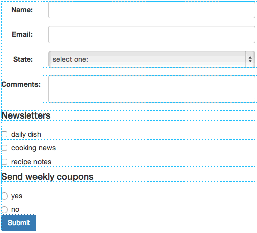
Go to File > Real-time Preview to see your form. You're done!
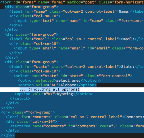
Bootstrap Horizontal Form
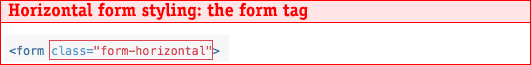
If you'd like to take a different approach to your form layout, you can try out Bootstrap's horizontal form styling. In horizontal forms, labels are placed to the left of input fields.
Horizontal forms require some extra formatting. First of all, you need to apply a class of "form-horizontal" to the form tag.
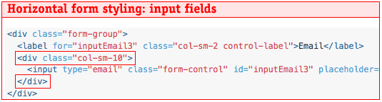
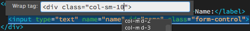
The label of each input field needs a class of "col-sm-2 control-label". This sets the label to take up two columns in the twelve column grid.
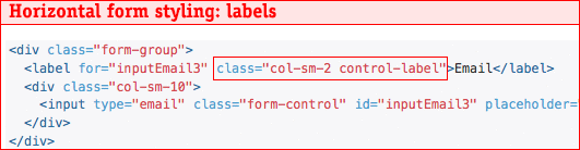
Each input needs to be wrapped in a div with a class of "col-sm-10". The input will take up ten columns in the twelve column grid.
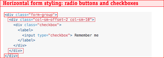
Radio buttons and checkboxes are nested inside two divs. The first div has a class of "col-sm-offset-2 col-sm-10". The offset property pushes the checkboxes over two columns. The second div has a class of "form-group".
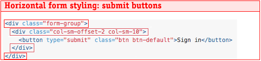
Like radio buttons and checkboxes, submit buttons are wrapped in two divs: "col-sm-offset-2 col-sm-10" and "form-group".
Would you like to try this out? Go to File > Save As to save a copy of your form. Name the new page "horizontal.html".
Add a class of "form-horizontal" to the form tag.

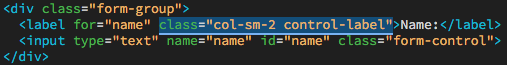
Add a class of "col-sm-2 control-label" to the name label, the email label, the state label, and the comments label.
Wrap the "name" input field in a div with a class of "col-sm-10".
And repeat — wrap the email input field in a div with a class of "col-sm-10", the select menu (including all the select options) in a div with a class of "col-sm-10", and the "comments" textarea in a div with a class of "col-sm-10".
Toggle to Live View to check your progress so far. The input fields look great, but the checkboxes are hanging off to the side of the layout. Use Bootstrap's "offset" style to push them over to the right.
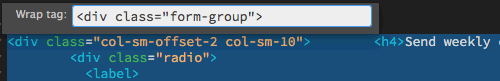
Back in Code View, select the "Newsletters" heading and all three checkboxes and wrap them in a div with a class of "col-sm-offset-2 col-sm-10".
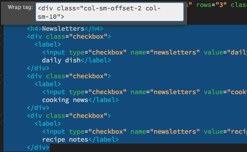
Select the "col-sm-offset-2 col-sm-10" div that you just inserted, and wrap it in another div with a class of "form-group".
Select the "Send weekly coupons" heading and both radio buttons and wrap them in a div with a class of "col-sm-offset-2 col-sm-10".
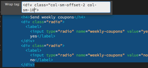
Again, select the "col-sm-offset-2 col-sm-10" div that you just inserted, and wrap it in another div with a class of "form-group".
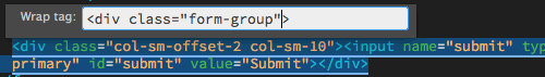
The submit button needs to be pushed over as well. Select the submit button and wrap it in a div with a class of "col-sm-offset-2 col-sm-10".
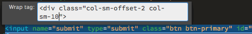
Finally, select the "col-sm-offset-2 col-sm-10" div and wrap it in another div with a class of "form-group".
Go to File >Real-time Preview to see how it looks. You'll notice that the horizontal styling kicks in at the small screen sizes and above (<750px). The labels stack in the extra-small size.
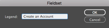
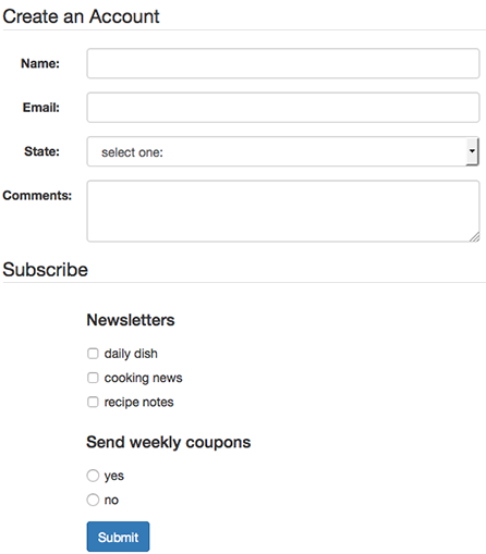
Fieldsets and Legends
In long forms, you might want to add fieldsets to organize your input fields into sections. Let's try it out. In Code View, select the name field, the email field, the select menu and the comments field.
Open your Insert panel. Scroll down to the bottom of the Form category, and click to insert a "Fieldset".

Enter "Create an Account" into the Legend field.
|
If the Fieldset dialog doesn't pop up, go to Dreamweaver > Preferences (or Edit > Preferences in Windows). In the General category, select "Show dialog when inserting form objects". |
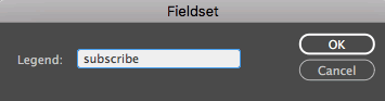
One more! In Code View, select the "Newsletters" heading, the checkbox group, the "Send weekly coupons" heading, and the radio button group.
Scroll down to the bottom of the Form category, and click to insert a "Fieldset".
Enter "Subscribe" into the Legend field.
The fieldsets help to structure the form.
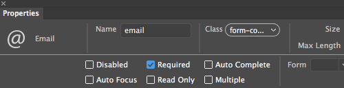
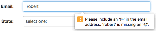
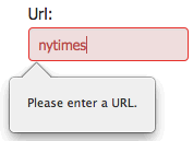
Required Fields
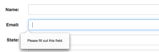
Important fields should be "required". Select the email input field.
Check "Required" in the Properties Inspector.
"Required" is a new HTML5 form attribute. In modern browsers, the user will receive an error if he or she tries to submit a form without filling in a required field. Go to File > Real-time Preview, then click the Submit button to test it.
HTML5 form attributes rely on native browser support, so no scripting is necessary. A "required" attribute has been added to the input field, and that's it!

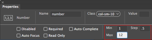
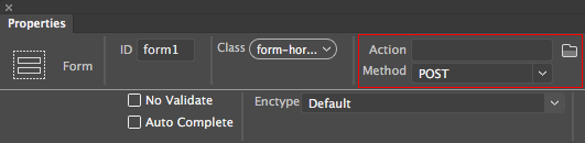
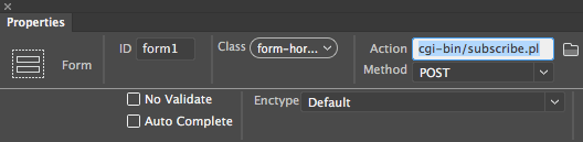
The Properties inspector offers several additional form attributes which can come in handy.
 Learn about front end and back end form design.