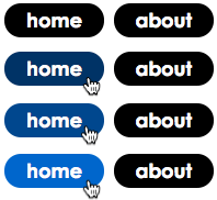
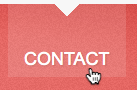
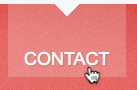
Mouse over the buttons below:
|
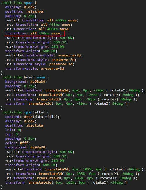
These buttons are styled purely with CSS. |
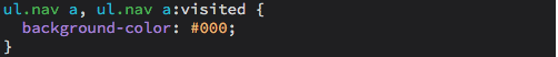
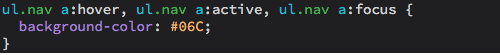
Whoa, where did that blue come from? This effect is made with just a few lines of CSS. The link background-color is set to black.
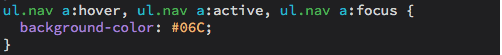
During the "hover" state, the background-color changes to blue.
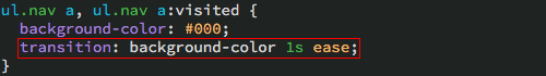
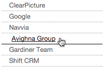
While the blue is nice, it's a little abrupt. For a different approach, mouse over the buttons below. Notice the difference? The background-color "eases" to blue more smoothly:
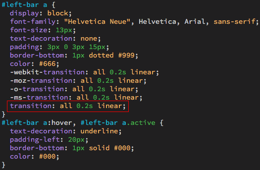
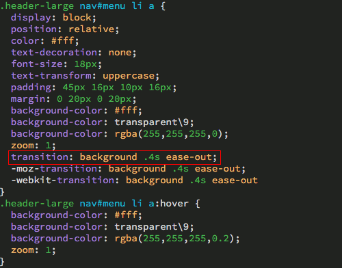
When the page first loads, the background-color is black (the start state). When the user mouses over a link, the background-color turns blue (the end state). The transition declaration is applied to the start state.
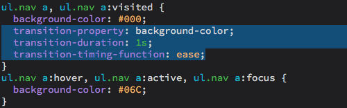
The transition declaration feeds the browser three pieces of information:
 |
|
 |
| |
-
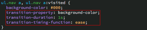
transition-property: which CSS property will be transformed (in the example above, the background-color)
-
transition-duration: how long the the transition will last (1 second)
-
transition-time-function: how the transition should animate (ease)
"Ease" is the default timing function, but there are several to choose from:
- ease: starts slow, speeds up, and slows at end
- ease-in: starts slow, then speeds up
- ease-in-out: similar to ease, but slower at each end
- ease-out: starts fast, and slows towards the end
- linear: constant speed throughout
- cubic-bezier(x1,y1,x2,y2): specifies a cubic-bézier curve to control the speed
|
|
 |
|
 |
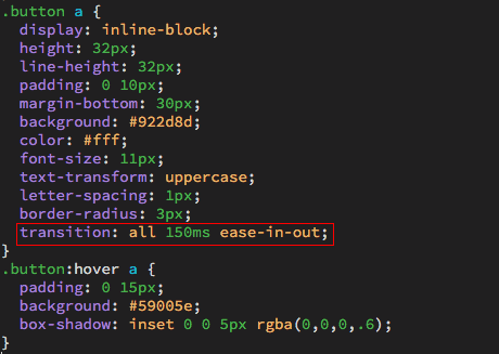
You can write the transition declaration in longhand, with each property on a separate line:
Or in shorthand, with all the properties on a single line:
Writing your transitions in shorthand results in fewer lines of code. It's cleaner and more efficient.
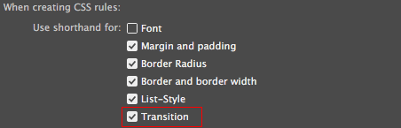
In fact, you can make Dreamweaver default to shorthand transitions! Go to Dreamweaver > Preferences (or Edit > Preferences on a PC). Choose the CSS Styles category, and select "Use shorthand for transition".
So, what can you do with transitions? Lots! To get an idea, check out Lea Verou's animatable.
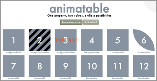 |
Lea Verou's animatable offers a smorgasbord of exciting CSS animation effects, all achieved—as she says in the header!—with any two values of (almost) any property. |
You'll notice that almost all the CSS properties are represented here. Properties like "font-family" cannot be transitioned, since it would be impossible to for the browser to determine the in-between states transitioning from one font to another.
In order to apply a transition, the browser needs to compute a mathematical value. If you tell the browser to transition a font-size of 10 pixels to a font-size of 20 pixels, it's done. Colors can also be transitioned, since they are represented by RGB values. Here's a list of CSS properties which can be transitioned:
|
|
|
| |
- background: background-color, background-position, background-size
- borders: border-color, border-width, border-radius, border-spacing, outline-color, outline-width
- typography: font-size, color, font-weight, letter-spacing, word-spacing text-indent, text-shadow, vertical-align
- size: height, width, max-height, max-width, min-height, min-width
- positioning: left, right, top, bottom, z-index, clip
- margins: margin-bottom, margin-left, margin-right, margin-top
- padding: padding-bottom, padding-left, padding-right, padding-top
- opacity
|
|
|
|
|
You're probably familiar with most of the CSS properties listed above, but you might not have used the new CSS transform properties yet. Combining transitions and transforms, you can create all kinds of animated effects:
|
|
|
| |
- rotate: rotates the element clockwise
- scale: increases or decreases the size of the element
- skew: slants an element to the side
- translate: moves an element to the right or left, or up or down
|
|
|
|
|
The CSS Transitions Panel
Ready to give transitions a try? Download the transitions folder from the course downloads area and move it into your dw2projects folder. Expand the transform folder and open transform.html.
You can write your transitions by hand in Code View, but Dreamweaver has a handy panel called "CSS Transitions" which only works in Live View. Toggle to Live View to try it out.
Square 1: Rotate
First, tell Dreamweaver which page element should be transitioned. Select the first square in the document window.

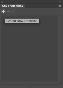
Go to Window > CSS Transitions and click the + sign to create a new transition.
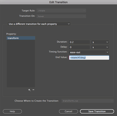
The New Transition dialog will appear.
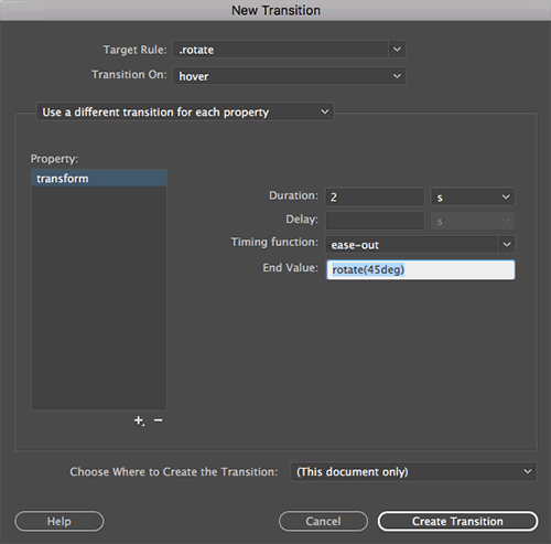
1. Type .rotate into the Target Rule field (Dreamweaver will create a new class selector called .rotate and apply it to the div).
2. Choose "hover" from the Transition On menu (the transition will occur when you mouse over the .rotate div).
3. Choose "Use a different transition for each property". This will allow you to specify exactly which CSS property should receive the transition.
Choosing "Use the same transition for all properties" slows performance a bit, since the browser has to check each CSS property to see if a change has occurred. If you only want to apply the transition to a single property, save the browser the work.
4. Click the + sign beneath the Property pane, selecting "transform" from the list.
5. Type "2" into the Duration menu (the transition will occur for 2 seconds).
6. Leave the Delay field blank (it will default to a delay of 0 seconds). The transition-delay setting isn't often used, since you'll usually want your transition to start playing right away.
7. Choose "ease-out" from the Timing Function menu.
8. Type "rotate(45deg)" into the End Value field.
9. Save the transition in the transform.css file, and click Create Transition.
Mouse over the first square to see the transition in action.

Toggle to the transform.css file to see how this magic works. On hover, the square is set to rotate 45 degrees. This transition is applied to the "transform" property. It takes place over a two second time period, and eases out.
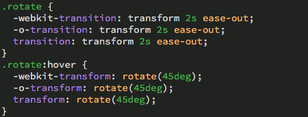
Dreamweaver also provides specific browser prefixes for Safari and Opera.
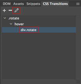
Toggle back to Live View. Select div.rotate in the CSS Transitions panel, then click the pencil icon to edit.
Let's speed up the rotation and change how the transition is timed.
1. Change the duration to "0.2" seconds.
2. Click the menu to the right of the Timing Function field and choose "linear".
Save the transition and preview in a browser. Mouse over the first square, noticing the fast, steady rotation speed.
Square 2: Spin
Is spinning the same as rotation? Not quite.
Select square #2, which will receive the next transition.
 |
Dreamweaver will apply the new transition to whatever element is selected on the page. |
Click the + sign in the CSS Transitions panel to create a new transition.
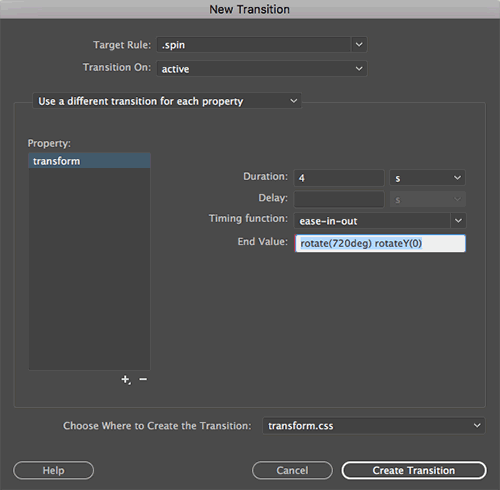
1. Type .spin into the Target Rule field.
2. Choose "active" from the Transition On menu (the transition will occur when you click the .rotate div).
3. Choose "Use a different transition for each property".
4. Click the + sign beneath the Property pane, selecting "transform" from the list.
5. Type "4" into the Duration menu. Leave the Delay field blank, and choose "ease-in-out" from the Timing Function menu.
6. Type "rotate(720deg) rotateY(0)" into the End Value field.
7. Save the transition in the transform.css file, and click Create Transition.
When you mouse over the second square, nothing will happen. Click and hold to see the square spin. The "active" transition occurs as the element is being activated.
Square 3: Scale and Color
Feeling dizzy? Don't worry, we'll stop rotating for now and try out some scale and color transitions. Select square #3.
 |
Dreamweaver will apply the new transition to whatever element is selected on the page. |
Click the + sign in the CSS Transitions panel to create a new transition.
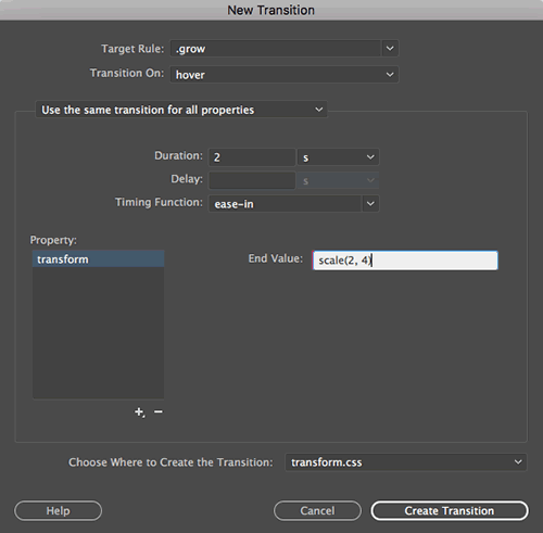
1. Type .grow into the Target Rule field.
2. Choose "hover" from the Transition On menu.
3. We are going to apply this transition to more than one property here, so choose "Use the same transition for all properties".
4. Click the + sign beneath the Property pane, selecting "transform" from the list.
5. Type "2" into the Duration menu and choose "ease-in" from the Timing Function menu. Leave the Delay field blank.
6. Type "scale(2, 4)" into the End Value field. This will make the square twice as wide and four times as tall—you'll see!
Don't click Create Transition yet, there's another property to add.
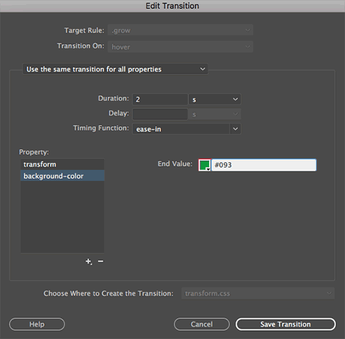
7. Click the + sign beneath the Property pane, selecting "background-color" from the list.
8. Type "#093" as the End Value.
9. Save the transition in the transform.css file, and click Create Transition.
When you mouse over the third square, it will grow in size as it turns green. Pretty neat!
Square 4: Skew
OK, time to get a little skewed! Select square #4.
 |
Dreamweaver will apply the new transition to whatever element is selected on the page. |
Click the + sign in the CSS Transitions panel to create a new transition.
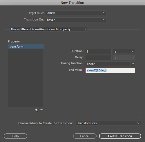
1. Type .skew into the Target Rule field.
2. Choose "hover" from the Transition On menu.
3. Choose "Use a different transition for each property".
4. Click the + sign beneath the Property pane, selecting "transform" from the list.
5. Type "1" into the Duration menu and choose "linear" from the Timing Function menu. Leave the Delay field blank.
6. Type "skewX(20deg)" into the End Value field. This will skew the square 20 degrees horizontally. If you wanted to skew the square vertically, you would use a value of "skewY(20deg)".
7. Save the transition in the transform.css file, and click Create Transition.
Mouse over the fourth square to see it slant.
Square 5: Translate
Translate, in this case, is a fancy word for "move." Select square #5.
 |
Dreamweaver will apply the new transition to whatever element is selected on the page. |
Click the + sign in the CSS Transitions panel to create a new transition.
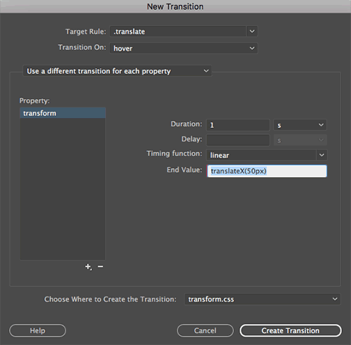
1. Type .translate into the Target Rule field.
2. Choose "hover" from the Transition On menu.
3. Choose "Use a different transition for each property".
4. Click the + sign beneath the Property pane, selecting "transform" from the list.
5. Type "1" into the Duration menu and choose "linear" from the Timing Function menu. Leave the Delay field blank.
6. Type "translateX(50px)" into the End Value field. This will move the square 50 pixels to the right. If you wanted to move the square to the left, you would use a negative value, "translateX(-50px)". To move the square down, use "translateY(50px)". Or up: "translateY(-50px)".
7. Save the transition in the transform.css file, and click Create Transition.
When you mouse over the fifth square, it will move to the right.
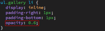
Opacity
We put those boxes through a lot, didn't we? They might be feeling a little worn out, fading a little. Seems like the right time to talk about opacity transitions! Open the opacity.html file from the opacity folder. Expand the CSS Designer panel. Toggle to opacity.css and find the ul.gallery li style. Add a new property to set the opacity to "0.6".
Toggle back to Live View. Click the + sign in the CSS Transitions panel to create a new transition.
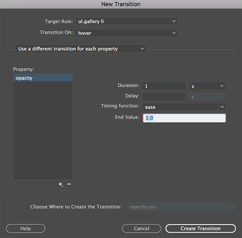
1. Click the menu to the right of the Target Rule field, and choose ul.gallery li.
2. Choose "hover" from the Transition On menu.
3. Choose "Use a different transition for each property".
4. Click the + sign beneath the Property pane, selecting "opacity" from the list.
5. Type "1" into the Duration menu, and choose a value of "ease" from the Timing Function menu. Leave the Delay field blank.
6. Type "1.0" into the End Value field.
7. Save the transition in the opacity.css file, and click Create Transition.
Mousing over an image will bring it to full opacity.

Jump Links
There's a specific method of CSS transition that does a great job making links feel more vibrant. Open target.html from the target folder. This document contains several summaries of Jane Austen novels, indexed by jump links at the top. Clicking a jump link takes you to the appropriate heading in the document.
The "target" transition can be used to animate the headings as they are targeted. Click the + sign in your CSS Transitions panel to create a new transition.
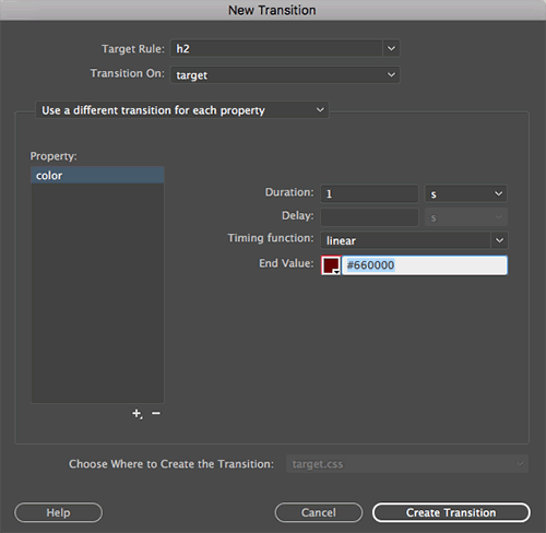
1. Click the menu to the right of the Target Rule field, and choose h2.
2. Choose "target" from the Transition On menu.
3. Choose "Use a different transition for each property".
4. Click the + sign beneath the Property pane, selecting "color" from the list.
5. Type "1" into the Duration menu. Leave the Delay field blank. Set the timing-function to "linear".
6. Type "#660000" into the End Value field.
7. Save the transition in the target.css file, and click Create Transition.
When you click a link, the heading will glow red.
Forms
Expand the form folder and open form.html. Click the + sign to create a new transition.
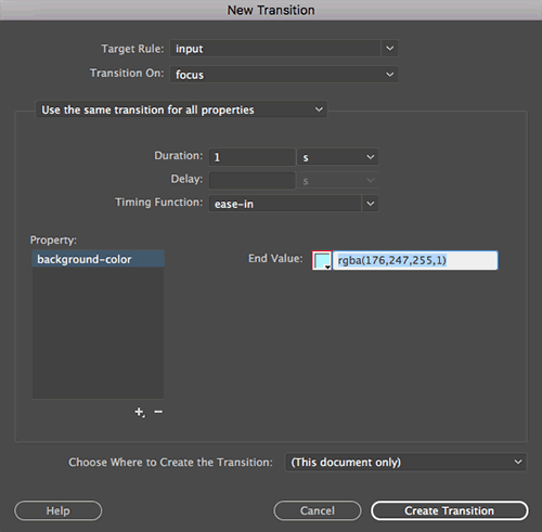
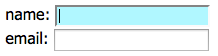
1. Type "input" into the Target rule field (the input tag selector will apply to <input> form elements, like text boxes).
2. Choose "focus" from the Transition On menu (this transition will occur when you insert your cursor into a form field).
In case you're wondering, the checked, disabled, enabled, and indeterminate transitions also apply to form elements:
|
|
|
| |
- checked: occurs when a checkbox is checked
- disabled/enabled: occurs when a form element becomes disabled or enabled
- indeterminate: occurs when a checkbox's indeterminate DOM property is set to "true" by JavaScript
|
|
|
|
|
3. Choose "Use the same transition for all properties".
4. Type "1" into the Duration menu. Leave the Delay field blank. Choose "ease-in" from the timing-function menu.
5. Click the + sign beneath the Property pane, selecting "background-color" from the list.
6. Type "rgba(176,247,255,1)" into the End Value field.
7. Save the transition in the form.css file, and click Create Transition.
Click inside an input field and watch as it glows blue.
 Learn about CSS transition properties.

