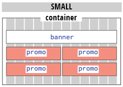
Compresses to two columns to fit a tablet:
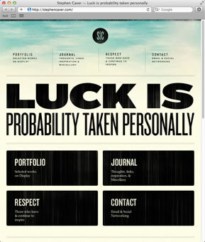
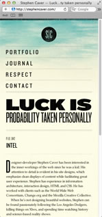
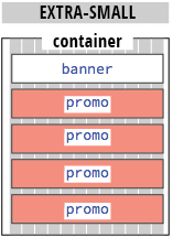
And wraps to a single column to fit a mobile device:
The fluid columns are achieved by percentage widths and margins. Percentage values can be complicated to calculate, but Bootstrap's grid framework will do the work for you.
Creating a New Layout
Download the luck folder from the course downloads area. Unzip it and move it into your dw1exercises folder.
Go to File > New and choose the Bootstrap tab. Select "Create new" and uncheck "Include a pre-built layout". Click Create.
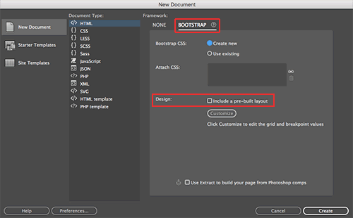 |
Create a new Bootstrap layout via the New Document window. |
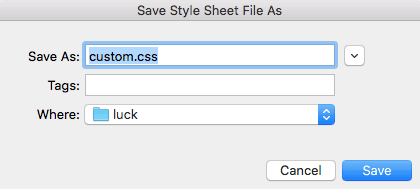
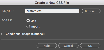
When the Save Style Sheet File dialog opens, navigate to the luck folder and save the file as "custom.css".
 |
The Save Style Sheet File dialog should open after you click "Create". If it doesn't, keep going. I will show you how to create a custom.css file using the CSS Designer panel in the next steps. |
The Bootstrap layout will open in a new document window. Right away, go to File > Save As, saving the HTML file as luck.html in your luck folder.
Related Files
Using the Related Files toolbar, select Source Code and switch to Code View.
So far, this is just an empty HTML file, but it is linking to several CSS and JS files.

If you've saved your luck.html file inside your luck folder, you'll notice a ../ before the links to the css and js folders, indicating that they are located one folder level up from the luck.html file. Dreamweaver always saves these files at the top level of the local site folder.
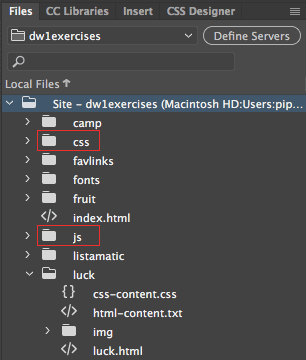 |
Dreamweaver created CSS and JS folders along with the new Bootstrap layout. |
Keep the css and js folders exactly where they are – don't move them into the luck folder. The bootstrap.css and bootstrap.js files are a basic framework. You could attach these files to any html file to apply the Bootstrap formatting. In this class, we will be creating six different projects. Each project will have a custom.css file (in the project folder) with the custom formatting. However, all six projects link to the same bootstrap.css and bootstrap.js files.
Media Queries
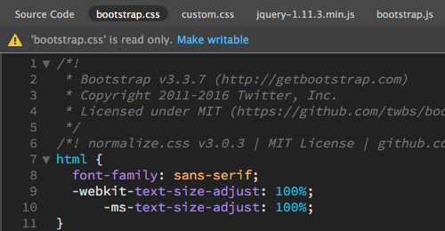
Use the Related Files toolbar to toggle to the bootstrap.css file. At the very top, you'll notice a warning that "bootstrap.css is read only". You can't edit or modify any of the styles that you see here. When you need to modify the design, you'll use your custom.css file.
Dreamweaver provides an option to make the bootstrap.css file writable, but I recommend keeping it read only. Bootstrap often releases updates to its core css. If you keep your customized styles in a separate custom.css file, then you can replace the bootstrap.css file without losing any changes you made to your design.
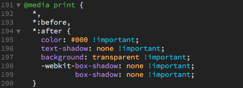
Scroll down for a quick overview of the styles provided in the bootstrap.css file. You'll notice many media queries along the way. Here's a media query that formats the page if it is printed from the browser:
The following media query formats the "lead" paragraph in large screens that are at least 768 pixels wide:
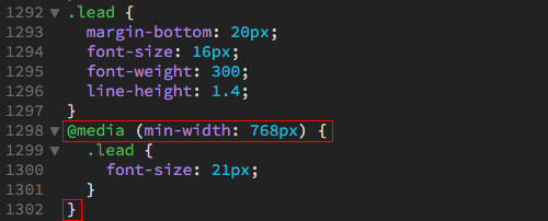 |
The lead paragraph has a default font-size of 16 pixels. However, it will appear at a font-size of 21 pixels in screens larger than 768 pixels wide. |
Media queries marked in red. Notice how there is an extra closing bracket at the bottom, marking the end of the media query? Any style nested within the brackets will be affected by the media query.
If a style isn't enclosed in a media query, it will take effect in all screen size variations, as a "global" style.
Custom Styles
Use the Related Files toolbar to toggle to the custom.css file. If you're lucky, you'll see an empty CSS file. This file should have been created via the File > New dialog. If you're not lucky, you'll see an error warning you that the custom.css file is not on the local disk. Not to worry! Open your CSS Designer panel and click the + sign next to "Sources". Choose "Create a New CSS File".
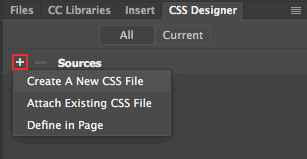
Type "custom.css" into the File/URL field and choose "Add as Link". Click OK.
Inserting Bootstrap Components
Before diving into page layout, it is helpful to create a wireframe of the extra-small, small, medium, and large layouts. Your wireframe could be just a sketch on a napkin, but the advance planning will save you time in the long run.
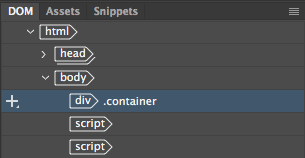
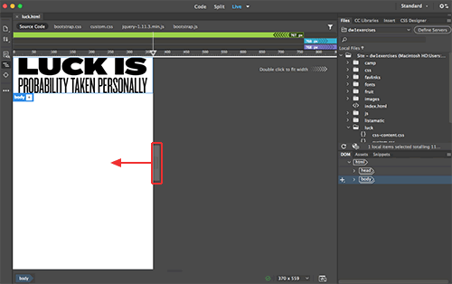
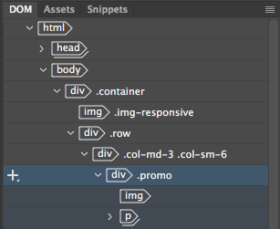
1. Toggle to Live View. Expand the DOM panel in the lower-right corner of the Document window. Select the body element.
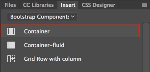
Open your Insert Panel and choose "Bootstrap Components" from the dropdown menu. Click "Container".
The container div should be inserted ABOVE the two script tags. If it is not in the right place, you can drag and drop using the DOM panel.
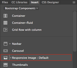
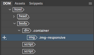
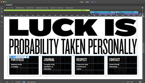
2. Keeping the container selected, choose "Responsive Image: Default".
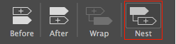
Choose "Nest" from the insert options. This will nest the image inside the container div.
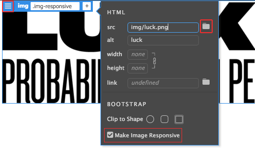
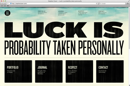
Click the hamburger icon on the blue tab to edit the HTML attributes. Browse to select the luck.png file inside the img folder. You'll notice that the option for "Make Image Responsive" is checked. This means the image will resize to fit any screensize.
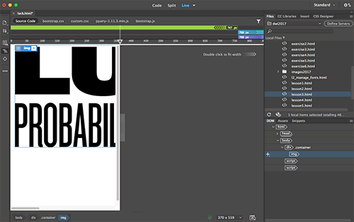
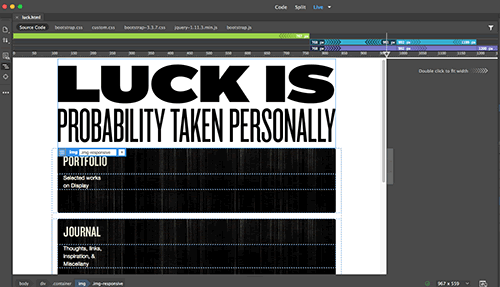
If you drag the vertical scrubber to make your workspace smaller, the responsive image will scale to fit.
This magic is happening thanks to the Bootstrap framework. In the source code, a class of "img-responsive" is applied to the image:

In the
bootstrap.css file, the "img-responsive" class has a maximum width of 100%. This means that the image will never be wider than its container.
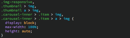
If you removed the "img-reponsive"
class, the image would overflow.
Double-click the grey scrubber area to expand the window back to full size. The next element will be inserted after the image, so make sure that the img is highlighted in the DOM panel.
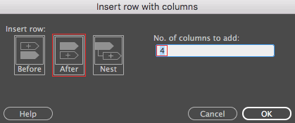
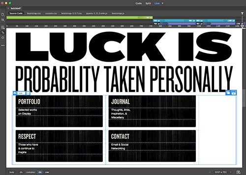
3. We'll use the Bootstrap grid system to tackle the positioning of the four promo divs. Choose "Grid Row with column".
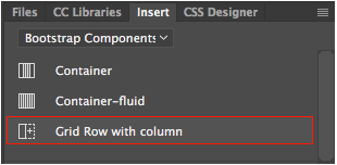
The grid row should go after the image that is selected in the document window. There are four promo divs, so we need 4 columns.
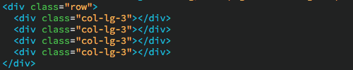
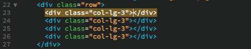
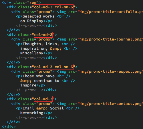
Toggle to Code View to take a look. You have a div with a class of "row". Inside the "row" there are four divs with a class of "col-lg-3" (if you have a smaller monitor, Dreamweaver may have applied a class of "col-md-3" or "col-sm-3").
We are going to insert content into each of these divs. Expand the luck folder in the Files panel and open html-content.txt. Copy the content under the /* Insert in column #1 */ comment:
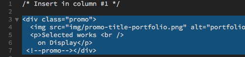
Switch back to your luck.html file, toggling to Code View. Insert your cursor inside the first column div, directly before the </div> tag.
Paste into the div:
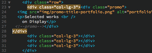
There are a lot of nested divs here, but Dreamweaver provides some useful visual cues to help you sort it out. If you click the opening <div class="col-lg-3"> tag, then the closing </div> will also be highlighted. This helps you to identify which closing </div> goes with which opening <div> tag.
4. Repeat this process for "promo" divs 2, 3, and 4.
When you're done, click the paint bucket icon in the Coding toolbar and choose "Apply Source Formatting" to clean up the code.
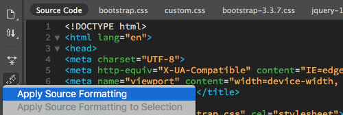
Go to File > Save to save your work so far. Then check the bottom toolbar in Code View. If you see a green check, all good. If you see a red x, you've made a mistake. Click the red x for a list of errors.
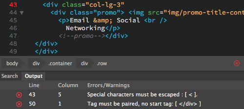 |
Whoops, I accidentally deleted my closing bracket. I'll fix the error and resave to get a green check. |
Toggle to Live View. This is looking more like a real layout, but some custom styles will finish it off. Open css-content.css. Copy the styles and switch back to luck.html. Toggle to Code View, choose the custom.css file, then Edit > Paste.
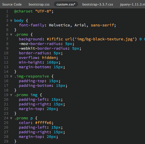
Bootstrap's Grid System
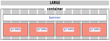
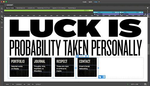
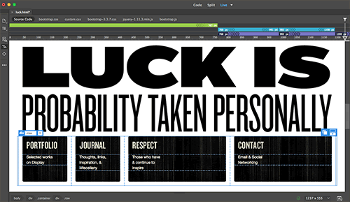
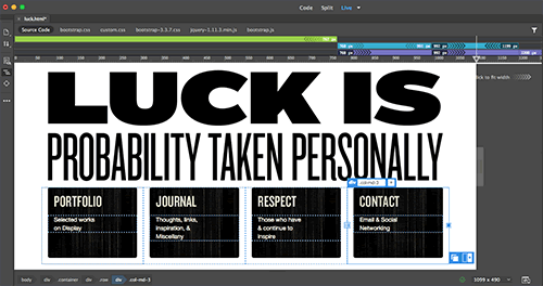
Toggle back to Live View. If you expand your workspace, the promo divs will be arranged in a four column div.
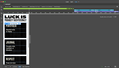
If you drag the vertical scrubber to make the window narrower, the divs will stack in a single column.
What is happening here? Bootstrap is composed of four grid systems: extra-small, small, medium, and large. Each grid system has a style prefix: .col-xs-, .col-sm-, .col-md- and .col-lg.

When you inserted your Grid Row with 4 columns, Dreamweaver entered a style prefix for your current screen resolution. In my case, the style prefix was .col-lg-
The number following the style prefix indicates the number of columns the div takes up in the grid. Each of my divs spans 3 columns in the large grid. That's 4 divs, each spanning 3 columns, for a total of 12 columns. 12 is the magic number here — keep it in mind!
If you changed the values to .col-lg-2, each div would take up 2 columns, and your layout would look like this:
You have a total of 12 columns to work with. If your values add up to more than 12, then the divs will simply flow down to the next row. In the example below, the divs are set to 5 columns each. That makes for 2 rows spanning 10 columns (with 2 empty columns in each row).
Of course, all the columns don't have to be the same. Here I've set the first two divs to 2 columns and the second two divs to 4 columns.
In most layouts, you'll need to use more than one grid system to format the layout for multiple screen sizes. Let's start with extra-small and work our way up. Drag the vertical scrubber until it is at the 320 pixel mark, the width of an average cell phone. This looks okay as a single column, so we don't have to do anything.
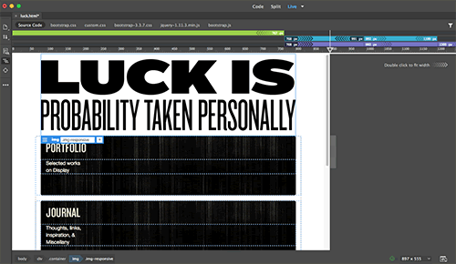
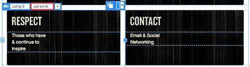
Resize your workspace to about 900 pixels, right in the middle of the "small" grid system. The promo divs are starting to look rather wide.
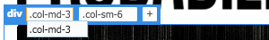
Click the Portfolio heading, then use the DOM panel to select the outer column div (or alternatively, you can hit your upward arrow key a few times until the outer div is selected).
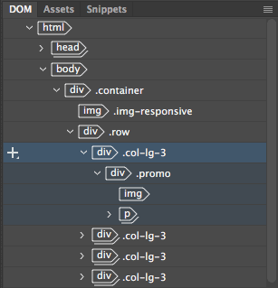
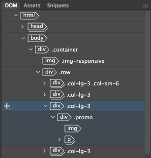
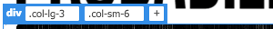
This div already has a ".col-lg-3" class which sizes it in the large grid system. Add another class selector to size the div in the small grid system.
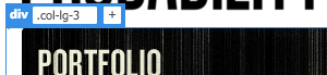
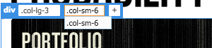
Click the + sign on the blue tab, then type ".col-sm-6". After you finish typing the selector, hit your return key to register the change. This will set the div to 6 columns, (half the 12 column grid).
Dreamweaver also allows you to resize the columns visually. Click the "Respect" graphic, then use the DOM panel (or your upward arrow key) to select the outer div.
Grab the resize handle on the right edge of the "Respect" div ...
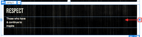
And drag to the left to resize the div. Dreamweaver will automatically add the .col-sm-6 selector for you. It sees that you are working in the small media query, so it uses the "sm" prefix. Smart!
Drag the vertical scrubber to about 1100 pixels, smack in the middle of the medium media query. This layout displays in two columns, just like the small layout.
The medium grid system inherits the styles from the small grid system. This is a huge time-saver. You don't have to apply a small prefix and a medium prefix. The small prefix will "cascade" up to the larger sizes. Cool!
If you decide to change your medium layout, edit each of the "lg" prefixes.
 |
Carefully, click inside the ".col-lg-3" selector. |
And change them to "md" prefixes.
 |
Wait until you see a blinking cursor. Then, change the "lg" prefix to "md". |
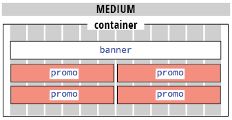
After changing the selectors, the 4 column grid kicks in at the medium size.
To better understand the styles at play, feel free to make some tweaks. Modify a few elements in all four layouts. If you break something beyond repair, you can use Edit > Undo.
Take a look at Code View too. You can edit the class selectors directly in Code View. Sometimes it is faster than selecting and editing the tabs on each div.
Nested Grids
You are becoming a pro with grids by now, so nesting grids will be just another drop in the bucket.
1. Resize your workspace to the large media query to try out this next technique (at least 1200px wide).
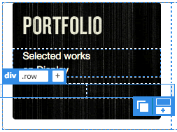
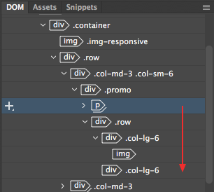
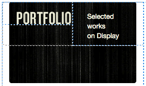
2. Click the Portfolio heading, then use the DOM panel to select the "promo" div. Be careful to select the "promo" div, not the "col" div this time.
Using the Insert panel, choose "Grid Row with column".

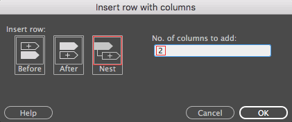
Choose "Nest" to nest the new grid row inside the promo div. Enter "2" columns.
The new grid fits neatly inside the promo div. It just needs some content.
3. Expand the new nested div in the DOM panel.
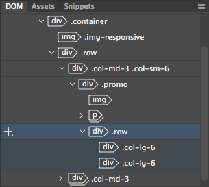
Select the img in the DOM panel and drag it down, hovering over the "div class="col-lg-6". Release to drop the image inside the column.
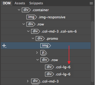
4. Select the paragraph and drag it into the second grid column.
Our nested grid creates a mini 2-column layout.
The nested grid works just like any other grid. Each row is based of a total of 12 columns. A 6 column div takes up half a row. We've used a col-lg- prefix, so this grid will only be viewable in the large screen size.
Containers
Let's turn our attention to the container div surrounding the layout. Go to File > Real-time Preview. Make your window large and small, noticing the white margins around the outside of the page.
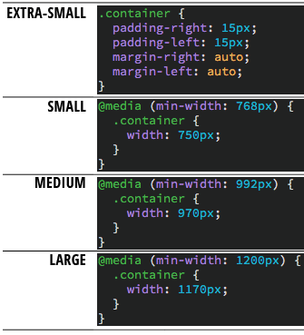
In the extra-small media query, the container div has 15 pixels of right and left padding. This prevents the content from bumping up against the edge of the browser.
In the small media query, the container is set to a fixed width of 750 pixels. If the browser is 768 pixels wide, the container div will be 750 pixels. If the browser is 991 pixels wide, the container is still 750 pixels.
The container div is 950px wide in the medium media query, and 1170px wide in the large media query.
Back in Dreamweaver, select the container div.
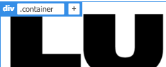
Change the selector to "container-fluid".
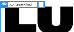
Check your layout in Real-time preview again, and you'll notice a difference in the page margins as you resize your browser. The fluid container has 15 pixels of right and left padding, in all screen sizes.
Depending on your page layout, you can decide whether a fixed container or fluid container is better for you.
Done? Click here to compare your responsive site file with one that we created.
Are you getting the hang of working with grids? Don't stop here! Head to http://getbootstrap.com to review what you've learned along with some new tricks.
When you browse getbootstrap.com, you'll notice that there are several versions of Bootstrap to choose from. A beta version of Bootstrap 4 was released in August 2017 - feel free to check it out. However, we will be using the latest stable release of Bootstrap in this class: Bootstrap v3.3.7.

 Learn
the benefits of using responsive layouts.
Learn
the benefits of using responsive layouts. 
